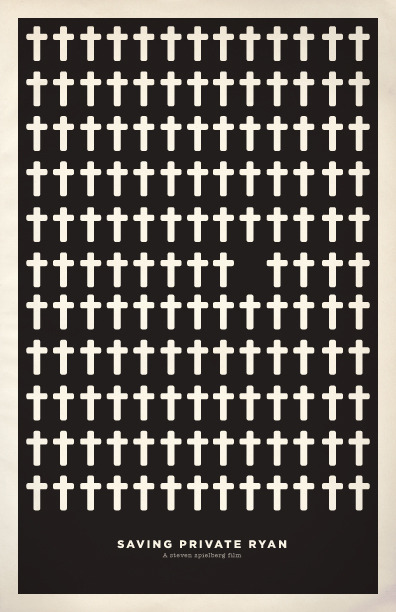
Look At All These Pop Culture References Reduced To Simple Colors And Shapes
August 18, 2011 10:51 AM Subscribe
Fan art, bootleg or both? Fan art, bootleg or both? Tom Papalardo sounds off on the ubiquitous "Minimalist Revisionist Poster" trend
"They’ve put a lot of thought and time into their bootlegged merchandise! They’re not hiding behind a few well-worn tropes of minimalist design to cover up any inadequacies in the skills department, either, so don’t even think that!"
With the recent spate of minimalist movie posters becoming more and common (really common), blogger/illustrator/designer Tom Pappalardo gives his take.
Is it still really just "fan art" if you are selling it or is it just a bootleg?
He seems so angry about this. Why on earth is he so angry about this?
posted by dersins at 10:59 AM on August 18, 2011 [5 favorites]
posted by dersins at 10:59 AM on August 18, 2011 [5 favorites]
I suppose you would have to consult a copyright lawyer, but boiling a specific cultural expression down to just a few shapes or one representative moment containing no trademarked objects seems to me to fit into the category of "derivative work." And you can't copyright a title.
I suppose I would be interested in seeing the outcome of such a legal battle, but I don't think it has happened yet and don't know of any that are in the works. So the question of bootlegging is academic at the moment.
Mostly, this author seemed like he wanted to fume about a trend his dislikes. I suppose that's his prerogative. I'm a professional arts writer, and it bothers me when amateurs attempt to write criticism and just end up sounding like angry spoilsports, but what are you going to do?
posted by Bunny Ultramod at 11:01 AM on August 18, 2011 [5 favorites]
What you're doing is too easy and gets too much attention! And some of you might be making a tiny bit of money too! If you were real artists you'd toil in obscurity (and penury)!
posted by 2bucksplus at 11:03 AM on August 18, 2011 [9 favorites]
posted by 2bucksplus at 11:03 AM on August 18, 2011 [9 favorites]
I will say I think the minimalist movie posters thing has become a bit of a cliche by now (maybe the next site from the Cheezburger network?), but there's nothing wrong with them per se.
posted by kmz at 11:03 AM on August 18, 2011 [1 favorite]
posted by kmz at 11:03 AM on August 18, 2011 [1 favorite]
Metafilter: I suppose that's his prerogative.
posted by longsleeves at 11:03 AM on August 18, 2011
posted by longsleeves at 11:03 AM on August 18, 2011
Please, won't someone make a big blue poster on an "old piece of paper scan" with a tiny red violin in the very center representing Tom Pappalardo's anger. And sell it?
posted by chavenet at 11:04 AM on August 18, 2011 [5 favorites]
posted by chavenet at 11:04 AM on August 18, 2011 [5 favorites]
Really, if it leads to even a couple of studios hiring actual artists (instead of what appears to be a 15-year-old with a pirated copy of photoshop) to design posters for even a couple of movies, I'm all for it.
Previously on the bad movie posters.
posted by Huck500 at 11:05 AM on August 18, 2011 [1 favorite]
Previously on the bad movie posters.
posted by Huck500 at 11:05 AM on August 18, 2011 [1 favorite]
This is the first I've heard of any of this, pretty cool; thanks for the pointer, Tom!
posted by villanelles at dawn at 11:06 AM on August 18, 2011 [3 favorites]
posted by villanelles at dawn at 11:06 AM on August 18, 2011 [3 favorites]
I am reading this in Howard Beale's voice and it is like ten times as entertaining.
posted by griphus at 11:11 AM on August 18, 2011 [2 favorites]
posted by griphus at 11:11 AM on August 18, 2011 [2 favorites]
Actually, that previous Empire collection of bad movie poster photoshops seems to have been updated, just so you know.
posted by Huck500 at 11:11 AM on August 18, 2011 [1 favorite]
posted by Huck500 at 11:11 AM on August 18, 2011 [1 favorite]
I share his rage. So few of them are good and yet the trend continues. At a certain point one just wants to say "Really, that's your creative highball, copying the a previously interesting but now lame trend and doing it poorly?"
posted by Brandon Blatcher at 11:11 AM on August 18, 2011 [8 favorites]
posted by Brandon Blatcher at 11:11 AM on August 18, 2011 [8 favorites]
I'm a professional arts writer, and it bothers me when amateurs attempt to write criticism and just end up sounding like angry spoilsports, but what are you going to do?
Because clearly only a professional arts writer should be allowed to write about anything critical pertaining to the arts, even when their field is in fact the arts.
posted by Senor Cardgage at 11:12 AM on August 18, 2011
Because clearly only a professional arts writer should be allowed to write about anything critical pertaining to the arts, even when their field is in fact the arts.
posted by Senor Cardgage at 11:12 AM on August 18, 2011
I'm with Tom on this one.
posted by BeerFilter at 11:13 AM on August 18, 2011
posted by BeerFilter at 11:13 AM on August 18, 2011
Because clearly only a professional arts writer should be allowed to write about anything critical pertaining to the arts, even when their field is in fact the arts.
*whoosh*
posted by dersins at 11:14 AM on August 18, 2011
*whoosh*
posted by dersins at 11:14 AM on August 18, 2011
Wait you mean this movie isn't about two men in love with an Uma Thurman cardboard cut-out?
I want my twelve dollars back.
posted by griphus at 11:15 AM on August 18, 2011
I want my twelve dollars back.
posted by griphus at 11:15 AM on August 18, 2011
Because clearly only a professional arts writer should be allowed to write about anything critical pertaining to the arts, even when their field is in fact the arts.
That's a shockingly poor and humorless reading of what I wrote.
posted by Bunny Ultramod at 11:16 AM on August 18, 2011
That's a shockingly poor and humorless reading of what I wrote.
posted by Bunny Ultramod at 11:16 AM on August 18, 2011
I don't really care about the copyright issues but I completely agree with his critique of the design issues (and it's been done to death). Everything does not need to look like an early '60s paperback cover.
posted by doctor_negative at 11:17 AM on August 18, 2011
posted by doctor_negative at 11:17 AM on August 18, 2011
What you're doing is too easy and gets too much attention! And some of you might be making a tiny bit of money too! If you were real artists you'd toil in obscurity (and penury)! make quality work that isnt beholden to a lazy trend and maybe also try to not infringe on someone else's copyright by selling it.
posted by Senor Cardgage at 11:18 AM on August 18, 2011 [2 favorites]
posted by Senor Cardgage at 11:18 AM on August 18, 2011 [2 favorites]
Everything does not need to look like an early '60s paperback cover.
I don't mind this trend. It's sometimes done better, sometimes done worse. Mostly people seem to be doing it in their spare time and sharing it online. Some are selling theirs, and it's usually the people who are doing the least interesting version, but for the rest it really seems like a design challenge. I think it a worthwhile one. It never hurts to try to learn to communicate complex ideas simply.
posted by Bunny Ultramod at 11:19 AM on August 18, 2011 [3 favorites]
I'm a big fan of many of the revisionist posters I've seen. They're often quite clever and visually stunning. Some of them I like for the quick chuckle or nod of recognition, but there are also a bunch that strike me as great pieces of graphic design. Sure the style of most of them are becoming a bit cliche, but occasionally I still see new ones that leap out and impress me. Like any other art form, some people are really talented and excel at what they do while others are less skilled or creative. By starting with a likable or pop culture reference you've already got a hook, but to make it work as whole you still need to deliver a quality piece of work.
posted by Slack-a-gogo at 11:20 AM on August 18, 2011 [1 favorite]
posted by Slack-a-gogo at 11:20 AM on August 18, 2011 [1 favorite]
One can critique these examples, of course. They have to stand on their own merit.
But complaining that re-imaginings of what are now ubiquitous popular culture tropes shouldn't be sold for filthy lucre misses the entire point.
No one likes blind rip-offs, and we are right to point such examples out. But complaining about how popular culture and art actually work, and working to suppress that, is being disingenuous at best.
Modern art borrows heavily from popular culture -- it almost has to in order to be "modern" (or post-modern as the case may be) -- and it is unclear at what point we decide something is acceptable (Warhol) or not (Fairey) or vice-versa.
Give me a pixel-stained individual doing yet another minimalist poster for my morning RSS cruise any day over the "art" factories created by people like Hirst.
But, one thing is for sure: we need to think about these things /without/ getting caught up in the whole "intellectual property" nonsense, which is something that hardly fits the notion of art or craft. It is a corporate tool used by corporate interests in order to make corporate things. It scales very, very poorly to things like software and art.
On my bookshelf to read this month is "The Copyright Thing Doesn't Work Here" by Boatema Boateng. Oddly enough, it appears to have some application to at least some of the dialogue here and elsewhere on IP and "authenticity" (a matter for a whole 'nother rant) in art and craft.
posted by clvrmnky at 11:20 AM on August 18, 2011 [3 favorites]
Eh. I made one for my reboot blog while I was fiddling around with my iPad. It was fun to do and I may make more when the mood strikes me, but I doubt I'd put anything I doodle up for sale.
I can see his point about the minimalist wave being tiring, though. I think its popularity has something to do with the average reaction to stuff viewed online. Naked women aside, I suspect the same amount of attention is paid a minimalist movie poster that took 20 minutes to make in photoshop and a super detailed, hand-drawn poster. People click on a link, go "Huh. Neat." and then move on to the next thing. The quick stuff gets just as much attention as the detailed, individually, but there's so much more of it out there.
posted by robocop is bleeding at 11:24 AM on August 18, 2011 [1 favorite]
Is it REALLY that well done? The concept, the layout, the execution. Does it really seem like the designer has put more than five seconds of thought into it, or spent more than 15 minutes in Illustrator? Is the thing really any good? Now back up and find the rest of the series it came from. You’ll most likely find the same formula applied with a minimum of imagination added (maybe that’s what they mean when they claim they’re making minimalist designs… hmmm…). These series are more often than not excellent studies in lazy design, lazy thinking, and wanton self-promotion.
Meanwhile, Pappalardo's blog post is one of the most mind-blowing works of art criticism I have ever read. He most likely spent hours crafting this 700-word work of genius. Just think of the thousands of image search results he had to go through to find the perfect pop culture posters to display on his blog without permission. And the rest of his blog is far from formulaic and derivative, just look at his series of Random Images From The Internet posts, each one completely unique and including work he created entirely on his own. I will certainly follow him on Twitter and see his upcoming appearances at Flywheel and MICE.
posted by burnmp3s at 11:27 AM on August 18, 2011 [2 favorites]
In what way is that poster (or any of those referenced) a "bootleg"? The only elements it contains which exist in any other work are the words "The Empire Strikes Back" -- everything else is original. A bootleg is an unauthorized copy of another work, not an original derivative work... so yes, this would be fan art.
And people have been selling fan art for years. Decades, in fact. Fan art prints are neither new nor exciting, not even "on your flickr or deviantart or tumblr accounts as ‘art prints’ for sale". I expect the dealer's room of any given con would blow this guy's mind -- much less artists' alley, in which the "bootlegged merchandise" often has its tits or cock out...
posted by vorfeed at 11:33 AM on August 18, 2011
If this is bootlegging, what is the equally hot 'mashup' art? Double bootlegging? Just because the producers of My Little Pony are supporting it, won't the concerns of whoever provided the paste-over soundtracks kill them all? How long until they come for Cookie Waits?
posted by oneswellfoop at 11:47 AM on August 18, 2011 [2 favorites]
posted by oneswellfoop at 11:47 AM on August 18, 2011 [2 favorites]
I like the minimalist poster trend all right, with the understanding that Sturgeon's Law applies, but I admit to wondering how many of them would look good at full large-size movie poster size on my wall. Apart from the "don't buy art you don't have room for", that would be my big concern about buying one of the minimalist posters. I imagine that small versions framed up and put on a wall in groups would be more interesting than one giant one in the same space.
posted by immlass at 12:01 PM on August 18, 2011
posted by immlass at 12:01 PM on August 18, 2011
I thought it said "Fart, bootleg..."
posted by stormpooper at 12:07 PM on August 18, 2011
posted by stormpooper at 12:07 PM on August 18, 2011
I would like to see Star Wars posters done in an Aubrey Beardsley way, but I reckon that is more technically strenuous than minimalist makeovers. I would totally do it myself, but I have no skills.
posted by everichon at 12:33 PM on August 18, 2011 [2 favorites]
posted by everichon at 12:33 PM on August 18, 2011 [2 favorites]
I'm sick of the minimalist thing, too. The author's right, they are predictable. The sixties paperback ones are cool with me, but I love retro.
Much more than these trends, I've come to enjoy fake Criterion covers. There's something about real Criterion covers that really pushes my buttons, so it's interesting to look at these and see what works and what doesn't. It's all so subtle. There is some crossover with the minimalist thing, but when someone gets one right, it seems very clever.
posted by heatvision at 12:38 PM on August 18, 2011
I'm sorta tired of this trend too but not enough to work up a good rant about it.
posted by octothorpe at 12:39 PM on August 18, 2011 [1 favorite]
posted by octothorpe at 12:39 PM on August 18, 2011 [1 favorite]
I'm sick of the trend of people being sick about trends.
posted by sweetkid at 12:41 PM on August 18, 2011 [2 favorites]
posted by sweetkid at 12:41 PM on August 18, 2011 [2 favorites]
I'm looking forward to when we're nostalgic for the trend of people being sick of the trend of people being sick about trends. We'll look back and laugh about how much simpler times used to be when this is the kind of stuff people complained about. We'll throw Blog Rant parties and everyone will come enraged about something trivial. Maybe the party game will be "Guess Which Meme Pisses Me Off Today" and everyone has to figure out which trend you've stuck your flag of bitterness into.
posted by Slack-a-gogo at 1:04 PM on August 18, 2011 [4 favorites]
posted by Slack-a-gogo at 1:04 PM on August 18, 2011 [4 favorites]
"Really, that's your creative highball, copying the a previously interesting but now lame trend and doing it poorly?"
That's what we call an art movement.
posted by Joey Michaels at 1:25 PM on August 18, 2011
That's what we call an art movement.
posted by Joey Michaels at 1:25 PM on August 18, 2011
Every one of these posters is better than the crap they put up in theaters.
posted by empath at 1:25 PM on August 18, 2011
posted by empath at 1:25 PM on August 18, 2011
"... and everyone has to figure out which trend you've stuck your flag of bitterness into."
I'll start.
Gods, those fucking CUTE CATS and their CUTE LITTLE SAYINGS and the CUTE WAYS that people creatively spell.
GOSH.
posted by clvrmnky at 1:36 PM on August 18, 2011 [1 favorite]
I'll start.
Gods, those fucking CUTE CATS and their CUTE LITTLE SAYINGS and the CUTE WAYS that people creatively spell.
GOSH.
posted by clvrmnky at 1:36 PM on August 18, 2011 [1 favorite]
I would like to see Star Wars posters done in an Aubrey Beardsley way, but I reckon that is more technically strenuous than minimalist makeovers. I would totally do it myself, but I have no skills.
That is a dope-ass idea. Get to it, vis art motherfuckers!
posted by Mister_A at 1:44 PM on August 18, 2011
That is a dope-ass idea. Get to it, vis art motherfuckers!
posted by Mister_A at 1:44 PM on August 18, 2011
THE KIDS.
THE LAWN.
THE RAAAAAAAAAAAAAAAAAAAAAAAAAAAGE.
posted by Sebmojo at 2:40 PM on August 18, 2011
THE LAWN.
THE RAAAAAAAAAAAAAAAAAAAAAAAAAAAGE.
posted by Sebmojo at 2:40 PM on August 18, 2011
i guess i agree with him but don't feel it's worth spending the energy to write a blog post about. yes, the web certainly has made us all aware of the astounding amount of trivial, derivative bullshit that people create. the end.
posted by Señor Pantalones at 3:49 PM on August 18, 2011
posted by Señor Pantalones at 3:49 PM on August 18, 2011
There is a point where IP infoms culture, and the lawyers might howl about it, and they might even win court cases due to the systematic corruption of our laws, but culture has no owners. Deal with it.
posted by -harlequin- at 4:51 PM on August 18, 2011 [1 favorite]
posted by -harlequin- at 4:51 PM on August 18, 2011 [1 favorite]
This one is, in my opinion, far better than the any of the professional posters for the movie.
posted by tzikeh at 5:49 PM on August 18, 2011
posted by tzikeh at 5:49 PM on August 18, 2011
Its cliche, overdone, and doesn't need to be linked to on the Blue anymore but I don't think it deserves this sort of rant.
posted by Lovecraft In Brooklyn at 6:33 PM on August 18, 2011 [1 favorite]
posted by Lovecraft In Brooklyn at 6:33 PM on August 18, 2011 [1 favorite]
While we're venting our grumblings about Things Novices Do To Learn How To Use Illustrator:
I have seen enough meticulously gradient-meshed pictures of phones and computers, usually flat on to the screen, to last several lifetimes.
I have also seen enough obsessive gradient-mesh traceovers of photos of pretty ladies to last a similar amount of time.
I understand that these are conceptually-simple exercises that can be executed by a beginner, thus giving them a lot of confidence in their work and in their command of this complicated tool. But for your sake as an artist, please stop endlessly repeating these simple uses of the tool and learn to draw the human form from scratch instead of tracing a photo or drawing shiny plastic-and-metal boxes with rounded corners.
also please quit calling your flat-color Photoshop traceovers "vector art" i am not as much a fundamentalist about the purity of mybodily fluids vectors as some are, i will gladly use blurs and lay in textures when the mood suits me, but your photoshop "vector art" is as deeply tainted by pixels as a guilty christian is by that whole thing with eating the apple.
posted by egypturnash at 7:32 PM on August 18, 2011
I have seen enough meticulously gradient-meshed pictures of phones and computers, usually flat on to the screen, to last several lifetimes.
I have also seen enough obsessive gradient-mesh traceovers of photos of pretty ladies to last a similar amount of time.
I understand that these are conceptually-simple exercises that can be executed by a beginner, thus giving them a lot of confidence in their work and in their command of this complicated tool. But for your sake as an artist, please stop endlessly repeating these simple uses of the tool and learn to draw the human form from scratch instead of tracing a photo or drawing shiny plastic-and-metal boxes with rounded corners.
also please quit calling your flat-color Photoshop traceovers "vector art" i am not as much a fundamentalist about the purity of my
posted by egypturnash at 7:32 PM on August 18, 2011
The minimal movie poster trend is dead. The hot new thing is minimal novels.
Back to the Future - Stop kissing me mom!
Batman - Bruce is sad, but he harnesses it for constructive purposes!
Indiana Jones - Let's find Treasure! No, don't look at it!
Robocop - I'd buy that for a dollar!
Johnny 5 - That looks like a squashed tomato, but resembles a butterfly!
Reservoir Dogs - Let's rob together! Oh no, what went wrong?
You can buy these minimal novels and others at my website: burnchaos-minimal-novel-emporium.com
posted by BurnChao at 1:39 AM on August 19, 2011
I made some for fun a few years ago and put them on my deviantart portfolio. The default option seems to be "allow prints to be purchased," so I left it checked. Why not? Do I expect anyone to buy a print? Hell no. Would I go out of my way to prevent it? Hell no.
Am I infringing on someone's copyrighted work and "offering it for sale"? I certainly don't think so.
Also, is it just me or can a LOT of the criticisms he makes (cliched concepts, limited, muted color palettes, offering for sale, etc.) be said about his own portfolio?
posted by ShutterBun at 2:55 AM on August 19, 2011
Also, is it just me or can a LOT of the criticisms he makes (cliched concepts, limited, muted color palettes, offering for sale, etc.) be said about his own portfolio?
Congratulations, you must be one of them "geniuses" I've been hearing so much about.
The cliched concept thing is subjective so we cant really bat that around too much, but lets address the other two: no one has a problem with muted color palettes themselves, it is the fact that they become a strict shorthand in a lazy trend that is the issue.
As to him selling prints...are you dense? No one has a problem with someone selling prints of their work. The problem is selling unauthorized prints of someone else's IP. All those band posters on his site are done in partnership with the band, film, or event featured. They arent just portfolio filler made by an outsider.
posted by Senor Cardgage at 8:54 AM on August 19, 2011
Every one of these posters is better than the crap they put up in theaters.
To be fair, the fan posters are usually only better if the viewer has already seen the movie. The posters in theatres serve a different purpose and a different demographic, and they're generally better at it than the fan posters.
posted by -harlequin- at 2:16 PM on August 19, 2011
To be fair, the fan posters are usually only better if the viewer has already seen the movie. The posters in theatres serve a different purpose and a different demographic, and they're generally better at it than the fan posters.
posted by -harlequin- at 2:16 PM on August 19, 2011
no one has a problem with muted color palettes themselves, it is the fact that they become a strict shorthand in a lazy trend that is the issue.
But the goal of the trend itself is to replicate a certain cliche'd look and feel. If there were a trend to create photos that look like they were taken in the 1870's, you can't blame people for using a sepia tone effect as a matter of course.
The problem is selling unauthorized prints of someone else's IP
I guess I'm gonna need that unwrapped for me. Is he complaining about sites that host other people's posters and sell them without the artist's permission? Or does he somehow think the posters themselves are infringing on something? Granted, trademarked logos should be avoided, but I haven't seen many posters that I would consider infringing on anything. (movie titles are not copyrightable, although character names may be)
I'm sure there are examples of amateur-made posters that go too far when it comes to logos, but I think by and large the trend is to avoid that.
Please feel free to elucidate to this dense one, as I'm still not seeing what the beef is, other than perhaps the idea that the meme of "minimalist movie posters" has gotten popular enough that the talent pool is shallowing.
posted by ShutterBun at 9:26 PM on August 19, 2011 [1 favorite]
i'd get behind him more, but he has a bunch of halftones in his portfolio.
posted by altersego at 9:57 PM on August 19, 2011
posted by altersego at 9:57 PM on August 19, 2011
« Older The L*** H*** of D***ness | Postmodernism is dead. Newer »
This thread has been archived and is closed to new comments
posted by CharlesV42 at 10:57 AM on August 18, 2011 [2 favorites]