A language capable of increasing people's awareness
December 21, 2011 8:08 AM Subscribe
10b Photography has established itself as one of the world’s leading digital darkrooms, handling post-production for scores of award-winning photojournalists who trust that the company knows where to draw the line between processing and manipulation. [...] 10b is quick to point out that it is not a retouching firm. The term is often associated with Photoshop experts, who are hired to alter the look and shape of fashion icons, for example. So when it comes to defining Palmisano's role, it can get tricky. Post-processing in the digital age.
This one is certainly better - they've cut through the haze and squeezed more detail & contrast out of the shadow areas, without making it look like some HDR cartoon. That kind of balancing is very tricky to do well.
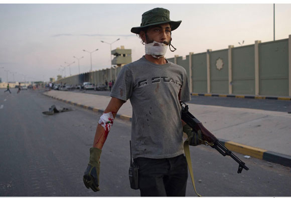
The rest, though, I don't know...the way they've desaturated the reds here draws attention away from the guy's bleeding arm. In the original, it makes for a nice dual focal point - I find myself looking from the guy's eyes to his injury and back again. Likewise, the increased contrast in the ground here makes the guy firing the gun fade into his surroundings more - I like the way his silhouette pops out in the original.
It's all down to personal taste, of course - they seem to be going for the contrasty, pushed-film look for their war photography, and I can understand the thinking behind that. Still, part of the power of the originals, I think, is how they look so modern. They say, "This is happening NOW." We see war photography from decades past, and it's gritty and grainy and contrasty and harsh, and that fits the subject matter, but also puts a layer of unreality on it. The lack of processing on the originals makes them feel more real and less like a movie director's vision of what war ought to feel like.
posted by echo target at 8:37 AM on December 21, 2011 [3 favorites]
10b shows every sign of being an ethically run shop. That is the key - there should be a code of ethics for photo processing (for editorial purposes) to ensure that no deliberately deceptive manipulations are undertaken.
posted by Mister_A at 8:44 AM on December 21, 2011 [3 favorites]
posted by Mister_A at 8:44 AM on December 21, 2011 [3 favorites]
Yeah, I don't see a speck of dust out of place. Adjusting for color, contrast & detail is just the same as what you'd try to do in a traditional development lab with film. The best film photographers were also masters of the darkroom.
posted by Devils Rancher at 8:47 AM on December 21, 2011
posted by Devils Rancher at 8:47 AM on December 21, 2011
The lack of processing on the originals makes them feel more real
Implying an auto white balanced f/8 aperture priority hipshot in the middle of a war looks more real than a processed photograph. Those originals certainly don't look the way the scene would look if you were there seeing it yourself.
All photography is lies, and once you really accept that, then somebody tweaking a histogram in Lightroom isn't a media bias devil.
Should writers writing about wars not run spell check?
posted by Threeway Handshake at 8:48 AM on December 21, 2011 [2 favorites]
IANAPP, but I don't quite understand what 'original' means in any of these anyway. Raw digital image data is extremely adaptable and has no particular reference to an as-shot touchstone.
I was enlightened when I realized that to even display a camera-raw image, the program showing you the image has to make decisions for you just to put it on the screen. I.e. there simply is not a single true method of displaying raw image data. Someone or something, whether it's your camera LCD, your software, or a person finely tuning the variables, has to make decisions about it before it can even be viewed.
The stuff that gets people up in arms is in Photoshop proper - things like the liquefy filter that changes body shapes or masking that removes or replaces elements in the photo. I don't see any of that going on with the 10b stuff, but maybe I'm missing something. (I'm terrible at the 'see six differences in these two pictures!' game.)
These all just look like post-processing decisions to me - some great, some average. It's all a matter of taste.
posted by dragstroke at 8:58 AM on December 21, 2011
The lack of processing on the originals makes them feel more real and less like a movie director's vision of what war ought to feel like.
Maybe. As someone who had done enough image editing/processing I thought they looked, ahem, lacking, which is completely understandable because they are shots taken under demanding conditions.
Speaking of photography, I think this is a much worse problem in architecture. I've only recently begun studying architecture on my own and it's frustrating to see all these incredibly pre and post processed photos with all sorts of lightning that isn't part of the building itself but added just for the photo shoot.
I understand there are valid aesthetic reasons why photographers do this, that the photography is separated from that which is depicted, but when you're actually studying and trying to learn architecture this makes things difficult. I want to see the architecture the way people see who live/work in the building not the photographer's glam vision.
posted by Foci for Analysis at 9:06 AM on December 21, 2011
All photography is lies
I know what you mean by saying this, but I think it's an unhelpful way of putting the point--it's what people tell themselves to excuse actual outright falsification of images and to pretend that that's the same thing as what this studio is doing. It's equivalent to what Fox News tells itself to justify using news as propaganda: "there's no such thing as perfectly unbiased news." Well, yeah, there isn't--but there's still a difference between shooting imperfectly for that ideal and deliberately lying to advance a cause. There's no such thing as a photograph that simply replicates the experience of "being there"--but that doesn't mean there's no difference between attempting as best as one can to convey the truth through your photographs and deliberately misleading people by falsifying them.
posted by yoink at 9:07 AM on December 21, 2011 [2 favorites]
I guess I do have a problem with photojournalism receiving the same "wash" (and visibly so) as glossy fashion mag shoots--and the uniformity that results (as pleasing as it is) makes every photo look like it was taken by the same person (and if this were 30 years ago, on the same film stock).
posted by availablelight at 9:09 AM on December 21, 2011 [1 favorite]
posted by availablelight at 9:09 AM on December 21, 2011 [1 favorite]
Does Errol Morris know about these guys yet? This looks like it is perfect fodder for his opinionator blog.
posted by bukvich at 9:10 AM on December 21, 2011
posted by bukvich at 9:10 AM on December 21, 2011
somebody tweaking a histogram in Lightroom
This is multiscale spatial dodging and burning, which is really local contrast enhancement. It's not a "media bias devil", but it is also NOT a "stencil off the real".
If you want to see what's been changed in these images, have a look. I made derivative images that show the (mathematical) difference between the before and after.
How to read these images: The darker and less saturated something is, the less was changed. The brighter something is (the greater the difference) the more was altered. A fun way to look at them is to load them into different tabs of your browser and toggle between them. In order, I am providing a difference image, the altered image, and the "original".
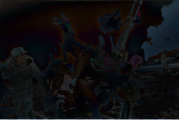
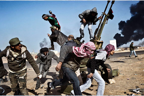
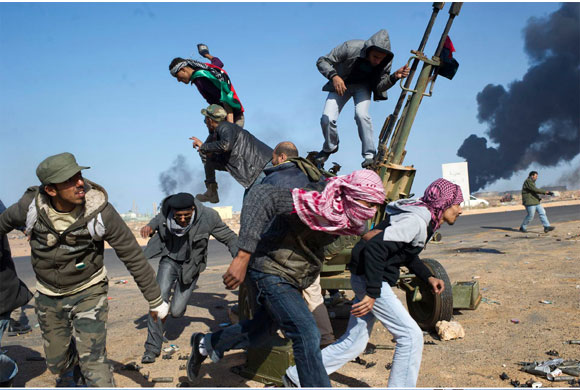
1. altered. original. In this image, the colors have been changed across the entire image. A slight halo has been introduced around the figure jumping from the van as a means of emphasis. The soldier on the left has had his face brightened for emphasis.
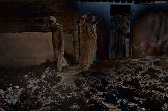
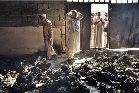
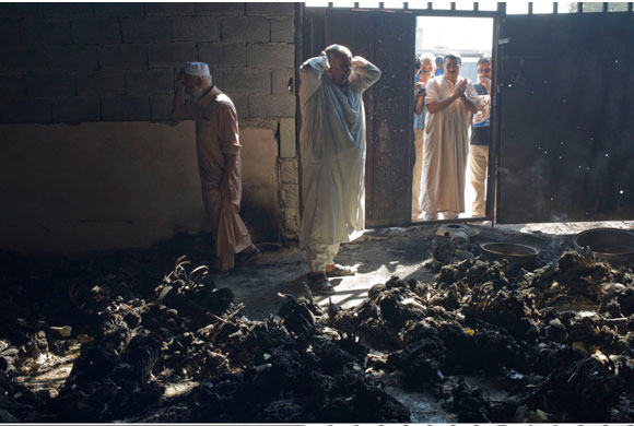
2. altered. original. In this image, the area above the door has been darkened to increase contrast and drama with the surrounding light. The entire floor has been brightened and sharpened. The smoke has been lightened, and the faces of the figures outside the door have been brightened. The trees and other features visible outside the wall were all but eliminated through a levels adjustment.
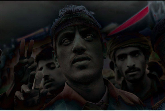
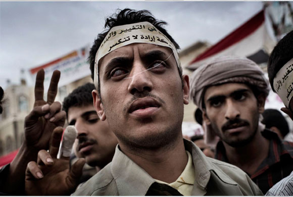
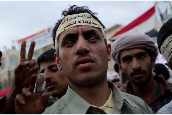
3. altered. original. The faces were all locally adjusted and brightened. The red sash was desaturated. The corners were darkened for emphasis. Local contrast enhancement and sharpening applied throughout the image. The central figure's hair was sharpened, causing high-frequency artifacts. Look at the selective way the "peace sign" figures were darkened.
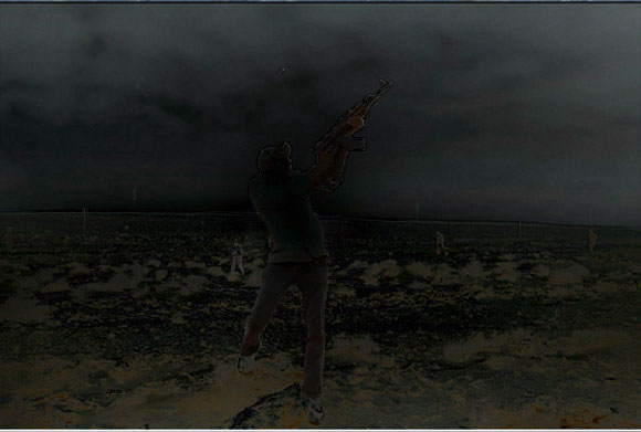
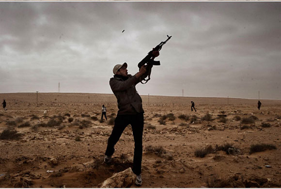
4. altered. original. The primary edit in this image is a large, vignetting-like darkening applied to the sky. Colors adjusted throughout.
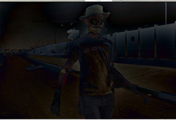
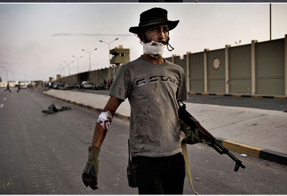
5. altered. original. This image sees the most movie-like adjustments. The bandage on his face has been brightened. The top of the wall has been selectively darkened. Around the head and torso of the figure are halos of local contrast adjustment (which make the figure "pop"). The face of the figure has been brightened and the watch tower darkened.
It is clear to me that this editing has intent - the emphasis on faces and hands is clearly about narrative, and lead one toward a certain interpretation of the photographed event. There is the meta-intention of making the images "pop", and I personally question if that is the right approach to ostensibly journalistic imagery. Ultimately, as I've said before, no image is untouched and in fact much of this spatial enhancement is now happening in-camera.
I put pixel-perfect photoshop files here for others to play with.
posted by fake at 9:27 AM on December 21, 2011 [11 favorites]
This is multiscale spatial dodging and burning, which is really local contrast enhancement. It's not a "media bias devil", but it is also NOT a "stencil off the real".
If you want to see what's been changed in these images, have a look. I made derivative images that show the (mathematical) difference between the before and after.
How to read these images: The darker and less saturated something is, the less was changed. The brighter something is (the greater the difference) the more was altered. A fun way to look at them is to load them into different tabs of your browser and toggle between them. In order, I am providing a difference image, the altered image, and the "original".
1. altered. original. In this image, the colors have been changed across the entire image. A slight halo has been introduced around the figure jumping from the van as a means of emphasis. The soldier on the left has had his face brightened for emphasis.
2. altered. original. In this image, the area above the door has been darkened to increase contrast and drama with the surrounding light. The entire floor has been brightened and sharpened. The smoke has been lightened, and the faces of the figures outside the door have been brightened. The trees and other features visible outside the wall were all but eliminated through a levels adjustment.
3. altered. original. The faces were all locally adjusted and brightened. The red sash was desaturated. The corners were darkened for emphasis. Local contrast enhancement and sharpening applied throughout the image. The central figure's hair was sharpened, causing high-frequency artifacts. Look at the selective way the "peace sign" figures were darkened.
4. altered. original. The primary edit in this image is a large, vignetting-like darkening applied to the sky. Colors adjusted throughout.
5. altered. original. This image sees the most movie-like adjustments. The bandage on his face has been brightened. The top of the wall has been selectively darkened. Around the head and torso of the figure are halos of local contrast adjustment (which make the figure "pop"). The face of the figure has been brightened and the watch tower darkened.
It is clear to me that this editing has intent - the emphasis on faces and hands is clearly about narrative, and lead one toward a certain interpretation of the photographed event. There is the meta-intention of making the images "pop", and I personally question if that is the right approach to ostensibly journalistic imagery. Ultimately, as I've said before, no image is untouched and in fact much of this spatial enhancement is now happening in-camera.
I put pixel-perfect photoshop files here for others to play with.
posted by fake at 9:27 AM on December 21, 2011 [11 favorites]
After reading fake's comment, I see I really, really suck at the 'see six differences' game.
posted by dragstroke at 9:35 AM on December 21, 2011
posted by dragstroke at 9:35 AM on December 21, 2011
it's what people tell themselves to excuse actual outright falsification of images and to pretend that that's the same thing as what this studio is doing.
This is 100% not what I am saying. Yes, there is Pravda-style airbrushing people out of images, things like that. Clear manipulations in order to deceive people. Purely propaganda. But then there is everything else.
A photograph is not a perfect documentary machine. A camera records light the passes through a lens and onto a sensor (digital or chemical). What you think about what the resulting photo represents is an opinion. There has not been a single photo ever taken that represents "truth."
(Last link is graphic)
Drawing the line at "this guy slid the contrast slider a bit to the right so therefore, this photo is now fake" is just very... odd, to me. What makes pressing the shutter button something sacred? What absolute truths lie in the aperture or shutter speed settings of the camera before a photo is taken? Does God speak directly to the autofocus in a Nikon? (Surely, he does with Leicas.) Do angel's wings guide the photographer to stand at a certain spot, at a certain time? Does Jesus compress each pixel in a JPG?
There are more choices, artistic and/or documentarian, to be made before a photograph is taken than can be made afterwards. There exists no camera that comes close to seeing the world as we see it, so therefore choices must be made in order to present a taken image to us. It is unavoidable. Those un-whitebalanced originals you see in this link are as fake as the "fake modernized Robert Capa slide film look" finals are. They just chose to present them in a different way, artistically.
You can fault them for being shitty artists, but just because you don't like something doesn't mean that it is fake.
On prieview: Yes, Fake, I know that they have done much more than brightness sliders, this is just shorthand for "all of the processing done to these." but I do disagree with you about the "a slight halo has been introduced." This makes it seem like this has been drawn in. Haloing is typical in many photographs of objects against bright skies; I doubt that this halo has been added, rather it has been "made more visible by changes to contrast."
posted by Threeway Handshake at 9:44 AM on December 21, 2011
Drawing the line at "this guy slid the contrast slider a bit to the right so therefore, this photo is now fake"
I think that is a poor characterization of the argument. This is local contrast enhancement, meaning selectively lightening or darkening parts of an image. Since an image is composed entirely of light and dark local areas, you can see how lightening or darkening them might change the meaning of an image.
You can disagree about the halo being introduced, but frankly, you are wrong, I do not know a better way to say it. In darkrooms, it was called dodging/burning, and it has been going on forever. The difference images I presented show the halos were not in the original image. They occur because someone is either dodging or burning around a subject using a brush tool, or they are using a local contrast enhancement filter like Unsharp Mask with a very wide radius.
And frankly, it has been drawn in, and it is a major feature in Adobe Lightroom, and it is also done in Adobe Photoshop using masks.
Just to drive my point home,
Here is the original image.
Here is that image, with the contrast jacked up to 89%.
Here is the difference between the contrast-enhanced and the original. No halo appears.
Here is the difference between the 10b one and the original. Clear halo around torso and head.
Finally, the 10b image by itself, which again, shows a bright halo around the figure, which is a perceptual trick to focus your attention on the figure and make it "pop".
It's the same reason vignetting is such a popular film effect these days. It's a tool to focus the viewer on a part of a scene. It's a major part of modern post-production tools and post-production artists and image processors use them day in and day-out.
posted by fake at 10:22 AM on December 21, 2011 [3 favorites]
Here's another way to look at it.
Figure.
Background.
posted by fake at 10:34 AM on December 21, 2011 [2 favorites]
Figure.
Background.
posted by fake at 10:34 AM on December 21, 2011 [2 favorites]
When I was selling the occasional pic to hobby magazines, every single client I ever sold a picture to wanted slide film to prevent exactly this sort of thing. The magazine would of course have to make adjustments from the slide to the printing process, but the image itself was not subject to darkroom decisions.
posted by localroger at 10:43 AM on December 21, 2011
posted by localroger at 10:43 AM on December 21, 2011
There has been a misunderstanding! This (warning: extreme midrange level abuse) is the type of halo I was talking about, and what I thought you were talking about. (Though much of this is because of jpg artifacts, so this becomes actually a poor example.) The lens coating inflicted/chromatic aberration kind, that really shines through when changing ranges.
So anyway, they were sloppy with their masking either on purpose or not. Either way, I still fail to see why this invalidates a photo any more than say, the photographer shooting this at f/1.2 or f/22 for example.
posted by Threeway Handshake at 11:05 AM on December 21, 2011
So anyway, they were sloppy with their masking either on purpose or not. Either way, I still fail to see why this invalidates a photo any more than say, the photographer shooting this at f/1.2 or f/22 for example.
posted by Threeway Handshake at 11:05 AM on December 21, 2011
It looks to me like the difference between this and this. (To use the sword&sandals movie genre)
posted by -harlequin- at 11:25 AM on December 21, 2011 [1 favorite]
posted by -harlequin- at 11:25 AM on December 21, 2011 [1 favorite]
Some of those retouched photos look like a full-on use of the photoshop water-colour filter. Obviously they're exerting much more control than that, but it's such a very painterly style that in some cases the photographic element looks quite distant to me.
(Once again I'm pleasantly surprised at how much of the difference between my hobby photos and pro pics is actually me being too self-restraining in photoshop. I really need to Get Over That and just process the shit out of things :)
posted by -harlequin- at 11:32 AM on December 21, 2011
(Once again I'm pleasantly surprised at how much of the difference between my hobby photos and pro pics is actually me being too self-restraining in photoshop. I really need to Get Over That and just process the shit out of things :)
posted by -harlequin- at 11:32 AM on December 21, 2011
MetaFilter: just process the shit out of things
posted by Doleful Creature at 12:23 PM on December 21, 2011
posted by Doleful Creature at 12:23 PM on December 21, 2011
Fake, those compare-n-contrast images are fantastic at illustrating what's going on here. Thanks.
And yes, harlequin, that's a fantastic analogy. I have exactly the same emotional reaction to those differences. The original photos and the older movie still both look more "real" to me, like what I'd have seen if I'd been there. The doctored photos and the still from 300 look stylized, cinematic. They're more attractive, but seem less real.
It's striking how much the fourth pair (the man holding his gun up against a desert background) give me completely different impressions about the weather and the time of day that photo was taken.
posted by straight at 12:39 PM on December 21, 2011
(To use the sword&sandals movie genre)
But one is a comic book. It is like saying that this looks more real than this.
posted by Threeway Handshake at 12:59 PM on December 21, 2011
But one is a comic book. It is like saying that this looks more real than this.
posted by Threeway Handshake at 12:59 PM on December 21, 2011
But one is a comic book. It is like saying that this looks more real than this.
Sure, so it's understandable that some people feel that this kind of photo-processing real-world shots into comic-book-like exaggeration can go beyond their ideal of where to stop photoshopping when you're claiming to not be depicting fantasy.
posted by -harlequin- at 1:20 PM on December 21, 2011
Sure, so it's understandable that some people feel that this kind of photo-processing real-world shots into comic-book-like exaggeration can go beyond their ideal of where to stop photoshopping when you're claiming to not be depicting fantasy.
posted by -harlequin- at 1:20 PM on December 21, 2011
"We believe that talking of ‘manipulation' is correct only when pixels are ‘moved', therefore when the minimum unit of a digital image is at least either replaced or cloned," says 10b on its website. "In these cases we can talk of a mystification of reality, whose results not only represent something different from the original subject but have also broken the main rule of the photojournalism ethics."
They spell out an ethos that I've been trying to articulate for myself in my own photography. Manipulating light via adjusting colors, luminescence, local contrast, etc has been a long darkroom tradition and is perfectly kosher, and in fact concern with light is really at the heart of photography itself. The moment one starts using tools like clone stamp and liquify, however, then things have really moved into the realm of image manipulation and design. It's heartening to see that photojournalists and their editors have been striving to holding the line on this issue.
I wish publications such as women's magazines would make a similar distinction between photography and illustration, especially when it comes to the ridiculous cover images bombarding women at newsstands.
posted by DaShiv at 1:48 PM on December 21, 2011 [2 favorites]
I mostly prefer the originals personally. I do think post-processing can be totally legit, though. Like in #2, where the photographer is probably trying not to completely blow-out the bright outdoor part and inside the room it's too dark to see what's going on. Adding some fill light can help make the image clearer, and because the human eye has more dynamic range than a camera sensor, it might be a little closer to what someone would have actually seen.
A lot of the images, though, seem to be more geared towards making the image more striking rather than just making them more clear or correcting for problems, like underexposure or something. I also think they up the blacks, which kinda destroys a lot of detail. So overall, I'm not a fan, but I don't think they edited photos are misleading from a journalistic standpoint.
posted by snofoam at 1:55 PM on December 21, 2011
Manipulating light via adjusting colors, luminescence, local contrast, etc has been a long darkroom tradition and is perfectly kosher
I basically agree, though I wouln't say perfectly kosher...
posted by afiler at 7:58 PM on December 24, 2011
I basically agree, though I wouln't say perfectly kosher...
posted by afiler at 7:58 PM on December 24, 2011
« Older The Medieval Names Archive | Measuring our lives out with SLYTs Newer »
This thread has been archived and is closed to new comments
posted by Foci for Analysis at 8:19 AM on December 21, 2011