Skeu'd!
September 10, 2012 4:23 PM Subscribe
Skeu It! "A celebration of arbitrary and gratuitious user interface decisions." Specifically: needless or inappropriate skeumorphism. Best of Skeu It.
I get what my friends are saying now. I promise to never write anything in all caps ever again. Even for effect.
posted by dumbland at 4:28 PM on September 10, 2012 [3 favorites]
posted by dumbland at 4:28 PM on September 10, 2012 [3 favorites]
Some even have fun with plug-in designs. Ohm Force has offered two skeumorphic interfaces in their software, for as long as I can remember: a boring one for "pros", and a crazy design for the rest of us.
posted by Blazecock Pileon at 4:29 PM on September 10, 2012
posted by Blazecock Pileon at 4:29 PM on September 10, 2012
From the best of:
yo dawg, I herd you like shadows and curves, so I put shadows and curves on your shadows and curves…
That makes it best of the web from my perspective. I can't stop giggling.
posted by MCMikeNamara at 4:29 PM on September 10, 2012 [4 favorites]
yo dawg, I herd you like shadows and curves, so I put shadows and curves on your shadows and curves…
That makes it best of the web from my perspective. I can't stop giggling.
posted by MCMikeNamara at 4:29 PM on September 10, 2012 [4 favorites]
This one seems to be striving for "as illegible as it is unpronounceable".
posted by Egg Shen at 4:32 PM on September 10, 2012
posted by Egg Shen at 4:32 PM on September 10, 2012
Professional leatherette background.
posted by 2bucksplus at 4:32 PM on September 10, 2012 [4 favorites]
posted by 2bucksplus at 4:32 PM on September 10, 2012 [4 favorites]
It's kind of weird to snark about skeuomorphism in audio plug-ins.
People have been snarking about skeuomorphism in audio software UI at least as long as the software has had knobs, because knobs have always been awkward to work with using a mouse.
posted by weston at 4:42 PM on September 10, 2012 [7 favorites]
People have been snarking about skeuomorphism in audio software UI at least as long as the software has had knobs, because knobs have always been awkward to work with using a mouse.
posted by weston at 4:42 PM on September 10, 2012 [7 favorites]
Is Everyone brand bottled water somehow the Soylent Green of confusingly-designed iOS apps?
posted by King, in the hall of the mountain at 4:43 PM on September 10, 2012
posted by King, in the hall of the mountain at 4:43 PM on September 10, 2012
People have been snarking about skeuomorphism in audio software UI at least as long as the software has had knobs, because knobs have always been awkward to work with using a mouse.
The real crime is when you need to move the mouse around the knob, rather than up-for-up and down-for-down.
posted by pompomtom at 4:45 PM on September 10, 2012 [3 favorites]
The real crime is when you need to move the mouse around the knob, rather than up-for-up and down-for-down.
posted by pompomtom at 4:45 PM on September 10, 2012 [3 favorites]
If you have to hire a designer anyway you may as well get your money's worth!
posted by yonega at 4:45 PM on September 10, 2012 [4 favorites]
posted by yonega at 4:45 PM on September 10, 2012 [4 favorites]
Most of these look pretty nice and since there's no actual research that Skeumorphism Is Considered Harmful I don't see what the problem is. Certainly not worse than having icons that don't make sense anymore.
posted by Foci for Analysis at 4:46 PM on September 10, 2012 [3 favorites]
posted by Foci for Analysis at 4:46 PM on September 10, 2012 [3 favorites]
I know skeumorphism is wrong, but I'm just a sucker for it.
It only fails when the user extends the metaphor until it breaks. That's the user's fault for not suspending disbelief.
Which I agree is blasphemy. But sometimes blasphemy is so, so right.*
*Not necessarily the opinions of Workplace Bleep.
posted by bleep at 4:49 PM on September 10, 2012 [2 favorites]
Most of these look pretty nice and since there's no actual research that Skeumorphism Is Considered Harmful I don't see what the problem is. Certainly not worse than having icons that don't make sense anymore.
Skeuomorphism that doesn't make sense, however, like the jeans-pocket weather app, is the worst of both worlds. Unless it's a form of trolling, like setting everything in Papyrus to irritate the typography nerds.
posted by acb at 4:54 PM on September 10, 2012 [3 favorites]
Skeuomorphism that doesn't make sense, however, like the jeans-pocket weather app, is the worst of both worlds. Unless it's a form of trolling, like setting everything in Papyrus to irritate the typography nerds.
posted by acb at 4:54 PM on September 10, 2012 [3 favorites]
Is the Field Notes theme an inside joke here, or just irony?
posted by stopgap at 4:56 PM on September 10, 2012 [4 favorites]
posted by stopgap at 4:56 PM on September 10, 2012 [4 favorites]
Some even have fun with plug-in designs. Ohm Force has offered two skeumorphic interfaces in their software, for as long as I can remember: a boring one for "pros", and a crazy design for the rest of us.
Pluggo UIs also tend to be a bit more straitlaced than most, usually consisting of some variant of MacOS sliders over a jarringly crazy colour scheme. Most audio plugins take skeuomorphism to a reasonable limit, tweaking their icons to look like a synthesizer front panel seen front-on and putting in some LED/rubber-button/knob assets. (Some plugins let you turn the knobs by dragging up and down, others require you to rotate the pointer, and some are configurable.) Only a few go overboard with an OpenGL-rendered 3D metal box, just because they can.
The only ones that look absolutely straight seem to be Apple's built-in AudioUnits.
posted by acb at 4:59 PM on September 10, 2012
I think Skeumorphism can serve its purpose, but it can also be actively confusing.
For example, I recently bought a new computer case that's more compact and horizontal, so it could fit in our media console. The case was designed to mimic other A/V hardware so the power button is a big ol' knob. A big ol' knob that you press instead of turning. It's not only a useless design touch, it's actively hostile because, anachronism that I am, when I see a knob I want to turn it.
posted by muddgirl at 5:10 PM on September 10, 2012 [1 favorite]
That was Chris Randall of Audio Damage and Sean Costello of Valhalla DSP snarking. They don't do skeuomorphism in their plugins.
The copy of AudioDamage DubStation I just loaded up, and which presented its controls in a perspective-rotated box with specular highlights washing out the top left and about 100 pixels at the top for cables, begs to differ.
posted by acb at 5:14 PM on September 10, 2012 [2 favorites]
The copy of AudioDamage DubStation I just loaded up, and which presented its controls in a perspective-rotated box with specular highlights washing out the top left and about 100 pixels at the top for cables, begs to differ.
posted by acb at 5:14 PM on September 10, 2012 [2 favorites]
(One web skeumorphism that always confounds me is the fake stack of pages, because I always feel like I'm too stupid to figure out how to get to those bottom 'pages.' But they're not really pages!
posted by muddgirl at 5:16 PM on September 10, 2012
posted by muddgirl at 5:16 PM on September 10, 2012
It's not skeu (I think; there's an argument that it is) but the single common UI design element I hate most of all - even above scroll bars and uncopyable text in error windows - is the Play/Pause button that changes its graphic between solid right-facing triangle and parallel lines. It's ubiquitous, but it breaks me.
Because I do not know if that graphic indicates the mode the control is in, or the mode it will be in if I press it. When trying to play something that may be in deep lag due to network or local issues, this adds to my misery a thousandfold.
When that control was on a device that whirred as it fed media past some sort of pickup, there were plenty of cues to make it obvious - and the blasted graphic didn't change anyway. Now, not so much.
How can I kill this? I don't even care if it's just me, I want it dead.
posted by Devonian at 5:22 PM on September 10, 2012 [53 favorites]
The best Skeumorphism ever was the UI for the Lucasart X-Wing and Tie Fighter; I loved those games just for their UI (I sucked at them).
posted by Monday, stony Monday at 5:24 PM on September 10, 2012
posted by Monday, stony Monday at 5:24 PM on September 10, 2012
Every time I see a UI with stitched leather, I hear Ricardo Montalban's voice in my head.
posted by octothorpe at 5:34 PM on September 10, 2012 [1 favorite]
posted by octothorpe at 5:34 PM on September 10, 2012 [1 favorite]
I do all my audio work on Linux.
Skeuomorphism is a problem that Linux audio software and plugins emphatically does not have nearly enough of. I can see that it can sometimes go too far, and the whole rotating knob as UI item thing certainly has its issues, but not nearly as many as replacing a more or less familiar and friendly looking layout of knobs and switches with a mass of grey sliders and checkboxes; if you're very lucky you might get a meter of some sort. When I'm doing audio stuff I really don't care about design except insofar as it allows me to get the job done, and the only thing that I miss about not working in a Mac or Windows audio environment is.. the skeuomorphism.
Notable exception - the drum machine Hydrogen. All kinds of skeuomorphism there, rotating knobs galore, and it's a pleasure to use and play with.
posted by motty at 5:38 PM on September 10, 2012 [2 favorites]
Devonian: this 1000x. I'm like 95% certain the standard is that the button shows you the action that will happen if you press it. (So a pause button means the video is playing and if you press it the video will pause) But I'm not sure enough to trust myself, and anyway, half the sites out there will get it wrong.
posted by aspo at 5:38 PM on September 10, 2012 [1 favorite]
posted by aspo at 5:38 PM on September 10, 2012 [1 favorite]
I do all my audio work on Linux.
They have audio software on Linux these days?
/me, who bought his first Mac due to the lack of audio software on Linux. Mind you, that was in 1997.
posted by acb at 5:42 PM on September 10, 2012 [1 favorite]
They have audio software on Linux these days?
/me, who bought his first Mac due to the lack of audio software on Linux. Mind you, that was in 1997.
posted by acb at 5:42 PM on September 10, 2012 [1 favorite]
Every time I see a UI with stitched leather, I hear Ricardo Montalban's voice in my head.
posted by octothorpe at 5:34 PM on September 10 [+] [!]
"It smells like ME!"
posted by Mental Wimp at 5:49 PM on September 10, 2012
posted by octothorpe at 5:34 PM on September 10 [+] [!]
"It smells like ME!"
posted by Mental Wimp at 5:49 PM on September 10, 2012
octothorpe: "Every time I see a UI with stitched leather, I hear Ricardo Montalban's voice in my head ."
"It was easy my dear. You forget, I spent two years as a building contractor. "
posted by Chrysostom at 5:52 PM on September 10, 2012 [1 favorite]
"It was easy my dear. You forget, I spent two years as a building contractor. "
posted by Chrysostom at 5:52 PM on September 10, 2012 [1 favorite]
Skeumorphism in UIs can be fun sometimes, if it doesn't get in the way. I generally avoid it, but I can see why some people might get a kick out of it. What bug the heck out of me though are skeumorphs in real life, ones that are designed to make things look more rugged than they really are. Whenever I see something that's made of plastic but has obviously-fake bolts molded in, or something that's covered in fake chrome, I think "here is a piece of trash that will doubtless break after less than a dozen uses, and then be impossible to repair." Specifically though, I hate skeumorphs on cars. Especially on trucks and SUVs.
Compare and constrast:
Exhibit A (the original): The Humvee. This is a vehicle which, while a stupid thing to drive around town, was built to serve a purpose and does its job pretty well, and which looks the way it does because that's the way it needs to look to do its job. There is indeed a certain utilitarian charm to the machine, even if it's hardly pretty. It's easy to see why it's an iconic car, though I have no desire to actually own one myself.
Exhibit B (the skeumorph): The H2. This is a cheap, stupid knockoff of the original, built on the frame of (if I recall correctly) a Chevy Tahoe, which is a pretty middle-of-the-road truck to begin with. It recalls many of the design features of the Humvee, but here they are pointless tinsel, and they look chintzy and bogus. The skeumorphs make the car actually worse than the one that is is based on, because they make it more bloated and thirsty without actually adding anything. It's a stupid thing, pointlessly macho and posturing but not actually particularly rugged or useful.
That's just an extreme example, but you see those kind of stupid design cues in trucks and SUVs all the time now, and have for probably about the last 15 years. Look at the evolution of the Ford F-Series for example. It's had a lot of different styles over the many years of its production, but the skeumorphs really started kicking in around Generation 11 or so. Nowadays it's just a hot mess. Or the Jeep Wrangler, another icon that's been ruined in recent years by pointless skeumorphs.
I keep hoping that this is just a design fad and that it will eventually play itself out and we can all go back to having things that look like what they are, rather than like what the designers think we wish they were. Unfortunately, as quality of materials in consumer goods goes down and down (more and more plastic where metal should be, softwoods replacing hardwoods as we finish chopping through all the good timber on the planet, a culture of fast-forward fashion trends and planned obsolescence) I fear that disposability and cheap manufacturing will continue to rule and we will continue to get objects which are designed to use shapes and colors and finishes to tell us obvious, insulting lies about their quality and style.
Incidentally, I think Apple's success is due in no small part to their general reluctance to rely on skeumorphs to create an illusion of quality. More than most tech companies anyway, they have a willingness to do things like using actual metal where most manufacturers would settle for silver-painted plastic. Even tools have succumbed to this disease -- go to the hardware store and look at how macho and beefy and colorful all the tools are, how they use design cues to make them look incredibly overbuilt and strong, and then look at how much of that is tacked-on plastic. Better yet, compare something like a drill made today to your dad's drill or your grandfather's. Some things have improved, but durability is not one of them.
Anyway, rant over. I've been needing to get that off my chest, I guess. It just bugs me how we build so much cheap, disposable garbage and then dress it up to look tough and durable as if we can't see right through the thin veneer of quality smeared on top of so much of the shit that we buy. It's insulting and tiresome and I wish people would stop doing it.
posted by Scientist at 6:01 PM on September 10, 2012 [35 favorites]
I know skeumorphism is wrong
The most profitable company in the world got that way through skeumorphism. It's OK to say you like it - this isn't Comic Sans, this is a proven human interface technique that bears immediate and tangible results.
I'm sorry, that "wthr" app is gorgeous. It invites people to fiddle and play with it.
And that's why it enrages the nerds - computers should be controlled by modifying text files from the keyboard after reading the full documentation. Lynx it on google if there's jargon you don't understand in the documentation, this "computers for everyone" shit it lame, and threatens their job in some vague way.
posted by Slap*Happy at 6:01 PM on September 10, 2012 [8 favorites]
People have been snarking about skeuomorphism in audio software UI at least as long as the software has had knobs, because knobs have always been awkward to work with using a mouse.
It's just weird, like complaining the sky is blue.
posted by Blazecock Pileon at 6:11 PM on September 10, 2012
It's just weird, like complaining the sky is blue.
posted by Blazecock Pileon at 6:11 PM on September 10, 2012
That was Chris Randall of Audio Damage and Sean Costello of Valhalla DSP snarking. They don't do skeuomorphism in their plugins.
The Valhalla stuff is all knobs. The old AD stuff is mostly fake hardware looking. The latest AD plugs though have a pretty great interface; no fake knobs, but not just a bunch of generic sliders either.
I never heard of skeumorphism until now. I agree with scientist, it bugs me WAY more on physical objects than in software. In software it often gives a clue to usage and makes it faster to figure out. Fake screws on a piece of plastic make me sad, and laugh. Sad Laughter, that’s where I got my band name.
posted by bongo_x at 6:21 PM on September 10, 2012 [1 favorite]
There are far more worse problems than skeumorphism.
For example, this and this and this.
I'll take skeumorphism over that crap any day.
posted by charlie don't surf at 6:42 PM on September 10, 2012 [2 favorites]
For example, this and this and this.
I'll take skeumorphism over that crap any day.
posted by charlie don't surf at 6:42 PM on September 10, 2012 [2 favorites]
I'm like 95% certain the standard is that the button shows you the action that will happen if you press it.
Yes, this is true of the play / pause toggle. For instance, take a look at the button on youtube.
Here's the crazy part though: On that same youtube player, just about 30 pixels to the right, you'll see a speaker icon. When you click on the speaker icon, the sound mutes and it becomes a speaker with an X. So play / pause is showing the action that will happen, sound / mute is showing current status.
posted by condour75 at 6:44 PM on September 10, 2012 [16 favorites]
Twisting the knobs in any well designed skeuomorphic interface has been no problem since the invention of the wheel mouse.
posted by flabdablet at 6:45 PM on September 10, 2012 [1 favorite]
posted by flabdablet at 6:45 PM on September 10, 2012 [1 favorite]
My favorite skeumorph is the concrete pillars on today's banks that are meant to look like the marble pillars on yesterday's temples that in turn are meant to look like the wooden logs on whatever kind of building those came from.
posted by DU at 6:47 PM on September 10, 2012 [3 favorites]
posted by DU at 6:47 PM on September 10, 2012 [3 favorites]
the Play/Pause button that changes its graphic between solid right-facing triangle and parallel lines.
I blame Apple for this. Before iTunes every music player app used to have all the old physical buttons: play, pause, and stop. ITunes was the first app I saw that dropped the stop button, in the service of combining play and pause into one button. Otherwise, apps could highlight play to show that it was pressed, and then highlight both play and pause when the music was paused — just like my old tape player. I still find myself wishing I could actually stop the music in iTunes just to clear the titles from the little info bar at the top of the window.
posted by stopgap at 7:01 PM on September 10, 2012 [1 favorite]
Another anti- for audio software interfaces here. I like things like this EQ, where you can change multiple parameters at the same time via dragging, versus this one which is full of twiddly nonsense.
posted by kersplunk at 7:03 PM on September 10, 2012 [1 favorite]
posted by kersplunk at 7:03 PM on September 10, 2012 [1 favorite]
This makes me want to design a series of intentionally ridiculous, endlessly tedious skeumorphic apps: The notepad that runs out of paper and leaves little torn fragments of paper at the binding; the mail app where you have to use your finger as a letter opener, and to which mail is only delivered once a day and never on Sundays or holidays; the password keeper that makes you turn the dial of a skeumorphic safe back and forth, simulating the noise of a physical lock mechanism so that if you're clever you can guess the combination.
posted by qxntpqbbbqxl at 7:37 PM on September 10, 2012 [40 favorites]
posted by qxntpqbbbqxl at 7:37 PM on September 10, 2012 [40 favorites]
And that's why it enrages the nerds - computers should be controlled by modifying text files from the keyboard after reading the full documentation. Lynx it on google if there's jargon you don't understand in the documentation, this "computers for everyone" shit it lame, and threatens their job in some vague way.
This is dumb.
posted by sonic meat machine at 7:40 PM on September 10, 2012 [7 favorites]
This is dumb.
posted by sonic meat machine at 7:40 PM on September 10, 2012 [7 favorites]
It's just weird, like complaining the sky is blue.
Or boxes are beige?
Twisting the knobs in any well designed skeuomorphic interface has been no problem since the invention of the wheel mouse.
Until you're working with a touch pad/screen.
posted by weston at 7:41 PM on September 10, 2012
Or boxes are beige?
Twisting the knobs in any well designed skeuomorphic interface has been no problem since the invention of the wheel mouse.
Until you're working with a touch pad/screen.
posted by weston at 7:41 PM on September 10, 2012
I think skeuomorphism can be inappropriate, but can't help feeling that a lot of the hate is from developers who don't have the design chops to pull it off. It's a difficult, unforgiving style that takes a lot of painstaking effort to do right. You can't just turn on rounded corners, tweak a gradient or two and call it a day. So the complaint is ultimately that users have high expectations for app design, and that requires designers.
posted by AlsoMike at 8:01 PM on September 10, 2012 [4 favorites]
posted by AlsoMike at 8:01 PM on September 10, 2012 [4 favorites]
This makes me want to design a series of intentionally ridiculous, endlessly tedious skeumorphic apps: The notepad that runs out of paper and leaves little torn fragments of paper at the binding; the mail app where you have to use your finger as a letter opener, and to which mail is only delivered once a day and never on Sundays or holidays; the password keeper that makes you turn the dial of a skeumorphic safe back and forth, simulating the noise of a physical lock mechanism so that if you're clever you can guess the combination.
So skeuomorphic chindogu then?
posted by acb at 8:05 PM on September 10, 2012 [3 favorites]
So skeuomorphic chindogu then?
posted by acb at 8:05 PM on September 10, 2012 [3 favorites]
this is a proven human interface technique that bears immediate and tangible results.
I don't think it enrages nerds by making UIs more accessible. I really don't think that's what gets nerds going.
It's frowned upon because metaphors fall apart, but the user is still relying on that metaphor, not knowing it's about to fall apart. It's like filling a balloon with too much air... and then something else happens...
posted by bleep at 8:06 PM on September 10, 2012 [1 favorite]
iBooks for iPad is a textbook example of skeuomorphism gone wrong. iBooks is an ebook reading app which, by default, includes fake page turning animation, fake pages stacked up on the screen and fake book binding along the edges.
All of that fake stuff takes up room on the screen which should have been reserved for whitespace to make the text more readable. Instead it's just clutter. It's also useless clutter. The photo-realistic digital painting of pages doesn't get smaller as you page through the book - so it doesn't serve as an indicator of your place in the text. It's just wall paper. There's actually a separate interface for showing your place in the book...and it being fully digital allows a user to scrub through the book faster than you could with pages.
There's a conflict with the freedom and power of a purely virtual interface and some dumb cruft which only serves to remind people "hey it's like a book!"
posted by device55 at 8:15 PM on September 10, 2012 [10 favorites]
And that's why it enrages the nerds - computers should be controlled by modifying text files from the keyboard after reading the full documentation. Lynx it on google if there's jargon you don't understand in the documentation, this "computers for everyone" shit it lame, and threatens their job in some vague way.
Yes, this. It's as if a complicated and convoluted interface defines the product as "serious", and a sensible and familiar interface is therefore "bad", by way of naive comparison based on look. Some designs may not lend themselves well to a skeuomorphic approach, but audio software has historically not been one of them. Some people really need to broaden their horizons of not only what is possible with technology, but what other people have preferred for some time, now.
posted by Blazecock Pileon at 8:28 PM on September 10, 2012
I decided to come back and give a little bit more of my opinion besides my comment above.
Programmers have been trying to build effective metaphors for computers for decades. It has led to a proliferation of terms: desktop, window, icon, menu; file, document, folder, directory; web, page, link, spider, browser, server... we've got a whole landscape of metaphors. They are useful, in their way; files go in folders is easy to tell grandma. The problem is the edge cases: what is a hidden folder? What about a symbolic link? What about a folder inside a folder inside a folder inside a folder? What about compressed folders? The term "folder," as nice as it is for the simplest case, quickly loses all of its metaphorical value and just carries baggage.
Skeumorphic interfaces are similar. iBooks, as mentioned above, is an example; it trades functionality for eye candy that nobody will ever notice after the first use, your grandma included, except possibly to be annoyed at it when it slows down their page turning. "Paper" notepads are another example. When you're working with a text editor, you aren't working with one page after another, you're working with a very long string of text. Visual pages that have no real meaning obscure that.
As for dials, well, dials in the real world are awesome. You grab it and you twist it. It's as natural an action as there is. However, a dial on a computer screen is related only visually. You can't grab and twist... there is only the infernal "scooching in a circle," or, if you're lucky, clicking on a particular point on the circle to achieve the same thing that a good, honest slider (which are also skeumorphic, but more sensibly so) can accomplish.
I really hate opening up a purportedly practical app on my phone to find that it's a weird hybrid of graphic designers' experimentation and really simplistic programming.
posted by sonic meat machine at 8:32 PM on September 10, 2012 [4 favorites]
There are some skeuomorphisms that work for me.
Scrivener, which I adore, allows me to lay out my short stories in a "cork board" format, which I prefer to a simple outline because it invites my right brain to shuffle scenes and ideas around in "space" rather than "time." This notion, of recruiting different parts of the brain to organize (things, tasks, ideas) seems smart. I use vi everyday, so I know the power of the keyboard; but parts of my brain just like reaching out with the mouse and moving stuff around.
Maybe some skeuomorphisms must survive, because of our own affinities. Perhaps that's why the Minority Report interface, as absurd as it is sometimes, interests us because it appeals to our physical nature, our bodies rather than our brains.
(Perhaps that's why I'm so uncomfortable with Windows 8. Looking at it, I wonder if my workstation is just tired of pandering to me, and my slow, meatspace ways.)
posted by SPrintF at 8:38 PM on September 10, 2012
It's as if a complicated and convoluted interface defines the product as "serious"
Like this one or that one? This blog isn't criticizing skeumorphic interfaces for being simple. It's criticising poorly-designed interfaces which are also skeumorphic. Not all skeumorphic interfaces. Not all poorly-defined interfaces.
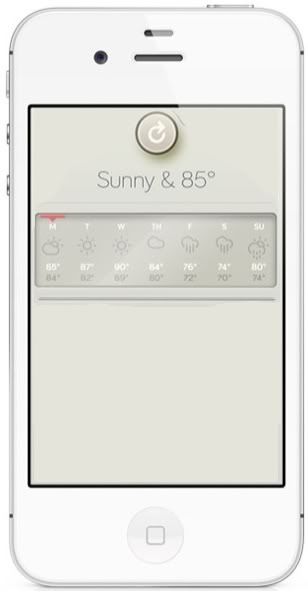
The wthr app, for example - sure, it encourages fiddling. Fiddling with what, the slider from Fahrenheit to Celcius? Pressing the refresh button? What else is there to fiddle with? (nothing). What is the purpose of the dial animation? (nothing)
posted by muddgirl at 8:39 PM on September 10, 2012 [4 favorites]
Like this one or that one? This blog isn't criticizing skeumorphic interfaces for being simple. It's criticising poorly-designed interfaces which are also skeumorphic. Not all skeumorphic interfaces. Not all poorly-defined interfaces.
The wthr app, for example - sure, it encourages fiddling. Fiddling with what, the slider from Fahrenheit to Celcius? Pressing the refresh button? What else is there to fiddle with? (nothing). What is the purpose of the dial animation? (nothing)
posted by muddgirl at 8:39 PM on September 10, 2012 [4 favorites]
OK, I read Dieter Ram's 10 Principles of Design, then I redesigned the Wthr app to actually follow them. Yes, I am a nerd.
posted by muddgirl at 8:47 PM on September 10, 2012 [6 favorites]
posted by muddgirl at 8:47 PM on September 10, 2012 [6 favorites]
It's not only a useless design touch, it's actively hostile because, anachronism that I am, when I see a knob I want to turn it.
That's because knobs are designed for turning. They stick out and are roundish, so they fit the palms of our hands and we can twist them easily. If it doesn't need to turn, it shouldn't be in the form of a knob. This is why people get confused about push/pull actions on doors, too: a flat plate or horizontal bar says "push" and a vertical handle says "pull" to our bodies, but builders attach handles without thinking about that. Donald Norman wrote about this stuff 25 years ago and it still hasn't filtered through to people who make physical or virtual objects.
And although it takes a great deal of skill to produce a realistic-looking skeumorphic design, I always think it's done because the designer doesn't have any idea about visual heirarchy, affordance and other elements of interface design. Being an expert in Photoshop and Illustrator software is *not* the same thing as being a good designer.
posted by harriet vane at 8:48 PM on September 10, 2012 [4 favorites]
I find skeumorphic interfaces on audio plugins really distracting. I didn't grow up using actual hardware synths, so the "hardware synth look" is just noise- the UI equivalent of chartjunk. I know I'm weird, but I like it when Fruityloops loads a plugin without a skin and just gives it a plain UI with stock knobs, sliders, etc.
posted by a snickering nuthatch at 8:53 PM on September 10, 2012
posted by a snickering nuthatch at 8:53 PM on September 10, 2012
Certainly not worse than having icons that don't make sense anymore.
The original meanings might be lost in time, but if "boxy thing with two rectangles on it" means something as abstract as "save" to the old folk, then that's what they'll teach the young folk. Languages adapt such that symbols or words just take on their new meaning regardless of the original context. It's as simple as ox-head, cottage, staff sling!
posted by rh at 8:56 PM on September 10, 2012
Scrivener, which I adore, allows me to lay out my short stories in a "cork board" format
That seems like a useful metaphor, and the cork background image doesn't prevent you from doing anything nor does it pretend to be a actionable object (like fake pages you can't turn). In this case I'd argue that the cork texture is setting the 'mood' for casual rearrangement of notes and ideas - encouraging experimentation.
OK, I read Dieter Ram's 10 Principles of Design, then I redesigned the Wthr app to actually follow them. Yes, I am a nerd
Definite improvement. You could use all that extra space for a radar map.
posted by device55 at 8:58 PM on September 10, 2012
files go in folders is easy to tell grandma
Actually that one frequently fails. I have a number of elderly customers, and I have had to explain to every single one of them that when something on their computer screen says "file" it does not mean something like "the thing you hang in a filing cabinet that you put papers in".
Grandma doesn't say "folder". She says "file". The idea of a "file" in the long-established computer industry jargon sense of "chunk of data with a name" makes no sense at all in her world. She has no clue that documents, songs and pictures share the common property of "being representable as bits" because she doesn't know what bits are, so she has no reason to expect that something called a "file manager" or "file browser" is anything it would be useful for her to learn.
However, in my experience it doesn't usually take more than an hour to convince an elderly person she should know that "folder" and "directory" are both computer industry words for something akin to what she's always thought of as a "file", and that the computer industry term "file" actually refers to a different idea. I have frequently been thanked, after having done just this, for revealing the Deep Mystery that makes it possible to move photos onto a USB stick without first opening Picasa, or back up a collection of Word documents without needing to open and re-save every single one.
Which is why I am saddened and somewhat infuriated by the modern push to hide filesystems altogether and make the App the only way to interact with your stuff. The "file" abstraction is useful, and Grandma is perfectly capable of learning that there's a baby in that bathwater.
posted by flabdablet at 9:02 PM on September 10, 2012 [11 favorites]
Which is why I am saddened and somewhat infuriated by the modern push to hide filesystems altogether and make the App the only way to interact with your stuff.
I have a pet theory that in version 7 or 8 of iOS they will introduce some kind of file organizing model which technically savvy folks will recognize as simple directories but will look like a pin board or a scrapbook to users. It will probably have some kind of whizzy built in share-via-the-cloudz button but still won't let you move everything onto a USB stick.
posted by device55 at 9:10 PM on September 10, 2012
It's as if a complicated and convoluted interface defines the product as "serious", and a sensible and familiar interface is therefore "bad", by way of naive comparison based on look.
I think it's more they dislike the assumption that the familiar interface is also the sensible one when transported to a new arena.
An actual physical knob you can grab with your fingers is great. A picture of a knob that you must manipulate using a 2D pointing interface is less great, and you start to feel like you should abandon the knob and find something that will work better in this flat-screen context.
posted by RobotHero at 9:14 PM on September 10, 2012 [5 favorites]
And that's why it enrages the nerds - computers should be controlled by modifying text files from the keyboard after reading the full documentation. Lynx it on google if there's jargon you don't understand in the documentation, this "computers for everyone" shit it lame, and threatens their job in some vague way.
I've seen this idea expressed fairly frequently, that computer nerds are afraid of losing their status as high priests of technology. However, this attitude makes no sense, since if anything, these types of walled gardens and heavily designed skeumorphic interfaces only strengthen the difference between normal users and programmers. The nerd who wants you to compile all your software from source and run everything from the command line wants to induct you into that priesthood, which if anything will produce more competition for programming jobs, not less. If the GNU-Linux crowd were just interested in increasing the value of their occupations, they would be thrilled about the way things are going, because if necessary they can afford to pay $10,000+ for certified developer licenses and code signing keys, while high school and college students cannot.
posted by Pyry at 9:17 PM on September 10, 2012 [1 favorite]
The designs that enrage this particular nerd are those that render all my long established UI muscle memory completely useless for no good reason.
I'm expecting to loathe Windows 8.
posted by flabdablet at 9:20 PM on September 10, 2012 [1 favorite]
I'm expecting to loathe Windows 8.
posted by flabdablet at 9:20 PM on September 10, 2012 [1 favorite]
The nerd who wants you to compile all your software from source and run everything from the command line
is a straw man, as far as I can tell.
That's not to deny the existence of a large contigent of nerds who enjoy doing those very things themselves, and lack the maturity to avoid turning that preference into some kind of dick size contest.
posted by flabdablet at 9:22 PM on September 10, 2012 [3 favorites]
Also: my own motivation, as a proselytising member of the GNU-Linux crowd, is sympathy for people who have been duped into believing that the ability to browse the Web or save a few photos necessarily involves paying hundreds of dollars for the privilege of not-owning computer software requiring constant vigilance against vandalism.
I run all Debian boxes at home, and I know how good I've got it compared to the owners of all those infected Windows installations I get paid to render workable again. And in quite a few cases I have indeed persuaded people to pay me tens of dollars to set them up in similar style, and it's worked out very well for them.
posted by flabdablet at 9:29 PM on September 10, 2012 [2 favorites]
iBooks is an ebook reading app which, by default, includes fake page turning animation, fake pages stacked up on the screen and fake book binding along the edges.
All of that fake stuff takes up room on the screen
Well, a couple of things, there. I don't use iBooks -- Stanza is still superior, even long after it was bought and killed outright by fucking Amazon -- but a) I've been reading for pleasure (novels and such) exclusively on screens for 13 years now, on a succession of better-suited devices with better software and I completely and unequivocably love page-turning animation and b) page turning animation does not take up room on the screen, at all.
Given the choice between (well-executed) skeumorphism and the fisher-price eyesearing nightmare that is the new Windows 8 UI (part of the design brief of which was to avoid skeuing), I'll take the former, at least for now.
That said, I'll probably go Win 8 when it comes out, and the flattening out of pointless faux 3D UI elements and distracting transparencies is a good thing. But I'll also continue using and enjoying iOS stuff, which tends to go in the opposite direction.
posted by stavrosthewonderchicken at 9:33 PM on September 10, 2012
OK, I read Dieter Ram's 10 Principles of Design, then I redesigned the Wthr app to actually follow them. Yes, I am a nerd.
You forgot to erase all the dividing lines, now that there's nothing to be divided from. :)
One thing I'll say the Wthr got right that I wouldn't want to take away is having a big prominent current weather symbol.
The dial has an implication, I think, that the next section on the wheel is what's coming up next. If that's not the case, it should definitely be dropped so it stops giving a false impression. If it is the case, I think it would be helped by a small time indicator around the outside of the dial. I don't know if that's what it's predicting two hours from now or six.
I just checked my regular weather website, and it lists a short-term forecast for: Monday Overnight, Tuesday Morning, Tuesday Afternoon, Tuesday Evening, Tuesday Overnight, and for each it gives Temperature and P.O.P. But if the Wthr just has one forecast per day, I'd worry am I missing something? (Unless are the days clickable to bring up more info?) And when there's a big honking fake dial on the screen, that's going to be an easy target for any frustration that these other valuable things aren't there.
posted by RobotHero at 9:39 PM on September 10, 2012
I'm so glad for this post, because I learned this word.
posted by Miko at 9:50 PM on September 10, 2012 [1 favorite]
posted by Miko at 9:50 PM on September 10, 2012 [1 favorite]
Hi folks! Thanks for the attention. i've never had the opportunity to blue myself before!
Direct Responses:
@stopgap: It's irony. I chose it from the default Tumblr themes, mainly because an immensely shitty unnecessary-skeu designer with whom i had the (dis)pleasure of working insisted his Field Notes gave him "street cred" with the designer community. It seemed a perfect background (with poorly seamed tiles) to the effort.
@scientist: Thanks for that Humvee comparison. That's great.
Topics:
Audio Software: Yes, and I'm an avid (no pun intended...I don't use PT) user of them. I own the whole Ohm suite, all the Valhalla stuff, and many AD plugs, so I'm happy to see that referenced here. But there's a big difference between evoking experience (e.g., UAD Neve 1073) and just creating a whole shitstorm of unusability.
Overall:
I'm very happy to see this conversation has self-moderated with the voice of reason. The "it's hard, so people knock it" argument is an irrelevant conclusion. Skeuomorphism has purpose, and I have nothing but tremendous respect for those who have employed it well. I, and Skeu.it's many contributors, seek to showcase those who have employed familiar visual artifacts for the sake of ornamentation. In the past this may have been minimalism (late 00's), post-TdR-rave (late 90s-early 00's), grunge/post-Carson (90's), or even airbrushed wicked sci-fi motifs (70), but right now it's skeu, and we intend to highlight examples of people making delightfully stupid design decisions with it.
posted by Señor Pantalones at 11:13 PM on September 10, 2012 [6 favorites]
I'm very happy to see this conversation has self-moderated with the voice of reason
Snark is fun, but the site is just one-sided opinion. It's not offering any kind of objective, repeatable analysis of usability. Again, funny, but not rigorous.
posted by Blazecock Pileon at 11:53 PM on September 10, 2012
Snark is fun, but the site is just one-sided opinion. It's not offering any kind of objective, repeatable analysis of usability. Again, funny, but not rigorous.
posted by Blazecock Pileon at 11:53 PM on September 10, 2012
@blazecock You're correct, I am not, in fact, devoting my time to doing free usability studies. I keep not knowing what to respond here other than yes, you are correct, I am not doing the thing that you mention that I had no intention of doing in the first place and would never do for free anyway, especially since 80% of these are make-believe applications that won't ever get past a photoshop comp. So, I hope we're cool about that.
It's a fascinating direction you address, the concept of skeu vs non-skeu split testing of otherwise identical visual design in user interfaces. I haven't seen any studies, but I'd be interested in any you know of.
posted by Señor Pantalones at 12:30 AM on September 11, 2012 [4 favorites]
It's a fascinating direction you address, the concept of skeu vs non-skeu split testing of otherwise identical visual design in user interfaces. I haven't seen any studies, but I'd be interested in any you know of.
posted by Señor Pantalones at 12:30 AM on September 11, 2012 [4 favorites]
Oh, no worries. I wasn't expecting anything, free or otherwise. I enjoyed your site, fwiw.
posted by Blazecock Pileon at 12:53 AM on September 11, 2012
posted by Blazecock Pileon at 12:53 AM on September 11, 2012
The most profitable company in the world got that way through skeumorphism.
Not really. The skeumorphism overdrive came long after victory was assured. OK, apart from AppleCD Audio Player. But even Hypercard's "cards" felt like digital objects, not slavish real-world analogs
this is a proven human interface technique that bears immediate and tangible results.
Where's the proof? I'd really like to read that.
I'm sorry, that "wthr" app is gorgeous. It invites people to fiddle and play with it.
I don't think you are sorry. And attractiveness is orthogonal to the problems of skeumorphism. They arrive when you take up the invitation to fiddle and discover that the fake object doesn't operate as it should/would.
posted by fightorflight at 1:04 AM on September 11, 2012 [3 favorites]
you take up the invitation to fiddle and discover that the fake object doesn't operate as it should/would
Exactly! It's so infuriating. If there were a toaster that had the same problem, or a keyboard, or a camera, the Amazon reviews would be scathing. But once you get on-screen, it's like usability is forgotten. Work out what controls and navigation you need first, *then* make them pretty.
I like that the advent of mainstream touch devices has led to some innovative ways of showing that an element of the design has a purpose. I hope we'll settle on some useful conventions soon so we don't have the little pop-up instructions on how to move to the next bit of content or adjust a setting that are infesting my apps right now. But it's fun to see experimentation even if there are some mistakes along the way.
posted by harriet vane at 3:20 AM on September 11, 2012 [2 favorites]
Again, funny, but not rigorous.
Because the designers who liberally spray skeumorphism everywhere have rigorously demonstrated that this improves the UI? Give me a break.
Skeu is just the current design fad that many, many designers are using in a lazy fashion to show that they're 'on-trend' IMO. If you can show me the UI research that shows that leatherette backgrounds in iCal make a positive contribution then I'll be happy to reverse my opinion. Until that time, I'm going to continue to point & laugh.
posted by pharm at 3:40 AM on September 11, 2012 [1 favorite]
The notepad that runs out of paper and leaves little torn fragments of paper at the binding
The current Mac Calendar app has unevenly torn shreds of paper at the top edge. People had a fit about it. I hate it.
posted by charlie don't surf at 4:11 AM on September 11, 2012
The current Mac Calendar app has unevenly torn shreds of paper at the top edge. People had a fit about it. I hate it.
posted by charlie don't surf at 4:11 AM on September 11, 2012
I've seen this idea expressed fairly frequently, that computer nerds are afraid of losing their status as high priests of technology.
Sometimes difficult design to reinforce the status of the select few who use it is a feature. The Bloomberg Terminal is a case in point. They could redesign it to be easier for novices to learn, but then it'd lose the unstated feature of bestowing elite status on those who have learned it.
posted by acb at 4:47 AM on September 11, 2012
The notepad that runs out of paper and leaves little torn fragments of paper at the binding
Ahem: myNotebook: Carbon
posted by kmz at 5:24 AM on September 11, 2012
Ahem: myNotebook: Carbon
Make notes, lists, and doodles. Or even play your favorite pen and paper games (games not included).Note that this is only one in the long line of myNotebooks for the DS, which differ only in how many pages are available and the color of the "cover". Collect them all!
myNotebook allows you to take notes wherever you are. Just pop open your Nintendo DSi system and jot down your thoughts! Make a list and cross it off, or even play your favorite pen and paper games (games not included). You can even personalize your notebook by drawing on the cover and changing the paper type with 24 different unlockable squared and lined paper styles. Use the pen or pencil to make your notes or doodles and then erase the bits you don't like. With five ink colors, you'll always be able to make your notes and doodles look stylish. myNotebook also includes 128 pages to write on and the ability to export your pages to your Nintendo DSi Photo Album!
posted by kmz at 5:24 AM on September 11, 2012
The position of high priest is as natural a part of the complex technology that runs today's world as of any other mystery cult. As with any priesthood, to become ordained requires the novice to devote many years to the sincere and patient study of the sacred scrolls.
High priesthood is a status bestowed by the ignorant multitude. It is not sought for its own sake and its loss is not feared except by false prophets.
posted by flabdablet at 5:36 AM on September 11, 2012
High priesthood is a status bestowed by the ignorant multitude. It is not sought for its own sake and its loss is not feared except by false prophets.
posted by flabdablet at 5:36 AM on September 11, 2012
One thing I'll say the Wthr got right that I wouldn't want to take away is having a big prominent current weather symbol.
Yeah, I should add that back in and move the refresh button to the bottom (this literally happened so I did it as quick as possible)
The dial has an implication, I think, that the next section on the wheel is what's coming up next.
Like I said, I don't have an iPhone and their website is less than helpful in basically every way. If the dial indicates what's coming up (I don't think it does), is the left side of the dial what happened last night/yesterday? Is that useful info? I could definitely see a minor value in having some kind of visual strip indicator of future weather, but then 'now' should probably be on one end, not in the middle.
(Standard disclaimer: I don't hate the Wthr app - I do hate its website - but I don't think it was designed with Ram's 10 principles. It is definitely a pretty app that displays information in a visually pleasing way. I think the faux-bathroom-scale dial probably gives a zing of dopamine, but I'd probably tire of it quickly.)
posted by muddgirl at 5:42 AM on September 11, 2012 [1 favorite]
Skeu is just the current design fad...
These are Skeu done right.
KeyCaps: Lights up when you press keys on the physical keyboard: it's less of a real-world analogue than it is a real-world adjunct.
Puzzle, Calculator, Clock: Is a digital representation of a physical artifact, it's appropriate here. Calculators are born to Skeu, really.
Note Pad: Those lines aren't just pretty graphics: you click them to flip pages
Control Panel: The only skeumorphic element of that is the volume slider, and there hasn't been a better digital equivalent found yet.
These are the sort of things that are the good to which this site provides the bad. I don't know if you're getting the objections here. It's not that replicating real-world objects in software is always bad. It isn't. It's when you do it either as a useless design fetish (the inert page stack in iBooks, the pointless tears in iCal), or at the detriment of better "native" digital interfaces (iCal again, Wthr) that it's a problem.
posted by fightorflight at 5:42 AM on September 11, 2012 [2 favorites]
Oops, also: The Bloomberg Terminal is a case in point. They could redesign it to be easier for novices to learn
I think a lot of the discussion surrounding that piece at the time missed the point. It's not so much that it confers elite status, as it is that it confers speed. The Bloomberg combines the speed of a command line, with the visualisation and interactivity of a GUI. It's beloved for the same reason novice-hostile environments like emacs and vi are beloved.
It's a shame more UI designers can't experience it, because it's almost a different paradigm. It's as if the Macintosh had never happened, and terminal interfaces had continued their evolution into the modern age (rather than being frozen in time)
posted by fightorflight at 5:45 AM on September 11, 2012 [1 favorite]
fightorflight: I'm pointing and laughing and pointless skeu. Done well, when the both the physical object itself and the effect of its use map effectively to a computer UI, be it touch or WIMP, it can be a very effective way to expose an interface to users in terms of things that they already understand. Sometimes (like the tape mechanics) it can just be a bit of fun & have no UI implications whatsoever beyond the visual feedback that "something" is happening. Done badly however, as in many of the examples on this blog, it's at best irrelevant fluff (the design fad I referenced, where most of the blame for the current wave of skeumorphic excrescences lies with Apple) or worse, actively misleading.
posted by pharm at 6:07 AM on September 11, 2012
posted by pharm at 6:07 AM on September 11, 2012
pharm: yes, me too! My comment was to Slap*Happy, sorry if that wasn't clear.
posted by fightorflight at 7:00 AM on September 11, 2012 [1 favorite]
posted by fightorflight at 7:00 AM on September 11, 2012 [1 favorite]
Which is why I am saddened and somewhat infuriated by the modern push to hide filesystems altogether and make the App the only way to interact with your stuff.
YES THIS THIS THIS, DIE iPHOTO, DIE. Don't fucking make me open the app and "export" a picture file to my desktop just so I can upload it to a website. Holy crap is that annoying.
posted by psoas at 7:05 AM on September 11, 2012 [1 favorite]
YES THIS THIS THIS, DIE iPHOTO, DIE. Don't fucking make me open the app and "export" a picture file to my desktop just so I can upload it to a website. Holy crap is that annoying.
posted by psoas at 7:05 AM on September 11, 2012 [1 favorite]
So don't use iPhoto. I don't. Picasa runs just fine on my Mac, and doesn't freak out if I have the audacity to manage my own images manually.
Sure, it's hard as fuck to use images in any apps because every goddamn thing on the computer thinks all my images will always be in iPhoto, but that's a small price to pay for sanity. Besides, what genius at Apple thinks I want stuff like work graphs and tables in iPhoto along with my personal pictures anyway? Keynote thinks that's where I want them. One reason I don't use that, either.
The Calendar app bugs me a lot. Not the stupid fake leather, but the inability to scroll through weeks or months like I ought to be able to do. It's digital, I am not limited to one month pages, I can actually have an app that shows me the last two weeks of month A and the first two weeks of month B at the same damn time. Right? Apparently not. Gee thanks. At least they kinda fixed the Contacts app in Mtn Lion. Kinda. Still less functional than the old version.
posted by caution live frogs at 7:22 AM on September 11, 2012
YES THIS THIS THIS, DIE iPHOTO, DIE. Don't fucking make me open the app and "export" a picture file to my desktop just so I can upload it to a website. Holy crap is that annoying.
Which is why my photo store is still a directory tree on a Linux box and some scripts to harvest updates from memory cards.
Opaque datastores: DO NOT WANT.
posted by acb at 7:29 AM on September 11, 2012
Which is why my photo store is still a directory tree on a Linux box and some scripts to harvest updates from memory cards.
Opaque datastores: DO NOT WANT.
posted by acb at 7:29 AM on September 11, 2012
Don't fucking make me open the app and "export" a picture file to my desktop just so I can upload it to a website. Holy crap is that annoying.
I don't like iPhoto either, but it is a good example where it offers an easier way to do it that everyone ignores because the "hard" ways are so ingrained.
Eg, to do what you want, either:
1. Click the "browse" button in the website, and in the file picker choose "Pictures" at the bottom of the sidebar. You get your entire iPhoto library, including events, and can choose the file directly from there.
2. Drag the picture directly from iPhoto to the file field in the web page (this takes a modern browser and only works on certain sites) or the the file upload dialog (works everywhere).
posted by fightorflight at 7:36 AM on September 11, 2012
Click the "browse" button in the website, and in the file picker choose "Pictures" at the bottom of the sidebar. You get your entire iPhoto library, including events, and can choose the file directly from there.
Maybe I'm not remembering this right since I'm not on my home computer, but when I have tried to do this in the past, my iPhoto library is represented as a grayed-out "droplet" icon in the Pictures folder and is unopenable.
caution: Is there a Picasa app, or are you just suggesting I store all photos on the web?
posted by psoas at 8:31 AM on September 11, 2012
Interestingly there appears to be a split on this even within Apple: Will Apple’s Tacky Software-Design Philosophy Cause A Revolt?
I'm with Jonathan Ive block.
posted by Artw at 9:06 AM on September 11, 2012 [4 favorites]
I'm with Jonathan Ive block.
posted by Artw at 9:06 AM on September 11, 2012 [4 favorites]
I think a large part of this that I don’t read anything about is giving people the impression that they have something. When I buy a book I feel like I have something. I know people will preach all day about how much they love their ebooks, mp3’s, etc. but I think there’s a part of everyone that feels like "What did I just pay money for? There’s nothing there". I think that’s a huge part of why electronic versions of media (and software) don’t sell like physical ones did, and why people make up all kinds of "information must be free, it’s a new world, all rules are off" excuses for taking stuff without paying for it.
The representation of a book on a wooden shelf gives a little subconscious nudge, "there’s the book I bought". Big knobs and slow, cracked meters tell me I bought a piece of gear that sounds like an old compressor, not a math formula I can’t see. People work on these things, invest their time and risk paying the mortgage, of course they’re worth buying. But people want to feel like they actually bought something, it all seems so abstract. It’s one more huge abstraction step away from hunting down a small animal and eating it.
posted by bongo_x at 9:27 AM on September 11, 2012
This is like one of my favorite words/concepts when talking about the intersection of science and art and now it seems to be cropping up everywhere.
posted by The Whelk at 12:43 PM on September 11, 2012
posted by The Whelk at 12:43 PM on September 11, 2012
I didn't know there was a word for this, I've been bugged about the voice message icon being a stylized reel to reel tape for ages.
posted by BrotherCaine at 12:59 PM on September 11, 2012
posted by BrotherCaine at 12:59 PM on September 11, 2012
'Rift' within Apple over skeuomorphism fetish
posted by stavrosthewonderchicken at 5:48 PM on September 11, 2012 [1 favorite]
posted by stavrosthewonderchicken at 5:48 PM on September 11, 2012 [1 favorite]
This one is pretty funny too. I cannot imagine a worse way to shop online.
posted by flabdablet at 8:54 PM on September 11, 2012 [2 favorites]
posted by flabdablet at 8:54 PM on September 11, 2012 [2 favorites]
That's great. It's like all the things I dislike about shopping, but I also have to create an avatar.
posted by pompomtom at 9:49 PM on September 11, 2012 [1 favorite]
posted by pompomtom at 9:49 PM on September 11, 2012 [1 favorite]
And install their client software on your Windows-only PC!
With that many barriers to entry, I'm surprised their website doesn't feature an overlay of chain-link fencing wire.
posted by flabdablet at 10:54 PM on September 11, 2012
With that many barriers to entry, I'm surprised their website doesn't feature an overlay of chain-link fencing wire.
posted by flabdablet at 10:54 PM on September 11, 2012
Oh pshaw. I saw no door bitch.
posted by flabdablet at 2:24 AM on September 12, 2012
posted by flabdablet at 2:24 AM on September 12, 2012
I've been bugged about the voice message icon being a stylized reel to reel tape for ages.
Then what should it look like, a tiny answering machine?
posted by mimo at 7:03 AM on September 12, 2012
Then what should it look like, a tiny answering machine?
posted by mimo at 7:03 AM on September 12, 2012
Tiny butler.
posted by flabdablet at 10:13 AM on September 12, 2012 [1 favorite]
posted by flabdablet at 10:13 AM on September 12, 2012 [1 favorite]
Tiny wax cylinder.
posted by BrotherCaine at 1:02 AM on September 13, 2012
posted by BrotherCaine at 1:02 AM on September 13, 2012
Tiny hologram of a Princess imploring me.
posted by bongo_x at 10:37 AM on September 13, 2012 [3 favorites]
posted by bongo_x at 10:37 AM on September 13, 2012 [3 favorites]
A Former iPhone UI Designer Defends Apple’s Fake-Leather Design Philosophy
posted by charlie don't surf at 3:53 PM on September 18, 2012 [1 favorite]
posted by charlie don't surf at 3:53 PM on September 18, 2012 [1 favorite]
« Older Indian cartoonist jailed on sedition charges | The Last Ride of Billy Clyde? Newer »
This thread has been archived and is closed to new comments
posted by Blazecock Pileon at 4:26 PM on September 10, 2012 [4 favorites]