That doesn't look right!
November 10, 2012 11:07 AM Subscribe
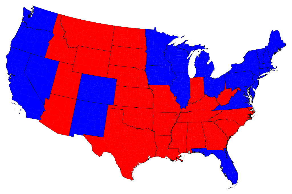
Remember that big Red/Blue map that you kept looking at on election night?
That graphic was really pretty deceptive, and maps were mentioned 117 times in our huge election thread, often because they didn't make sense or were confusing.
Mark Newman, Department of Physics and Center for the Study of Complex Systems, University of Michigan, has created a neat page that represents the data from last Tuesday in a more visually accurate manner.
His FAQ for this page is located here. If you want to make your own maps, the software he uses to create the maps is located here.
His FAQ for this page is located here. If you want to make your own maps, the software he uses to create the maps is located here.
Also, remember Tim Russert and his little whiteboard...good times...good times...
posted by briank at 11:12 AM on November 10, 2012 [6 favorites]
posted by briank at 11:12 AM on November 10, 2012 [6 favorites]
I'd like to see Al Franken do THAT.
posted by lostburner at 11:13 AM on November 10, 2012 [14 favorites]
posted by lostburner at 11:13 AM on November 10, 2012 [14 favorites]
Montana looks like a black hole.
posted by leotrotsky at 11:14 AM on November 10, 2012 [5 favorites]
posted by leotrotsky at 11:14 AM on November 10, 2012 [5 favorites]
Another nice visualization of red/blue. This one uses animation effects to show red and blue shifts in 2008 and 2012 elections. The two take homes I got from this one were: don't get to cocky Dems, the nation mostly shifted more red. And, shockingly, the core deep south areas actually shifted a bit the other way.
posted by mcstayinskool at 11:14 AM on November 10, 2012 [6 favorites]
posted by mcstayinskool at 11:14 AM on November 10, 2012 [6 favorites]
How hard is it to copy states on the map with roughly the same population (or electoral votes or whatever) as Alaska and Hawaii, and then color them in appropriately and put them (as two blobs) off to the corner of the map?
posted by Casuistry at 11:15 AM on November 10, 2012 [1 favorite]
posted by Casuistry at 11:15 AM on November 10, 2012 [1 favorite]
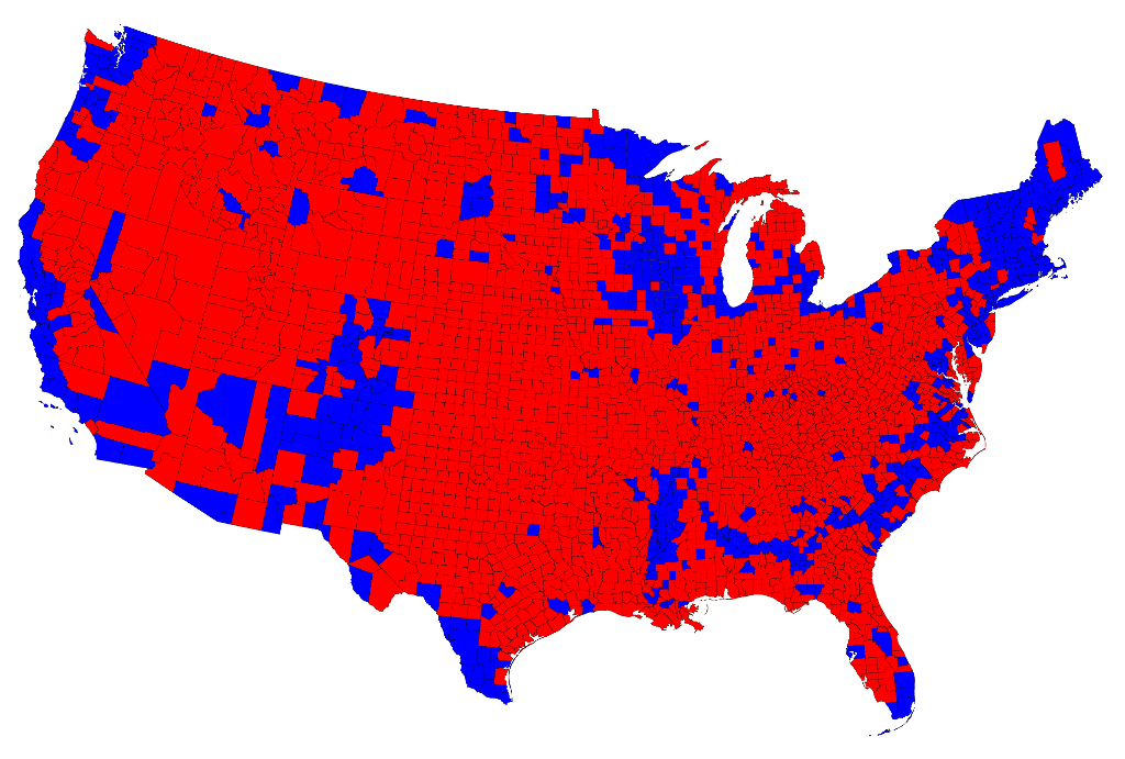
On election night, Fox News kept trying to comfort its viewers by showing a "heat map" that's similar to the county breakdown on that page to demonstrate that most of the country is Republican. The fatal flaw in that line of reasoning is that land doesn't vote.
posted by MegoSteve at 11:15 AM on November 10, 2012 [20 favorites]
posted by MegoSteve at 11:15 AM on November 10, 2012 [20 favorites]
Don't forget the Wall Street Journal's helpful map.
posted by dobbs at 11:19 AM on November 10, 2012 [21 favorites]
posted by dobbs at 11:19 AM on November 10, 2012 [21 favorites]
If land could vote, that map would be overwhelmingly Green.
posted by Scientist at 11:19 AM on November 10, 2012 [47 favorites]
posted by Scientist at 11:19 AM on November 10, 2012 [47 favorites]
This is fantastic, thank you!
I'm teaching sixth grade social studies and my kids have been having trouble conceptualizing precisely this about the election; we colored election maps based on percentage of the vote for Romney or Obama and they wondered why they had to use so much more red (55% or more for Romney) and orange (50-55%) even though Obama won; I tried to explain but a lot of them are visual and they didn't really get it. I am 100% absolutely planning on using these to demonstrate to my classes what's actually going on. It also fits in really nicely with some standards about reading maps. Thank you thank you, this is awesome!
posted by Mrs. Pterodactyl at 11:23 AM on November 10, 2012 [20 favorites]
Mrs. Pterodactyl, you are very welcome, you are exactly the mefite type (meaning teachers!) I posted this for!
posted by HuronBob at 11:27 AM on November 10, 2012 [2 favorites]
posted by HuronBob at 11:27 AM on November 10, 2012 [2 favorites]
Hah! I'm teaching a college level GIS class right now and I'm planning on using this too! Given the complexities of getting software installed on lab computers, it's about all I can do, although it would be fun to do an exercise in class using cartograms like these. Thanks, HuronBob.
posted by mollweide at 11:30 AM on November 10, 2012
posted by mollweide at 11:30 AM on November 10, 2012
Would it be possible to use state population density to add transparency to the colour? There would be a fully opaque blue for New Jersey (> 1000 inhabitants per square mile) and an almost transparent red for Wyoming (< 10 ).
posted by elgilito at 11:30 AM on November 10, 2012 [9 favorites]
posted by elgilito at 11:30 AM on November 10, 2012 [9 favorites]
I really like the county-by-county map. It really shows how tightly Democrats are clustered in urban/suburban areas and how spread out Republican areas are. Obama won Pennsylvania but looking at the state, he only won a few counties around Philly, one around Harrisburg, one around Erie and one around Pittsburgh. But all the counties that he did win were the one's with people in them. Romney won all the counties where hardly anyone lives.
posted by octothorpe at 11:32 AM on November 10, 2012 [3 favorites]
posted by octothorpe at 11:32 AM on November 10, 2012 [3 favorites]
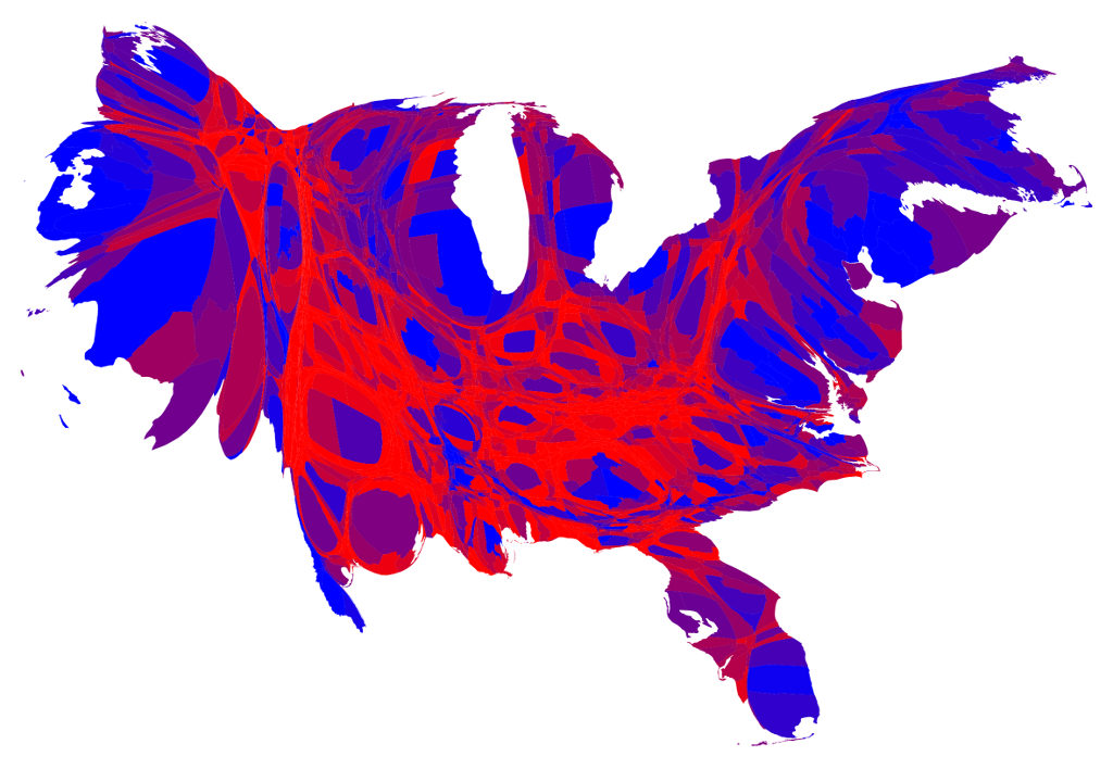
Interestingly, you can see Utah, the plains, and even the Appalachians in the cartograms.
posted by squorch at 11:32 AM on November 10, 2012
posted by squorch at 11:32 AM on November 10, 2012
My final project in my GIS class almost 4 years ago was just like this...
posted by schyler523 at 11:33 AM on November 10, 2012
posted by schyler523 at 11:33 AM on November 10, 2012
I posted this on fb a couple days ago and people have been sharing it like mad. And it makes me want to rewatch that West Wing ep - Big Block of Cheese, I'm pretty sure - where CJ has to take a meeting with cartographers and ends up being enlightened and amazed. And it makes me wish I'd taken some geography classes in college; I have a layperson's love of maps but I would like a deeper understanding of the field.
posted by rtha at 11:34 AM on November 10, 2012 [1 favorite]
posted by rtha at 11:34 AM on November 10, 2012 [1 favorite]
Here is an example of why those of us on the (more) progressive side of things are at a disadvantage. To a progressive, truth is itself a value. But what, politically, a progressive ought to do is to use that "more red than blue" map as a illustration in a campaign to eliminate the electoral college in favor of a national popular vote. I think red voters with a poor grasp of the mechanics could easily be misled into thinking that a popular vote is to their advantage, but darn it, it's only the other side that gets to lie that way. We have to be the ones that toss the other guy's dropped sword back to him.
I don't think, though, that the weighted area maps will ever come into vogue on mainstream media outlets. They're too confusing for the casual viewer. But you could maybe get PBS to use them, and I wonder if campaign HQ's might not already be using them.
posted by tyllwin at 11:34 AM on November 10, 2012 [1 favorite]
i prefer the proportional electoral maps at princeton. they are less "swimmy" to my eye.
posted by bruceo at 11:38 AM on November 10, 2012 [10 favorites]
posted by bruceo at 11:38 AM on November 10, 2012 [10 favorites]
I like the fact that as the maps represent the election results more and more accurately, America looks more and more like a squamous Lovecraftian horror.
posted by DaDaDaDave at 11:40 AM on November 10, 2012 [29 favorites]
posted by DaDaDaDave at 11:40 AM on November 10, 2012 [29 favorites]
If the earth could vote, we'd be underwater.
posted by zippy at 11:40 AM on November 10, 2012 [8 favorites]
posted by zippy at 11:40 AM on November 10, 2012 [8 favorites]
The last cartogram is kind of beautiful.
posted by book 'em dano at 11:41 AM on November 10, 2012
posted by book 'em dano at 11:41 AM on November 10, 2012
Don't show this to people in the red states because most of them already believe that reality is being warped by the blue states.
posted by twoleftfeet at 11:41 AM on November 10, 2012 [3 favorites]
posted by twoleftfeet at 11:41 AM on November 10, 2012 [3 favorites]
There's a similar map based on state voting with purple shaded states that's going around my Facebook feed. I don't have a source for it, though.
posted by immlass at 11:43 AM on November 10, 2012
posted by immlass at 11:43 AM on November 10, 2012
...America looks more and more like a squamous Lovecraftian horror."
Or Phoenix rising from the ashes.
posted by HuronBob at 11:46 AM on November 10, 2012 [1 favorite]
Or Phoenix rising from the ashes.
posted by HuronBob at 11:46 AM on November 10, 2012 [1 favorite]
I watched Fox for a bit on election day and some clown was actually pointing out the HUGE swath of red for Romney and the tiny bits of blue for Obama claiming that America REALLY did vote for Romney all while descrying the electoral college.
All I could do was laugh.
posted by Max Power at 11:46 AM on November 10, 2012
All I could do was laugh.
posted by Max Power at 11:46 AM on November 10, 2012
Don't show this to people in the red states because most of them already believe that reality is being warped by the blue states.
It's not just red and blue states that are the issue though. I live in Indiana, which voted something like 54% for Romney. But if you look at the map, Obama won exactly nine of ninety-two counties in the state. But those counties include Marion County (Indianapolis), Monroe County (Bloomington and thus IU), Lake County (Gary and the Chicago burbs), and St. Joe County (South Bend). The only major population center that went for Romney is my current city of Fort Wayne, which happens to be the second-largest city in the state.
But Marion, Monroe, and Lake Counties are widely reputed by the rest of the state as being full of liberal wingnuts. Lake and Monroe have particularly bad reputations. So even inside any given red state, everyone knows where all the liberals are.
posted by valkyryn at 11:54 AM on November 10, 2012
I suppose this is self perpetuating. The most liberal people up and move to the most liberal places.
I saw an art documentary recently in which someone said there were no New Yorkers, just people who moved to New York from the Midwest. That isn't exactly true, but she was right, people flee from the midwests to the coasts by the millions. Anyone ever meet anyone who moved to the Midwest because all the liberalism on the coasts was stifling them?
posted by Ad hominem at 11:54 AM on November 10, 2012 [2 favorites]
Not just the coasts, liberal enclaves all over. Blue place are blue by default.
posted by Ad hominem at 11:56 AM on November 10, 2012
posted by Ad hominem at 11:56 AM on November 10, 2012
Anyone ever meet anyone who moved to the Midwest because all the liberalism on the coasts was stifling them?Yes. I have the feeling it's a bit of selection bias.
posted by verb at 11:56 AM on November 10, 2012 [3 favorites]
Anyone ever meet anyone who moved to the Midwest because all the liberalism on the coasts was stifling them?
posted by Ad hominem at 11:54 AM on November 10 [+] [!]
Yes, in fact. My stepmother grew up in CT all her life and is planning on moving to Idaho of all places because "her people and the politics are better there."
It's not exactly midwest, but it fits your point.
posted by Lipstick Thespian at 11:59 AM on November 10, 2012 [1 favorite]
If the earth could vote, we'd be underwater.
The earth is voting on a slightly longer timeframe, but early returns on this one are starting to look like you're right.
posted by brennen at 12:00 PM on November 10, 2012 [24 favorites]
The earth is voting on a slightly longer timeframe, but early returns on this one are starting to look like you're right.
posted by brennen at 12:00 PM on November 10, 2012 [24 favorites]
The midwest no? But Florida, Atlanta, or the Carolinas for sure.
posted by JPD at 12:01 PM on November 10, 2012 [1 favorite]
posted by JPD at 12:01 PM on November 10, 2012 [1 favorite]
Wait wait he needs 4000 more pointless flourishes to make this a proper infographic
posted by benzenedream at 12:03 PM on November 10, 2012 [1 favorite]
posted by benzenedream at 12:03 PM on November 10, 2012 [1 favorite]
"Anyone ever meet anyone who moved to the Midwest because all the liberalism on the coasts was stifling them?"
Hey now. There's a bunch of blue states in the midwest. I totally moved back to the midwest to live in a place where government works and people believe in education and adequately-funded police and nice city parks, instead of a conservative coastal state where people were like "yay private fire departments!"
Salt water does not make you liberal.
posted by Eyebrows McGee at 12:04 PM on November 10, 2012 [31 favorites]
Short, informative plaintext articles with simple, centered images are my favorite form of website. Mmm.
posted by Buckt at 12:06 PM on November 10, 2012 [17 favorites]
posted by Buckt at 12:06 PM on November 10, 2012 [17 favorites]
Sorry, you are right.
posted by Ad hominem at 12:07 PM on November 10, 2012 [1 favorite]
posted by Ad hominem at 12:07 PM on November 10, 2012 [1 favorite]
The combination of statistical data with pretty pictures is giving me complicated feelings that I find difficult to explain!
Mmmm, data in a finely tuned graphic representation... yeah, that's just how I like it. ::bites lip::
posted by wolfdreams01 at 12:20 PM on November 10, 2012 [1 favorite]
Mmmm, data in a finely tuned graphic representation... yeah, that's just how I like it. ::bites lip::
posted by wolfdreams01 at 12:20 PM on November 10, 2012 [1 favorite]
I'd like to see a Congressional district map that illustrates the effects of 2011 gerrymandering.
I like the fact that as the maps represent the election results more and more accurately, America looks more and more like a squamous Lovecraftian horror.
I always thought of it as "OMG, our burgeoning liberal America is being strangled to death by this insidious conservative weed!", but I guess an equally strong case could be made for "OMG, our simple, conservative America is being swollen to death by these insidious liberal tumors!"
posted by Rhaomi at 12:22 PM on November 10, 2012 [6 favorites]
The midwest no? But Florida, Atlanta,
Exurban Atlanta would make sense, but ...
posted by raysmj at 12:23 PM on November 10, 2012
Exurban Atlanta would make sense, but ...
posted by raysmj at 12:23 PM on November 10, 2012
I'd like to see a Congressional district map that illustrates the effects of 2011 gerrymandering.
Not a map, exactly, but this may help.
posted by psoas at 12:25 PM on November 10, 2012 [1 favorite]
Not a map, exactly, but this may help.
posted by psoas at 12:25 PM on November 10, 2012 [1 favorite]
raysmj- That Georgia map kinda reminds me of their Buckle Up sign.
posted by MtDewd at 12:30 PM on November 10, 2012 [1 favorite]
posted by MtDewd at 12:30 PM on November 10, 2012 [1 favorite]
If land could vote, that map would be overwhelmingly Green.
In some regions, the land shifts based on the season. I come from the land of eternally dusty browns. And it's amusing to note that the one significant blob of white is in Utah.
I really like the county-by-county map. It really shows how tightly Democrats are clustered in urban/suburban areas and how spread out Republican areas are. Obama won Pennsylvania but looking at the state, he only won a few counties around Philly, one around Harrisburg, one around Erie and one around Pittsburgh. But all the counties that he did win were the one's with people in them. Romney won all the counties where hardly anyone lives.
One of the news people (maybe Chuck Todd?) covering the election night mentioned that the election was basically decided not at the state level, but by 11 (?) counties.
I'd like to see a population heat map overlaid on the electoral college results and/or county-level results, because if that map was made well, it could really convey how population centers vote, vs areas on the map.
posted by filthy light thief at 12:37 PM on November 10, 2012
What I'd really like to see a cartographer do with election results would be to express population density in the third dimension like a relief map. When you tilt the map, you'd see towering columns of blue over vast red plains.
posted by MegoSteve at 12:53 PM on November 10, 2012 [22 favorites]
posted by MegoSteve at 12:53 PM on November 10, 2012 [22 favorites]
The 1992 frame from the animated gif at the bottom of the page by the Princeton researcher whom he collaborated with makes me wonder if we'll ever see a third party reach that level again.
posted by radwolf76 at 1:15 PM on November 10, 2012 [3 favorites]
posted by radwolf76 at 1:15 PM on November 10, 2012 [3 favorites]
The alteration of the shape of Florida and the curvature of the keys makes the United States look like a tumor with an engorged penis. I like it.
posted by Renoroc at 1:28 PM on November 10, 2012 [2 favorites]
posted by Renoroc at 1:28 PM on November 10, 2012 [2 favorites]
What I'd really like to see a cartographer do with election results would be to express population density in the third dimension like a relief map. When you tilt the map, you'd see towering columns of blue over vast red plains.
Surely you mean deep, vasty blue pits of iniquity?
posted by brennen at 1:38 PM on November 10, 2012 [1 favorite]
Surely you mean deep, vasty blue pits of iniquity?
posted by brennen at 1:38 PM on November 10, 2012 [1 favorite]
I hate to be that guy, but this seems silly to me. The physical map of the US shows how the land looks physically. Skewing the shape to match the population seems like the wrong way to go about this. I mean, can you really tell from this map whether there's more red or more blue?
If you're going to skew the map that much, why not just present a pie chart w/ red and blue slices for each state, where the width of the pie slice for each state is measured based on its population?
I don't have time to do it now, but what if you just divided the regular map by county or state, and then colored each county/state red or blue, but made the intensity of each color correlate to population of that county/state? So New York and California are bright blue, and Texas is bright red, but Wyoming and Montana are both pink, almost white. Or something.
posted by nushustu at 1:47 PM on November 10, 2012 [4 favorites]
The superior map is the circle map sized by margin of victory, an option on the NYT site (though some transparency in the circles would be nice). It de-emphasizes the sparsely populated areas that are intensely red, jumping off the page in traditional color maps, but lack sufficient people to deliver huge margins, and also de-emphasizes the much-lauded swing counties which deliver small margins by virtue of their closeness. What it does emphasize is the huge urban cores and inner suburban fortresses where Obama ran up his margins.
Vote margins decide elections, not percentages. Think of it this way: what had more impact on the eventual victory margin, a 50-50 county or a huge urban core? This was a base turnout election and the circle map shows it most effectively.
posted by Hollywood Upstairs Medical College at 1:59 PM on November 10, 2012 [3 favorites]
I like these 3D electoral maps (this one if from 2008).
They do help visualize the difference in populations by counties, but still don't quite provide an easy, at-a-glance understanding of the difference in the total votes.
Haven't found one for 2012 yet.
posted by Davenhill at 2:46 PM on November 10, 2012 [1 favorite]
They do help visualize the difference in populations by counties, but still don't quite provide an easy, at-a-glance understanding of the difference in the total votes.
Haven't found one for 2012 yet.
posted by Davenhill at 2:46 PM on November 10, 2012 [1 favorite]
I would love to see this with some of the interlocking blue and red areas labeled with the county and city names.
posted by en forme de poire at 3:08 PM on November 10, 2012
posted by en forme de poire at 3:08 PM on November 10, 2012
The red/blue/purple cartograms are still misleading: since purple is a cooler color, it's easy to visually lump it in with the blue. That problem can be easily solved by representing one party with plaid and the other with paisley.
posted by cosmic.osmo at 3:09 PM on November 10, 2012 [3 favorites]
posted by cosmic.osmo at 3:09 PM on November 10, 2012 [3 favorites]
The map makes it look like the Republicans have strangled the nation, which isn't that far from reality.
posted by SillyShepherd at 3:11 PM on November 10, 2012
posted by SillyShepherd at 3:11 PM on November 10, 2012
One of the best maps I've seen to successfully represent this election was in the Chicago Sun-times, by their graphics lead, Max Rush. It really does a tremendous job of relating the Nation's geography to population while visually explaining each State's voting significance. Cool--I think all election maps should look like this, since it puts the red/blue thing into much better perspective. Here's another that breaks down the vote by counties. More.
posted by silkyd at 3:54 PM on November 10, 2012 [25 favorites]
posted by silkyd at 3:54 PM on November 10, 2012 [25 favorites]
The 1992 frame from the animated gif at the bottom of the page by the Princeton researcher whom he collaborated with makes me wonder if we'll ever see a third party reach that level again
These are fascinating maps, and they really show the polarization that's taken place in the last couple of decades. Even the Year-O-Reagan 1984 looks purple compared to 2008, which brings out the blue coastlines and red middle in sharp relief.
I didn't realize that previous to 2000 we didn't have the terms red and blue states -- in fact the two parties' colors were reversed, and not strongly associated with the electoral college. (I seem to remember a time when it wasn't polite to discuss your vote.) I can't help but wonder if this labeling and regional-flag-waving contributed to the growing polarization in the U.S. (and if so, can I blame Tim Russert?)
posted by RobotVoodooPower at 3:54 PM on November 10, 2012 [1 favorite]
representing one party with plaid and the other with paisley
I think it should be two of something that the Democrats wouldn't want both of.
posted by brennen at 3:57 PM on November 10, 2012
I think it should be two of something that the Democrats wouldn't want both of.
posted by brennen at 3:57 PM on November 10, 2012
That's hideous.
What about just using the map as-is, and adding a bar graph or two alongside it? Has anyone thought of doing that? Oh, just every single news organization in existence?
Huh.
posted by Sys Rq at 4:01 PM on November 10, 2012
What about just using the map as-is, and adding a bar graph or two alongside it? Has anyone thought of doing that? Oh, just every single news organization in existence?
Huh.
posted by Sys Rq at 4:01 PM on November 10, 2012
Don't show this to people in the red states because most of them already believe that reality is being warped by the blue states.
Andddd this really illustrates the problem with the typical presentation of states as all one thing or another, and what's really the larger problem, which is that the electoral college forces states to be all one color.
I live in Alabama. Look at all that blue. But there's enough red there that the Democratic party doesn't even bother. And neither does the Republican, really, because both sides believe that it's in the bag for the Republicans. And even if it wasn't, there's not enough votes there to matter. But if it was based on the popular vote, or at least if the state delegates were somehow weighted to vote as the state went, not all or nothing, I personally feel that would be a powerful centrist force, because everyone's vote would actually matter, no matter where they lived, and candidates would have to actually consider every region's points of view.
I voted for Romney, by the way, but I also voted for Democrat St. Supreme court Vance because the Republican candidate was stone crazy*. So does that make me personally purple?
*I know, you could say the same about Romney. I wasn't "crazy" about either candidate.
posted by randomkeystrike at 4:21 PM on November 10, 2012
Another nice visualization of red/blue. This one uses animation effects to show red and blue shifts in 2008 and 2012 elections. The two take homes I got from this one were: don't get to cocky Dems, the nation mostly shifted more red. And, shockingly, the core deep south areas actually shifted a bit the other way.
That area has the most fertile soil in the south, it's where most of the plantations were. After the civil war, a lot of black people stayed there.
posted by stavrogin at 4:29 PM on November 10, 2012 [1 favorite]
That area has the most fertile soil in the south, it's where most of the plantations were. After the civil war, a lot of black people stayed there.
posted by stavrogin at 4:29 PM on November 10, 2012 [1 favorite]
This is a fun one too. U.S. Distorted By Super PAC Ad Spending
(spoiler: non-swing states get crushed to a singularity)
posted by RobotVoodooPower at 4:34 PM on November 10, 2012
(spoiler: non-swing states get crushed to a singularity)
posted by RobotVoodooPower at 4:34 PM on November 10, 2012
How Ancient Plankton Elected Obama, And other crazy tales from the world's electoral maps.
posted by homunculus at 4:47 PM on November 10, 2012 [2 favorites]
posted by homunculus at 4:47 PM on November 10, 2012 [2 favorites]
Anyone ever meet anyone who moved to the Midwest because all the liberalism on the coasts was stifling them?
LOLLERS. I grew up 15 minutes from the Atlantic Ocean and it wasn't until I moved to the Midwest that I finally found people who didn't sneer at me for being a chick with short hair or not going to church or being comfortable around people who are gay and/or not white or reading books about evolution, so like maybe you can suck my balls or something dude. Crimeny.
posted by phunniemee at 5:06 PM on November 10, 2012 [1 favorite]
so like maybe you can suck my balls or something dude
That isn't really necessary. I already apologized for conveniently ignoring the red parts of the east coast and not really acknowlging that there are many dots of blue in the sea of red that Is the middle of the country.I sometimes forget they exist. If you are telling me that the red parts of the country are more accepting than the blue parts, that is interesting and I'm sorry liberals made you feel uncomfortable for reading books about evolution.
posted by Ad hominem at 5:21 PM on November 10, 2012 [2 favorites]
If Chinese Citizens Had a Vote, Here’s One Possible Election Map
posted by homunculus at 5:27 PM on November 10, 2012 [4 favorites]
posted by homunculus at 5:27 PM on November 10, 2012 [4 favorites]
That isn't really necessary.
You're probably right. Sorry. I just like telling people to suck my balls because it amuses me.
But I will fight anyone who tries to hate on the Midwest. People who use the phrase "flyover country": I'm lookin' at you.
posted by phunniemee at 6:33 PM on November 10, 2012 [5 favorites]
You're probably right. Sorry. I just like telling people to suck my balls because it amuses me.
But I will fight anyone who tries to hate on the Midwest. People who use the phrase "flyover country": I'm lookin' at you.
posted by phunniemee at 6:33 PM on November 10, 2012 [5 favorites]
I have nothing against the Midwest, I have something against people who vote republican. Of course people will say Obama is just as bad, maybe he is. I refuse to cede even minuscule gains, to throw up my hands and say fuck it, I didn't get a pony so I don't want anything.
posted by Ad hominem at 6:49 PM on November 10, 2012
posted by Ad hominem at 6:49 PM on November 10, 2012
mcstayinskool: "The two take homes I got from this one were: don't get to cocky Dems, the nation mostly shifted more red"
The margin of victory for Obama was no doubt smaller, but the popular vote totals for both candidates were down this year. Romney failed to retain about a million and a half voters who went with McCain in 2008, to say nothing of the votes he would have needed to close the gap. This may be the GOP reaping what it sows when it suppresses voter turnout, but if anything, it suggests Dems should have devoted more energy to turning out their base.
posted by Apropos of Something at 6:50 PM on November 10, 2012 [1 favorite]
But I will fight anyone who tries to hate on the Midwest. People who use the phrase "flyover country": I'm lookin' at you.
I love the Midwest, and the Middle West, and the parts that fall into "flyover country". The great flat middle is where I'm from and a huge part of who I am and contains an astonishing number of truly decent people. I feel how much I love it in my very bones, and every time I go home to the Plains and spend time around my people, I get that much closer to abandoning my comfortable life in a comfortable Colorado liberal enclave and going back there to some plot of land surrounded by fields and cows, or maybe taking a job in some university town with a little downtown zone where a few thousand people live the counterculture pretty well and the fields are a short drive away.
I also fucking hate it, because it's full of horrifying bigotry and weird complacence and often seems to seethe with a barely-contained general-purpose madness.
Life is complicated and boy howdy am I looking forward to the conversational dance at my family Thanksgiving.
posted by brennen at 6:58 PM on November 10, 2012 [3 favorites]
Oklahoma is still far too big on every one of these population maps.
posted by yellowcandy at 7:19 PM on November 10, 2012
posted by yellowcandy at 7:19 PM on November 10, 2012
I really like the county-by-county map.
I saw that on a blog with the explanation "You can go from Canada to Mexico through all red counties, and from the Atlantic to the Pacific too. This really is a conservative nation."
I believe Glenn Beck used a similar map to underscore his menacing "We Surround Them" message.
Anyway, yes, people are saying the same more or less above, but my retort to this has always been "yeah, if square miles voted!"
Hey now. There's a bunch of blue states in the midwest.
Indeed -- there was once a strain of politics known as Prairie Populism, a relic of the farm and labor parties in the upper Midwest. People like George McGovern (D-SD!) came out of this tradition. It's closely related to the LaFollette Progressive movement of Wisconsin. Most of those seats have gone red in recent years, though; it probably skews the Senate's composition something fierce, if anyone is willing to do the math. It would be even worse than the Southern Strategy's flipping of the Solid South, since at least the states in the south have people in them whereas many of the Western and Prairie states are beneficiaries of the built-in "small" state EC advantage.
Of all the representations of the EC proportional US, I like the Sun-Times blocky type the best (and I've seen them all over the years, from the 3-D to the heat to the circle map. Some of those have their advantages but I like the simple clarity of this one. (I posted one I made for the 2004 election here back then.) I generally especially dislike the various red/blue/purple gradation maps for this lack of overall or specific clarity; the one point they tend to make is the general one that maybe we're all a little purply. I think I liked the skew map that showed the campaign spending, though.
posted by dhartung at 7:33 PM on November 10, 2012 [6 favorites]
Why does it have to be a map?
posted by Brocktoon at 7:46 PM on November 10, 2012 [1 favorite]
posted by Brocktoon at 7:46 PM on November 10, 2012 [1 favorite]
It doesn't, of course, and sometimes there are non-map charts that give you fascinating insights -- such as this one showing how support for same-sex marriage has been steadily increasing across all 50 states (just not at the same rate, or from the same starting point). But a map has the advantage of allowing one to use geographic memory to immediately find the state that you want to know the status of, rather than scanning a list of fifty state names.
posted by dhartung at 8:04 PM on November 10, 2012 [4 favorites]
posted by dhartung at 8:04 PM on November 10, 2012 [4 favorites]
nushustu: I hate to be that guy, but this seems silly to me. The physical map of the US shows how the land looks physically. Skewing the shape to match the population seems like the wrong way to go about this. I mean, can you really tell from this map whether there's more red or more blue?
If you're going to skew the map that much, why not just present a pie chart w/ red and blue slices for each state, where the width of the pie slice for each state is measured based on its population?
Sys Rq: What about just using the map as-is, and adding a bar graph or two alongside it?
I am a huge fan of cartograms, especially for the US presidential elections (growing up in California will do this to you) so I feel compelled to defend them.
Presenting this kind of data in bar graphs alongside a geographical map misses the point of connecting the geographical and population data. A cartogram immediately and powerfully tells you that California has a larger population than all its neighbor states in the Mountain West combined without forcing you to match up the separately-charted data to the geography. I can immediately tell you that while the Mountain West occupies a lot of land, it's "underpopulated" relative to the rest of the US, so that swath of Republican red isn't as overwhelming as it looks.
I suppose you could use an individual, proportional bar graph on top of every state on a geographic map (so California's bar graph is way bigger than Wyoming's), but at that point you are basically replicating a cartogram in a less-efficient way.
A cartogram also intuitively tells you something about state population density. Because we're all so familiar with the geographical shape of the US, looking at a cartogram, where the Northeast bulges and the Mountain West shrinks, intuitively tells us that the Northeast is much denser than the Mountain West.
posted by andrewesque at 10:26 PM on November 10, 2012 [4 favorites]
And from a European, many thanks HuronBob - that really helped me to understand better what went down last week.
RobotVoodooPower: the two parties' colors were reversed:
That's the one thing that I (and many of my friends over here) am having trouble with. For us, red is traditionally the Left, and blue the Right, so we flail around trying to see things the other way 'round, like trying to recognise somebody on a photographic negative.
posted by aqsakal at 11:53 PM on November 10, 2012
Something one should not look at when they are hung over at 3 am
posted by stormpooper at 1:57 AM on November 11, 2012
posted by stormpooper at 1:57 AM on November 11, 2012
I understand the point these maps are making, and for some, like the schoolchildren mentioned above, who are puzzled by how a country made up of mostly red states elect a blue president, hopefully it gets the point across.
But what's really interesting to me is when you look at the results on the county levels. Across the states, the overwhelming trend is that rural areas vote red while urban areas vote blue. That can't (or at least shouldn't) be reduced to a question of population density, that is a major cultural and/or socio-economic difference. For this, the squashing up of the map isn't really necessary and might even obscure the point, since the unsquashed map will look very familiar for people with a general knowledge of US geography: Seas of red-ish land with islands of blue-ish where the major cities are.
I like the purple, though.
posted by cx at 3:49 AM on November 11, 2012
andrewesque:
I hear what you're saying, I just think the link from the OP has a bunch of not very useful cartograms. Whereas the link that dhartung provided shows me something that I CAN make both heads and tails of.
posted by nushustu at 6:27 AM on November 11, 2012
I hear what you're saying, I just think the link from the OP has a bunch of not very useful cartograms. Whereas the link that dhartung provided shows me something that I CAN make both heads and tails of.
posted by nushustu at 6:27 AM on November 11, 2012
The red in the proportionally adjusted county-level map looks suspiciously like a cancer cell.
posted by Devils Rancher at 7:14 AM on November 11, 2012
posted by Devils Rancher at 7:14 AM on November 11, 2012
But I will fight anyone who tries to hate on the Midwest. People who use the phrase "flyover country": I'm lookin' at you.
The only time I've ever heard that phrase used non-ironically is from offended Midwesterners who think being from a small town in the grasslands is what makes you a Real American (tm).* I've literally never heard it used non-ironically by one of us Coastal Elites (just as offensive and used all time in the "liberal" media).
* this of course excludes Native America, the flyover country of flyover country. Because, you know, minorities don't count even when they were here first and are a minority due to genocide, no big deal.
posted by spitbull at 7:53 AM on November 11, 2012
I like the EV-by-state map at usatoday.com (click on ELECTORAL to see), which illustrates the relative importance of each state without having to distort the map.
posted by dfan at 7:57 AM on November 11, 2012
posted by dfan at 7:57 AM on November 11, 2012
I really like this map, where the red/blue/purple result is multiplied by population density, represented as saturation/brightness.
posted by dmd at 9:17 AM on November 11, 2012 [11 favorites]
posted by dmd at 9:17 AM on November 11, 2012 [11 favorites]
Lipstick Thespian: Yes, in fact. My stepmother grew up in CT all her life and is planning on moving to Idaho of all places because "her people and the politics are better there."
Aryan Nations?
posted by symbioid at 10:12 AM on November 11, 2012
Aryan Nations?
posted by symbioid at 10:12 AM on November 11, 2012
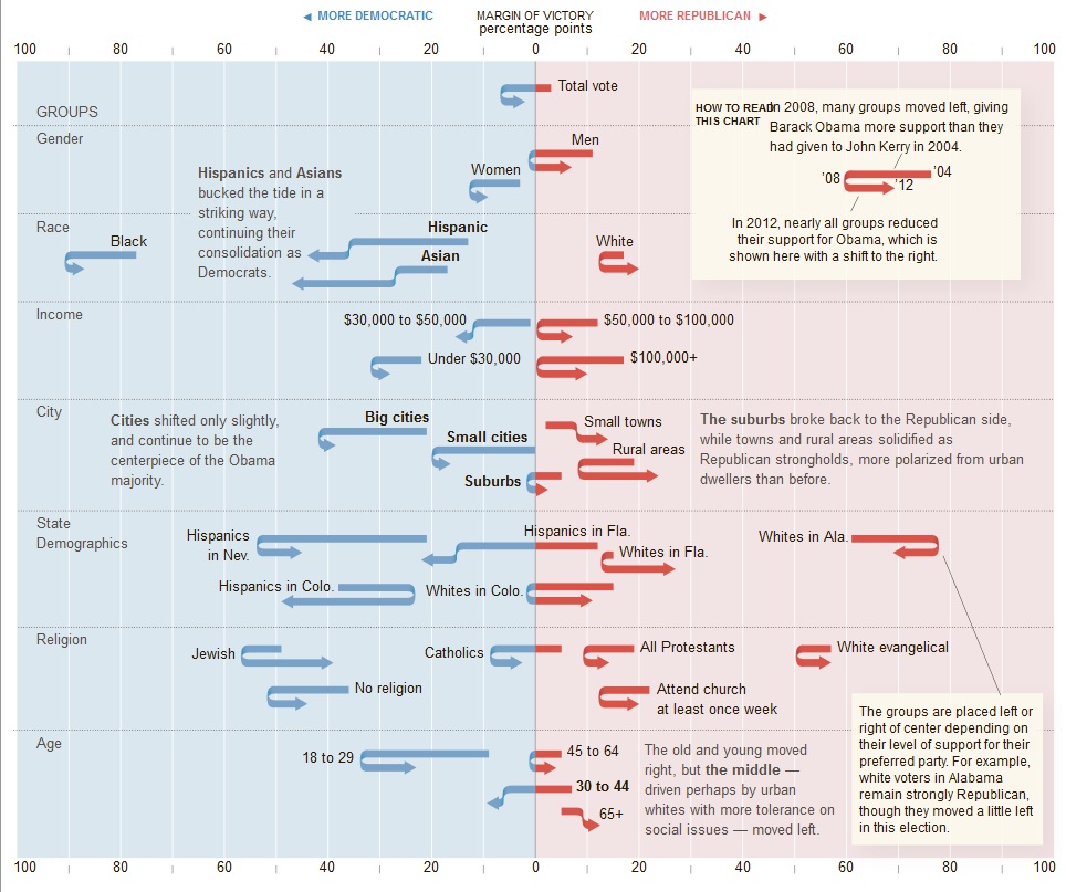
One of the most interesting charts I've seen is this NYTimes chart (link via Barry Ritholtz).
It shows the various shifts from 2004->2008->2012.
Lots of right-ward shifts, but also plenty of leftward ones.
The changes in Hispanics in Florida vs Hispanics in Nevada is interesting (FL pushed left all times, NV shifted radically right).
Overall Hispanics and Asians pushed much harder to the left. The youth, also, pushed left.
Blacks had a slight rightward shift.
Whites in Florida shifted harshly right, but the most surprising one and I'm not sure why this is...
Whites in Alabama pushed leftward in 2012.
What's up with that?
posted by symbioid at 10:23 AM on November 11, 2012 [2 favorites]
To reply to my own, maybe Obama signs Alabama Disaster Declaration - 9/21/12 has something to do with it?
posted by symbioid at 10:26 AM on November 11, 2012
posted by symbioid at 10:26 AM on November 11, 2012
thegears: I don't recall, but probably DataIsBeautiful on reddit.
posted by dmd at 10:36 AM on November 11, 2012
posted by dmd at 10:36 AM on November 11, 2012
Whites in Alabama pushed leftward in 2012.
What's up with that?
Also note that they pushed rightward in 2008, unlike other groups (with the exception of small towns, those 65+, who also moved to the right 2004-2008). Was there just particularly strong support of McCain in Alabama, as opposed to Romney?
posted by thegears at 1:59 PM on November 11, 2012
I want to see analysis of the bordering-Mexico counties, which are mostly blue. Punditry wants me to believe everyone that lives there is part of a local border-patrolling militia or not legally here and/or stealing my job.
posted by nile_red at 2:58 PM on November 11, 2012
posted by nile_red at 2:58 PM on November 11, 2012
The thing that's not obvious to foreigners (or even to many Americans) is that the interior north-west of the country is essentially empty land. The 'Empty Quarter' of Idaho/Montana/Wyoming/ North Dakota /South Dakota /Nebraska is six states (with together only 20 electoral votes and TWELVE US Senators) - and together that land has fewer people than New York City.
"NYC" is geographically tiny, and is of course essentially invisible on any map of the entire USA....
posted by AsYouKnow Bob at 3:08 PM on November 11, 2012 [2 favorites]
"NYC" is geographically tiny, and is of course essentially invisible on any map of the entire USA....
posted by AsYouKnow Bob at 3:08 PM on November 11, 2012 [2 favorites]
Then there's the Driftless Area, a white rural agricultural region and one of the bluest parts of the country.
posted by akgerber at 3:28 PM on November 11, 2012 [1 favorite]
posted by akgerber at 3:28 PM on November 11, 2012 [1 favorite]
thegears: "Was there just particularly strong support of McCain in Alabama, as opposed to Romney?"
Perhaps. Lots of reasons for people on the lower end of the income spectrum to be afraid of Mitt Romney. But, for a moment, let's consider the non-fear alternative: much of the whisper campaign against Obama in the deep south in 08 was that he was a closet Kenyan Muslim who would sabotage and socialize the country. That didn't happen.
posted by Apropos of Something at 6:59 PM on November 11, 2012
I totally advocate coloring all political decisions using the RGB system, but what the hell is wrong with you, G? That's why we need the Green Party. Years from now, when the Republicans and the Democrats and the Green Party all have equal representation, a county-by-county representation of the electorate will, at least at a distance, have all the colors of the rainbow.
posted by twoleftfeet at 8:55 PM on November 11, 2012
posted by twoleftfeet at 8:55 PM on November 11, 2012
Whites in Alabama pushed leftward in 2012.
What's up with that?
Could it be that Kid Rock, bless his heart, managed to burn off the last of those Lynyrd Skynyrd fumes with his godawfulness?
(I almost wonder if there might be a similar leftward push among lupine Britons...)
posted by Sys Rq at 9:40 PM on November 11, 2012
What's up with that?
Could it be that Kid Rock, bless his heart, managed to burn off the last of those Lynyrd Skynyrd fumes with his godawfulness?
(I almost wonder if there might be a similar leftward push among lupine Britons...)
posted by Sys Rq at 9:40 PM on November 11, 2012
Bloke speculates that this time around, Anonymous outrigged the Ohio voting machine tabulators that Karl Rove had rigged in 2004. Hence Karl Rove, on the 2012 election night, having a meltdown as he's expecting Ohio to "flip" Romney whereas it's stayed Obama.
(Which, if this was true, would mean that 2 out of the last 3 presidential elections had been majorly rigged or interfered with. Add on Florida's problems in 2000, and that would be 3 out of the last 4.)
posted by Wordshore at 4:07 PM on November 17, 2012 [1 favorite]
(Which, if this was true, would mean that 2 out of the last 3 presidential elections had been majorly rigged or interfered with. Add on Florida's problems in 2000, and that would be 3 out of the last 4.)
posted by Wordshore at 4:07 PM on November 17, 2012 [1 favorite]
« Older Brasil profundo | ...and then you strangle a giant slug with a chain... Newer »
This thread has been archived and is closed to new comments
posted by briank at 11:10 AM on November 10, 2012 [5 favorites]