How the Future Changed
January 10, 2013 10:54 PM Subscribe
Nice slideshow, shame about the article which started off reasonably well and then just ended.
posted by MartinWisse at 1:09 AM on January 11, 2013
posted by MartinWisse at 1:09 AM on January 11, 2013
I really like the pulpy ones, but one of my favourites, which I would dearly love a framed print of, is this art deco style one for A Princess Of Mars.
I'm not one for the cheesecake covers often, but the old Weird Tales covers speak to me.
There seems to be a modern trend I like to call Really Crappy Drawings, as evidenced by some of these classic SF books.
posted by Mezentian at 1:14 AM on January 11, 2013
I'm not one for the cheesecake covers often, but the old Weird Tales covers speak to me.
There seems to be a modern trend I like to call Really Crappy Drawings, as evidenced by some of these classic SF books.
posted by Mezentian at 1:14 AM on January 11, 2013
There seems to be a modern trend I like to call Really Crappy Drawings, as evidenced by some of these classic SF books.
The art director at Penguin who chose the illustrator and signed off on the final artwork wants something that will stand out against all the other books on the shelf.
It's distinctive, like hark a vagrant, or, god help us, the oatmeal comic.
I'm not very warm about it, but I don't think it was the illustrator saying, "Oh dear, I'm trying to do a tight careful drawing, and it's just coming out as poop. I do so wish I could draw."
Picasso's Guernica might be a more classy example.
Now this cover for an ebook reprint of this made me vomit.
posted by sebastienbailard at 3:46 AM on January 11, 2013
The books will stand out because they are Classics.
Most of my Wyndhams are orange-spined Penguin classics, and they have awesome covers that would stand out.
On the other hand, the Masters of Fantasy/SF book range is a study in contrasts.
posted by Mezentian at 5:03 AM on January 11, 2013
Most of my Wyndhams are orange-spined Penguin classics, and they have awesome covers that would stand out.
On the other hand, the Masters of Fantasy/SF book range is a study in contrasts.
posted by Mezentian at 5:03 AM on January 11, 2013
Oh god now I'm imagining a set of Oatmeal covers for classic SF and its all badly traced pterodactyls and crude drawings of fat men wallowing in their own filth.
posted by egypturnash at 5:13 AM on January 11, 2013 [2 favorites]
posted by egypturnash at 5:13 AM on January 11, 2013 [2 favorites]
L. Ron Hubbard's literal book covers really stood out on the shelf, so......
posted by Brocktoon at 6:20 AM on January 11, 2013
posted by Brocktoon at 6:20 AM on January 11, 2013
Oh god now I'm imagining a set of Oatmeal covers for classic SF and its all badly traced pterodactyls and crude drawings of fat men wallowing in their own filth.
"Guys, I have an idea for the re-release of the Dune series..."
posted by Slap*Happy at 6:55 AM on January 11, 2013 [6 favorites]
"Guys, I have an idea for the re-release of the Dune series..."
posted by Slap*Happy at 6:55 AM on January 11, 2013 [6 favorites]
the mediocre Napoleon Dynamite follow up 'Gentleman Broncos' has a whole bunch of classic covers.
I kind of love that movie.
posted by Artw at 8:18 AM on January 11, 2013
I kind of love that movie.
posted by Artw at 8:18 AM on January 11, 2013
How about some attribution. From isfdb.com's publication history of The Puppet Masters You can see that its cover art has come in a wide variety of styles.
Galaxy Science Fiction, 1951, with cover by Don Sibley
Doubleday, 1951, cover artist unknown.
Signet, 1952 with cover art by Stanley Meltzoff. This image was used for all of Signet's printings of this title in the 1950's and 1960's.
Panther, 1960 with cover Art by Richard Powers.
Pan Books, 1969 with cover art by W.F. Philips.
Signet 1971 with cover art by Gene Szafran who did covers for several other Heinlein reprints for Signet at this time.
Pan Books, 1973 with cover art by Victor Gollancz
Pan Books, 1974, cover artist unknown.
Pan Books, 1977, with cover art by Gino D'Achille.
Del Rey/Ballentine, 1986 with cover art by Barclay Shaw.
NEL, 1987 cover artist unknown.
Baen, 2009 with cover art by Bob Eggleton.
posted by wobh at 8:18 AM on January 11, 2013 [4 favorites]
And Here's a page on Gene Szafran's Heinlein covers
posted by wobh at 8:24 AM on January 11, 2013 [2 favorites]
posted by wobh at 8:24 AM on January 11, 2013 [2 favorites]
There's the outline of a point here, but I'm not seeing a lot of actual psychedelia as such.
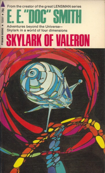
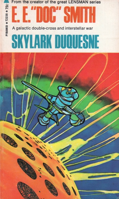
I myself was seduced by the Jack Gaughan covers on the 1970 printings of E. E. Doc Smith's space operas when I discovered them at Waldenbooks. Organic-shaped starships orbit bulbous planets in a 'void' that seems filled with flows of supersaturated dayglo paint.
Triplanetary
First Lensman
Galactic Patrol
Gray Lensman
Second Stage Lensmen
Masters of the Vortex
Children of the Lens
Skylark of Space
Skylark Three
Skylark of Valeron
Skylark DuQuesne
That was my idea of space travel and a psychedelic future I could get into.
posted by Herodios at 9:17 AM on January 11, 2013 [1 favorite]
Och, the above was written before I saw Wobh's Gene Szafran link. I have most of those titles in editions with Szafran covers. Pretty sike, actually, especially when seen all together.
posted by Herodios at 9:20 AM on January 11, 2013
posted by Herodios at 9:20 AM on January 11, 2013
That was my idea of space travel and a psychedelic future I could get into.
They look akin to the Dragonfall 5 covers I recall as a kid.
Personally, I grew up with people like Angus McKie, Colin Fross and others (mostly from the TTS guidebooks). Their versions of the Lensman and Hooded Swan series are seared into my brain.
posted by Mezentian at 10:01 AM on January 11, 2013
I really like the realistic covers - maybe because SF&F is almost always in an alien environment and I like to have as much visual representation of that alien reality as possible. The best aren't cartoonish, but revealing like a really good realistic oil painting. Whelan has had some great covers. I was a big fan of the work he did on the Pern series, but I didn't realize how special he was until I was looking at a cover for another series, thought "hey, that's better than a lot of Fantasy covers" and then saw that it was a Whelan one - dramatic, made me wonder about the story, but also giving me a bit of a sense of the world.
What shocks me, though, is how so many bad cover artists manage to keep getting work. I'm looking at you, whoever it is that contracts out Baen bookcovers.
posted by jb at 10:09 AM on January 11, 2013
What shocks me, though, is how so many bad cover artists manage to keep getting work. I'm looking at you, whoever it is that contracts out Baen bookcovers.
posted by jb at 10:09 AM on January 11, 2013
I think you mean BAEN!!!!
And the person responsible for the font choices is the most evil.
posted by Mezentian at 10:31 AM on January 11, 2013
And the person responsible for the font choices is the most evil.
posted by Mezentian at 10:31 AM on January 11, 2013
And then there's these... (also posted by Artw-- thanks, man! Keep 'em coming!)
posted by Fuzzy Monster at 10:43 AM on January 11, 2013
posted by Fuzzy Monster at 10:43 AM on January 11, 2013
Anyone interested in this stuff should get their hands on Frank M. Robinson's Science Fiction of the 20th Century: An Illustrated History, the most gorgeous book about sf I know, satisfyingly big and heavy, with satisfyingly large full-color illustrations of magazine and book covers from every era of sf, from 1901 (The Boys of New York: A Paper for Young Americans, featuring "The Electric Man; or, Frank Reade, Jr., in Australia") to 1999 (posters for Star Wars Episode I—The Phantom Menace). It's the first Christmas present my wife ever got me; she saw me drooling over it at the long-gone WTC Borders and snuck back to buy it while I wasn't paying attention. Every time I pull it off the shelf I sink into a pleasant retrofuturistic reverie. Pixels on a screen don't compare to well-printed glossy pages.
posted by languagehat at 12:20 PM on January 11, 2013 [2 favorites]
posted by languagehat at 12:20 PM on January 11, 2013 [2 favorites]
« Older Not THAT kind of virus. | Strike One for Comet Apophis Newer »
This thread has been archived and is closed to new comments
The title sequence to the mediocre Napoleon Dynamite follow up 'Gentleman Broncos' has a whole bunch of classic covers.
posted by Charlemagne In Sweatpants at 12:09 AM on January 11, 2013