Cameras, Cartography and Competition
May 18, 2013 10:27 AM Subscribe
PITCHF/x and SportVU data analysis shows...
1. Pitch framing, once nebulously understood, can be quantifiably measured and taught.
2. The secret dead spot on the NBA floor, along with the hidden advantage of low percentage, long range shots. [Bonus Kirk Goldsberry analysis of Golden State Warriors' coach's claim that Klay Thompson and Stephen Curry are "the greatest shooting backcourt in the history of the game."]
Further analysis can be found by combing through the MIT Sloan Sports Analytics Conference.
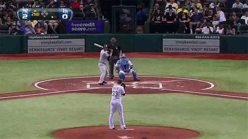
Re: Pitch framing. May well be a thing, but those first examples, where the author's all "The pitches are the same, but one was called a strike and the other a ball!" are, to my eye, completely different. The first pitch is in the strike zone; the second is outside -- and really obviously so to any batter or umpire with functioning eyes. It'd be really clear in an overhead shot, but you can start to see what I mean if you just compare the relative positions of the pitchers' left feet. That second pitch comes in from way wide and sneaks in behind the strike zone.
I'm pretty sure exactly the same is true of the second set of gifs, but the angle is too wonky to tell 100%.
posted by Sys Rq at 10:58 AM on May 18, 2013
I'm pretty sure exactly the same is true of the second set of gifs, but the angle is too wonky to tell 100%.
posted by Sys Rq at 10:58 AM on May 18, 2013
Max Marchi of Baseball Prospectus did a great piece on catcher framing numbers using Retrosheet data, which is more limited than pitch FX but goes much farther back.
Awesome stuff.
posted by xmutex at 12:08 PM on May 18, 2013
Awesome stuff.
posted by xmutex at 12:08 PM on May 18, 2013
PitchF/x is awesome.
MLB releases all of the game data (including PitchF/x data) used in their Gameday application in XML format. Sadly, they don't include HitF/x data.
This diagram by Philip Kromer gives the best explanation what each parameter of PitchF/x data records.
Great sites for PitchF/x data are Texas Leaguers (batters), and Brooks Baseball (pitchers).
Thinking that the R(?) charts typically used to chart PitchF/x data look dull and graphically uninteresting, I charted a strikezone scatter plot for Matt Cain's perfect game using D3 and tooltips to add additional depth to the data.
posted by clearly at 3:07 PM on May 18, 2013 [1 favorite]
The 4-footer from the left block being the toughest shot is something I can believe. For some reason it's just tough to put the right amount of oomph from that area; it's not a layup, but it's not the type of spot you can square up for a jumper. Most people shoot right handed so there's really no good way to use the glass. Defenders tend to be right in your face there, and in the NBA that means big guys with long arms who are really good at blocking shots.
posted by azpenguin at 7:00 PM on May 18, 2013
posted by azpenguin at 7:00 PM on May 18, 2013
MLB's mix of data transparency, beautiful interactives, and iron media control is a blueprint for a dazzling, not very democratic, future.
posted by mwhybark at 11:33 PM on May 18, 2013
posted by mwhybark at 11:33 PM on May 18, 2013
Thinking that the R(?) charts typically used to chart PitchF/x data look dull and graphically uninteresting, I charted a strikezone scatter plot for Matt Cain's perfect game using D3 and tooltips to add additional depth to the data.
That's a really nifty dataviz. Why didn't you break out called strikes, swinging strikes, and fouls by color?
posted by Hollywood Upstairs Medical College at 12:11 PM on May 20, 2013
That's a really nifty dataviz. Why didn't you break out called strikes, swinging strikes, and fouls by color?
posted by Hollywood Upstairs Medical College at 12:11 PM on May 20, 2013
« Older The Cartography of Bullshit | The enigmatic language of the new Windows 8 ads Newer »
This thread has been archived and is closed to new comments
posted by drezdn at 10:44 AM on May 18, 2013 [1 favorite]