15 Over-Used Movie Poster Cliches
July 30, 2013 10:25 AM Subscribe
I like things like this, but I can't help but think that we've reached the point of having enough movie posters that you could pick and choose to demonstrate pretty much anything you wanted.
posted by bswinburn at 10:34 AM on July 30, 2013 [16 favorites]
posted by bswinburn at 10:34 AM on July 30, 2013 [16 favorites]
Ha, look at that! I'm one of the people who are just astoundingly oblivious to visual patterns like this until someone notices them for me, so this is wonderful. Thanks.
posted by FelliniBlank at 10:35 AM on July 30, 2013 [4 favorites]
posted by FelliniBlank at 10:35 AM on July 30, 2013 [4 favorites]
That was good, but if you accidentally hit the left arrow you get this gallery of high-speed photos of ink being dropped into water, which is really really amazingly cool.
posted by googly at 10:37 AM on July 30, 2013 [23 favorites]
posted by googly at 10:37 AM on July 30, 2013 [23 favorites]
Um, just happened to notice that one of the titles in the red romantic comedy collection is "Coffy," described on IMDB as "... an African American nurse takes vigilante justice against inner city drug dealers after her sister becomes their latest victim." (That's an action-crime-thriller, for those of you keeping score at home.) I suspect there may be some other titles that don't belong where they appear.
posted by Longtime Listener at 10:37 AM on July 30, 2013 [3 favorites]
posted by Longtime Listener at 10:37 AM on July 30, 2013 [3 favorites]
Some of these are kinda cheating (like the Puss In Boots poster that is, after all, satirizing the brooding-hero-turning-his-back cliche). But more to the point, it's not really clear that the purpose of a poster is to defy all cliches. I mean, some of these would be better described simply as genre expectations. The poster looks like the posters for other, related, movies because part of the job of the poster is to say "this is the kind of movie this is; if you like these kinds of movies, then you can be reasonably sure that this will be the kind of movie you're potentially interested in." Getting excited about the fact that conventions emerge in any medium of communication seems like missing the point a bit.
posted by yoink at 10:40 AM on July 30, 2013 [7 favorites]
posted by yoink at 10:40 AM on July 30, 2013 [7 favorites]
It turns out the drug dealer was just trying to get Coffy's attention and she finally realizes he was the guy she wanted all along.
posted by cmfletcher at 10:41 AM on July 30, 2013 [5 favorites]
posted by cmfletcher at 10:41 AM on July 30, 2013 [5 favorites]
Best comment: "The reason Tom Cruise is only shown in profile is so that people won't notice his middle tooth".
posted by Curious Artificer at 10:42 AM on July 30, 2013 [15 favorites]
posted by Curious Artificer at 10:42 AM on July 30, 2013 [15 favorites]
This (the 2nd last one) one makes no sense at all.
- The classic Skull/body poster for The Descent.
- The Truman Show poster composed of thousands of surveillance images.
- A stylized drawing of Stallone as Rambo
etc. It's a wall of entirely unrelated images.
posted by justsomebodythatyouusedtoknow at 10:45 AM on July 30, 2013
- The classic Skull/body poster for The Descent.
- The Truman Show poster composed of thousands of surveillance images.
- A stylized drawing of Stallone as Rambo
etc. It's a wall of entirely unrelated images.
posted by justsomebodythatyouusedtoknow at 10:45 AM on July 30, 2013
Tom Cruise's middle tooth cannot be unseen.
posted by troika at 10:45 AM on July 30, 2013 [5 favorites]
posted by troika at 10:45 AM on July 30, 2013 [5 favorites]
Well, there's "The Shining" in the "big independent" (what?) category, there's Resident Evil in the romantic comedies section, Requiem for a Dream is a horror movie as is Avatar and The Day of the Jackal, I don't know what the fuck "The blindfolded hero must face justice," even means, and who can forget the "tough love relationship" between the two mall cops in Observe and Report.
I'm pretty sure I've seen these collages elsewhere, and this imgur user has added really, really dumb captions to them and hosted them as their own work.
posted by codacorolla at 10:45 AM on July 30, 2013 [5 favorites]
I'm pretty sure I've seen these collages elsewhere, and this imgur user has added really, really dumb captions to them and hosted them as their own work.
posted by codacorolla at 10:45 AM on July 30, 2013 [5 favorites]
Tom Cruise's middle tooth cannot be unseen.
What? It's just that when the alien inside him turns a little too quickly the skin-job exterior tends to "float" a little off-center.
Hang on. I've said too much...
posted by yoink at 10:48 AM on July 30, 2013 [2 favorites]
What? It's just that when the alien inside him turns a little too quickly the skin-job exterior tends to "float" a little off-center.
Hang on. I've said too much...
posted by yoink at 10:48 AM on July 30, 2013 [2 favorites]
Was going ot say the same thing about Coffy, Longtime Listener. There's also Puss in Boots, which is clearly a send-up, and the Harry Potter poster where they've kind of missed the mark on the "lonely hero/vigilante" by having that whats-his-face-rich-blond-jerk villain kid.
I think this whole project benefits from the effect you get in those big photo collages everyone was doing a while ago, where even outliers sort of blend in to the bigger picture. I have a feeling we weren't supposed to look that hard because a lot of the captions don't stand up to scrutiny.
posted by Hoopo at 10:50 AM on July 30, 2013
Ixnay on the iddlemay otthtay, folks!
posted by Elementary Penguin at 10:51 AM on July 30, 2013 [7 favorites]
posted by Elementary Penguin at 10:51 AM on July 30, 2013 [7 favorites]
Yeah, I'd thought I'd seen these before. Here's one example. They're by a designer named Christophe Courtois, who assembles images by visual categories instead of (totally incorrect) genre classifications. Here are some more. This appears to be the designer's actual site.
posted by codacorolla at 10:57 AM on July 30, 2013 [12 favorites]
posted by codacorolla at 10:57 AM on July 30, 2013 [12 favorites]
Well, there's "The Shining" in the "big independent" (what?) category
Woah I just assumed that was the Room 237 documentary but you're right
posted by Hoopo at 11:03 AM on July 30, 2013
Woah I just assumed that was the Room 237 documentary but you're right
posted by Hoopo at 11:03 AM on July 30, 2013
I don't know what the fuck "The blindfolded hero must face justice," even means,
Because justice is blind, so to face justice, you should also be blindfolded. It's only fair. Or just, if you will.
Coffy was the first outlier I noticed, but I also think Cat People has potential as a romantic comedy.
Thank you codacorolla. That version is like a breath of fresh air. He also has categories like "Polish school" and he comes across more as someone genuinely interested in these things instead of the "I noticed a pattern argle bargle trope trope trope" bullshit so common on the internet.
posted by RobotHero at 11:12 AM on July 30, 2013
Can anybody point to a gallery of TOTALLY ORIGINAL movie posters for the last year/decade? I know I can't.
posted by oneswellfoop at 11:12 AM on July 30, 2013
posted by oneswellfoop at 11:12 AM on July 30, 2013
There's a truthiness to it, but there are a few examples of very small releases, older films that may pre-date current mores, and just miscategorizations. That Cthulhu poster, for instance, was probably seen by 12 eyeballs, all of whom loved it.
posted by Mister_A at 11:13 AM on July 30, 2013
posted by Mister_A at 11:13 AM on July 30, 2013
Requiem for a Dream is a horror movie
I'll give 'em a pass on this one; I found it a lot more unsettling than, say, Saw.
But, yes, this really ought to be a link to the guy who actually made the collages, not the jerk who recaptioned them on imgur. (Link contains one thumbnail-size NSFW image)
posted by ook at 11:26 AM on July 30, 2013 [3 favorites]
troika: "Tom Cruise's middle tooth cannot be unseen."
As a guy with a bite plane so far off horizontal that pulling my lips into a symmetrical smile makes me look like I'm sneering, I'm ok with that.
posted by notsnot at 11:33 AM on July 30, 2013
As a guy with a bite plane so far off horizontal that pulling my lips into a symmetrical smile makes me look like I'm sneering, I'm ok with that.
posted by notsnot at 11:33 AM on July 30, 2013
oneswellfoop: "Can anybody point to a gallery of TOTALLY ORIGINAL movie posters for the last year/decade? I know I can't."
Mondo does a lot of neat posters, but they aren't official.
posted by brundlefly at 11:40 AM on July 30, 2013
Mondo does a lot of neat posters, but they aren't official.
posted by brundlefly at 11:40 AM on July 30, 2013
Good find codacorolla. These become a lot less annoying when someone hasn't tried to add categories that aren't there. Visual cliches is a much more defensible thesis really...
posted by Cannon Fodder at 11:43 AM on July 30, 2013 [1 favorite]
posted by Cannon Fodder at 11:43 AM on July 30, 2013 [1 favorite]
-- Best comment: "The reason Tom Cruise is only shown in profile is so that people won't notice his middle tooth".
-- Tom Cruise's middle tooth cannot be unseen.
Yeah, I think the FPP totally buried the lede here. How is it that we've only now noticed this about one of our more inescapable movie stars? DAMMIT NOW I'M SEEING ALL THE FNORDS.
posted by Strange Interlude at 12:06 PM on July 30, 2013 [1 favorite]
-- Tom Cruise's middle tooth cannot be unseen.
Yeah, I think the FPP totally buried the lede here. How is it that we've only now noticed this about one of our more inescapable movie stars? DAMMIT NOW I'M SEEING ALL THE FNORDS.
posted by Strange Interlude at 12:06 PM on July 30, 2013 [1 favorite]
Honestly, looking at the many many pictures you get if you google "tom cruise middle tooth", it just looks like his teeth are shifted half a tooth's width to his left, so his right front incisor is roughly under his nose. I actually have the same problem, to a lesser extent, and I know I basically never smile in pictures as a result, so props to Tom Cruise and his self-confidence, which is a phrase no one has written ever.
run-on sentence woo
posted by Elementary Penguin at 12:18 PM on July 30, 2013 [1 favorite]
run-on sentence woo
posted by Elementary Penguin at 12:18 PM on July 30, 2013 [1 favorite]
These seem to indicate that there is a visual language of movie posters where the combination of colors, text, poses and background tend to indicate something about the tone and genre of the movie. It's basically just emotes for movie ads.
posted by NoraReed at 12:22 PM on July 30, 2013
posted by NoraReed at 12:22 PM on July 30, 2013
I think I'm OK with movie posters being cliche. I mean, what else are they going to be? Is anyone sitting down to enjoy their DVD boxes? Even the artistic ones are usually only that way because you know what the movie is about. But that tells the uninitiated nothing and is therefore not appropriate for the container.
It's just a genre label. Explosions on the front mean explosions inside. "Dude, have you noticed all these comedies are in the COMEDY section? How cliche!"
posted by DU at 12:23 PM on July 30, 2013
It's just a genre label. Explosions on the front mean explosions inside. "Dude, have you noticed all these comedies are in the COMEDY section? How cliche!"
posted by DU at 12:23 PM on July 30, 2013
Is anyone sitting down to enjoy their DVD boxes?
I enjoy the heck out of my Mad Men DVD boxes. They are neato as all get out.
posted by sweetkid at 12:26 PM on July 30, 2013
I enjoy the heck out of my Mad Men DVD boxes. They are neato as all get out.
posted by sweetkid at 12:26 PM on July 30, 2013
Ain't nothin' wrong with having a middle tooth.
posted by FelliniBlank at 12:40 PM on July 30, 2013 [1 favorite]
posted by FelliniBlank at 12:40 PM on July 30, 2013 [1 favorite]
Movie posters used to be more than just interchangeable yawn-inducing expectations-stoking genre labels, but if that's all you want from a movie poster, whatever.
posted by blucevalo at 12:41 PM on July 30, 2013
posted by blucevalo at 12:41 PM on July 30, 2013
Movie posters used to be more than just interchangeable yawn-inducing expectations-stoking genre labels
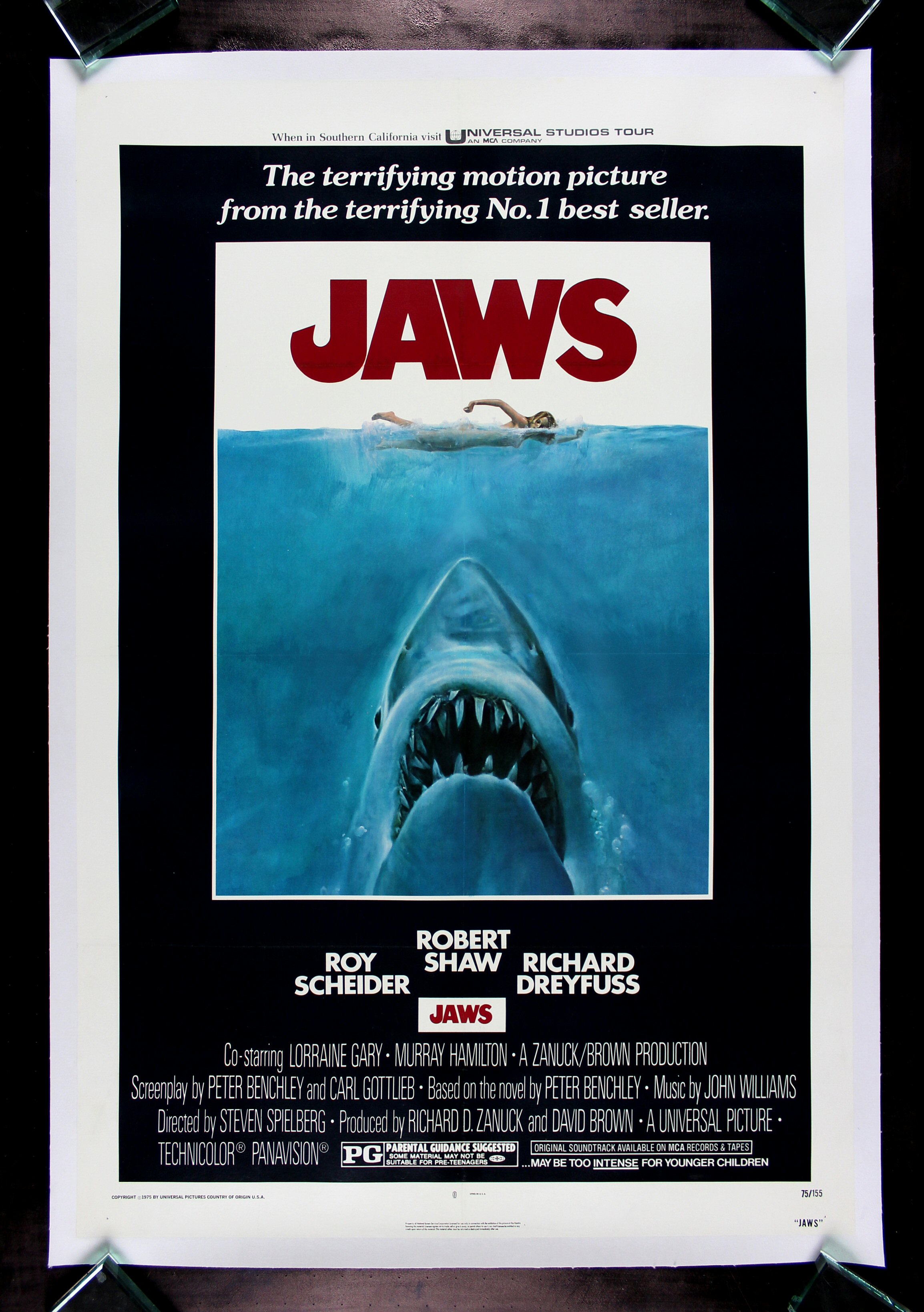
How is a poster of a giant shark about to attack a scantily clad woman not an "expectations-stroking genre label" for a film like Jaws? It's hard to imagine a more on the nose poster.
posted by yoink at 12:52 PM on July 30, 2013 [1 favorite]
How is a poster of a giant shark about to attack a scantily clad woman not an "expectations-stroking genre label" for a film like Jaws? It's hard to imagine a more on the nose poster.
posted by yoink at 12:52 PM on July 30, 2013 [1 favorite]
Some of these are kinda cheating
Agreed. Many, if not most, of the yellow "big independent film" movie posters this guy includes aren't the official US movie poster, but are from overseas releases or DVD issues. That said, cannot wait to see Michael Cera in Crystal Fairy & the Magical Cactus.
For a while there, I was collecting examples of 21st century movie posters that already look dated. Here are two, both from 2000: Pay it Forward, Almost Famous and
posted by wensink at 1:08 PM on July 30, 2013
Jeebus. I didn't know the "Tom Cruise Middle Tooth" thing was a thing. But there's a facebook page and a million GIS hits and stuff. It's at least as much of a thing as Stephen Colbert's asymmetrical ears, or Milton Berle's gigantic...oh never mind.
posted by Cookiebastard at 1:10 PM on July 30, 2013 [1 favorite]
posted by Cookiebastard at 1:10 PM on July 30, 2013 [1 favorite]
Jeebus. I didn't know the "Tom Cruise Middle Tooth" thing was a thing.
Dig deeper. This is one of Metafilter's X-files. The truth is Out There.
posted by ereshkigal45 at 1:30 PM on July 30, 2013 [5 favorites]
Dig deeper. This is one of Metafilter's X-files. The truth is Out There.
posted by ereshkigal45 at 1:30 PM on July 30, 2013 [5 favorites]
Jimmy Durante's nose. Can't unsee.
posted by octobersurprise at 1:32 PM on July 30, 2013
posted by octobersurprise at 1:32 PM on July 30, 2013
The truth is Out There.
Surely you meant ‘the tooth is Out There.’
p.s. I didn't realize ‘the tooth thing’ was a thing either. Now I’m trying to hold myself back from looking at any photos, so I won’t have to unsee them.
posted by LeLiLo at 1:46 PM on July 30, 2013
Surely you meant ‘the tooth is Out There.’
p.s. I didn't realize ‘the tooth thing’ was a thing either. Now I’m trying to hold myself back from looking at any photos, so I won’t have to unsee them.
posted by LeLiLo at 1:46 PM on July 30, 2013
I think Megan Fox's thumbs are adorbs.
posted by Mister_A at 1:50 PM on July 30, 2013 [1 favorite]
posted by Mister_A at 1:50 PM on July 30, 2013 [1 favorite]
The best movie posters are the ones made in Communist Poland. Previously
posted by Renoroc at 1:58 PM on July 30, 2013
posted by Renoroc at 1:58 PM on July 30, 2013
How do you properly express your tough-love relationship? By standing back to back!
Wait is this not how other people express their tough-love relationships in real life
posted by threeants at 2:06 PM on July 30, 2013 [1 favorite]
Wait is this not how other people express their tough-love relationships in real life
posted by threeants at 2:06 PM on July 30, 2013 [1 favorite]
In a way, they're clichés for a reason. The black and white photo with a shock of red flame tells you that it's an action movie. That's a feature, not a bug. Posters exist to grab your attention as you're walking by, and if you're into action flicks or romantic comedies, and see the corresponding layout and theme on a poster out in the world, you may stop to look at it to see who's in it and what the title is and, more importantly, when it's coming out.
Is it terribly original? No. Does it accomplish a very specific task? Absolutely.
posted by moviehawk at 2:11 PM on July 30, 2013
Is it terribly original? No. Does it accomplish a very specific task? Absolutely.
posted by moviehawk at 2:11 PM on July 30, 2013
For a while there, I was collecting examples of 21st century movie posters that already look dated. Here are two, both from 2000: Pay it Forward, Almost Famous and
I know you said two, but you're leaving me hangin' here. THERE MUST BE ONE MORE!
posted by potsmokinghippieoverlord at 2:12 PM on July 30, 2013 [1 favorite]
I know you said two, but you're leaving me hangin' here. THERE MUST BE ONE MORE!
posted by potsmokinghippieoverlord at 2:12 PM on July 30, 2013 [1 favorite]
Is it terribly original? No. Does it accomplish a very specific task? Absolutely.
Indeed. Some of the best art is that which nails the convention(s) perfectly.
I await the day those that go on about how nothing is original anymore or this and that isn't good because it's conventional do so in a language they invented themselves and that no one else understands.
That said, this is truly a horrible poster. I suspect that those who made this poster would feature someone piggy backing someone running for a movie called On the Run.
posted by juiceCake at 2:17 PM on July 30, 2013 [3 favorites]
If you had Tom Cruise's troubles, you might be Tom Cruise Crazy too!
posted by blue_beetle at 2:36 PM on July 30, 2013
posted by blue_beetle at 2:36 PM on July 30, 2013
Blue and yellow don't get to be cliches.
posted by jenlovesponies at 3:04 PM on July 30, 2013
posted by jenlovesponies at 3:04 PM on July 30, 2013
It's only when it's gone do you realise what you've lost
(Oh and if you google around you can find full on conspiracy theories regarding Cruise's Middle Tooth)
posted by fearfulsymmetry at 3:19 PM on July 30, 2013 [1 favorite]
(Oh and if you google around you can find full on conspiracy theories regarding Cruise's Middle Tooth)
posted by fearfulsymmetry at 3:19 PM on July 30, 2013 [1 favorite]
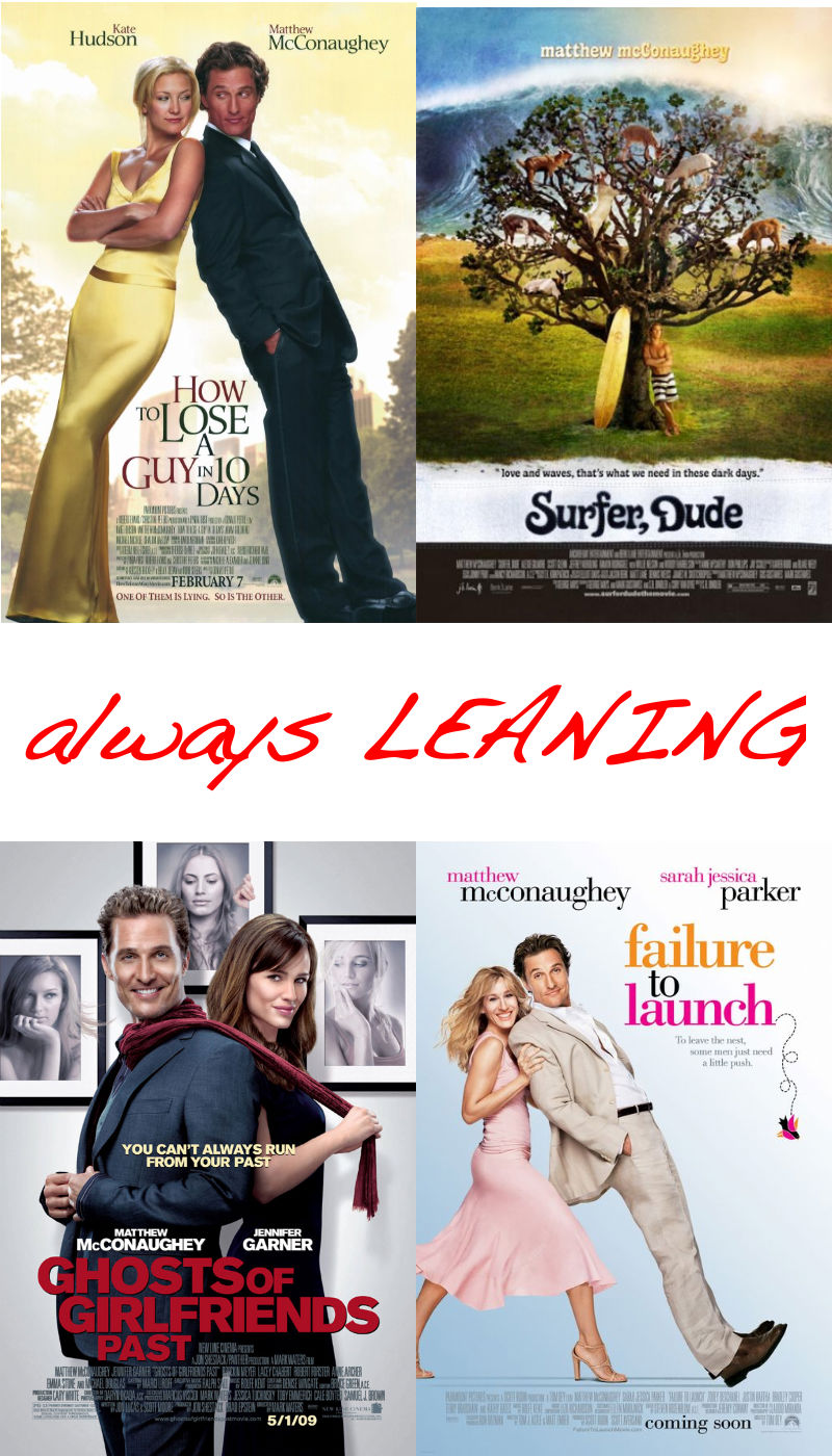
Matthew Mcconaughey - always leaning
Listened to fairly recently radio interview where this was pointed out to him... he took it well.
posted by fearfulsymmetry at 3:24 PM on July 30, 2013
Listened to fairly recently radio interview where this was pointed out to him... he took it well.
posted by fearfulsymmetry at 3:24 PM on July 30, 2013
#16: If there are faces lined up under names, the names will not match up with the faces.
posted by MtDewd at 3:36 PM on July 30, 2013 [1 favorite]
posted by MtDewd at 3:36 PM on July 30, 2013 [1 favorite]
To be fair, illustrating The Eye with anything except, well, and eye, is either trying too hard or not ahrd enough.
posted by GenjiandProust at 5:14 PM on July 30, 2013
posted by GenjiandProust at 5:14 PM on July 30, 2013
Matthew Mcconaughey - always leaning
I think that says more about the characters he has played in the last decade than about the posters.
posted by Kaiverus at 5:21 PM on July 30, 2013
I think that says more about the characters he has played in the last decade than about the posters.
posted by Kaiverus at 5:21 PM on July 30, 2013
I just learned from this thread that I have weird thumbs (not the Megan Fox condition, but I also now realize that my boss has that).
posted by nev at 6:34 PM on July 30, 2013
posted by nev at 6:34 PM on July 30, 2013
HOW HAVE I NEVER NOTICED THE TOOTH
posted by elizardbits at 9:31 PM on July 30, 2013 [1 favorite]
posted by elizardbits at 9:31 PM on July 30, 2013 [1 favorite]
I wish to have this memory professionally expunged.
posted by elizardbits at 9:31 PM on July 30, 2013
posted by elizardbits at 9:31 PM on July 30, 2013
I wish to have this memory professionally expunged.
I believe there's a movie where Jim Carrey's blindfolded hero must face the justice of erasing his memories.
I checked and the original makes the connection to blindfolded justice as well. I'm a little disappointed that he doesn't reference The Sex Pistols "God Save the Queen" which is what this motif tends to make me think of.
posted by RobotHero at 10:52 AM on July 31, 2013
Movie Poster Ideas that Are Used Sometimes
posted by RobotHero at 12:22 PM on July 31, 2013 [1 favorite]
posted by RobotHero at 12:22 PM on July 31, 2013 [1 favorite]
For a while there, I was collecting examples of 21st century movie posters that already look dated. Here are two, both from 2000: Pay it Forward, Almost Famous and
I know you said two, but you're leaving me hangin' here. THERE MUST BE ONE MORE!
Pesky edit timer got me before I could delete that "and." But since you asked, I give you Erin Brockovich.
posted by wensink at 8:01 AM on August 1, 2013
I know you said two, but you're leaving me hangin' here. THERE MUST BE ONE MORE!
Pesky edit timer got me before I could delete that "and." But since you asked, I give you Erin Brockovich.
posted by wensink at 8:01 AM on August 1, 2013
Yeah, but that one was already "dated" when it came out because it needed to go along with the Norma Rae/Silkwood/Presidents' Men retro crusader vibe of the movie.
posted by FelliniBlank at 10:39 AM on August 1, 2013
posted by FelliniBlank at 10:39 AM on August 1, 2013
« Older Sketch comedy made by men. Or whatever. | They aren't the weakest link Newer »
This thread has been archived and is closed to new comments
posted by weapons-grade pandemonium at 10:29 AM on July 30, 2013 [15 favorites]