Everybody Dots Now
August 14, 2013 10:03 AM Subscribe
Dustin Cable, a researcher at the University of Virginia's Weldon Cooper Center for Public Service, has created a map of the United States incorporating 2010 US Census data. 308,745,538 colored dots represent every citizen of the United States (as of 2010, anyway.)
♬ Am I bluuuuuue ... ♬
posted by ZenMasterThis at 10:06 AM on August 14, 2013 [1 favorite]
posted by ZenMasterThis at 10:06 AM on August 14, 2013 [1 favorite]
/looks at yellow and red splotch on the western end of the Richmond bridge, in otherwise very blue Marin county
Yup, San Quentin is still there.
posted by rtha at 10:09 AM on August 14, 2013 [1 favorite]
Yup, San Quentin is still there.
posted by rtha at 10:09 AM on August 14, 2013 [1 favorite]
It's so neat to see the dots spaced out every so often on the great plains roadways.
Actually the whole thing is neat, thanks for this.
posted by RolandOfEld at 10:10 AM on August 14, 2013
Actually the whole thing is neat, thanks for this.
posted by RolandOfEld at 10:10 AM on August 14, 2013
Beautiful, and a great reminder of how open some places in the country are.
You have to zoom waaay out to see Alaska and Hawaii, and because of the low population densities compared to the eastern portion of the continental US, it's really hard to get a feeling for the shape of Alaska.
posted by filthy light thief at 10:11 AM on August 14, 2013
You have to zoom waaay out to see Alaska and Hawaii, and because of the low population densities compared to the eastern portion of the continental US, it's really hard to get a feeling for the shape of Alaska.
posted by filthy light thief at 10:11 AM on August 14, 2013
This really drives home just how empty much of the west still is.
This is neat, thanks.
posted by ambrosia at 10:12 AM on August 14, 2013
This is neat, thanks.
posted by ambrosia at 10:12 AM on August 14, 2013
Aww, 5 dots at 1600 Pennsylvania Ave.
posted by troika at 10:13 AM on August 14, 2013 [10 favorites]
posted by troika at 10:13 AM on August 14, 2013 [10 favorites]
Zooming all the way out it's so odd how, at about halfway across the country in an almost perfect line, the population density changes dramatically. It seems to track very roughly with I-35. Cool.
posted by DiscourseMarker at 10:14 AM on August 14, 2013 [1 favorite]
posted by DiscourseMarker at 10:14 AM on August 14, 2013 [1 favorite]
For fun/posterity (as long as these images last on a random free host): the continental US, and the continental US, Hawaii, and Alaska. Sorry if I cut off part of Alaska, it's hard to tell where it begins and ends.
posted by filthy light thief at 10:18 AM on August 14, 2013
posted by filthy light thief at 10:18 AM on August 14, 2013
And just to get this out of the way... and not that I care but it was the best logical checksum I could come up with.
Either someone was trolling or the data wasn't uber-clean or the program has some erratic behavior, all of which is totally understandable with something like this, because there are a few dots in Yellowstone National Park where no one, and I mean no one, 'lives'. The dots around the gateway cities, Mammoth Hot Springs, and Old Faithful seem accurate but there were a very, very few random ones* along the roadways in the interior of the park that just made no sense whatsoever. Unless the census takers caught some hitchhikers/hikers/cyclists and threw down a GPS pin where they stood or something....
*I did confirm they weren't specs of dust on my monitor, those were throwing me off for a bit as well.
Aaaaaanndddd ignore everything I said. It was throwing me off to just see one or two dots on very lonely/wild stretches of uninhabited highway though, unlike the distribution described above, which I do actually see in city parks and green spaces.
posted by RolandOfEld at 10:23 AM on August 14, 2013 [1 favorite]
Man, you zoom in a bit on the trans-pecos, and it looks like someone just barely smudged my nice clean monitor.
posted by Devils Rancher at 10:23 AM on August 14, 2013 [1 favorite]
posted by Devils Rancher at 10:23 AM on August 14, 2013 [1 favorite]
This completely messes up Orange is The New Black.
♬ Blue and Green Swirl...♬ just doesn't sound as good.
posted by Brandon Blatcher at 10:26 AM on August 14, 2013 [1 favorite]
♬ Blue and Green Swirl...♬ just doesn't sound as good.
posted by Brandon Blatcher at 10:26 AM on August 14, 2013 [1 favorite]
Yeah, Devils Rancher. At first, I thought the map wasn't loading right. I still think my county isn't even on this map.
Living down here in the biggest glob of yellow, I'm pretty surprised at how blue this country is. I expected a lot more color.
posted by byanyothername at 10:28 AM on August 14, 2013
Living down here in the biggest glob of yellow, I'm pretty surprised at how blue this country is. I expected a lot more color.
posted by byanyothername at 10:28 AM on August 14, 2013
Sigh, you can correlate local property values very highly with blue or orange dots on this map.
posted by tylerkaraszewski at 10:29 AM on August 14, 2013
posted by tylerkaraszewski at 10:29 AM on August 14, 2013
Remarkable to see that, where I used to live, not only were the African-American neighborhoods where I kind of expected them to be in a majority-caucasian area, but that there were a number of Asian-American neighborhoods that I wasn't aware of dotting the outer perimiter of the town. Huh. (Also kind of pleased to see my old neighborhood taking on a kind of compound of hues.)
posted by ardgedee at 10:29 AM on August 14, 2013
posted by ardgedee at 10:29 AM on August 14, 2013
It strikes me that the race classification is really such a product of its time that it is not that useful to anybody but us, at this moment only.
Someone from 100 years ago might ask "What about the Irish and the Jews and the Italians? They're all 'White' just like me?? That makes no sense!"
Hopefully someone 100 years from now would say "Ha! Colored dots! How ridiculous they were."
posted by vacapinta at 10:30 AM on August 14, 2013 [12 favorites]
Not enough zoom!
posted by Windopaene at 10:30 AM on August 14, 2013
posted by Windopaene at 10:30 AM on August 14, 2013
Also, whoa, the city of Buffalo is just three clearly defined N-S columns of race. Wow.
posted by troika at 10:32 AM on August 14, 2013
posted by troika at 10:32 AM on August 14, 2013
1. UVa! Woohoo!
2. the map was created by Dustin Cable
posted by LionIndex at 10:36 AM on August 14, 2013
2. the map was created by Dustin Cable
posted by LionIndex at 10:36 AM on August 14, 2013
It strikes me that the race classification is really such a product of its time that it is not that useful to anybody but us, at this moment only.
Heck I don't think it even matches what was on the census form - I remember that the "are you hispanic?" question was separate from the "what is your race?" question. I'm not sure how they interpreted this for the map...
posted by Zalzidrax at 10:41 AM on August 14, 2013
Heck I don't think it even matches what was on the census form - I remember that the "are you hispanic?" question was separate from the "what is your race?" question. I'm not sure how they interpreted this for the map...
posted by Zalzidrax at 10:41 AM on August 14, 2013
I was scooting around the map, roughly around the confluence of VT, MA, and NY, when I saw what looked like a majority-Black town. The more I zoomed in, the odder it looked: its borders were very abrupt, and not organic looking at all. Then I realized what I was looking at: a jail. Specifically the Great Meadow Correctional Facility in Comstock, NY.
We are really failing the whole equality thing as a nation, aren't we?
posted by ocherdraco at 10:43 AM on August 14, 2013 [11 favorites]
We are really failing the whole equality thing as a nation, aren't we?
posted by ocherdraco at 10:43 AM on August 14, 2013 [11 favorites]
Similar project previously (monochrome, but with Canada and Mexico added).
posted by gubo at 10:43 AM on August 14, 2013 [1 favorite]
posted by gubo at 10:43 AM on August 14, 2013 [1 favorite]
Today I learned there's no edit window for fixing typos in posts.
posted by emelenjr at 10:46 AM on August 14, 2013
posted by emelenjr at 10:46 AM on August 14, 2013
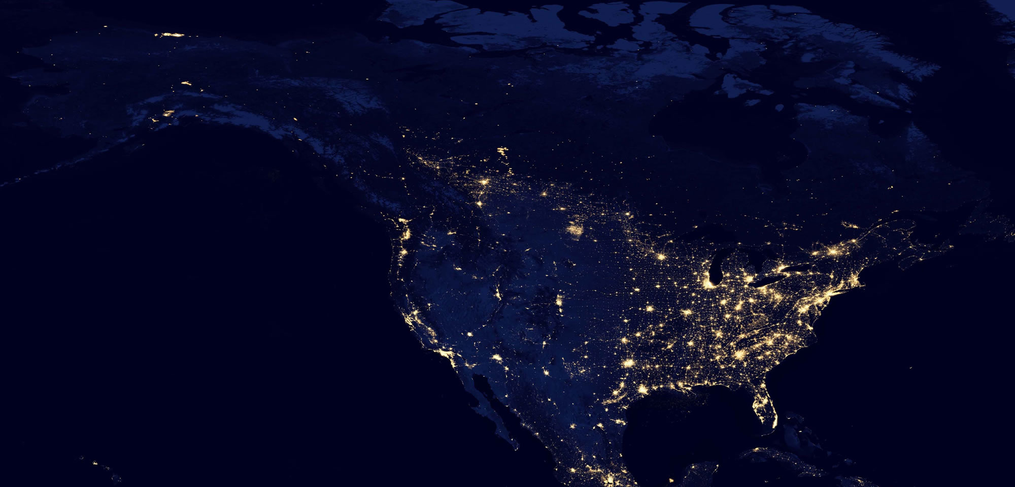
Holy shit this looks just like the Verizon wireless coverage map. MIND. BLOWN.
posted by Ratio at 10:48 AM on August 14, 2013 [1 favorite]
posted by Ratio at 10:48 AM on August 14, 2013 [1 favorite]
Parts of the Northeast are so white, they are purple.
posted by MoxieProxy at 10:51 AM on August 14, 2013
posted by MoxieProxy at 10:51 AM on August 14, 2013
Heck I don't think it even matches what was on the census form - I remember that the "are you hispanic?" question was separate from the "what is your race?" question. I'm not sure how they interpreted this for the map...
The second link talks a bit about methodology, although I'm not sure it completely answers this question. The implication seems to be that anyone who ticked the "Hispanic" box gets coded "hispanic" regardless of what other boxes they ticked. (I.e., a "hispanic black" person gets coded "hispanic").
posted by yoink at 10:51 AM on August 14, 2013
Zooming all the way out it's so odd how, at about halfway across the country in an almost perfect line, the population density changes dramatically. It seems to track very roughly with I-35. Cool.
Matches this map pretty well -- west of the 100th meridian is about where irrigation becomes necessary for agriculture.
posted by Killick at 10:56 AM on August 14, 2013 [5 favorites]
Matches this map pretty well -- west of the 100th meridian is about where irrigation becomes necessary for agriculture.
posted by Killick at 10:56 AM on August 14, 2013 [5 favorites]
Aaaannndddd, this is why I live west of the Mississippi.
posted by Confess, Fletch at 10:59 AM on August 14, 2013
posted by Confess, Fletch at 10:59 AM on August 14, 2013
"What about the Irish and the Jews and the Italians? They're all 'White' just like me?? That makes no sense!"
I dare you to say that to a White Irish/Italian Jew.
posted by srboisvert at 11:01 AM on August 14, 2013
I dare you to say that to a White Irish/Italian Jew.
posted by srboisvert at 11:01 AM on August 14, 2013
Parts of the Northeast are so white, they are purple.
We call that Wine Dark.
posted by srboisvert at 11:05 AM on August 14, 2013 [1 favorite]
We call that Wine Dark.
posted by srboisvert at 11:05 AM on August 14, 2013 [1 favorite]
srboisvert -- did you miss the "Someone from 100 years ago" at the beginning of that sentence?
posted by Now there are two. There are two _______. at 11:05 AM on August 14, 2013
posted by Now there are two. There are two _______. at 11:05 AM on August 14, 2013
Zalzidrax, as yoink, points out in the "What am I Looking at?" link, you can see that they abstracted out five race categories:
"Five racial categories were created based on the data in table P5: non-Hispanic White, non-Hispanic Black, non-Hispanic Asian, Hispanic or Latino, and a category for all other racial categories including the multiracial identifications. The sum of all five categories equals the total population."
This sort of combination and recombination of categories for simplicity's sake is pretty common when presenting US Census data; as you reference, race and ethnicity are separate categories. There are six race categories in the most recent Census (White, Black or African-American, Asian, American Indian or Alaska Native, Native Hawaiian or Pacific Islander, and Other). In addition, the race question allows for multiple responses (check all that apply). So, even before considering ethnicity, there are 720 different possible combinations of races. (This doesn't even take into account the huge numbers of potential write-ins: the Other race allows for write-in, as does Native American Tribe, Asian race group, and Pacific Islander group). Add the separate dimension of ethnicity (Hispanic or Latino vs Not Hispanic or Latino), which applies once to the person, and you have 1440 different categories to display, if you don't combine for clarity.
So, most people (and many of the official tables in the summary files), collapse all 'multiple response' to the race question to one category "Two or More Races." This simplifies things a great deal, but it still is pretty unwieldy for visualization (this would be fourteen different categories).
Another common grouping (as they do here) is to group anyone, regardless of race, who answered "Yes" to the Hispanic or Latino question, into one collective group, "Hispanic or Latino, all races." Then you can preserve the ability to sum to the total by presenting exclusively Non-Hispanic categories with it: Non-Hispanic White, Non-Hispanic Black, etc.
By this point, you're slicing and dicing the data quite a bit for clarity's sake, so there's no reason not to abstract a little more, to make the visualization as clear and distinct as possible. They've chosen to group all Native Hawaiian/Pacific Islanders, Other, Native American/Alaska Natives and multiple race people into one wastebasket category. This is probably because the number of dots are so few that it would add needless complexity to a countrywide map.
Methodology aside, this is a lovely map. Reminds me of the Census Bureau's 'night time' population distribution map, which is also really nice. In fact, I'd love to see how this map looks with a black background instead of a white one. I'll be it'd be pretty striking.
posted by Eldritch at 11:05 AM on August 14, 2013 [2 favorites]
The map suggests that there are predominantly Asian neighborhoods in DC. Chinatown makes sense, but I've never noticed this in Scott Circle, Shaw, or Upper Northwest. Columbia Heights is also considerably more Hispanic than I'd thought. I don't see *any* blue in my neighborhood.
I don't understand the ultra-dense pockets of hispanics that seem to be spread across Northern Virginia.
Silver Spring is one of the least segregated places I've seen...
posted by schmod at 11:27 AM on August 14, 2013
I don't understand the ultra-dense pockets of hispanics that seem to be spread across Northern Virginia.
Silver Spring is one of the least segregated places I've seen...
posted by schmod at 11:27 AM on August 14, 2013
predominantly Asian neighborhoods in DC
I am wondering if the prevalence of red in those areas might be a layering issue. Those living in apartment buildings would have the dots stacked and Asian could just be the layer on top.
posted by troika at 11:46 AM on August 14, 2013
I am wondering if the prevalence of red in those areas might be a layering issue. Those living in apartment buildings would have the dots stacked and Asian could just be the layer on top.
posted by troika at 11:46 AM on August 14, 2013
Oh wait that doesn't make sense, then it would be really red everywhere, not just a few distinct blocks. Never mind.
posted by troika at 11:50 AM on August 14, 2013
posted by troika at 11:50 AM on August 14, 2013
I don't understand the ultra-dense pockets of hispanics that seem to be spread across Northern Virginia.
They are apartment buildings, or complexes of fairly multiple apartment buildings. E.g. this complex, which is relatively easy to find on the dotmap if you want (look for the shopping plaza which appears as a blank spot along Rt 7). It is a low-rise high-density apartment complex in the middle of what are otherwise low-density single family housing units. That one in particular is referred to generically as "Culmore" and happens to be almost entirely Salvadoran.
Interestingly though, the apartment complex just up the street (NE along Leesburg Pike; Munson Hill Towers for locals) is probably higher-density, but it doesn't appear as striking on the map because it's much more diverse. It's a high-rise tower, though.
posted by Kadin2048 at 12:02 PM on August 14, 2013 [1 favorite]
The stark racial dividing lines in Detroit, especially 8-Mile Road, still shock me every time I see a map like this.
posted by rocket88 at 12:22 PM on August 14, 2013
posted by rocket88 at 12:22 PM on August 14, 2013
Many large cities appear to be mostly Asian on the map. I think this is just because the bright red dots really drown out every other color used. I'd suggest using colors that blend better.
posted by miyabo at 12:23 PM on August 14, 2013
posted by miyabo at 12:23 PM on August 14, 2013
Either someone was trolling or the data wasn't uber-clean or the program has some erratic behavior, all of which is totally understandable with something like this, because there are a few dots in Yellowstone National Park where no one, and I mean no one, 'lives'.
Dots Located in Parks, Cemeteries, and Lakes:
The locations of the dots do not represent actual addresses. The most detailed geographic identifier in Census Bureau data is the census block. Individual dots are randomly located within a particular census block to match aggregate population totals for that block. As a result, dots in some census blocks may be located in the middle of parks, cemeteries, lakes, or other clearly non-residential areas within that census blockposted by kirkaracha at 12:36 PM on August 14, 2013 [2 favorites]
The map suggests that there are predominantly Asian neighborhoods in DC. Chinatown makes sense, but I've never noticed this in Scott Circle, Shaw, or Upper Northwest. Columbia Heights is also considerably more Hispanic than I'd thought. I don't see *any* blue in my neighborhood.
Red does tend to pop forward and dominate, but knowing that--and maybe it's because I have more Asian friends than the average DC resident--but it doesn't seem strange to me. You correctly identified Chinablock, but note that the block by Scott Circle (and especially Foggy Bottom) contain a lot of student housing, and there are more Asians at places like the UC in DC center (and GW) than in the general population. Upper Northwest doesn't seem that surprising either, considering "red" encompasses both South and East Asians, who often do well economically.
And yes, Columbia Heights is very Hispanic/black. The white kids partying at Wonderland are still a small part of the neighborhood.
posted by psoas at 12:52 PM on August 14, 2013 [3 favorites]
Yep, Philly's still segregated.
posted by madcaptenor at 12:52 PM on August 14, 2013
posted by madcaptenor at 12:52 PM on August 14, 2013
And yes, Columbia Heights is very Hispanic/black. The white kids partying at Wonderland are still a small part of the neighborhood.
Also, this is 2010 data. Columbia Heights' gentrification had been going on for a while before that, yeah, but the neighborhood has gotten a lot whiter over the past three years.
posted by troika at 12:58 PM on August 14, 2013 [1 favorite]
Also, this is 2010 data. Columbia Heights' gentrification had been going on for a while before that, yeah, but the neighborhood has gotten a lot whiter over the past three years.
posted by troika at 12:58 PM on August 14, 2013 [1 favorite]
I'd be more interested in Firefox, IE, Chrome and Safari dots.
Followed by a rainbow of dots representing percent of mortgage paid off.
posted by Twang at 5:08 PM on August 14, 2013
Followed by a rainbow of dots representing percent of mortgage paid off.
posted by Twang at 5:08 PM on August 14, 2013
This is the coolest map I have ever seen. Is other census data put to this granularity?
posted by chemoboy at 6:51 PM on August 14, 2013
posted by chemoboy at 6:51 PM on August 14, 2013
Because of this map, I'm going to start referring to myself as the Pale Blue Dot.
posted by schmod at 8:42 PM on August 14, 2013 [1 favorite]
posted by schmod at 8:42 PM on August 14, 2013 [1 favorite]
psoas: "Upper Northwest doesn't seem that surprising either, considering "red" encompasses both South and East Asians, who often do well economically."
I wasn't trying to make any sort of economic/qualitative observation there. Walking around on the city, I simply don't notice a higher percentage of Asians in upper northwest than I would in other economically-similar areas of the city (ie. Capitol Hill).
That being said, I'm wondering if there actually are layering issues in dense tracts, given that it instinctively feels like the yellow/red dots are overstated in those areas (ie. if two dots are drawn on the same pixel, does one color always take precedence?).
posted by schmod at 8:48 PM on August 14, 2013
Zooming all the way out it's so odd how, at about halfway across the country in an almost perfect line, the population density changes dramatically. It seems to track very roughly with I-35. Cool.
Matches this map pretty well -- west of the 100th meridian is about where irrigation becomes necessary for agriculture.
Also matches this map. Thanks for the irrigation explanation. I had noticed this a while back, and wondered what the underlying cause might be.
posted by LEGO Damashii at 10:27 AM on August 15, 2013 [1 favorite]
« Older This Charming Charlie | Putting a New C in CSI Newer »
This thread has been archived and is closed to new comments
posted by briank at 10:05 AM on August 14, 2013 [2 favorites]