UNfair Use
November 27, 2013 3:17 AM Subscribe
LogoThief is a new blog that "exists to name and shame logo thieves and all others who plagiarize the work of logo designers." Some are more subtle copies of form and/or color, some are minimally altered, and some are pure photocopy jobs. Some mix parts of two other logos into a rip-off hybrid. And then there are the multiple offenders, where logos are so good that they get stolen by many copycats or coffee copiers or just hand/eye appropriators.
bitch stole my html!
posted by thelonius at 4:48 AM on November 27, 2013 [3 favorites]
posted by thelonius at 4:48 AM on November 27, 2013 [3 favorites]
Um, the Taoist fish from the Japanese restaurants? Really that's a stolen logo? I wonder which church came up with the Cross logo that the others have all stolen?
posted by The 10th Regiment of Foot at 4:51 AM on November 27, 2013 [3 favorites]
posted by The 10th Regiment of Foot at 4:51 AM on November 27, 2013 [3 favorites]
Funny thing is: on graphic design forums where they routinely complain about stuff like this you also see queries wondering where they might download a piece of music or a font from.
posted by epo at 4:56 AM on November 27, 2013 [8 favorites]
posted by epo at 4:56 AM on November 27, 2013 [8 favorites]
Really that's a stolen logo?
I suspect a bit of digging will reveal that most of them fit into that appropriated-and-reappropriated slot. All art is theft, but it seems like newly-minted, soi-disant "designers" would rather act shocked and pretend they don't know that.
You know what another word for artistic appropriation is? Art. Perhaps not coincidentally: I've seen a variation on that ball-with-a-mask logo somewhere before.
posted by mhoye at 5:02 AM on November 27, 2013 [2 favorites]
Really that's a stolen logo?
It's not the concept of the taoist fish themselves that's stolen. Rather it's the actual art. There are limitless ways in which one could draw the fish. It's pretty apparent that the thieves simply removed a few external flourishes and left the fish themselves intact from the original and called it a day. That qualifies as stolen in my book.
posted by Thorzdad at 5:11 AM on November 27, 2013 [9 favorites]
Yeah, artistic appropriation does not mean save a copy of a logo from a website, import it into illustrator, and trace directly over the existing artwork. Which is exactly what happened with that fish logo.
And btw, when I say "artwork" I don't mean capital A Art. I don't think many designers think the work they do is Art. Design is a paid profession, with standards of professional conduct and skills that take years to develop. Yes, you need to have a bit of an eye towards trends and styles, and yes you should be living and participating in a contemporary ecosystem of visual design which might involve being inspired by others work.
Would you guys be equally incredulous if someone took a short story, re-wrote it but used the same plot points and characters with different names, and then passed it off as their own work and was paid for it?
posted by fontophilic at 5:15 AM on November 27, 2013 [11 favorites]
Excusing crap like this with "all art is theft" is just lame.
I can imagine making that fish logo is 15 hours of research, that might deliver 3-4 reference images, then you draw it manually for 4 hours, spend 2 hours tracing it and then 2-10 hours getting the vectors *just right*.
This is assuming that he took the easy legit way.
Then he has to convince the client to buy it, perhaps risk losing pay for his work if the client doesn't.
If he does everything right, he maybe gets paid decently.
The thief can charge the same as the original author. If he can get a hold of a digital vector version of the logo he's stealing, he just needs to add a bit of dodgy fontage, and voila! he's got 15 minutes of work to sell for a bunch of moneys. Then later his client finds out that there's a bunch of logos that look just like his, and decides, and tells his friends that they should pay 50 bucks for a logo tops.
posted by svenni at 5:18 AM on November 27, 2013 [3 favorites]
I can't believe somebody would make, steal, or have a problem with the theft of this shitty CAT logo.
posted by entropone at 5:24 AM on November 27, 2013
posted by entropone at 5:24 AM on November 27, 2013
It's pretty apparent that the thieves simply removed a few external flourishes and left the fish themselves intact from the original and called it a day.
And where did the "original" come from? It's a common Taoist symbol that's been used over and over for hundreds of years in almost the exact form, even the red color is ancient symbolism!
posted by The 10th Regiment of Foot at 5:41 AM on November 27, 2013 [2 favorites]
And where did the "original" come from? It's a common Taoist symbol that's been used over and over for hundreds of years in almost the exact form, even the red color is ancient symbolism!
posted by The 10th Regiment of Foot at 5:41 AM on November 27, 2013 [2 favorites]
The Centre Methodist Church in Nottingham still makes me laugh logo-wise because it's on a major street and it's emblazoned across the front, and surely someone must have pointed it out at some time.
Then again, this is the town of the slightly crooked N...
posted by Katemonkey at 5:42 AM on November 27, 2013 [1 favorite]
Then again, this is the town of the slightly crooked N...
posted by Katemonkey at 5:42 AM on November 27, 2013 [1 favorite]
And where did the "original" come from? It's a common Taoist symbol that's been used over and over for hundreds of years in almost the exact form, even the red color is ancient symbolism!
Again, it's neither the basic shapes or the concept that is stolen here, it is the specific artistic representation of it. No one here invented the coffee cup or the letters c, o, f or e either, but directly copying someone else's representation is still "logo theft".
posted by spaltavian at 5:46 AM on November 27, 2013 [1 favorite]
it is the specific artistic representation of it.
And that was "stolen" from Japanese wood block prints. The reason the "fake" is so close is that it is a common symbol not original artwork.
posted by The 10th Regiment of Foot at 5:52 AM on November 27, 2013
And that was "stolen" from Japanese wood block prints. The reason the "fake" is so close is that it is a common symbol not original artwork.
posted by The 10th Regiment of Foot at 5:52 AM on November 27, 2013
Can you link to a picture of these two fish drawn exactly that way?
posted by SharkParty at 5:54 AM on November 27, 2013 [3 favorites]
posted by SharkParty at 5:54 AM on November 27, 2013 [3 favorites]
I swear to God, can someone make like a portable Cory Doctorow app or something so I can just scan something in front of me with my phone and have it tell me whether I'm looking at contemptible theft of intellectual property or artistically laudable recontextualization/remixing of cultural artifacts being enclosed by contemptible old-economy rent seekers.
Because I cannot figure out for the life of me which is which and I don't know who to praise and who to hold in contempt, and I don't even want to look at anything anymore.
Or listen.
And I'm a little worried about smelling things. I know all those celebrities aren't really crafting their own fragrances in their designer kitchens...
posted by Naberius at 5:59 AM on November 27, 2013 [8 favorites]
Naberius: A good hint that something was an "artistically laudable recontextualization/remixing" would be if it were either:
1. Recontextualized, e.g. not in a logo. If someone does a painting where a character in is has the Quaker Oats logo for a head, it's not plagiarism, clearly. If you just trace the logo, it is.
2. Remixed. This is why I'm a little iffy about that combined-logos post, it's actually a fair bit of creativity to get them combined like that. Not saying it's a great way to make logos, but at least it's not a blatant ripoff or risking trademark infringement lawsuits.
posted by thegears at 6:09 AM on November 27, 2013
Can you link to a picture of these two fish drawn exactly that way?
Sure, knock yourself out.
posted by The 10th Regiment of Foot at 6:10 AM on November 27, 2013 [1 favorite]
Sure, knock yourself out.
posted by The 10th Regiment of Foot at 6:10 AM on November 27, 2013 [1 favorite]
none of those are the same drawing.
posted by SharkParty at 6:15 AM on November 27, 2013 [8 favorites]
posted by SharkParty at 6:15 AM on November 27, 2013 [8 favorites]
Exactly, SharkParty. Yin Yang Koi is a common symbol. The shame-page is pointing out theft via a near-exact tracing.
posted by surplus at 6:17 AM on November 27, 2013 [2 favorites]
posted by surplus at 6:17 AM on November 27, 2013 [2 favorites]
surely someone must have pointed it out at some time.
I'm a little embarrassed to ask, but: pointed what out?
posted by ook at 6:24 AM on November 27, 2013 [3 favorites]
I'm a little embarrassed to ask, but: pointed what out?
posted by ook at 6:24 AM on November 27, 2013 [3 favorites]
The sad thing is that most of these business owners probably have no idea. They just contracted with a designer who was supposed to come up with something original but instead ripped off some other better designer.
posted by octothorpe at 6:25 AM on November 27, 2013
posted by octothorpe at 6:25 AM on November 27, 2013
Yeah it's sad when they don't know, but it's sucks worse when they do know and they don't care.
But that's the nature of this argument. Designers and other visual creators get upset because we KNOW THE RULES, but it's pretty common for everyone else to just shrug it off. Even right in this thread there are multiple "what's the big deal" posts!
posted by SharkParty at 6:35 AM on November 27, 2013 [2 favorites]
none of those are the same drawing.
I'm not going to spend my day sifting images to make this point. That symbol is used in that form, in that color, all over East Asia. That two people drew it in very similar fashion could be coincidence, it could be theft, or more likely they both borrowed it from any number of restaurants or shops or food wrappers or bags or tee shirts or pieces of trash or whatever that you can find an almost identical symbol on.
posted by The 10th Regiment of Foot at 6:35 AM on November 27, 2013
See?
posted by SharkParty at 6:36 AM on November 27, 2013 [14 favorites]
posted by SharkParty at 6:36 AM on November 27, 2013 [14 favorites]
A lot of these are less "Logo, thief!" and more "Logo, get over it you weren't original either."
posted by borges at 6:43 AM on November 27, 2013
posted by borges at 6:43 AM on November 27, 2013
Foot, no one is debating if the koi is or is not a historical symbol. We are not saying that every single drawing of the fish ever done is a theft of artwork. No one is debating red is a color that is used in conjunction with the koi symbol.
The "restaurants or shops or food wrappers or bags or tee shirts or pieces of trash or whatever" were also designed by people, they're not some spontaneous kruft that seeps from the sidewalk unbidden and organically.
posted by fontophilic at 6:44 AM on November 27, 2013 [9 favorites]
The "restaurants or shops or food wrappers or bags or tee shirts or pieces of trash or whatever" were also designed by people, they're not some spontaneous kruft that seeps from the sidewalk unbidden and organically.
posted by fontophilic at 6:44 AM on November 27, 2013 [9 favorites]
It's pretty skanky just to clone somebody else's design with minimal or no changes. But I'm not at all certain that what an "original" logo designer does is always, or even usually, original enough to deserve protection either legal or moral.
Consider the World's Most Plagiarized Logo", which looks to me to represent a case of picking common design elements out of the zeitgeist and putting them together.
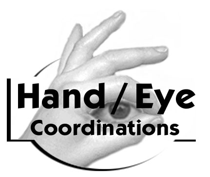
Hands-encircling-eyeball zeitgeist:
example 1 on page
example 2 on page
example 3 on page
example 4 on page
example 5 on page
example 6 on page
Pointy-fingered hand zeitgeist:
example 1
example 2
example 3 on page
example 4 on page
example 5 on page
I myself feel that the "putting the elements together" part, together with the work of making them into a finished piece, can be enough for a logo designer to justifiably say "This is mine" rather than "This is a pastiche." Against that, though, if you're a designer working with common zeitgeist elements, there's a cartain President of the United States who would say If you designed a logo, you didn't make that. Somebody else made that happen. So name your poison.
posted by jfuller at 6:46 AM on November 27, 2013
Consider the World's Most Plagiarized Logo", which looks to me to represent a case of picking common design elements out of the zeitgeist and putting them together.
Hands-encircling-eyeball zeitgeist:
example 1 on page
example 2 on page
example 3 on page
example 4 on page
example 5 on page
example 6 on page
Pointy-fingered hand zeitgeist:
example 1
example 2
example 3 on page
example 4 on page
example 5 on page
I myself feel that the "putting the elements together" part, together with the work of making them into a finished piece, can be enough for a logo designer to justifiably say "This is mine" rather than "This is a pastiche." Against that, though, if you're a designer working with common zeitgeist elements, there's a cartain President of the United States who would say If you designed a logo, you didn't make that. Somebody else made that happen. So name your poison.
posted by jfuller at 6:46 AM on November 27, 2013
Beats by Dre (circa 2008)
BigFix (circa 2001)
posted by deadmessenger at 6:53 AM on November 27, 2013 [2 favorites]
BigFix (circa 2001)
posted by deadmessenger at 6:53 AM on November 27, 2013 [2 favorites]
That two people drew it in very similar fashion could be coincidence,
No, they are not "very similar". The copy is identical to the original with a few elements cropped out. It's the difference between The Hidden Fortress inspiring Star Wars and somebody releasing an exact duplicate of Star Wars with a few scenes cut out as their own movie.
posted by kmz at 6:54 AM on November 27, 2013 [7 favorites]
surely someone must have pointed it out at some time.
I'm a little embarrassed to ask, but: pointed what out?
The fallacy of their assumption that no one uses Firefox.
posted by fuse theorem at 6:57 AM on November 27, 2013 [1 favorite]
I'm a little embarrassed to ask, but: pointed what out?
The fallacy of their assumption that no one uses Firefox.
posted by fuse theorem at 6:57 AM on November 27, 2013 [1 favorite]
I think that for many people the finer points of graphic design are just completely lost on them - "Arial looks identical to Helvetica" and you won't be able to convince them otherwise.
posted by Lanark at 6:57 AM on November 27, 2013 [7 favorites]
posted by Lanark at 6:57 AM on November 27, 2013 [7 favorites]
Xbox Logo
Xerox Logo
They're vaguely similar concepts but other than that I don't see it.
posted by kmz at 6:59 AM on November 27, 2013
Xerox Logo
They're vaguely similar concepts but other than that I don't see it.
posted by kmz at 6:59 AM on November 27, 2013
> whether I'm looking at contemptible theft of intellectual property or artistically laudable recontextualization/remixing …
Both. It's always both. Make money from a recognizable part of a logo? Gelt by association, I'm afraid.
posted by scruss at 7:00 AM on November 27, 2013
Both. It's always both. Make money from a recognizable part of a logo? Gelt by association, I'm afraid.
posted by scruss at 7:00 AM on November 27, 2013
I think that for many people the finer points of graphic design are just completely lost on them
Likewise, I think many people lost in the finer points of graphic design can lose focus on some of the larger issues of cultural iconography, public domain, and derivative uses.
posted by The 10th Regiment of Foot at 7:04 AM on November 27, 2013 [1 favorite]
Likewise, I think many people lost in the finer points of graphic design can lose focus on some of the larger issues of cultural iconography, public domain, and derivative uses.
posted by The 10th Regiment of Foot at 7:04 AM on November 27, 2013 [1 favorite]
There are several "gotcha" sites out there dedicated to sniffing out visual design ripoffs... one of the more famous ones that made the rounds was this site who piled on tons of convincing evidence against the T-shirt company David and Goliath.
One common theme that runs through the comments of these sites is that it's really difficult to pursue this legally. You have to bend over backwards to prove that they clearly traced your work and even then it's not really worth the trouble.
So in the cold dark world where it's impossible to convince even other computer professionals that making a logo from scratch requires hours of taste-based artistic decisions in Illustrator and isn't just a random force of nature, all we can do is commiserate in design ripoff blogs.
posted by SharkParty at 7:08 AM on November 27, 2013 [5 favorites]
Yeah, it's odd to me with the "hands encircling eye" and "yin/yang fish" that people are saying well, it's no big deal to exactly trace somebody else's work, because these are common themes anyway.
Yes, it's a common theme, but logo design is all about getting the shape and color and proportion just right. It's like saying that you might as well copy someone else's font, because you're all just appropriating the basic forms of the same Roman alphabet.
posted by ftm at 7:11 AM on November 27, 2013 [8 favorites]
Besides, we should all just contribute to culture for free because art is fun!!! Can you like, even OWN art?
posted by fontophilic at 7:14 AM on November 27, 2013 [1 favorite]
posted by fontophilic at 7:14 AM on November 27, 2013 [1 favorite]
> people are saying well, it's no big deal to exactly trace somebody else's work
Nb, that doesn't include my own post with all the links to common themes, supra. "It's pretty skanky just to clone somebody else's design with minimal or no changes" is that post's first line. Just notin'.
posted by jfuller at 7:50 AM on November 27, 2013
Nb, that doesn't include my own post with all the links to common themes, supra. "It's pretty skanky just to clone somebody else's design with minimal or no changes" is that post's first line. Just notin'.
posted by jfuller at 7:50 AM on November 27, 2013
Likewise, I think many people lost in the finer points of graphic design can lose focus on some of the larger issues of cultural iconography, public domain, and derivative uses.
Okay, I think I need you to explain these larger issues to me.
Does cultural iconography say that if you and I both draw a fish we're going to naturally make a "spot the differences" cartoon? ( This row of dots has only 2 dots instead of 5. The row of 3 dots on the tail is missing, and the row of 4 dots on the tail is shifted to the side. )
Or is the larger issue that if I have fish in a logo for a sushi restaurant, I'm just as bad as someone who traces a logo?
I'm kind of coming across as argumentative here, I guess, but I just mean, these all sound ridiculous, so I'm going to have to assume you have some other, more reasonable point you're trying to make and I'd like to hear what it is.
posted by RobotHero at 8:40 AM on November 27, 2013
I think the point being made here is "I like to take things I didn’t pay for and I’m not a bad person, so this is all OK" and "It’s not coming out of my pocket and free is always good".
posted by bongo_x at 8:48 AM on November 27, 2013
posted by bongo_x at 8:48 AM on November 27, 2013
"...somebody releasing an exact duplicate of Star Wars with a few scenes cut out as their own movie."
*cough*
posted by BrashTech at 9:04 AM on November 27, 2013 [1 favorite]
*cough*
posted by BrashTech at 9:04 AM on November 27, 2013 [1 favorite]
If you click into the "read more" on the posts, most have a graphic showing the logos overlaid so you can see that one was a very literal, very faithful tracing of the other. That is where the cries of theft are coming from.
There's nothing wrong with a million various companies having the hand/eye logo, for example, because as jfuller illustrated, the concept is simple and zeitgeisty enough that many/most of the designers could have come up with it independently. But if each of these designers draws their own hands and eye (even if they are consciously ripping off the concept), there are going to be an infinite number of possible variations in style, proportion, positioning, details, etc. There is no conceivable way that two people would independently draw the exact same thing. It's the tracing of the actual lines that's the biggest problem here.
posted by ella wren at 9:19 AM on November 27, 2013 [6 favorites]
10th Regiment of Foot: You aren't getting it and apparently aren't going to. Everybody in this thread understands what iconography is. You are apparently the only one who doesn't understand the difference between iconography and expression. The very link you originally posted shows the overlay between the "two" designs to show that there is no difference (except for the theft version removing some flourishes around the fish.) None of the images you posted are even close to the details we're talking about except in the broadest concepts of "two fish kind of in a yin-yang formation and sometimes they are red." This is straight-up copied theft.
posted by Navelgazer at 9:48 AM on November 27, 2013 [6 favorites]
posted by Navelgazer at 9:48 AM on November 27, 2013 [6 favorites]
I get the “tracing is bad” part: it’s lazy and scummy and all that. But how does that relate to the “more subtle copies of form and/or color” noted as the second link?
'Originality' is lacking from most logos; that doesn’t excuse someone using an exact copy, but does reduce the moral force behind claim that "they stole my colors and general idea."
posted by Quinbus Flestrin at 9:49 AM on November 27, 2013 [1 favorite]
'Originality' is lacking from most logos; that doesn’t excuse someone using an exact copy, but does reduce the moral force behind claim that "they stole my colors and general idea."
posted by Quinbus Flestrin at 9:49 AM on November 27, 2013 [1 favorite]
If you click into the "read more" on the posts, most have a graphic showing the logos overlaid so you can see that one was a very literal, very faithful tracing of the other. That is where the cries of theft are coming from.
Yes. I’ve seen blogs and articles like this before and they often just have things like "they both used a circle and a letter", things that are similar but not the same. This isn’t that.
posted by bongo_x at 9:51 AM on November 27, 2013
Yes. I’ve seen blogs and articles like this before and they often just have things like "they both used a circle and a letter", things that are similar but not the same. This isn’t that.
posted by bongo_x at 9:51 AM on November 27, 2013
'Originality' is lacking from most logos; that doesn’t excuse someone using an exact copy, but does reduce the moral force behind claim that "they stole my colors and general idea."
Sure, but few if any, are saying that that is an issue. Colours and general ideas are fine. Taking some fish from a logo and replicating it exactly, is not.
posted by juiceCake at 9:51 AM on November 27, 2013
Sure, but few if any, are saying that that is an issue. Colours and general ideas are fine. Taking some fish from a logo and replicating it exactly, is not.
posted by juiceCake at 9:51 AM on November 27, 2013
Quinbus Flestrin, I think with that Joca/Kiube issue the question is less one of whether a court would determine that it was theft and more that it's just obviously a stolen and barely-altered logo and Joca (or the "designer" there) should be ashamed.
posted by Navelgazer at 10:03 AM on November 27, 2013
posted by Navelgazer at 10:03 AM on November 27, 2013
I think the person or people behind this need to be much more rigorous. Claims like this where the designs are similar but have marked differences should not be put up as "theft." I have no problem saying tracers are stealing. This is not tracing (or even close), and a number of these aren't either. They're plagiarism, but not actual reuse of a graphical element. The traces make things very clear, even on ones like the canary and teacup where superficial differences make the ripoff appear to have original elements.
posted by graymouser at 10:06 AM on November 27, 2013
posted by graymouser at 10:06 AM on November 27, 2013
Sure, but few if any, are saying that that is an issue.
Well, except for LogoThief itself.
posted by Quinbus Flestrin at 10:13 AM on November 27, 2013
Well, except for LogoThief itself.
posted by Quinbus Flestrin at 10:13 AM on November 27, 2013
Being original and good requires hard work and perseverance. Thieves who can't hack it and have to cheat by copying other people's hard work should maybe find another profession.
posted by Blazecock Pileon at 10:22 AM on November 27, 2013 [1 favorite]
posted by Blazecock Pileon at 10:22 AM on November 27, 2013 [1 favorite]
As I stated above, I believe that the audience for these kind of blogs is mainly other graphics people or at least people that are interested in graphics as a discipline, meaning that each post assumes you already know what Illustrator is, how LiveTrace works, how a color picker is used, etc... as well as assuming you understand the basics of design as a task, making choices in abstraction, and some color theory.
I'm not saying that to be exclusionary and if non-graphics people understand the complaints and feel the indignity as well, that's great! I'm just saying that when you do this for a living, you can see VERY CLEARLY what JOCA did and you know that they saved a lot of time by bogarting that idea.
If you don't think it's worth a public tsk tsk, that's cool... but hopefully you can understand that it sucks to see someone using your handiwork as a shortcut. That's all!
posted by SharkParty at 10:26 AM on November 27, 2013 [1 favorite]
Well, except for LogoThief itself.
In the case of the the Tokyo logo, which is the one we are particularly discussing with this line of posts, I don't see any claims that colour and concept are entirely original when using traditional concepts that have been around for years.
From the overlay it is easy to see that the ‘designer’ has traced directly over TAS’s original logo, replicating the linework as closely as they could. The only real difference is in the simplification of some of the smaller details and the removal of the small fins, leaves and water ripples.
The snapshots below were collected from the Sushi Tokyo website.
posted by juiceCake at 10:42 AM on November 27, 2013
What really does shock me about this is that these people can't even bother to do their own art of a sapling growing in a mug, or a couple of fish, or whatever. I'm not super-sympathetic to the ones where they did, although the Joca/Kiube one does look like just a particularly badly done attempt to copy rather than something inspired by the original. Seriously, I can't draw at all and I can draw a stylized mug with a tree growing out of it. I presume you don't get into this field at my level of non-skill, which means these are basically people copying just to save the few minutes that it would take to actually think of anything even vaguely different to do with the base concept. And that's just pitiful.
posted by Sequence at 10:43 AM on November 27, 2013 [3 favorites]
posted by Sequence at 10:43 AM on November 27, 2013 [3 favorites]
What really does shock me about this is that these people can't even bother to do their own art of a sapling growing in a mug, or a couple of fish, or whatever.
You'd be shocked how many people working as graphic designers can't draw. It's unsettling.
There's also the issue with a client bringing you an existing logo or other piece of design and saying "I want this! Just change the colors!" It's really hard explaining how you just can't do that to someone who thinks changing the color makes it completely different.
posted by Thorzdad at 11:08 AM on November 27, 2013 [1 favorite]
In the case of the the Tokyo logo, which is the one we are particularly discussing with this line of posts
juiceCake, You may be limiting yourself to one specific logo on the site, but the original post and my comment explicitly didn’t.
The Tokyo logo is ripped off because of the tracing, which I agreed is a bad thing. But that logo is in fact also a good example of a general lack of originality in the concept behind the logo being copied. The lack of originality doesn’t excuse the rip off, but does limit the claim to one of tracing rather than stealing the idea.
posted by Quinbus Flestrin at 11:38 AM on November 27, 2013
juiceCake, You may be limiting yourself to one specific logo on the site, but the original post and my comment explicitly didn’t.
Agreed. It happens.
The Tokyo logo is ripped off because of the tracing, which I agreed is a bad thing. But that logo is in fact also a good example of a general lack of originality in the concept behind the logo being copied. The lack of originality doesn’t excuse the rip off, but does limit the claim to one of tracing rather than stealing the idea.
Agreed. Which is why I cited the claim, that it's a trace.
posted by juiceCake at 11:54 AM on November 27, 2013
Here's my non-expert takeaway.
Shaming doesn't work and I bet most logo designers can't afford to prosecute copyrights.
Best course? I'd notify the offender that I'm aware of the theft and ask the graphic be removed from all publications.
And then just wait. Who knows. Maybe my logo will be chain-stolen enough times that a company will adopt it and then go mega-IPO like Twitter, and then you can find a lawyer to get you a chunk of the IPO.
posted by surplus at 12:18 PM on November 27, 2013
most logo designers can't afford to prosecute copyrights
It's not the designer you have to worry about, it's the company who own the original logo and their trademark protection lawyers.
posted by Lanark at 1:45 PM on November 27, 2013
It's not the designer you have to worry about, it's the company who own the original logo and their trademark protection lawyers.
posted by Lanark at 1:45 PM on November 27, 2013
I swear to God, can someone make like a portable Cory Doctorow app or something
I tried making one but I can't fix the bug where it only shows me pictures of bananas.
posted by RobotHero at 2:48 PM on November 27, 2013 [2 favorites]
I tried making one but I can't fix the bug where it only shows me pictures of bananas.
posted by RobotHero at 2:48 PM on November 27, 2013 [2 favorites]
I'd agree at least some of these are pretty weak. For example the last coffee cup example. Which was probably inspired by the award winning logo (though maybe several times removed). But it's pretty obviously not a trace job and doesn't even manage to maintain the cup text present in the original.
fontophilic: "The "restaurants or shops or food wrappers or bags or tee shirts or pieces of trash or whatever" were also designed by people, they're not some spontaneous kruft that seeps from the sidewalk unbidden and organically."
True, that is the power of the public domain and the reason the weakening of the public domain by copyright extension is so infuriating.
posted by Mitheral at 3:27 PM on November 27, 2013 [3 favorites]
I did some IT work at a small private college some years back, basic website maintenance stuff.
One of my first tasks was to go through the entire website and find all instances of the logo for the sports team. See, their team was called the Bears*, and their logo was a stylized bear. I come to find out the reason for my task was because they were currently facing legal action. It turns out that the Bears logo was stolen. Not just a stolen drawing of a bear, but the logo for an existing college team, also called the Bears. No one really knew where it came from or who designed it, as it'd just been the team logo for the last 10 years or so. I asked around and it turns out it'd been "designed" by the since-retired football coach, who apparently just found it on the internet.
The website was just my part of this ordeal: this was the school logo: it was on EVERYTHING: the site, the team uniforms, the merchandise, the day planners, mousepads, rendered in 50'x50' on the gym floor, everything. God only knows how much it ended up costing them to fix/replace everything. I couldn't believe it; how does that happen? These aren't stupid people, it's a *college*! I mean, even if the administration is braindead, there MUST be at least one professor on hand who knows how copyright works, right? Or failing that, they couldn't have thrown a bone to the Art department and gotten something right?
But now I'm watching people argue that two identical images are not, in fact, identical, and now I can completely understand a room full of people going "What? A bear's a bear, right?"
posted by Uther Bentrazor at 7:52 AM on November 28, 2013 [4 favorites]
I do now want to start doing a joke version of a "Find six differences" cartoon where instead of copying the picture and changing some things, I give the same verbal description to two different illustrators, "Draw a man washing his car, and to the right there's a dog digging a hole and there's a bird on the roof of the house, etc. etc."
posted by RobotHero at 8:27 AM on November 28, 2013
posted by RobotHero at 8:27 AM on November 28, 2013
RobotHero, that would actually be a great example to show people of why designs shouldn't look as identical as a lot of these do. "See, these two different illustrators/designers came up with vastly different designs based on the exact same set of prompts and specifications, none of which can be laid over another design and match up exactly."
posted by redsparkler at 9:49 AM on November 29, 2013
posted by redsparkler at 9:49 AM on November 29, 2013
Uther: At least with my higher-ed experience, the logo probably didn't get run past anyone outside the athletics group, which means the administration and professors may not have even been told who designed it or where it came from. Ultimately, at some point, someone probably should have checked with counsel about verifying copyright ownership, but they didn't.
Ultimately, I'm not sure it says so much about the college's smarts as it does about how much free reign athletics departments can have, and how little people think about IP concerns.
posted by thegears at 3:24 PM on December 3, 2013
Ultimately, I'm not sure it says so much about the college's smarts as it does about how much free reign athletics departments can have, and how little people think about IP concerns.
posted by thegears at 3:24 PM on December 3, 2013
« Older A nation underwater | You can't get there from here Newer »
This thread has been archived and is closed to new comments
posted by GenjiandProust at 3:39 AM on November 27, 2013