Michal Krasnopolski
May 3, 2014 7:38 AM Subscribe
I dunno, Kane is a spoiler.
posted by GenjiandProust at 7:59 AM on May 3, 2014 [5 favorites]
posted by GenjiandProust at 7:59 AM on May 3, 2014 [5 favorites]
Indiana Jones works really well. Neat.
posted by roomthreeseventeen at 7:59 AM on May 3, 2014 [1 favorite]
posted by roomthreeseventeen at 7:59 AM on May 3, 2014 [1 favorite]
Okay, I don't get the Pulp Fiction one.
And these are all great -- for people who have already seen the movies and just like feeling nostalgic for having seen them. They're nice art-as-art, but they're shite at selling the movies.
posted by Etrigan at 8:05 AM on May 3, 2014 [5 favorites]
And these are all great -- for people who have already seen the movies and just like feeling nostalgic for having seen them. They're nice art-as-art, but they're shite at selling the movies.
posted by Etrigan at 8:05 AM on May 3, 2014 [5 favorites]
clever concept... and, yep, there were a couple I still need to figure out....
posted by HuronBob at 8:09 AM on May 3, 2014
posted by HuronBob at 8:09 AM on May 3, 2014
Ooh, the Back to the Future poster is really good.
Okay, I don't get the Pulp Fiction one.
I'm glad it's not just me!
posted by Room 641-A at 8:13 AM on May 3, 2014
Okay, I don't get the Pulp Fiction one.
I'm glad it's not just me!
posted by Room 641-A at 8:13 AM on May 3, 2014
It's a line of heroin
posted by East Manitoba Regional Junior Kabaddi Champion '94 at 8:19 AM on May 3, 2014 [4 favorites]
posted by East Manitoba Regional Junior Kabaddi Champion '94 at 8:19 AM on May 3, 2014 [4 favorites]
Pulp Fiction is the line of heroin.
posted by feckless fecal fear mongering at 8:19 AM on May 3, 2014
posted by feckless fecal fear mongering at 8:19 AM on May 3, 2014
What's the Ark one, though?
posted by curious nu at 8:20 AM on May 3, 2014
posted by curious nu at 8:20 AM on May 3, 2014
I liked them a lot, but I agree with what others have said -- I only like them because I already know the movies they're about. They tell me nothing about the movies I haven't seen, like Midnight in Paris or Lost Highway. The posters for those make sense because they match the titles, but I still know nothing more about the movies themselves.
posted by jacquilynne at 8:20 AM on May 3, 2014
posted by jacquilynne at 8:20 AM on May 3, 2014
The Ark one is a man running away from a rolling rock
posted by East Manitoba Regional Junior Kabaddi Champion '94 at 8:23 AM on May 3, 2014
posted by East Manitoba Regional Junior Kabaddi Champion '94 at 8:23 AM on May 3, 2014
Yeah exactly. As concept art for people who already know the movies, these are gorgeous (and there's more than one I'd love to have on my wall).
But as a movie-selling tool? These are not so great. It's a design exercise, that's all.
That said, Fargo was perfect. The Matrix was just a complete rip of the imagery that was actually used. Singin' In The Rain was cute. Back To The Future was basically perfect, and the only one that leapt out at me as being a possibly actually effective movie poster.
posted by feckless fecal fear mongering at 8:23 AM on May 3, 2014 [2 favorites]
It's a line of heroin
Totally failed to evoke that for me, then. Still doesn't make a tremendous amount of sense -- was it on a red table? Is a line of heroin that emblematic of the movie?
posted by Etrigan at 8:26 AM on May 3, 2014 [1 favorite]
Totally failed to evoke that for me, then. Still doesn't make a tremendous amount of sense -- was it on a red table? Is a line of heroin that emblematic of the movie?
posted by Etrigan at 8:26 AM on May 3, 2014 [1 favorite]
This one, for The Birds, is amazing though. (Found under 'various'). That poster works as art and as a marketing tool. Amazing. If they ever do a reissue of the movie, that poster should be the cover/marketing.
This too, for LOST, is very good I think.
There's actually a lot of good stuff in 'various.'
The first Fight Club poster would have also been effective as the actual poster.
Is the Alien one a Xenomorph?
Yes
re: heroin
It's certainly a pivotal scene in the movie, for sure. Wasn't on a red table, but PF's branding colours were black, red, and yellow. Black may have been a better choice.
posted by feckless fecal fear mongering at 8:30 AM on May 3, 2014
Most of them work, more or less. Midnight in Paris fails because it's a computer "on" button more than it's midnight. Alien looks awful, though.
posted by graymouser at 8:34 AM on May 3, 2014 [1 favorite]
posted by graymouser at 8:34 AM on May 3, 2014 [1 favorite]
For Pulp Fiction I would have a glowing, brown horizontal line.
posted by Room 641-A at 8:41 AM on May 3, 2014 [3 favorites]
posted by Room 641-A at 8:41 AM on May 3, 2014 [3 favorites]
The idea is based on a very simple grid: a circle and two diagonals inscribed in a square, he says. But the gradient as an element is doing a lot of the heavy lifting here.
posted by interrobang at 8:48 AM on May 3, 2014 [4 favorites]
posted by interrobang at 8:48 AM on May 3, 2014 [4 favorites]
Yeah brownish would have made more sense.
Or he's playing off the idea that she thought it was coke.
posted by feckless fecal fear mongering at 8:48 AM on May 3, 2014
Or he's playing off the idea that she thought it was coke.
posted by feckless fecal fear mongering at 8:48 AM on May 3, 2014
(But a lot of these are very cool.)
posted by interrobang at 8:49 AM on May 3, 2014
posted by interrobang at 8:49 AM on May 3, 2014
He got the title to The Hunt for Red October wrong. That's mildly irritating. Also, the 101 Dalmatians poster looks more like a TIE Fighter so should've been for one of the Star Wars films (Empire, probably -- I didn't get what was supposed to be on that poster).
posted by axiom at 9:29 AM on May 3, 2014
posted by axiom at 9:29 AM on May 3, 2014
Trying to guess them w/o looking at the bottom was an interesting experience. I mis-guessed "Back to The Future" as "Lost Highway," so I was happy when it finally made an appearance at the end.
Many were delightful; Alien (Pac-Man?) was not one of them.
posted by Earthtopus at 9:46 AM on May 3, 2014
Many were delightful; Alien (Pac-Man?) was not one of them.
posted by Earthtopus at 9:46 AM on May 3, 2014
These remind me why I love minimalism so much: when it works, it approaches the sublime. That some of these have an overt connotative aspect to them that also works is an amazing parlor trick. Yay, graphic design!
posted by mondo dentro at 10:00 AM on May 3, 2014 [1 favorite]
posted by mondo dentro at 10:00 AM on May 3, 2014 [1 favorite]
Yeah brownish would have made more sense.
Well, that just shows you how good I am at this game. I meant to evoke the briefcase!
posted by Room 641-A at 10:01 AM on May 3, 2014
Well, that just shows you how good I am at this game. I meant to evoke the briefcase!
posted by Room 641-A at 10:01 AM on May 3, 2014
Derrrrrrrrrrrrrrrrrrrrrrrrrrrrp. Then again I think the briefcase was just a MacGuffin. The heroin-snorting had real implications for two of the main characters. The briefcase was just a way to get people from A to B.
posted by feckless fecal fear mongering at 10:05 AM on May 3, 2014
posted by feckless fecal fear mongering at 10:05 AM on May 3, 2014
Oh man, as a graphic designer this was a great way to start my day. Love it!
posted by Hermione Granger at 10:37 AM on May 3, 2014
posted by Hermione Granger at 10:37 AM on May 3, 2014
This rendered weird on my tablet - the bottom quarter wouldn't always refresh. So for a while I was like "why are all of these Return of the King???".
posted by divabat at 10:52 AM on May 3, 2014
posted by divabat at 10:52 AM on May 3, 2014
But the gradient as an element is doing a lot of the heavy lifting here.
Yeah exactly. Tron or the Star Wars one with the lightsabers wouldn't work without the colouring.
posted by divabat at 10:55 AM on May 3, 2014
Yeah exactly. Tron or the Star Wars one with the lightsabers wouldn't work without the colouring.
posted by divabat at 10:55 AM on May 3, 2014
I usually don't like minimalist movie posters, but I liked a lot of these.
Change the color scheme for the first Star Wars poster, and it's a poster for the Pokemon movie.
posted by Metroid Baby at 10:59 AM on May 3, 2014
Change the color scheme for the first Star Wars poster, and it's a poster for the Pokemon movie.
posted by Metroid Baby at 10:59 AM on May 3, 2014
Perhaps the Pulp Fiction one is meant to be the spine of a book?
posted by jeffamaphone at 11:23 AM on May 3, 2014
posted by jeffamaphone at 11:23 AM on May 3, 2014
Ship Arriving Too Late to Save a Drowning Witch
posted by chavenet at 11:54 AM on May 3, 2014 [3 favorites]
posted by chavenet at 11:54 AM on May 3, 2014 [3 favorites]
Yeah, nthing that these are great for people who know the movies (or the spoilers, er, common knowledge about them) but not so much for people who have little to no idea of what's going on. And I came in here to figure out what the point of the Raiders poster was.
posted by immlass at 1:21 PM on May 3, 2014
posted by immlass at 1:21 PM on May 3, 2014
"a TIE Fighter so should've been for one of the Star Wars films (Empire, probably -- I didn't get what was supposed to be on that poster)."
I took it as a play on the symbol of the Galactic Empire.
It also works as a kind of inversion of the Episode IV poster.
posted by oddman at 1:40 PM on May 3, 2014
I took it as a play on the symbol of the Galactic Empire.
It also works as a kind of inversion of the Episode IV poster.
posted by oddman at 1:40 PM on May 3, 2014
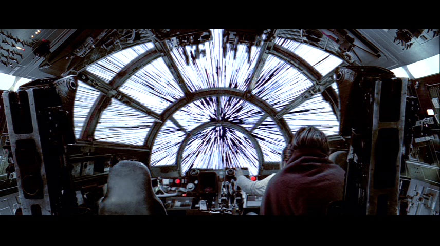
It just occurred to me that it might also be an allusion to the scene in the Millennium Falcon's cockpit.
posted by oddman at 1:43 PM on May 3, 2014
posted by oddman at 1:43 PM on May 3, 2014
The two "spoiler!" comments about Citizen Kane suggest to me that an awful lot of people haven't seen the movie if they think it's a spoiler in any meaningful sense. It spoils the movie in roughly the way that "the Titanic sinks" spoils that one.
posted by DoctorFedora at 4:44 PM on May 3, 2014
posted by DoctorFedora at 4:44 PM on May 3, 2014
Incidentally, these are better than I expected them to be (though I can't help but agree that Pulp Fiction was a little too hard to guess)
posted by DoctorFedora at 5:10 PM on May 3, 2014
posted by DoctorFedora at 5:10 PM on May 3, 2014
The Ark one is a man running away from a rolling rock
Huh, I first thought it was Indy's whip coiled up.
posted by JHarris at 6:06 PM on May 3, 2014
Huh, I first thought it was Indy's whip coiled up.
posted by JHarris at 6:06 PM on May 3, 2014
The two "spoiler!" comments about Citizen Kane suggest to me that an awful lot of people haven't seen the movie if they think it's a spoiler in any meaningful sense. It spoils the movie in roughly the way that "the Titanic sinks" spoils that one.
I think "spoiler!" comments about Citizen Kane are usually meant as joke, but the first comment does make sense in the context of a movie poster.
posted by Room 641-A at 10:45 PM on May 3, 2014 [1 favorite]
I think "spoiler!" comments about Citizen Kane are usually meant as joke, but the first comment does make sense in the context of a movie poster.
posted by Room 641-A at 10:45 PM on May 3, 2014 [1 favorite]
I have emailed Krasnopolski to ask him to make them available as a set of postcards. I'd have those in a heartbeat.
posted by epo at 2:56 AM on May 4, 2014
posted by epo at 2:56 AM on May 4, 2014
The Empire one might be the shaft that Luke falls down after losing his hand.
posted by interrobang at 8:02 AM on May 4, 2014 [1 favorite]
posted by interrobang at 8:02 AM on May 4, 2014 [1 favorite]
Oh, it's talking about shaft. Then I can dig it
posted by East Manitoba Regional Junior Kabaddi Champion '94 at 7:24 AM on May 5, 2014 [2 favorites]
posted by East Manitoba Regional Junior Kabaddi Champion '94 at 7:24 AM on May 5, 2014 [2 favorites]
« Older "His work belongs in a museum." | Legendary film careers, Dissolved. Newer »
This thread has been archived and is closed to new comments
posted by arcticseal at 7:51 AM on May 3, 2014