Why "Marsala"? Because we thought it sounded better than "Scab".
December 12, 2014 1:59 PM Subscribe
Pantone has announced that 18-1438 aka Marsala, is the color of the year for 2015. Here's how they decided, although not everyone approves. Fast Company offers some alternate names.
Pantone Color of the year, previously – 2014: Radiant Orchid, Pantone Color Forecasting
Pantone Color of the year, previously – 2014: Radiant Orchid, Pantone Color Forecasting
That Fast Company article is just silly. It's red-brown. Big deal. That makes you immediately think of bloody shit? Why? You can come up with a negative association for any color.
posted by showbiz_liz at 2:05 PM on December 12, 2014 [2 favorites]
posted by showbiz_liz at 2:05 PM on December 12, 2014 [2 favorites]
Can we get a 'Professional Marsala' option for MetaFilter?
posted by mazola at 2:06 PM on December 12, 2014 [6 favorites]
posted by mazola at 2:06 PM on December 12, 2014 [6 favorites]
It is interesting, if you look at the past colors, that the past six years have been very light and bright colors. A dark color with a neutral base is a big departure. (That said, the entire 'color of the year' thing is ridiculous, but it's also fun.) (And I always like looking at the Sephora collections, though I have yet to actually buy one.)
posted by showbiz_liz at 2:10 PM on December 12, 2014 [2 favorites]
posted by showbiz_liz at 2:10 PM on December 12, 2014 [2 favorites]
Well I'm just letting you all know that I'm going to slap that shit on *everything* now.
posted by mazola at 2:11 PM on December 12, 2014 [4 favorites]
posted by mazola at 2:11 PM on December 12, 2014 [4 favorites]
That really is disappointing from Brownlee -- and I just read and really liked his piece on the use of Comic Sans on the "I Can't Breathe" t-shirts.
My job cares a little about Pantone color forecasting and trend forecasting in general. Though, I haven't noticed a color of the year really trickling through into retail the way Tangerine Tango did in 2012. Perhaps that was just the boldness of the color, harder to notice pink (Radiant Orchid) and green (Emerald), which are already pretty present. But I keep betting on the blue; Pantone hasn't chosen one in quite a while.
posted by gladly at 2:12 PM on December 12, 2014
Neil Krawetz predicted some attributes of the chosen color. He expects 2016 to be a "blue mineral".
posted by Rangi at 2:13 PM on December 12, 2014 [1 favorite]
posted by Rangi at 2:13 PM on December 12, 2014 [1 favorite]
Yeah I saw this on a Sephora email blast a few days ago and was a little grossed out. As a color, it's got kind of a sick yellowish edge to it. I'd maybe call it "deep, day-old bruise," personally.
posted by trunk muffins at 2:15 PM on December 12, 2014 [1 favorite]
posted by trunk muffins at 2:15 PM on December 12, 2014 [1 favorite]
There's something 1980s maroon about it.
posted by Kabanos at 2:16 PM on December 12, 2014 [6 favorites]
posted by Kabanos at 2:16 PM on December 12, 2014 [6 favorites]
But like a fake instagrammed 1980s.
posted by Kabanos at 2:17 PM on December 12, 2014 [1 favorite]
posted by Kabanos at 2:17 PM on December 12, 2014 [1 favorite]
Fortunately, nobody but Pantone actually cares what the color of the years is. I can prove this by asking anyone what the color of the year was last year.
posted by doctor_negative at 2:24 PM on December 12, 2014 [6 favorites]
posted by doctor_negative at 2:24 PM on December 12, 2014 [6 favorites]
That Fast Company article is just silly.
Definitely written by someone who has never actually seen bloody shit, can we arrange for them to get noro and ideally some perspective?
posted by poffin boffin at 2:50 PM on December 12, 2014 [3 favorites]
Definitely written by someone who has never actually seen bloody shit, can we arrange for them to get noro and ideally some perspective?
posted by poffin boffin at 2:50 PM on December 12, 2014 [3 favorites]
That fast company piece was awful. I like the color well enough, I guess, but I'm not sure what I'm supposed to do with it. Do I have too repaint my house, it could I just, for example, eat some chicken marsala?
posted by Admiral Haddock at 3:15 PM on December 12, 2014 [1 favorite]
posted by Admiral Haddock at 3:15 PM on December 12, 2014 [1 favorite]
oh hey 1992 called, they want their burgundy-everything back pls.
posted by lonefrontranger at 3:40 PM on December 12, 2014 [4 favorites]
posted by lonefrontranger at 3:40 PM on December 12, 2014 [4 favorites]
Does anyone have a link to the acceptance speech?
posted by FAMOUS MONSTER at 3:50 PM on December 12, 2014 [7 favorites]
posted by FAMOUS MONSTER at 3:50 PM on December 12, 2014 [7 favorites]
Wow that is a difficult color to work with and sure as hell doesn't work on many skin tones. I actually think the household stuff in the photos is the best possible use for that color, but still very difficult color. Goes with very little. Doesn't really go with a lot of the current styles. Loud, yet not in a fun, dash of color way. Yeah no. I mean it's an interesting choice I'll give them that, but pretty unlikely I'd ever wear it.
posted by whoaali at 3:53 PM on December 12, 2014 [4 favorites]
posted by whoaali at 3:53 PM on December 12, 2014 [4 favorites]
Can I get that icon in cornflower marsala?
posted by Strange Interlude at 4:14 PM on December 12, 2014 [2 favorites]
posted by Strange Interlude at 4:14 PM on December 12, 2014 [2 favorites]
I like it - not the specific color so much as the jewel-earthy tones around it. You can't do neon with Marsala, you need neutrals and textures and deep calm colors to balance it.
posted by viggorlijah at 4:19 PM on December 12, 2014 [3 favorites]
posted by viggorlijah at 4:19 PM on December 12, 2014 [3 favorites]
I like the colour but the name doesn't really seem to fit... it makes me think of curry-like yellows.
posted by Too-Ticky at 4:23 PM on December 12, 2014 [1 favorite]
posted by Too-Ticky at 4:23 PM on December 12, 2014 [1 favorite]
The actual color of the year: transparent.
I hope.
posted by Foosnark at 4:23 PM on December 12, 2014 [1 favorite]
I hope.
posted by Foosnark at 4:23 PM on December 12, 2014 [1 favorite]
I would describe the look that the dude in the Marsala apron & polka dot Marsala tie is giving to the other dude in the Marsala shirt as "Smouldering Marsala."
posted by leftcoastbob at 4:28 PM on December 12, 2014 [6 favorites]
posted by leftcoastbob at 4:28 PM on December 12, 2014 [6 favorites]
Even the copper pots wish they were marsalacious like the bricks
posted by oceanjesse at 4:31 PM on December 12, 2014
posted by oceanjesse at 4:31 PM on December 12, 2014
Look, just tell me what it is in the solid coated library so I get a can of the stuff mixed when the agency people start to call about shirts in the spring.
posted by Devils Rancher at 4:34 PM on December 12, 2014
posted by Devils Rancher at 4:34 PM on December 12, 2014
I used to know John Brownlee's wife! Huh. If you're reading this, guys, I still have your copy of Harpo Speaks.
posted by pxe2000 at 5:01 PM on December 12, 2014
posted by pxe2000 at 5:01 PM on December 12, 2014
I really don't like it. I've spent too much time mixing paint, and the brown-ness of it (but it's blatant refusal to actually be brown, or red) just looks like it's stuck in the middle. It's like a decision that's left undone.
posted by FirstMateKate at 5:09 PM on December 12, 2014 [3 favorites]
posted by FirstMateKate at 5:09 PM on December 12, 2014 [3 favorites]
No likey. I liked the last few years' colors better.
posted by jenfullmoon at 5:52 PM on December 12, 2014
posted by jenfullmoon at 5:52 PM on December 12, 2014
He expects 2016 to be a "blue mineral"
Maybe a nice, gaseous vespene in 2017.
posted by Reyturner at 6:01 PM on December 12, 2014 [2 favorites]
Maybe a nice, gaseous vespene in 2017.
posted by Reyturner at 6:01 PM on December 12, 2014 [2 favorites]
One year I just want it to be 100% magenta.
posted by Kabanos at 7:13 PM on December 12, 2014 [1 favorite]
posted by Kabanos at 7:13 PM on December 12, 2014 [1 favorite]
Well, Crankshaft seems to have gotten the message — check out Funky's apron.
posted by benito.strauss at 7:27 PM on December 12, 2014
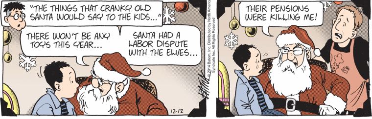
posted by benito.strauss at 7:27 PM on December 12, 2014
Hi, I am apparently the only person in the world who likes this color. I also loved circa-1992 maroon.
posted by selfmedicating at 7:49 PM on December 12, 2014 [10 favorites]
posted by selfmedicating at 7:49 PM on December 12, 2014 [10 favorites]
I actually sort of like it. I prefer deeper reds -- more blue than brown -- but it's a nice, rich color and it's kind of in the direction I'm moving anyway. I think it could've been better and the flat color sample leaves something to be desired but I tend to like it in context.
I had fun with Tangerine Tango, yeah, but Marsala feels like a color (or variations of it) that people will actually wear or use in decor. It's cool if you aren't into it, but people seem much more cranky about this one than ones in years past. You either decide it's a thing or you ignore it.
posted by darksong at 7:49 PM on December 12, 2014 [1 favorite]
If the attractive people in the photos on the page are digging it, then I suppose I am also digging it.
posted by Hicksu at 8:35 PM on December 12, 2014 [2 favorites]
posted by Hicksu at 8:35 PM on December 12, 2014 [2 favorites]
Marsala has your number tucked away, to ripen. He spends the morning crushing grapes at his father's winery, juice ecstatic between glistening toes, then conjures jump formations tossing origami from the veranda. Marsala threw away his iPhone 6 when he read about the bumble bees. When Marsala finally rings you, springy coils rub dewy skin, and you have melted. Minds entwine like vines and shed the secrets of the hive. Marsala.
posted by sylvanshine at 8:42 PM on December 12, 2014 [13 favorites]
posted by sylvanshine at 8:42 PM on December 12, 2014 [13 favorites]
Green, Red, and Gold. (Warning: The Wiz.)
Color in design is very serious business, and, yes, you're often being hoodwinked by it to get you to buy new/more stuff, not just clothes or housepaint.
When I worked in my dad's screenprinting shop, even at our bottom-tier member of the so-called fashion industry scale in the weeds in the "sportswear/casual/athletic" segment we spent a lot of time postulating, wondering and even fretting what the next season's colors would be, especially for sportswear, which might actually be more unstable and dynamic than couture or major label stuff, because you can do some really wild stuff on t-shirts and cut-piece stuff with colors and printing and garment dying.
A large, major fraction of our cost and expenditure was specifically devoted to color matching and ink/pigment mixing, or managing the contract dying of fabrics/garments. Large batches of ink are difficult to mix by hand in the days before computer-controlled pigment systems, and it's best to mix in large batches for uniformity, which is costly and can go wrong.
And that color market information is solid, spendable gold. If you can predict color themes accurately more than a year or two in advance in given market/product segments you can probably command million dollar consultancy fees. Hell, just because we jumped on easy color trends like florescents, earthtones, jeweltones our in-house designs sold better than others.
I've always wondered if there's a cartel that sets the tone, but I don't think there is. Pantone does do some leading with their color advocacy, but I'm pretty sure they follow the pack like every other designer, if you could imagine a skittish herd of caffeinated, nicotine-soaked deer browsing and traversing a landscape that exists in dimensions and axii measured along vectors of aesthetics, color, shape, style, simplicity or complexity with a major weighted vector being function - a herd moved from place to place as the proverbial grass grew better in some places, and not others.
I kid, but that grass is worth billions, and it is cultivated with careful calculation and tended. Some of those deer are very smart farmers, and I think that the true answer is "Yes, all of the above." and further "there is a cartel, but there is a herd, too, and often the cartel has to follow the herd, and it doesn't really matter because new colors just means new stuff, new clothes, new furnishings, and new whatever that makes dollars change hands.
And this herd thing can be seen in how very durable goods like cars, houses, appliances and furniture change color the least. The most rapid change in colors is found perhaps not in fashion, but in electronics, sportswear and plastic things of all sorts.
One pattern I see that is a thing in the color industry is that something new will come out, and a classic example of this is the original iMacs with their colorful and translucent shells, and suddenly everything computer or even just related to plastics was iMac themed even if it was a kitchen utensil. There was a stretch of about a year where it was difficult to buy damn near anything that didn't have iMac inspired design cues. I saw clothes hangers and coffee mugs that looked like iMacs. You could probably fill a large museum with all of the random, arcane things that were some mix of frosted clear plastic and some other colored frosted clear plastic.
And manufacturers all over the world maybe even saved some money on pigments and opaquers making the same old crap they made before - if they didn't update their molds into swoopy iMac aerodynamics and teardrops and pebbled/frosted plastic.
Another major influence on the movement of the color herd/cartel seems to be mass media. Particularly children's mass media. Remember the crazy sea green-blue, blue-green and golds and purples and other very bright green/blue colors and iridescents of 1989-1990-ish?
That's when Disney's A Little Mermaid came out. My dad's shop was getting Disney Pantone callouts, design bibles and other data for various animated movies at least half a year to almost a year before movie releases to do production work for their parks and retail stores. Almost every Pantone number in The Little Mermaid movie was seen in clothing and products after the movie, particularly in that youth demo.
This is cynical, but who better to pick out a new bedspread, sippy cup, lunchbox or whatever than a child who thinks the color of it reminds them of a movie they just saw and liked a whole lot?
I noticed a similar but lesser trend into earthtones and black and gold around Beauty and the Beast, and browns and pastels around Notre Dame. The Batman movies also made black and gold a brief thing again.
Fashion and color is weird. It's a deeply emergent behavior even outside of market forces and suspected collusion, and it's not a new thing at all.
posted by loquacious at 9:12 PM on December 12, 2014 [34 favorites]
I envision the color industry's backwater districts as featuring vast warehouses of outmoded colors, such as maroon and teal and their less saturated variants mauve and sea foam used for industrial-scale decorating (when? In the1980s-90s?). I don't know if experts decided that these colors hide dirt and wear better than others or if the diktat merely was "let there be mauve and sea foam."
posted by bad grammar at 9:23 PM on December 12, 2014 [1 favorite]
posted by bad grammar at 9:23 PM on December 12, 2014 [1 favorite]
Can we get a 'Professional Marsala' option for MetaFilter?
MarsalaFilter
posted by Ian A.T. at 9:33 PM on December 12, 2014 [4 favorites]
MarsalaFilter
posted by Ian A.T. at 9:33 PM on December 12, 2014 [4 favorites]
I personally could not be more delighted at this color. It's a shade that looks fabulous on me. Even if it's a flash in the pan, it will be a flash in the pan that adds positively to my wardrobe and cosmetics cabinet.
posted by rednikki at 10:48 PM on December 12, 2014 [4 favorites]
posted by rednikki at 10:48 PM on December 12, 2014 [4 favorites]
Color mixing is a weird thing. The colorspace online is RGB transmitted light, whereas print generally uses a CMYK model and is reflective. This new shade looks great on my laptop but less so on paper. Unless custom-mixed and used as CMYK +1 or even black +1, this could be kind of flat and dead for print media.
The whole "color of the year" thing feels silly and arbitrary, like the folks at Pantone have a party where somebody throws a dart at a giant color chart.
One of my 1920s-vintage artist friends had her own take on next year's color when I showed her the article. "Dark colors are for bad times," she muttered forebodingly. "Everything was dark during the 30s. You couldn't buy a bright color. I guess they're thinking 2015 could be pretty grim."
posted by kinnakeet at 2:20 AM on December 13, 2014 [6 favorites]
I guess Ubuntu's history of color schemes will prove to have been fashion forward...
posted by ennui.bz at 4:40 AM on December 13, 2014 [1 favorite]
posted by ennui.bz at 4:40 AM on December 13, 2014 [1 favorite]
Jesus, when will these silly potty-humored dorks grow up? Embrace not being a 12 yr old boy anymore.
posted by discopolo at 4:48 AM on December 13, 2014 [1 favorite]
posted by discopolo at 4:48 AM on December 13, 2014 [1 favorite]
the color of a used maxi pad
I feel sorry for the woman/man with low self esteem who might ever choose to date/marry someone as gross as Brownlee. You're dating a guy who has no wit and is just beyond gross. Guys who poke fun at/are obsessed with menstruation humor---unrelatable, dateable, unfriendable, can't stand them. What's wrong with them?
posted by discopolo at 4:56 AM on December 13, 2014 [1 favorite]
I personally could not be more delighted at this color. It's a shade that looks fabulous on me.
Ha! I was just thinking the exact opposite about me, because I feel it's a little too dressy for my flip-flop lifestyle. I cannot wait for Mauve-y Nude to be the color of the year because then I will buy all the lip glosses. (Because the current count of ~14,000 mauve-y nude lip gloss shades isn't enough.)
posted by Room 641-A at 8:21 AM on December 13, 2014
Aaand as I am getting ready to go out I realize that the new "Deeply Mauve" lipstick sample from Birchbox that I've been using as a light stain under my Mauve-y Nude gloss is, in fact, Marsala.
posted by Room 641-A at 8:50 AM on December 13, 2014
posted by Room 641-A at 8:50 AM on December 13, 2014
this OP definitely buried the lede, which is that spookedly peering out from behind a fox mask is the coy pagan gesture of 2015
posted by threeants at 9:56 AM on December 13, 2014 [6 favorites]
posted by threeants at 9:56 AM on December 13, 2014 [6 favorites]
I actually really like earthy neutral red tones for makeup, and already have a couple of blushes and lipsticks that are pretty close to this. I bought some of Sephora's emerald products and never wore them, and all I have in Radiant Orchid is a nail polish. I completely avoided Tangerine Tango because I look awful in orange makeup. I totally don't get the blog hate for Marsala.
posted by matildaben at 2:15 PM on December 13, 2014 [1 favorite]
posted by matildaben at 2:15 PM on December 13, 2014 [1 favorite]
A few years ago my sister and brother-in-law painted an entire indoor wall in "Marsala" (I think it's called something else) so they must be prescient.
What's wrong with mahogany, burnt sienna, bittersweet and similar color terms from the old Crayola crayon box set?
posted by bad grammar at 4:50 PM on December 13, 2014
What's wrong with mahogany, burnt sienna, bittersweet and similar color terms from the old Crayola crayon box set?
posted by bad grammar at 4:50 PM on December 13, 2014
I am not a big fan of men using menstruation-based woman shaming as humor, but I am a woman and grrrr I hate this color and it totally looks like dried menstrual blood (i.e., any blood, but since this is the main blood I see I guess).
I like this color for makeup actually! But it's not that fun to look at. Like as a couch or dinnerware or whatever. It's just such a neutrallyish/uninteresting color to me. Maybe because it matches my coloring so well I am just kind of blah about it.
posted by stoneandstar at 10:05 PM on December 13, 2014
Wow that is a difficult color to work with and sure as hell doesn't work on many skin tones. I actually think the household stuff in the photos is the best possible use for that color, but still very difficult color. Goes with very little. Doesn't really go with a lot of the current styles. Loud, yet not in a fun, dash of color way. Yeah no. I mean it's an interesting choice I'll give them that, but pretty unlikely I'd ever wear it.
Burgundy is my favoritest color! It goes beautifully with jewel tones, especially greens and blues, as well as bluer-toned purples. Redder burgundies are great paired with browns, or as an accent with neutral grays. It's also set off nicely by black and navy (think jeans).
posted by fraula at 3:20 AM on December 14, 2014
Yeah I guess I don't really consider this a true jewel tone rich burgundy, but more of a faded, flat deep red with brown undertones that wouldn't go with jewel tones at all.
The burgundy in those links are all very nice, but I wouldn't really call any of those Marsala. Maybe the print in the last one, but not the rest.
posted by whoaali at 8:05 AM on December 14, 2014 [1 favorite]
The burgundy in those links are all very nice, but I wouldn't really call any of those Marsala. Maybe the print in the last one, but not the rest.
posted by whoaali at 8:05 AM on December 14, 2014 [1 favorite]
So far I've seen this color illustrated using everything from terra cotta pottery to pomegranate seeds. Certainly there were products sold as "Radiant Orchid" that were everything from deep greyed purple to bright pinky lavender. The whole "color of the year" seems to be a push towards a general segment of the color wheel more than anything more specific.
posted by KathrynT at 2:31 PM on December 14, 2014
posted by KathrynT at 2:31 PM on December 14, 2014
« Older A Single Conversation | I paint both invasive species and native wild... Newer »
This thread has been archived and is closed to new comments
posted by Mayor Curley at 2:05 PM on December 12, 2014 [8 favorites]