A Masterpiece of Modern… Trial and Error
June 1, 2015 10:55 PM Subscribe
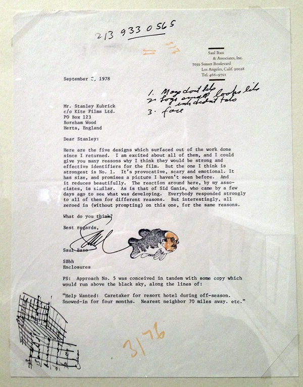
I've never been a huge fan of the yellow Shining poster, I think it's a striking design, but way, way too generic for the film, it could be a poster for almost any horror film you could think of. I agree with Kubrick's comments on most of the rejected designs, though. They're very nicely done, but they don't really get the film, they focus on the wrong elements, etc.
posted by Joakim Ziegler at 12:38 AM on June 2, 2015 [5 favorites]
posted by Joakim Ziegler at 12:38 AM on June 2, 2015 [5 favorites]
Super interesting, thanks!
Did he particularly like this graphic artist or something? I'm puzzled why he didn't just ask for a bunch of wildly different concepts. The options are all pretty similar and all crap in the same way (hokey, faux-poetic, heavy on the cheesy symbolism).
I'd have sent everything back and asked for some options based on stills from the film.
posted by dontjumplarry at 2:15 AM on June 2, 2015
Saul Bass doesn't really do film-still style, he's got his own signature style and Kubrick had asked for him specifically I think.
I like how Bass kept the dotted effect while addressing the legibility problem that Kubrick rightly noted.
posted by harriet vane at 3:00 AM on June 2, 2015 [2 favorites]
I like how Bass kept the dotted effect while addressing the legibility problem that Kubrick rightly noted.
posted by harriet vane at 3:00 AM on June 2, 2015 [2 favorites]
Did he particularly like this graphic artist or something?
Saul Bass
posted by iotic at 3:44 AM on June 2, 2015 [5 favorites]
Saul Bass
posted by iotic at 3:44 AM on June 2, 2015 [5 favorites]
Love Bass but never really liked The Shining poster and don't really like any of the others much either.
posted by octothorpe at 4:13 AM on June 2, 2015 [1 favorite]
posted by octothorpe at 4:13 AM on June 2, 2015 [1 favorite]
I also love Bass and would never have guessed in a million years that he was behind the yellow Shining poster. And given that it's dramatically different from pretty much every other design Bass has ever done, I have to imagine the whole stippling aesthetic was Kubrick's idea. Maybe he was reading a lot of the Wall Street Journal at the time.
posted by AlonzoMosleyFBI at 5:00 AM on June 2, 2015 [2 favorites]
posted by AlonzoMosleyFBI at 5:00 AM on June 2, 2015 [2 favorites]
Other Saul Bass Film Posters
Looking at that gallery, I'm surprised to say that his film poster work is hit-and-miss for me. And "The Shining" poster is one of the lesser pieces in my eyes.
As for the other "Shining" sketches, I think the hand and bicycle one is a stronger concept than the final one, but needed more polish.
I'm not sure whose idea the pointillism was, but I don't much care for it in this case. I think I get it conceptually -- the idea of all the pieces slowly coming together -- but it doesn't strike me viscerally the same way the movie does.
I think it is because the visuals of the film itself are so strong and graphic (in the illustration sense) that a poster coming in with a different graphic concept doesn't fit for me.
posted by He Is Only The Imposter at 5:18 AM on June 2, 2015
The bass stamp here is my favorite part of all of this.
posted by msbrauer at 5:39 AM on June 2, 2015 [4 favorites]
posted by msbrauer at 5:39 AM on June 2, 2015 [4 favorites]
MetaFilter: terror (a must) and the supernatural (if possible)
posted by Shepherd at 5:48 AM on June 2, 2015 [5 favorites]
posted by Shepherd at 5:48 AM on June 2, 2015 [5 favorites]
Even Bass's worst stuff is tons better than most (or all) of modern film posters.
posted by octothorpe at 5:52 AM on June 2, 2015 [4 favorites]
posted by octothorpe at 5:52 AM on June 2, 2015 [4 favorites]
Your jazz combo could do worse name-wise than "Saul Bass's Rejects".
posted by MCMikeNamara at 6:22 AM on June 2, 2015 [3 favorites]
posted by MCMikeNamara at 6:22 AM on June 2, 2015 [3 favorites]
Saul Bass-O-Matic would also be good, but it would probably be a shitty ska punk band.
posted by Atom Eyes at 8:57 AM on June 2, 2015
posted by Atom Eyes at 8:57 AM on June 2, 2015
Looking at that gallery, I'm surprised to say that his film poster work is hit-and-miss for me.
I love Saul Bass enough that I'd like to point a trembling finger at you and croak "Blasphemer!!!" here, but in fact I agree. As works of art there's not one I wouldn't hang on the wall, but barely half of them are especially good posters for the film.
Grand Prix, for example, is a visual masterpiece -- arguably its entire purpose is to be a visual masterpiece; as drama it's fairly routine, almost rote for the period. The right poster would be much more realist; and would certainly use color.
posted by George_Spiggott at 1:44 PM on June 2, 2015
Mod note: This is a comment from an anonymous mefite.
I'm a longtime MeFite and my dad is Sid Ganis, referenced in Saul Bass's letter. Sid worked for many years in movie marketing -- at Seven Arts, Fox, Columbia, Lucasfilm, Paramount, Sony and probably more that I'm forgetting right now. He eventually became President of Production at Paramount, and later was a five-time president of the Academy of Motion Picture Arts and Sciences. He's now an independent producer.posted by cortex (staff) at 9:38 AM on June 3, 2015 [5 favorites]
I have happy childhood memories of sitting in his office, paging through concept art for films like Blazing Saddles, Superman ("You'll Believe a Man Can Fly" was the tagline) and Raiders of the Lost Ark. In the days long before digital there would be stacks and stacks of drawings at various stages, different taglines, fonts, colors, etc. All done by hand and xeroxing and cutting & pasting.
Sid kept a lot of stuff, and his archives are in the process of being donated to the Academy, so hopefully more great documents like this Kubrick stuff will see the light of day. I think he once told me that Kubrick and he worked well together -- they had a long association, dating back to Dr. Strangelove.
« Older 100 years, 94 books | The market is as wide open as a walk-in closet in... Newer »
This thread has been archived and is closed to new comments
(and the final design is by far the most effective of the lot.)
posted by LooseFilter at 11:40 PM on June 1, 2015 [1 favorite]