15 Images That Show Why Letter-Spacing Is Important
January 17, 2016 8:32 AM Subscribe
Ever wondered why good designers focus so much on kerning, i.e. adjusting the spacing between characters in a piece of text? These 15 epic images show you why letter-spacing is important not just in logos and graphic design, but also in everyday handwriting.
This post was deleted for the following reason: Sorry for the late delete; seems a little too thin to be a good metafilter post. -- Eyebrows McGee
A number of these weren't keming errors at all. Like Curt and SHIT AKE. And ANUSTART is either fake or someone repeating a joke from Arrested Development. I'm also fairly sure that BULL TIT ANUS is exactly what they were going for. I mean, how else do those three words end up that way? Engrish, I suppose?
But the real reason good kerning is important is that bad kerning is ugly and makes my eyes sad and unhappy.
posted by dis_integration at 8:41 AM on January 17, 2016 [8 favorites]
But the real reason good kerning is important is that bad kerning is ugly and makes my eyes sad and unhappy.
posted by dis_integration at 8:41 AM on January 17, 2016 [8 favorites]
#13 is a nod to Arrested Development.
posted by workerant at 8:41 AM on January 17, 2016 [1 favorite]
posted by workerant at 8:41 AM on January 17, 2016 [1 favorite]
ugh, dickbait
posted by theodolite at 8:45 AM on January 17, 2016 [73 favorites]
posted by theodolite at 8:45 AM on January 17, 2016 [73 favorites]
At least some of those are not real.
posted by roomthreeseventeen at 8:47 AM on January 17, 2016 [2 favorites]
posted by roomthreeseventeen at 8:47 AM on January 17, 2016 [2 favorites]
You can only put 7 letters on a california plate, so yeah.
posted by Heywood Mogroot III at 8:55 AM on January 17, 2016
posted by Heywood Mogroot III at 8:55 AM on January 17, 2016
Ligatures (e.g. encyclopædia, fulffilment) and long s (ſ) or GTFO.
posted by save alive nothing that breatheth at 9:05 AM on January 17, 2016 [1 favorite]
posted by save alive nothing that breatheth at 9:05 AM on January 17, 2016 [1 favorite]
I no longer have any idea what the word 'epic' means.
posted by shakespeherian at 9:07 AM on January 17, 2016 [4 favorites]
posted by shakespeherian at 9:07 AM on January 17, 2016 [4 favorites]
shakespeherian: "I no longer have any idea what the word 'epic' means."
I think it's one of those photographs you can send through your mobile phone and put on the intarwebs.
posted by Dr. Zira at 9:14 AM on January 17, 2016 [2 favorites]
I think it's one of those photographs you can send through your mobile phone and put on the intarwebs.
posted by Dr. Zira at 9:14 AM on January 17, 2016 [2 favorites]
dis_integration: " I'm also fairly sure that BULL TIT ANUS is exactly what they were going for. I mean, how else do those three words end up that way?"
If you line up the left bottom of an A with the right top of a T, because you're just thinking of the letters as blocks, rather than how they're going to look, you could make this mistake. Note the only other letter pair that does the same sort of thing is the LT and that one's supposed to be a space. If you compare carefully, especially on the lower sign, you can see that the NU has just a little more space between them than the AN and US pairs. But that barely registers as a space when you have these honking huge gaps between the LT and TA.
posted by RobotHero at 9:15 AM on January 17, 2016 [2 favorites]
I no longer have any idea what the word 'epic' means.
It means Electronic PICture, but it is often misused redundantly as in "I'm going to show you an epic picture." vs. "I'm going to send you email mail.", or worse to mean any digital media, like in "epic tune".
posted by Free word order! at 9:18 AM on January 17, 2016 [4 favorites]
It means Electronic PICture, but it is often misused redundantly as in "I'm going to show you an epic picture." vs. "I'm going to send you email mail.", or worse to mean any digital media, like in "epic tune".
posted by Free word order! at 9:18 AM on January 17, 2016 [4 favorites]
Kerning English is hard if you dont know English.
posted by the man of twists and turns at 9:21 AM on January 17, 2016
posted by the man of twists and turns at 9:21 AM on January 17, 2016
No comic characters called CLINT back in the day due to the smudgeness of the cheapo printing (don't use the world FLICKER either)
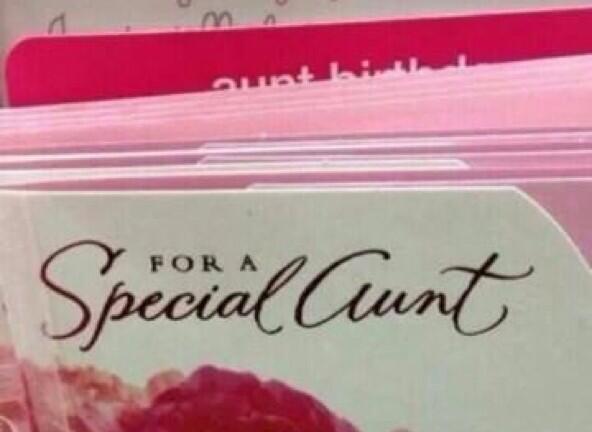
Surprised they didn't have the 'Special Aunt' card that's on permenant rotation on twitter
posted by fearfulsymmetry at 9:22 AM on January 17, 2016
Surprised they didn't have the 'Special Aunt' card that's on permenant rotation on twitter
posted by fearfulsymmetry at 9:22 AM on January 17, 2016
(Thought the aunt one is more of a inappropriate typeface rather than kerning)
posted by fearfulsymmetry at 9:24 AM on January 17, 2016
posted by fearfulsymmetry at 9:24 AM on January 17, 2016
Kerning is a particular method of letter spacing. Only one or two of those errors are a product of poor kerning. At least one was a problem of ink bleed and not any designer's fault.
posted by ardgedee at 9:26 AM on January 17, 2016 [1 favorite]
posted by ardgedee at 9:26 AM on January 17, 2016 [1 favorite]
No comic characters called CLINT back in the day due to the smudgeness of the cheapo printing
Famed Avenger Cunt Barton first appeared in 1964.
posted by Sangermaine at 9:34 AM on January 17, 2016 [2 favorites]
Famed Avenger Cunt Barton first appeared in 1964.
posted by Sangermaine at 9:34 AM on January 17, 2016 [2 favorites]
Kerning is a particular method of letter spacing. Only one or two of those errors are a product of poor kerning. At least one was a problem of ink bleed and not any designer's fault.
I have to more-or-less disagree. Back when I came through school, ink bleed/spread was definitely something we were taught to account for, depending on the printing process used. So, in theory, the designer should have accounted for the ink spread. That said, I doubt design students today have any clue about such things, given that they are so massively focused on the web. Still, if you're designing something for print, you really should know how to adjust things to accommodate the particular processed that will be used.
A lot of these are so obviously 'shopped, that the humor dies a tragic death, at least for anyone who knows what they are looking at. Some of them, though, are legit. I've seen a similar Kids Exchange sign in Indianapolis and, yeah, it's real easy to read it the funny way.
Massage Therapist loudly screams "Photoshop", though. It's not just the spacing between the E and R. It's the way the entire word "Therapist" is horribly off-center from everything else on the sign. And, once you see that the sign maker got the kerning in "Massage" more-or-less correct, it's even less plausible that they would have bungled Therapist so badly.
posted by Thorzdad at 9:51 AM on January 17, 2016 [2 favorites]
« Older Bookmaking is Hard | Siberian farmyard rap goes viral! And the crowd... Newer »
This thread has been archived and is closed to new comments
The birthday cake for Curt does not really belong in this, unless I'm supposed to be bothered by the "B irthday."
posted by RobotHero at 8:38 AM on January 17, 2016 [3 favorites]