There is an excitement about having nightmares.
October 10, 2016 2:07 PM Subscribe
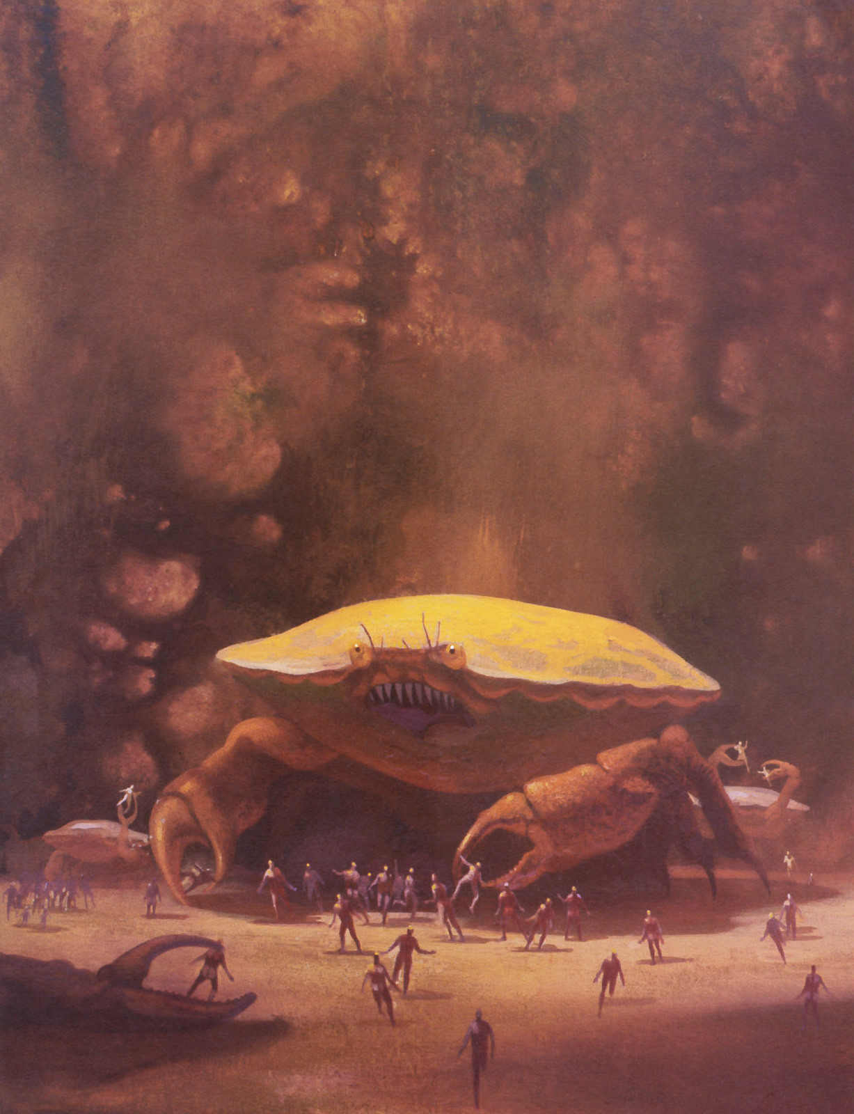
An artist named Christopher Shy has somehow managed to capture the swirling, amorphous feeling of a nightmare with his series of watercolor horror and sci-fi movie posters, and each is more terrifying than the last. For example: The Thing
Shy is the founder of Studio Ronin. His prints—and others'—are available for purchase at Wooden Nickel Art Works.
Shy is the founder of Studio Ronin. His prints—and others'—are available for purchase at Wooden Nickel Art Works.
Oh, the Blade Runner one is beautiful... but this one actually took me a shamefully long moment.
posted by The otter lady at 2:41 PM on October 10, 2016 [5 favorites]
posted by The otter lady at 2:41 PM on October 10, 2016 [5 favorites]
They remind me a lot of a certain generation of cheap SF paperback covers (mid-70s?). They all need the yellow DAW spines to be visible.
posted by GenjiandProust at 3:55 PM on October 10, 2016 [4 favorites]
posted by GenjiandProust at 3:55 PM on October 10, 2016 [4 favorites]
GenjiandProust, I think you're thinking of Frazetta. Actually, the two posters in the first link (The Fog and the one below it) are so Frazetta-like that it seems looks almost as though the poses are actually cribbed from him.
posted by Frowner at 4:41 PM on October 10, 2016 [4 favorites]
posted by Frowner at 4:41 PM on October 10, 2016 [4 favorites]
And it turns out that he's actually participated in a Frazetta homage exhibit.
I dunno. These are certainly wonderfully pretty and I like that he does not replicate Frazetta's queasy lime yellow light, but one does get tired of "and the light catches on her ass/breasts/thighs" in fantasy art.
posted by Frowner at 5:06 PM on October 10, 2016 [4 favorites]
I dunno. These are certainly wonderfully pretty and I like that he does not replicate Frazetta's queasy lime yellow light, but one does get tired of "and the light catches on her ass/breasts/thighs" in fantasy art.
posted by Frowner at 5:06 PM on October 10, 2016 [4 favorites]
Beautiful.
posted by turbid dahlia at 5:12 PM on October 10, 2016
posted by turbid dahlia at 5:12 PM on October 10, 2016
It's not just Frazetta, although he was certainly a big part of it, but early Boris, Whelen, and dozens of imitators used that color palette and those general layouts. I remember every DAW paperback between 1972 and 1980 drinking from that same well. And, yes, the barbarian princess/priestess/breasts-haver is a trope that would have been better left in Hyperborea. Nostalgia is a two-edged sword, as Conan might have said between quaffs.
posted by GenjiandProust at 5:30 PM on October 10, 2016 [3 favorites]
posted by GenjiandProust at 5:30 PM on October 10, 2016 [3 favorites]
The Thing poster is too explicit to be terrifying, although it does show a decent visual imagination. Horrifying, but not terrifying; as Stephen King put it, terror is hearing something scratching at the door (especially when it's clearly not the way that a dog would do it), horror is when the door bursts open and the monster is revealed, and the gross-out (or splatterpunk) is when the monster bites your head off. King also said that the reveal almost always kills terror; even if it's a ten-foot cockroach, you think to yourself, whew, I thought it would be twenty feet tall. And, as others have said, this is a pretty familiar visual style.
posted by Halloween Jack at 9:11 PM on October 10, 2016 [3 favorites]
posted by Halloween Jack at 9:11 PM on October 10, 2016 [3 favorites]
Hoping this is not too off-topic, I'm curious if people would define the imagery of their nightmares as "swirling" and "amorphous" - because if someone had asked me I would have said the imagery of my nightmares was extremely clear: stark, simple lines, lots of contrast. These are definitely beautiful, but they are about the opposite of what a "nightmare" feels like for me.
posted by brainmouse at 8:30 AM on October 11, 2016 [1 favorite]
posted by brainmouse at 8:30 AM on October 11, 2016 [1 favorite]
Yeah, I sure don't have blurry amorphous horror-movie nightmares even when I'm having the "dangerous monsters want to kill you" kind.
One thing that strikes me about Shy's work - when he's painting men/monsters/etc, everything is almost dissolving in a way that far exceeds what Frazetta did. The Frazetta homage shows this particularly well, but so does this.
Like, the bodies are dissolving and blending into the landscape/cityscape or into other bodies.
And then, as soon as there's women, the dissolving stops - look, some boobs! look, a shiny ass! The faces are no longer obscured or hidden but stand out sharply. And I'm just like, come on, dude, have the courage of your convictions - if we live in scary/beautiful dissolve-o-world, we do not live in sharply-defined-boobs-world.
It's precisely this kind of art (and it's different from Frazetta, whose work sexualizes women's bodies while grotesquifying men's but still leaves a very clear similarity of grotesquery/sexual parts between the two) that makes clear what it's like when women are treated as the decorative note. It's important to paint this spooky landscape and create a climate of horror....and everything goes better with breasts!
I don't buy books that have pointlessly sexualized images of women on the covers - that's a serious limit with me, and there are books I haven't read because I can't buy them without a pin-up shot on the front.
posted by Frowner at 9:13 AM on October 11, 2016 [2 favorites]
Teehee - my friend works with him and goes to SDCC every year to help out. Cool to see him on the blue.
posted by symbioid at 9:38 AM on October 11, 2016
posted by symbioid at 9:38 AM on October 11, 2016
These are awesome. I wish there was a Ghostbusters movie with the vibe of this painting.
My only gripe: what is it with illustrators putting everything smack in the middle? Have they never taken a photography class where they learned the rule of thirds?
posted by hot_monster at 10:07 AM on October 11, 2016
My only gripe: what is it with illustrators putting everything smack in the middle? Have they never taken a photography class where they learned the rule of thirds?
posted by hot_monster at 10:07 AM on October 11, 2016
Nightmares....I guess the mind of the beholder determines context. When my dreams conjure thighs and breasts they are not nightmares. My nightmares nowadays are versions of ever-moving goalposts--a mounting sense of frustration, often mixed with some sort of visual pun that sometimes wakes me in mid-laugh, its meaning forgotten before I can figure out what was funny. It drives my wife crazy when I wake up laughing but can't tell her why.
Bug hunts and commie infiltrators, eh? Let your imagination do the walking and you get misogyny, xenophobia, or simply wet dreams.
Artists: go figure.
Drop by my closet sometime and we'll compare boogie men--I don't let these fuckers anywhere near my dreams anymore.
posted by mule98J at 11:50 AM on October 11, 2016 [1 favorite]
My only gripe: what is it with illustrators putting everything smack in the middle?
Leaving room for the title, various credits, tag lines, and trimming?
posted by GenjiandProust at 1:08 AM on October 12, 2016 [1 favorite]
Leaving room for the title, various credits, tag lines, and trimming?
posted by GenjiandProust at 1:08 AM on October 12, 2016 [1 favorite]
Reminds me of the Warren Publishing magazines in the 70s and 80s. Also with cover art by Frazetta and his acolytes.
posted by xtian at 5:26 PM on October 12, 2016 [1 favorite]
posted by xtian at 5:26 PM on October 12, 2016 [1 favorite]
I'm reminded of Paul Lehr's SF book covers from the 60s and 70s. (this one is so great)
posted by quartzcity at 4:24 PM on October 14, 2016 [3 favorites]
posted by quartzcity at 4:24 PM on October 14, 2016 [3 favorites]
« Older “‘This is shit. I’m one of the other people who... | For the love of #god, Montresor Newer »
This thread has been archived and is closed to new comments
posted by DirtyOldTown at 2:15 PM on October 10, 2016 [1 favorite]