Dang, Antarctica Is Tiny
November 1, 2016 10:18 AM Subscribe
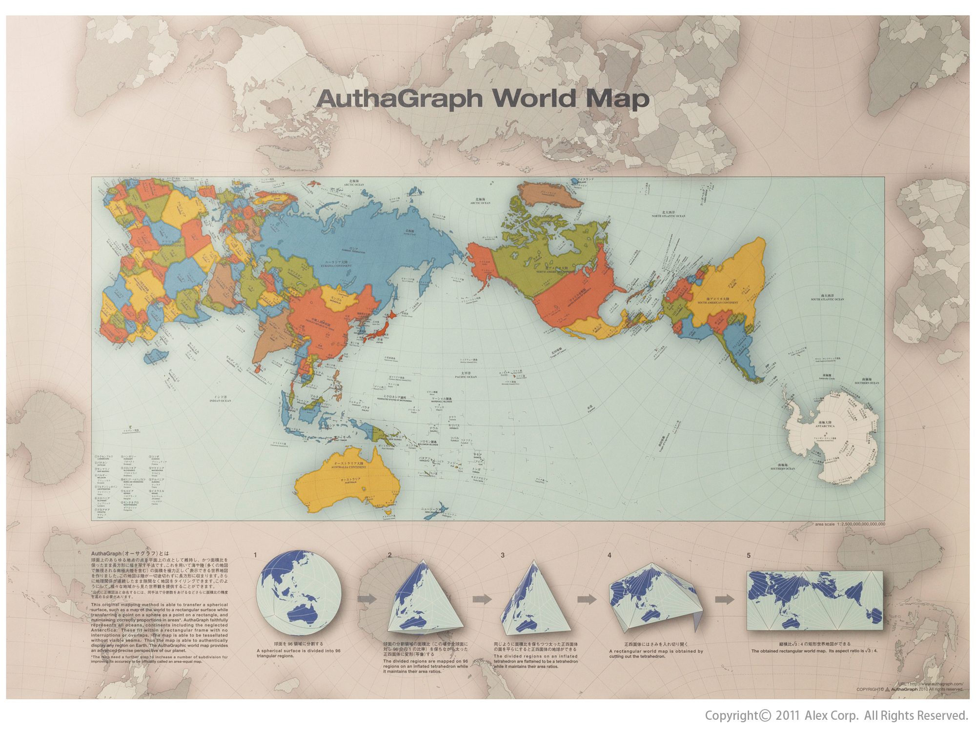
The 2016 Good Design Grand Award has been awarded to Hajime Narukawa's AuthaGraph World Map, a new projection of the Earth's surface onto a two-dimensional space that more accurately represents the sizes of continents and oceans (the Mercator projection "stretches" details farther from the equator, resulting in an greatly oversized Greenland and undersized Africa, among other issues).
I get an OpenDNS malware warning on the second link.
posted by jedicus at 10:25 AM on November 1, 2016
posted by jedicus at 10:25 AM on November 1, 2016
Seems like they took the land masses as a whole and tipped them to fit on the smallest rectangle possible. It's nice that everything is correctly sized but having Antarctica above Australia is flat out confusing. Picturing this on a globe is pretty difficult whereas the Mercator is easy. So, interesting but not really better. And what the man of twists and turns said.
posted by doctor_negative at 10:25 AM on November 1, 2016
posted by doctor_negative at 10:25 AM on November 1, 2016
That's pretty cool.
You can buy it here if you're outside of Japan:
http://www.alexcious.com/products/detail150.html#tab-sub1
posted by Annika Cicada at 10:26 AM on November 1, 2016 [1 favorite]
You can buy it here if you're outside of Japan:
http://www.alexcious.com/products/detail150.html#tab-sub1
posted by Annika Cicada at 10:26 AM on November 1, 2016 [1 favorite]
having Antarctica above Australia is flat out confusing
Well, the earth is a sphere (sort of) and any point of reference is going to be subjective so there's no reason you couldn't have Antarctica "above" Australia, you just need to make sure you know that north isn't necessarily up which, again, it doesn't have to be.
I would have loved to have this when I was teaching sixth grade Social Studies (we learned a lot about map projections and their uses and drawbacks and everything). Thanks for the post!
posted by Mrs. Pterodactyl at 10:28 AM on November 1, 2016 [7 favorites]
Interesting, but is there anywhere to see a non-tiny version of this map?
Also, while the map does a good job of keeping the sizes of the continents roughly correct, there are some weird and unexpected distortions in their shapes. I've never seen Brazil look so pointy before, for instance. And it doesn't do a particularly good job of representing the relative positions of the continents (How far is South Australia from Antarctica, for instance? Good luck working that out from this map.) and the meridians and parallels are just all over the place.
Equal-area projections aren't a new thing, anyway. If you want the continents to look about right and don't care about their positions, give me a good old Goode homolosine projection. Not so good near the poles, but much more useful for the places where almost everybody actually lives.
posted by Anticipation Of A New Lover's Arrival, The at 10:30 AM on November 1, 2016 [6 favorites]
Is it just me or does Brazil look totally wacky?
posted by delicious-luncheon at 10:31 AM on November 1, 2016 [3 favorites]
posted by delicious-luncheon at 10:31 AM on November 1, 2016 [3 favorites]
...having Antarctica above Australia is flat out confusing
Look in the grayed-out area outside the colored rectangle.
Equal-area maps are not a new thing, but the way this presents relative locations of features in multiple ways is new to me. Clever idea.
posted by agentofselection at 10:33 AM on November 1, 2016 [1 favorite]
Look in the grayed-out area outside the colored rectangle.
Equal-area maps are not a new thing, but the way this presents relative locations of features in multiple ways is new to me. Clever idea.
posted by agentofselection at 10:33 AM on November 1, 2016 [1 favorite]
Also, obligatory XKCD comic.
posted by Anticipation Of A New Lover's Arrival, The at 10:34 AM on November 1, 2016 [18 favorites]
posted by Anticipation Of A New Lover's Arrival, The at 10:34 AM on November 1, 2016 [18 favorites]
As a Canadian - I do not approve of the considerable shrinking down of my my country compared to older style maps. CANADA RULES THE TOP OF MAPS!!!
posted by helmutdog at 10:34 AM on November 1, 2016 [5 favorites]
posted by helmutdog at 10:34 AM on November 1, 2016 [5 favorites]
It would be better if they had drawn the equator into it as well, but it's p neat regardless
posted by clockzero at 10:42 AM on November 1, 2016 [1 favorite]
posted by clockzero at 10:42 AM on November 1, 2016 [1 favorite]
Well I give them credit, it's innovative. The super-misshapen Brazil seems to be the biggest drawback, given how populous that country is. It's a bit odd how the Polynesian islands end up being some of the most "correct"; I suspect very few map readers know or care about the precise alignments there. But all projections are compromises, I like this for being a different one.
posted by Nelson at 10:43 AM on November 1, 2016 [2 favorites]
posted by Nelson at 10:43 AM on November 1, 2016 [2 favorites]
Australia seems oversized relative to Canada? Australia seems oversized relative to everything on this map.
posted by GuyZero at 10:43 AM on November 1, 2016 [2 favorites]
posted by GuyZero at 10:43 AM on November 1, 2016 [2 favorites]
It would be better if they had drawn the equator into it as well
They did? It's the heaviest line of latitude drawn on the map. It follows a broad u-shape.
posted by agentofselection at 10:45 AM on November 1, 2016
They did? It's the heaviest line of latitude drawn on the map. It follows a broad u-shape.
posted by agentofselection at 10:45 AM on November 1, 2016
Interesting, but is there anywhere to see a non-tiny version of this map?
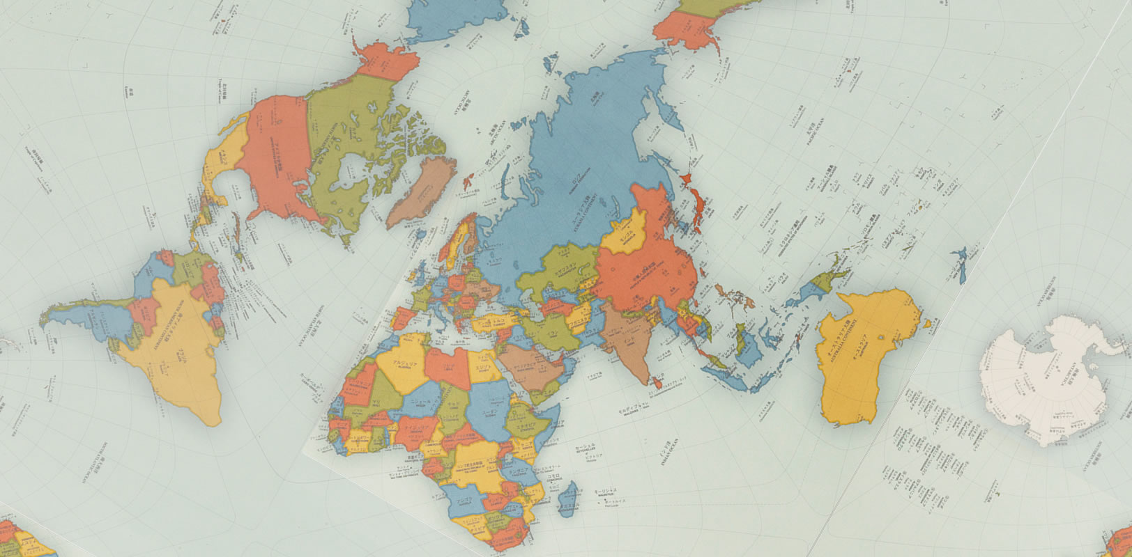
Here's the image from the the retail link posted above.
Still not great, but much better resolution, and importantly includes latitude and longitude lines (which are frustratingly missing from the original). I still think it could be much better about indicating north and south though.
I also don't so much mind the idea of flipping the typical America First view of the world, but if you're going to recenter things, I'd rather see the map centered on a land mass, as opposed to an ocean. Or, if you're going to center on the Equator/International Date Line, maybe label them both more clearly, and center on them?
posted by sparklemotion at 10:48 AM on November 1, 2016 [3 favorites]
Huh. Greenland's still pretty big.
posted by Bee'sWing at 10:49 AM on November 1, 2016 [1 favorite]
posted by Bee'sWing at 10:49 AM on November 1, 2016 [1 favorite]
I guess radically distorting large sections of ocean is an OK idea.
Perfectly practical when you never leave your own country.
posted by oneswellfoop at 10:51 AM on November 1, 2016
Perfectly practical when you never leave your own country.
posted by oneswellfoop at 10:51 AM on November 1, 2016
Blegh, I hate this. Everything looks crowded in the top-left corner, I can't visualize distance between two points, and I can't figure out why they decided to center the map on Hawaii.
posted by pintapicasso at 10:52 AM on November 1, 2016 [2 favorites]
posted by pintapicasso at 10:52 AM on November 1, 2016 [2 favorites]
Australia seems oversized relative to everything on this map.
That's because Australia is actually really big but it's shrunk by the Mercator projection we're so used to seeing. Try the True Size map to look at it more accurately.
posted by shelleycat at 10:53 AM on November 1, 2016 [6 favorites]
That's because Australia is actually really big but it's shrunk by the Mercator projection we're so used to seeing. Try the True Size map to look at it more accurately.
posted by shelleycat at 10:53 AM on November 1, 2016 [6 favorites]
Canada is still bigger than Australia, but not by as much as you might expect from the maps we're used to seeing.
posted by shelleycat at 10:55 AM on November 1, 2016 [2 favorites]
posted by shelleycat at 10:55 AM on November 1, 2016 [2 favorites]
As a Canadian - I do not approve of the considerable shrinking down of my my country compared to older style maps. CANADA RULES THE TOP OF MAPS!!!
No TrueScotsman Canadian would make this statement!
posted by hippybear at 10:56 AM on November 1, 2016 [2 favorites]
No True
posted by hippybear at 10:56 AM on November 1, 2016 [2 favorites]
Google "australia superimposed on america" to see how big it is.
posted by Bee'sWing at 10:56 AM on November 1, 2016
posted by Bee'sWing at 10:56 AM on November 1, 2016
Fun fact: the modern Germany is just about the same size as the state of New Mexico.
posted by hippybear at 10:57 AM on November 1, 2016
posted by hippybear at 10:57 AM on November 1, 2016
This projection isn't particularly better than existing ones at minimizing distortion, and it's worse than most in terms of shape and direction. The most interesting thing about it is that it tessellates (check out images 4 and 5 at this link), which means the edges can be drawn anywhere without having to re-project. That's super cool - it eliminates topological distortion and the privileging of any particular spot as the center of the world. It's a shame the image they used doesn't really get that across.
posted by theodolite at 10:59 AM on November 1, 2016 [15 favorites]
posted by theodolite at 10:59 AM on November 1, 2016 [15 favorites]
I feel like this is an attempt to make a map that everyone on earth can be equally unhappy about.
posted by Mr.Encyclopedia at 11:01 AM on November 1, 2016 [9 favorites]
posted by Mr.Encyclopedia at 11:01 AM on November 1, 2016 [9 favorites]
The Fuller projection is still my favorite:
posted by llin at 11:07 AM on November 1, 2016 [10 favorites]
The problem for me with the Fuller projection and similar is that I have no idea what's near anything else; at first glance, it looks like the easternmost part of Brazil should fit in right next to Norway. Obviously that's not true and you can figure it out if you put in some effort, but it feels really counterintuitive to me and like it's going to take a lot of extra processing time, especially for non-professionals.
posted by Mrs. Pterodactyl at 11:09 AM on November 1, 2016
posted by Mrs. Pterodactyl at 11:09 AM on November 1, 2016
So, the xkcd link posted above, lead me to the section on Wikipedia about the Gall-Peters controversy, and John Stewart's quote about trying to find a perfect projection being like "squaring the circle or making pi come out even"
Which, kind of makes this whole thing adorkable. Like -- we need to acknowledge that every map projection is flawed, make sure that kids learn that when they are learning geography, and maybe tweak the decision makers every once in a while to make sure that they aren't letting their projection of choice influence said decisions too much.
But yet, cartographers gonna cartograph, and new crazy kirigami schemes are going to keep getting made and pushed as "the best," as if there could be an objective "best" about map projections or super heroes or unix text editors.
(the waterman butterfly is pretty great, the Cahill 1909 poster is nice too look at as well).
posted by sparklemotion at 11:19 AM on November 1, 2016 [5 favorites]
Well, the earth is a sphere (sort of) and any point of reference is going to be subjective so there's no reason you couldn't have Antarctica "above" Australia, you just need to make sure you know that north isn't necessarily up which, again, it doesn't have to be.
I would have loved to have this when I was teaching sixth grade Social Studies (we learned a lot about map projections and their uses and drawbacks and everything). Thanks for the post
World maps basically have two purposes. One purpose being educational, the other being decorative. In an educational setting, there are reasons why you wouldn't want Antarctica above Australia. Using this map to teach environmental science, climate, or world economics would cause quite a bit of confusion. This map heavily distorts bearing, at the expense of maintaining some integrity of shape and area. There are far better projections that maintain bearing, shape, and area (Robinson Projection).
Anyway, this is a cool decorative map, but I wouldn't want this anywhere near a classroom, unless the lesson was in regards to geographic projections.
posted by Beardsley Klamm at 11:30 AM on November 1, 2016
Also, obligatory XKCD comic.
AOANLA, thank you for reminding me that I want a Waterman Butterfly for Christmas.
posted by Gaz Errant at 11:31 AM on November 1, 2016 [1 favorite]
AOANLA, thank you for reminding me that I want a Waterman Butterfly for Christmas.
posted by Gaz Errant at 11:31 AM on November 1, 2016 [1 favorite]
Speaking of Gall-Peters, time for the annual viewing of "Nothing is where you think it is" from The West Wing
posted by fifteen schnitzengruben is my limit at 11:32 AM on November 1, 2016 [11 favorites]
posted by fifteen schnitzengruben is my limit at 11:32 AM on November 1, 2016 [11 favorites]
Like -- we need to acknowledge that every map projection is flawed, make sure that kids learn that when they are learning geography, and maybe tweak the decision makers every once in a while to make sure that they aren't letting their projection of choice influence said decisions too much.
But yet, cartographers gonna cartograph, and new crazy kirigami schemes are going to keep getting made and pushed as "the best," as if there could be an objective "best" about map projections or super heroes or unix text editors.
Cartographers aren't the folks pushing one or another as the 'best' or 'worst.' We understand that no map projection is perfect better than anyone, because we actually use this stuff. There are thousands of map projections (lots of us make our own, just for funsies!). This map is not being pushed as 'the best' or whatever by cartographers. It won a design award, not a cartography one.
posted by everybody had matching towels at 11:34 AM on November 1, 2016 [8 favorites]
Has a weird 'skinned animal' vibe -- my poor little planet!
posted by jamjam at 11:35 AM on November 1, 2016 [2 favorites]
posted by jamjam at 11:35 AM on November 1, 2016 [2 favorites]
The most interesting thing about it is that it tessellates (check out images 4 and 5 at this link), which means the edges can be drawn anywhere without having to re-project. That's super cool - it eliminates topological distortion and the privileging of any particular spot as the center of the world.
That is a super-cool feature! It's genuinely really nice that this projection offers the freedom to recenter on any given location like that.
posted by tobascodagama at 11:37 AM on November 1, 2016 [1 favorite]
That is a super-cool feature! It's genuinely really nice that this projection offers the freedom to recenter on any given location like that.
posted by tobascodagama at 11:37 AM on November 1, 2016 [1 favorite]
Now is even easier to play "What Fits Into Russia"!
posted by TheWhiteSkull at 11:39 AM on November 1, 2016 [2 favorites]
posted by TheWhiteSkull at 11:39 AM on November 1, 2016 [2 favorites]
I like this map because it makes it very clear there are SIX continents. None of this dividing Europe from Asia nonsense, it's SIX. SIX CONTINENTS.
posted by happyroach at 11:41 AM on November 1, 2016 [2 favorites]
posted by happyroach at 11:41 AM on November 1, 2016 [2 favorites]
It's not the size that counts; it's the projection.
posted by I-baLL at 11:44 AM on November 1, 2016 [5 favorites]
posted by I-baLL at 11:44 AM on November 1, 2016 [5 favorites]
Re. pointy Brazil: Bill Rankin's comparison of South America in various common projections (and relatedly, another experiment in center-of-the-worldism).
posted by theodolite at 11:51 AM on November 1, 2016
posted by theodolite at 11:51 AM on November 1, 2016
The tessellation is super-neat. I like the commercial version because it actually shows this and allows you to see things the pure rectangle doesn't (like the Atlantic, or the closeness of Autralia and Antarctica).
Other pros: highlights Antarctica; the equal-area thing. Seems like a really good map for Japan (it's well designed to highlight Eurasia and the Pacific).
Cons: Some weird local distortions. Brazil has been noted; also Russia looks like it's been wrung out. China is squashed.
Directions are just weird. Even with the tessellation, you can't get a good idea of (say) the Arctic, since you're getting the surroundings twice. Aesthetically, Africa+Eurasia are all cramped up in the top left.
posted by zompist at 11:54 AM on November 1, 2016 [1 favorite]
The only positive aspect of this map is the more accurate relative sizes of the land features. Other than that it greatly distorts distances between continents, distorts ocean sizes, is just downright ugly and is terrible at conveying information how it all fits together on a globe.
As a map, it's a design fail. Mercator has real problems but this isn't a workable solution.
posted by rocket88 at 11:55 AM on November 1, 2016 [2 favorites]
As a map, it's a design fail. Mercator has real problems but this isn't a workable solution.
posted by rocket88 at 11:55 AM on November 1, 2016 [2 favorites]
Is this the thread where we all argue pointlessly about which map projection is the best for displaying the whole world? Awesome, because I have the one true definite answer!
The best projection for displaying the whole world is clearly the Mollweide projection! It's equal area, so you don't have to go through the whole "colonialist maps" argument, it's round like the Earth, everything is in its proper place relative to everything else (i.e. no "antarctica is above of Australia"), and it looks like you think the earth looks like! It achieves all of this by distorting shapes far to the east or west of the prime meridian, but it distorts them in a way that makes perfect sense to the human brain (the map almost feels "3d" in a way, making the center pop out and the edges recede back). There's a reason why Mollweide is almost extremely common in science for displaying things like cosmic background radiation or how gravity works on Mars.
However, if you want your map to be useful for... you know... getting around, Mercator is still the king. Having no local shape distortion, orthogonal latitudes and longitudes, and straight lines on the map being lines of constant bearing is, as it turns out, incredibly useful for actually getting places. It's the reason why virtually all online mapping services (like Google Maps) use Mercator, or some very slight variation on it.
posted by gkhan at 11:58 AM on November 1, 2016 [9 favorites]
I guess radically distorting large sections of ocean is an OK idea.
GO BACK TO ATLANTIS!
posted by TheWhiteSkull at 11:59 AM on November 1, 2016 [4 favorites]
GO BACK TO ATLANTIS!
posted by TheWhiteSkull at 11:59 AM on November 1, 2016 [4 favorites]
Cartographers aren't the folks pushing one or another as the 'best' or 'worst.' We understand that no map projection is perfect better than anyone, because we actually use this stuff.
I shouldn't have worded my comment in such a way as to imply that cartographers are the ones trying to put objective "bestness" on projections. Here's an attempted redo:
Why isn't there a Google Cardboard-enabled video or app that lets me see (and maybe play with?) the sphere to prism to plane flattening and unfolding?
Where's the papercut pattern that I can print out and make myself crazy trying to fold up and assemble?
It seems neat -- but for something that's supposedly an innovation in the visual display of information, the visual display of the thing is kind of frustrating to engage with.
*I really want to say mapotaku here, but with the whole Japanese designer thing I figured I'd skip it. I'm open for other (hopefully gender neutral) portmanteaus that get across the Dwight Schrute/Comic Book Guy type insistence that "thing" is "best," based on shoddy assumptions regarding what the objective standards are/should be.
posted by sparklemotion at 12:00 PM on November 1, 2016
I shouldn't have worded my comment in such a way as to imply that cartographers are the ones trying to put objective "bestness" on projections. Here's an attempted redo:
But yet, cartographers gonna cartograph, and new crazy kirigami schemes are going to keep getting made and pushed by map-fanboys* as "the best," as if there could be an objective "best" about map projections or super heroes or unix text editors.Anyways, on a more positive (I guess) front, I feel like for a "design award winner" the presentation of this map leaves a lot to be asked for. The tessellation feature is awesome -- where's the HTML5 app that lets me move and rotate my "map box" around to see how that really works?
Why isn't there a Google Cardboard-enabled video or app that lets me see (and maybe play with?) the sphere to prism to plane flattening and unfolding?
Where's the papercut pattern that I can print out and make myself crazy trying to fold up and assemble?
It seems neat -- but for something that's supposedly an innovation in the visual display of information, the visual display of the thing is kind of frustrating to engage with.
*I really want to say mapotaku here, but with the whole Japanese designer thing I figured I'd skip it. I'm open for other (hopefully gender neutral) portmanteaus that get across the Dwight Schrute/Comic Book Guy type insistence that "thing" is "best," based on shoddy assumptions regarding what the objective standards are/should be.
posted by sparklemotion at 12:00 PM on November 1, 2016
Has a weird 'skinned animal' vibe -- my poor little planet!
Any equal-area projection is in some sense similar to skinning an animal.
posted by a snickering nuthatch at 12:01 PM on November 1, 2016 [2 favorites]
Any equal-area projection is in some sense similar to skinning an animal.
posted by a snickering nuthatch at 12:01 PM on November 1, 2016 [2 favorites]
It's not the size that counts; it's the projection.
Mapmakers do it with projections.
posted by fairmettle at 12:01 PM on November 1, 2016 [4 favorites]
Mapmakers do it with projections.
posted by fairmettle at 12:01 PM on November 1, 2016 [4 favorites]
zompist: "Other pros: highlights Antarctica; the equal-area thing."If you look at the small print, it's not actually equal-area. The map may be pretty (to some), but it fails on most counts as an actual map.
posted by brokkr at 12:07 PM on November 1, 2016 [1 favorite]
Where's the papercut pattern that I can print out and make myself crazy trying to fold up and assemble?
This seems like a neat project - PDF file from U.S. Geological Survey:
posted by cynical pinnacle at 12:09 PM on November 1, 2016 [2 favorites]
This seems like a neat project - PDF file from U.S. Geological Survey:
This report contains instructions and two patterns for making a terrestrial globe and a tectonic globe. The pattern or map projection is designed to be glued onto a used tennis ball. The terrestrial globe is intended to help visualize the location of the continents and oceans. The purpose of the tectonic globe is to help visualize the location of the Earth's plates and types of plate boundaries (e.g., spreading, convergent, and transform). By constructing and examining the globes, students and others will obtain a greater appreciation of why the edges of continents are located where they are, and of the shape and position of the Earth's plates and their boundaries.The paper pattern starts on page 10. Pages 12 and 13 show how to apply the paper cut-outs to a tennis ball.
posted by cynical pinnacle at 12:09 PM on November 1, 2016 [2 favorites]
What is this, an arctica for ants?
posted by Jon Mitchell at 12:16 PM on November 1, 2016 [5 favorites]
posted by Jon Mitchell at 12:16 PM on November 1, 2016 [5 favorites]
idk i like the butterfly one but more importantly the population density map of australia is v relevant to the current discussion in the westworld fanfare thread.
posted by poffin boffin at 12:19 PM on November 1, 2016 [1 favorite]
posted by poffin boffin at 12:19 PM on November 1, 2016 [1 favorite]
Yes but how does it depict Western Sahara and Palestine??
posted by MisantropicPainforest at 12:24 PM on November 1, 2016 [1 favorite]
posted by MisantropicPainforest at 12:24 PM on November 1, 2016 [1 favorite]
I can't figure out why they decided to center the map on Hawaii
Japanese Mercator projection maps often have either Japan or the IDL (which is close to same thing, and still puts Japan near the center instead of way off to the side like a US/England map would) as the center of the map (like this). I suspect its basically the same reason.
(Some Japanese people I know were surprised to learn that American maps were not centered on America, especially given how famous Americans are for... not caring about the rest of the world so much)
posted by thefoxgod at 12:34 PM on November 1, 2016 [1 favorite]
really though why don't we have cool hologram projected maps as the universal standard yet? why isn't actual science keeping up with movies, this is such a betrayal
posted by poffin boffin at 12:36 PM on November 1, 2016 [2 favorites]
posted by poffin boffin at 12:36 PM on November 1, 2016 [2 favorites]
Buckminster Fuller's dymaxion world map. Not dissimilar?
posted by plep at 12:47 PM on November 1, 2016 [2 favorites]
posted by plep at 12:47 PM on November 1, 2016 [2 favorites]
(Some Japanese people I know were surprised to learn that American maps were not centered on America, especially given how famous Americans are for... not caring about the rest of the world so much)
A middle-school teaching friend had a Cold War-era map that had the USofA smack dab in the middle of it. The first time I saw it, I busted out laughing.
posted by slogger at 1:02 PM on November 1, 2016 [3 favorites]
A middle-school teaching friend had a Cold War-era map that had the USofA smack dab in the middle of it. The first time I saw it, I busted out laughing.
posted by slogger at 1:02 PM on November 1, 2016 [3 favorites]
Back in the late 80s there was an issue of National Geographic Magazine that compared a whole bunch of different map projections (it was the first time I learnt what the Mercator projection was) and they settled on the Robinson projection as the best compromise. According to Wikipedia they abandoned that in favour of the Winkel tripel projection in 1998. Is this even really much of a concern any more though? If you want a physical representation of the world, use a globe. If you want a 2D representation, it's probably going to be on an electronic device, so why not have an interactive 3D projection?
posted by L.P. Hatecraft at 1:30 PM on November 1, 2016 [3 favorites]
posted by L.P. Hatecraft at 1:30 PM on November 1, 2016 [3 favorites]
The Peirce quincuncial and Guyou projections tessellate too! They project two hemispheres down to squares conformally (preserving angles) so you get goofy area distortions. You can do the same preserving areas, but it tends to look awful. Using a tetrahedron is quite clever.
The Fuller map has big tears across oceans; this one distorts the oceans a bit more, but at least they're continuous. I think the Fuller map manages to avoid lots of distortion specifically because of the tears.
posted by BungaDunga at 1:32 PM on November 1, 2016 [1 favorite]
The Fuller map has big tears across oceans; this one distorts the oceans a bit more, but at least they're continuous. I think the Fuller map manages to avoid lots of distortion specifically because of the tears.
posted by BungaDunga at 1:32 PM on November 1, 2016 [1 favorite]
Dymaxion 4 Lyfe!!!! /throws up gang projections
posted by Celsius1414 at 1:54 PM on November 1, 2016 [3 favorites]
posted by Celsius1414 at 1:54 PM on November 1, 2016 [3 favorites]
The Fuller map has the advantage over Mercator in that rather than having them on opposite sides of the map, it shows how close together Eurasia and North America really are. In fact, Fuller shows we really have a single line of continents that wraps around the glove.
posted by happyroach at 2:09 PM on November 1, 2016 [1 favorite]
posted by happyroach at 2:09 PM on November 1, 2016 [1 favorite]
I was playing around with the Peirce quincuncial projection recently (transformation formulae included). I love how it turns the equator into a diamond.
posted by Mapes at 2:31 PM on November 1, 2016 [4 favorites]
posted by Mapes at 2:31 PM on November 1, 2016 [4 favorites]
Also, obligatory XKCD comic.
AOANLA, thank you for reminding me that I want a Waterman Butterfly for Christmas.
If you're really good you'll get a Pierce Quincuncial - seems to be Randal Monroe's fave anyway.
posted by rongorongo at 3:47 PM on November 1, 2016
AOANLA, thank you for reminding me that I want a Waterman Butterfly for Christmas.
If you're really good you'll get a Pierce Quincuncial - seems to be Randal Monroe's fave anyway.
posted by rongorongo at 3:47 PM on November 1, 2016
Aw, I thought it was cleverly done, and I like maps that mess with your sense of familiarity and make you remember that the edges aren't really there. The complaints about it distorting things seem a little uncharitable. Does it distort things that much compared to most other rectangular maps, or is it just distorting them in an unusual way that's easy to recognise as different from what we're used to? Especially given the way it wraps in an unintuitive manner.
Here's a section that's centred a bit more like usual Western maps, which feels like it's doing interesting things.
posted by lucidium at 3:51 PM on November 1, 2016 [2 favorites]
Here's a section that's centred a bit more like usual Western maps, which feels like it's doing interesting things.
posted by lucidium at 3:51 PM on November 1, 2016 [2 favorites]
The cool thing about the Fuller Projection is that the "tears" can be along any of the triangular sides, to make different maps that focus on different relationships. For instance, this one that unfolds the world to show a continuous ocean ringed by fragments of land.
posted by ejs at 4:15 PM on November 1, 2016 [3 favorites]
posted by ejs at 4:15 PM on November 1, 2016 [3 favorites]
lucidium: "The complaints about it distorting things seem a little uncharitable. Does it distort things that much compared to most other rectangular maps, or is it just distorting them in an unusual way that's easy to recognise as different from what we're used to?"You cannot make a map that does not distort shapes, but you can make socalled conformal maps which have the property that distortion at a given point is equal in all directions. This gives the best fidelity of shape. Peirce's Quincuncial is a conformal projection.
It is not possible to make a map that is both conformal and equal area.
posted by brokkr at 4:57 PM on November 1, 2016 [1 favorite]
Dang, Antarctica Is Tiny
Indeed it is, on this map. Australia is 2.97 square miles, Antarctica is 5.41 square miles, but on this map they appear more or less the same size. Fail, on that score alone.
But hey. Maps is not you get any idea how big someplace is. To do that, you have to walk across it.
posted by beagle at 5:25 PM on November 1, 2016 [3 favorites]
Dang, Antarctica Is Tiny
I like the site thetruesize.com which allows you to drag one country from a Mercator projection map over another - with size preserved correctly. By this measure Antarctica would cover all of North America coast to coast while stretching from central America to somewhere in Baffin Island. "Tiny" only for extreme definitions. Explanatory video with other demos.
posted by rongorongo at 1:07 AM on November 2, 2016
why flat anymore? can't everybody get a globe digital or otherwise...where's my cat?
posted by judson at 10:44 AM on November 2, 2016
posted by judson at 10:44 AM on November 2, 2016
« Older It's time to bake a cake | Challenge accepted! Newer »
This thread has been archived and is closed to new comments
posted by the man of twists and turns at 10:22 AM on November 1, 2016 [8 favorites]