I renewed the domain last night and couldn't believe two years had already past. There have been over six thousand threads and almost sixty thousand comments by over four thousand members. I started planning the site in early 1999, bought the domain in March, worked on mockups through March and April, coded through May, and began posting in June. By July I had found a groove, and the site began regular updates. It would be until January of 2000 before significant crowds started showing up, and since then it has steadily grown, with intermittent spurts. If I had to come up with an hourly estimate for time spent building and maintaining the site, it would certainly be in the thousands.
I salvaged an old hard drive last week and found a lot of the first mockups and ideas for the site. It didn't always look or act the way you see it now, in fact the original concept for the site was
much different.
Way back when
Way back at the beginning of 1999, there were maybe 30 weblogs total, and I was in awe. I was drawn to the personalities and the interesting links. I couldn't possibly do one myself, so I thought that perhaps summarizing other blogs would be useful. Luckily, that idea didn't last long before I decided to scrap it and do a normal blog, but the idea for a summary or meta weblog (much like
Crazy Uncle Joe's Metacubed) hadn't been done yet and it was the direction I intended to go at first.
The horror
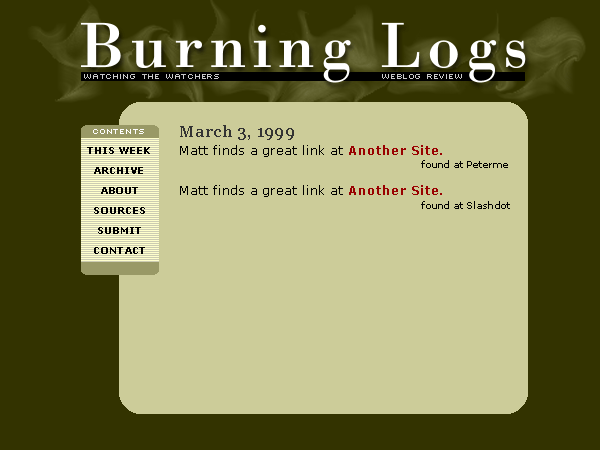
When I thought the site would simply be a weblog of other weblogs, I created some mockups to go along with that. The first name I came up with was "burning logs" because I was "burning" through many weblogs a day to summarize the content. What was I thinking?
Burninglogs mockup
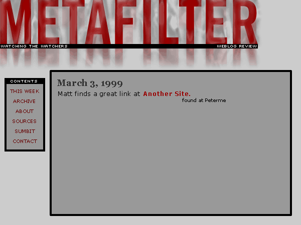
Thank god that name didn't last more than a few hours. The same night I came up with "MetaFilter" because it was a meta-weblog and it would be "filtering" through many sites
First MetaFilter mockup
At this point, the smoky background thing didn't make much sense, so I started in a new direction, but for some reason I still liked the smoky look. This next mockup probably used 4 or 5 photoshop filters to get the logo text looking so goofy.
a distressed MetaFilter mockup
A few days later I dropped the smoky distressed look and thought a slick, semi-transparent look would be more fitting. I came up with the following and actually coded it at one point. The problem at the time was the transparency only looked good in windows versions of IE, which I used a special alpha filter built into the browser to display table backgrounds as see through.
Blue transparent
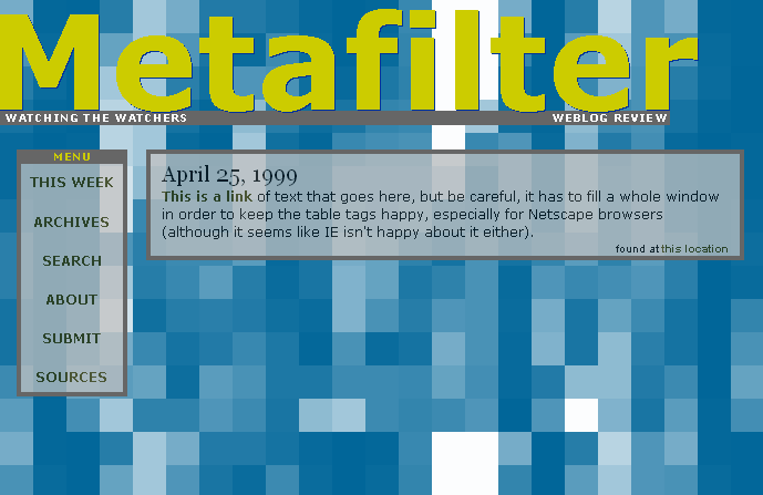
Then I decided to drop the photoshop look and try something funky, something pixelated. I still liked the transparency though, and this would have the same limits of the last - it would only look best in windows IE browsers. I tried all sorts of color combos, this one, using the current metafilter palette might have come later, since I remember starting with a red/gray/white/black palette.
Pixely MetaFilter
I wise up
So after a couple weeks of playing around with mockups with the idea in mind that I'd simply summarize other weblogs, I ditched it in favor of creating my own. At the time (spring '99), weblogs were being criticized by personal publishers, because the weblog itself wasn't considered content. The real content was all off-site, created by someone else, so webloggers were seen as simply poaching or pointing to real things instead of actually making real things themselves. I thought there was still something worthwhile in the commentary of weblog authors, the text surrounding links, and went ahead and built a weblog anyway.
I used the project as an excuse to push my nascent coldfusion and SQL database programming skills, and thought having multiple authors would be the key to creating a good weblog. If I could find one or two links a day, perhaps having 4 or 5 others joining me would result in a fairly decent amount of content. I added the comments because I figured if 4 or 5 authors were trading links all day, they might want to also leave comments for other link posters. What I envisioned was much like
Flutterby is today, a site with a few contributors, a smattering of comments, and a sizable readership.
On the mockup front, I was playing with colors and the path tools in photoshop. I stumbled upon a bright, but flat blue that I liked for a background and made some white shapes of various sizes for accents. My then favorite font was TradeGothic Condensed Bold, so I put those together. I needed a second, accent color, and went with a weird yellow-green I hadn't seen people using much.
Almost there
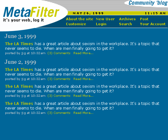
The final change to the mockup was to darken the top menu area, so the non-traditional navigation layout was easier to see.
Final mockup
So why is the site down?
I'm spending this weekend tweaking a lot of things behind the scenes. With the recent
donation money, I purchased another 512Mb of RAM (to take the total up to 1Gb of installed RAM) and an extra 40Gb hard drive for storing log files (the server's access logs are over 10Gb and growing by dozens of Mb a day) - total spent so far: about $400. I'll be patching the server's software, and I'll be working on the code for the site itself. I'm hoping to clean up a lot of little bugs, polish up the rules/guidelines and copy, make the sign-up and sign-in process smoother, redo the backend end mechanics of metafilter and metatalk, and incorporate a few new features.
It used to be so much better man...
There probably won't too many noticeable differences, but it'll make maintaining the site, administering the content, and policing the members much easier for me. The site has grown to a pretty significant size, and may be slightly straining under the load, and I want to do as much as possible technically to keep things running smoothly.
And don't worry, the site will be back on Monday.
--
Matt (1:00 AM Saturday March 17, 2001)
