The incredible challenge of recreating reality
April 10, 2006 12:59 PM Subscribe
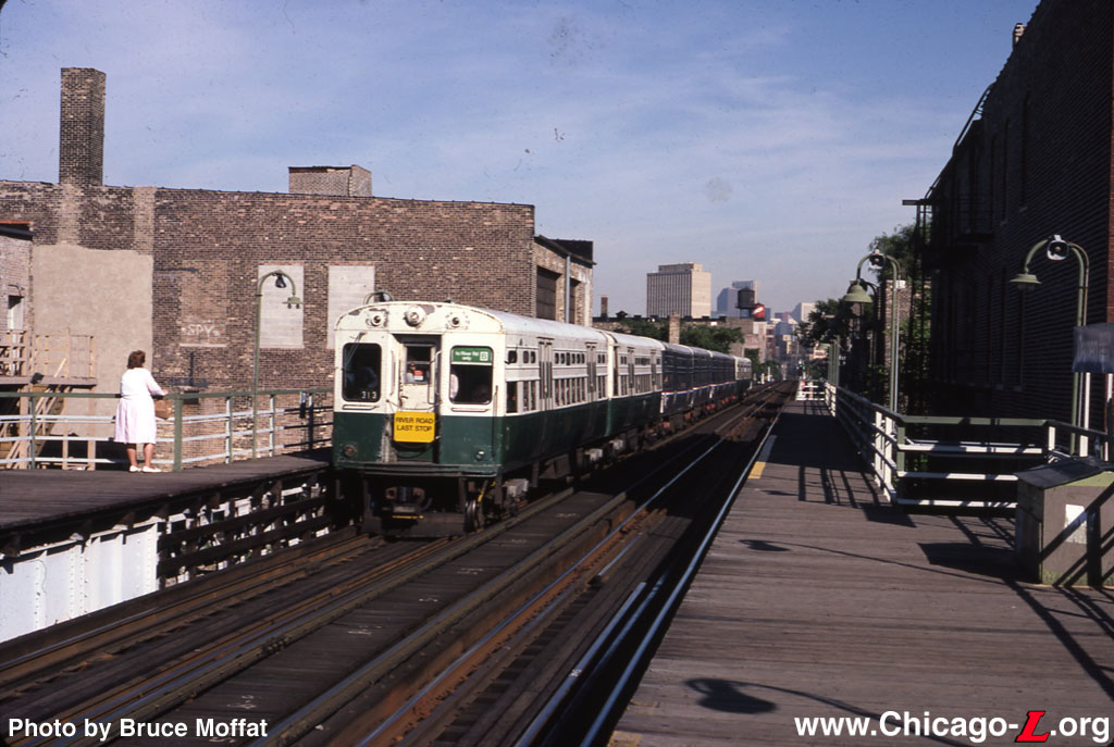
Fun with Photoshop and Illustrator Incredibly detailed photo-realistic image of the Chicago Transit Authority's Damen Station [map]. Here's a similar photo. [more inside]
Via Veerle's blog:posted by kirkaracha at 1:00 PM on April 10, 2006
At my art college, using Illustrator to make photorealistic images was actually one of the standard projects for learning how to use the program. I did a pretty decent one of a Juke box.
posted by dgaicun at 1:17 PM on April 10, 2006
posted by dgaicun at 1:17 PM on April 10, 2006
What kind of computer was he using when he created these? Jeebus.
The flattened file weighs in at 1.7 Gigabytes.
*gasp*
posted by mr.curmudgeon at 1:17 PM on April 10, 2006
The flattened file weighs in at 1.7 Gigabytes.
*gasp*
posted by mr.curmudgeon at 1:17 PM on April 10, 2006
I have always been fascinated by photorealism, but it's more about skill than any real creativity. A waste of talent if anything.
posted by Acey at 1:17 PM on April 10, 2006
posted by Acey at 1:17 PM on April 10, 2006
what zenzizi said, contrast with the work of On Kawara posted earlier... Now this I can 'get'
posted by sfts2 at 1:20 PM on April 10, 2006
posted by sfts2 at 1:20 PM on April 10, 2006
It dosn't really look 'photo realistic' to me. I mean, maybe I'm spoild by all the really amazing 3d stuff being done these days but it does look more like a painting then a photograph to me.
Maybe if it was done from imagination I would be impressed.
posted by delmoi at 1:22 PM on April 10, 2006
Maybe if it was done from imagination I would be impressed.
posted by delmoi at 1:22 PM on April 10, 2006
Looking at some of his other stuff, it really seems to lack any creative spirit at all. It's like he's copying bland photographs, for the most part.
posted by delmoi at 1:24 PM on April 10, 2006
posted by delmoi at 1:24 PM on April 10, 2006
Well, after the coming ecological meltdown when we're all living in some kinda VR hologram doodad, we're going to need guys like him.
posted by 327.ca at 1:33 PM on April 10, 2006
posted by 327.ca at 1:33 PM on April 10, 2006
I have to disagree with the haters. I look at these photos - er, paintings, and these are the types of things I love about Chicago and the things I find myself taking pictures of. Bland? Perhaps in your eye, beholder, but not mine.
However, I was always told in school that painting from pictures was cheating - though I doubt my 7th grade art teacher had any idea about things like this to come. Though it would be really neat to see someone sitting outside with their laptop instead of sketch book doing a digital painting like these. I would love to see how the results differ from the same artist.
posted by [insert clever name here] at 2:18 PM on April 10, 2006
one interesting thing he seems to be forgetting is color perspective, a.k.a.aerial perspective - the blurring and slightly bluish coloration of objects in the distance as a result of atmospheric effects. it immediately jumped out at me that the skyline in the distance in his illustration look very close, because the colors are as clear and vibrant as his foreground.
that being said, being someone who works with photoshop and illustrator every day... wow. you've got to respect the time and effort and attention to detail. which is maybe why the above omission irks me so much.
posted by ab3 at 2:24 PM on April 10, 2006
that being said, being someone who works with photoshop and illustrator every day... wow. you've got to respect the time and effort and attention to detail. which is maybe why the above omission irks me so much.
posted by ab3 at 2:24 PM on April 10, 2006
Very creative use of the applications to achieve his vision. Wonderful stuff.
posted by juiceCake at 2:44 PM on April 10, 2006
posted by juiceCake at 2:44 PM on April 10, 2006
one interesting thing he seems to be forgetting is color perspective, a.k.a.aerial perspective - the blurring and slightly bluish coloration of objects in the distance as a result of atmospheric effects.
Ditto. That kind of makes these images fall flat for me. Even some of the close up images don't look dirty enough - like the recycle sign on the side of the phone box.
That said, its an amazing accomplishment that deserves some respect!
posted by pkingdesign at 3:23 PM on April 10, 2006
Ditto. That kind of makes these images fall flat for me. Even some of the close up images don't look dirty enough - like the recycle sign on the side of the phone box.
That said, its an amazing accomplishment that deserves some respect!
posted by pkingdesign at 3:23 PM on April 10, 2006
This probably sounds really dumb, but where on the Chicago L website does it say that the image (the first one on the page that is linked to by the OP) is not a photograph of the real thing?
posted by A189Nut at 4:36 PM on April 10, 2006
posted by A189Nut at 4:36 PM on April 10, 2006
one interesting thing he seems to be forgetting is color perspective, a.k.a.aerial perspective - the blurring and slightly bluish coloration of objects in the distance as a result of atmospheric effects.
Maybe he's not trying to be that realistic.
This is what Bert said about when asked "Why not take just a picture?
You can also achieve perspectives in drawing that aren't possible in photography.
posted by disgruntled at 4:50 PM on April 10, 2006
Maybe he's not trying to be that realistic.
This is what Bert said about when asked "Why not take just a picture?
You can also achieve perspectives in drawing that aren't possible in photography.
posted by disgruntled at 4:50 PM on April 10, 2006
11 months!
posted by The Monkey at 4:58 PM on April 10, 2006
posted by The Monkey at 4:58 PM on April 10, 2006
Thanks for reminding me how much I like Gerhard Richter's work... particularly the monochromatic and blurry, photo-"realistic" stuff like this.
Which kind of reminds me of the mid-'80s work of Robert Longo. Unlike Munroy, however, Longo "first projects photographs of his subjects onto paper and traces the figures in graphite, stripping away all details of the background. After he records the basic contours, his assistant, Diane Shea, continues work on the figure for about a week, filling in the details."
posted by CMichaelCook at 5:26 PM on April 10, 2006
OK, at the risk of being accused of having some amount of sour lemon extract in my veins, I need to add my $0.25 to this thread.
I suppose when I signed onto MetaFilter, I was less than brilliant in choosing my MeFi name, it's simply my first initial and last name. So much for my desire to remain anon.
For many years, Bert was my primary creative collaborator and best friend. Those of you involved in any way with the Photoshop world might recognize my last name, and if so, very likely know about my longtime professional relationship with Bert. We worked side by side for almost 20 years, and in the end, we had a professional and personal breakup that puts most divorces to shame. It was not pretty, to put it mildly, and given the fact that Bert was the best male friend I ever had (we're both very hetero, even though my parents thought for years that we were gay lovers, as we were inseperable), it was as painful a breakup as I've ever been through. I suppose that you should judge my thoughts about Bert's work accordingly - that said, he told me many times that I was the most astute judge of his abilities and helped him create some of his best work.
Astute MeFi regulars such as delmoi hit the nail right on the head - Bert's art is technically very good, but completely and absolutely lacking in emotion and feeling. You can stare at his digital paintings for as long as you want, and in the end, you'll probably feel no different than before. They're nicely rendered, but devoid of any sense of wonder or mystery. To be honest, if one looks very, very carefully at the full size versions of his art, it's surprising how much they lack in technical accomplishment. Bert always idolized the photorealistic school of painters such as Richard Estes, and wanted to achieve comparable levels of realism in the digital realm. I don't think he's ever done a piece that made me gasp and go, "man, that looks like a photograph". There's always been something a little too flat about his work, and I often gave him this exact feedback when we worked on projects together. ab3 is exactly correct in pointing out that Bert's work is often lacking in color perspective, which is the most difficult part of painting photorealistic landscapes. He was never really able to get volumetric rendering down, and it shows in his work. Bert is much more of an illustrator than artist, and this has caused him much frustration over the years.
You will also notice another significant omission in Bert's work - people. It's ironic, given that the very first graphics Bert ever did on a computer was a product called HumanForms, a B&W clipart package of human body parts.
I want to address another of Bert's statements - that this piece took "2000 hours" of work. I'm about as familiar with Bert's working process as anyone will ever be, and I promise you, the actual time is a fraction of his claim. I'll qualify this, and some of you may really think I'm being petty here, but Bert has made other claims about his work that are far less than accurate: he has long claimed to be the "co-author of the first Photoshop book", "The Official Adobe Photoshop Handbook", and has used this credit time and time again as a validation of his place in Photoshop history. I would like to set the record straight for once and all - Bert's actual written contribution to that book was about 10-15% of the text, the majority of which had to be reworked by me in order to be useful. He's listed as the second author on "Photoshop Channel Chops", but the truth is that Nathan Moody wrote far more of that book than Bert, and to this day, I regret the ordering of our names on the cover. As I stated, you can call me an asshole for coming out with these statements now, and in this venue, but they are the truth of his accomplishments. When Bert was inducted into the Photoshop Hall of Fame, he made sure to only thank his wife, and specifically avoided my name. Anyone who knows our history together would tell you that his omission during his acceptance speech was a low, painful blow to the reality of our joint involvement with Photoshop, a program he had access to because of me, and most of what he learned about using Photoshop was the result of many hours of me sharing my own knowledge of the program with him.
A very good friend of mine, one of the most accomplished artists in the world, a master of all mediums that he touches, once told me that "Bert is a human photocopy machine". I don't think I could add much more to that, but I suppose I've tried with this post. Enjoy his work, and let it inspire you to your own greatness, just know that nothing is really as it seems.
posted by dbiedny at 5:43 PM on April 10, 2006
Good question, when you consider my paintings look like photographs. Well, for one thing, I'm not a photographer. To me, it is not the destination that is important--it is the journey. The incredible challenge of recreating reality is my motivation.
That's right folks, when you look at one of these painting you're watching a man masturbate. Enjoy.
posted by Brandon Blatcher at 6:20 PM on April 10, 2006
That's right folks, when you look at one of these painting you're watching a man masturbate. Enjoy.
posted by Brandon Blatcher at 6:20 PM on April 10, 2006
That's right folks, when you look at one of these painting you're watching a man masturbate. Enjoy.
posted by Brandon Blatcher at 9:20 PM EST on April 10 [!]
See Metafilter for more...
posted by juiceCake at 6:37 PM on April 10, 2006
posted by Brandon Blatcher at 9:20 PM EST on April 10 [!]
See Metafilter for more...
posted by juiceCake at 6:37 PM on April 10, 2006
"I have always been fascinated by photorealism, but it's more about skill than any real creativity. A waste of talent if anything."
Not true, just look at the work of a hyper realist like Richard Estes and tell me his work isn't creative.
And while this Monroy is very impressive, I think it's not as impressive as some of the things hyper and photo realistic painters can do.
As good as it looks, it's still pretty obvious that it was computer generated. Though I tend to feel the same way about 3D CGI, I haven't seen anything created 100% digitally that can convince me it's a photograph.
posted by slip81 at 6:59 PM on April 10, 2006
to dbiedny:
as sour as it might have been, your post here is definitely an interesting piece of context for the piece. thanks.
posted by pokermonk at 7:17 PM on April 10, 2006
as sour as it might have been, your post here is definitely an interesting piece of context for the piece. thanks.
posted by pokermonk at 7:17 PM on April 10, 2006
A189Nut: The first link (to bertmonroy.com) is the digital painting. The link to chicago-l.org shows a photograph from very nearly the same perspective. (A place I've stood myself a time or two -- for non-Chicagoans, this is the "L" stop at the heart of Wicker Park, steps away from the Real World Chicago building).
I'll accept on the face of it dbiedny's assertions that Monroy doesn't work that way, but the absence of people in this very culturally significant neighborhood seemed ironic, even if it wasn't intended as commentary. I don't think the divide between illustrator and artist is that starkly drawn -- yes, he leans more toward technical illustration, but the art is found in his dedication toward the creative task, and the obsessive detail that has to be "zoomed in" to see. The human cultural patrimony is chock full of people who were consummate craftsmen but in no way "artists" in the modern starving-in-a-garret fashion.
posted by dhartung at 7:36 PM on April 10, 2006
staggeringly awesome.
posted by crunchland at 7:47 PM on April 10, 2006
posted by crunchland at 7:47 PM on April 10, 2006
Even a photograph does not truly represent reality, because our eyes and brain do not see precisely like a camera does. I feel the best "realists" are those like Jan Vermeer, Jacques-Louis David, Jean-Auguste-Dominique Ingres, and James Tissot ("VIEW IMAGE LIST" to see paintings) who give us their vision of reality.
It's no secret that classic artists frequently used assistants to paint backgrounds, clothing, hands, arms, legs, and bodies, but did they automate their work in other ways? Contemporary artist/photographer David Hockney, in his controversial book (and video) Secret Knowledge, makes the claim that classic painters used optical devices such as the camera obscura to realistically render their subjects (previously on MeFi.)
For artists in demand—particularly before photography became widespread—it's not unreasonable that they used any tools at their disposal to increase their output and income.
posted by cenoxo at 7:51 PM on April 10, 2006
Got to agree with the haterz. If the guy's going to go to all that effort to reproduce a photograph using vector illustration, why not pick a more interesting scene?
posted by kindall at 7:51 PM on April 10, 2006
posted by kindall at 7:51 PM on April 10, 2006
You know, when I first looked at this, I thought the omission of atmospheric perspective was a deliberate decision, partially because the composition seems to benefit from it and partially because, contrary to what dbiedny states, I've always thought it one of the easier things to pick up with landscape painting. It's a fairly consistent effect after all. Capturing the quality of a given outdoor light is much, much harder (for me) by way of counterexample. And honestly, the more I look at Monroy's picture, the more I think he failed at this. The light is very flat in his picture. But, the fact that he didn't include atmospheric perspective in his picture cuts against the notion that he just slavishly copied it from a photograph, because photos pick that up – it's all over the photo linked in the post. It's possible that he's dropping the aerial blur out of a subconscious lack of observation, or as part of his Photoshop process, but I'm not 100% on that.
I think the second close-up betrays the trouble with volumetric rendering that dbeidny describes. There's not very much in that crop that looks like three-dimensional objects in space, to my eye.
The other parts of the picture I have trouble buying are the reflections in the booths in the center of the picture, middle ground. Maybe they look like that. Or maybe those are shortcut reflections. Just enough doubt there.
Overall, I tend to admire expressionism and minimalism in art more than this kind of approach, but taken to this extreme I find it fascinating: when it's good, it's like seeing the human mind turned into a graphics card.
posted by furiousthought at 11:33 PM on April 10, 2006
I have respect of a kind (as long as I can keep at a distance) for obsessiveness, particularly when the output is creative, and so I've got to say [this is good].
But when I first saw it, linked from digg, I think, a few days ago, I clicked through, looked at it for about 20 seconds, and then moved on.
Whether that says more about me or more about the piece, or just that one person's life work can be another's bin liner, well, I don't know the answer to that. Or even if it matters.
posted by stavrosthewonderchicken at 1:37 AM on April 11, 2006
« Older Holy Racist Athletic Gear, Batman! | The nonsense about AdSense Newer »
This thread has been archived and is closed to new comments