Illustrator Marcos Chin
August 17, 2006 12:48 AM Subscribe
If you ride a subway in North America, you've probably seen the pictures: standing before that always red background, stylish urbanites look over their shoulders, giving each other flirtatious looks. And even if you're not in the dating market, you may have taken interest in the posters' energetic style, in the way their intricate linework confidently mixes caricature and fashion illustration influences, and wondered what the artist gets up to when he's not tempting singles towards Lavalife. The artist is Marcos Chin.
So that's who it is. Thanks for posting it, I've always liked the style of those ads.
posted by vernondalhart at 1:05 AM on August 17, 2006
posted by vernondalhart at 1:05 AM on August 17, 2006
Me too - Those ads are quite stylish and I've always wondered who did them. I would have sworn it was a woman, but whatever. Good stuff.
posted by chudmonkey at 1:14 AM on August 17, 2006
posted by chudmonkey at 1:14 AM on August 17, 2006
Thanks for posting those! I've definitely seen them before on trains in New York. His other work is really impressive, too.
posted by anjamu at 1:38 AM on August 17, 2006
posted by anjamu at 1:38 AM on August 17, 2006
I like the lavalife ads, but some of this other stuff was pretty bland.
posted by delmoi at 2:27 AM on August 17, 2006
posted by delmoi at 2:27 AM on August 17, 2006
Any links to the adverts described?
posted by lemonfridge at 3:33 AM on August 17, 2006
posted by lemonfridge at 3:33 AM on August 17, 2006
lemonfridge: I think they're the ones on his site under the 'lavalife' section.
posted by PenDevil at 3:44 AM on August 17, 2006
posted by PenDevil at 3:44 AM on August 17, 2006
I actually hate those lavalife ads, not so much for the artwork itself, but for the uber smug mating hipness the style represents.
posted by footnote at 4:42 AM on August 17, 2006
posted by footnote at 4:42 AM on August 17, 2006
We actually did a parody of his Lavalife ads a while back. I was always freaked out by the one with the butterflies flying out of a woman's navel.
posted by Captaintripps at 4:59 AM on August 17, 2006
posted by Captaintripps at 4:59 AM on August 17, 2006
Addendum: I looked at his personal stuff -- I really liked that. Especially the one with the two punks tying each other's bow ties.
There's just something about the idealization/beautifcation/homogenization of affluent twenty-something heterosexual urban dating life in the lavalife ads that makes my skin crawl. Plus the name "lavalife" for a dating service bugs me. What the hell is that supposed to mean? Dumb.
/grouchy/
posted by footnote at 5:18 AM on August 17, 2006
Those are stylish urbanites?
There's just something about the idealization/beautifcation/homogenization of affluent twenty-something heterosexual urban dating life in the lavalife ads that makes my skin crawl.
Plus it bears no resemblance to actual reality. It's a fantasy straight out of this movie, whereas for most twentysomethings, the reality is more like this.
posted by jonmc at 6:01 AM on August 17, 2006
The Lavalife ads infested the Boston T system for a while. Felt no need to pay 'em much attention, though yeah, the art is nicely stylized.
The vibe that the Lavalife ads give off remind me of that joke in Best In Show where Parker Posey and her husband explain that they met in Starbucks -- but not the same Starbucks, two Starbucks across the street from each other.
But for some reason I did like the slogan "Meet someone your friends haven't dated yet."
posted by Spatch at 6:36 AM on August 17, 2006
How is this not Pepsi Blue? Essentially we've become a marketing vector for a commercial artist that would love loads of potential clients to see his work.
It's not like TimTypeZed brought to our attention some unknown, doing art for art's sake, but instead used Mefi as a giant resume broadcaster.
I'm not really complaining, just curious how this works.
posted by sourwookie at 6:37 AM on August 17, 2006
It's not like TimTypeZed brought to our attention some unknown, doing art for art's sake, but instead used Mefi as a giant resume broadcaster.
I'm not really complaining, just curious how this works.
posted by sourwookie at 6:37 AM on August 17, 2006
I'm with the wookie.
posted by TonyRobots at 6:54 AM on August 17, 2006
posted by TonyRobots at 6:54 AM on August 17, 2006
The ads are nonexistent in Cleveland, probably because there are no single people here. Maybe if he illustrated minivan ads, we might see his work.
posted by elmwood at 6:58 AM on August 17, 2006
posted by elmwood at 6:58 AM on August 17, 2006
How is this not Pepsi Blue?
Don't you get it?
Posts about products we love (Firefox, Google, Apple, Google, YouTube, Google) != Pepsi Blue.
Posts about products we hate = Pepsi Blue.
In between you have posts like this.
posted by KirkJobSluder at 7:05 AM on August 17, 2006
Don't you get it?
Posts about products we love (Firefox, Google, Apple, Google, YouTube, Google) != Pepsi Blue.
Posts about products we hate = Pepsi Blue.
In between you have posts like this.
posted by KirkJobSluder at 7:05 AM on August 17, 2006
Me too - Those ads are quite stylish and I've always wondered who did them. I would have sworn it was a woman, but whatever. Good stuff.
I'm not sure a woman would draw women with waists tinier than a pinkie finger, but I do like those ads. Thanks for the link!
posted by agregoli at 7:19 AM on August 17, 2006
I'm not sure a woman would draw women with waists tinier than a pinkie finger, but I do like those ads. Thanks for the link!
posted by agregoli at 7:19 AM on August 17, 2006
And the immediate association that pops into my head at that art is the most awesome Shag.
posted by KirkJobSluder at 7:21 AM on August 17, 2006
posted by KirkJobSluder at 7:21 AM on August 17, 2006
Marcos is a friend of my friend, J, who is responsible for the women that used to live on Shopper's Drugmart's Quo packaging--another well-known Canadian illustration "stamp". I've always liked Marcos' work but it never occured to me to FPP his stuff.
The best thing about the LL posters is that there's really no other way to successfully market the product. You couldn't do it with photos--it would look ridiculous, as proved by ads for just about every other personals dating service.
posted by dobbs at 7:33 AM on August 17, 2006
The best thing about the LL posters is that there's really no other way to successfully market the product. You couldn't do it with photos--it would look ridiculous, as proved by ads for just about every other personals dating service.
posted by dobbs at 7:33 AM on August 17, 2006
The OP could have warned us that the Marco Chin website will resize your browser window. An unforgiveable sin in my book.
posted by davebarnes at 7:51 AM on August 17, 2006
posted by davebarnes at 7:51 AM on August 17, 2006
You couldn't do it with photos--it would look ridiculous, as proved by ads for just about every other personals dating service.
I think it's all in the taglines. The art is good in this instance, but the copy is what hooks into your brain and gets you to identify with the scene. They can't escape cognitive dissonance if they want to cover all the bases, see the second and third prints in 2002 of his LL section:
"Make Your Married Friends Jealous."
"Be One Of Those Annoying Couples You See"
If you long to orient your relationships based on outward perceptions by relative strangers, LavaLife is for you!
Not really slamming on LL, or the copy here... it's the same shtick no matter which purveyor of love is spoonfeeding it.
posted by prostyle at 7:56 AM on August 17, 2006
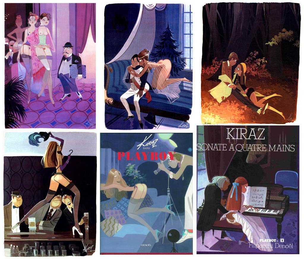
Also reminiscent of Playboy cartooninst Kiraz. (NSFW)
posted by sourwookie at 8:08 AM on August 17, 2006
posted by sourwookie at 8:08 AM on August 17, 2006
Why the hell is it called Lava Life to begin with? Terrible name.
Not knocking the artist, but I dislike the ads. I see these every day. They do come across as smug and silly, especially contrasted so easily by the very real people sitting on the bus next to the ads themselves. There's so much of this selling to young urban transplants here in Chicago that it is just background noise now. Red Streak, Red Eye, etc...
Again, I'm not criticizing the art itself, but the ads.
posted by jeff-o-matic at 8:13 AM on August 17, 2006
Why the hell is it called Lava Life to begin with? Terrible name.
Because the whole 'dating site,' thing is just a ruse to find virgins to throw into volcanos. They're owned by a cargo cult. or the Scientologists. I forget which.
posted by jonmc at 8:17 AM on August 17, 2006
Because the whole 'dating site,' thing is just a ruse to find virgins to throw into volcanos. They're owned by a cargo cult. or the Scientologists. I forget which.
posted by jonmc at 8:17 AM on August 17, 2006
How is this not Pepsi Blue? Essentially we've become a marketing vector for a commercial artist that would love loads of potential clients to see his work.
It's not like TimTypeZed brought to our attention some unknown, doing art for art's sake, but instead used Mefi as a giant resume broadcaster.
Yeah, I'm the guy's agent, and Metafilter is the site art directors everywhere visit first thing each morning. I don't want to argue the merits of commercial versus fine art, but I see lots of art for art's sake in his work, as I do in the work of any other illustrator who has a personal and dynamic style. There is personal work and sketchbook drawings shown on his site. I would think, like most other successful illustrators, he is an unknown to the almost everyone who sees his work, but is in an interesting spot because his one campaign is in so many people's face for half an hour every workday. The Lavalife stuff isn't his best work - there can be a bit of an ick factor to the company and the ads themselves - and he does say there are pros and cons for him due to its ubiquity, but I believe that in some way their now several year old association with this artist and his distinctive look lifts the company into a space seperate from some other dating sites.
I first noticed his work outside of these ads when I visited the site of his then agent in Montreal. His work stood out from all the other artists represented there. More controlled and mature and individual. It wasn't until after viewing several of his pictures that I hit on one that was from the LL campaign and had my he's-that-guy moment. When I looked at his portfolio, my first reaction was to think, Wow! You can do that with Illustrator (or Freehand or Corel Draw or whatever he uses). For awhile he inspired me to look at what I could do with a vector program, although I soon realized that while he could do that in Illustrator, I couldn't, so I gave up.
jonmc writes, Those are stylish urbanites?
You just haven't seen the flannel shirt campaign yet. Try the Winnipeg Metro.
posted by TimTypeZed at 8:27 AM on August 17, 2006
eh, I'm more stylish than anyone in those ads, trust me.
posted by jonmc at 8:28 AM on August 17, 2006
posted by jonmc at 8:28 AM on August 17, 2006
TimTypeTed: I'm not accusing you of anything malicious.
posted by sourwookie at 8:35 AM on August 17, 2006
posted by sourwookie at 8:35 AM on August 17, 2006
Thanks for posting. As I was looking at them, I actually wondered why more graphic art is viewed as just "art". Is it the intent behind it? That it was made for commercial purposes?
posted by Bear at 8:57 AM on August 17, 2006
posted by Bear at 8:57 AM on August 17, 2006
Face it, this guy wouldn't exist if Jordi Labanda hadn't paved the way for him. Jordi did it all first...and far more charmingly.
posted by adamgreenfield at 9:08 AM on August 17, 2006
posted by adamgreenfield at 9:08 AM on August 17, 2006
I'm not accusing you of anything malicious.
Didn't think you were, but I didn't understand your Pepsi Blue argument. I read that to say that commercial art could have little worth or interest outside of its ability to score more contracts. I'm sure the work of photographers and filmmakers and webbuilders who work for commercial interests has been posted here - would you raise the same concern about them?
Face it, this guy wouldn't exist if Jordi Labanda hadn't paved the way for him.
They should have a cage match, but maybe neither of them see themselves in competition. Clearly there are similar influences of fashion, glossy magazines and urban club cultures, as well as older illustration styles. On the site you posted, I especially like the picture of the belly dancer that's crowded with half-revealed figures. To me the work there looks more nostalgic of illustration from a martini soaked early-Playboy time, while I respond more directly to the distortions and the multi-ethnic (or at least blue-haired) shine of Chin's work. But that's my personal taste. I'm sure it's a big space with room for anyone with talent.
posted by TimTypeZed at 11:36 AM on August 17, 2006
Here's my friend's parody I mentioned earlier.
posted by Captaintripps at 11:58 AM on August 17, 2006
posted by Captaintripps at 11:58 AM on August 17, 2006
I liked the soundtrack to Singles, the Wilson sisters did a sweet cover of "Battle of Evermore".
I'm gonna bring back rocking the flannel shirts this fall.
The LL ads, meh.
posted by erskelyne at 2:31 PM on August 17, 2006
I'm gonna bring back rocking the flannel shirts this fall.
The LL ads, meh.
posted by erskelyne at 2:31 PM on August 17, 2006
One of my art instructors at George Brown slammed those ads and said she found she "couldn't even look at them". I think they're... okay. The art may not be the greatest but they certainly catch the eye. There are lots of other subway ad campaigns I'd never remember even if reminded.
posted by orange swan at 6:44 PM on August 17, 2006
posted by orange swan at 6:44 PM on August 17, 2006
Man I hate those ads. Ugly caricatures of the already blandly unattractive fratty-stereotype young urbanite. I'm not sure who their target audience is, but I feel like it shops at Abercrombie and Fitch.
posted by ch1x0r at 8:16 PM on August 17, 2006
posted by ch1x0r at 8:16 PM on August 17, 2006
« Older These Records Are BenT | Language courses, courtesy of the United States... Newer »
This thread has been archived and is closed to new comments
posted by phyrewerx at 12:57 AM on August 17, 2006