Law of the Letter
July 8, 2008 4:03 PM Subscribe
"Type designers know well that context, culture, and history shape the connotations of letterforms. . . . In fact, type plays a starring role in the making of nations." A short but interesting look at typography and political identity from Print magazine.
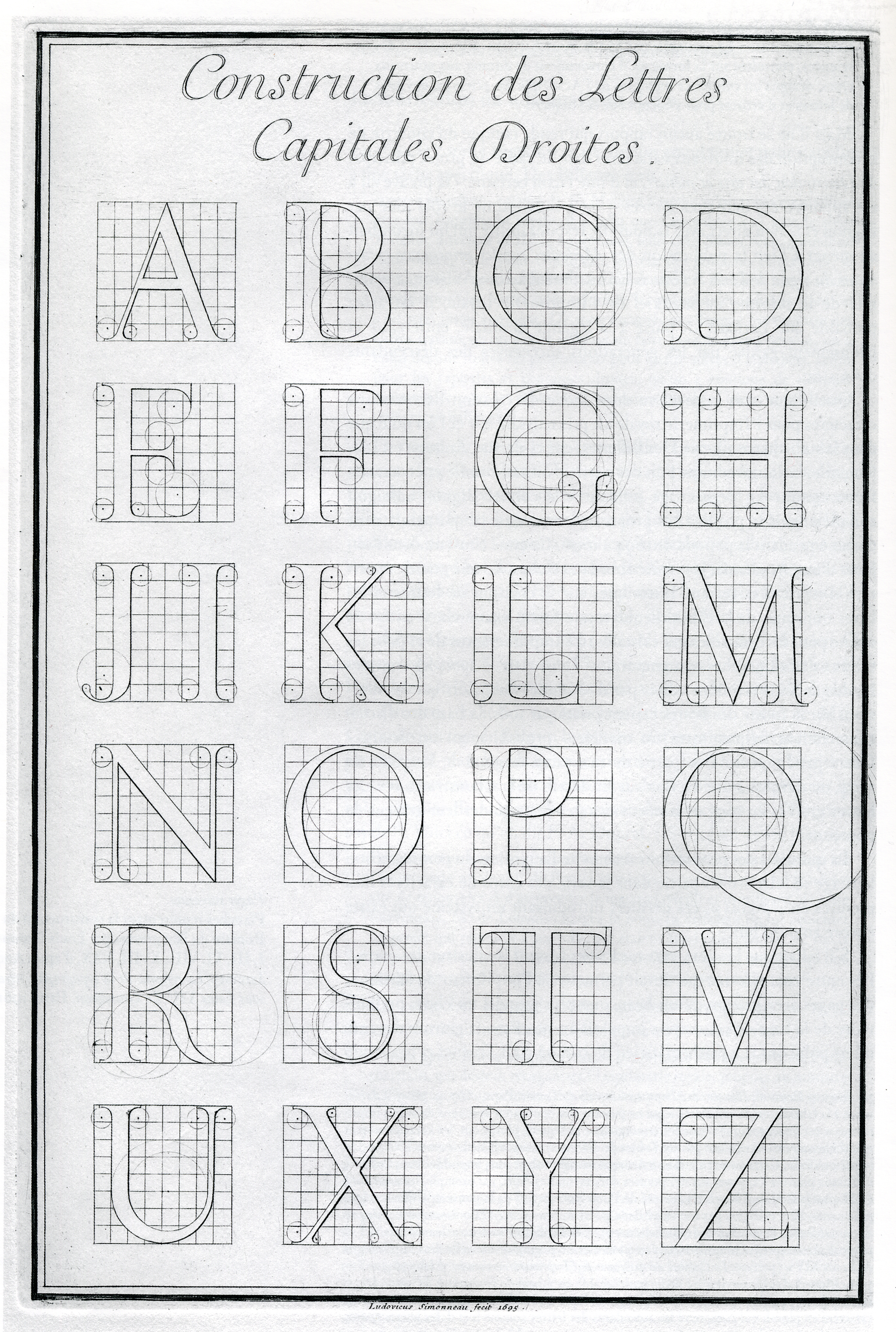
History note: The Romain du Roi, commissioned by Louis XIV, is said to be the first official typeface of a nation.
posted by parhamr at 5:20 PM on July 8, 2008
posted by parhamr at 5:20 PM on July 8, 2008
Handwritten Typographers via daringfireball.
Oh, and infinitewindow, not only gray text, which I not only don't mind, but actually like, but so tiny!
posted by cjorgensen at 5:24 PM on July 8, 2008 [1 favorite]
Oh, and infinitewindow, not only gray text, which I not only don't mind, but actually like, but so tiny!
posted by cjorgensen at 5:24 PM on July 8, 2008 [1 favorite]
Elizabeth Eisenstein wrote The Printing Press as an Agent of Change in 1979 and in that makes a much more in depth and complete argument along these lines, but of course, as much as typography gets an assist, I think that's all it can aspire to--an assist.
posted by beelzbubba at 6:19 PM on July 8, 2008
posted by beelzbubba at 6:19 PM on July 8, 2008
Great subject, but there are a number of problems with the way it is handled here. There are the sweeping historical generalizations, such as "It’s no accident that the rise of movable type and the decline in paper prices in the 17th century coincided with the European Enlightenment. "
Movable type was invented in the 15th century, while the Enlightenment is invariably dated to the 18th-Century. Certainly, type played a role in furthering commmunications between figures within the Enlightenment and pre-Englightenment, but so did the postal service, and face-to-face communication within groups closed to the general public. But I like the author's attention to paper, which often drops out of the Eisensteinian print-revolution narrative.
Moving on: "In the ’30s, the Nazis embraced blackletter type as deeply and authentically German". The Nazis actually banned blackletter, reversing a previous enthusiasm for a style which now commonly means something completely different, i.e. gang-membership. This actually makes what appears to be the author's point - that typography does not baldly express national character, but can be a means both of promoting and contesting it. I don't quite follow the author's distinction between 19th-Century bottom-up nationalisms and a 20th Century top-down variety: it sounds a wee bit romanticist/organicist to me, but he may have something specific in mind.
Also, the author does not distinguish between writing systems such as alphabets, scripts, and types. I'd like to know if he sees them as performing the same functions in this context, or not.
posted by GeorgeBickham at 8:34 PM on July 8, 2008
Though of course Baskerville and Helvetica dominate official government documents, it's Optima that gets my True Patriot Love flowing. I blame Expo 67, of course, and the huge wave of Canadaganda of that period that has carried over into my lifetime.
The recent flap about the McCain campaign's logo with Optima in the starring role highlighted why it's the perfect typeface for Canada: It's effete, inoffensive, indecisive, out of style, and boring. (It is also my favourite font; make of that what you will.)
Of course, it's also German, so...?
posted by Sys Rq at 5:03 PM on July 9, 2008
(I must say, it's rather depressing that an article on typography should be set in suck a singular, monotonous column, though I guess that sort of irony is to be expected on the website for Print magazine.)
posted by Sys Rq at 5:11 PM on July 9, 2008
posted by Sys Rq at 5:11 PM on July 9, 2008
Hey, thanks for noting the piece--I'm enjoying the discussion a lot. I think you'll be pleased to hear that we're redesigning PRINT's website as we speak; the relaunch should be sometime in early fall. We're looking forward to it being easier to read and use, too!
posted by Emily Gordon at 8:41 AM on August 1, 2008
posted by Emily Gordon at 8:41 AM on August 1, 2008
« Older A mind dismembered: In search of the magical penis... | Post and run, post and run -- even when I was... Newer »
This thread has been archived and is closed to new comments
The problem, though, is that if you need a tool to be part of a culture, then your culture takes after the ones who made the tool. Look at Sequoyah—he wanted to keep Cherokee culture distinct, and his alphabet was supposed to be key. Yet every Cherokee I've ever met is as American as apple pie.
The Tai people in the article may be able to communicate with their font, but they'll soon be watching anime mashups on YouTube just like the rest of us.
I loved Print back in high school. Looking at their website, though, I can see why they call it Print. Gray text? Really?
posted by infinitewindow at 5:17 PM on July 8, 2008