Number of cats I own: 2
April 10, 2010 1:09 PM Subscribe
You're right, throat-band. Thanks for linking that up.
posted by defenestration at 1:28 PM on April 10, 2010
posted by defenestration at 1:28 PM on April 10, 2010
No probs, 'stration.
See also: the man who sparked this trend for lame infographics with outsize sans-serif annotations. Though his annual reports are pretty interesting, to be fair.
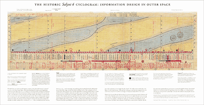
The hardcore antidote to all this modern datafrippery: the cyclogram from outer space!
posted by a little headband I put around my throat at 1:40 PM on April 10, 2010
See also: the man who sparked this trend for lame infographics with outsize sans-serif annotations. Though his annual reports are pretty interesting, to be fair.
The hardcore antidote to all this modern datafrippery: the cyclogram from outer space!
posted by a little headband I put around my throat at 1:40 PM on April 10, 2010
The hardcore antidote to all this modern datafrippery: the cyclogram from outer space!
I see your cyclogram and raise you an invasion of Russia.
posted by The Michael The at 1:52 PM on April 10, 2010 [2 favorites]
I see your cyclogram and raise you an invasion of Russia.
posted by The Michael The at 1:52 PM on April 10, 2010 [2 favorites]
Oh my. I particularly like the pie chart that doesn't add up to anything (the percentage of the total cost of buying two apps for different platforms at the same time? A common figure) and the iPads Sold section which compares two different things and says almost nothing, with a grammar error thrown in as a bonus.
posted by eykal at 2:00 PM on April 10, 2010 [1 favorite]
posted by eykal at 2:00 PM on April 10, 2010 [1 favorite]
I see your cyclogram and raise you an invasion of Russia.
Yum!
Also (and I promise I'll shut up after this), I think this fad for the data visualisation of absolutely everything is connected in a vague zeitgeisty way with stuff like Ribbon Hero, Apple's new Game Center, those Mii avatars on the Wii, 750words, the wonderful Noby Noby Boy game, that farming thing on Facebook etc. etc.
We're pretty much hurtling towards a terrible future of tiny, deeply pointless, repetitive and addictive tasks, each one diligently recorded and tastefully displayed for the admiration of our peers.
*Wanders off to write a web app where all you do is click a button to score a point... with charts!*
posted by a little headband I put around my throat at 2:05 PM on April 10, 2010 [3 favorites]
I, too, get sick about about 2 sentances + a short table worth of information being presented as a larger-than-A4 set of graphs, most of which don't even have proper scales and legends.
Holy shit, no, what the fuck is that first pit chart trying to show? That should be a capital offense.
"Infographics" are the new "List of 17 arbitrary things" in the world of Digg/Delicious-scamming. Humans, please stop being suckers.
posted by Jimbob at 2:18 PM on April 10, 2010
Holy shit, no, what the fuck is that first pit chart trying to show? That should be a capital offense.
"Infographics" are the new "List of 17 arbitrary things" in the world of Digg/Delicious-scamming. Humans, please stop being suckers.
posted by Jimbob at 2:18 PM on April 10, 2010
Oh my. I particularly like the pie chart that doesn't add up to anything (the percentage of the total cost of buying two apps for different platforms at the same time? A common figure) and the iPads Sold section which compares two different things and says almost nothing, with a grammar error thrown in as a bonus.
I am still trying to work out what the columns headed "Purchase Intent", "Aided Awareness" and "Researched Online" are trying to say. They are quite magnificent in their total lack of clarity.
Also, the words "7 Point Scale", floating free of any particular context or meaning next to a graph that is organized by "likely" vs "unlikely".
Wow.
posted by game warden to the events rhino at 2:19 PM on April 10, 2010 [1 favorite]
I am still trying to work out what the columns headed "Purchase Intent", "Aided Awareness" and "Researched Online" are trying to say.
Oh, I'm sure they're something marketers would understand. Therefore, I don't ever, ever want to.
posted by Jimbob at 2:28 PM on April 10, 2010
Oh, I'm sure they're something marketers would understand. Therefore, I don't ever, ever want to.
posted by Jimbob at 2:28 PM on April 10, 2010
I thought the whole infographic thing was so graphic designers could pretend to be scientists and thus justify the oversized black rim glasses.
(ducks)
posted by Damienmce at 2:31 PM on April 10, 2010 [22 favorites]
(ducks)
posted by Damienmce at 2:31 PM on April 10, 2010 [22 favorites]
I thought the whole infographic thing was so graphic designers could pretend to be scientists and thus justify the over rsized black rim glasses.
* Scientist trying to bash the [+] repeatedly *
posted by Jimbob at 2:32 PM on April 10, 2010 [2 favorites]
* Scientist trying to bash the [+] repeatedly *
posted by Jimbob at 2:32 PM on April 10, 2010 [2 favorites]
Rap represented in mathematical charts and graphs
posted by hypersloth at 2:33 PM on April 10, 2010 [1 favorite]
posted by hypersloth at 2:33 PM on April 10, 2010 [1 favorite]
The pie charts under Purchase Intent, etc. ad. naus., are the first ones I've seen that only have a single data point per chart. That's some zen-level lack of information density, right there.
E. Tufte would spin in his grave, if he were dead.
posted by signal at 2:34 PM on April 10, 2010
E. Tufte would spin in his grave, if he were dead.
posted by signal at 2:34 PM on April 10, 2010
Snarking is so easy.
I like infographics. Well, not necessarily in general, but certainly ones on topics I'm interested in. OK, so that pie chart might not add up to anything, but it does quickly and clearly represent the approximate ratio between the average prices of the two platforms.
No, it's not scientific.
No, it's not supposed to be.
posted by Mwongozi at 2:36 PM on April 10, 2010 [1 favorite]
i blame the harper's index
posted by nathancaswell at 2:46 PM on April 10, 2010 [1 favorite]
posted by nathancaswell at 2:46 PM on April 10, 2010 [1 favorite]
OK, so that pie chart might not add up to anything, but it does quickly and clearly represent the approximate ratio between the average prices of the two platforms.
But why do we need that as a ratio? So we can figure out how many iPhone apps we could buy per iPad app? Who would need to know that? It makes the data more confusing than simply writing "A costs $x, B costs $y". The purpose of graphs is to represent complex information in a simple way, not to represent simple information in a complex way.
posted by Jimbob at 2:50 PM on April 10, 2010 [2 favorites]
I think that "likely" vs. "unlikely" bar graph, in the lame infographic, could be interesting. I don't think it's a bad idea to inquire how people would use an iPad and try to display the information like this.
But I'd
1. delete the "unlikely" bars (probably)
2. turn the graph 90 degrees clockwise, so all the labels could be horizontal,
3. rearrange the bars by increasing or decreasing likely %.
On point #1, yes, the bars don't add to 100% so you lose a little bit of information if you delete the "unlikely". However, greater likely % seems to always go with smaller unlikely %, so you'd still get the correct picture.
posted by Someday Bum at 2:51 PM on April 10, 2010
We're pretty much hurtling towards a terrible future of tiny, deeply pointless, repetitive and addictive tasks, each one diligently recorded and tastefully displayed for the admiration of our peers.
Favorite you. No sure why me favorite you. Only lower brain squishy part awake now. Soon click yellow Post Comment button.
posted by hal9k at 2:58 PM on April 10, 2010 [1 favorite]
Favorite you. No sure why me favorite you. Only lower brain squishy part awake now. Soon click yellow Post Comment button.
posted by hal9k at 2:58 PM on April 10, 2010 [1 favorite]
Actually, with regards to that app prices pie chart: after going into OpenOffice and constructing the pie chart myself (I got curious), it turns out that the pie chart adds up to $4.99, with the white representing $1.99 and the blue segment representing $3, despite being labelled as $4.99. There is nothing that indicates this on the graph, of course.
posted by eykal at 3:03 PM on April 10, 2010
posted by eykal at 3:03 PM on April 10, 2010
Wow, they guy who's tumblr got linked too Loves the tiger woods ad. Crazyness.
posted by delmoi at 3:04 PM on April 10, 2010
posted by delmoi at 3:04 PM on April 10, 2010
But why do we need that as a ratio? So we can figure out how many iPhone apps we could buy per iPad app? Who would need to know that?
What's wrong with knowing ratios? For example, if you were going to show how much time you spent working vs. how much time you spent sleeping, all you could really show was the ratio -- you couldn't give an absolute number of hours because you don't know how long you'll be working. (You could give the number of hours per day, but that doesn't work for the weekends. You could go per week, but is that really helpful?)
posted by delmoi at 3:07 PM on April 10, 2010
But why do we need that as a ratio? So we can figure out how many iPhone apps we could buy per iPad app? Who would need to know that?
Oh, I just looked at that iPad infographic. Yeah, the use of. Those are pretty terrible uses of pie charts. Especially when they show the 'purchase intent' with the slices of each pie on separate "pans" so to speak. (i.e. each question gets it's own pie chart, yes or no, rather then showing a pie chart of how many people are in each group. Of course, there could be some overlap - people who want a kindle and an iPad)
posted by delmoi at 3:11 PM on April 10, 2010
Some incarnations of $THING are totally bad, you guys.
posted by l33tpolicywonk at 3:15 PM on April 10, 2010
posted by l33tpolicywonk at 3:15 PM on April 10, 2010
I think a rise in infographics is a good thing. I agree that there are many dubious ones out there, but I've also seen a lot more well-produced and accurate visualizations of data (the NYTimes being an example of mind-blowing interactive infographics). My favorite one is the US Time Use survey.
posted by a womble is an active kind of sloth at 3:16 PM on April 10, 2010 [2 favorites]
posted by a womble is an active kind of sloth at 3:16 PM on April 10, 2010 [2 favorites]
(the NYTimes being an example of mind-blowing interactive infographics). My favorite one is the US Time Use survey.
(Without necessarily condemning all infographics) I think the New York Times graphics and this "lame infographic" are entirely different beasts. I wouldn't even call the New York Times graphics "infographics".
posted by Someday Bum at 3:28 PM on April 10, 2010
(Without necessarily condemning all infographics) I think the New York Times graphics and this "lame infographic" are entirely different beasts. I wouldn't even call the New York Times graphics "infographics".
posted by Someday Bum at 3:28 PM on April 10, 2010
Yeah. The NY Times, National Geographic etc. do some pretty brilliant infographics. Random Digg-baiting "designers" with pop culture fetishes...not so much.
posted by Jimbob at 3:36 PM on April 10, 2010
posted by Jimbob at 3:36 PM on April 10, 2010
I've played a bit with (non-informative) infographics and (obvious to the point of insulting) explanatory illustrations-- they seem to increase sales a bit...
usually the point is to arrest attention, not breakdown something otherwise hopelessly abstruse.
But, yeah, the bits cited above are funny.
posted by darth_tedious at 4:11 PM on April 10, 2010
usually the point is to arrest attention, not breakdown something otherwise hopelessly abstruse.
But, yeah, the bits cited above are funny.
posted by darth_tedious at 4:11 PM on April 10, 2010
Pie chart theme:
2007 NYPD arrests for vandalism
Meatloaf pie chart
Should I invest in fuel cell technology?
posted by jjj606 at 4:53 PM on April 10, 2010 [1 favorite]
2007 NYPD arrests for vandalism
Meatloaf pie chart
Should I invest in fuel cell technology?
posted by jjj606 at 4:53 PM on April 10, 2010 [1 favorite]
Oh my. I particularly like the pie chart that doesn't add up to anything
I like the adoption by state, which becomes impossible to decipher in the NE coastal area
posted by krinklyfig at 5:29 PM on April 10, 2010
I like the adoption by state, which becomes impossible to decipher in the NE coastal area
posted by krinklyfig at 5:29 PM on April 10, 2010
┏┓┏━━━┓+-----+
┃┃┃┏━┓┃| +-+ |
┃┃┃┃ ┃┃| | | |
┃┃┃┗━┛┃| +-+ |
┗┛┗━━━┛+-----+

% of your web browser
that supports Unicode
Boxdrawing characters
posted by oulipian at 6:33 PM on April 10, 2010 [5 favorites]
I don't like the ipad infographic. I like infographics generally. I believe that the tumblr guy's snark is somewhat lame.
posted by blucevalo at 7:17 PM on April 10, 2010
posted by blucevalo at 7:17 PM on April 10, 2010
Maybe it's me (it usually is) but I find the inconsistent use of single quote marks (Unicode RIGHT SINGLE QUOTATION MARK & APOSTROPHE) in the website text of the lame infographic guy & the use of an upper case C in coffee shop* in the graphic far more disturbing.
*Unless this is correct use in US English..?
posted by i_cola at 4:04 AM on April 11, 2010
*Unless this is correct use in US English..?
posted by i_cola at 4:04 AM on April 11, 2010
Arguably an even more accurate pie chart than the "most accurate pie chart ever" linked above.
posted by yoz420 at 6:02 AM on April 11, 2010
posted by yoz420 at 6:02 AM on April 11, 2010
As the creator of the infographic that defenestration first linked to (the sarcastic spoof one, not the iPad one), a couple of points...
The iPad infographic was the one I saw a few hours before making my own, but I wasn't targeting it specifically -- I didn't even look at it long enough to realise quite how good or bad it was. It was simply the final straw after seeing many graphics that make data pretty, rather than adding anything.
I'm surprised to see several people (here and elsewhere) start asking whether (or claiming that) "all infographics" are good or bad. As pointed out above, there is some amazing work being done with illuminating graphics that bring to light patterns and surprises in data that we wouldn't otherwise see at first glance. (This one about healthcare from National Geographic springs to mind.) Unfortunately the term "infographic" is used for an increasingly wide range of "graphics about data" so it's useless as an indicator of what kind of work it will refer to. Good infographics require a lot of work -- not just understanding the data, and making it look nice, but working out what the interesting stories behind it are and how best to present them to the reader/viewer. (Having said that, I rarely create infographics myself, so this is just my impression -- I'd love to hear the point of view of someone who does this hard work.)
If I'm really honest, I created my angry infographic not because I was annoyed about graphics like the iPad one, but because I was annoyed about people linking to them so enthusiastically. Presented with a pretty design featuring numbers, charts and maybe a map, otherwise respectable people lose all critical faculties and get over excited about something which, after a little more attention, doesn't help understanding of the data.
posted by fabius at 7:44 AM on April 11, 2010 [3 favorites]
I should've assumed that someone who could bring the funny and the critique was on MeFi. Thanks for responding, Phil. Your satire was completely on point—I hope my post didn't make it sound like all infographics are inherently bad or superfluous.
posted by defenestration at 7:53 AM on April 11, 2010
posted by defenestration at 7:53 AM on April 11, 2010
Good infographics require a lot of work -- not just understanding the data, and making it look nice, but working out what the interesting stories behind it are and how best to present them to the reader/viewer.
"Readers of a report should be unaware of its 'design.' Rather, they should be enticed into reading it by interesting content, logical arrangement and simple presentation. The printed page should appear natural and authoritative, avoiding gimmicks which might get in the way of its documentary character."
-- Paul Rand, "Design," in Speaking Out on Annual Reports. Quoted by Tufte in Envisioning Information.
posted by Someday Bum at 9:28 AM on April 11, 2010 [1 favorite]
(This one about healthcare from National Geographic springs to mind.)
There was a good discussing about this graph on the blog Statistical Modeling, Causal Inference, and Social Science when it came out (1,2). (I have the feeling I'm repeating links that have already appeared on MetaFilter.)
posted by Someday Bum at 9:49 AM on April 11, 2010
There was a good discussing about this graph on the blog Statistical Modeling, Causal Inference, and Social Science when it came out (1,2). (I have the feeling I'm repeating links that have already appeared on MetaFilter.)
posted by Someday Bum at 9:49 AM on April 11, 2010
A brief glance at http://www.onlineschools.org/ makes it look like they are devoted to (mostly extremely poor even for the form) this sort of infographic. Is there a name for this lately-everywhere style of infographic cum factsheet?
The fad is a very specific form of infographic, the main feature being that it's a set of facts each described in blocks laid out in a grid-like format. Maybe someone with a better design eye than me can come up with a more detailed description (there are similarities in terms of typography, graphics, use of multiples.)
Honestly I like the idea. They're reminiscent of executive dashboards and I think that there's a role for design that does not maximize data per pixel. I don't have a great example to share right now but I figure good ideas are abused and overdone at least as much as bad ideas.
posted by Wood at 3:01 PM on April 11, 2010
« Older In February, it is good to know a plow guy | tertium non data Newer »
This thread has been archived and is closed to new comments
posted by a little headband I put around my throat at 1:25 PM on April 10, 2010 [5 favorites]