Coming to a keyboard near you.
July 16, 2010 6:45 AM Subscribe
India unveils new rupee symbol. The new symbol. Measures are already afoot to have the rupee sign declared a computer standard, meaning it could join currencies such as the pound, dollar, euro and yen on keyboards within two years. And in case you wondered, Where do currency symbols come from?
Bring back the ¢ key!
posted by ND¢ at 6:50 AM on July 16, 2010 [9 favorites]
posted by ND¢ at 6:50 AM on July 16, 2010 [9 favorites]
I really like that symbol.
I'd never considered how $ came to be, but that was an interesting thing to learn on a Friday morning. Thanks for the post.
posted by codacorolla at 6:55 AM on July 16, 2010
I'd never considered how $ came to be, but that was an interesting thing to learn on a Friday morning. Thanks for the post.
posted by codacorolla at 6:55 AM on July 16, 2010
That's really well done.
I'm not sure why there is a second bar. It looks like the letter "Ra" in Devanagari is close the Rupee symbol, but with a single bar. He's kind of played with that to make it look more like the letter "R" as well.
posted by chunking express at 6:55 AM on July 16, 2010 [2 favorites]
I'm not sure why there is a second bar. It looks like the letter "Ra" in Devanagari is close the Rupee symbol, but with a single bar. He's kind of played with that to make it look more like the letter "R" as well.
posted by chunking express at 6:55 AM on July 16, 2010 [2 favorites]
smackfu- pretty much. they're all combining the two bars (used in Yen and Euro, design works in dialogue with other design, borrowing visual shorthand blah blah), the latin R and the Devanagari letter for the sound "ra." There are only so many combinations you can make there.
posted by The Esteemed Doctor Bunsen Honeydew at 6:57 AM on July 16, 2010
posted by The Esteemed Doctor Bunsen Honeydew at 6:57 AM on July 16, 2010
from the article: It's a fusion of the Latin letter "R" with the ancient Devanagari Ra
posted by shinybaum at 7:00 AM on July 16, 2010
posted by shinybaum at 7:00 AM on July 16, 2010
Surely this is something that I, as an American with an internet connection, large coffee and misplaced righteous indignation, can get up in arms about? Nope. That looks pretty cool!
posted by KevinSkomsvold at 7:03 AM on July 16, 2010
posted by KevinSkomsvold at 7:03 AM on July 16, 2010
Heh - I guess I can see that if it's connected with the "ra" then it makes sense, but without that connection, it looks like the worst of the candidates to me, in all honesty.
posted by symbioid at 7:08 AM on July 16, 2010
posted by symbioid at 7:08 AM on July 16, 2010
They picked the right one imo.
posted by 2bucksplus at 7:15 AM on July 16, 2010
posted by 2bucksplus at 7:15 AM on July 16, 2010
Surely this is something that I, as an American with an internet connection, large coffee and misplaced righteous indignation, can get up in arms about? Nope. That looks pretty cool!
Have no fear, the spirit of snark is here!
Michael Johnson, a director at the award-winning London-based design consultancy johnson banks, said the new symbol fitted with other currency signs but lacked imagination.
posted by echo target at 7:16 AM on July 16, 2010
Have no fear, the spirit of snark is here!
Michael Johnson, a director at the award-winning London-based design consultancy johnson banks, said the new symbol fitted with other currency signs but lacked imagination.
posted by echo target at 7:16 AM on July 16, 2010
I can't see this catching on unless the Indian government forces everyone to use it. It doesn't seem very easy to write and is not very aesthetically pleasing.
posted by reenum at 7:27 AM on July 16, 2010
posted by reenum at 7:27 AM on July 16, 2010
So, what strokes do you use to write this by hand?
What seems most natural to me is to start at the top right, do the top bar and main shape in one stroke, then add the second crossbar right-to-left. After doing it a half-dozen times, the result doesn't look much like the intended symbol ... it tends toward horizontal symmetry around the crossbar.
The other option is to make the R shape then add both crossbars, top first. I don't always pick up my pen, which makes the two crossbars look like a Z, however, this seems to yield a better overall result.
posted by These Premises Are Alarmed at 7:32 AM on July 16, 2010
I want to move to South Africa so I can purchase things with a currency that has elephants on it. That is all.
posted by grapefruitmoon at 7:36 AM on July 16, 2010
posted by grapefruitmoon at 7:36 AM on July 16, 2010
I would start in the upper right of the top bar, draw that, drop down into the R, and then slash across with the second bar. I just tried it, and it doesn't look as good as the bold typed version.
It looks slightly better when I start with R and then draw the lines in afterwards.
I'm not sure how Brahmic alphabets right (up to down, right to left, etc)... what would be the usual default starting position for a pen?
posted by codacorolla at 7:41 AM on July 16, 2010
It looks slightly better when I start with R and then draw the lines in afterwards.
I'm not sure how Brahmic alphabets right (up to down, right to left, etc)... what would be the usual default starting position for a pen?
posted by codacorolla at 7:41 AM on July 16, 2010
Ergh, how they "write".
posted by codacorolla at 7:41 AM on July 16, 2010
posted by codacorolla at 7:41 AM on July 16, 2010
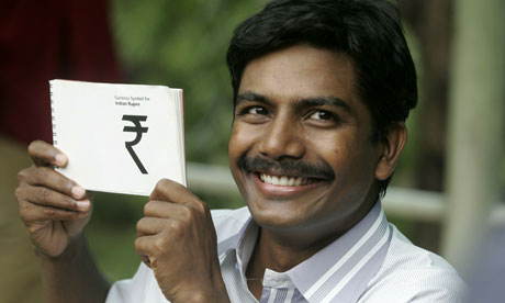
Oh man the guy who made the winning design is so keeeeee-yewt! Lookit that lil smile!
posted by seagull.apollo at 7:43 AM on July 16, 2010
posted by seagull.apollo at 7:43 AM on July 16, 2010
grapefruitmoon: "I want to move to South Africa so I can purchase things with a currency that has elephants on it. That is all."
A one-rupee coin has a thumbs-up on it. Clearly that should have been the symbol.
posted by roll truck roll at 7:50 AM on July 16, 2010
A one-rupee coin has a thumbs-up on it. Clearly that should have been the symbol.
posted by roll truck roll at 7:50 AM on July 16, 2010
I remember when Read Between the Leading (previously) discussed the contest back in May of last year. The winning design is passable but seems to lack charm or continuity with other Indian letterforms. I would've liked to see something more traditional looking. I'm also surprised it took this long to come up with a decision.
posted by The Winsome Parker Lewis at 7:54 AM on July 16, 2010
posted by The Winsome Parker Lewis at 7:54 AM on July 16, 2010
So, what strokes do you use to write this by hand?
In writing devanagri characters, you usually draw the body of the letter (the "R" part), starting at the top and going downward. You add the top bar afterward, usually after finishing a full word-- although in this case there's only one letter so that's not an issue. So I would draw the body of the letter, then the top bar, and then the lower bar.
This will be pretty easy for people who can write in Hindi, since it's basically just the letter "ra" with an extra horizontal line.
posted by bookish at 7:59 AM on July 16, 2010
Metafilter: fitted with other currency signs but lacked imagination.
posted by blue_beetle at 8:10 AM on July 16, 2010
posted by blue_beetle at 8:10 AM on July 16, 2010
Yay. A new currency symbol for people to get confused about.
I used to work producing database-driven fund reports & accounts for a large, global, privately owned (hint), investment company and it always amazed me that nobody could work out a company standard for showing currency symbols.
A US Dollar could be shown as $1 US$1 USD 1 or 1 USD. As we were working in about 10 different languages it seemed to make sense to use the ISO currency, especially as the company typeface could only access $ (USD) & £ (GBP) and we had to work around getting the € (EUR) symbol from Helvetica and then use ISO for everything else. Then of course you got Australian Dollars which could be A$, AU$ or AUD and so on.
Different funds would use different ways of showing the currency in the name of the fund too and some managers would get very stroppy about their particular one.
I took great pleasure in watching the assets under management (AUM) figure lurch floorward and then picking up a nice redundancy cheque and now have a much more happy life. I like to think that the currency symbol faff was symptomatic of the idiocy of the company as a whole.
So yeah. Yay new currency symbol...
posted by i_cola at 8:11 AM on July 16, 2010
Here's a link to the IndiaTimes page that the "New Symbol" link is from. The link is an image link from the "view larger" popup from that page. For some reason, copy/pasting that image link results in a whole lot of hash on some browsers.
posted by Thorzdad at 8:21 AM on July 16, 2010
posted by Thorzdad at 8:21 AM on July 16, 2010
Hrmph. I still think the symbol for Rupee should be a smashed clay pot, or perhaps a swath of freshly-cut grass.
posted by xedrik at 8:45 AM on July 16, 2010 [8 favorites]
posted by xedrik at 8:45 AM on July 16, 2010 [8 favorites]
Link is a hooligan. Get off my lawn!
posted by The Winsome Parker Lewis at 8:55 AM on July 16, 2010
posted by The Winsome Parker Lewis at 8:55 AM on July 16, 2010
So down at the bottom of the Slate article about where currency symbols come from I am presented with the following suggestions for other Slate content:
posted by Babblesort at 9:18 AM on July 16, 2010
You might also like:WTF Slate?
Blogging the Periodic Table: Vanadium: Sperm, beware. (from Slate)
Getting Rid of Your "Gay Boyfriend" (from Slate)
Greetings From Fat-Land: The Washington Post reports on obesity in rural Kentucky and misses the point. (from Slate)
Should I get a boob job because my man prefers large breasts? (from Slate)
posted by Babblesort at 9:18 AM on July 16, 2010
Wow, that new symbol link is broken in Firefox in some fantastic way.
You're going to need a bigger coin...
posted by Artw at 9:48 AM on July 16, 2010
You're going to need a bigger coin...
posted by Artw at 9:48 AM on July 16, 2010
I must be about the only person who doesn't really like this new symbol. I get where it's coming from – the R, the two bars – but the end result doesn't seem good enough. Also, I keep thinking that it's some letter from the Klingon alphabet ...
posted by barnacles at 10:00 AM on July 16, 2010
posted by barnacles at 10:00 AM on July 16, 2010
It certainly would win any currency-symbol-most-likely-to-be-an-arcane-rune contest. I think I may have squiggled it on a D&D character sheet.
posted by Artw at 10:03 AM on July 16, 2010
posted by Artw at 10:03 AM on July 16, 2010
i_cola, did you ever have to deal with the forerunner to the euro, the ecu, symbolized thusly: ₠ ?
Talk about ugly.
posted by IndigoJones at 10:06 AM on July 16, 2010
Talk about ugly.
posted by IndigoJones at 10:06 AM on July 16, 2010
Oliver Pollock in 1778. Pollack
A pedantic typo, but one I'm constantly afflicted with and one that galls me constantly. ITS PRONOUNCED HOW ITS WRITTEN, PEOPLE. "loch" might also qualify, but nobody ever types it like that. WTF, Slate?
posted by Ogre Lawless at 10:13 AM on July 16, 2010
A pedantic typo, but one I'm constantly afflicted with and one that galls me constantly. ITS PRONOUNCED HOW ITS WRITTEN, PEOPLE. "loch" might also qualify, but nobody ever types it like that. WTF, Slate?
posted by Ogre Lawless at 10:13 AM on July 16, 2010
It's hardly surprising that this was picked, since र is already used as the currency symbol for INR in most hindi documents. That said, I dislike the top-heaviness, and some symmetry would have been nice.
posted by vanar sena at 10:16 AM on July 16, 2010
posted by vanar sena at 10:16 AM on July 16, 2010
I agree with the naysayers in this thread. You all are correct: it would have been much better in Comic Sans.
not really
posted by Xoebe at 10:33 AM on July 16, 2010
not really
posted by Xoebe at 10:33 AM on July 16, 2010
I was surprised to read that "the symbol will not be printed or embossed on currency notes or coins," but then I looked at a dollar bill and couldn't find a $ on it. Based on the images I'm looking at online, the pound and euro symbols ARE on their respective notes, though.
Not putting the currency's symbol on the actual currency isn't nearly as weird as having a coin that nowhere indicates its actual value.
posted by Xalf at 11:16 AM on July 16, 2010 [1 favorite]
Not putting the currency's symbol on the actual currency isn't nearly as weird as having a coin that nowhere indicates its actual value.
posted by Xalf at 11:16 AM on July 16, 2010 [1 favorite]
then I looked at a dollar bill and couldn't find a $ on it
The US is just bastards in general on that. You know what a dime says on it? "One Dime"
posted by smackfu at 11:48 AM on July 16, 2010
The US is just bastards in general on that. You know what a dime says on it? "One Dime"
posted by smackfu at 11:48 AM on July 16, 2010
The word "dime" comes from the French dixième, meaning "tenth", as in "tenth of a dollar". So technically a dime says how much it's worth. Of course, if you knew that you probably also knew how much a dime is worth, so it's kind of useless.
posted by madcaptenor at 12:14 PM on July 16, 2010
posted by madcaptenor at 12:14 PM on July 16, 2010
According to Wikipedia, "The dollar sign did not appear on U.S. coinage until February 2007,[citation needed] when it was used on the reverse of a $1 coin authorized by the Presidential $1 Coin Act of 2005." Citation needed, I know. The $1 coins are cool. There will eventually be one for every president and corresponding $10 coins for each first spouse. (Yay gender neutrality!) Read more from the U.S. Mint. Interesting how the handled periods where there was no first spouse.
posted by Xalf at 12:54 PM on July 16, 2010
posted by Xalf at 12:54 PM on July 16, 2010
I found it a lot easier to get right when I noticed the second horizontal stroke bisects the loop of the "R" part.
posted by straight at 1:07 PM on July 16, 2010
posted by straight at 1:07 PM on July 16, 2010
A one-rupee coin has a thumbs-up on it. Clearly that should have been the symbol.
Turn it upside-down and squint a bit. The symbol could be a "thumbs-down" if you think about it that way.
posted by swimming naked when the tide goes out at 4:10 PM on July 16, 2010
Turn it upside-down and squint a bit. The symbol could be a "thumbs-down" if you think about it that way.
posted by swimming naked when the tide goes out at 4:10 PM on July 16, 2010
Contest rules (PDF). Curiously favourable coverage at Typophile. (I think it’s a worse abomination than €.)
Or would you like to save the original symbol, ₨?
posted by joeclark at 11:22 AM on July 17, 2010
Or would you like to save the original symbol, ₨?
posted by joeclark at 11:22 AM on July 17, 2010
« Older So long, and thanks for all the fish | Whatever you do, don't tell Warport Security that... Newer »
This thread has been archived and is closed to new comments
From looking at all the options, it's a bit surprising how similar they are. What's with the two bars? Is that international for currency symbol?
posted by smackfu at 6:49 AM on July 16, 2010