Bad Photoshop work + movie posters = crazy delicious!
October 4, 2010 3:29 PM Subscribe
Two of Metafilter's favourite topics, dismal Photoshop work and movie posters collide in Empire Online's Ultimate Collection Of Badly Photoshopped Movie Posters. This collection of 37 (Why 37? Why not?) generally second-tier movies from the past decade and a bit -- listed semi-alphabetically for your convenience -- is a buffet of bad lighting, terrible crop work and grim airbrushing. So, enjoy!
As a bonus, each poster has a follow-up link or two showing attempted later fixes: some passably salvaged, some even more dreadful, and more than a few WTF.
To save you wonderful people the grating one-poster-per-page views, here they are:
Takers (2010)
The Whole Ten Yards (2004)
The Accidental Husband (2008)
All About Steve (2009)
Bad Lieutenant: Port Of Call New Orleans (2009)
Bangkok Dangerous (2008)
Be Kind Rewind (2008)
Blonde And Blonder (2007)
Crazy On The Outside (2010)
Death At A Funeral (2010)
Everybody’s Fine (2009)
Good Luck Chuck (2009)
My Life In Ruins (2009)
Heavy Petting (2007)
Jonah Hex (2010)
King Arthur (2004)
Mad Money (2008)
My Best Friend’s Girl (2007)
Night at the Museum: Battle of the Smithsonian (2009)
Nine (2009)
Nothing To Lose (1997)
Over Her Dead Body (2008)
Postal (2007)
Prime (2005)
Sex And The City 2 (2010)
Snakes On A Plane (2006)
Spider-Man 2 (2004)
Spread (2009)
The Spy Next Door (2010)
Street Kings (2008)
Superbabies: Baby Geniuses 2 (2004)
The Spirit (2008)
The Women (2008)
The Penthouse (2010)
Two Lovers (2008)
Virgin Territory (2008)
Wanted (2008)
To be fair, I think the Bad Lieutenant one captures the whole tone of the movie pretty accurately.
posted by hnnrs at 3:42 PM on October 4, 2010 [5 favorites]
posted by hnnrs at 3:42 PM on October 4, 2010 [5 favorites]
The real crime is that most of these movies actually got made.
posted by The Card Cheat at 3:45 PM on October 4, 2010 [4 favorites]
posted by The Card Cheat at 3:45 PM on October 4, 2010 [4 favorites]
A lot of these films are terrible though so I appreciate them using bad posters. You really can judge a book by it's cover a lot of the time, using anything better would be like false advertising.
Sad that Night at the Museum II is up here though. Glad they fixed it later.
posted by shinybaum at 3:47 PM on October 4, 2010 [1 favorite]
Sad that Night at the Museum II is up here though. Glad they fixed it later.
posted by shinybaum at 3:47 PM on October 4, 2010 [1 favorite]
I just don't have an eye for mistakes like these, which is why I'm kinda glad other people do. "What do you mean there's something wrong with... oh. Eww." Though I have to add that the empire website could use a little work itself. ahem.
posted by malaprohibita at 3:48 PM on October 4, 2010
posted by malaprohibita at 3:48 PM on October 4, 2010
Why don't they just get the actors to pose and take a photo?
Seriously, they have all the actors there, they are being paid well. Take one hour out of production time to create a the scene you want and take a fucking photo of it to put on the posters. Why don't they do this? Are posters really that much of an after-thought?
posted by Jimbob at 3:49 PM on October 4, 2010 [5 favorites]
Seriously, they have all the actors there, they are being paid well. Take one hour out of production time to create a the scene you want and take a fucking photo of it to put on the posters.
It sounds like a good idea...
posted by mazola at 3:51 PM on October 4, 2010 [26 favorites]
It sounds like a good idea...
posted by mazola at 3:51 PM on October 4, 2010 [26 favorites]
Why don't they just get the actors to pose and take a photo?
I almost get the feeling someone asked the opposite question, "Why don't they just photoshop all the actors together? Photoshop can work wonders, and it'll be cheaper!", and this is the horrible result.
Of course, I miss old fashioned painted posters.
posted by Artw at 3:52 PM on October 4, 2010
I almost get the feeling someone asked the opposite question, "Why don't they just photoshop all the actors together? Photoshop can work wonders, and it'll be cheaper!", and this is the horrible result.
Of course, I miss old fashioned painted posters.
posted by Artw at 3:52 PM on October 4, 2010
I think my favourite bit is my discovery that South Koreans must think Mos Def is four feet tall, or else that Jack Black is sort of a latter-day André the Giant.
posted by ricochet biscuit at 3:56 PM on October 4, 2010 [3 favorites]
posted by ricochet biscuit at 3:56 PM on October 4, 2010 [3 favorites]
Nine thoroughly deserved all it's horrible posters. Fucking awful movie.
posted by Artw at 4:01 PM on October 4, 2010 [2 favorites]
posted by Artw at 4:01 PM on October 4, 2010 [2 favorites]
Oh man... this Uwe Boll effort just screams terribleness.
posted by Artw at 4:05 PM on October 4, 2010
posted by Artw at 4:05 PM on October 4, 2010
I don't know how people who consider themselves Photoshop artists -- or I guess anyone with an eye for design and such -- can live.
Because as is often the joke in the commentary to these, once you see stuff like this, you can't see it, and I would assume that if this is your calling/your job/your hobby/your thing-you-are-passionate-about, you start to view the world through that lens even more.
What I mean is if there's a crap book or screenplay or whatever, I have to actively pick it up to be assaulted by its badness. But it seems bad Photoshop is everywhere. What can they do?
(set up snark filled websites about it, I suppose)
posted by MCMikeNamara at 4:08 PM on October 4, 2010 [2 favorites]
The Bad Lieutenant: Port Of Call New Orleans (2009)
Is that an absurdly large gun in your hand, or has someone just ruined a perfectly decent poster?
Methinks that one doesn't get this particular movie.
posted by wcfields at 4:10 PM on October 4, 2010 [3 favorites]
Is that an absurdly large gun in your hand, or has someone just ruined a perfectly decent poster?
Methinks that one doesn't get this particular movie.
posted by wcfields at 4:10 PM on October 4, 2010 [3 favorites]
How does one get a job doing this? Because I think I could probably do as good of a job as these people have done. I know how to make bad cutouts in Photoshop and paste things on top of other things. That really seems the be majority of skills that are required here.
I can understand when the posters are bad for basically-straight-to-DVD movies, but it baffles me that bigger budget movies have this problem too.
posted by darksong at 4:14 PM on October 4, 2010
I can understand when the posters are bad for basically-straight-to-DVD movies, but it baffles me that bigger budget movies have this problem too.
posted by darksong at 4:14 PM on October 4, 2010
Remember, you are allowed to do weird sight-lines and disparate scales as long as you put a glow around each person to separate them from the others...
posted by Artw at 4:16 PM on October 4, 2010 [3 favorites]
posted by Artw at 4:16 PM on October 4, 2010 [3 favorites]
Concept: funny.
Movie posters: terrible, and an embarrassment to all graphic designers.
Alastair Plumb's accompanying commentary on each bad poster? Extraordinarily unfunny. Painful and awkward, even. My teenager could be wittier than that. They should have given these posters to the Trailers Without Pity guys, who could have cranked out some actual lulz on the fly.
If this web feature were a TV show, I would mute it and just look at the visuals.
posted by pineapple at 4:28 PM on October 4, 2010 [2 favorites]
I can understand when the posters are bad for basically-straight-to-DVD movies, but it baffles me that bigger budget movies have this problem too.
It's not too surprising to me, having worked as a graphic designer. Sometimes the client has a... unique vision of how things should be done. Throw in some general poor mismanagement and endless corrections and it's kind of a miracle that good posters are made.
posted by nomadicink at 4:37 PM on October 4, 2010 [2 favorites]
(to be fair, ricochet biscuit, this is a fun post, and I especially appreciate the time you put into making the individual posters into separate links)
posted by pineapple at 4:37 PM on October 4, 2010
posted by pineapple at 4:37 PM on October 4, 2010
It's not too surprising to me, having worked as a graphic designer. Sometimes the client has a... unique vision of how things should be done. Throw in some general poor mismanagement and endless corrections and it's kind of a miracle that good posters are made.
Heh. There's a reason clients-are-idiots posts are never unwelcome on MeFi.
posted by Artw at 4:45 PM on October 4, 2010
Heh. There's a reason clients-are-idiots posts are never unwelcome on MeFi.
posted by Artw at 4:45 PM on October 4, 2010
fantastic!
posted by blue_beetle at 4:49 PM on October 4, 2010
posted by blue_beetle at 4:49 PM on October 4, 2010
Is there even such a thing as a movie poster with people in it that hasn't been 'shopped to within an inch of its life, if not further? Create a site like this and where do you stop? When you've hosted a copy of every poster that has people in it from every single film with a budget of more than $6000 made in the last 20 years?
posted by George_Spiggott at 4:52 PM on October 4, 2010
posted by George_Spiggott at 4:52 PM on October 4, 2010
Is there even such a thing as a movie poster with people in it that hasn't been 'shopped to within an inch of its life, if not further?
Probably not, at least non this decade. It's all about the fantasy and that "perfect" image to entice 18-24 year old males as they're standing outside the theatre with an impatience girlfriend, trying to decide what to see.
I doubt movie posters are all that important anymore, it's all about the trailer or commercial, that's how people are really sold.
posted by nomadicink at 4:55 PM on October 4, 2010
Sometimes I get the feeling it's the movies that aren't all that important anymore. Just get them through the front door and in line for some popcorn and who cares if the movie sucks?
posted by The Card Cheat at 5:00 PM on October 4, 2010 [1 favorite]
posted by The Card Cheat at 5:00 PM on October 4, 2010 [1 favorite]
For marketing purposes I don't think the content of the poster matters much and certainly not the quality of execution. Really it's just the visual language.
For example, if it has people standing against a white background looking at the camera, it's certainly a comedy, probably a romantic comedy, almost certainly family-friendly. I'm sure a graphic artist could provide us with a complete list of the indicators they use, that's just the most obvious one that pops into my head.
posted by George_Spiggott at 5:06 PM on October 4, 2010 [1 favorite]
This collection of 37 (Why 37?
In a row?
posted by Horace Rumpole at 5:23 PM on October 4, 2010 [7 favorites]
In a row?
posted by Horace Rumpole at 5:23 PM on October 4, 2010 [7 favorites]
Impatience girlfriend, I am disappoint.
No Junior Mints for you.
posted by Senor Cardgage at 5:39 PM on October 4, 2010 [2 favorites]
No Junior Mints for you.
posted by Senor Cardgage at 5:39 PM on October 4, 2010 [2 favorites]
The Bangkok Dangerous poster is amazing - did they actually forget to put the gun in his hands? How the hell would that go unnoticed all the way to print?
posted by mannequito at 5:41 PM on October 4, 2010
posted by mannequito at 5:41 PM on October 4, 2010
Nicolas Cage actually did have an absurdly large gun on Bad Lieutenant. And he wore it in his pants. No holster. Just stuck it down the front of his pants.
Now I want to see that film again.
posted by Astro Zombie at 6:00 PM on October 4, 2010 [1 favorite]
Now I want to see that film again.
posted by Astro Zombie at 6:00 PM on October 4, 2010 [1 favorite]
Glad to see the Sex and the City 2 poster on there. I noticed that poster on my own a while back and was utterly horrified. Though, honestly, a slapdash poster with a focus on superficiality and a lack of regard for its female stars seems about par for the course for that series.
posted by HostBryan at 6:31 PM on October 4, 2010
posted by HostBryan at 6:31 PM on October 4, 2010
Wow, that Sex and the City 2 poster is hilariously distorted that Sarah Jessica Parker doesn't look like a complete horse.
Sarah Jessica Parker walks into a bar. Bartender asks, "Hey buddy, why the long face?"
posted by slogger at 6:53 PM on October 4, 2010
Sarah Jessica Parker walks into a bar. Bartender asks, "Hey buddy, why the long face?"
posted by slogger at 6:53 PM on October 4, 2010
"Ultimate"? Not without Heartbreakers.
heartBREAKeRS
Man. I will never understand that as long as I live.
posted by EmGeeJay at 6:54 PM on October 4, 2010
heartBREAKeRS
Man. I will never understand that as long as I live.
posted by EmGeeJay at 6:54 PM on October 4, 2010
I saw that Crazy on the Outside poster in the theater, and had the exact same thought: that has to be the crappiest photoshop ever. I could have done better with scissors and glue.
In fact, I think that's the cure. Give the designers a stack of stills from the move, a pair of scissors, and a can of spraymount.
posted by Jimmy Havok at 6:58 PM on October 4, 2010 [1 favorite]
In fact, I think that's the cure. Give the designers a stack of stills from the move, a pair of scissors, and a can of spraymount.
posted by Jimmy Havok at 6:58 PM on October 4, 2010 [1 favorite]
What I mean is if there's a crap book or screenplay or whatever, I have to actively pick it up to be assaulted by its badness. But it seems bad Photoshop is everywhere. What can they do?
I work in architecture. One reason it's really fun to go camping.
posted by LionIndex at 7:44 PM on October 4, 2010 [4 favorites]
I work in architecture. One reason it's really fun to go camping.
posted by LionIndex at 7:44 PM on October 4, 2010 [4 favorites]
I don't really care about the bad photoshop as much as the bad design of most of these in general. So many of the look the same. Can't they come up with something else to do other than have the whole cast lined up in a row and facing the camera. Most of these look like someone spent about an hour designing them at the most. Why spend $100 million on a movie and then slap together a half assed poster that looks like every other poster?
posted by octothorpe at 8:02 PM on October 4, 2010 [1 favorite]
posted by octothorpe at 8:02 PM on October 4, 2010 [1 favorite]
Why spend $100 million on a movie and then slap together a half assed poster that looks like every other poster?
Nobody ever got fired for buying IBM.
posted by Justinian at 8:21 PM on October 4, 2010 [1 favorite]
Nobody ever got fired for buying IBM.
posted by Justinian at 8:21 PM on October 4, 2010 [1 favorite]
It's like nomadicink said, the posters aren't supposed to be good in an artistic sense, they're just supposed to be effective in their pursuit of young male moviegoers. It's a semisecret code that people learn when they look at hundreds of the things, from childhood into adolescence. After a while you just know from the poster if the movie is right for you. But then you get a bit older and they all begin to look the same.
posted by Kevin Street at 8:50 PM on October 4, 2010
posted by Kevin Street at 8:50 PM on October 4, 2010
THE SNAKES ON A PLANE ONE BLEW MY MIND
posted by Potomac Avenue at 8:51 PM on October 4, 2010 [2 favorites]
posted by Potomac Avenue at 8:51 PM on October 4, 2010 [2 favorites]
This must have been made by the sort of person who would say: "You know what was worse than All About Steve? The poster for All About Steve.
posted by sanko at 9:21 PM on October 4, 2010
posted by sanko at 9:21 PM on October 4, 2010
Seeing all these in a row makes me think that making the stars' heads too big is actually a thing that they do on purpose, presumably to bring the presence of Hayden Christenson/Uma Thurman/Ben Stiller to the attention of the movie-going public.
If I ever have to make one of these I may stab myself in the head.
posted by smartyboots at 11:31 PM on October 4, 2010
If I ever have to make one of these I may stab myself in the head.
posted by smartyboots at 11:31 PM on October 4, 2010
Can someone explain what's wrong with the Snakes on a Plane one? Is it supposed to be some sort of MC Escher-esque visual paradox? 'Cuz I followed the snakes' tails up to their heads and I don't see anything off.
posted by jeremy b at 12:20 AM on October 5, 2010 [1 favorite]
posted by jeremy b at 12:20 AM on October 5, 2010 [1 favorite]
At first I was yeah, hahahaha! but after a while it just seemed like they grabbed a bunch of one-sheets at random and whinged about them. Seriously, Snakes on a Plane ZOMG the tails don't match up LULZ!
The movie biz is so lame nowadays it's harder to find one-sheets that aren't crap. In fact, crap one-sheets do us all a favor by indicating the amount of care and thought that went into the movie itself.
posted by Jimmy Havok at 12:36 AM on October 5, 2010 [1 favorite]
The movie biz is so lame nowadays it's harder to find one-sheets that aren't crap. In fact, crap one-sheets do us all a favor by indicating the amount of care and thought that went into the movie itself.
posted by Jimmy Havok at 12:36 AM on October 5, 2010 [1 favorite]
I followed the snakes' tails up to their heads and I don't see anything off.
teach me how i've been unable to sleep since i convinced myself that halfway up one of the snakes actually BECOMES THE PLANE
posted by Potomac Avenue at 1:48 AM on October 5, 2010 [1 favorite]
teach me how i've been unable to sleep since i convinced myself that halfway up one of the snakes actually BECOMES THE PLANE
posted by Potomac Avenue at 1:48 AM on October 5, 2010 [1 favorite]
Can someone explain what's wrong with the Snakes on a Plane one?
The snake with the head on the left (in blue, below), moving from the top to the bottom, goes Over, Under, Over the tail of the plane.
The snake with the head on the right, (in red, below) moving from the top to the bottom, goes Under, Over...Over!
See here.
posted by Jimbob at 3:27 AM on October 5, 2010 [5 favorites]
Why spend $100 million on a movie and then slap together a half assed poster that looks like every other poster?
The majority of people don't go to the movies for a drastically different experience; most folks like getting something familiar from movies because they don't want to "waste" money on the unknown.
posted by nomadicink at 3:47 AM on October 5, 2010
The majority of people don't go to the movies for a drastically different experience; most folks like getting something familiar from movies because they don't want to "waste" money on the unknown.
posted by nomadicink at 3:47 AM on October 5, 2010
"Probably not, at least non this decade. It's all about the fantasy and that "perfect" image to entice 18-24 year old males as they're standing outside the theatre with an impatience girlfriend, trying to decide what to see."
Non-Hollywood films have posters too. Although in fairness said posters always feature a Frenchman looking mornful over a spilt glass of milk.
posted by mippy at 4:18 AM on October 5, 2010 [1 favorite]
Non-Hollywood films have posters too. Although in fairness said posters always feature a Frenchman looking mornful over a spilt glass of milk.
posted by mippy at 4:18 AM on October 5, 2010 [1 favorite]
This thread seems like as good a place as any to say that I really liked the posters for two movies this year: The American and The Social Network. Good design, nice typography, attention-getting, and no floating heads. I love the vintage feel of the former one.
posted by The Winsome Parker Lewis at 8:31 AM on October 5, 2010 [1 favorite]
posted by The Winsome Parker Lewis at 8:31 AM on October 5, 2010 [1 favorite]
The poster for The American seems like a design throwback. For some reason it's reminding me of the watercolor poster for 1998's adaptation of Great Expectations.
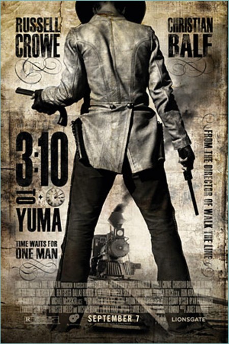
One of my recent favorites movie posters was one for 3:10 to Yuma and the creepy look of a one for The Fountain.
posted by nomadicink at 8:54 AM on October 5, 2010 [1 favorite]
One of my recent favorites movie posters was one for 3:10 to Yuma and the creepy look of a one for The Fountain.
posted by nomadicink at 8:54 AM on October 5, 2010 [1 favorite]
I was really disappointed with the Wanted poster. There was a nice attempt at a visual between the tattoo on her wrist and the scroll work on the .45, but it's completely undermined by everything else going wrong in that photo.
Fortunately there's a scene in the grocery store shootout where you can see what they were going for.
posted by quin at 9:24 AM on October 5, 2010
Fortunately there's a scene in the grocery store shootout where you can see what they were going for.
posted by quin at 9:24 AM on October 5, 2010
It's not even that hard to make something like the 3:10 to Yuma one. It would be much simpler than drawing all the paths to embiggen someones head, tweaking appendages, changing perspective, adding props etc.
posted by thsmchnekllsfascists at 10:56 AM on October 5, 2010
posted by thsmchnekllsfascists at 10:56 AM on October 5, 2010
The Bangkok Dangerous poster is amazing - did they actually forget to put the gun in his hands?
I think that's a sanitized version, because guns can't be shown in some subway systems, &tc.
posted by StickyCarpet at 12:34 PM on October 5, 2010
I think that's a sanitized version, because guns can't be shown in some subway systems, &tc.
posted by StickyCarpet at 12:34 PM on October 5, 2010
If you like this sort of thing, then you'll love Photoshop Disasters Blog, which contains most of these posters along with other hilarious and unfortunate photoshop gaffes. I only just discovered this blog a few weeks ago, and I find it interesting, funny, and horrifying (seriously, check out the Ralph Lauren model who was cut down to about a size -5, then RL tried to force this blog and others to take down the image, issued an "apology" after they were unsuccessful, and then promptly fired the model for being overweight. Allegedly.).
posted by 1000monkeys at 8:21 PM on October 5, 2010
posted by 1000monkeys at 8:21 PM on October 5, 2010
« Older We don't need you to type at all | visualizing.org Newer »
This thread has been archived and is closed to new comments
posted by nomadicink at 3:32 PM on October 4, 2010