Zaha Hadid's first school.
October 16, 2010 8:59 PM Subscribe
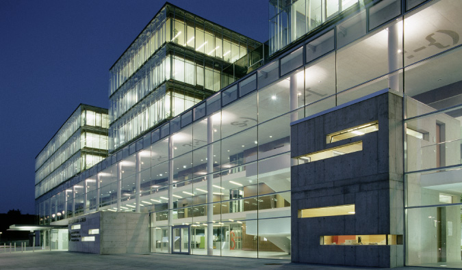
"Zaha Hadid is a celebrated architect. You have probably read the articles by now: most famous woman architect in history, Pritzker prize winner, forceful character, born in Iraq or possibly, if the journalist hasn't done their research properly, Iran. She has just completed her first school, a powerful, singular object in Brixton, south London." Story. Slideshow. Some photos from Flickr.
Previously: 1, 2, 3.
Previously: 1, 2, 3.
Just because Zaha Hadid is celebrated doesn't make her a good architect.
WTF? Yeah, she's a good architect. Many of the people who celebrate her are pretty knowledgable about architecture (and what is "good"), as well.
In actual response to the post, the school looks beautiful. As someone who is perhaps unnaturally affected by my environment, I do sort of buy the idea that the surroundings can rub off and inspire the students. At the very least, it shows students the respect of giving them a beautiful and auspicious space to learn in, which is more than I can say for the collection of ramshackle "portables" (read: trailers) that was my elementary school.
posted by EL-O-ESS at 9:42 PM on October 16, 2010
Hey, alright! Zaha Hadid got one of her designs actually built!
posted by intermod at 9:59 PM on October 16, 2010 [2 favorites]
posted by intermod at 9:59 PM on October 16, 2010 [2 favorites]
And Mumsnet posters comment about getting their kids into the school.
And more controversy on it being an Academy.
posted by Ideefixe at 10:13 PM on October 16, 2010
And more controversy on it being an Academy.
posted by Ideefixe at 10:13 PM on October 16, 2010
El-O-Ess, did you actually read the article? It's not very complimentary of Hadid's work.
Here is what the Guardian actually says:
The truth is that the Evelyn Grace Academy is a one-off from an age that has already passed, when the City of London's firestorm of wealth threw off sparks of philanthropy to less lucky districts a few miles distant. It is not something that is repeatable for hundreds of new schools, and Young would be right not to hire Hadid or Norman Foster for the free school he is trying to establish.
I think learning spaces are important, but this is a one-off. That's not cynicism. No parent picks a school for the grounds.
posted by parmanparman at 10:17 PM on October 16, 2010
hm. it's funny how different people react to a particular piece of architecture. i appreciate most styles of architecture, from queen anne to brutalist. looking at the photos of that building gives me shivers, though. the spaces seem visually cold and unwelcoming, austere at best. all that gray. and the accents of citrus green and yellow seem forced, not true to the rest of the space, while at the same time hitting notes of shlocky plastic 70's looks--like i grew up with! brr.
it certainly is massive! kind of like an ocean liner ran aground there. and the running track does run right through it! when the trees in the courtyard get some size on them, that will help, i suppose. i would not want to study there--it would feel like trying to learn in an airport terminal--seems like it would be damned echo-y.
although, yes, it is definitely better than "portables." or being shipped half-way across town to a church's basement whilst one's school is being renovated.
posted by miss patrish at 10:30 PM on October 16, 2010 [1 favorite]
Both Hadid's work and her business premises are pertinent to the debate going on about the design of schools, prompted by the remarks of the education secretary Michael Gove and the waspish columnist-turned-education-reformer Toby Young. They claim that the last government's £55bn Building Schools for the Future programme was a monstrous waste of money, that architects "creamed off cash which should have been going out to the front line", that "the link between buildings and academic performance is practically zero", that "vainglorious architects" had inflated budgets with "extravagant fantasies."
Silly administrators and their data and facts. We'll show you that all it takes is utopian architecture to improve education!
posted by outlandishmarxist at 10:49 PM on October 16, 2010 [1 favorite]
Silly administrators and their data and facts. We'll show you that all it takes is utopian architecture to improve education!
posted by outlandishmarxist at 10:49 PM on October 16, 2010 [1 favorite]
That is a building that serves itself, not its students.
I am not impressed.
posted by Malor at 11:12 PM on October 16, 2010 [1 favorite]
I am not impressed.
posted by Malor at 11:12 PM on October 16, 2010 [1 favorite]
> That is a building that serves itself, not its students.
I haven't seen any internal shots yet, but that's pretty much what I thought when I saw her fire station on the Vitra grounds. Except "firemen" instead of "students". I think Hadid has interesting ideas from time to time, but that fire station really didn't feel like it was made to be used by people. And this school... oh dear, it's hideous. It's like she wanted to make an office building for a nameless corporation which had asked for an extra grey and soul-crushing look.
posted by bjrn at 11:33 PM on October 16, 2010 [1 favorite]
No, wait, I changed my mind. It's a soul-crushing government building from a dystopian future. For the Academy of Strength and Hope, or something along those lines.
posted by bjrn at 11:35 PM on October 16, 2010 [3 favorites]
posted by bjrn at 11:35 PM on October 16, 2010 [3 favorites]
I like the clean aesthetic and the abundant light, but "damned echo-y" doesn't go far enough in describing how truly loud I'd expect it to be.
posted by BrotherCaine at 12:11 AM on October 17, 2010
posted by BrotherCaine at 12:11 AM on October 17, 2010
I quite like it. But it made me think of its predecessors, the red-brick Victorian schools that dot London (with their gothic twiddles) and a question that always nags me. Why is contemporary architecture always all about clean, straight lines. Why does virtually nobody do decoration and ornamentation anymore?
I hasten to add by this, I don't mean grotty pastiche (of which the UK has plenty) but recognisably modern buildings that are also decorated in some way - I guess the last time this happened was probably in the 1930s.
posted by rhymer at 1:08 AM on October 17, 2010 [2 favorites]
I hasten to add by this, I don't mean grotty pastiche (of which the UK has plenty) but recognisably modern buildings that are also decorated in some way - I guess the last time this happened was probably in the 1930s.
posted by rhymer at 1:08 AM on October 17, 2010 [2 favorites]
This looks like a school designed by someone who's forgotten what it was like to be in school. Are there any children on the planet who like to spend their breaks in empty concrete courtyards?
Treating the imperfections and pointy bits of normal humans as secondary to the ideals of the artist's vision may be acceptable in high fashion, but this is a school.
posted by vanar sena at 1:17 AM on October 17, 2010 [3 favorites]
Treating the imperfections and pointy bits of normal humans as secondary to the ideals of the artist's vision may be acceptable in high fashion, but this is a school.
posted by vanar sena at 1:17 AM on October 17, 2010 [3 favorites]
Why does virtually nobody do decoration and ornamentation anymore?
What are you, some filthy degenerate?
posted by sebastienbailard at 1:22 AM on October 17, 2010 [6 favorites]
What are you, some filthy degenerate?
posted by sebastienbailard at 1:22 AM on October 17, 2010 [6 favorites]
It's a soul-crushing government building from a dystopian future.
That doesn't seem too far off. According to Ideefixe's links the academy is highly regimented. You can lose behavior points for not walking properly. The school day is longer because extra-curricular activities are not optional. A lot of parents seem reluctant to send their kids there because they know they'd hate it. It seems like Zaha Hadid's clients may have gotten what they wanted.
posted by nangar at 1:47 AM on October 17, 2010
Pretty generic, really, what with the mirrored glass and goofy curves. No wonder the architecture geeks love it. It looks like a set from Gattaca.
Routing the running track through the building is one of those exciting and innovative ideas that is just plain stupid. It means you can't see the whole length of the track from any vantage point. Now, if the track is purely for exercise, that's passable, but if they are actually going to hold athletic events on it (which, given that it's part of a school, I would expect), that's a big fail.
posted by Jimmy Havok at 2:33 AM on October 17, 2010 [2 favorites]
Yeah I was thinking the same thing: I hope they have a different track for the track and field team. How the hell are you supposed to watch any event longer than 200m? And where exactly are you supposed to throw a javelin?
posted by creasy boy at 3:05 AM on October 17, 2010
posted by creasy boy at 3:05 AM on October 17, 2010
Her first project in the US is in my town, the Cincinnati Contemporary Arts Center
posted by Mick at 5:09 AM on October 17, 2010
posted by Mick at 5:09 AM on October 17, 2010
Wow, if I didn't read the context I'd have sworn that that school was from 1971 or so. It looks like all of the horrible giant institutional buildings built during that era that everyone hates now. Why bring that back?
posted by octothorpe at 6:02 AM on October 17, 2010
posted by octothorpe at 6:02 AM on October 17, 2010
Architecture is right up there with fat chicks and religion on the high end of "things MeFi does not do well'.
posted by signal at 6:19 AM on October 17, 2010
posted by signal at 6:19 AM on October 17, 2010
I think it is a great building and would be inspired to learn there. That a school has been built by a fine architect instead of the usual cheap schlock that's thrown up serves to demonstrate that we give a shit about children.
posted by Lleyam at 7:22 AM on October 17, 2010
posted by Lleyam at 7:22 AM on October 17, 2010
It looks like a prison, especially when viewed with the neighborhood.
posted by nomadicink at 7:29 AM on October 17, 2010
posted by nomadicink at 7:29 AM on October 17, 2010
Hmm. To me, it looks kind of cold and un-school-like. It resembles my idea of what a hospital or airline terminal school look like, rather than a school. But that might just be my preconceived notions of what school architecture is like. It would be interesting to see what students and teachers thought of it in a few years.
The problem, though, is that the linked article makes it hard for me to think of this as an architecture story. The article links the building to some pretty popular and problematic ideas about education reform, such as that rich, glamorous people who have never taught know more about how education should work than actual teachers and that inner-city kids can only learn if they are subjected to military-style discipline. Maybe it's just because I have more invested in education than in architecture, but it's hard for me to respond to the building and not to the other ideas that the article espouses.
posted by craichead at 7:53 AM on October 17, 2010 [1 favorite]
I went to school in sixth grade in a brand new building very much like that.
It was awesome, especially the amount of sunlight. These kids are lucky.
posted by Navelgazer at 8:12 AM on October 17, 2010 [1 favorite]
It was awesome, especially the amount of sunlight. These kids are lucky.
posted by Navelgazer at 8:12 AM on October 17, 2010 [1 favorite]
Well I'm sure Mrs. Jenkins class is going to put on an amazing version of "Battlestar Galactica - the Musical" this year.
posted by mr.ersatz at 8:18 AM on October 17, 2010 [1 favorite]
posted by mr.ersatz at 8:18 AM on October 17, 2010 [1 favorite]
Hey, alright! Zaha Hadid got one of her designs actually built!
Her firm has been on a serious roll for about five years now.
WTF? Yeah, she's a good architect.
This isn't uncontroversial among people who are knowledgeable about architecture. While I wouldn't go so far as to compare her to Libeskind, there's often an excess of formal virtuosity in her firm's buildings that overpowers everything and never scales down. For me, it's the architectural equivalent of shredding electric guitarists; it's impressive that you can play so fast, but your music is hollow and uninspiring to me, please turn it off.
Why does virtually nobody do decoration and ornamentation anymore?
Now that designers have discovered robots, CNC cut rehases of ornamental motifs throughout the ages should be deluging your world fairly soon. The controversy sebastienbailard pointed to is pretty complicated. It boils down to early Modern architects getting lathered up about authenticity. Patterns of ornamentation aren't just there to look nice- historically, they emerge from long traditions of making, and are bound up in their material. When we started to build with modern materials and techniques, the argument was made that continuing to use traditional schemes of ornamentation was an unthinking conservative reflex. There was a lot of screaming about it. Things were said. Manifestoes were written.
posted by Casimir at 8:51 AM on October 17, 2010 [4 favorites]
I don't know how popular the futuristic look is in the neighborhood (not very, from the looks of it) but it never seems popular among the public at large, at any period in time. People like things that don't look too different. "Different" means "unfamiliar," which in turn seems to mean "cold" and "unwelcoming" to people. That's too bad. I wish more buildings everywhere were designed to be interesting and eye-catching like this. Gives me something to look at when I walk around. (And why does it matter that it's a school?)
posted by Xezlec at 8:55 AM on October 17, 2010
posted by Xezlec at 8:55 AM on October 17, 2010
Forgot to mention, regarding recognisably modern buildings that are also decorated in some way. There was an attempt at that, starting in the late 60's, reaching its peak in the 80's. That's when your grotty pastiches were misbegotten.
posted by Casimir at 9:00 AM on October 17, 2010
posted by Casimir at 9:00 AM on October 17, 2010
When we started to build with modern materials and techniques, the argument was made that continuing to use traditional schemes of ornamentation was an unthinking conservative reflex.
Really, unthinking? Even if you thought about whether or not to do it first?
posted by kenko at 9:21 AM on October 17, 2010
Really, unthinking? Even if you thought about whether or not to do it first?
posted by kenko at 9:21 AM on October 17, 2010
I mean, really. Modernists—what a tiresome bunch of worrywarts.
posted by kenko at 9:22 AM on October 17, 2010
posted by kenko at 9:22 AM on October 17, 2010
It would probably look nice if they didn't use such a cheap material for the siding. I mean from this angle it just looks cheap. And the style, from that angle seems more like a prison then a school.
From other angles, with more glass, it looks better. Like this one I hope the fence that's there is just for the construction and won't be there when the school opens, that would just be tacky. Maybe if the parts that are Grey and paneled were stone, or brick or some kind of shiny metal it would look better.
posted by delmoi at 9:48 AM on October 17, 2010
Looking at that picture Nomadicink links, all I can think is that Banksy has really outdone himself on this one.
posted by Kid Charlemagne at 10:50 AM on October 17, 2010
posted by Kid Charlemagne at 10:50 AM on October 17, 2010
Xezlec--i have no problem with a futuristic look in architecture, so long as the architect hasn't forgotten what the heck the building is going to be used for. it does matter that it's a school, precisely because kids are going to be spending great long swaths of their days pretty much trapped in these spaces, and if those spaces are not appealing to the senses and the mind and the spirit, it will indeed feel like a prison. and i am not saying this looks cold and unwelcoming because of some vague perception of it different-ness; as i child of the 70s, i've done time in soul-destroying spaces just like these.
i will agree that there is going to be lots of sunlight. i am all for sunlight--i'm living right now in a 1916 arts and crafts house with 28 oversized windows and a sunroom on the back, so yeah, sunlight! that's a tick on the good side for this place. a tick then has to go on the bad side, though, because so far as i can tell (and obviously, not having been there, i am only going by the pictures available, so correct me if i'm wrong) none of those windows open. on a lovely sunny day, it will be a sultry greenhouse and will begin to smell of overly warm people after only a few years.
my guess is that, if these people are wise, they will pitch out the spindly chairs and blocky formica-clad desks and furnish this fucker with hardwoods and carpets and live plants and install some openable windows within the next couple years when all the ugly qualities begin to surface and have a deleterious effect on students psyches.
posted by miss patrish at 10:59 AM on October 17, 2010 [1 favorite]
speaking of recognizably modern building that are also decorated in some way, take a gander at frank lloyd wright's hollyhock house.
posted by miss patrish at 11:06 AM on October 17, 2010
posted by miss patrish at 11:06 AM on October 17, 2010
miss patrish: I still don't see why it matters that it's a school. What use of the building would be acceptable if it is "not appealing" and "soul-destroying"? And if you aren't saying that it looks awful because it is futuristic, then why are you saying that? Are there any contrasting examples of that kind of architecture that might help illustrate your point?
posted by Xezlec at 11:34 AM on October 17, 2010
posted by Xezlec at 11:34 AM on October 17, 2010
> I don't know how popular the futuristic look is in the neighborhood (not very, from the looks of it) but it never seems popular among the public at large, at any period in time.
I'm not sure I could describe it as futuristic, and I don't think that's the issue. You can look at a blog like Arch Daily and see a lot of modern architecture that doesn't look like it comes straight out of some totalitarian government's handbook of approved aesthetics.
Okay, I'm exaggerating, but I do think that the building doesn't exactly look inviting.
posted by bjrn at 1:29 PM on October 17, 2010
Hmm. On one hand I like the futuristic look, and I find that the school looks amazing in those pictures. And I generally like Zada Hadid's work, and the way she's aimed to redeem apparent concrete and the old Brutalist school of architecture.
But on the other hand, I've also the distinct impression that this school is going to age just as badly as most Brutalist buildings of the 60s and 70s, especially in London's less-than-clement weather (can't help noticing that all the pictures have been taken in a rare sunny day). Moreover, (as many of the worst examples of Brutalism) it appears to have been conceived as a showcase for the architect, rather than as an actual, functional school. Take for instance that sunken racing track (second picture in the Guardian's picture gallery): as a former dweeby schoolkid, I get the shivers just from looking at it: it's a perfect hideout for bullies, where they'll be able to kick the living shit out of their fellow pupils away from the teachers' prying eyes. Also, those raw concrete walls are going to be graffiti magnets.
In general, schoolkids are better served by schools designed by an unpretentious, practical, level-headed, even pedestrian architect, than by some high-flyer like Zada Hadid, who, quite frankly, should stick to banks.
posted by Skeptic at 1:40 PM on October 17, 2010 [1 favorite]
Casimir makes a good point about ornamentation. I recall the Memphis era quite well, its travesties still remain as strip malls here and there. It's a style that particularly galls me because Hard Rock Cafe (may they all die in a fire) tore down a beautiful Tiki style restaurant, one of the few remaining, to put up a Memphis monstrosity with the same footprint, a building that could easily have been adapted to their use.
The biggest problem I see with this building is that its exterior seems to be the focus of the design effort. My opinion is that form should follow function, that is to say, design the interior spaces, and wrap the building around them. The running track through the building is a clear violation of form follows function. The chunk of concrete sticking out of the face of the building is form for form's sake. In some cases, form for form's sake is the function, for example, if the building is meant to display the wealth of the organization installed in it, but in this case, we're talking about a school, not a corporate headquarters.
The glass walls I like. They do bring natural light to the interior and give the rooms an open aspect. Given that this building is in England, excessive reflected light and heat is not likely to be a problem, in fact one could argue in favor of deliberately angling the windows in order to reflect more onto the exterior common areas. The only thing that needs to be addressed with glass walls and hard floors is sound reflection, but that's not too hard to deal with. I've seen a room that was nearly unusable due to echoes rehabilitated with a few pieces of fabric art placed on the walls and in the ceiling space.
posted by Jimmy Havok at 1:43 PM on October 17, 2010
bjrn: Except for this hideous thing, I didn't see anything on that blog that isn't in some kind of vaguely back-to-nature style. The "looks like it was made by a totalitarian government" thing is something I now hear every time I see anything that looks attractive to me. People were saying that about those beautiful, 3-D fractals that got posted before too. I can't think of any real-world totalitarian governments that build things that look smooth and flowing like this, so I don't know where that association could have formed. Has science fiction just tied the futuristic look to evil so firmly that it is dead forever?
posted by Xezlec at 2:09 PM on October 17, 2010
posted by Xezlec at 2:09 PM on October 17, 2010
bjrn's link to arch daily kind of answers your "contrasting examples" question, xezlec.
i guess i would say it's soul-destroying if one has to spend all one's days there, if all one has to rest one's eyes on are flat gray surfaces. it's soul-destroying if one is a teacher trying to make herself heard in a space with poor acoustics, or a student trying to hear her, day after day. the architecture itself can be visually pleasing, but there's not a lot to work with, visually, over the long haul. i have experienced the visual and auditory fatigue that sets in after only a few days in a place like this when the initial excitement of the forms is exhausted. for me, the effect is stultifying.
norwegian modern does this aesthetic well: it is spare and minimalist, but it remembers that the human eye likes contrast, likes material with which to make patterns. we are, after all, pattern recognition monkeys. all great architecture works with this: those who move around and within it interact with it--it isn't static. good architecture gives plenty of nucleation sites for the psyche to glom on to.
examples of places that would feel right with this sort of architecture would be those that are meant to house great crowds of people for limited stints: airport terminals, maybe museums. libraries. science centers or big public buildings at zoos. opera houses/theaters, if the acoustics are carefully considered. in fact, any of these uses requires a consideration of the acoustics to make them workable. but they're big spaces, appropriately so.
schools--well, classrooms, to be precise--do not need these huge spaces, primarily because the act of learning/teaching is such an intimate one. or should be. not that classrooms should be cramped and claustrophobic, either; the rooms in which learning is done need to be large enough to house the class and its accouterments with plenty of elbow room, but small enough to imply a sense of connectedness, of safety to our primate instincts. whether those rooms are in the georgian style or italianate or brutalist or modern makes no difference, really, so long as they meet these requirements.
posted by miss patrish at 2:46 PM on October 17, 2010 [6 favorites]
miss patrish: Thank you for the explanation and patience. I think I'm following you now. Also, thanks for that image search. This one is particularly awesome.
posted by Xezlec at 3:00 PM on October 17, 2010
posted by Xezlec at 3:00 PM on October 17, 2010
ah, i am a very slow typist. i see you don't find anything in arch daily. actually, did you look at the . . . what are the called . . . "selected buildings" shown in the sidebar of that "hideous thing"? for instance, take a look at this one. it's a museum. for shells! i couldn't think of a more appropriate building. it's big, it's designed to accommodate lots of people. it's modern. what a thing of beauty!
actually, i find st. louis lambert main terminal rather lovely. its form fits its function. i wouldn't want to go to school there.
well, crap, i am so slow! i'm glad i did okay explaining.
posted by miss patrish at 3:02 PM on October 17, 2010
actually, i find st. louis lambert main terminal rather lovely. its form fits its function. i wouldn't want to go to school there.
well, crap, i am so slow! i'm glad i did okay explaining.
posted by miss patrish at 3:02 PM on October 17, 2010
oooh! nice.
posted by miss patrish at 3:03 PM on October 17, 2010
posted by miss patrish at 3:03 PM on October 17, 2010
heh. now that i look at all the pictures, i kind of, um, like "this hideous thing." no accounting for taste, hm?
i think it comes down to the warm terra-cotta colored brick base, the capacious wooden deck in the elbow between the two wings, the echo of cloud-lift motif along the bottom of the cantilevered part that hints at a line of hills or a ridge. and being a big fan of arts and crafts style, i so dig the connectedness between inside and out with the seating on the balconies. i am divided on the windows on the main part . . . too small, maybe? in its setting though . . . amazing!
i would say that's the difference between this hideous thing and the school: it seems to be conscious of where it is and isn't nervous about using natural materials in conjunction with the rather daunting concrete/glass.
posted by miss patrish at 3:24 PM on October 17, 2010 [1 favorite]
Oh, sorry, I just didn't like it because the metal on top looked too stony and rigid, and I didn't like the contrast between the bluish top and the orangey bottom. It's definitely a matter of personal taste. And I agree, the shell-shaped shell building is nice.
posted by Xezlec at 4:03 PM on October 17, 2010
posted by Xezlec at 4:03 PM on October 17, 2010
Oh, and as long as we're posting pictures of our favorite buildings: The new Library of Alexandria in Egypt for the futuristic category and Sagrada Familia in the modern-but-with-gratuitous-decoration category.
posted by Xezlec at 4:10 PM on October 17, 2010 [1 favorite]
posted by Xezlec at 4:10 PM on October 17, 2010 [1 favorite]
Surprisingly tame compared to her early stuff- like her Hong Kong Peak proposal. Completely baffled by it when I saw her present it decades ago..
posted by marvin at 9:54 PM on October 17, 2010
posted by marvin at 9:54 PM on October 17, 2010
It looks like a prison.
Where are the trees or green spaces?
As someone who is perhaps unnaturally affected by my environment...
That makes no sense to me. Everyone is significantly affected by his or her environment. What's unnatural about it?
although, yes, it is definitely better than "portables."
I'd almost rather have a portable/sectional trailer with a lawn out front.
posted by mrgrimm at 10:46 PM on October 17, 2010
"Different" means "unfamiliar," which in turn seems to mean "cold" and "unwelcoming" to people.
No, no, and no. I wish people would stop projecting their own art school snobbishness about buildings into the discussion. When people say a building is cold and unwelcoming, can we respect them enough to appreciate the precision of what they are saying? I found this building to be a hideous and inhuman monstrosity, and I used to write catalog copy on art and architecture books (including Zaha Hadid, over ten years ago).
posted by existential hobo at 7:44 AM on October 18, 2010
Not to make this a rag-on-EL-O-ESS thread, but I just have to say in regards to:
Many of the people who celebrate her are pretty knowledgable about architecture (and what is "good"), as well.
NO ONE is knowledgable about what is "good". It's not a fact, it's an opinion (which, even if fairly widely held, can be controversial, as Casimir points out).
Huxley's "Brave New World" was panned by the critics, and sold horribly in its first edition. There were fist fights and boos in the audience of at least one major symphony & ballet (Moussorgsky's Night on Bald Mountain? memory fails me). "Good" taste, in the lasting sense, isn't something there exist real experts on; and if architecture isn't good in a lasting sense, it's crap.
posted by IAmBroom at 1:17 PM on October 18, 2010
Uh, what country has prisons with big windows? 'cause I'd probably want to move there. I might agree that it looks like an airport terminal.
posted by BrotherCaine at 1:22 PM on October 18, 2010
posted by BrotherCaine at 1:22 PM on October 18, 2010
Uh, what country has prisons with big windows
Austria - The Justizzentrum Leoben
No joke.
posted by mrgrimm at 2:53 PM on October 18, 2010 [1 favorite]
Austria - The Justizzentrum Leoben
No joke.
posted by mrgrimm at 2:53 PM on October 18, 2010 [1 favorite]
Thanks, mrgrimm, I wouldn't mind going to school in a prison like that. I even like the emoticons on the ceiling.
posted by BrotherCaine at 11:28 AM on October 19, 2010
posted by BrotherCaine at 11:28 AM on October 19, 2010
« Older These Are Paintings | Book Sculpture Newer »
This thread has been archived and is closed to new comments
posted by parmanparman at 9:24 PM on October 16, 2010 [2 favorites]