(blue)OOOO(yellow)OOOOOO
November 8, 2010 7:32 AM Subscribe
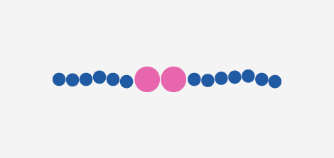
Unevolved Brands. Taking well known corporate logos and simplifying them into colored circles. How many can you still recognize?
Some are really easy while others are a bit harder. I wish there was an answer key, but I'm not finding one. Discovered via this Sporcle quiz which does give away quite a few answers.
Some are really easy while others are a bit harder. I wish there was an answer key, but I'm not finding one. Discovered via this Sporcle quiz which does give away quite a few answers.
A quick scroll down and I can say that Mastercard, VISA and ESSO are the only ones I could recognize*. I'm happy about that.
*and I'm not entirely sure about those...
posted by flapjax at midnite at 7:38 AM on November 8, 2010
*and I'm not entirely sure about those...
posted by flapjax at midnite at 7:38 AM on November 8, 2010
Logos that are already circle-heavy have an unfair advantage here - MasterCard, for example. Still pretty cool.
posted by Tomorrowful at 7:47 AM on November 8, 2010
posted by Tomorrowful at 7:47 AM on November 8, 2010
Huh, I had no idea that ESSO still existed as a brand.
posted by octothorpe at 7:47 AM on November 8, 2010
posted by octothorpe at 7:47 AM on November 8, 2010
"Unevolved" is an inelegant word; "devolved" would probably be more accurate for what this is.
It's an interesting idea but I'm not too impressed with the execution (which isn't to say that some of them didn't stump me). I recognized Reddit, of course, and Cingular. I have no idea what the "shame on you if you don't get it" one is, but I also think it's cheating using an angular background (assuming that's part of the brand).
posted by Gator at 7:48 AM on November 8, 2010 [3 favorites]
Gee, the ones where the brand involves circles already are the easiest.
posted by smackfu at 7:48 AM on November 8, 2010
posted by smackfu at 7:48 AM on November 8, 2010
I think that's pretty great, but so many of them are so hard (or I'm not any good at this.)
I did recognise this one though.
posted by DanCall at 7:52 AM on November 8, 2010
I did recognise this one though.
posted by DanCall at 7:52 AM on November 8, 2010
The only ones that really jumped off the page for me in a quick scroll-through were Best Buy and Lush. I only got 11 on the Sporcle quiz. These are tough.
I heart Sporcle!
posted by phunniemee at 7:55 AM on November 8, 2010
I heart Sporcle!
posted by phunniemee at 7:55 AM on November 8, 2010
Heh. This looks a lot like the work of Francis Baudavin, a Swiss painter who has been "reducing" logos for quite some time now - often using round circles. For example, here's a print of his from 1996. Here's another, and here's a quick bit on his work from Art in America.
posted by armisme at 9:04 AM on November 8, 2010
posted by armisme at 9:04 AM on November 8, 2010
Niels Aalbers does something similar with record covers. Some of these are Dutch, but most are well-known in the Anglosphere and fun to guess.
posted by goodnewsfortheinsane at 9:06 AM on November 8, 2010
posted by goodnewsfortheinsane at 9:06 AM on November 8, 2010
Actually, looks like there are more Dutch ones in there than I thought. Still, fun concept.
posted by goodnewsfortheinsane at 9:10 AM on November 8, 2010
posted by goodnewsfortheinsane at 9:10 AM on November 8, 2010
I have no idea what the "shame on you if you don't get it" one is
It's Tumblr, the company hosting the blog.
posted by caaaaaam at 9:14 AM on November 8, 2010
It's Tumblr, the company hosting the blog.
posted by caaaaaam at 9:14 AM on November 8, 2010
Gator: "Unevolved" is an inelegant word
I don’t know why; it’s a perfectly cromulent word.
posted by xedrik at 9:15 AM on November 8, 2010
I don’t know why; it’s a perfectly cromulent word.
posted by xedrik at 9:15 AM on November 8, 2010
I mistook Tumblr for MeFi. At least I got Reddit, Google, and BestBuy...
posted by crataegus at 9:25 AM on November 8, 2010
posted by crataegus at 9:25 AM on November 8, 2010
Let's see: I got blackberry, reddit, bestbuy, cingular, McDonnell's, Lego, mastercard, google, starbucks, I think this one is Nike, cisco, dunkin' donuts and I think this is baskin' robins. And who could miss BP? subway (which the author calls two words with three letters, but it's one word in American english), T-Mobile, Apple, and Pan-am since someone mentioned upthread.
posted by delmoi at 10:16 AM on November 8, 2010
posted by delmoi at 10:16 AM on November 8, 2010
I'm not at all ashamed that I didn't recognize a single one of those. I don't know if that's because shapes / fonts mean more to me than colors / size, or if I actually have a decreased awareness of consumer culture. I'm hoping for the latter, but it's probably just the former.
posted by mdn at 10:38 AM on November 8, 2010
posted by mdn at 10:38 AM on November 8, 2010
I think I got Audi, Target and the Olympics, but I'm not so sure.
posted by hydrophonic at 10:39 AM on November 8, 2010
posted by hydrophonic at 10:39 AM on November 8, 2010
SomethingAwful recently did a great two part series of minimalist representations of sets of characters, mostly from fiction.
posted by theclaw at 10:51 AM on November 8, 2010
posted by theclaw at 10:51 AM on November 8, 2010
I was thinking of that too. Posted last month. Those work a lot better than this logo thing, in my opinion. I don't know why. Is it just that humanoid figures who wear the same clothes every week are more easily reduced to their iconic bits than a logo? Maybe it's just that all humanoids are roughly the same shape and can pretty easily be devolved into rectangles, whereas logos vary pretty widely and not all of them devolve into circles as well as others.
posted by Gator at 11:01 AM on November 8, 2010
posted by Gator at 11:01 AM on November 8, 2010
"Unevolved" is an inelegant word; "devolved" would probably be more accurate for what this is.
Unevolved is a perfectly cromulent word.
posted by Biru at 11:10 AM on November 8, 2010
Unevolved is a perfectly cromulent word.
posted by Biru at 11:10 AM on November 8, 2010
Unevolved is a perfectly cromulent word.
Knowledge embiggens the smallest man.
posted by djgh at 12:24 PM on November 8, 2010
Knowledge embiggens the smallest man.
posted by djgh at 12:24 PM on November 8, 2010
This was tough. The only one I got upon first view was BestBuy.
posted by Night_owl at 11:17 AM on November 9, 2010
posted by Night_owl at 11:17 AM on November 9, 2010
« Older Come Out, Come Out, Wherever You Are | The United States is a confused and fearful... Newer »
This thread has been archived and is closed to new comments
posted by Devils Rancher at 7:38 AM on November 8, 2010