Homeland Security Logo Contest
March 3, 2003 7:32 AM Subscribe
The Department of Homeland Security logo contest finalists have been announced. Each finalist now has 10 days to alter their designs, based on feedback given by you! [via K10k]
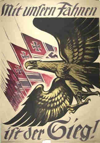
i favor the one featuring the blitzkreig lightning bolts, or the one with the eagle attacking the SUV.
posted by quonsar at 7:39 AM on March 3, 2003
posted by quonsar at 7:39 AM on March 3, 2003
I just hope it doesn't turn into a svastika
posted by elpapacito at 7:40 AM on March 3, 2003
posted by elpapacito at 7:40 AM on March 3, 2003
Even though the contest is being held by Logo-Contest.com, and not the Department itself, I think there are some interesting concepts mixed in there, even if much of the execution isn't the greatest. According to the site, "submissions of qualifying nature will be passed on to the government"
posted by ScottUltra at 7:40 AM on March 3, 2003
posted by ScottUltra at 7:40 AM on March 3, 2003
#8, definitely. Lose the star in the Eagle's eye, or make it white, and shape the Eagle's body like a traditional shield (see #7). Boom, golden. The Dept. would still be the earthly embodiment of evil but hey, they'd have a cool non-scary logo.
posted by Ryvar at 7:51 AM on March 3, 2003
posted by Ryvar at 7:51 AM on March 3, 2003
1 is the most classic, the stars are a little cheesy and the atom is unnecessary, how about an olive branch instead of the arrows, it is peach we seek with DHS, no?
2 looks like a Captain America badge, not that I don't like that, but it does.
3 looks fake, sharpen up those lines!
4 is kinda boring, please lose the 9-11, its the DHS not the Dept. of 9-11
5 is interesting.
6 looks like a letterhead not a seal.
7, oh, 7, good number 7 was a nice try, but its not a chicken restaurant, its a federal agency, thanks for trying.
8 is a little scary, how about you put a contiguous 48 map in the lock instead of the cheesy 1st grade drawing of a house.
9 see 6.
posted by Pollomacho at 7:52 AM on March 3, 2003
is it just me who's getting oddly nazi-eque feelings about this one?
posted by twine42 at 7:56 AM on March 3, 2003
posted by twine42 at 7:56 AM on March 3, 2003
that would be peace, not peach, thanks.
posted by Pollomacho at 7:56 AM on March 3, 2003
posted by Pollomacho at 7:56 AM on March 3, 2003
This just screams for Photoshopped entries of our own...
quonsar!
posted by Shane at 7:59 AM on March 3, 2003
quonsar!
posted by Shane at 7:59 AM on March 3, 2003
here's my comment:
I like the eagle with the red eye carrying off the home. It's very symbolic of the frightening things we are all subject to under "homeland security," similar to my house being carried off by an eagle with blood red eyes.
posted by iamck at 8:08 AM on March 3, 2003
I like the eagle with the red eye carrying off the home. It's very symbolic of the frightening things we are all subject to under "homeland security," similar to my house being carried off by an eagle with blood red eyes.
posted by iamck at 8:08 AM on March 3, 2003
twine42
is it just me who's getting oddly nazi-eque feelings about this one?
Damn Skippy, now I'll sit back and wait for someone to say that's what makes that design so fitting.
posted by KnitWit at 8:09 AM on March 3, 2003
is it just me who's getting oddly nazi-eque feelings about this one?
Damn Skippy, now I'll sit back and wait for someone to say that's what makes that design so fitting.
posted by KnitWit at 8:09 AM on March 3, 2003
is it just me who's getting oddly nazi-eque feelings about this one?
Not just you. Note the eye.
posted by jpoulos at 8:16 AM on March 3, 2003
Not just you. Note the eye.
posted by jpoulos at 8:16 AM on March 3, 2003
heh! there are more logo's in that directory besides the finalists. they all seem to be numbered "logoxx.gif". collect the whole set!
posted by quonsar at 8:18 AM on March 3, 2003
Dear entrants 2, 4, 8, etc.
We at the National Eagle Promotion Board were disappointed to see that you had neglected to include an eagle in your recent entry to the Department of Homeland Security Logo Contest. Eagles are an essential part of the fabric of this great nation of ours, especially if it's Eagore-Tex, the all new waterproof eagle-down fabric from EagleCo™. Eagles are hardy, self-reliant, and have 83% less fat than tofurkey and comparable meat-stuffed-with-other-meat products.
May we take this opportunity to remind you that eagles are firm and resolute in appearance, come up quite nicely in Adobe Illustrator, and just scream 'security'. (Sorry, that would be a parrot. One that had been trained to scream 'security'... by some noble patriot, no doubt. As you were.)
Yours faithfully,
Earnest G. Lee
President, NEPD
posted by rory at 8:22 AM on March 3, 2003
It appears that the site changes the order of the logos on every refresh or page visit, so it would be best to identify the logos by their creators. I, too, like the Eagle attacking the SUV. Hitchcockesque.
posted by samuelad at 8:23 AM on March 3, 2003
posted by samuelad at 8:23 AM on March 3, 2003
I typed comments to all in succession or at once and hit send on one and....they all re-set. Clumsy of them or stupid of me....
I liked the lightning one. That was mystifying - and almost scary. The rest - ohhhh boy. I agree about the nazi one... The one that had HOMELAND written on a banner cross the middle looked like it should grace the front of a organic food product box. The nazi eagle looked like it was snatching a big purse too.
The one eagle that was facing forward looked like some platypus billed Mummer.
posted by RubberHen at 8:24 AM on March 3, 2003
number 7 has a rainbow in it. the five little dots could represent respect for cultural difference in the face of fear or something, yes?
or maybe it's just the department of homeland skittles.
posted by grabbingsand at 8:24 AM on March 3, 2003
or maybe it's just the department of homeland skittles.
posted by grabbingsand at 8:24 AM on March 3, 2003
Nice one quonsar. Number 28 can only have been done by someone who's taken too much acid.
posted by squealy at 8:38 AM on March 3, 2003
posted by squealy at 8:38 AM on March 3, 2003
The Department of Homeland Security, formerly Kenny Roger's Roasters
posted by Pollomacho at 8:41 AM on March 3, 2003
posted by Pollomacho at 8:41 AM on March 3, 2003
What says "homeland security" best? Is it an eagle? A patriot? A waving flag? A cascade of stars? Or just a map of the good ol' US of A? Aw, heck, I just can't decide! (On the other hand, the barbed wire patriot gets triple points for unintended irony...)
posted by ook at 8:57 AM on March 3, 2003
posted by ook at 8:57 AM on March 3, 2003
Excellent.
Now our government is promoting work on spec?
Please, devalue my profession even more!
thogh, I agree with quonsar - this one wins.
posted by cinderful at 9:04 AM on March 3, 2003
Now our government is promoting work on spec?
Please, devalue my profession even more!
thogh, I agree with quonsar - this one wins.
posted by cinderful at 9:04 AM on March 3, 2003
The slogan, Land of the Free, Home of the Brave for 26 seems worthless by its seal.
though, I agree with quonsar - this one wins.
posted by thomcatspike at 9:42 AM on March 3, 2003
though, I agree with quonsar - this one wins.
posted by thomcatspike at 9:42 AM on March 3, 2003
Number 28 can only have been done by someone who's taken too much acid.
Or, more precisely, someone who's dyslexic and has taken too much acid. I don't want those psychedelic freaks gettin' all hopped up on DSL and gthering ifnormation on me!
(On preview: quonsar, you beat me by mere seconds . . .)
posted by gompa at 10:02 AM on March 3, 2003
Or, more precisely, someone who's dyslexic and has taken too much acid. I don't want those psychedelic freaks gettin' all hopped up on DSL and gthering ifnormation on me!
(On preview: quonsar, you beat me by mere seconds . . .)
posted by gompa at 10:02 AM on March 3, 2003
IF(NORM('citizen'))
{
PROTECT();
}
ELSE
{
PREEMPT();
}
ENDIF;
posted by quonsar at 10:31 AM on March 3, 2003
{
PROTECT();
}
ELSE
{
PREEMPT();
}
ENDIF;
posted by quonsar at 10:31 AM on March 3, 2003
#17 is my fav. I know I'll feel safe when we erect a 200-mile-high Lincoln Log wall around the north-central states and herd everyone inside. Even without the green roof, it seems to be protecting against those puffy white ICBM air bursts.
posted by jalexei at 10:49 AM on March 3, 2003
posted by jalexei at 10:49 AM on March 3, 2003
#6 is the one that gave me the creepy third reich feeling...
posted by crookdimwit at 12:05 PM on March 3, 2003
posted by crookdimwit at 12:05 PM on March 3, 2003
The one with the eye (#18) obviously has seen the cover of Jennifer Government.
posted by ?! at 12:44 PM on March 3, 2003
posted by ?! at 12:44 PM on March 3, 2003
Note: while nothing's more American than Fried Chicken restaurants, and Washington DC is surely becoming very mountainous, there was never really a time in U.S. History when we swashbuckled with rapiers.
posted by sixfoot6 at 1:15 PM on March 3, 2003
posted by sixfoot6 at 1:15 PM on March 3, 2003
there was never really a time in U.S. History when we swashbuckled with rapiers.
sixfoot, that's the logo for the Homeland Fencing Team.
posted by Shane at 2:09 PM on March 3, 2003
sixfoot, that's the logo for the Homeland Fencing Team.
posted by Shane at 2:09 PM on March 3, 2003
Number 23, beyond a doubt.
Though they should maybe jazz it up with some inner-beveled text, drop shadows and a blingtastic lens flare.
posted by arto at 2:15 PM on March 3, 2003
Though they should maybe jazz it up with some inner-beveled text, drop shadows and a blingtastic lens flare.
posted by arto at 2:15 PM on March 3, 2003
I find the upside down "United States of America" in #19 amusing. Also a fan of lowly #15; Did they sign Captain America for the job, or something? Finally, with #22, I at fist thought the lock-thingie they use for the A in "Homeland" was a trashcan with a house in it. Which is cool, and all.
posted by kaibutsu at 3:30 PM on March 3, 2003
posted by kaibutsu at 3:30 PM on March 3, 2003
I was about to ask "is irony really dead??"
Then I saw all the entries (especially #23).
posted by Taken Outtacontext at 8:21 AM on March 4, 2003
Then I saw all the entries (especially #23).
posted by Taken Outtacontext at 8:21 AM on March 4, 2003
ummm, I don't get it. is it?
posted by joe_murphy at 11:20 PM on March 6, 2003
posted by joe_murphy at 11:20 PM on March 6, 2003
« Older 3 | Radio payola, it just never went away Newer »
This thread has been archived and is closed to new comments
Number 3 looks like a Boy Scout's patch.
posted by Witty at 7:37 AM on March 3, 2003