Judge not
January 31, 2011 2:16 PM Subscribe
You can't judge a book by its cover. But people do. if the 41st version of the cover of The Madonnas of Echo Park is this awful...how bad were the first 40?
The first ten were probably pretty good, but That One Guy didn't like them.
posted by Sidhedevil at 2:25 PM on January 31, 2011
posted by Sidhedevil at 2:25 PM on January 31, 2011
In art and design decisions made by committee, the quality does not generally increase as successive iterations are discarded. The end result is usually something like the South Park episode where the former Christmas Holiday pageant ends up being kids in gray sweatsuits performing Philip Glass.
posted by Sidhedevil at 2:27 PM on January 31, 2011 [4 favorites]
posted by Sidhedevil at 2:27 PM on January 31, 2011 [4 favorites]
The cover isn't that bad. The commenter there likens it to Bukowski on Black Sparrow and she's not far off.
posted by mrgrimm at 2:27 PM on January 31, 2011
posted by mrgrimm at 2:27 PM on January 31, 2011
Feedback for the book is good on Amazon. I hope the negative publicity on the book's cover translates for positive publicity for its content.
For what it's worth, that book cover is an easy one to pass by at a bookstore. I can't pinpoint why. Perhaps a book-cover or graphic designer can shed some light on it.
The final design was intended to appeal to the broadest possible readership, says publisher Martha Levin, whose imprint is a unit of CBS Corp.’s Simon & Schuster Inc.
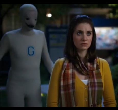
This reminds me of how the look of the Human Being mascot for the fictional Greendale Community College (featured in the tv show, Community) was chosen: on the basis of what was least offensive to everybody. In doing so, they made something unappealing to everybody.
posted by jabberjaw at 2:32 PM on January 31, 2011 [3 favorites]
For what it's worth, that book cover is an easy one to pass by at a bookstore. I can't pinpoint why. Perhaps a book-cover or graphic designer can shed some light on it.
The final design was intended to appeal to the broadest possible readership, says publisher Martha Levin, whose imprint is a unit of CBS Corp.’s Simon & Schuster Inc.
This reminds me of how the look of the Human Being mascot for the fictional Greendale Community College (featured in the tv show, Community) was chosen: on the basis of what was least offensive to everybody. In doing so, they made something unappealing to everybody.
posted by jabberjaw at 2:32 PM on January 31, 2011 [3 favorites]
The cover isn't that bad.
It's not a good representation of the book's tone or mood at all, though. People wanting the sort of book that is usually associated with those graphic design choices will be disappointed, and vice-versa.
posted by Sidhedevil at 2:33 PM on January 31, 2011
It's not a good representation of the book's tone or mood at all, though. People wanting the sort of book that is usually associated with those graphic design choices will be disappointed, and vice-versa.
posted by Sidhedevil at 2:33 PM on January 31, 2011
With a name like Brando Skyhorse, how badly can it sell?
posted by catwash at 2:34 PM on January 31, 2011 [2 favorites]
posted by catwash at 2:34 PM on January 31, 2011 [2 favorites]
I always hated that phrase. There's a lot you can judge about a book by its cover. Covers aren't masquerade balls. They're an attempt to represent what's inside the book. This was a failed attempt, apparently, but you don't blame the people who look at you funny because you showed up at the fancy dress ball in clown shoes.
posted by Astro Zombie at 2:36 PM on January 31, 2011 [1 favorite]
posted by Astro Zombie at 2:36 PM on January 31, 2011 [1 favorite]
I judged a book by its cover this weekend. It was a slim vintage paperback with a gorgeous abstract design, like one of the books in this flickr set. It was in a sealed plastic bag, but it had a nice enigmatic title ("Paths to the Fire") and a tempting price ($5). I bought it, thinking I'd wind up with some cool beatnik poetry or at worst a nice bit of hippie detritus. It turned out to be a 70s reprint of a 1930 work of unreadable Theosophic astrological rambling. Serves me right.
posted by theodolite at 2:36 PM on January 31, 2011 [4 favorites]
posted by theodolite at 2:36 PM on January 31, 2011 [4 favorites]
If you're the type who shops for books by browsing bookstores exclusively, I think it's a combination of the title and the cover artwork. I bought The Billionaire's Vinegar from seeing it in a bookstore. The title was enough to pique my interest, and the cover accompanied that nicely.
But I can see someone looking at a somewhat contextless title and seeing a cover like this and not even opening the dust jacket cover to read anything about it. It looks tired and not particularly engaging and I can definitely see how it'd be damaging to their sales.
posted by disillusioned at 2:38 PM on January 31, 2011
The cover isn't that bad. The commenter there likens it to Bukowski on Black Sparrow and she's not far off.
The Black Sparrow Bukowski books have a great feel in your hands, something that makes me love them in spite of the cover designs. They have an almost linen feel, and straddle the line between softcover and hardcover (there has to be a trade name for that type of book, right?).
posted by letitrain at 2:43 PM on January 31, 2011
I've always thought that was a silly saying. You have to judge a book by its cover, at least initially
I expect the phrase "you can't judge a book from it's cover" predates dustjacket art by quite some amount. For centuries, most books had very non-descript covers, and you could not tell much about a book from such a cover.
posted by briank at 2:43 PM on January 31, 2011 [4 favorites]
I expect the phrase "you can't judge a book from it's cover" predates dustjacket art by quite some amount. For centuries, most books had very non-descript covers, and you could not tell much about a book from such a cover.
posted by briank at 2:43 PM on January 31, 2011 [4 favorites]
> I judged a book by its cover this weekend...Serves me right.
Man, if I had passed on half of the crappy LPs I bought at thrift stores solely because they had awesome covers, I'd...have a lot more money.
posted by The Card Cheat at 2:46 PM on January 31, 2011 [2 favorites]
Man, if I had passed on half of the crappy LPs I bought at thrift stores solely because they had awesome covers, I'd...have a lot more money.
posted by The Card Cheat at 2:46 PM on January 31, 2011 [2 favorites]
I want to Curzio Malaparte's Kaputt.
But I can't even bring myself to buy it with this cover.
I don't want that in my home.
This edition, though, I would pick up on the spot.
posted by chavenet at 2:51 PM on January 31, 2011
But I can't even bring myself to buy it with this cover.
I don't want that in my home.
This edition, though, I would pick up on the spot.
posted by chavenet at 2:51 PM on January 31, 2011
I'm not a graphic designer, but it's way too busy - I don't know what to look at. The sillouette looks slapped on to fill a blank space - not like part of the design at all. Is it suppose to be grafitti on the brick wall? If so, it doesn't look like grafitti - if not, the brick wall looks incongruent to the rest of the cover. The grape vines have the same problem - they just look like they're taking up space, they don't fit with the brick wall or vice-versa. I also hate the font.
From the Amazon.com reviews, this seems like a book I would really enjoy. I don't quite understand the comparison to Bukowski's covers, but again I'm not a graphic designer so maybe there's something I'm missing. If it did look clean and graphic, with an exceptional font that fit the rest of the image, I would be more likely to check out the back cover.
You know, the more I look at it the more it sort of grows on me - I can see why it was probably finally approved (a sort of review fatigue) - but that's not what a good book cover should do, IMO.
posted by muddgirl at 2:56 PM on January 31, 2011 [1 favorite]
"Judging a book by its cover is not always an accurate way to guess what the contents will be like" just doesn't have the same snap to it.
posted by Stagger Lee at 3:01 PM on January 31, 2011 [1 favorite]
posted by Stagger Lee at 3:01 PM on January 31, 2011 [1 favorite]
I know literally nothing about the book. I'm the male reader they're concerned about that will, upon seeing the book on a shelf with literally no other context, make his decision purely on the cover.
* The cover looks like it's trying really, really hard to create a "you go, girl" image -- as if it has to do a backflip to fit into the chick lit category.
* "Brando Skyhorse" sounds like pseudonym chosen to elicit a specific twee sensibility, as if you named the author "Sinatra Moonbeam." I now know it's a real name, but if I saw it on the shelf, it screams pseudonym and low quality.
* "Madonnas," plural, conjures up an image of people attempting to copy the fashions of Madonna, the singer. This is not like the classical art subject, e.g. The Madonna of the Rocks. So, again, it just feels very twee.
* The construction "of Echo Park" leaves a specific impression. Something that thinks it's grander than it really is. A well trod story of smug, blue-collar royalty.
* The visual art is ... meh. An L.A. inspired pop-art font.
I wouldn't pick it up.
posted by Cool Papa Bell at 3:05 PM on January 31, 2011
Wow, my reactions were pretty opposite Cool Papa Bell - I thought the sillouette plus the brick wall were supposed to be evocative of a kind of hard-nosed masculine novel (apparently that's supposed to be Madonna????) The stencilled jacaranda blossoms didn't read as deliberately "chick lit" to me at all. Yeah, clearly unsuccessful at reaching a "compromise" between male and female audiences.
posted by muddgirl at 3:10 PM on January 31, 2011 [1 favorite]
posted by muddgirl at 3:10 PM on January 31, 2011 [1 favorite]
* "Madonnas," plural, conjures up an image of people attempting to copy the fashions of Madonna, the singer. This is not like the classical art subject, e.g. The Madonna of the Rocks. So, again, it just feels very twee.
Well, I believe it's set in the 80's and I believe is SUPPOSED to conjure that image.
* The construction "of Echo Park" leaves a specific impression. Something that thinks it's grander than it really is. A well trod story of smug, blue-collar royalty.
What? Have you been to Echo Park? Are we thinking of the same LA neighborhood?
* The visual art is ... meh. An L.A. inspired pop-art font.
To me, it looks exactly like the kind of street signage I saw growing up in that neighborhood. You know, In Echo Park. In the 80's and early 90's.
I'm sorry to pick on you like that, but I'm really confused by your commentary on the cover. I think it conjures the time (the 1980's) and setting (east LA) of the book pretty well, and that is somehow...a bad thing?
posted by piratebowling at 3:13 PM on January 31, 2011
You can't read all of the books whether they're metaphorical or not and you've got to decide somehow which to read.
Have you heard of book reviews? There are enough people in the world that together we can read every book in the world and tell each other what they're really like.
As for the metaphorical case, I think the point is that you don't have to make assumptions about people, you can just withhold judgment and behave equitably until you get to know more about them. Rather than assuming people from some country are up to no good, you can learn more about them and their culture and then have some respect for them rather than just assuming from looks alone that you know all about them. I think that's what the proverb is getting at.
posted by Xezlec at 3:14 PM on January 31, 2011
For Christ's sake, do two editions. To sell it to women, you have a picture of a bare-legged young woman with painted toenails whose face you can't see, sitting on a dock or something. For men, same thing, except you can see her face. It's not fucking rocket science. Haven't any of these people been in a Borders lately?
posted by Naberius at 3:14 PM on January 31, 2011 [11 favorites]
posted by Naberius at 3:14 PM on January 31, 2011 [11 favorites]
The thing about this book is that it's a really lovely meditation on families and ethnic/racial identity and self-realization and the connection between traditional culture and popular culture. The Madonnas of the title refer to the lawn statues and a vision of the Virgin Mary and the monomymic performer. The other thing about this book is that it's about Mexican-Americans trying to scratch a living in LA.
Do you get any of that from the cover? Because I didn't. To me, the cover looks like it's trying to appeal to Jonathan Safran Foer readers.
posted by Sidhedevil at 3:17 PM on January 31, 2011 [2 favorites]
Do you get any of that from the cover? Because I didn't. To me, the cover looks like it's trying to appeal to Jonathan Safran Foer readers.
posted by Sidhedevil at 3:17 PM on January 31, 2011 [2 favorites]
With a name like Brando Skyhorse, how badly can it sell?
Yes, I feel a little bad saying this, as it is, you know, somebody's name, so I don't want to seem mocking*. But when I see that name I think "what combination of first pet/street name/middle name is this?"
As far as the appropriateness of the book/cover saying, I thought it was supposed to be "You can't always judge a book by its cover" -- meaning, sure you sometimes can, in fact maybe usually you can, but you still shouldn't do just that.
* Especially don't want to seem mocking because it's an awesome name.
posted by MCMikeNamara at 3:18 PM on January 31, 2011
catwash: "With a name like Brando Skyhorse, how badly can it sell"
Don't get me started.
posted by Bushrod Johnson at 3:23 PM on January 31, 2011 [8 favorites]
Don't get me started.
posted by Bushrod Johnson at 3:23 PM on January 31, 2011 [8 favorites]
What? Have you been to Echo Park? Are we thinking of the same LA neighborhood?
Near downtown L.A. Heavily Hispanic, blue-collar, working class.
The "of" construction infers gentry and nobility. I'm not Cool Papa Bell ... I'm Cool Papa Bell of Seattle. When you use the "of" construction with something known to not be a very nice place, you're raising the irony bar and pointing out that the person really isn't as hoity-toity as his title might suggest, e.g. The Lords of Flatbush, The King of Queens.
I think it conjures the time (the 1980's) and setting (east LA) of the book pretty well, and that is somehow...a bad thing?
I just think it could be a hell of a lot better. ;-)
posted by Cool Papa Bell at 3:24 PM on January 31, 2011
Ah, the coincidences of Metafilter. Just today I attended a lecture given by an editor at Pan Macmillan, and half her PowerPoint was dedicated to the delicate art of choosing a cover. She stressed that, being a group decision between editorial, sales, and marketing (the author might get a say-so at the end of the process) it was always a difficult call to make. Even more stressful is designing the mass market paperback cover, because those will be bought (or not) by supermarkets, and the buyers that choose stock for those stores only care about the cover.
What I don't know is if thirty or forty iterations is tremendously unusual--the article only shows us what they went with. Some earlier designs could have been quite different, but I'm guessing that most of them were only slight variations on typeface, colour, and image ("With the silhouette? How about without? Better?") The result, now, is publicity for a book I never would have heard of otherwise, which I guess will please the author (and ultimately the publisher if it does sell) but it has to suck that you're going to be known as the team that choose this bland thing. But c'mon, it's not exactly the worst cover in the history of publishing.
The "Oh no we're not a vanity press!" crew at PublishAmerica are the ones chasing that particular crown.
posted by Chichibio at 3:31 PM on January 31, 2011 [1 favorite]
I get your point about being "of" a place although, honestly, that is not the impression I got from that construction. I can also see how they could have done it better, but I think it was handled in a clean, straightforward, but respectful way. Agree to disagree, I suppose.
posted by piratebowling at 3:33 PM on January 31, 2011
posted by piratebowling at 3:33 PM on January 31, 2011
The "of" construction infers gentry and nobility.
??
The book includes stories about a vision of the Virgin Mary in Echo Park, a young girl who loves the pop star Madonna in Echo Park, and mentions of the lawn Madonnas in Echo Park.
"The Madonnas of Echo Park" seems like a perfectly cromulent title.
She stressed that, being a group decision between editorial, sales, and marketing (the author might get a say-so at the end of the process) it was always a difficult call to make.
Yes, and as we've talked about here in the past, like many decisions made by committee, it often founders in petty nonsense (the sales guy who used to say "The Midwest doesn't buy green!" frex).
posted by Sidhedevil at 3:38 PM on January 31, 2011
I think it conjures the time (the 1980's) and setting (east LA) of the book pretty well, and that is somehow...a bad thing?
Although I'm not sure that I agree with the cover conjuring up those images, if the general public is not interested or doesn't like 1980's LA, and that's what the book cover communicates, it won't be sold.
In this specific case, the cover probably doesn't work because a) it conjures up the 'worst' parts of the 80s, and b) the park itself is simply not well known enough for a national audience, thus the reference falls flat. In this case the cover probably needs to say something about the story, not the setting.
posted by romanb at 3:38 PM on January 31, 2011
As far as the appropriateness of the book/cover saying, I thought it was supposed to be "You can't always judge a book by its cover" -- meaning, sure you sometimes can, in fact maybe usually you can, but you still shouldn't do just that.
I always choose my books by their covers when I'm buying genre fiction. Fantasy? If it has majestic dragons or cartoony goblins, I give it a pass. Scifi? Large breasted cyborgs are usually a bad sign. Crime? Tricky one, but I usually avoid the moodily-lit photographs of bloody personal objects, like a stack of letters with a knife on top--pass. YMMV, natch.
That's the real benefit of hardcover: you can throw the dust jacket in the garbage if you like.
posted by Chichibio at 3:39 PM on January 31, 2011
In doing so, they made something unappealing to everybody.
Holy crap jabberjaw, it's Pit Pat!
posted by Hoopo at 3:46 PM on January 31, 2011 [1 favorite]
Holy crap jabberjaw, it's Pit Pat!
posted by Hoopo at 3:46 PM on January 31, 2011 [1 favorite]
The book includes stories about ...
Doesn't matter what's inside. Remember, we're judging books by covers here. Based on the cover alone and no other input or context, how likely are you to pick it up and learn more about it? (e.g. by reading the dust jacket).
If your job is marketing and merchandising books (as opposed to writing books), this is extremely important, and will depend on things like whether you're trying to infer something, or trying to differentiate yourself from something, or how much of both.
posted by Cool Papa Bell at 3:51 PM on January 31, 2011
CPB, my point is that the cover sucks. The title is fine, but neither it nor the tone and mood of the book are represented well by the cover design.
I just thought you were off on the "of connotes gentility"--really? The Bridges of Madison County?
posted by Sidhedevil at 3:54 PM on January 31, 2011
I just thought you were off on the "of connotes gentility"--really? The Bridges of Madison County?
posted by Sidhedevil at 3:54 PM on January 31, 2011
Okay, I figured out a couple problems I have with the cover:
(1) The hierarchy between the book title and the author's name; they are kind of equal. The text is almost the same size. I think the emphasis should be on the title of the book, and it should be in an even bigger type than the author's name, seeing as how I have no idea who the author is. And having the author's name in a color that doesn't match the rest of the colors used is jarring.
(2) The general palette is messed up. Initially, I see a palette that is very soft, other than the title and author's name (which are in colors that don't match the rest of the palette). I see warm grey, purple and green as the palette, then this discordant bold black title and discordant bold red author name.
(3) There is no central image on the cover. This places huge emphasis on the title to make me want to read this. There is a silhouette, but it is cast off to the side of the cover as if I am not supposed to see it as a main part of the cover. They could have picked a better silhouette, in any case.
(4) Look at this guy. Look at him! I'd read his book called "The Madonnas of Echo Park." That book cover, though, doesn't look like that guy.
I'm sure there are other things that irk me about the cover I can't exactly place. For some reason, the cover initially reminded me of the cover of The House on Mango Street. That's not a bad thing.
posted by jabberjaw at 4:01 PM on January 31, 2011
Haven't any of these people been in a Borders lately?
Judging from Borders sales figures lately, no.
posted by drezdn at 4:10 PM on January 31, 2011
Judging from Borders sales figures lately, no.
posted by drezdn at 4:10 PM on January 31, 2011
ask an expert on the design of the cover, i knew one really good artist and seeing he has passed away, only his name comes to mind, Rick Griffin his covers attracted a lot of attention!
posted by tustinrick at 4:15 PM on January 31, 2011
posted by tustinrick at 4:15 PM on January 31, 2011
I study contemporary literature and am a recreational reader of romance novels. I saw this cover in the "new releases" section at the library and immediately checked it out. I thought it would be like Junot Diaz for Ladies. I was right.
posted by munyeca at 4:23 PM on January 31, 2011
posted by munyeca at 4:23 PM on January 31, 2011
I just thought you were off on the "of connotes gentility"--really? The Bridges of Madison County?
Bridges are not people; Madonnas are.
posted by Cool Papa Bell at 4:27 PM on January 31, 2011 [1 favorite]
Bridges are not people; Madonnas are.
posted by Cool Papa Bell at 4:27 PM on January 31, 2011 [1 favorite]
Candace: Mom, that's why books have covers - to judge them. I mean, why did you choose these books from the library?
Mom: They looked interesting.
Candace: [gesturing] So...
Mom: Point taken.
posted by selfmedicating at 4:30 PM on January 31, 2011
Mom: They looked interesting.
Candace: [gesturing] So...
Mom: Point taken.
posted by selfmedicating at 4:30 PM on January 31, 2011
Heh, this hardcover popped up on the donation shelf in the library the other day. I picked it up because I used to live in Echo Park, and set it down again because yeah, the cover is really really unappealing. Now I kind of want to read it. Wonder if it's still over there...
posted by carsonb at 4:32 PM on January 31, 2011
posted by carsonb at 4:32 PM on January 31, 2011
As others point out, you should judge a book by it's covers. This phrase dates back to the days of bookbinders and folios and uniform libraries.
This cover says 'publisher nervous and unsure, fucked author around a lot, felt like they could, but still had to get this out to make quota, but now clearly regretting it. '
* based on looking at cover but not reading book
posted by davemee at 4:36 PM on January 31, 2011
This cover says 'publisher nervous and unsure, fucked author around a lot, felt like they could, but still had to get this out to make quota, but now clearly regretting it. '
* based on looking at cover but not reading book
posted by davemee at 4:36 PM on January 31, 2011
"When you make something no one hates, no one loves it." --Tibor Kalman
posted by Artifice_Eternity at 6:12 PM on January 31, 2011
posted by Artifice_Eternity at 6:12 PM on January 31, 2011
That cover looks like a building in Little Five Points, GA.
as for judging a book by its cover, my 13 year old self had a very glib response when my 7th grade art teacher said "You guys wouldn't walk into a library and pick up a black book with black letters?"
*raises hand*
"I did, actually"
"Well, of course you would, rubah!"
posted by rubah at 7:07 PM on January 31, 2011 [2 favorites]
I've always thought that was a silly saying. You have to judge a book by its cover, at least initially.
I am not understanding this line of reasoning. No one ever said you can't choose a book by its cover. It's "judge", and no you can't.
posted by two or three cars parked under the stars at 7:19 PM on January 31, 2011
I am not understanding this line of reasoning. No one ever said you can't choose a book by its cover. It's "judge", and no you can't.
posted by two or three cars parked under the stars at 7:19 PM on January 31, 2011
That cover makes me think of wallpaper, and those borders you can put up just below the ceiling, which have big bunches of grapes that coordinate with the main wallpaper. And the font says "80s version of the 50s". All of which adds up to: ?
But it would be a much more interesting publicity campaign if they'd release some of the other designs, which would let them go "oh but it's such an appealing book with so many facets, woe was us when we had to choose a cover, vote for your favorite on your social media sites" or whatever.
posted by LobsterMitten at 8:28 PM on January 31, 2011
Sortof surprising to me that they are having a hard time after getting the thumbs-up from Oprah, I thought that was pretty much an assurance of many sales, funky cover or not...
posted by dancestoblue at 8:40 PM on January 31, 2011
posted by dancestoblue at 8:40 PM on January 31, 2011
Have you heard of book reviews?
I'm a book reviewer. I judge books by their covers all the time.
posted by Wolof at 10:45 PM on January 31, 2011 [1 favorite]
I'm a book reviewer. I judge books by their covers all the time.
posted by Wolof at 10:45 PM on January 31, 2011 [1 favorite]
I made a quick cover that would make me at least pick it up ... not that it's better, it's just better for me. But I haven't even read the book, so. The problem with the current cover is that (again, purely in my opinion) it looks like a book for a teenage girl. (It's not, right?)
posted by taz at 1:31 AM on February 1, 2011 [2 favorites]
posted by taz at 1:31 AM on February 1, 2011 [2 favorites]
Contributing to the derail:
That's not what "don't judge a book by it's cover" means. It doesn't mean "don't choose what to read based on the covers of books, read them all indiscriminately. It's more like "don't actively make value judgments about books you have not read"
posted by tehloki at 8:54 AM on February 1, 2011
That's not what "don't judge a book by it's cover" means. It doesn't mean "don't choose what to read based on the covers of books, read them all indiscriminately. It's more like "don't actively make value judgments about books you have not read"
posted by tehloki at 8:54 AM on February 1, 2011
Of course you can judge a book by its cover. Here -- I'll do it right now. I have not read "The Madonnas of Echo Park", nor have I read any reviews or synopses. I have, however, seen the cover. So:
I judge the prose would definitely be for the most part unexceptional, with occasional flashes of lyric brilliance. I judge that the characters, in general, failed (or would fail, if you prefer) to hold my interest, and I particularly would not understand the main character's relationship with his mother; on the other hand, I'm not Japanese, so perhaps there were subtleties there that I would have missed. I judge that the entire subplot about the atomic bomb tests could have gone, if it existed; I mean, I understand why it was there, if it was, or rather I would have understood this if I'd actually read the book, but would it really have added anything? All in all, I give a judgement of, just *barely*, three-and-a-half stars, and frankly the extra half a star is for the sex scenes I presume are present in there somewhere.
There, judged! That wasn't hard at all.
... Oh, wait, do you think the expression could mean *accurately* judge?
posted by kyrademon at 9:33 AM on February 1, 2011
In art and design decisions made by committee, the quality does not generally increase as successive iterations are discarded. The end result is usually something like the South Park episode where the former Christmas Holiday pageant ends up being kids in gray sweatsuits performing Philip Glass.
While I agree with that first sentence, I have to question your given example.
Because that was totally awesome.
posted by malocchio at 10:36 AM on February 1, 2011
While I agree with that first sentence, I have to question your given example.
Because that was totally awesome.
posted by malocchio at 10:36 AM on February 1, 2011
Anecdata: My debut was recently published by One of the Big Guys. We went through three covers, one that skewed older, one that skewed younger but was beloved and was rejected by A Major Account (read: big box megabookland).
I was surprised not only by how much input I had into the process (having a rocking agent and a really sensitive editor helped a lot with this), but on how many factors have to be weighed to get the cover just so. Appealing to readers is the last part of the equation; before that, it has to grab the many, many people in-house who have to get excited about it and sell the hell out of in realms such as production, sales, publicity, and distribution; it has to get accounts in an uproar; it has to somehow stand out on a shelf of books from other publishers, the covers of which are still in question, too; it has to look recognizable and good from far away and on the Web and in an audio edition that's square, not rectangular, etc. etc. etc.
All of which is to say that I have no idea how many iterations "my" designer went through, but that she sure had to accomplish a lot of things in that tiny amount of space.
posted by mynameisluka at 6:32 PM on February 1, 2011 [2 favorites]
Thanks for the author's perspective, mynameisluka! I just bought your book, and look forward to reading it. (I also quite like the cover!)
posted by taz at 9:24 PM on February 1, 2011 [1 favorite]
posted by taz at 9:24 PM on February 1, 2011 [1 favorite]
I was contacted by an author who wanted to use a photograph of mine in his book - he had to clear his own rights as it was a small print run. I was happy to let him do so, but he then told me that the editorial assistant found it 'too morbid' and it was nixed.
posted by mippy at 7:36 AM on February 2, 2011
posted by mippy at 7:36 AM on February 2, 2011
Thanks, Taz! Here's a link to blog posts that show the evolution of the cover. (Self-link, obvs.)
posted by mynameisluka at 9:29 PM on February 3, 2011 [2 favorites]
posted by mynameisluka at 9:29 PM on February 3, 2011 [2 favorites]
... Oh, wait, do you think the expression could mean *accurately* judge?
kyrademon: The expression is "don't judge a book by it's cover", not "you can't judge a book by its cover, you just can't do it, it's impossible". Are you trolling?
posted by tehloki at 1:18 AM on February 4, 2011
kyrademon: The expression is "don't judge a book by it's cover", not "you can't judge a book by its cover, you just can't do it, it's impossible". Are you trolling?
posted by tehloki at 1:18 AM on February 4, 2011
I've heard the expression both ways. (Sans the "you just can't do it, it's impossible" part.) In fact, the first line of this post is "You can't judge a book by its cover." I don't think anybody's trolling.
posted by jabberjaw at 9:47 AM on February 4, 2011
posted by jabberjaw at 9:47 AM on February 4, 2011
I love it when my brain pulls that trick where I read what I expect to read instead of what's actually there. My mistake. Disregard all comments I have made in this thread.
posted by tehloki at 1:35 PM on February 6, 2011
posted by tehloki at 1:35 PM on February 6, 2011
« Older NYC's MTA.. Visualized | Printer Centipede Newer »
This thread has been archived and is closed to new comments
posted by cmoj at 2:25 PM on January 31, 2011 [2 favorites]