Sometimes state flags are just so Vermont.
July 13, 2011 2:06 PM Subscribe
Interesting how they're all set in Helvetica. Did the flag specifications get amended to be set in Helvetica some time after it came out, or is it just the nearest sans serif font they could find?
Perhaps if the budget situation gets really bad, they can switch to Arial to save on licensing fees.
posted by acb at 2:14 PM on July 13, 2011 [2 favorites]
Perhaps if the budget situation gets really bad, they can switch to Arial to save on licensing fees.
posted by acb at 2:14 PM on July 13, 2011 [2 favorites]
New Mexico's state flag is awesome. Never knew that.
Colorado looks very designed, and for obvious reasons reminds me of the Criterion Collection.
posted by jsturgill at 2:18 PM on July 13, 2011 [3 favorites]
Colorado looks very designed, and for obvious reasons reminds me of the Criterion Collection.
posted by jsturgill at 2:18 PM on July 13, 2011 [3 favorites]
Arizona's flag looks like it could double for some Asian tinpot communist dictatorship. Just make the star a little more red and you have a new communist dawn over the Democratic People's Republic of Arizona.
posted by Jehan at 2:18 PM on July 13, 2011 [10 favorites]
posted by Jehan at 2:18 PM on July 13, 2011 [10 favorites]
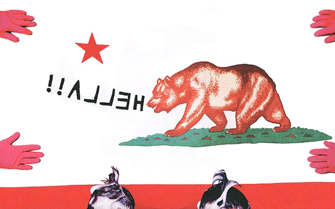
California's flag is the best by far.
posted by 2bucksplus at 2:21 PM on July 13, 2011
posted by 2bucksplus at 2:21 PM on July 13, 2011
(also this article uses a weird version of the California "Bear Flag." It looks more like this in practice.)
posted by 2bucksplus at 2:24 PM on July 13, 2011
posted by 2bucksplus at 2:24 PM on July 13, 2011
Flags that have seals and other literal depictions of state resources are eighth-grade-social-studies boring, and the ones that are some combination of red, white, & blue + stars always seem so forgettable. I feel like Alaska and New Mexico have the right ideas.
posted by missix at 2:27 PM on July 13, 2011 [1 favorite]
posted by missix at 2:27 PM on July 13, 2011 [1 favorite]
The state plates? Um, Puerto Rico (not a state) has corn and Iowa doesn't? Oregon is represented by a serving of spaghetti? Alternate views I guess.
posted by Cranberry at 2:27 PM on July 13, 2011
posted by Cranberry at 2:27 PM on July 13, 2011
I kinda dig how California's flag depicts a formerly plentiful animal that was killed off by the white settlers of the state. The next revision of the flag shows a balanced budget instead.
posted by GuyZero at 2:33 PM on July 13, 2011 [15 favorites]
posted by GuyZero at 2:33 PM on July 13, 2011 [15 favorites]
When I was in 5th grade, we had to do massive, year-long "state scrapbook" projects detailing every bit of history and info on our chosen state. I chose Indiana. (When my brother was in 5th grade, he chose Arizona.) I got SO good at making stars. I was the star-drawing, star-cutting master. SO many stars.
(Also, you reeeeally don't want to tell a South Carolinian that his flag has an Islamic crescent on it. Trust me, that does not go over well.)
posted by phunniemee at 2:33 PM on July 13, 2011 [2 favorites]
(Also, you reeeeally don't want to tell a South Carolinian that his flag has an Islamic crescent on it. Trust me, that does not go over well.)
posted by phunniemee at 2:33 PM on July 13, 2011 [2 favorites]
The North American Vexillogical Association did a survey back in 2001 about the best/worst state/provincial flags.
New Mexico, Texas, Quebec, Maryland, and Alaska were the top five. Crappy state flags with blue fields and tiny coat of arms were at the end.
posted by SNWidget at 2:37 PM on July 13, 2011
New Mexico, Texas, Quebec, Maryland, and Alaska were the top five. Crappy state flags with blue fields and tiny coat of arms were at the end.
posted by SNWidget at 2:37 PM on July 13, 2011
Oh, and to make up for the butt-ugly lameness that is the Illinois state flag, I'd like to give a shout out to the totally awesome Chicago municipal flag.
posted by phunniemee at 2:40 PM on July 13, 2011 [7 favorites]
posted by phunniemee at 2:40 PM on July 13, 2011 [7 favorites]
Minnesota had a small push for a state flag change during the 90's:
http://mnflag.tripod.com/endorse.html
I really liked it over the 'seal on a bedsheet' that we have now. Alas, the issue is currently dead in the water but I keep bringing it up, just in case...
posted by unixrat at 2:42 PM on July 13, 2011 [1 favorite]
http://mnflag.tripod.com/endorse.html
I really liked it over the 'seal on a bedsheet' that we have now. Alas, the issue is currently dead in the water but I keep bringing it up, just in case...
posted by unixrat at 2:42 PM on July 13, 2011 [1 favorite]
And here it is in link form, because I messed up:
http://mnflag.tripod.com/endorse.html
posted by unixrat at 2:42 PM on July 13, 2011
http://mnflag.tripod.com/endorse.html
posted by unixrat at 2:42 PM on July 13, 2011
The North American Vexillological Association (yes that's a thing) conducted a poll of NAVA members and the general public on their opinions of state and municipal flags. There results can be found here:
NEW MEXICO TOPS STATE/PROVINCIAL FLAGS SURVEY, GEORGIA LOSES BY WIDE MARGIN (heh)
> Amazing how the 10 worst flags look identical.
AMERICAN CITY FLAGS SURVEY 1ST PLACE WINNER: WASHINGTON, D.C
> Poor Pocatello, ID, all they had was MS Paint
posted by 2bucksplus at 2:48 PM on July 13, 2011 [6 favorites]
Oh, and to make up for the butt-ugly lameness that is the Illinois state flag, I'd like to give a shout out to the totally awesome Chicago municipal flag.
The best thing about the Chicago flag is that that particular weird skinny-armed six-pointed star isn't used anywhere else, as far as I know, so even by itself and stripped of color it still stands for "Chicago."
posted by theodolite at 2:50 PM on July 13, 2011 [1 favorite]
The best thing about the Chicago flag is that that particular weird skinny-armed six-pointed star isn't used anywhere else, as far as I know, so even by itself and stripped of color it still stands for "Chicago."
posted by theodolite at 2:50 PM on July 13, 2011 [1 favorite]
I think the California flag beats the pants off every other state, but I am biased. Plus when the nuclear apocalypse comes, we can start over with just a few additions.
Also, get ready for a TRUE FACT: the bear flag was a mistake; it was supposed to be a pear flag, but the flag maker misread the request.
posted by danny the boy at 2:51 PM on July 13, 2011 [7 favorites]
Also, get ready for a TRUE FACT: the bear flag was a mistake; it was supposed to be a pear flag, but the flag maker misread the request.
posted by danny the boy at 2:51 PM on July 13, 2011 [7 favorites]
The California flag was already the cover of Rooney's debut album.
posted by aaronetc at 2:55 PM on July 13, 2011
posted by aaronetc at 2:55 PM on July 13, 2011
I never realized how much I lucked out in elementary school- the hardest part of drawing the Texas flag is remembering which color goes on top (cream rises to the top, fyi).
posted by MadamM at 3:00 PM on July 13, 2011
posted by MadamM at 3:00 PM on July 13, 2011
NEW MEXICO TOPS STATE/PROVINCIAL FLAGS SURVEY, GEORGIA LOSES BY WIDE MARGIN (heh)
Nope, can't take that seriously after they put Maryland 4th, because Maryland's flag is an eyesore. I've had to look away from it because its horrible colors and design were making my eyes hurt.
posted by Copronymus at 3:04 PM on July 13, 2011
Nope, can't take that seriously after they put Maryland 4th, because Maryland's flag is an eyesore. I've had to look away from it because its horrible colors and design were making my eyes hurt.
posted by Copronymus at 3:04 PM on July 13, 2011
As a general rule I can't dig flags that have drawings on them. California is a big exception there, but for the rest of these, nah. Save it for the state seal, and keep your state seal off your flag. They have two different purposes. Anyway, the NAVA survey has it right, or pretty damn close anyway.
Texas: simplicity, an homage to Old Glory while making the unmistakable point of standing alone as well. Perfect for Texas.
New Mexico: Again, nice simplicity, with colors that feel appropriate and a symbol found nowhere else which still evokes the Native atmosphere of the state. (actually, I'm wrong. It also shows up on the Madison, WI city flag for some reason even though it is clearly far away from home and lost and confused. Please let that poor little symbol go home, Madison, it has no place up there.)
Maryland: Maddening to look at initially, sure, but it's Baron Baltimore's coat of arms and as such it was derived from a strict set of rules, which adds to it's charm. Unlike any other flag in the new world. It really does become very charming after not too long.
Washington, DC.: George Washington had a much simpler coat of arms, and this flag is lovely.
As for the bad ones: New Jersey's at least allows me to make sense of the Jersey license plates, which for so long just made me wonder who designed the plate to remind people of smog. Now I realize that questionable decision goes back way further.
Oklahoma's is NOT badass. It is as piss-poor as every other flag just shoving a detailed image onto an ugly blue field. But in this case unless you're RIGHT up next to it the image just resembles a coughed-up hairball. Thankfully you've got "OKLAHOMA" wirtten right underneath said hairball in case anyone is mistaken. No, this flag tell you, this is NOT New Hampshire's hairball.
Mississippi: Jesus Christ let it go already and then hire a graphic designer if anyone will have you.
posted by Navelgazer at 3:07 PM on July 13, 2011 [1 favorite]
I've always liked Alaska's flag. Simple but reminiscent of the state in a subtle way.
posted by Gymnopedist at 3:18 PM on July 13, 2011
posted by Gymnopedist at 3:18 PM on July 13, 2011
Colorados looks like an 80s company logo, probably something in the tech field.
posted by GenjiandProust at 3:19 PM on July 13, 2011 [3 favorites]
posted by GenjiandProust at 3:19 PM on July 13, 2011 [3 favorites]
GenjilandProust: I completely agree. It may be just me, but something about Colorado will always and forever be stuck in 1983 or thereabouts. In a good way.
posted by Navelgazer at 3:20 PM on July 13, 2011 [1 favorite]
posted by Navelgazer at 3:20 PM on July 13, 2011 [1 favorite]
Also, get ready for a TRUE FACT: the bear flag was a mistake; it was supposed to be a pear flag, but the flag maker misread the request.
TRUE FACT: Snopes has several pages of false information intended to teach people that no one source is impeachably accurate, presumably through subsequent humiliation. (This is the "More information about this page" link at the bottom of the pear flag page, amongst others.)
In general the NAVA survey is pretty good; the 35 or so State Crest On Blue Background flags should be failed, and made to repeat the grade. Maryland is ugly, but at least it's distinctively ugly. I don't think that secessionist insignia are good for state flags (the Confederate Stars and Bars, or the more obscure the red/white part of MD), but I suppose it's not my country.
posted by Homeboy Trouble at 3:21 PM on July 13, 2011 [7 favorites]
Homeboy Trouble, the problem is that the secessionists used part of an existing Maryland herald for their unofficial banner there. I think the Baltimore family (and Maryland) should be permitted to take it back.
posted by Navelgazer at 3:24 PM on July 13, 2011
posted by Navelgazer at 3:24 PM on July 13, 2011
California's flag is the best by far.
I think so too, mainly because I love that "Saint Louise Is Listening" song.
posted by mintcake! at 3:24 PM on July 13, 2011
I think so too, mainly because I love that "Saint Louise Is Listening" song.
posted by mintcake! at 3:24 PM on July 13, 2011
(I mean Calvert family, of course.)
posted by Navelgazer at 3:25 PM on July 13, 2011
posted by Navelgazer at 3:25 PM on July 13, 2011
I think Arkansas was robbed (it should have been higher, although not at the top, thanks), and Albuquerque's flag is better than the New Mexico state flag, so they also got robbed.
posted by wierdo at 3:28 PM on July 13, 2011
posted by wierdo at 3:28 PM on July 13, 2011
Oh, and Tulsa probably has the most awful flag of all. Why not just make it all white?
posted by wierdo at 3:28 PM on July 13, 2011
posted by wierdo at 3:28 PM on July 13, 2011
Nice of you to use it as a post title, but I hoped for a better joke for Vermont.
The comments gave me "DON'T MESS WITH VERMONT" but neglected to point out that we were a republic for longer than Texas.
posted by Earthtopus at 3:29 PM on July 13, 2011
The comments gave me "DON'T MESS WITH VERMONT" but neglected to point out that we were a republic for longer than Texas.
posted by Earthtopus at 3:29 PM on July 13, 2011
My state's flag, Virginia, has an honest to god TIT on it and that's the best the dude could come up with?
posted by TheTingTangTong at 3:29 PM on July 13, 2011
posted by TheTingTangTong at 3:29 PM on July 13, 2011
I should be clear that even thought I hate Maryland's flag, I'd still put it above all the seal flags and the ones that mimic the Stars and Bars, so it's probably in the upper half of US state flags.
Think about that, state flag designers. Ponder it in your quiet moments and study it during your long days. Maryland's flag is probably objectively better than yours despite being uglier than most optical illusions.
posted by Copronymus at 3:31 PM on July 13, 2011 [1 favorite]
Think about that, state flag designers. Ponder it in your quiet moments and study it during your long days. Maryland's flag is probably objectively better than yours despite being uglier than most optical illusions.
posted by Copronymus at 3:31 PM on July 13, 2011 [1 favorite]
More than half of them have the state's name right on there. That's a burnin'.
posted by Sys Rq at 3:35 PM on July 13, 2011 [1 favorite]
posted by Sys Rq at 3:35 PM on July 13, 2011 [1 favorite]
Nope, can't take that seriously after they put Maryland 4th, because Maryland's flag is an eyesore. I've had to look away from it because its horrible colors and design were making my eyes hurt.
Maryland's flag is the only one based on real-ass English heraldry. The rest don't have any excuse for their hideousness.
posted by Sys Rq at 3:39 PM on July 13, 2011 [1 favorite]
Maryland's flag is the only one based on real-ass English heraldry. The rest don't have any excuse for their hideousness.
posted by Sys Rq at 3:39 PM on July 13, 2011 [1 favorite]
Nope, can't take that seriously after they put Maryland 4th, because Maryland's flag is an eyesore. I've had to look away from it because its horrible colors and design were making my eyes hurt.
This is literally the best flag they could come up with that could double as a jester's costume; it's a real feat of flag making.
I'm going to stick up for my home state of North Carolina's flag. It's simple, but it works, and it's more interesting than the seal on a field. Plus, you get some historically important dates for the state. I would also stick up for our state motto, state dog, and state historic boat; I will not stick up for the "state blue berry" being the blueberry, that's dumb.
Also, we have to all agree that every single American state flag is better than The flag of British Columbia which looks like it was designed by a committee. of the blind. and insane.
posted by Bulgaroktonos at 3:40 PM on July 13, 2011 [7 favorites]
I can't believe Provo, Utah has a RAINBOW flag.
posted by get off of my cloud at 3:41 PM on July 13, 2011 [2 favorites]
posted by get off of my cloud at 3:41 PM on July 13, 2011 [2 favorites]
Also, we have to all agree that every single American state flag is better than The flag of British Columbia which looks like it was designed by a committee. of the blind. and insane.
Well this should be interes- GAH! MAKE IT STOP MAKE IT STOP!
posted by Navelgazer at 3:42 PM on July 13, 2011
Well this should be interes- GAH! MAKE IT STOP MAKE IT STOP!
posted by Navelgazer at 3:42 PM on July 13, 2011
2bucksplus: AMERICAN CITY FLAGS SURVEY 1ST PLACE WINNER: WASHINGTON, D.C
It always seems appropriate that my city's flag has the same colors as all three local sports teams.
posted by octothorpe at 3:42 PM on July 13, 2011 [1 favorite]
It always seems appropriate that my city's flag has the same colors as all three local sports teams.
posted by octothorpe at 3:42 PM on July 13, 2011 [1 favorite]
I have always thought Maryland has the 'best overall' flag: it wins for style and character together.
posted by milestogo at 3:43 PM on July 13, 2011
posted by milestogo at 3:43 PM on July 13, 2011
I can't believe Provo, Utah has a RAINBOW flag.
It's not the rainbow that bothers me the most -- it's the DROP SHADOW.
Seriously Provo, was it the Mayor's nephew who designed that flag right after he discovered the gradient, perspective, and drop shadow tools? Up your game, Provo. All the other cities are laughing at you.
posted by chimaera at 3:43 PM on July 13, 2011 [4 favorites]
Provo definitely wins for "Flag most likely to make me think of Braniff Airlines."
posted by Navelgazer at 3:45 PM on July 13, 2011 [3 favorites]
posted by Navelgazer at 3:45 PM on July 13, 2011 [3 favorites]
The Haipin captions draw on the style of this lovely Danish blog (Some NSFW pix)
posted by growabrain at 3:45 PM on July 13, 2011
posted by growabrain at 3:45 PM on July 13, 2011
It should be borne in mind that state flags, like license plate designs, state birds, and so on, are designed at the bequest of and approved by state legislatures. That explains a lot of this.
posted by localroger at 3:46 PM on July 13, 2011 [1 favorite]
posted by localroger at 3:46 PM on July 13, 2011 [1 favorite]
I can't believe Provo, Utah has a RAINBOW flag.
Ha! It's like they just tore the label off a thing of multivitamins.
posted by Sys Rq at 3:48 PM on July 13, 2011 [7 favorites]
Ha! It's like they just tore the label off a thing of multivitamins.
posted by Sys Rq at 3:48 PM on July 13, 2011 [7 favorites]
I think Provo's flag is a rip off of a logo that one of the software companies based there used in the late 80s or early 90s.
posted by wierdo at 3:50 PM on July 13, 2011
posted by wierdo at 3:50 PM on July 13, 2011
Also, we have to all agree that every single American state flag is better than The flag of British Columbia which looks like it was designed by a committee.
Oh, come on! That flag says "We have a crown! On the sun! Beat that, loser provinces!"
posted by GenjiandProust at 3:57 PM on July 13, 2011 [2 favorites]
Oh, come on! That flag says "We have a crown! On the sun! Beat that, loser provinces!"
posted by GenjiandProust at 3:57 PM on July 13, 2011 [2 favorites]
(I've been thinking for weeks now to compose a Vexillological post. So I'll just throw the starter yeast here, and you can bake rest of the bread:
100 Examples of Japanese Municipal Flags
Typographic town logos in hiragana/katakana
Japanese municipal flags
wikipedia's list of Japanese flags)
In conclusion: "Never put off until tomorrow what you can do the day after tomorrow."
posted by growabrain at 4:00 PM on July 13, 2011 [11 favorites]
100 Examples of Japanese Municipal Flags
Typographic town logos in hiragana/katakana
Japanese municipal flags
wikipedia's list of Japanese flags)
In conclusion: "Never put off until tomorrow what you can do the day after tomorrow."
posted by growabrain at 4:00 PM on July 13, 2011 [11 favorites]
I'm still wondering why (not to mention how) Newfoundland ditched its awesome tricolour for this ... thing. Labrador also has its own flag, and it too is heaps better than that POS.
posted by Sys Rq at 4:04 PM on July 13, 2011
posted by Sys Rq at 4:04 PM on July 13, 2011
The 'awesome' tricolour that looks like a faded Irish flag? No way. The new one is as fun to draw as the Union Jack.
posted by hydrobatidae at 4:10 PM on July 13, 2011 [1 favorite]
posted by hydrobatidae at 4:10 PM on July 13, 2011 [1 favorite]
Oh, man, growabrain. I think it's clear that, whatever else is going on, American cities should outsource their flag designs to Japanese city flag designers.
(Yes I'm aware that a lot of the flags are based on highly stylized Japanese characters, but still, so aesthetically superior to.... say.... Provo, Utah.)
posted by chimaera at 4:12 PM on July 13, 2011
(Yes I'm aware that a lot of the flags are based on highly stylized Japanese characters, but still, so aesthetically superior to.... say.... Provo, Utah.)
posted by chimaera at 4:12 PM on July 13, 2011
WTF does this mean? Is Vermont's flag so good you can't make fun of it? So bad? VALIDATE ME.
posted by maryr at 4:27 PM on July 13, 2011
posted by maryr at 4:27 PM on July 13, 2011
Provo, Utah: The More You Know. *chimes*
posted by maryr at 4:30 PM on July 13, 2011 [3 favorites]
posted by maryr at 4:30 PM on July 13, 2011 [3 favorites]
Homeboy Trouble: " Snopes has several pages of false information intended to teach people that no one source is impeachably accurate, presumably through subsequent humiliation."
DON'T CARE; PEAR REPUBLIC 4LIFE
posted by danny the boy at 4:43 PM on July 13, 2011 [4 favorites]
DON'T CARE; PEAR REPUBLIC 4LIFE
posted by danny the boy at 4:43 PM on July 13, 2011 [4 favorites]
The seal on the Louisiana flag is of a mother pelican who has self-wounded its chest in order to feed its starving children with three drops of its blood.
For a long time they left the blood out, so it just looked like a mother bird and her brood or even just some birds hanging out. But then in 2006 some middle schooler from a little town near the coast noticed the ubiquitous edit-job, so he wrote his state legislator. Now the blood is back on all official seals. It's a little gruesome but I think it's nice and makes for a great flag.
This may not be entirely made clear by the crappy gif and cute vampire joke on this website.
posted by gordie at 4:51 PM on July 13, 2011 [2 favorites]
No, the Louisiana flag is definitely better than most aside from the almost capital offense of having a state named after Louis and not using the Fleur-de-Lis.
posted by Navelgazer at 4:55 PM on July 13, 2011
posted by Navelgazer at 4:55 PM on July 13, 2011
Washington was founded in 6881??
posted by Pruitt-Igoe at 4:58 PM on July 13, 2011
posted by Pruitt-Igoe at 4:58 PM on July 13, 2011
New Mexico's state flag is awesome. Never knew that.
Indeed. The bit about it in the linked website from the FPP is ignorant and annoying.
The Zia sun symbol is old school Native American (oh, great, now Mitheral is going to lecture me on how it isn't universally First Nations or something like that). It's a great symbol, and I've always loved the simplicity and basic straightforward design of the NM state flag.
posted by hippybear at 5:07 PM on July 13, 2011 [1 favorite]
Flag Design Fail and How to Avoid It. From the excellent podcast on design, 99% Invisible.
posted by BrashTech at 5:09 PM on July 13, 2011 [3 favorites]
posted by BrashTech at 5:09 PM on July 13, 2011 [3 favorites]
Colorado looks very designed, and for obvious reasons reminds me of the Criterion Collection.
posted by jsturgill at 2:18 PM on July 13 [1 favorite +] [!]
The Colarado Flag always reminds me of the Leather Pride Flag Whether this is unintentional irony, or wishful thinking on my part is not clear.
posted by helmutdog at 5:21 PM on July 13, 2011 [1 favorite]
posted by jsturgill at 2:18 PM on July 13 [1 favorite +] [!]
The Colarado Flag always reminds me of the Leather Pride Flag Whether this is unintentional irony, or wishful thinking on my part is not clear.
posted by helmutdog at 5:21 PM on July 13, 2011 [1 favorite]
I still say that the flag of Yaroslavl Oblast is the best flag in the world. That bear would take the California flag's bear in two seconds.
posted by Omon Ra at 5:30 PM on July 13, 2011 [2 favorites]
posted by Omon Ra at 5:30 PM on July 13, 2011 [2 favorites]
As for the bad ones: New Jersey's at least allows me to make sense of the Jersey license plates, which for so long just made me wonder who designed the plate to remind people of smog. Now I realize that questionable decision goes back way further.
No idea why the flag has a gradient in this article. In real life, the background is a bright and solid yellow. It's not a great flag, but it is a lot better in person than depicted in that article.
Oh, and the DC flag is indeed pretty sweet, especially since it's very easy to shrink down into symbol format. It's one of the damn few things that are uniquely our own that we can celebrate as a symbol of our city (we tried putting a half smoke on the flag, but just couldn't make it work). Quite a few longtime residents have it as a tattoo.
posted by schmod at 5:31 PM on July 13, 2011
Homeboy Trouble.
Actually the TRoLL page from SNOPES indicates that the CA p/bear flag mistake is a true story. Like all sections it has the story titles listed with green - true, red- false, yellow - undertermined, red/green -- mufti faceted.
I hadn't come across this section before you pointed to it, so thanks! Snopes has long been one of my faborite time sucks.
Back on topic, MD's flag rocked for doing Elementary school arts and crafts.
I lived in VA for a while and never could make sense of how such a conservative state has a bare breasted warrior woman. I lived in worked in Richmond. I noticed the city flag then and still think it is a good design that does a good job of reflecting the ethos of the city. Previously, I lived in MD and PA. Richmond lives in history even more than Philly. .
posted by Librarygeek at 5:36 PM on July 13, 2011 [1 favorite]
Librarygeek: check the names in the article - they're all Pear varieties. Snopes is indeed awesome, and part of their awesomeness is the Lost Legends page, in which all of the stories are made up (presumably) by Barbara to prove the point of falacious appeal to authority.
posted by Navelgazer at 5:50 PM on July 13, 2011 [1 favorite]
posted by Navelgazer at 5:50 PM on July 13, 2011 [1 favorite]
wait for it ....
wait for it .....
Metafilter : Sometimes state flags just want to be gently caressed by a bear.
posted by Afroblanco at 6:01 PM on July 13, 2011 [2 favorites]
wait for it .....
Metafilter : Sometimes state flags just want to be gently caressed by a bear.
posted by Afroblanco at 6:01 PM on July 13, 2011 [2 favorites]
My state flag, Tennessee, features three white stars in a blue circle surrounded by a field of red. The three stars represent the three regions of Tennessee, East Tennessee (capitol: Knoxville, Great Smoky Mountains), Middle Tennessee (capitol: Nashville, country music and whiskey) and West Tennessee (capitol: Memphis, Elvis and the Mighty Mississippi).
To the best of my knowledge, ours is the only flag that officially recognizes the regional linguistic, cultural and economic differences present in one state.
posted by workerant at 6:19 PM on July 13, 2011
To the best of my knowledge, ours is the only flag that officially recognizes the regional linguistic, cultural and economic differences present in one state.
posted by workerant at 6:19 PM on July 13, 2011
New Mexico's state flag is awesome. Never knew that.
Indeed. The bit about it in the linked website from the FPP is ignorant and annoying.
The Zia sun symbol is old school Native American (oh, great, now Mitheral is going to lecture me on how it isn't universally First Nations or something like that). It's a great symbol, and I've always loved the simplicity and basic straightforward design of the NM state flag.
Flag of New Mexico
posted by ovvl at 6:22 PM on July 13, 2011
I'm told the design for the soon-to-be-unveiled Alabama flag features an Real American Citizen (accompanied by a squadron of police in mirrored shades) pointing a horde of illegal aliens* toward the Mexican border.
*Except for one or two, of course, who come once a week to do the lawn. They're very nice, and they're just marvelous with the edging.
posted by flapjax at midnite at 6:25 PM on July 13, 2011
*Except for one or two, of course, who come once a week to do the lawn. They're very nice, and they're just marvelous with the edging.
posted by flapjax at midnite at 6:25 PM on July 13, 2011
Maryland: Maddening to look at initially, sure, but it's Baron Baltimore's coat of arms and as such it was derived from a strict set of rules, which adds to it's charm.
It's Baltimore's quartered with Calvert's. And it's badass. Looks like something a knight would carry.
Connecticut has the best of the 'stick the seal on there' flags, but that's just due to having a decent seal.
posted by ChurchHatesTucker at 6:27 PM on July 13, 2011
It's Baltimore's quartered with Calvert's. And it's badass. Looks like something a knight would carry.
Connecticut has the best of the 'stick the seal on there' flags, but that's just due to having a decent seal.
posted by ChurchHatesTucker at 6:27 PM on July 13, 2011
Librarygeek: I lived in VA for a while and never could make sense of how such a conservative state has a bare breasted warrior woman.
It was designed in 1776 or 1777 by a committee of 4 landed semi-famous Virginia planters and deliberately looks to Roman mythology (the woman is Virtus, a deity of sort representing all sort of manly, warrior virtue ... and the righteous peace that comes from defeating the enemy) as yet another rejection of the English. So the nudity isn't that surprising because it's classical, and classical is good. What is surprising that it's taken to the present day and our current Attorney General, The Cooch, to get prudish and hand out buttons to his staff with the breast on the seal covered by an added armored breastplate.
I mean it's 2011 - couldn't he have covered up his embarassment by decking her out in something more modern, like a hoodie? or mardi gras beads?
posted by julen at 6:28 PM on July 13, 2011 [1 favorite]
Somewhat related: Coats of arms of Scandinavia.
posted by Joakim Ziegler at 7:07 PM on July 13, 2011 [5 favorites]
posted by Joakim Ziegler at 7:07 PM on July 13, 2011 [5 favorites]
- Nope, can't take that seriously after they put Maryland 4th, because Maryland's flag is an eyesore. I've had to look away from it because its horrible colors and design were making my eyes hurt.
- This is literally the best flag they could come up with that could double as a jester's costume; it's a real feat of flag making.
- It's Baltimore's quartered with Calvert's. And it's badass. Looks like something a knight would carry.
I really love Maryland's flag, and not just because I'm a native, or because of the heraldry (to Catholics, no less), part of which is to Maryland's first governor, who looks like a guy we used to get to buy us beer when we were in high school, but because my mother thought it sort of looks like the retired Tastycake flag. I can sort of see the resemblance.
But yes, Maryland's flag is great, although I also really like New Mexico's. This flag is like the Libya of US state flags. Well, it's not a solid color, but there's still that minimalist impact. I think if any state could pull off a solid color flag, it'd be Idaho. Or maybe one of the Dakotas, for entirely different reasons.
posted by Marisa Stole the Precious Thing at 7:25 PM on July 13, 2011
but neglected to point out that we were a republic for longer than Texas.
I know, right???
14 years!
Freedom
+
Unity
Rah!
posted by jessamyn at 7:47 PM on July 13, 2011 [1 favorite]
I know, right???
14 years!
Freedom
+
Unity
Rah!
posted by jessamyn at 7:47 PM on July 13, 2011 [1 favorite]
Metafilter : Sometimes state flags just want to be gently caressed by a bear.
Sorry, no, not going there. This was just lame. Watch me write fifty one-liners about state flags! Whee! Not clever or funny, imo.
posted by wallabear at 7:48 PM on July 13, 2011
Sorry, no, not going there. This was just lame. Watch me write fifty one-liners about state flags! Whee! Not clever or funny, imo.
posted by wallabear at 7:48 PM on July 13, 2011
Not clever or funny, imo.
Maybe it shoulda been "gently caressed by a wallabear".
posted by flapjax at midnite at 7:55 PM on July 13, 2011
Maybe it shoulda been "gently caressed by a wallabear".
posted by flapjax at midnite at 7:55 PM on July 13, 2011
Metafilter: Not clever or funny, imo.
posted by solarion at 8:11 PM on July 13, 2011 [2 favorites]
posted by solarion at 8:11 PM on July 13, 2011 [2 favorites]
Yeah, Rhode Island's flag is sweet. :)
posted by lunit at 8:23 PM on July 13, 2011 [1 favorite]
posted by lunit at 8:23 PM on July 13, 2011 [1 favorite]
Snopes is indeed awesome, and part of their awesomeness is the Lost Legends page, in which all of the stories are made up (presumably) by Barbara to prove the point of falacious appeal to authority.
Actually David (a.k.a. snopes) writes most of the Lost Legends, and they're pretty much just what they say: trolling. I used to be pretty chummy with David and Barbara back in the day, and one thing that was a constant headache for Barbara (and an endless source of amusement for David) was the TRoLL page. They finally compromised when Barbara suggested a way to make it easier for people to discover the truth about that section of the site. (there didn't use to be any sort of warning, other than the suggestive name of "TRoLL."
posted by ShutterBun at 8:29 PM on July 13, 2011
Arizona's flag looks like it could double for some Asian tinpot communist dictatorship.
Well, the first time I drove to visit family in California with an Arizona flag plate on the front of my car (Arizona requiring only rear number tags), my brother glanced at the car in his driveway and asked, "What, Free Tibet?"
The Arizona flag comes into its own when viewed from a distance on a flagpole, as flags are meant to be seen.
posted by Creosote at 8:34 PM on July 13, 2011 [1 favorite]
These were slightly amusing until 17 (Rhode Island), when the snark all of a sudden seemed to disappear and, from thence onward, the "jokes" started discussing things far too literally.
posted by Conrad Cornelius o'Donald o'Dell at 8:34 PM on July 13, 2011 [1 favorite]
posted by Conrad Cornelius o'Donald o'Dell at 8:34 PM on July 13, 2011 [1 favorite]
For those who are confused about the Maryland Heraldry stuff, Calvert refers to the family, and Baltimore to the Barony, which was held exclusively by the family. Both sections are coats of George Calvert, first Baron of Baltimore, though originally only the yellow and black was used. The red and white cross was added after the civil war, but was also one of George Calvert's coats.
posted by Navelgazer at 8:40 PM on July 13, 2011
posted by Navelgazer at 8:40 PM on July 13, 2011
Lacks ambition?? Is that sarcasm? An eagle, with a shield, carrying some symbolic berry-bearing evergreen and ... a flashlight? a free weight? ... flying a banner and an awning of stars? North Dakota's flag is setting up for a Boy Scout camping jamboree or something. It is making everything happen. If I could only take one state flag with me to a desert island, it would be North Dakota.
posted by salvia at 8:42 PM on July 13, 2011
posted by salvia at 8:42 PM on July 13, 2011
I've always been a little ashamed that the best state (Washington) has the saddest, boringest flag.
posted by Neofelis at 8:51 PM on July 13, 2011
posted by Neofelis at 8:51 PM on July 13, 2011
Lacks ambition?? Is that sarcasm?
I read it as such, yeah.
posted by ShutterBun at 9:28 PM on July 13, 2011
I read it as such, yeah.
posted by ShutterBun at 9:28 PM on July 13, 2011
South Dakota's flag is just sad. It's like South Dakota is a guy you met at a party that one time who learned if you repeated your name three times people will remember it better. It's all, "Hi, I'm the flag from South Dakota. You known, South Dakota, the Mount Rushmore state? Have you seen my seal? Yeah, this is the seal of the state of South Dakota." And you're all "Yeah, um, that's a great seal. Sure. Yeah, Dakota, I get it. Have you seen Ohio? It's had a lot to drink and I'm not sure where it was going with those scissors..."
posted by maryr at 9:42 PM on July 13, 2011 [3 favorites]
posted by maryr at 9:42 PM on July 13, 2011 [3 favorites]
Maybe some of you Vermontfolk or perhaps one of you flag scholars can tell me - what the heck is that neon red cow on the flag doing there? I mean, what does it symbolize or is it just glowing from some odd form of radiation? Or is it just the Wikipedia image that's so vibrantly red? For some reason it really catches the eye.
Meanwhile I grew up in Kansas and I can not for the life of me remember that sunflower stuck up there above the state seal. No idea how I managed to ignore that - it's sort of floating loose in space...
posted by batgrlHG at 10:40 PM on July 13, 2011
Meanwhile I grew up in Kansas and I can not for the life of me remember that sunflower stuck up there above the state seal. No idea how I managed to ignore that - it's sort of floating loose in space...
posted by batgrlHG at 10:40 PM on July 13, 2011
Kansas REALLY wants you to know about every little thing on its state seal. So I still can't find anything out about why the heck Vermont has dayglow red cows wandering around, but I know why there's a steamboat on the Kansas seal and who owns the cabin. (Spoiler: plowing farmer is the homeowner. I wonder if that's actually documented somewhere?)
posted by batgrlHG at 10:50 PM on July 13, 2011
posted by batgrlHG at 10:50 PM on July 13, 2011
It looks like some designers confused state flag (a broad-stroked design that is recognizable from far away, like a flexible street sign waving around on top of a big ass pole) and state seal (an intricate design that is stamped on a piece of paper you can hold in your hand and closely examine and that may even purposely be intricate to discourage counterfeiting).
That, or a committee of politicians designed a lot of them. "Well, gentlemen, let us tally up the requirements of our state flag. It must have oil and corn and cotton. Also, cattle and grapes and wheat. And potatoes. It must show urban constituents getting along with rural constituents. It must have beavers and Indians and the sun and a river. It must show the stars and the moon. Ships and trains. The sea. And at least one shapely woman. And it must express the sentiments that we are free and fair men who are wise and peaceful but who will not be fucked with. Did I get everything?"
posted by pracowity at 11:56 PM on July 13, 2011 [4 favorites]
As a lifelong Marylander, but a general flag-hater, our state flag is the only one I'll fly, because it's so completely representative of our cultural weirdness. You've got Calvert and Crossland heraldry fighting it out in a psychedelic clash, which looks great as a tattoo, and it's free of lousy typography or fussy, complicated imagery that looks like they held a contest for the final flag design in an elementary school class during a Ritalin shortage. Like many of Maryland's attributes and dilemmas, it sums up the collision of crazy one can find in a tiny, haphazard state that looks like it was mapped out by Jackson Pollack, where our anthem rambles on about Lincoln's despotic shoes and streets flecked with "patriotic gore" to the tune of the most boring Christmas carol ever.
Plus, if you stare at our flag for one minute and then look at a blank white wall, an interdimensional portal will appear.
posted by sonascope at 3:50 AM on July 14, 2011 [3 favorites]
Plus, if you stare at our flag for one minute and then look at a blank white wall, an interdimensional portal will appear.
posted by sonascope at 3:50 AM on July 14, 2011 [3 favorites]
Maryland's flag is the only one you could carry into battle whilst playing Dungeons and Dragons, so it wins.
/native Marylander
posted by bardic at 3:54 AM on July 14, 2011 [1 favorite]
/native Marylander
posted by bardic at 3:54 AM on July 14, 2011 [1 favorite]
No, the Louisiana flag is definitely better than most aside from the almost capital offense of having a state named after Louis and not using the Fleur-de-Lis.
No, that was very forward-looking. If we had used the fleur de lis for the state flag, what the hell would we use as the logo for our football team?
posted by localroger at 5:35 AM on July 14, 2011
No, that was very forward-looking. If we had used the fleur de lis for the state flag, what the hell would we use as the logo for our football team?
posted by localroger at 5:35 AM on July 14, 2011
I reallllly don't get why Hawaii has a union jack on it.
posted by like_neon at 6:04 AM on July 14, 2011
posted by like_neon at 6:04 AM on July 14, 2011
I reallllly don't get why Hawaii has a union jack on it.
Captain Cook?
posted by MikeMc at 6:32 AM on July 14, 2011
Captain Cook?
posted by MikeMc at 6:32 AM on July 14, 2011
No, that was very forward-looking. If we had used the fleur de lis for the state flag, what the hell would we use as the logo for our football team?
Huh. I was about to make a snarky comment here but I went and double-checked it. Turns out the Pittsburgh Steelers logo does not appear on the city of Pittsburgh flag. Which means I managed to live there for six years without learning what the actual city flag looks like.
This says something about Pittsburgh and football, I think.
Luckily, the real actual official flag is goddamn awesome-looking too.
posted by nebulawindphone at 7:11 AM on July 14, 2011
Crappy state flags with blue fields and tiny coat of arms were at the end.
The story about state flags in general--which may or may not be true--that I've heard is that many of them, particularly the coat-of-arms-on-a-blue-field variety, started out as the state militia/regiment flags that were used by the Union during the Civil War. That obviously doesn't apply to the states of the former Confederacy (many of which have flags that are based, directly or indirectly, on one Confederate flag or another), states that used to be independent republics, states that didn't exist back then, etc.
posted by Halloween Jack at 7:24 AM on July 14, 2011
I reallllly don't get why Hawaii has a union jack on it.
Captain Cook?
George Paulet.
posted by Sys Rq at 10:10 AM on July 14, 2011
Captain Cook?
George Paulet.
posted by Sys Rq at 10:10 AM on July 14, 2011
california flag as a vinyl release by indie rock band!
posted by zachhouston at 10:36 AM on July 14, 2011
posted by zachhouston at 10:36 AM on July 14, 2011
Does anyone remember a screed on state flags from someone like PJ O'Rourke or Hunter S. Thompson that declared that all the state flags suck except MD and one other? I remember reading it on the web years ago, but haven't been able to find it in the past 5 years or so. I think it was 2004 or 2005 that I read it.
posted by frecklefaerie at 12:28 PM on July 14, 2011
posted by frecklefaerie at 12:28 PM on July 14, 2011
Surprisingly consistently funny and good. Thanks for sharing this!
posted by ericbop at 1:36 PM on July 14, 2011
posted by ericbop at 1:36 PM on July 14, 2011
Isn't the city of Pittsburgh flag the Terrible Towel?
posted by kirkaracha at 1:59 PM on July 14, 2011
posted by kirkaracha at 1:59 PM on July 14, 2011
From the first Japanese flag link: the flag for Fukuyama, Hiroshima, which is supposed to symbolize a bat. Is that for real?
The Batman homage aside, the rest of the Japanese flags are extremely beautiful. Well done, Japanese designers!
posted by tickingclock at 9:17 PM on July 14, 2011
The Batman homage aside, the rest of the Japanese flags are extremely beautiful. Well done, Japanese designers!
posted by tickingclock at 9:17 PM on July 14, 2011
perhaps one of you flag scholars can tell me - what the heck is that neon red cow on the flag doing there?
I asked the state reference librarian Gerrie Denison.
I asked the state reference librarian Gerrie Denison.
What a great question! I needed help with this one, so I emailed Tracy Martin, Assistant Curator at the Vermont Historical Society. Tracy responded:posted by jessamyn at 8:31 AM on July 15, 2011 [4 favorites]
I am sending along a link to a page on the Vermont Secretary of State’s website that gives the history of the State Coat of Arms. The statutory language associated with the Coat of Arms simply calls for a “red” cow without specifying any breed (the State Seal is rendered in black and white). It is my understanding that most of our familiar dairy breeds were not introduced to the state until the mid 19th century, but that many of the multi-purpose cattle found on 18th and early 19th century farms in Vermont were red. Unfortunately, recent renditions on nylon state flags often have a fire engine red cow. We know that “red” in the cow world translates “reddish-brown.”
http://www.sec.state.vt.us/kids/emblems.html
``````````````````````````````````````````````````````````````````
After a bit of searching online for information about Vermont cattle, cows, livestock, 18th century I found a Mother Earth News article that I think answers the breed of cow question.
The article states:
Long before the Quartly and Davy herds, the small triple-purpose Devon had made its way to the New World with the Pilgrims. This original Devon type is still represented in America by the Milking Devon breed, but it no longer exists in Britain. Devon cattle were certainly well known and common by the end of the eighteenth century. It is believed that George Washington, like many colonists, raised Devons for draft, beef, and milk. The first official seal of Vermont was designed in 1778 and prominently features a Red Devon cow. The state’s coat of arms also depicts the beloved “old red cow.” Milking Devon were brought into Canada in the early 1800s and were reimported in the1960s.
Read more: http://www.motherearthnews.com/Sustainable-Farming/Devon-cattle-heritage-livestock-zeylaf.aspx
So, I would venture to say the breed of cow on the Vermont Coat of Arms (also on the flag) is a Red Devon from Devonshire, England. The Red Devon may have been selected to be on the Coat of Arms because it the most common cow found on Vermont farms during the 18th and early 19th century. I wonder why they included a cow rather than a sheep? Sheep were very important to Vermont during this period. Hmm…another question to ponder.
And the power of the librarian network again rules the day! Seriously, I was going to work on this with google again today because the question was pestering me. I was guessing it might have been something in the herford line so this has saved me some long googling of cattle history.
I am totally giddy that the state reference librarian got involved! And the historical society! History team power, gooooo!
posted by batgrlHG at 2:27 PM on July 15, 2011
I am totally giddy that the state reference librarian got involved! And the historical society! History team power, gooooo!
posted by batgrlHG at 2:27 PM on July 15, 2011
« Older Short and Sweet | Manning Chat Logs Newer »
This thread has been archived and is closed to new comments
posted by netbros at 2:10 PM on July 13, 2011 [2 favorites]