Once and future logos
September 21, 2011 10:55 AM Subscribe
Pretty much all of these (even, visually, VW) were best on the first try.
posted by cmoj at 11:08 AM on September 21, 2011 [1 favorite]
posted by cmoj at 11:08 AM on September 21, 2011 [1 favorite]
I remember when Gap announced its new logo (probably because it was posted on MetaFilter) but I never heard that they tucked tail between legs and switched back the same year. If anybody deserves a logo parody it's them.
Some of these punchlines I just didn't get though. The Apple evolution makes a certain sort of design sense, but the Google one for example just kinda jumps out from left field. All of their progressions have been revisions of a theme that Stocklogos seems to have overlooked. If anything, their next logo would be the same colors and typeface, only with the sheen removed. It would make the most sense following the Chrome logo's conversion to flat matte.
posted by The Winsome Parker Lewis at 11:32 AM on September 21, 2011
Yeah, I don't get some of them either. Does the IBM one just mean that it's going to be more boring, or what?
posted by Melismata at 11:37 AM on September 21, 2011
posted by Melismata at 11:37 AM on September 21, 2011
The VW logo could also morph very naturally into this.
posted by Cironian at 11:44 AM on September 21, 2011 [7 favorites]
posted by Cironian at 11:44 AM on September 21, 2011 [7 favorites]
The Nokia is both funny and sad at the same time.
posted by Old'n'Busted at 11:48 AM on September 21, 2011 [1 favorite]
posted by Old'n'Busted at 11:48 AM on September 21, 2011 [1 favorite]
Firefox = brilliant.
Nokia = v. witty.
Starbucks = huh? (if the site is suggesting they're going for the green, those glory days are past. We hit peak Starbucks.)
posted by IAmBroom at 11:50 AM on September 21, 2011
Nokia = v. witty.
Starbucks = huh? (if the site is suggesting they're going for the green, those glory days are past. We hit peak Starbucks.)
posted by IAmBroom at 11:50 AM on September 21, 2011
Wow, Volkswagen's first logo was fairly Nazi-infused
posted by delmoi at 11:57 AM on September 21, 2011 [1 favorite]
posted by delmoi at 11:57 AM on September 21, 2011 [1 favorite]
Pretty much all of these (even, visually, VW) were best on the first try.
Would you buy a phone with a not-at-all cute picture of a fish for a logo?
posted by delmoi at 12:00 PM on September 21, 2011
Would you buy a phone with a not-at-all cute picture of a fish for a logo?
posted by delmoi at 12:00 PM on September 21, 2011
Would you buy a phone with a not-at-all cute picture of a fish for a logo?
I'm actually surprised no one has picked up on these, with how much people love retro things. I think a phone with that logo - or an iPhone or iBook with the original Apple logo - would be awesome.
posted by roll truck roll at 12:05 PM on September 21, 2011 [2 favorites]
I'm actually surprised no one has picked up on these, with how much people love retro things. I think a phone with that logo - or an iPhone or iBook with the original Apple logo - would be awesome.
posted by roll truck roll at 12:05 PM on September 21, 2011 [2 favorites]
Wow, Volkswagen's first logo was fairly Nazi-infused
Given VW was started by the Nazi Deutsche Arbeitsfront, yeah. In fact the 1940 VW logo is just the Deutsche Arbeitsfront logo with a VW swapped in for the swastika. Hell, the '39 logo is the Deutsche Arbeitsfront logo with VW swapped in for the small swastika but extensioned to make the whole logo into a big stylized swastika.
The firefox one is funny. I'm not sure if it is a comet-impact or global warming or both causing the lack of land but either way, nice.
posted by Justinian at 12:16 PM on September 21, 2011
Well that one page puts me off the idea of using a site like Stock Logos more than I could even imagine. Lazy logos making lazy jokes.
The only exception is Starbucks (if you ignore the last one).
posted by sodium lights the horizon at 12:26 PM on September 21, 2011
The only exception is Starbucks (if you ignore the last one).
posted by sodium lights the horizon at 12:26 PM on September 21, 2011
Ah, I never made the connection about the all-blue earth. I thought it was just a continuation of the theme of everything getting simpler.
posted by roll truck roll at 12:35 PM on September 21, 2011
posted by roll truck roll at 12:35 PM on September 21, 2011
...Google, your mom made your logo. You were running late that day, and she drew it in the car on the way to the meeting.
posted by griphus at 12:37 PM on September 21, 2011 [3 favorites]
posted by griphus at 12:37 PM on September 21, 2011 [3 favorites]
I'm actually surprised no one has picked up on these, with how much people love retro things. I think a phone with that logo - or an iPhone or iBook with the original Apple logo - would be awesome.
roll truck roll
I think the best example of awesome retro logos is the Japanese camera giant Canon.
Current logo.
10,000x cooler original log.
posted by Sangermaine at 12:37 PM on September 21, 2011 [8 favorites]
roll truck roll
I think the best example of awesome retro logos is the Japanese camera giant Canon.
Current logo.
10,000x cooler original log.
posted by Sangermaine at 12:37 PM on September 21, 2011 [8 favorites]
The Firefox one is funny, but I take issue with their implied thesis that logos will become more simplified. Prudential Insurance is one example of a company pulling back from the brink of abstraction to a recognizable image.
Our means of reproduction are getting better and better, so designers will have more freedom to use photographic color and detail in logos.
posted by scose at 12:38 PM on September 21, 2011 [1 favorite]
Our means of reproduction are getting better and better, so designers will have more freedom to use photographic color and detail in logos.
posted by scose at 12:38 PM on September 21, 2011 [1 favorite]
Royal Mail (UK) also had a bit of an identity/logo crisis as seen here (full article).
posted by crapmatic at 12:38 PM on September 21, 2011
posted by crapmatic at 12:38 PM on September 21, 2011
Wait. Is Microsoft seriously going to that horrible "MS" logo next year? Because, if so, they're going to have some serious trademark issues with Norfolk Southern.
posted by schmod at 12:46 PM on September 21, 2011
posted by schmod at 12:46 PM on September 21, 2011
Wondering how many Web 2.0 boomers have that flaming Firefox tattoo in some anatomically discrete location.
and
Formed in 1947 by the Koo and Huh families, Lucky-Goldstar started out selling face creams, and quickly grew to become dominant in the national chemical manufacturing business.
Part of me hopes, here, that they are not still manufacturing the face creams...?
posted by obscurator at 12:53 PM on September 21, 2011
Man, I wish Apple had stuck with that original logo. I don't know if I'm buying a computer or a Neil Young album, here.
posted by adamdschneider at 1:38 PM on September 21, 2011 [2 favorites]
posted by adamdschneider at 1:38 PM on September 21, 2011 [2 favorites]
Would you buy a phone with a not-at-all cute picture of a fish for a logo?
You say that as if there's some reason I wouldn't say, "Fuck yes."
posted by cmoj at 1:55 PM on September 21, 2011 [2 favorites]
You say that as if there's some reason I wouldn't say, "Fuck yes."
posted by cmoj at 1:55 PM on September 21, 2011 [2 favorites]
My critique, as a non-working humorist:
Apple has kept the same shape as its logo for most of its history. Going forward should have kept the shape instead of simplifying it, and replaced the current pseudo-glossiness with some "lens flare", then with a crowded mess of visual effects - and fireworks.
IBM should keep the shape of the letters and make the blue lines finer and fuzzier, ending with a blurring together of the letters into unreadability... either that, or morphing the initials into HAL (dated 2001).
Xerox should evolve into the XXX of a porno video title.
Microsoft, instead of turning into a b&w Windows logo, should integrate the shapes and colors of Windows 8's Metro interface, with rectangular boxes containing "MIC" "RO" "SO" and "FT", not necessarily in that order.
LG is too close to the actual intent of the real logo. Maybe keep the "L" nose and turn the "G" into a giant ear?
VW should lose the border, making the letters themselves part of the white background, then remove other parts until all that is left are the wedges at top and bottom. Mmm, pie.
Google should keep the full name, just devolving into Helvetica, then Helvetica Rounded, THEN shorten to only the "OO".
I can not improve on what they did with Gap.
Nokia, instead of totally disappearing (because they'll be out of business in a few years, geddit?) should just shorten to "NO".
Firefox, I'm not sure if I understand the joke they were trying for; I'd have shown the land masses on the globe behind the fox shrinking to nothing, for a climate-change/waterworld gag. Or put something in the paw of the fox (YOU decide what would be funny).
Motorola, instead of turning into Google, should just have "Motorola" in the font and colors of the Google logo, then devolving like Google above into "OTO".
My work here is done.
posted by oneswellfoop at 4:08 PM on September 21, 2011
I had heard that the VW logo was a swastica but had not seen it, Interesting - the exercise seems to be set up for the Nokia logo disappearing as many of the evoloutions just blanded out.
I liked the firefox treatment.
posted by the noob at 5:55 PM on September 21, 2011
I liked the firefox treatment.
posted by the noob at 5:55 PM on September 21, 2011
The Nokia one won't disappear. It will have the same logo as Microsoft's.
posted by eye of newt at 8:46 PM on September 21, 2011
posted by eye of newt at 8:46 PM on September 21, 2011
I like the ones that take the logical progression a step further, like the Starbucks one. There used to be a similar image, though I can't find it now, that turned the BP logo into one of these.
posted by Gordafarin at 3:14 AM on September 22, 2011
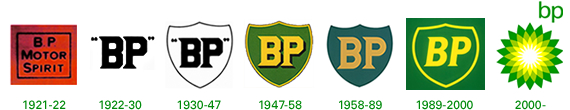
posted by Gordafarin at 3:14 AM on September 22, 2011
Google should keep the full name, just devolving into Helvetica, then Helvetica Rounded, THEN shorten to only the "OO".
Except that, knowing Google's attention to visual detail, it'd be in Arial.
posted by acb at 9:13 AM on September 22, 2011
Except that, knowing Google's attention to visual detail, it'd be in Arial.
posted by acb at 9:13 AM on September 22, 2011
Firefox, I'm not sure if I understand the joke they were trying for;
I think the idea is that an asteroid strikes in 2012 and then the world is covered in water.
posted by jacquilynne at 8:00 AM on September 26, 2011
I think the idea is that an asteroid strikes in 2012 and then the world is covered in water.
posted by jacquilynne at 8:00 AM on September 26, 2011
Starbucks = huh? (if the site is suggesting they're going for the green, those glory days are past. We hit peak Starbucks.)
The joke is that their logo has been zooming in and will continue to do so until there is nothing left to zoom in on.
It is a very obvious joke.
posted by Sys Rq at 3:23 PM on October 5, 2011
The joke is that their logo has been zooming in and will continue to do so until there is nothing left to zoom in on.
It is a very obvious joke.
posted by Sys Rq at 3:23 PM on October 5, 2011
« Older zombies holding fists full of balloons | Sweetness follows Newer »
This thread has been archived and is closed to new comments
posted by Gator at 10:58 AM on September 21, 2011