Brothers of chimpanzees, cousins of rats
November 10, 2011 7:44 PM Subscribe
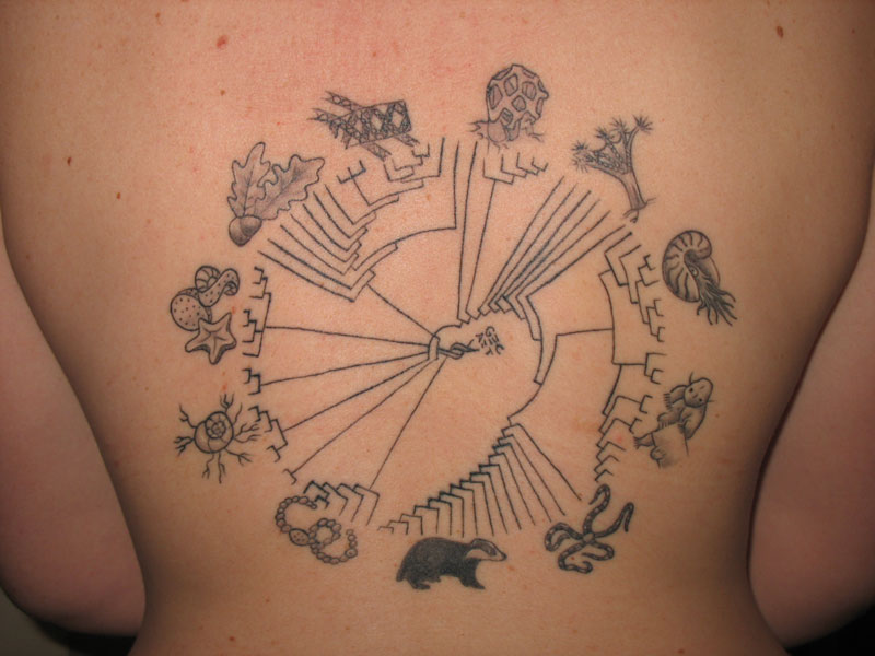
You have certainly seen a Tree of Life at some point (not the movie; the diagram of the evolution of species). Originally conceived of by Lamarck (though there is some interesting debate on this), it was Darwin himself who popularized the concept, first in his notebook, and next as the only image in The Origin of the Species. Though they have inspired beautiful illustrations, and a large and fascinating web project to map the tree, trees of life remain problematic since taxonomy can be complicated. One truly stunning way of redrawing the tree is the Hillis Plot, which maps 3,000 species by genetic similarity. You can print out the amazing illustration here, but, even though the Plot only contains 0.18% of named species, it needs to be 1.5 meters square to be legible. The Hillis Plot has been appearing in art, notably (and meta-rifficly) this one carved into an English oak, and, of course, tattoos.
That is an awesome tattoo, I should mention. [Related]
posted by maryr at 8:10 PM on November 10, 2011
posted by maryr at 8:10 PM on November 10, 2011
I downloaded the Hillis Plot.
The platypus was not on it.
I don't think the reason is that it only contains 0.18% of names species. I think that they tried to put the platypus on it and ended up with these lines all over the chart and finally just gave up.
posted by eye of newt at 8:28 PM on November 10, 2011 [1 favorite]
The platypus was not on it.
I don't think the reason is that it only contains 0.18% of names species. I think that they tried to put the platypus on it and ended up with these lines all over the chart and finally just gave up.
posted by eye of newt at 8:28 PM on November 10, 2011 [1 favorite]
It gets complicated when endosymbiosis is taken into account, producing trees like this.
posted by gubo at 8:30 PM on November 10, 2011
posted by gubo at 8:30 PM on November 10, 2011
I love how the Hillis Plot does away with the concept of "evolutionary progress" and of "higher and lower life", instead focusing on the process of continuous outward radiation in all directions. However, it does make it difficult to visualize the timeline of speciation, in terms of comparing when in history two different species arose.
posted by Scientist at 8:43 PM on November 10, 2011
posted by Scientist at 8:43 PM on November 10, 2011
Def. a cool diagram, although I find the tatoo quite lacking. The diagram is very tech-looking but I know there's no way you could get a decent resolution on skin. It reminds me of the automatons in Wolfram's science book.
posted by daHIFI at 8:45 PM on November 10, 2011
posted by daHIFI at 8:45 PM on November 10, 2011
I think I would actually prefer the tattoo if it didn't have the illustrations, actually. It would be even more obscure of course, but I don't think the illustrations really add anything. It's the sort of thing that if you're going to "get it" then you'll get it, if not then you won't. And I think that the branching circular plot is intrinsically aesthetic, even without labels.
Also I'd have it higher on the back, and larger, and I'd modify it from a circle to a golden spiral like that of a nautilus shell, just because. I agree though that overall the density of the plot doesn't lend itself well to the relatively thick lines that tattoos are limited to.
Of course, it's not my tattoo and it's not my back. I don't mean to disparage the owner of the tattoo or her design choices, I was merely musing on how I'd have it done if I chose to do such a tattoo myself. Which I might, except for the aforementioned line density/line weight problem, and the fact that I already have a tattoo on the back of my shoulder that I think would be in the way.
posted by Scientist at 8:59 PM on November 10, 2011 [1 favorite]
Actually I think I actually would prefer the actual tattoo if it didn't actually have the actual illustrations, actually. Actually.
posted by Scientist at 9:00 PM on November 10, 2011 [1 favorite]
posted by Scientist at 9:00 PM on November 10, 2011 [1 favorite]
I love how the Hillis Plot does away with the concept of "evolutionary progress" and of "higher and lower life", instead focusing on the process of continuous outward radiation in all directions. However, it does make it difficult to visualize the timeline of speciation, in terms of comparing when in history two different species arose.I think I've seen versions of this that try to arrange the splits based on when they arose.
posted by delmoi at 9:58 PM on November 10, 2011
I think it actually does base the splits on when speciation occured; the closer to the center, the earlier the speciation event. However, it is much more difficult to directly compare two speciation events when they are on opposite sides of a circle instead of arranged in a "linear" cladogram. With a traditional tree, you can just put a straightedge (real or imaginary) up to the tree and get a quick sense of which species evolved first. With he Hillis Plot you would have to measure the distance from the center of the circle for both species.
Not saying it's a bad plot, I think it has some symbolic advantages over the traditional tree (mentioned above) and placing all the labels out at the edges makes it dead easy to roughly compare the relative relatedness of two species (closer together = more closely related, though this assumes that all portions of the Tree of Life are populated with equal density, which they are not) which can be more difficult in a linear tree where one may have to trace back through the branchings to determine how far apart two species are. And it certainly shows a heckuva lot of species in a relatively small space.
I'd love to see a dynamic one that you could resize with new species appearing and disappearing based on relative obscurity as judged by frequency of mention in scientific literature, and the branchings automatically reorganizing to suit. That would be spiffy.
posted by Scientist at 10:36 PM on November 10, 2011
It's interesting that the Hillis plot comes from David Hillis, the brother of Danny Hillis, because Danny Hillis has been blowing people's minds with the Clock of the Long Now, among other things. I just imagine the Hillis family sitting around at Thanksgiving, trying to blow each other's minds. Danny is like, "my clock only chimes once every 10,000 years" and David is like, "we're all little specks at the end of a very big evolutionary tree".
I'd like to have Thanksgiving dinner with the Hillis family, actually.
posted by twoleftfeet at 10:44 PM on November 10, 2011 [3 favorites]
I'd like to have Thanksgiving dinner with the Hillis family, actually.
posted by twoleftfeet at 10:44 PM on November 10, 2011 [3 favorites]
The R ape package generates lovely circular phylograms if you want to roll your own. The Hillis plot is just an example of a rather large circular phylogram.
Although these are beautiful, the much messier maps which attempt to diagram horizontal gene transfer more accurately display how messy bacterial and archaea evolution is.
posted by benzenedream at 11:09 PM on November 10, 2011 [1 favorite]
Although these are beautiful, the much messier maps which attempt to diagram horizontal gene transfer more accurately display how messy bacterial and archaea evolution is.
posted by benzenedream at 11:09 PM on November 10, 2011 [1 favorite]
This is the most fascinating topic for me. It's interesting that tree-graphs were beginning to come into use in linguistics, geology and in textual criticism (the study of the descent of texts through manuscripts and other media) at around the same time as Darwin, albeit with varying applications and results. See articles here (get the PDF linked near the top of the page for the diagrams) and here (abstract).
posted by GeorgeBickham at 12:27 AM on November 11, 2011
posted by GeorgeBickham at 12:27 AM on November 11, 2011
Please don't forget about Dr. Argye Hillis, who is David's and Danny's sister. She has been blowing minds in neurology as well. And no discussion of David Hillis's work is complete without a tour of his Double Helix Texas Longhorn Ranch.
posted by Peter Petridish at 1:03 AM on November 11, 2011
posted by Peter Petridish at 1:03 AM on November 11, 2011
As an Evolutionary Anthropologist, I had been obsessed with this chart for some time and would love to see one done with primates. Once I have a house and money, I plan to get a colored version of the Hillis plot printed or painted on a wall.
posted by avagoyle at 6:51 AM on November 11, 2011
posted by avagoyle at 6:51 AM on November 11, 2011
Vaguely related, the Jesse Tree, a medieval visualization showing the heritage of Jesus. What I love is the metaphor of generations of people literally growing from the loins of Jesse. Also the renderings are generally beautiful. Some snapshots of the Chartres stained glass.
posted by Nelson at 7:12 AM on November 11, 2011 [1 favorite]
posted by Nelson at 7:12 AM on November 11, 2011 [1 favorite]
Our closest neighbors?
A rubber eel and a house mouse.
posted by notyou at 7:12 AM on November 11, 2011
A rubber eel and a house mouse.
posted by notyou at 7:12 AM on November 11, 2011
I hear that movie is boring.
posted by Fister Roboto at 7:58 AM on November 11, 2011
posted by Fister Roboto at 7:58 AM on November 11, 2011
It could be very interesting to see some of those gene transfer graphs done in 3D.
posted by maryr at 11:54 AM on November 11, 2011
posted by maryr at 11:54 AM on November 11, 2011
« Older Hell, Grover can't kill ya. He can't burn down... | Why the Female Sexual Submissive Scares Us Newer »
This thread has been archived and is closed to new comments
I will now leave this to the evolutionary biologists, as I know they're around here somewhere.
posted by maryr at 8:04 PM on November 10, 2011