Marlin jumps shark something something
November 16, 2011 3:35 PM Subscribe
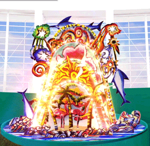
The Miami Marlins have a new logo. Reaction is less than favorable. But the new identity pales in comparison to the homerun feature that will play in the stadium. Reaction.
Weird, I like the new logo a lot better. I follow the under consideration logo blog and I don't always agree with the crowd. The old marlins logo was a weird retro-style throwback one in goofy colors I never liked. The new one looks original and I like the new use of colors and that they're going with Miami instead of Florida.
posted by mathowie at 3:38 PM on November 16, 2011 [4 favorites]
posted by mathowie at 3:38 PM on November 16, 2011 [4 favorites]
Mass transit. That's what the new logo says to me. It looks like it belongs on a bus, not a ballplayer.
posted by .kobayashi. at 3:41 PM on November 16, 2011 [5 favorites]
posted by .kobayashi. at 3:41 PM on November 16, 2011 [5 favorites]
"Sound effects. This thing will shriek, too. At the very least, it will make high-pitched shrieks that we can't hear, but the pod people can, and it will signal to them that it's okay to come down and feast on our skulls. But there's also a chance that it will make sounds we can hear, and that's even worse."
posted by Ivan Fyodorovich at 3:41 PM on November 16, 2011 [3 favorites]
posted by Ivan Fyodorovich at 3:41 PM on November 16, 2011 [3 favorites]
Hahahahahahahahahahahahahaha, GO YANKEES!!!
posted by ReeMonster at 3:43 PM on November 16, 2011 [2 favorites]
posted by ReeMonster at 3:43 PM on November 16, 2011 [2 favorites]
The Homerun Feature is garsih to be sure, but I adore the new mascot.
posted by Senor Cardgage at 3:45 PM on November 16, 2011 [7 favorites]
posted by Senor Cardgage at 3:45 PM on November 16, 2011 [7 favorites]
The thing I dont like about the new logo is the colors that do not lay nor play well with each other
posted by Senor Cardgage at 3:45 PM on November 16, 2011 [1 favorite]
posted by Senor Cardgage at 3:45 PM on November 16, 2011 [1 favorite]
I hated it for the first five seconds, but now I kinda like it. I think it's really hard for a new logo to look good when you first see it surrounded by nothing but white space and the old familiar logo.
posted by villanelles at dawn at 3:46 PM on November 16, 2011
posted by villanelles at dawn at 3:46 PM on November 16, 2011
In a better world, all of the players on the Marlins would bunt every single time they came up to bat until that thing was removed.
posted by The Card Cheat at 3:46 PM on November 16, 2011 [3 favorites]
posted by The Card Cheat at 3:46 PM on November 16, 2011 [3 favorites]
The only way that "homerun feature" thing will be worth it is if the players all dress up as Vegas showgirls and come dancing out of it in a chorus line.
posted by phunniemee at 3:46 PM on November 16, 2011 [12 favorites]
posted by phunniemee at 3:46 PM on November 16, 2011 [12 favorites]
Hahahahahahahahahahahahahaha, GO YANKEES!!!
Yep, there's a Yankee fan right there.
Related: The Jays do it right.
posted by auto-correct at 3:47 PM on November 16, 2011 [4 favorites]
Yep, there's a Yankee fan right there.
Related: The Jays do it right.
posted by auto-correct at 3:47 PM on November 16, 2011 [4 favorites]
I don't particularly mind the logo, but I just wanted to come in to say that the continued existence of the Marlins is an embarrassment to Major League Baseball.
posted by breakin' the law at 3:48 PM on November 16, 2011 [2 favorites]
posted by breakin' the law at 3:48 PM on November 16, 2011 [2 favorites]
On the other hand, the Marlins are going to lead the league in fans who do shrooms and come to the stadium to point and laugh and freak out at that thing.
posted by The Card Cheat at 3:49 PM on November 16, 2011 [2 favorites]
posted by The Card Cheat at 3:49 PM on November 16, 2011 [2 favorites]
Also, I kind of like the Marlins' new logo. Everything's been focus-grouped to the point where all new logos seem to look exactly the same. Good for them for trying something different.
posted by auto-correct at 3:49 PM on November 16, 2011 [1 favorite]
posted by auto-correct at 3:49 PM on November 16, 2011 [1 favorite]
The homerun feature is one of the better practical jokes I've seen though.
posted by villanelles at dawn at 3:49 PM on November 16, 2011
posted by villanelles at dawn at 3:49 PM on November 16, 2011
I liked the colors better before I learned they have names like Mandarin Red, Diva Blue and Sundance.
posted by box at 3:51 PM on November 16, 2011 [1 favorite]
posted by box at 3:51 PM on November 16, 2011 [1 favorite]
Sure, that homerun thing is absurd and terrible. On the other hand, they're the fucking Marlins, and it's not like doing something weird and gaudy as all hell made me lose any respect for them. I say the Marlins should go out there and embrace it. Make the other NL East teams fear your giant rotating fish monstrosity.
PS. The part where you hit a lot of home runs will be pretty easy if you're playing the Nationals.
posted by Copronymus at 3:52 PM on November 16, 2011
PS. The part where you hit a lot of home runs will be pretty easy if you're playing the Nationals.
posted by Copronymus at 3:52 PM on November 16, 2011
I don't care for the logo, but the homerun feature is fun! Sure, it's kinda garish and over-the-top, but so is Miami.
posted by mokin at 3:52 PM on November 16, 2011 [2 favorites]
posted by mokin at 3:52 PM on November 16, 2011 [2 favorites]
I like it. Its not any dumber than having a Major League team in Miami.
Too snarky?
posted by zzazazz at 3:52 PM on November 16, 2011
Too snarky?
posted by zzazazz at 3:52 PM on November 16, 2011
(I still like 'em better than the old colors, though--that shit was more '90s than Color Me Badd on Beverly Hills 90210.)
posted by box at 3:53 PM on November 16, 2011 [2 favorites]
posted by box at 3:53 PM on November 16, 2011 [2 favorites]
Veeck would have loved that home run feature, though.
posted by zzazazz at 3:53 PM on November 16, 2011 [2 favorites]
posted by zzazazz at 3:53 PM on November 16, 2011 [2 favorites]
Abstract fish are hard to deal with (especially if you ever eat sushi). And the Homerun Feature looked like a throwback to "Miami Vice".
But the Blue Jays logo made me think "aw, poor bird has an ear infection".
I can't imagine Yankee fans feeling superior to anybody. Their 'pinstripes' always looked to me like slimmed-down prison stripes and nobody has mentioned that to them in what, 75 years? They set the standard for bad uniform design and the rest of the sports world is just trying to catch up.
posted by oneswellfoop at 3:54 PM on November 16, 2011
I don't mind the uniforms. It's been several years since I even kept up with baseball, but I'm pretty happy as a natural born Miamian that they finally changed the name of the team. Nobody north of Broward county gives a shit about the Marlins.
posted by triceryclops at 3:54 PM on November 16, 2011
posted by triceryclops at 3:54 PM on November 16, 2011
I actually like this quite a bit. I'm getting tired of "logos with a face."
posted by Cool Papa Bell at 3:56 PM on November 16, 2011
posted by Cool Papa Bell at 3:56 PM on November 16, 2011
I like it. The best baseball logo will always be the Ball and Glove.
posted by drezdn at 4:01 PM on November 16, 2011 [8 favorites]
posted by drezdn at 4:01 PM on November 16, 2011 [8 favorites]
For the Back to the Future II prophecy to be fulfilled, Miami has to move to the American League and lose to the Cubs in the World Series in 2015.
posted by starman at 4:07 PM on November 16, 2011 [10 favorites]
posted by starman at 4:07 PM on November 16, 2011 [10 favorites]
Their 'pinstripes' always looked to me like slimmed-down prison stripes and nobody has mentioned that to them in what, 75 years?
Clever. *sigh* Be sure to mention that to every other team with pinstripes.
posted by grubi at 4:11 PM on November 16, 2011
Clever. *sigh* Be sure to mention that to every other team with pinstripes.
posted by grubi at 4:11 PM on November 16, 2011
When they finally move the Marlins to Charlotte, I'll buy a jersey with this logo for old times' sake.
posted by sonic meat machine at 4:14 PM on November 16, 2011
posted by sonic meat machine at 4:14 PM on November 16, 2011
The homerun feature is one of the better practical jokes I've seen though.
It's like a combination of all the 'FINAL HOLE - WIN A PRIZE' holes at all the miniature golf courses on Long Beach Island - but with a fish on top! Go, final hole home run fish!
Also: Reyes, huh? Is that going to happen?
posted by mintcake! at 4:23 PM on November 16, 2011
It's like a combination of all the 'FINAL HOLE - WIN A PRIZE' holes at all the miniature golf courses on Long Beach Island - but with a fish on top! Go, final hole home run fish!
Also: Reyes, huh? Is that going to happen?
posted by mintcake! at 4:23 PM on November 16, 2011
I think they should have gone with Miami Marlins of Anaheim.
posted by Frank Grimes at 4:30 PM on November 16, 2011 [3 favorites]
posted by Frank Grimes at 4:30 PM on November 16, 2011 [3 favorites]
Homerun sculpture by Red Grooms. Hell yes. Ruckus Miami!
posted by charlie don't surf at 4:32 PM on November 16, 2011 [1 favorite]
posted by charlie don't surf at 4:32 PM on November 16, 2011 [1 favorite]
I adore that gaudy home run juggernaut. It's funny as hell. I hope it's made as closely to that simulation as possible, with the awkward marlins inching up out of nowhere.
But for the logo: Swooping the mascot into a shitty retro toothpaste shape does not constitute a design. Look at the big logo. Why does the tippy-tip of the fishtail excruciatingly cross the line in the M like that? It is painful to see, the sort of thing that torture is made from. And nother "blech" for the color choices. Where are all the people who know how color works and are trying to pay back their student loans for learning it? Can they please have a job? (Not bitter.)
posted by gorgor_balabala at 4:32 PM on November 16, 2011 [1 favorite]
The logo is terrible, and at first I thought that hideous homerun feature was absurd too...but the more I think about, the more I want to see that thing exist! I would actually go to a Marlins game to see that thing in action! It is garish, and ridiculous, and so over-the-top that it just might work.
However, it has to go one of two ways:
Option A: It has to be huge...like, skyline-level huge. Like, you see this thing all the way up in the panhandle. Someone mentioned showgirls...that should definitely be a part of it. It needs to be like a big Vegas-style monstrosity that goes so far over the top that the umpires don't even check to see if the player crosses home plate.
or
Option B: It has to be tiny. Like, the scale of the Stonehenge model in Spinal Tap. So, clearly undersized for what it is trying to do that it becomes even more hilarious! Like, so small that if it get hits with a baseball, it goes down.
posted by This_Will_Be_Good at 4:51 PM on November 16, 2011 [18 favorites]
I think they should have gone with Miami Marlins of Anaheim.
Au contraire, they should be the Los Angeles Marlins of Miami.
posted by muddgirl at 4:52 PM on November 16, 2011 [2 favorites]
Au contraire, they should be the Los Angeles Marlins of Miami.
posted by muddgirl at 4:52 PM on November 16, 2011 [2 favorites]
The other option was that Marlins would come out of the sky and stand there.
posted by Slap*Happy at 4:54 PM on November 16, 2011
posted by Slap*Happy at 4:54 PM on November 16, 2011
But the new identity pales in comparison to the homerun feature that will play in the stadium.
The biggest news for people in Florida may be the fact that the Marlins have a stadium. Maybe some of them will start going to games.
posted by inigo2 at 4:57 PM on November 16, 2011
The biggest news for people in Florida may be the fact that the Marlins have a stadium. Maybe some of them will start going to games.
posted by inigo2 at 4:57 PM on November 16, 2011
Wow, the home run feature is almost crazy and garish enough to fit in at The House on the Rock.
posted by dialetheia at 4:58 PM on November 16, 2011 [2 favorites]
posted by dialetheia at 4:58 PM on November 16, 2011 [2 favorites]
The hat's kinda fugly, but I'll be more upset if they get Reyes. Get off the pot Mets front office!
posted by jonmc at 5:02 PM on November 16, 2011
posted by jonmc at 5:02 PM on November 16, 2011
Metafilter: giant rotating fish monstrosity
posted by Hairy Lobster at 5:04 PM on November 16, 2011
posted by Hairy Lobster at 5:04 PM on November 16, 2011
Mets 2012!
posted by roomthreeseventeen at 5:04 PM on November 16, 2011 [1 favorite]
posted by roomthreeseventeen at 5:04 PM on November 16, 2011 [1 favorite]
"But the new identity pales in comparison to the homerun feature that will play in the stadium."
Hey, its not like they'll ever be able to use it or anything.
posted by Blasdelb at 5:05 PM on November 16, 2011
Hey, its not like they'll ever be able to use it or anything.
posted by Blasdelb at 5:05 PM on November 16, 2011
I think this is fantastic. Their whole branding is some anti-corporate tacky retro shit, nobody goes to the games in Florida as it is, and yet this team is going to go on a buying spree this winter and win the World Series within the next three–four years. What's not to love?
posted by dixiecupdrinking at 5:06 PM on November 16, 2011
posted by dixiecupdrinking at 5:06 PM on November 16, 2011
Well, sir, there's nothing on earth like a genuine, bona fide, electrified, six car Mono Marlinrail! What'd I say?
Mono Marlinrail!
For what it's worth, I think it looks ok
posted by chimaera at 5:06 PM on November 16, 2011 [2 favorites]
For what it's worth, I think it looks ok
posted by chimaera at 5:06 PM on November 16, 2011 [2 favorites]
I lived in Dade County for two years. The onlys anybody gives a shit about down there are the fucking Dolphins and the fucking Hurricanes. The panthers wone the cup and nobody cared.
posted by jonmc at 5:07 PM on November 16, 2011
posted by jonmc at 5:07 PM on November 16, 2011
Looks like the Maroon 5 logo, but someone decided to "remix" it.
posted by squorch at 5:10 PM on November 16, 2011
posted by squorch at 5:10 PM on November 16, 2011
"If Carnival and Las Vegas had a baby, this would be the placenta. "
Bears repeating.
posted by notsnot at 5:11 PM on November 16, 2011
Bears repeating.
posted by notsnot at 5:11 PM on November 16, 2011
> The panthers wone the cup and nobody cared.
They lost in four games to the Avalanche, FWIW.
posted by The Card Cheat at 5:15 PM on November 16, 2011
They lost in four games to the Avalanche, FWIW.
posted by The Card Cheat at 5:15 PM on November 16, 2011
At the "old" Busch Stadium (the one that went from '66 to 2005), they had this. A little classier...
posted by notsnot at 5:17 PM on November 16, 2011 [1 favorite]
posted by notsnot at 5:17 PM on November 16, 2011 [1 favorite]
Oh yeah. But nobody in the Gator Bait State cared anyway.
posted by jonmc at 5:18 PM on November 16, 2011
posted by jonmc at 5:18 PM on November 16, 2011
Suck it up jocks, the design nerds have the last laugh. Fuckers.
posted by symbioid at 5:19 PM on November 16, 2011
posted by symbioid at 5:19 PM on November 16, 2011
Man, both the logo and the "feature" are heapin' helpin's of UGLY.
I can see what they were going for, but:
1. The colors are awfully, uhhh, pastel
2. The marlin mark looks like it was drawn by a five year old
3. The flat-topped "A" sticks out like a sore thumb next to the peaked "M"s, to my eye.
I'd give it a fail.
posted by Benny Andajetz at 5:20 PM on November 16, 2011 [1 favorite]
I fucking LOVE that home run feature. The spinning fish on top is what really makes it.
posted by ericost at 5:25 PM on November 16, 2011 [2 favorites]
posted by ericost at 5:25 PM on November 16, 2011 [2 favorites]
Someone I know thought the new logo was more befitting a discount airline than a professional baseball team, can't say I disagree.
posted by IvoShandor at 5:29 PM on November 16, 2011 [1 favorite]
posted by IvoShandor at 5:29 PM on November 16, 2011 [1 favorite]
Metafilter: giant rotating fish fishpants monstrosity?
posted by Alterscape at 5:29 PM on November 16, 2011
posted by Alterscape at 5:29 PM on November 16, 2011
My god, I should have watched that video first. It looks like it belongs in Obayashi's "House" or in a David Lynch film, or something.
posted by IvoShandor at 5:31 PM on November 16, 2011 [1 favorite]
posted by IvoShandor at 5:31 PM on November 16, 2011 [1 favorite]
And this STILL isn't the worst travesty Jeffrey Loria has inflicted on baseball. Not by a long shot.
Who, me, bitter? About my beloved Expos? ABSOFUCKINGLUTELY.
posted by Capt. Renault at 5:33 PM on November 16, 2011 [5 favorites]
Who, me, bitter? About my beloved Expos? ABSOFUCKINGLUTELY.
posted by Capt. Renault at 5:33 PM on November 16, 2011 [5 favorites]
At the "old" Busch Stadium (the one that went from '66 to 2005), they had this.
My Pavlovian conditioning makes "Here Comes the King" play in my head whenever I see that.
posted by Horace Rumpole at 5:43 PM on November 16, 2011 [2 favorites]
My Pavlovian conditioning makes "Here Comes the King" play in my head whenever I see that.
posted by Horace Rumpole at 5:43 PM on November 16, 2011 [2 favorites]
I like the "M" in the logo -- as others have said, it is new and different. The "abstract fish" jumping over it, however, is awful. I predict they drop it from the logo within two years.
posted by Rock Steady at 5:46 PM on November 16, 2011 [1 favorite]
posted by Rock Steady at 5:46 PM on November 16, 2011 [1 favorite]
Veeck would have loved that home run feature, though.
I believe the giant rotating fish monstrosity is powered by Bill Veeck's ashes. He would be so proud.
That thing absolutely rules.
posted by Chichibio at 5:49 PM on November 16, 2011 [1 favorite]
I believe the giant rotating fish monstrosity is powered by Bill Veeck's ashes. He would be so proud.
That thing absolutely rules.
posted by Chichibio at 5:49 PM on November 16, 2011 [1 favorite]
I've already nicknamed this thing the "Mescaline Fiesta" in my own mind.
posted by edverb at 5:51 PM on November 16, 2011 [8 favorites]
posted by edverb at 5:51 PM on November 16, 2011 [8 favorites]
It looks like a paper airplane being sucked into a black hole. M-shaped black hole.
posted by Anything at 5:53 PM on November 16, 2011
posted by Anything at 5:53 PM on November 16, 2011
Still not better than this.
Completely unrleated to logos or home run displays but fuck American League Astros in 2013. Send the Brewers back.
posted by PapaLobo at 5:54 PM on November 16, 2011
Completely unrleated to logos or home run displays but fuck American League Astros in 2013. Send the Brewers back.
posted by PapaLobo at 5:54 PM on November 16, 2011
At the "old" Busch Stadium (the one that went from '66 to 2005), they had this.
That thing (or an exact copy of it) still exists, just west of the stadium. I only ever notice it driving past, but I think it's on top of some Anheuser-Busch building.
posted by aaronetc at 6:01 PM on November 16, 2011
That thing (or an exact copy of it) still exists, just west of the stadium. I only ever notice it driving past, but I think it's on top of some Anheuser-Busch building.
posted by aaronetc at 6:01 PM on November 16, 2011
Oh God. Let's hope that homerun structure is only 18" tall.
The logo though...it's so...so...fresh. (Like, Aquafresh.)
posted by iamkimiam at 6:02 PM on November 16, 2011 [3 favorites]
The logo though...it's so...so...fresh. (Like, Aquafresh.)
posted by iamkimiam at 6:02 PM on November 16, 2011 [3 favorites]
I frankly doubt that any home run celebratory thingamabob will ever even remotely compare to the guy at old County Stadium who would go down a big slide into a giant mug of beer.
posted by Flunkie at 6:08 PM on November 16, 2011
posted by Flunkie at 6:08 PM on November 16, 2011
I was raised in Miami, I've been to Marlins games and I love my hometown. I have three things to say:
1) I like the new logo and colors. It grows on you. It's a little bit of a shout-out to the old team.
2. I love that Miami has a recognizable color scheme. When you see Aqua (any shade), orange and/or pastels (especially yellow, orange, etc.) it's almost certainly something about Miami. I love the contrarianism and almost unique color palette. The Heat are the main exception, and even they are contrarian in their own way.
3. Hahahahahahahahahahahahahaha, GO YANKEES!!!
Really dude? Yankees? Did you forget 2003?
2003!
posted by oddman at 6:35 PM on November 16, 2011 [2 favorites]
Wow... that's just awful. It looks like a guy lying on his back, farting.
posted by LuckySeven~ at 6:36 PM on November 16, 2011
posted by LuckySeven~ at 6:36 PM on November 16, 2011
aaronetc: "That thing (or an exact copy of it) still exists, just west of the stadium. I only ever notice it driving past, but I think it's on top of some Anheuser-Busch building."
Yeah, it's the same one. I didn't want to make my story more complicated than it needed to. And yes, I get "here comes the king" in my head every goddamn time I drive down highway "fahrty".
posted by notsnot at 6:44 PM on November 16, 2011
Yeah, it's the same one. I didn't want to make my story more complicated than it needed to. And yes, I get "here comes the king" in my head every goddamn time I drive down highway "fahrty".
posted by notsnot at 6:44 PM on November 16, 2011
I was primed to hate the homerun sculpture. It's got everything I'm either meh or outright hateful of: Red Grooms (meh), homerun features (hate, alternating with wtf), big-ticket tax boondoggles (hate). And, frankly, the FPP told me to.
But... I like it. It fits right into nonstop-action carnival atmosphere in major league stadiums these days. I wouldn't be surprised if Red Grooms hates major league ballparks and only attends minor league games at the parks that still allow people to bring in their own beer coolers. That would be awesome.
posted by ardgedee at 6:47 PM on November 16, 2011 [1 favorite]
The home run thing look like a designer took a trip to the Philippines or India and said, "lets make a HR celebration that celebrates both a home run and long haul trucking/busing in the third world."
posted by Keith Talent at 6:49 PM on November 16, 2011 [1 favorite]
posted by Keith Talent at 6:49 PM on November 16, 2011 [1 favorite]
The home run ?device? is by Red Grooms, and is, by his standards, disappointingly bland. It should have dwarfs and hookers and policemen and a trash can, and probably did before the team 'suits' fishified it.
posted by hexatron at 7:07 PM on November 16, 2011
posted by hexatron at 7:07 PM on November 16, 2011
Is that a home run feature or a Santana album cover?
posted by rocket88 at 7:25 PM on November 16, 2011 [3 favorites]
posted by rocket88 at 7:25 PM on November 16, 2011 [3 favorites]
The onlys anybody gives a shit about down there are the fucking Dolphins and the fucking Hurricanes.
Don't forget the Heat! Their annual Christmas game vs. the Lakers has become a tradition with my family down there.
I will agree about the Marlins, though; used to work in the stands at Joe Robbie on summer breaks and they were dullsville compared to the Dolphins' preseason.
Don't like this new logo, though. Also, "Miami Marlins" just sounds weird to me.
posted by May Kasahara at 7:28 PM on November 16, 2011
I guess the Marlins are trying to make their players hit less home runs.
posted by V4V at 7:28 PM on November 16, 2011
posted by V4V at 7:28 PM on November 16, 2011
*they = the games and the vibe from the stands
posted by May Kasahara at 7:29 PM on November 16, 2011
posted by May Kasahara at 7:29 PM on November 16, 2011
Everybody knows baseball major league-ers like to look fabulous when they play.
Also, Red Grooms? That's kind of amazing. They should have gone all the way and asked Jeff Koons to do the uniforms.
posted by bardic at 7:45 PM on November 16, 2011 [1 favorite]
Also, Red Grooms? That's kind of amazing. They should have gone all the way and asked Jeff Koons to do the uniforms.
posted by bardic at 7:45 PM on November 16, 2011 [1 favorite]
I'm hoping the pendulum is swinging back away from this rush towards a 1920s "traditional" baseball aesthetic. This Marlins logo is hideous, but at least it's different. I agree that the Dodgers, Yankees, Red Sox, Giants, and Cubs would be ill advised to ever change -- those uniforms are institutions and there is no further development possible. But in the last 15 years we've seen team after team try so hard to develop a look that evokes nostalgia, and what they actually achieve is offensively bland. I'm looking at you Mariners. It's a tragedy to see in my lifetime the Brewers lose the the baseball glove logo and the Astros ditch their 1970s rainbow uniforms.
posted by Slarty Bartfast at 7:59 PM on November 16, 2011
posted by Slarty Bartfast at 7:59 PM on November 16, 2011
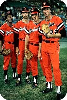
I'm not too crazy about the realistic Oriole versus the cartoon guy, though.
posted by box at 8:02 PM on November 16, 2011
posted by box at 8:02 PM on November 16, 2011
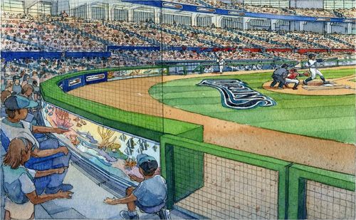
Whose idea was it exactly to put the fish tank behind the safety net?
posted by koeselitz at 8:14 PM on November 16, 2011
posted by koeselitz at 8:14 PM on November 16, 2011
As someone who has always really liked his initials, I really can't not really, really like this monstrosity.
posted by MCMikeNamara at 8:22 PM on November 16, 2011
posted by MCMikeNamara at 8:22 PM on November 16, 2011
Wait, people go to Marlins games, other than Phillies fans who flew down for the weekend?
posted by madcaptenor at 9:17 PM on November 16, 2011 [2 favorites]
posted by madcaptenor at 9:17 PM on November 16, 2011 [2 favorites]
This reminds of perhaps the most awesome of all ridiculous baseball redesigns, 1999's Turn Ahead the Clock Day. Some of that stuff i gold.
posted by ORthey at 9:29 PM on November 16, 2011
posted by ORthey at 9:29 PM on November 16, 2011
What's with the "feature" thing lately anyway? The old fashioned way to celebrate a home run is much cooler. And intimidating as hell when the whole half of the stadium is doing it in synch. Damn I love me some Japanese baseball. MLB just isn't the same since I went to some Japan ball games.
posted by ctmf at 9:30 PM on November 16, 2011 [1 favorite]
posted by ctmf at 9:30 PM on November 16, 2011 [1 favorite]
This reminds of perhaps the most awesome of all ridiculous baseball redesigns, 1999's Turn Ahead the Clock Day. Some of that stuff is gold.
Bloody hell! I'd never heard of that. Some of those uniforms are surreal.
posted by ambient2 at 9:46 PM on November 16, 2011
Bloody hell! I'd never heard of that. Some of those uniforms are surreal.
posted by ambient2 at 9:46 PM on November 16, 2011
I heard Pujols was given a tour of the new stadium. I'm guessing that "homerun feature" wasn't ready yet, but I can only imagine what it would've been like if it had been.
"Man, these new facilities look great. Thanks for showing me around."
"But that's not all, Albert! When you hit one of your majestic long-bombs, your new fans gonna be treated to this! Hit it!"
Fish spiral mechanism starts up. Slow-motion close-up of Albert's jaw dropping in disbelief.
Marlins executives grin ear-to-ear. "So we just happen to have a contract here..."
Smash cut to a jet flying back to St Louis.
posted by TheSecretDecoderRing at 12:25 AM on November 17, 2011 [2 favorites]
That thing (or an exact copy of it) still exists, just west of the stadium.
There were two. One is was on a billboard off of Highway 40, the other was in the stadium. I don't live in STL anymore, so I don't know if they moved either of them -- so I can't tell you if the one west of the stadium is the original stadium one, or the one from the billboard.
posted by eriko at 1:55 AM on November 17, 2011
Logotype: I dislike the Miami version on the jersey, but the Marlins version is better.
posted by eriko at 1:56 AM on November 17, 2011
posted by eriko at 1:56 AM on November 17, 2011
Bad logo or not, at least the Marlins are in the NL. (Bitter Houstonian)
posted by nimsey lou at 2:02 AM on November 17, 2011 [1 favorite]
posted by nimsey lou at 2:02 AM on November 17, 2011 [1 favorite]
well, it's cuter than an intrauterine.....
posted by Thomas Tallis is my Homeboy at 4:54 AM on November 17, 2011 [1 favorite]
posted by Thomas Tallis is my Homeboy at 4:54 AM on November 17, 2011 [1 favorite]
Needs to be about 20% cooler.
I got it! Sunglasses on the fish. Boom.
posted by Rock Steady at 6:11 AM on November 17, 2011 [2 favorites]
I got it! Sunglasses on the fish. Boom.
posted by Rock Steady at 6:11 AM on November 17, 2011 [2 favorites]
I have to admit, the first thing I did online today was stare at that animated gif for a few minutes. I kind of can't wait to see the real thing.
posted by mintcake! at 6:52 AM on November 17, 2011
posted by mintcake! at 6:52 AM on November 17, 2011
Copronymus, did you actually pay any attention to the NL East at all last season? The Nationals placed well ahead of the fish and their pitching staff is considered to be one of the best up and coming rotations in baseball.
Get with the times man.
Also, Bardic and box, you may want to check out the Orioles website, I have a feeling you will be pleasantly surprised (at least aesthetically, they will still be horrible for the foreseeable future).
posted by BobbyDigital at 7:14 AM on November 17, 2011
Get with the times man.
Also, Bardic and box, you may want to check out the Orioles website, I have a feeling you will be pleasantly surprised (at least aesthetically, they will still be horrible for the foreseeable future).
posted by BobbyDigital at 7:14 AM on November 17, 2011
Needs to be about 20% cooler.
I got it! Sunglasses on the fish. Boom.
I think you're onto something..
posted by inigo2 at 7:42 AM on November 17, 2011 [1 favorite]
I got it! Sunglasses on the fish. Boom.
I think you're onto something..
posted by inigo2 at 7:42 AM on November 17, 2011 [1 favorite]
The new uniforms remind me of nothing so much as the Astros rainbow-era kit, only with more pastel.
The homerun feature? Glorious! Looks like it could double as a mandala in a pinch.
posted by Fezboy! at 9:00 AM on November 17, 2011
The homerun feature? Glorious! Looks like it could double as a mandala in a pinch.
posted by Fezboy! at 9:00 AM on November 17, 2011
I sincerely hope that the new Miami Marlins actively advocate for lysergic ingestion at all home games and that George Harrison music is played every time a dinger leaves the yard. How can you NOT love this? Baseball is so fucking gloriously weird.
posted by Lipstick Thespian at 5:09 PM on November 17, 2011 [1 favorite]
posted by Lipstick Thespian at 5:09 PM on November 17, 2011 [1 favorite]
My mind went to Lisa Frank
posted by tenderman kingsaver at 1:34 PM on November 18, 2011 [1 favorite]
posted by tenderman kingsaver at 1:34 PM on November 18, 2011 [1 favorite]
Thanks, Bobby!
The '12 cartoon bird doesn't look quite as drunk as the '75 one, but maybe that's what they call progress.
posted by box at 9:24 AM on November 19, 2011
The '12 cartoon bird doesn't look quite as drunk as the '75 one, but maybe that's what they call progress.
posted by box at 9:24 AM on November 19, 2011
« Older written? kitten! | Give me something to listen to Newer »
This thread has been archived and is closed to new comments
posted by Tomorrowful at 3:37 PM on November 16, 2011 [7 favorites]