And you thought one logo and one client was hard? Pfft.
September 24, 2012 11:22 AM Subscribe
Time to make the logos. Take 300, yes 300, fan blogs with all kinds of inconsistent, homemade, clip-art, crappy logos and re-design ALL of them to be consistent with one over-arching look and feel. Oh... and do it in 7 weeks.
A behind-the-scenes summary of the process and a summary of all the new logos. (via UnderConsideration)
A behind-the-scenes summary of the process and a summary of all the new logos. (via UnderConsideration)
curse: The Battle of California logo is the best.
I was just going to say the same thing.
♪ ♫ One of these things is not like the others, one of these things is not the same... ♫ ♪
posted by Rock Steady at 11:34 AM on September 24, 2012
I was just going to say the same thing.
♪ ♫ One of these things is not like the others, one of these things is not the same... ♫ ♪
posted by Rock Steady at 11:34 AM on September 24, 2012
I think they did a remarkable job.
posted by cell divide at 11:46 AM on September 24, 2012
posted by cell divide at 11:46 AM on September 24, 2012
I'm sure that someone will decry this as soulless, taking distinctly different-styled logos and reinventing them to all fit one uniform, streamlined style. To the detractors I ask: Wouldn't all of these new logos look great as collectible pogs?
posted by Apocryphon at 11:50 AM on September 24, 2012 [8 favorites]
posted by Apocryphon at 11:50 AM on September 24, 2012 [8 favorites]
Oh, god, if I could do this with the hundreds of local logos under the national umbrella I work for, I would probably explode with joy.
posted by looli at 11:53 AM on September 24, 2012
posted by looli at 11:53 AM on September 24, 2012
To the detractors I ask: Wouldn't all of these new logos look great as collectible pogs?
Remember sports? They're back! In pog form.
posted by mightygodking at 11:53 AM on September 24, 2012 [5 favorites]
Remember sports? They're back! In pog form.
posted by mightygodking at 11:53 AM on September 24, 2012 [5 favorites]
Fraser Davidson does some fantastic work -- his animations for the Alternative Rugby Commentary alone ("The Ten Commandments" is a good place to start) should guarantee him immortality.
posted by Zonker at 11:59 AM on September 24, 2012 [1 favorite]
posted by Zonker at 11:59 AM on September 24, 2012 [1 favorite]
Oh goodness.
That "Windy City Gridiron" logo is... Well, it's evocative of a very popular internet shock-meme.
(Bearse?)
posted by Imperfect at 12:03 PM on September 24, 2012 [3 favorites]
That "Windy City Gridiron" logo is... Well, it's evocative of a very popular internet shock-meme.
(Bearse?)
posted by Imperfect at 12:03 PM on September 24, 2012 [3 favorites]
The colors are backwards on the Chicago logo. Simple mistake, or horrifying vision of a river choked red with blood??
posted by theodolite at 12:06 PM on September 24, 2012
posted by theodolite at 12:06 PM on September 24, 2012
I actually know the guys who started the Bears and Cowboys sites for SB Nation. They had to be careful with the initial logos and blog names due to the NFL IP police. Frankly, I'm surprised they can get away with some of the new logos--maybe those rules have relaxed or they have better lawyers now :)
posted by monkeymcgee at 12:19 PM on September 24, 2012
posted by monkeymcgee at 12:19 PM on September 24, 2012
I'm sure that someone will decry this as soulless, taking distinctly different-styled logos and reinventing them to all fit one uniform, streamlined style.
Ok. I'll be that guy. And, you forgot "corporate" and "safe".
posted by Thorzdad at 12:24 PM on September 24, 2012 [2 favorites]
Ok. I'll be that guy. And, you forgot "corporate" and "safe".
posted by Thorzdad at 12:24 PM on September 24, 2012 [2 favorites]
Gosh, the Battle of California logo sure looks corporate.
posted by muddgirl at 12:31 PM on September 24, 2012
posted by muddgirl at 12:31 PM on September 24, 2012
Ok. I'll be that guy. And, you forgot "corporate" and "safe".
I agree, while I appreciate the artistic feat the huge mass of uniform logos turns me off. Kudos for keeping the Battle of California one unique I guess.
posted by ghharr at 12:33 PM on September 24, 2012
I agree, while I appreciate the artistic feat the huge mass of uniform logos turns me off. Kudos for keeping the Battle of California one unique I guess.
posted by ghharr at 12:33 PM on September 24, 2012
Sadly, at the end of the day, this is still adorning a bunch of windbags discussing sports with occasionally sycophantic communities underneath. Perhaps YMMV but, man, my local SB....zzzzzzzzz. I suppose if you're into that thing, whatever: I find pretty much any sports punditry kind of lame and navel-gazing and about as much fun as political coverage. I find myself asking just how many people does this nation have and need breaking down sports. I'm sure its a global issue.
The feat is pretty spectacular though: thats about eight a day. "Our" new logo, one on the lower left makes us look like we're federated with the rebel alliance....
posted by Ogre Lawless at 12:38 PM on September 24, 2012
The feat is pretty spectacular though: thats about eight a day. "Our" new logo, one on the lower left makes us look like we're federated with the rebel alliance....
posted by Ogre Lawless at 12:38 PM on September 24, 2012
I'm okay with the new logo for Lookout Landing, the Mariner's fan blog at SB Nation. Sure the old dejected Richie Sexson logo captured a real sense of what it's like to follow the Mariners, but the new logo has a little of that spirit, too.
posted by curse at 1:19 PM on September 24, 2012 [1 favorite]
posted by curse at 1:19 PM on September 24, 2012 [1 favorite]
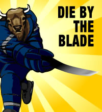
I'm a longtime reader of Die by the Blade, the new look is definitely better than the old. Not as good as this, this, or this, but nothing to complain about.
posted by troika at 1:22 PM on September 24, 2012
posted by troika at 1:22 PM on September 24, 2012
Imperfect: That "Windy City Gridiron" logo is... Well, it's evocative of a very popular internet shock-meme.
I have to wonder when I see that sort of thing, did the designer think he was sneaking in some kind of winking internet in-joke or something? I had the same reaction to that as I do when I hear the Wilhelm Scream in recent movies ("Oh, someone thinks they're clever"). But I have a bad attitude, so.
posted by troika at 1:26 PM on September 24, 2012
Sadly, at the end of the day, this is still adorning a bunch of windbags discussing sports with occasionally sycophantic communities underneath.
I admit, I pretty much only follow SBNation gifs.
posted by muddgirl at 1:39 PM on September 24, 2012
I admit, I pretty much only follow SBNation gifs.
posted by muddgirl at 1:39 PM on September 24, 2012
horrifying vision of a river choked red with blood??
Well, that's Chicago for you.
Well, it's evocative of a very popular internet shock-meme.
I suppose it could be, but sheesh, it's fine. It's pretty unfair that one outrageous image should forever sully a basic graphic design approach -- it's not like it's a swastika or anything.
posted by dhartung at 1:40 PM on September 24, 2012 [1 favorite]
'Bluebird Banter'? COME ON, ARE YOU FUCKING KIDDING ME?! Bluebirds are a group of medium-sized, mostly insectivorous or omnivorous birds in the genus Sialia of the thrush family. The Blue Jay (Cyanocitta cristata) is a passerine bird in the family Corvidae, native to North America. It is resident through most of eastern and central United States and southern Canada, although western populations may be migratory. NOT THE SAME THING.
posted by Flashman at 1:57 PM on September 24, 2012
posted by Flashman at 1:57 PM on September 24, 2012
Seriously, smokestacks for Pittsburgh? The mills have been gone for thirty five years.
posted by octothorpe at 2:32 PM on September 24, 2012
posted by octothorpe at 2:32 PM on September 24, 2012
Ugh, the Bless You Boys (Tigers) new logo is ugly.
Even little things, like the tiger covering up the thumb of the state (the mitten shape is kinda iconic, duders) and the move away from both the face of the tiger and the Gothic script is disappointing. I think BYB is one of the rare ones that had a better logo beforehand, and I guess it makes sense that it's nowhere to be found on the Bless You Boys site.
posted by klangklangston at 2:42 PM on September 24, 2012
Wow, the Lookout Landing logo is really depressing. But so are the Mariners! *rimshot*
posted by clorox at 3:32 PM on September 24, 2012 [1 favorite]
posted by clorox at 3:32 PM on September 24, 2012 [1 favorite]
Hmmph. The Twinkie Town logo looks like it got run over by a pair of bikes.
And I'm in the "soulless uniformity" camp.
Get off my lawn!!!
posted by Elly Vortex at 5:05 PM on September 24, 2012
And I'm in the "soulless uniformity" camp.
Get off my lawn!!!
posted by Elly Vortex at 5:05 PM on September 24, 2012
I thought this was great until I got to the EPL logos and then I was all HEY NOW.
posted by corvine at 5:52 PM on September 24, 2012
posted by corvine at 5:52 PM on September 24, 2012
I understand the motivation to streamline but the new Viva El Birdos logo is fugly and looks like a thumbprint. Not near as good as the old one.
posted by saul wright at 6:35 PM on September 24, 2012
posted by saul wright at 6:35 PM on September 24, 2012
What does the "SB" in "SBNation" stand for? The front page doesn't expand it, and neither does the site's about page.
posted by egypturnash at 11:13 AM on September 25, 2012
posted by egypturnash at 11:13 AM on September 25, 2012
What does the "SB" in "SBNation" stand for? The front page doesn't expand it, and neither does the site's about page.
From the first link: "Launched in 2004, SB Nation (short for Sports Blog Nation)"
posted by craven_morhead at 2:09 PM on September 25, 2012
From the first link: "Launched in 2004, SB Nation (short for Sports Blog Nation)"
posted by craven_morhead at 2:09 PM on September 25, 2012
« Older THE resource on the net for the history of GLBT... | Ben Krasnow builds neat things. Newer »
This thread has been archived and is closed to new comments
posted by curse at 11:31 AM on September 24, 2012 [3 favorites]