NFLreboot
December 5, 2012 3:40 PM Subscribe
Designer Matt McInerney is setting out to redesign every logo in the NFL as an uncomissioned fun side project. He's up to 20 of them and the results so far are pretty damn good. Fast Company has a bit more about the project.
That Titans logo is so terrible I think the team should be forced to use it this year.
posted by absalom at 3:43 PM on December 5, 2012 [14 favorites]
posted by absalom at 3:43 PM on December 5, 2012 [14 favorites]
The 49ers logo is a real improvement.
posted by vespabelle at 3:47 PM on December 5, 2012 [5 favorites]
posted by vespabelle at 3:47 PM on December 5, 2012 [5 favorites]
I love The Jets one most I think. That he got a football to evoke an airplane is kind of amazing, like the 49ers one.
The Raiders one looks scary and weird, but I love the simplified versions of the rest, like the Seahawks.
posted by mathowie at 3:51 PM on December 5, 2012
The Raiders one looks scary and weird, but I love the simplified versions of the rest, like the Seahawks.
posted by mathowie at 3:51 PM on December 5, 2012
Some are quite nice. A little too much reliance on pictures of a football. "We're playing football" is not really a message a football team needs to convey.
posted by zompist at 3:51 PM on December 5, 2012 [14 favorites]
posted by zompist at 3:51 PM on December 5, 2012 [14 favorites]
The Vikings logos really remind me of Thundercats for some reason.
On preview, zompist is right. The guy's putting footballs everywhere.
Can't wait to see what he does with the Pats, though.
posted by Rustic Etruscan at 3:54 PM on December 5, 2012
On preview, zompist is right. The guy's putting footballs everywhere.
Can't wait to see what he does with the Pats, though.
posted by Rustic Etruscan at 3:54 PM on December 5, 2012
These are a lot of a fun and a great personal project but I think also a good example of why it wouldn't make a ton of sense to have one designer build the brand ID of 32 separate clubs. That way lies madness.
I do agree that the 49ers logo is pretty sweet.
Also the Titans logo is basically a penis
posted by Doleful Creature at 3:57 PM on December 5, 2012
I do agree that the 49ers logo is pretty sweet.
Also the Titans logo is basically a penis
posted by Doleful Creature at 3:57 PM on December 5, 2012
Wow, I either really love or really hate almost all of these. Only one or two am I on the fence about.
Love: Lions, Eagles, Dolphins, Raiders, Jets, KC, Colts, Texans (v1)
Hate: Bills, Rams, Texans (alternate), Titans, Green Bay (seriously current G is perfect), Vikings, Saints, Bengals, Bears
On the fence: Seahawks, 49ers
posted by mullacc at 3:58 PM on December 5, 2012
Love: Lions, Eagles, Dolphins, Raiders, Jets, KC, Colts, Texans (v1)
Hate: Bills, Rams, Texans (alternate), Titans, Green Bay (seriously current G is perfect), Vikings, Saints, Bengals, Bears
On the fence: Seahawks, 49ers
posted by mullacc at 3:58 PM on December 5, 2012
WTF IT'S NOT THE BEARS LOGO IT'S THE CHICAGO CUBS LOGO AFTER A DISNEYWORLD VISIT FFS.
posted by eriko at 3:59 PM on December 5, 2012 [5 favorites]
posted by eriko at 3:59 PM on December 5, 2012 [5 favorites]
The Seahawks have the most perfect logo in the history of pro football. Anyone who thinks it needs to change needs to fuck right off.
posted by overeducated_alligator at 3:59 PM on December 5, 2012 [7 favorites]
posted by overeducated_alligator at 3:59 PM on December 5, 2012 [7 favorites]
Also the Titans logo is basically a penis
Well, Doctor Manhattan was a redhead before the accident.
posted by Lorin at 3:59 PM on December 5, 2012
Well, Doctor Manhattan was a redhead before the accident.
posted by Lorin at 3:59 PM on December 5, 2012
What I like most about the 49ers logo is that is captures a touch of communism for godless, socialist San Francisco.
posted by Joey Michaels at 3:59 PM on December 5, 2012 [2 favorites]
posted by Joey Michaels at 3:59 PM on December 5, 2012 [2 favorites]
"We're playing football" is not really a message a football team needs to convey.
Tell that to the NBA. Two thirds have basketballs in the logo.
posted by Gary at 4:02 PM on December 5, 2012 [1 favorite]
Tell that to the NBA. Two thirds have basketballs in the logo.
posted by Gary at 4:02 PM on December 5, 2012 [1 favorite]
The Vikings' logo looks like an owl.
posted by The Card Cheat at 4:03 PM on December 5, 2012
posted by The Card Cheat at 4:03 PM on December 5, 2012
I don't really follow football, so I have no idea how some of the originals look, but I love the Buffalo Bills one just from a how-cool-would-it-look-on-a-warhammer-40k-space-marine perspective.
posted by juv3nal at 4:04 PM on December 5, 2012 [2 favorites]
posted by juv3nal at 4:04 PM on December 5, 2012 [2 favorites]
Love the chiefs' but I'm a sucker for negative space (I guess that would probably get me ridiculed amongst the cool kids).
posted by TheShadowKnows at 4:05 PM on December 5, 2012
posted by TheShadowKnows at 4:05 PM on December 5, 2012
Both Vikings logos suck. Approved.
The Jets logo looks like a giant turd being dropped from the sky. As if they had the Three Worst Quarterbacks in the NFL. Approved.
The KC logo says "Exit K here."
Colts actually works very well, as does Seattle. The Saints works, but the football doesn't add anything. The Lions logo looks like an insurance company logo. The Texan's logo (not the alternate) may be the best of the bunch.
The Oakland Raiders are pirates, not Ninjas. HAVE YOU NOT READ THE INTERNET???
The Titans logo sucks so hard that it make makes the Packers logo look good. And, it implies that Tennessee doesn't know how to play tic-tac-toe. APPROVED WITH SPRINKLES.
The Steelers logo is based on the Throwupback uniforms. Seriously, dude, I can't do that to the Steelers.
posted by eriko at 4:06 PM on December 5, 2012 [1 favorite]
The Jets logo looks like a giant turd being dropped from the sky. As if they had the Three Worst Quarterbacks in the NFL. Approved.
The KC logo says "Exit K here."
Colts actually works very well, as does Seattle. The Saints works, but the football doesn't add anything. The Lions logo looks like an insurance company logo. The Texan's logo (not the alternate) may be the best of the bunch.
The Oakland Raiders are pirates, not Ninjas. HAVE YOU NOT READ THE INTERNET???
The Titans logo sucks so hard that it make makes the Packers logo look good. And, it implies that Tennessee doesn't know how to play tic-tac-toe. APPROVED WITH SPRINKLES.
The Steelers logo is based on the Throw
posted by eriko at 4:06 PM on December 5, 2012 [1 favorite]
The Dolphins logo would be great, if they actually looked like dolphins instead of angry mako sharks.
posted by oddman at 4:09 PM on December 5, 2012 [2 favorites]
posted by oddman at 4:09 PM on December 5, 2012 [2 favorites]
Hypocycloids or get out.
posted by octothorpe at 4:10 PM on December 5, 2012 [5 favorites]
posted by octothorpe at 4:10 PM on December 5, 2012 [5 favorites]
> "We're playing football" is not really a message a football team needs to convey.
Tell that to the NBA. Two thirds have basketballs in the logo.
With a loan from General Mills, I would start a new NBA team in Baldwin Hills: the Baldwin Hills Spacemen. Lime green uniforms with an orange basketball logo. Me coach the group solo. That's right, dolo.
posted by scose at 4:10 PM on December 5, 2012 [4 favorites]
I like some of them, but really don't like the Green Bay one. As mentioned above, the current Green Bay logo is perfect, and has worked so well that it's even used by a college football team.
Then again, part of sports logos are the memories connected to the teams that wore them. For example, while his 49er's logo is cool, the current one is awesome because it's tough to see it without thinking of the glory of the Joe Montana era.
posted by drezdn at 4:17 PM on December 5, 2012
Then again, part of sports logos are the memories connected to the teams that wore them. For example, while his 49er's logo is cool, the current one is awesome because it's tough to see it without thinking of the glory of the Joe Montana era.
posted by drezdn at 4:17 PM on December 5, 2012
Something about the Dolphins says 'sharks' to me. NY Jets is a bit twee...like a child's toy. Detroit Lions reminds me of a bank logo? Buffalo Bills looks a bit odd with the red arrow, like the skull has a goofy grin. I like the Colts, Steelers, Raiders and Bears.
posted by iamkimiam at 4:20 PM on December 5, 2012
posted by iamkimiam at 4:20 PM on December 5, 2012
So, if he gets the logos changed, will Barclays Bank have to re-issue new "NFL Extra Points" Credit Cards? (warning: link to credit card offer)
posted by oneswellfoop at 4:23 PM on December 5, 2012
posted by oneswellfoop at 4:23 PM on December 5, 2012
The Seahawks one reminds me of Art Deco for some reason. That's an era that doesn't get enough callbacks.
posted by drezdn at 4:24 PM on December 5, 2012
posted by drezdn at 4:24 PM on December 5, 2012
If anyone would like to see the somewhat NSFW, very non-PC set of team logos I made for "The Immature Football League" many years ago, memail me. This thread has inspired me to finally upload them.
Expect "Kansas City Queefs" level of maturity here.
posted by nathancaswell at 4:25 PM on December 5, 2012 [3 favorites]
Expect "Kansas City Queefs" level of maturity here.
posted by nathancaswell at 4:25 PM on December 5, 2012 [3 favorites]
I dunno. I'm normally a sucker for this sort of thing, but the only one I really feel is an improvement is the Chiefs'.
posted by The Card Cheat at 4:26 PM on December 5, 2012 [1 favorite]
posted by The Card Cheat at 4:26 PM on December 5, 2012 [1 favorite]
I'm not sure I love the new logo, but I support his idea to rename the team from the Kansas City Chiefs to the Kansas Air Fresheners.
posted by Homeboy Trouble at 4:38 PM on December 5, 2012
posted by Homeboy Trouble at 4:38 PM on December 5, 2012
I understand what he was going for with the Raiders one, but really all I see when I look at it is the gimp from Pulp Fiction.
posted by adamdschneider at 4:38 PM on December 5, 2012 [1 favorite]
posted by adamdschneider at 4:38 PM on December 5, 2012 [1 favorite]
That Rams logo...ugh. It looks more like a marble than a logo, first of all, and second, there is nothing "perfect" about the Rams—use of "perfect circles" is far from an apt metaphor.
The Eagles one looks like some unintelligible corporate logo. At least he didn't base it on the Enron logo, I guess.
The Steelers logo is awful—it looks like a clunky bunch of gold bars.
The tic-tac-toe Titans one isn't even recognizable as a logo.
You can't have a Raiders logo without pirate swords, so I'm passing on this one.
The perspective on the Jets one makes it look like the plane is bent in half, or yeah, about to drop a big one. Not good.
And yeah, the Bears one looks like it escaped from the Children's Zoo.
The ones that are actually OK: the Saints, the Chiefs, and the Vikings.
posted by limeonaire at 4:45 PM on December 5, 2012
Will the Chargers logo be:
A) A football with a lightning bolt replacing the stitching
B) A lightning bolt made of superimposed footballs
C) Something evocative of complete despair, with a lightning bolt
posted by LionIndex at 4:47 PM on December 5, 2012 [5 favorites]
A) A football with a lightning bolt replacing the stitching
B) A lightning bolt made of superimposed footballs
C) Something evocative of complete despair, with a lightning bolt
posted by LionIndex at 4:47 PM on December 5, 2012 [5 favorites]
The '49'ers logo was very surprising and whimsical, a definite improvement.
posted by Slap*Happy at 4:49 PM on December 5, 2012 [1 favorite]
posted by Slap*Happy at 4:49 PM on December 5, 2012 [1 favorite]
Will the Chargers logo be:
A) A football with a lightning bolt replacing the stitching
B) A lightning bolt made of superimposed footballs
C) Something evocative of complete despair, with a lightning bolt
D) Norv Turner's face locked in a rictus grin?
Throw in a lightning bolt and that's basically option C, though.
posted by artichoke_enthusiast at 4:55 PM on December 5, 2012 [2 favorites]
Some of these are good (49ers) others are terrible (Rams, Titans). Luckily not all of a professional sports league's logos are designed by one person. If that were so they'd all have the same glossy, smooth look that all these have.
posted by stltony at 4:55 PM on December 5, 2012
posted by stltony at 4:55 PM on December 5, 2012
I'm disappointed that he abandoned the Coast Salish-inspired Seahawks logo with a simple pun.
And is it just me or does the Lions one look like a sideways chicken wearing safety goggles?
posted by rouftop at 4:58 PM on December 5, 2012 [2 favorites]
And is it just me or does the Lions one look like a sideways chicken wearing safety goggles?
posted by rouftop at 4:58 PM on December 5, 2012 [2 favorites]
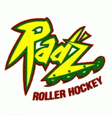
To be fair, I've been pretty jaded when it comes to sports team logos since the days of the Calgary Radz.
posted by The Card Cheat at 5:01 PM on December 5, 2012 [3 favorites]
posted by The Card Cheat at 5:01 PM on December 5, 2012 [3 favorites]
And is it just me or does the Lions one look like a sideways chicken wearing safety goggles?
Yeah, like the way that the Kansas State logo will forever look to me like a nerdy anime chick in profile.
posted by Navelgazer at 5:03 PM on December 5, 2012 [7 favorites]
Yeah, like the way that the Kansas State logo will forever look to me like a nerdy anime chick in profile.
posted by Navelgazer at 5:03 PM on December 5, 2012 [7 favorites]
Colts logo is simple, brilliant. Unfortunately the current logo is iconic, which is better.
posted by percor at 5:09 PM on December 5, 2012
posted by percor at 5:09 PM on December 5, 2012
attention everyone all the things are being redesigned
posted by threeants at 5:16 PM on December 5, 2012
posted by threeants at 5:16 PM on December 5, 2012
I hate the Eagles logo, which is the only one I care about.
posted by Drinky Die at 5:25 PM on December 5, 2012
posted by Drinky Die at 5:25 PM on December 5, 2012
The Bears logo isn't terrible but you just can't switch to the round C. You would have to include a football or people will not in fact know what sport you are talking about.
posted by restless_nomad at 5:29 PM on December 5, 2012
posted by restless_nomad at 5:29 PM on December 5, 2012
The poor Buffalo Deers (too cute to boot).
Eagles? More like fly United (they break guitars).
Chicago Pandas, Ha! (team get bought by China?)
Jets (dropping bombs, apparently). Don't they know we use drones now?
SF Golddiggers? I thought that was attributed more to LA.
Titans' (tic tac toe, woe)
I like some of these, but some are a bit literal.
Good fun, NHL up next for the snark!
posted by alicesshoe at 5:33 PM on December 5, 2012
SF Golddiggers? I thought that was attributed more to LA.
The name "'49ers" refers to the California Gold Rush of 1849.
posted by Navelgazer at 5:38 PM on December 5, 2012 [1 favorite]
The name "'49ers" refers to the California Gold Rush of 1849.
posted by Navelgazer at 5:38 PM on December 5, 2012 [1 favorite]
I hate the Eagles logo, which is the only one I care about.
posted by Drinky Die
I hate to beat a dead horse here, but that's too eponysterical to pass up.
Also, I hope he makes the Redskins one a tiny potato. Only way I can think of to make it not cringe-worthy.
posted by Ufez Jones at 5:54 PM on December 5, 2012 [3 favorites]
posted by Drinky Die
I hate to beat a dead horse here, but that's too eponysterical to pass up.
Also, I hope he makes the Redskins one a tiny potato. Only way I can think of to make it not cringe-worthy.
posted by Ufez Jones at 5:54 PM on December 5, 2012 [3 favorites]
Most of these are really awful. The Eagles and Steelers ones (right next to each other) are probably the worst designs, although giving the Browns a "logo" is probably the biggest insult. And a dog with a bone? The Eagles replaces the bird with a sad piece of layer cake, while the Steelers inexplicably abandons the United Steel theme and focuses on the black/yellow that is not a strength. Focus on letters is for baseball and showing the ball in the logo is for basketball. Not one is an improvement on what's there now.
posted by graymouser at 6:07 PM on December 5, 2012 [3 favorites]
posted by graymouser at 6:07 PM on December 5, 2012 [3 favorites]
Ugh, this is just... blech. Most of these offended me as a designer, and then the Bears one offended me as a Chicagoan. And I don't even like football!
posted by buriednexttoyou at 6:10 PM on December 5, 2012 [2 favorites]
posted by buriednexttoyou at 6:10 PM on December 5, 2012 [2 favorites]
The Lion's logo looks like a running rabbit with racing stripes...it works for me.
posted by Mojojojo at 6:31 PM on December 5, 2012
posted by Mojojojo at 6:31 PM on December 5, 2012
There are a few in here I really like, though I wouldn't replace the existing ones. These seem better suited to letterhead than football helmets, in reality (especially the Browns one. The plain burnt sienna helmet is wonderfully iconic, but the team needs a better symbol than just a picture of said helmet.)
Anyway, I actually like the Eagles one, and the one for the Texans as well. But then, I like the Brooklyn Nets designs, so what the hell do I know?
posted by Navelgazer at 6:41 PM on December 5, 2012
Anyway, I actually like the Eagles one, and the one for the Texans as well. But then, I like the Brooklyn Nets designs, so what the hell do I know?
posted by Navelgazer at 6:41 PM on December 5, 2012
Whenever I see a web-based "alternative design" project that proposes to redesign something originally intended for the mass-market, I assume that the redesign will tend towards whimsical minimalism. It doesn't matter if it's "alternative" movie posters, book covers, corporate logos, whatever - the result is usually reductive and clever. It seems that the tastes of designers themselves, and those who admire them online, are different from those of the original audience for these products. It's not like the NFL doesn't employ an army of designers and marketers to test the official logos. If the true preferences of football fans (or movie fans, for that matter) are accurately reflected in the testing, the fans favor a more complex, aggressive style. In my experience as a football fan with a family full of football fans, that preference is also reflected in their clothing, vehicles and home decor. I feel like a lot of these redesign projects should be called "NFL Logos FOR US" or "Movie Posters FOR US", "us" being people who spend a lot of time online and who like minimalism, modernism and a bit of irony. I also feel like there might be education and income level correlations with these preferences, but I don't know anything about it beyond what I have observed.
posted by ivanosky at 7:25 PM on December 5, 2012 [5 favorites]
posted by ivanosky at 7:25 PM on December 5, 2012 [5 favorites]
Well for movie posters, for one, you generally want to sell the stars, something the redesigns can't really do.
posted by Navelgazer at 7:32 PM on December 5, 2012
posted by Navelgazer at 7:32 PM on December 5, 2012
The Colts one won't work. Horseshoes have to open at the top. If you turn a horseshoe sideways, the Luck will fall out.
posted by Tavern at 7:43 PM on December 5, 2012 [3 favorites]
posted by Tavern at 7:43 PM on December 5, 2012 [3 favorites]
Now I want to see an anti-minimalist sports team logo that's just a bunch of photoshopped heads floating in space, a la every movie poster from the past 10 years.
posted by Strange Interlude at 7:51 PM on December 5, 2012
posted by Strange Interlude at 7:51 PM on December 5, 2012
I'm a little surprised how much I hate these. I appreciate the thought and effort, and that none of these are in the black and white 1920's hipster mode (looking at you Nets) but for the most part he completely misses the ethos of every team. These feel sanitized: They're all just too... clean.
The Colts logo, for example, does he understand the significance of an upright horseshoe? Or is getting an easy "C" more a priority?
I especially hate the Browns logo. There's something kind of lovable about a football team whose logo is a football helmet. Bringing in the Dawg Pound felt like he was searching for a mascot when there already is one - the whole damned team.
posted by elwoodwiles at 8:04 PM on December 5, 2012
I think the Saints one is pretty lame. He just added a football to the fleur-de-lis. As zompist said, we know they're a football team.
posted by brundlefly at 8:15 PM on December 5, 2012 [1 favorite]
posted by brundlefly at 8:15 PM on December 5, 2012 [1 favorite]
if he had somehow slipped past the pre-qualify submission, actually got a contract, and made a presentation to me, I'd terminate his ass asap for driveling this Hello Kitty Clip Art under my roof.
posted by wallstreet1929 at 8:34 PM on December 5, 2012
posted by wallstreet1929 at 8:34 PM on December 5, 2012
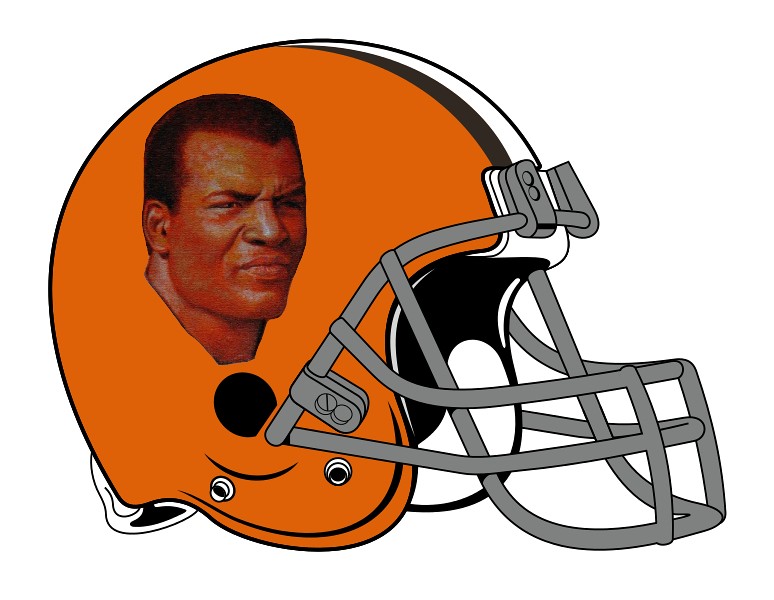
I especially hate the Browns logo.... he was searching for a mascot when there already is one - the whole damned team.
I'm with you, I love the brown helmet logo. But if it had to be changed, it would be cool if they just used their best player/namesake ever as their logo. Something like this.
My dream is for the team I root for to shorten their name from the horribly racist Redskins to just "Skins" at the same time that technology allows pads, jerseys, and helmets to be perfectly transparent. Then on the home scoreboard, no matter who they are playing, their opponents can be listed as "SHIRTS."
posted by Ice Cream Socialist at 8:39 PM on December 5, 2012 [6 favorites]
I'm with elwoodwiles, these are less than impressive. I guess they are just meant as quick design challenges, but even as exercises in minimal design there are little inconsistencies all over the place. Look at the weird differences in line width in the Eagles logo, or the odd way that he seems to be aiming for super-flat, minimal shapes but also throws in unnecessary curved lines to indicate shininess (like the Vikings helmet and the 49ers). The eyes on the Browns dog are not symmetrical. Overall, a lot of the designs just don't have a good sense of proportion or consistency, and the design concepts are not particularly meaningful. For me, getting these little details right would be the fun part of a project like this. So I'm not sure what he's going for.
posted by oulipian at 8:43 PM on December 5, 2012 [1 favorite]
posted by oulipian at 8:43 PM on December 5, 2012 [1 favorite]
The Seahawks have the most perfect logo in the history of pro football. Anyone who thinks it needs to change needs to fuck right off.
The Seahawks logo needs to change back to it's original NW Native art inspired design, which remains the best thing ever put on a sports uniform. So much better than the new "aggro" Hawk. Even though the new hawk is still better than 80% of the rest of the new-school NFL logos.
I've always enjoyed the Steelers sharing their logo with the US Steel corporation.
The Rams were the first team to put logos on helmets, handpainted by a player with a bit of an artistic streak. The logo remains pretty much the same to this day.
Also, the old Tampa Bay Buccaneers logo really needs to make a comeback. It was all kinds of saucy.
posted by billyfleetwood at 8:43 PM on December 5, 2012
If you're going to give the Browns a mascot, don't use the damn dogs.
Use this one!
Nothing suits the current team better than a fairy that will clean your house if you leave food out for it.
posted by charred husk at 8:47 PM on December 5, 2012 [1 favorite]
Use this one!
Nothing suits the current team better than a fairy that will clean your house if you leave food out for it.
posted by charred husk at 8:47 PM on December 5, 2012 [1 favorite]
More about the Seahawks original helmet design.
posted by The Hamms Bear at 9:30 PM on December 5, 2012
posted by The Hamms Bear at 9:30 PM on December 5, 2012
Before reading a single comment, I'd just like to say that they are all horrible, except for the last one. The Texans logo is quite good.
posted by spock at 9:42 PM on December 5, 2012 [1 favorite]
posted by spock at 9:42 PM on December 5, 2012 [1 favorite]
Navelgazer: Yeah, like the way that the Kansas State logo will forever look to me like a nerdy anime chick in profile.
What is seen, cannot be unseen.
posted by kilozerocharliealphawhiskey at 10:04 PM on December 5, 2012 [2 favorites]
What is seen, cannot be unseen.
posted by kilozerocharliealphawhiskey at 10:04 PM on December 5, 2012 [2 favorites]
What is seen, cannot be unseen.
They look identical to me because both feature a cat with its mouth locked around a spewing--uh, doorknob.
posted by fleacircus at 11:15 PM on December 5, 2012
They look identical to me because both feature a cat with its mouth locked around a spewing--uh, doorknob.
posted by fleacircus at 11:15 PM on December 5, 2012
"I'm disappointed that he abandoned the Coast Salish-inspired Seahawks logo with a simple pun."
Heh. That link is actually all about how the Coast Salish didn't have totems.
posted by klangklangston at 11:56 PM on December 5, 2012
Heh. That link is actually all about how the Coast Salish didn't have totems.
posted by klangklangston at 11:56 PM on December 5, 2012
Funny. I'm from New Orleans, and to be honest I don't give a damn about football. But that Saints logo is wrong, wrong, wrong. It's not so much the football at the top, it's the fact that he chopped off the bottom of the fleur-de-lis. Oh, and making it silver and black instead of gold and black is pretty damn wrong, too.
See, he's missing some important local symbolism there. There is a particular variant of the fleur-de-lis that is very much the New Orleans version. And the Saints' symbol is very close to that. The one he's drawn barely resembles a fleur-de-lis at all.
This has gotten more important since Katrina; you see a LOT of fleur-de-lis imagery around town nowadays; it's been revived as a symbol of the city as people pushed to get the place back together.
Bonus note on color: Yeah um basically if you want something to say "New Orleans" you want a hint of Mardi Gras colors: purple/green/gold. The Saints' color scheme has always been black/white/gold; the current Saints logo is, guess what, a gold fleur-de-lis with white/black borders. His is black and warm grey.
If the Saints announced they were switching to his logo, I think half the city would have a shit-fit. Hell, I don't give a damn about football, or live in New Orleans any more, and I'd express dismay. (It also doesn't help that there have been all of two logos for the entire life of the team, and the second one was pretty much just a palette swap and slight re-proportioning of the first.)
Admittedly he does say in the Fast Company interview that "There are plenty of marks here that I wouldn’t consider completely successful", maybe he's aware of some of the issues with the Saints logo.
I am very surprised to have this much to say about some dude's redesign exercise of freakin' NFL logos. Also holy crap if I ever get involved in redesigning an NFL logo I am going to want the big bucks because I now know that doing it right will involve some deep research and testing to make sure it respects whatever local symbolism may be in the logo.
Still. "Make new logos for a league of sports teams" is certainly a good exercise. I'll give him that.
posted by egypturnash at 12:28 AM on December 6, 2012 [3 favorites]
Ugh.
Reducing disparate team logos into one big homogenized mass might be a fun exercise, but it utterly fails in the task of giving/preserving a unique identity for each team. These are yet another example of "Designer applies his one-trick style onto everything, and misses the bigger point".
Logos exist to stand as a unique identifier. The wide array of existing logos in the NFL speak volumes to the league's history. It's a selling point, not something to be remedied and unified.
So, yeah, nice exercise. Hope it doesn't go any further than that.
And, for the record, the Colts re-do blows. I get that it's a "C" for "Colts". But, by laying the horseshoe on its side, you lose the immediate recognition of it as a horseshoe, and create an immediate sense of confusion as people try to determine which "C" city the logo represents. Did the Colts move to Chicago? Connorsville? Big, big fail. If I were still teaching design, I'd savage that thing during critique.
posted by Thorzdad at 4:42 AM on December 6, 2012 [2 favorites]
By the way - remember that designer who took it upon herself to create logos for 10,000 lakes in Minnesota? To the shock and dismay of absolutely nobody, she's given up.
posted by davebush at 6:50 AM on December 6, 2012 [1 favorite]
posted by davebush at 6:50 AM on December 6, 2012 [1 favorite]
Not only is the Steelers one terrible, he spelled Pittsburgh wrong in the tags.
posted by Chrysostom at 9:36 AM on December 6, 2012
posted by Chrysostom at 9:36 AM on December 6, 2012
Logos don't need to be "clever" (oh look, the jet is a football!) to be effective.
posted by davebush at 9:43 AM on December 6, 2012
posted by davebush at 9:43 AM on December 6, 2012
I like these because it makes me appreciate the current NFL Logos, many of which are a bit 1970's kitsch but are so much better than these.
posted by cell divide at 9:44 AM on December 6, 2012
posted by cell divide at 9:44 AM on December 6, 2012
« Older Goldberg: 1 - Newton: 0 | “It’s, I’m, uh … it’s an erotic epic poem.” Newer »
This thread has been archived and is closed to new comments
posted by nathancaswell at 3:42 PM on December 5, 2012 [1 favorite]