A world of equal districts
September 16, 2013 10:08 PM Subscribe
As much as I applaud any effort to separate Melbourne from Sydney, I don't think becoming part of the SA/WA axis is really a win.
I suggest we join Vic with Tas and NZ, and then dig up the rest of Aus and ship it to China.
posted by pompomtom at 10:25 PM on September 16, 2013 [3 favorites]
I suggest we join Vic with Tas and NZ, and then dig up the rest of Aus and ship it to China.
posted by pompomtom at 10:25 PM on September 16, 2013 [3 favorites]
This is really interesting. Especially because much of the world looks more-or-less similar in its distribution of big and little countries, except Asia and the subcontinent and Indonesia, which are all suddenly a million tiny countries. Striking.
posted by LobsterMitten at 10:30 PM on September 16, 2013 [3 favorites]
posted by LobsterMitten at 10:30 PM on September 16, 2013 [3 favorites]
Huh, I had no idea there were population densities like that in central Africa.
Thanks for posting this.
posted by Tell Me No Lies at 10:35 PM on September 16, 2013 [3 favorites]
Thanks for posting this.
posted by Tell Me No Lies at 10:35 PM on September 16, 2013 [3 favorites]
pompomtom, that is what we are already doing, yes?
posted by deadwax at 10:39 PM on September 16, 2013 [5 favorites]
posted by deadwax at 10:39 PM on September 16, 2013 [5 favorites]
Just think of all the wars we could have!
posted by a humble nudibranch at 10:46 PM on September 16, 2013 [5 favorites]
posted by a humble nudibranch at 10:46 PM on September 16, 2013 [5 favorites]
In my plan, we keep the Latrobe Valley (sorry China!), but dig up and export Sydney (sorry China!).
posted by pompomtom at 10:46 PM on September 16, 2013 [5 favorites]
posted by pompomtom at 10:46 PM on September 16, 2013 [5 favorites]
Just think of all the wars we could have!
We can finally start that 665 player Risk game!
posted by FJT at 10:53 PM on September 16, 2013 [17 favorites]
We can finally start that 665 player Risk game!
posted by FJT at 10:53 PM on September 16, 2013 [17 favorites]
The population density in central Africa was discussed by Jared Diamond (whether in Guns, Germs, and Steel or Collapse I can't recall now) as a major factor in the Rwandan genocide of the 1990s. Subsistence farmers had subdivided their plots so that everyone in their large families could inherit land, until the typical farm size was somewhere under an acre. Diamond interviewed some Rwandans who claimed to have through that war was inevitable, just because there were too many people.
posted by fantabulous timewaster at 10:59 PM on September 16, 2013 [1 favorite]
posted by fantabulous timewaster at 10:59 PM on September 16, 2013 [1 favorite]
Wasn't that also a major problem in Europe until it was solved by primogeniture?
posted by Harald74 at 11:28 PM on September 16, 2013 [1 favorite]
posted by Harald74 at 11:28 PM on September 16, 2013 [1 favorite]
Great visualization tool, but I can't imagine it working in reality. Fat chance you could convince the disparate peoples lumped together in some of the larger districts to get along peacefully, nor keep them from almost immediately fall into internecine chaos. I mean good lord, right here in the US parts of some states can't stand the other parts, and we're supposed to all be one country!
posted by Greg_Ace at 11:32 PM on September 16, 2013
posted by Greg_Ace at 11:32 PM on September 16, 2013
This would be cool to compare to another map done the same but with income ...
posted by chapps at 11:54 PM on September 16, 2013 [3 favorites]
posted by chapps at 11:54 PM on September 16, 2013 [3 favorites]
World map divided into 665 equally populated districts
I VOLUNTEER AS TRIBUTE!
posted by radwolf76 at 12:01 AM on September 17, 2013 [12 favorites]
I VOLUNTEER AS TRIBUTE!
posted by radwolf76 at 12:01 AM on September 17, 2013 [12 favorites]
why 665? why not one more? that would be so much more symmetrical.
posted by philip-random at 12:02 AM on September 17, 2013 [7 favorites]
posted by philip-random at 12:02 AM on September 17, 2013 [7 favorites]
Nice idea, but not sure about that projection when area seems significant.
posted by TheophileEscargot at 12:03 AM on September 17, 2013 [7 favorites]
posted by TheophileEscargot at 12:03 AM on September 17, 2013 [7 favorites]
Alaska and the Canadian and US west coast seem to be missing?
posted by Pruitt-Igoe at 1:06 AM on September 17, 2013
posted by Pruitt-Igoe at 1:06 AM on September 17, 2013
Wasn't that also a major problem in Europe until it was solved by primogeniture?
I think that's one of those questions that can't be answered properly in less than 40,000 words.
posted by Segundus at 1:31 AM on September 17, 2013 [2 favorites]
I think that's one of those questions that can't be answered properly in less than 40,000 words.
posted by Segundus at 1:31 AM on September 17, 2013 [2 favorites]
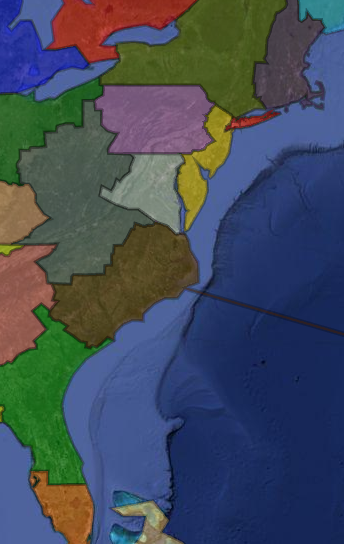
Typically, Rhode Island gets subsumed. What about the coffee milk? (In reality, coffee milk is disgusting. This would be for the best.)
posted by GenjiandProust at 2:37 AM on September 17, 2013 [1 favorite]
posted by GenjiandProust at 2:37 AM on September 17, 2013 [1 favorite]
Typically, Rhode Island gets subsumed.
Nah, Rhode Island's in that little New England blob, right where it should be. Right next to its mommy, Connecticut, and its daddy, Massachusetts.
Maine north of about Cumberland County got handed over to the Maritimes, and that's great.
posted by Mayor Curley at 2:59 AM on September 17, 2013 [4 favorites]
Typically, Rhode Island gets subsumed.
Nah, Rhode Island's in that little New England blob, right where it should be. Right next to its mommy, Connecticut, and its daddy, Massachusetts.
Take it back take it BACK!
posted by Mrs. Pterodactyl at 3:18 AM on September 17, 2013 [4 favorites]
Nah, Rhode Island's in that little New England blob, right where it should be. Right next to its mommy, Connecticut, and its daddy, Massachusetts.
Take it back take it BACK!
posted by Mrs. Pterodactyl at 3:18 AM on September 17, 2013 [4 favorites]
Frankly I find the absorption of Vermont into NY offensive. Western Connecticut, maybe.
posted by Elementary Penguin at 3:23 AM on September 17, 2013
posted by Elementary Penguin at 3:23 AM on September 17, 2013
I see they've divided the British Isles into seven kingdoms. Interesting.
posted by Acheman at 3:48 AM on September 17, 2013 [2 favorites]
posted by Acheman at 3:48 AM on September 17, 2013 [2 favorites]
Now do it with a better map projection that doesn't show Greenland as big as Africa.
posted by panaceanot at 3:55 AM on September 17, 2013 [6 favorites]
posted by panaceanot at 3:55 AM on September 17, 2013 [6 favorites]
We can finally start that 665 player Risk game!
Oh my Glob, 665 person Diplomacy.
posted by Rock Steady at 4:31 AM on September 17, 2013 [2 favorites]
Oh my Glob, 665 person Diplomacy.
posted by Rock Steady at 4:31 AM on September 17, 2013 [2 favorites]
Laos passes through the fire unscathed? Who else?
posted by Meatbomb at 4:33 AM on September 17, 2013
posted by Meatbomb at 4:33 AM on September 17, 2013
Greece although due to the colour chosen it looks as if Peloponnese and the rest of mainland Greece is a unified land mass.
Portugal looks the same too.
posted by ersatz at 4:40 AM on September 17, 2013
Portugal looks the same too.
posted by ersatz at 4:40 AM on September 17, 2013
Regarding the map projection: this was done in Google Maps/Earth. They don't really give you a choice.
posted by troika at 4:44 AM on September 17, 2013
posted by troika at 4:44 AM on September 17, 2013
In the 38-State map, Biscayne (i.e. Florida) loses Pensacola and gains the Okeefenokee?
I'm OK with that!
posted by oddman at 4:48 AM on September 17, 2013
I'm OK with that!
posted by oddman at 4:48 AM on September 17, 2013
Now do one with equal allocation of resources!
posted by The 10th Regiment of Foot at 5:04 AM on September 17, 2013 [4 favorites]
posted by The 10th Regiment of Foot at 5:04 AM on September 17, 2013 [4 favorites]
In the 38-State map: "Other city populations which cross State lines are Washington, D.C., St. Louis, Chicago, and Kansas City. The "straddling" of State lines causes economic and political problems. "
So I'm assuming that this was drawn in 1975... and is already outdated. Charlotte has grown exponentially since then. Where it previously straddled an E/W boundary the new map now has it straddling a N/S boundary... completely negating the point of redrawing the lines.
So what... do we redraw the map with every census? Or is my pointing out the futility part of the exercise?
posted by Blue_Villain at 5:12 AM on September 17, 2013 [1 favorite]
This is a fine geographic experiment, but gains nothing layered over the dark google background with transparency.
posted by bendybendy at 5:22 AM on September 17, 2013
posted by bendybendy at 5:22 AM on September 17, 2013
Looks like we'd... better know a district.
But seriously, I'm pretty sure someone out there has made a Civ mod that allows for 665 teams.
posted by Z. Aurelius Fraught at 5:25 AM on September 17, 2013
But seriously, I'm pretty sure someone out there has made a Civ mod that allows for 665 teams.
posted by Z. Aurelius Fraught at 5:25 AM on September 17, 2013
Alaska and the Canadian and US west coast seem to be missing?
A few more pictures from the second page of the blog. Alaska's still not depicted, but it's probably safe to assume that it's part of the big green district that covers much of the Canadian Arctic.
posted by Johnny Assay at 5:34 AM on September 17, 2013
A few more pictures from the second page of the blog. Alaska's still not depicted, but it's probably safe to assume that it's part of the big green district that covers much of the Canadian Arctic.
posted by Johnny Assay at 5:34 AM on September 17, 2013
What really leapt out at me is (1) map projections sure do make the poles look big, and (2) population density tends to be pretty low in areas that are less hospitable (deserts, the artic, really dense rain forest...).
posted by Karmakaze at 5:34 AM on September 17, 2013
posted by Karmakaze at 5:34 AM on September 17, 2013
I expect to see this map again in a forwarded email from my conspiracy theorist uncle with some nonsense about Obama, Freemasons, Agenda 21 and world government.
posted by Ham Snadwich at 5:52 AM on September 17, 2013 [9 favorites]
posted by Ham Snadwich at 5:52 AM on September 17, 2013 [9 favorites]
You can see a big chunk of Alaska in the pacific rim image. It is indeed part of the big green western canada and arctic region.
posted by Mitheral at 5:52 AM on September 17, 2013
posted by Mitheral at 5:52 AM on September 17, 2013
Typically, Rhode Island gets subsumed. What about the coffee milk? (In reality, coffee milk is disgusting. This would be for the best.)
I had coffee milk for the first time last month and it was delicious. I loved it. I was told it's "not usually that good," but I really enjoyed it. I was as surprised as anyone.
posted by Bulgaroktonos at 6:01 AM on September 17, 2013 [1 favorite]
I had coffee milk for the first time last month and it was delicious. I loved it. I was told it's "not usually that good," but I really enjoyed it. I was as surprised as anyone.
posted by Bulgaroktonos at 6:01 AM on September 17, 2013 [1 favorite]
District 666 is just Roger Ailes in a space station
posted by East Manitoba Regional Junior Kabaddi Champion '94 at 6:02 AM on September 17, 2013 [5 favorites]
posted by East Manitoba Regional Junior Kabaddi Champion '94 at 6:02 AM on September 17, 2013 [5 favorites]
Rock Steady: "Oh my Glob, 665 person Diplomacy."
I think that might result in an actual war.
posted by schmod at 6:26 AM on September 17, 2013 [2 favorites]
I think that might result in an actual war.
posted by schmod at 6:26 AM on September 17, 2013 [2 favorites]
District 666 is just Roger Ailes in a space station
Please, District 666 is the home of the hellish underlords. The population of which matches these averages perfectly. Coincidence?
Technically, not a coincidence; just totally made up.
posted by GenjiandProust at 6:30 AM on September 17, 2013
Please, District 666 is the home of the hellish underlords. The population of which matches these averages perfectly. Coincidence?
Technically, not a coincidence; just totally made up.
posted by GenjiandProust at 6:30 AM on September 17, 2013
I had coffee milk for the first time last month and it was delicious. I loved it.
Well, I'm pleased you found pleasure in our local foodways and waitaminute... was it Autocrat or Eclipse brand? It better not have been Eclipse. We don't need any more of that kind around here. Almost as bad as the degenerates who prefer red chowder. Almost.
posted by Slap*Happy at 6:38 AM on September 17, 2013 [3 favorites]
As a resident of the nation-state that now apparently includes Bermuda, I heartily approve of this plan, and will begin looking for beachside apartments immediately.
posted by Rock Steady at 7:07 AM on September 17, 2013
posted by Rock Steady at 7:07 AM on September 17, 2013
But the big question is could this map have been rendered with only four colours?
posted by ricochet biscuit at 7:12 AM on September 17, 2013 [1 favorite]
posted by ricochet biscuit at 7:12 AM on September 17, 2013 [1 favorite]
Let the gerrymandering begin!
posted by Kabanos at 7:16 AM on September 17, 2013 [3 favorites]
posted by Kabanos at 7:16 AM on September 17, 2013 [3 favorites]
Now do one with equal allocation of resources!
This would be fascinating if there was a sane methodology for doing it, but in practice it would be a huge headache.
Luckily, I'm the sort of weirdo who thinks methodological headaches are also fascinating. I wonder what percentage of human wealth can even be allocated to a specific spot on a map?
posted by Now there are two. There are two _______. at 8:00 AM on September 17, 2013
Makes you really appreciate what they've accomplished in India. All those little countries with different wants and needs and geographies and histories and somehow they keep it together. Amazing.
posted by Phreesh at 8:02 AM on September 17, 2013
posted by Phreesh at 8:02 AM on September 17, 2013
I guess one easy way to do it would be to limit the question to extractable commodities — oil, minerals, lumber, crops, whatever. Though then you'd need to move the borders every time commodity prices shifted....
posted by Now there are two. There are two _______. at 8:02 AM on September 17, 2013
posted by Now there are two. There are two _______. at 8:02 AM on September 17, 2013
Those Left Behind dudes warned me about this.
posted by Apocryphon at 8:29 AM on September 17, 2013
posted by Apocryphon at 8:29 AM on September 17, 2013
Land use: Wasn't that also a major problem in Europe until it was solved by primogeniture?
I believe primogeniture in Europe solved several problems: for example, the occupation of Jerusalem, and the population problem in the Caribbean. These were land use issues of a sort, too. Not everyone can be a priest.
Back to your regularly scheduled zoning.
posted by mule98J at 8:53 AM on September 17, 2013
Man, now I really want to see the World Cup tables for all these regions/nations. Let's go, green-place-where-I-live!
posted by grubi at 8:56 AM on September 17, 2013 [2 favorites]
posted by grubi at 8:56 AM on September 17, 2013 [2 favorites]
Let's go, green-place-where-I-live!
I'm originally from Gold-Place-Where-I-Was-Born (New Jersaware), but have lived in Yellow-Place-Where-They-Love-College-Football (Missabamassee), Brown-Place-With-Tobacco (Caroginia), Green-Place-Where-It's-Also_Mexico (Texico), Giant-Green-Place (Alaskanada), and Green-Place-Where-I-Live (Florigialina).
One day I hope to visit Purple-Place-Where-Some-of-My-Ancestors-Came-From (Midlanglia).
posted by grubi at 9:04 AM on September 17, 2013 [1 favorite]
I expect to see this map again in a forwarded email from my conspiracy theorist uncle with some nonsense about Obama, Freemasons, Agenda 21 and world government.
You should reply you think it's an Agenda 23 plan and why do They want you to think it's Agenda 21?
posted by ersatz at 9:14 AM on September 17, 2013 [2 favorites]
You should reply you think it's an Agenda 23 plan and why do They want you to think it's Agenda 21?
posted by ersatz at 9:14 AM on September 17, 2013 [2 favorites]
About a resources map; it's hard to compare resources in the abstract, but economic activity and GDP can be compared. Map showing GDP per square kilometer.
posted by Triplanetary at 9:52 AM on September 17, 2013 [3 favorites]
posted by Triplanetary at 9:52 AM on September 17, 2013 [3 favorites]
Interesting. I didn't realize that GDP was a meaningful measurement on a level smaller than a country. (N.B. this probably just means that I don't have a good handle on what a GDP is in the first place....)
posted by Now there are two. There are two _______. at 12:10 PM on September 17, 2013
posted by Now there are two. There are two _______. at 12:10 PM on September 17, 2013
grubi: I'm originally from Gold-Place-Where-I-Was-Born (New Jersaware), but have lived in Yellow-Place-Where-They-Love-College-Football (Missabamassee), Brown-Place-With-Tobacco (Caroginia), Green-Place-Where-It's-Also_Mexico (Texico), Giant-Green-Place (Alaskanada), and Green-Place-Where-I-Live (Florigialina).
You joke, but If I knew Asian and African geography and history better I would try and name them all.
posted by Rock Steady at 1:29 PM on September 17, 2013 [1 favorite]
You joke, but If I knew Asian and African geography and history better I would try and name them all.
posted by Rock Steady at 1:29 PM on September 17, 2013 [1 favorite]
Interesting. I didn't realize that GDP was a meaningful measurement on a level smaller than a country.
To me, it looks like they have multiplied national GDP by local population density. I still don't know if this is meaningful, but I guess it's more or less people who do the domestic production, so it could work.
posted by Jimbob at 2:14 PM on September 17, 2013
To me, it looks like they have multiplied national GDP by local population density. I still don't know if this is meaningful, but I guess it's more or less people who do the domestic production, so it could work.
posted by Jimbob at 2:14 PM on September 17, 2013
WHY IS THIS A TUMBLR?
posted by chevyvan at 3:26 PM on September 17, 2013 [1 favorite]
posted by chevyvan at 3:26 PM on September 17, 2013 [1 favorite]
is there any explanation of data sources or methodology or do I have to sentence another person to death?
posted by desjardins at 4:39 PM on September 17, 2013 [2 favorites]
posted by desjardins at 4:39 PM on September 17, 2013 [2 favorites]
I know the guy who made this map and asked about sources, he says: A variety of sources but the two most significant were wikipedia (including foreign language wikipedia especially for east asia) and city populations.de
He's planning on adding more about methodology to the tumblr.
posted by troika at 5:18 PM on September 17, 2013
He's planning on adding more about methodology to the tumblr.
posted by troika at 5:18 PM on September 17, 2013
Anyone have a link to the actual Google Maps overlay instead of just the images on tumblr?
posted by pravit at 6:53 PM on September 17, 2013 [1 favorite]
posted by pravit at 6:53 PM on September 17, 2013 [1 favorite]
« Older La Cosa Patento | The map is not the story Newer »
This thread has been archived and is closed to new comments
posted by Jimbob at 10:19 PM on September 16, 2013