A Hundred Bucks Says You Won't Read This Story
December 9, 2013 1:24 PM Subscribe
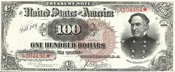
Esquire's Chris Jones looks at the old techniques used to make the new US $100 bill.
Related: EURion constellation
It had a passing reference in the article, but makes interesting reading on its own.
posted by cjorgensen at 1:45 PM on December 9, 2013 [1 favorite]
It had a passing reference in the article, but makes interesting reading on its own.
posted by cjorgensen at 1:45 PM on December 9, 2013 [1 favorite]
Can one still spend the old, small portrait, non-security-strip $20 bills?
They're still legal tender, but private businesses can refuse them, so don't go off on the guy working an overnight shift at the 7-11 who thinks it looks weird.
posted by Etrigan at 1:49 PM on December 9, 2013
They're still legal tender, but private businesses can refuse them, so don't go off on the guy working an overnight shift at the 7-11 who thinks it looks weird.
posted by Etrigan at 1:49 PM on December 9, 2013
Unless you're more of a player than we think you are
Esquire thinks I'm less of a player?
This is a great article, once you get past the weird put-down or ironic compliment.
posted by Blazecock Pileon at 1:54 PM on December 9, 2013 [1 favorite]
Esquire thinks I'm less of a player?
This is a great article, once you get past the weird put-down or ironic compliment.
posted by Blazecock Pileon at 1:54 PM on December 9, 2013 [1 favorite]
I want to see more images from the actual design process. All of Thompson's sketches from the process... Yeah, the machines are cool, but let me see his moleskine!
Interesting article, thank you.
posted by Grandysaur at 2:05 PM on December 9, 2013
Interesting article, thank you.
posted by Grandysaur at 2:05 PM on December 9, 2013
This article fails to highlight the best part of the new $100 bills, namely the fact that they were clearly designed in microsoft word using clip art.
posted by elizardbits at 2:09 PM on December 9, 2013 [1 favorite]
posted by elizardbits at 2:09 PM on December 9, 2013 [1 favorite]
Simply fascinating. Thanks.
posted by brokeaspoke at 2:13 PM on December 9, 2013
posted by brokeaspoke at 2:13 PM on December 9, 2013
I own that drafting brush. It is one of my most prized possessions. Charette #3650.
posted by Teakettle at 2:37 PM on December 9, 2013
posted by Teakettle at 2:37 PM on December 9, 2013
Weirdly, in this image, the watercolor set is crap--a Pelikan set of elementary school grade pan colors. I suppose that color work isn't a huge part of it outside of mockups, especially since their colors are apparently carefully designed by computers to be difficult, if not impossible, to reproduce by camera or photocopier, but still, you'd think they could spring for a Cotman travel set, at least.
posted by fatbird at 2:43 PM on December 9, 2013
posted by fatbird at 2:43 PM on December 9, 2013
New money is so ugly. No, I mean the actual money. It's ugly. Especially the coins. They don't even SOUND like real money anymore.
Now if you'll excuse me, there are some clouds that I need to go yell at.
posted by entropicamericana at 3:38 PM on December 9, 2013 [10 favorites]
Now if you'll excuse me, there are some clouds that I need to go yell at.
posted by entropicamericana at 3:38 PM on December 9, 2013 [10 favorites]
I don't see how adding a simple gradient is suddenly means it was designed in Word, especially since the example given in that buzzfeed link has a lot more shading to make the digits look 3D.
posted by ckape at 3:56 PM on December 9, 2013 [3 favorites]
posted by ckape at 3:56 PM on December 9, 2013 [3 favorites]
I've always thought it was ridiculous that the US refuses to go over to dollar coins (discussed peripherally here with regard to dollar bill designs). I have a peculiar liking for the things, which most people regard as some kind of curse you incur from using a twenty to buy a ticket for a MetroCard or PATCO, or at a self-service parking lot. I always have one in the pocket of my winter coat, even though I never spend it, through force of habit. The dollar bill at this point feels wasteful.
What was fascinating in this article is the love and care put into dollar bill designs, while most people I've heard voicing an opinion on recent US currency hold that it looks garish and awful.
posted by graymouser at 3:58 PM on December 9, 2013 [1 favorite]
What was fascinating in this article is the love and care put into dollar bill designs, while most people I've heard voicing an opinion on recent US currency hold that it looks garish and awful.
posted by graymouser at 3:58 PM on December 9, 2013 [1 favorite]
> This article fails to highlight the best part of the new $100 bills, namely the fact that they were clearly designed in microsoft word using clip art.
What? no. They don't look alike at all. The shapes of the characters are completely different. Color doesn't even have to be a consideration.
Granted the big splash of "100" on the new bill is just as ugly as the one in MS Word, but if they actually look alike to anybody, all I can surmise is that the Fed did this specifically to make it easy to spot the stupid forgers.
posted by ardgedee at 4:05 PM on December 9, 2013 [1 favorite]
Well, it is pretty ugly money, and you've still got the God stuff on the back. It looks like it was designed by a committee. ...in a dark room.
Canada's got the cool coloured polymer money that you can see through and Science! on the back of ours: the discovery of insulin, a DNA strand, and an ECG. And a woman scientist doing the Science! because Why The Hell NOT?
You guys should march for nicer money. Or at least send a stern email.
posted by Zack_Replica at 4:24 PM on December 9, 2013
The engravings on USA money are much more beautifully executed than any other currency I've seen. Our color palette and designs aren't always great but those engravers have got to be the cream of the crop.
posted by scose at 4:27 PM on December 9, 2013
posted by scose at 4:27 PM on December 9, 2013
But recently, Americans decided they liked jeans that stretched, so jeans companies began adding spandex to their fabric. Money with spandex in it wouldn't be money anymore ...
But adding spandex would make your dollar go further.
posted by Joe in Australia at 4:36 PM on December 9, 2013 [5 favorites]
But adding spandex would make your dollar go further.
posted by Joe in Australia at 4:36 PM on December 9, 2013 [5 favorites]
...the most coveted bill in the world...
Think I'd prefer a €500, but people are strange.
posted by pompomtom at 4:46 PM on December 9, 2013 [3 favorites]
Think I'd prefer a €500, but people are strange.
posted by pompomtom at 4:46 PM on December 9, 2013 [3 favorites]
He was nineteen when he began working at the bureau, a talented high school art student with no formal training in currency design.
That just makes me wonder where one would get formal training in currency design other than working for the Bureau of Engraving and Printing or a foreign equivalent.
posted by ckape at 4:48 PM on December 9, 2013 [1 favorite]
That just makes me wonder where one would get formal training in currency design other than working for the Bureau of Engraving and Printing or a foreign equivalent.
posted by ckape at 4:48 PM on December 9, 2013 [1 favorite]
It's a bit like Nuclear Submarine Operation; there are only a few organizations that do it. Although some countries outsource their money printing.
posted by Monday, stony Monday at 4:50 PM on December 9, 2013
posted by Monday, stony Monday at 4:50 PM on December 9, 2013
I love articles like this, but I really miss the artwork and design of the old US currency, so I keep old bills whenever I happen to get them as change. Unfortunately this happens less and less.
posted by freakazoid at 4:54 PM on December 9, 2013
posted by freakazoid at 4:54 PM on December 9, 2013
Well, it is pretty ugly money, and you've still got the God stuff on the back.
LIAR! Any hunnert dollar bill in my pocket is a thing of awesome beauty.
They're still legal tender, but private businesses can refuse them, so don't go off on the guy working an overnight shift at the 7-11 who thinks it looks weird.
I gotpanties twenties older than some of those 7-11 clerks.
Canadian money FTW!
posted by BlueHorse at 5:06 PM on December 9, 2013 [1 favorite]
LIAR! Any hunnert dollar bill in my pocket is a thing of awesome beauty.
They're still legal tender, but private businesses can refuse them, so don't go off on the guy working an overnight shift at the 7-11 who thinks it looks weird.
I got
Canadian money FTW!
posted by BlueHorse at 5:06 PM on December 9, 2013 [1 favorite]
Can one still spend the old, small portrait, non-security-strip $20 bills?
International data point: When I was on Socotra in March, my translator told me that the local exchange guy had a policy of refusing the "new" $20 bills because he hadn't seen enough of them to know if they were real. So I was forced to use as many old $20s as I had in my possession ... which, in 2013, was not very many. He actually did refuse my newer bills all throughout my stay until, at the absolute end of my cash flow, I basically had to beg him to take my new ones.
posted by mykescipark at 5:09 PM on December 9, 2013
I respect the craft a lot, but I hate the drift towards the look and feel of Monopoly money. I want pictures of mean men probably packing heat and a promise to give me precious metal on demand. In time I suppose we will get the money we deserve.
posted by IndigoJones at 5:25 PM on December 9, 2013 [2 favorites]
posted by IndigoJones at 5:25 PM on December 9, 2013 [2 favorites]
We got paid a couple weeks ago at the shop, a couple of these new hundreds for a new set of O2 sensors in a pickup truck. Upon seeing the bills in the hand of the customer, a friend, my brother-in-law (the boss) actually said, "What the fuck is *that*?!?"
In other numismatic apocrypha, when I first got my camera converted to infrared, I was taking pictures of "still life"--whatever I had on hand--and discovered that five-dollar bills have banding in the ink that's only visible in the IR spectrum.
posted by notsnot at 5:59 PM on December 9, 2013 [2 favorites]
I'll take a suitcase full of colourful Benjamins over some digital dohicky of Bitcoins any day.
posted by islander at 6:08 PM on December 9, 2013 [1 favorite]
posted by islander at 6:08 PM on December 9, 2013 [1 favorite]
Canada's got the cool coloured polymer money that you can see through
You can shine a laser pointer through our money too.
posted by stebulus at 6:36 PM on December 9, 2013 [2 favorites]
You can shine a laser pointer through our money too.
posted by stebulus at 6:36 PM on December 9, 2013 [2 favorites]
entropicamericana: New money is so ugly.
I know dahling, aren't they simply dreadful? Mummy always said so.
posted by Greg_Ace at 6:52 PM on December 9, 2013 [5 favorites]
I know dahling, aren't they simply dreadful? Mummy always said so.
posted by Greg_Ace at 6:52 PM on December 9, 2013 [5 favorites]
All I want I from US currency is:
1) Dollar coins
2) All prices in stores to be tax-included
which I think will generally lead to
3) the gradual elimination of all coins worth less than a quarter.
This is one area where Europe just has things really right and we have it really wrong. Pennies, ugh!
posted by kiltedtaco at 7:25 PM on December 9, 2013 [2 favorites]
New money is so ugly.
It is, but ugliness is easier to see.
Canadian money FTW!
Our current crop of bills is basically okay, I guess, but it bugs me so much that the 2 on the $20 is in the wrong typeface.
posted by Sys Rq at 7:31 PM on December 9, 2013
It is, but ugliness is easier to see.
Canadian money FTW!
Our current crop of bills is basically okay, I guess, but it bugs me so much that the 2 on the $20 is in the wrong typeface.
posted by Sys Rq at 7:31 PM on December 9, 2013
What I can't figure out is why the U.S. is so resistant to doing anything with our bills to help the blind tell them apart. There must be a reason, but nobody's been able to give me a satisfactory explanation.
posted by ErWenn at 7:32 PM on December 9, 2013 [2 favorites]
posted by ErWenn at 7:32 PM on December 9, 2013 [2 favorites]
What I can't figure out is why the U.S. is so resistant to doing anything with our bills to help the blind tell them apart.
Change is scary. Plus, there might be some cost for replacing bill-readers in vending machines and the suchlike. It's not a sufficient reason, but I'm sure there's some asshole lobbyist who harrumphs meaningfully every time the issue is raised.
posted by Etrigan at 7:37 PM on December 9, 2013
Change is scary. Plus, there might be some cost for replacing bill-readers in vending machines and the suchlike. It's not a sufficient reason, but I'm sure there's some asshole lobbyist who harrumphs meaningfully every time the issue is raised.
posted by Etrigan at 7:37 PM on December 9, 2013
kiltedtaco: "2) All prices in stores to be tax-included"
Very, very hard to do in a nation where most counties/municipalities collect sales taxes at varying rates. The actual sales tax you pay often varies, even from a city to its suburbs.
posted by savetheclocktower at 8:01 PM on December 9, 2013
Very, very hard to do in a nation where most counties/municipalities collect sales taxes at varying rates. The actual sales tax you pay often varies, even from a city to its suburbs.
posted by savetheclocktower at 8:01 PM on December 9, 2013
What I can't figure out is why the U.S. is so resistant to doing anything with our bills to help the blind tell them apart.
I vote for making them smell.
$1 smells like nothing
$5 smells like a big mac
$10 smells like cheddar
$20 smells like bacon
$50 smells like steak
$100 smells like vanilla.
posted by srboisvert at 8:04 PM on December 9, 2013 [2 favorites]
I vote for making them smell.
$1 smells like nothing
$5 smells like a big mac
$10 smells like cheddar
$20 smells like bacon
$50 smells like steak
$100 smells like vanilla.
posted by srboisvert at 8:04 PM on December 9, 2013 [2 favorites]
CANADIANS PLZ CONFIRM OR DENY: do any of the new bills truly and factually smell like maple syrup?
posted by elizardbits at 9:21 PM on December 9, 2013
posted by elizardbits at 9:21 PM on December 9, 2013
This article fails to highlight the best part of the new $100 bills, namely the fact that they were clearly designed in microsoft word using clip art.
Yeah, I’m not getting that.
posted by bongo_x at 9:48 PM on December 9, 2013
Yeah, I’m not getting that.
posted by bongo_x at 9:48 PM on December 9, 2013
Another new Benjamin? How often do they redesign these things now?
Bragging time: While working at the Bureau of Engraving and Printing, my sister co-led the design team for the redo time before last (prior to the colorization change). After a stint at Bank of Canada, she's back at the Fed. I've asked her about the secret anticounterfeit features, but she'd have to kill me if she told me.
posted by Mental Wimp at 9:57 PM on December 9, 2013
$100 smells like vanilla.
No, it smells like money.
posted by Mental Wimp at 9:58 PM on December 9, 2013
No, it smells like money.
posted by Mental Wimp at 9:58 PM on December 9, 2013
"After a stint at Bank of Canada, she's back at the Fed."
Maybe it's just me, but I think that "banknote scientist" is a very cool occupational title. I imagine an alarm going off at a major casino, your sister roaring up to the door in a Ferrari and red dress, sashaying out of the car and up to the panicked manager at the door, "Name's Church, Sara Church. Someone called for a Banknote Scientist?"
posted by Ivan Fyodorovich at 10:33 PM on December 9, 2013 [2 favorites]
Yeah, I’m not getting that.
Hey, Buzzfeed. When you use the Helvetica typeface in one place, and it looks the same as the Helvetica typeface you use in another place, that's a feature. It's, like, the point.
What I can't figure out is why the U.S. is so resistant to doing anything with our bills to help the blind tell them apart.
Well, it's been raised in the halls of Congress, but not passed into law as of yet. The BEP seems to be taking things more seriously in the past, working on such things as currency reader devices and, more recently, mobile apps. They claim they are working on "the raised tactile and large, high-contrast numeral features to be included in the next U.S. currency note designs." (I guess that's part of the orange 100, which should at least help the visually impaired.)
posted by dhartung at 10:36 PM on December 9, 2013
Yeah, I’m not getting that.
Hey, Buzzfeed. When you use the Helvetica typeface in one place, and it looks the same as the Helvetica typeface you use in another place, that's a feature. It's, like, the point.
What I meant to say was that I wasn’t getting the point of the article.
posted by bongo_x at 10:40 PM on December 9, 2013
Although some countries outsource their money printing.
Yes, I know a guy who is responsible for printing several different currencies. He does very well for himself.
(Relax, NSA, I'm not going to spill the beans)
posted by mrhappy at 10:41 PM on December 9, 2013
Yes, I know a guy who is responsible for printing several different currencies. He does very well for himself.
(Relax, NSA, I'm not going to spill the beans)
posted by mrhappy at 10:41 PM on December 9, 2013
The portrait of Franklin on the new hundreds looks to me like he's irritated at the bearer for spending so much money. I can almost see the thought bubble: "Fucking spendthrift..."
posted by polymath at 11:00 PM on December 9, 2013 [1 favorite]
posted by polymath at 11:00 PM on December 9, 2013 [1 favorite]
Very, very hard to do in a nation where most counties/municipalities collect sales taxes at varying rates.
100,000+ gas stations manage it, as do umpty-thousand movie theaters.
posted by ROU_Xenophobe at 11:27 PM on December 9, 2013 [1 favorite]
100,000+ gas stations manage it, as do umpty-thousand movie theaters.
posted by ROU_Xenophobe at 11:27 PM on December 9, 2013 [1 favorite]
In some state, at least, it was by law that prices on merchandise were required to be marked without sales tax. The idea was that consumers be made aware of how much they're paying in sales tax. (I don't recall where this was, I've lived in a lot of states).
posted by Goofyy at 1:27 AM on December 10, 2013
posted by Goofyy at 1:27 AM on December 10, 2013
They are phasing out the 1000 rupiah note in Indonesia and replacing it with a coin. It's the smallest denomination in paper money and worth roughly 10 cents. I am sad to see it go because I love having all my money in easy-to-see, lightweight notes and not have to fish around in the corners of my wallet for coins. There is a coin... discrepancy here, as often prices in a supermarket can not be achieved by the combination of coins in your possession resulting in more profit for market owners and little pieces of candy for yourself.
Also, it's been my experience that money changers are very quick to learn about new currency designs and even quicker to refuse to take the "old" ones, as well as discounting any bill that has the slightest tear or wrinkle. I've actually ironed my paper money before going to the money changer.
posted by TWinbrook8 at 6:14 AM on December 10, 2013
« Older "I feel bad for that kid if he got Cart Life for... | The 'grotesque beauty' of medieval Britons'... Newer »
This thread has been archived and is closed to new comments
It makes me happy, though, that they're still using hand-engraving. Engravers are rock stars.
A related question...Can one still spend the old, small portrait, non-security-strip $20 bills?
posted by Thorzdad at 1:38 PM on December 9, 2013