These goggles, they do nothing!
April 3, 2014 7:05 AM Subscribe
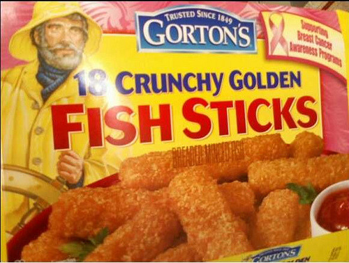
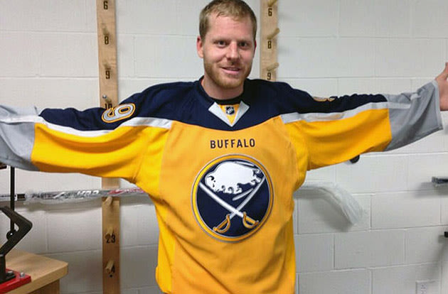
The Worst NHL Hockey Jerseys Dave Delisle, designer of Geeky Jerseys, excoriates the NHL designers for such monstrosities as the Buffaslug and the Islanders Fishsticks (it really is an uncanny resemblance).
Buffalo buffaslugs buffalo buffaslugs buffalo buffalo buffalo buffaslugs buffalo buffaslugs buffalo.
posted by Pre-Taped Call In Show at 7:16 AM on April 3, 2014 [2 favorites]
posted by Pre-Taped Call In Show at 7:16 AM on April 3, 2014 [2 favorites]
The old Canucks logo is a thing of beauty. It's a hockey stick laid across a rink that ends up making a stylized "C" that even has a bit of a west-coast first nations vibe to it. Perfect.
posted by rocket88 at 7:21 AM on April 3, 2014 [5 favorites]
posted by rocket88 at 7:21 AM on April 3, 2014 [5 favorites]
My brother-in-law has a Gretzky Blues jersey that proudly hangs in a closet alongside a Jake Plummer Cardinals jersey and his mother's Episcopal priest vestments. It's a weird closet.
Anyway, the late 90s Blues jersey is so much worse than the Buffaslug or Fishsticks that it's not even really close. I honestly kind of like the Fishsticks logo, even if the rest of the jersey is a mess of late 90s garish. The Buffaslug is dumb, but mostly because their original logo is really good. As a third jersey, I think it would be fine.
posted by Bulgaroktonos at 7:25 AM on April 3, 2014 [1 favorite]
This seems to be as much a hate-on for the contemporary sports logo disease that has been plaguing teams over the past several decades. And, I concur. Somewhere out there is a windowless factory churning-out these tortured, pseudo-dynamic generi-logos 24-7.
posted by Thorzdad at 7:25 AM on April 3, 2014 [1 favorite]
posted by Thorzdad at 7:25 AM on April 3, 2014 [1 favorite]
I love the Nashville mustard jersey (and own one) but it is pretty ugly. I also unironically love the old Coyotes jerseys. Some of the "honorable mention" ones are way worse.
posted by ghharr at 7:26 AM on April 3, 2014
posted by ghharr at 7:26 AM on April 3, 2014
I find the Buffaslug to have a certain charm in a way that the Blues musical note nonsense and the Mighty Duck breaking through the ice do not. It also manages to use yellow tastefully unlike basically every Canucks jersey that has yellow in it. On the other hand, I also kind of like the Bruins bear head and the Flames fire-breathing horse, so maybe I'm really into disembodied animal heads.
posted by Copronymus at 7:32 AM on April 3, 2014 [1 favorite]
posted by Copronymus at 7:32 AM on April 3, 2014 [1 favorite]
Buffalo buffaslugs buffalo buffaslugs buffalo buffalo buffalo buffaslugs buffalo buffaslugs buffalo.
It would have to be
Buffalo buffaslugs Buffalo buffaslugs buffalo buffalo Buffalo buffaslugs.
(Buffaslugs from Buffalo who are buffaloed by buffaslugs from Buffalo do themselves buffalo other buffaslugs from Buffalo)
posted by ROU_Xenophobe at 7:40 AM on April 3, 2014
It would have to be
Buffalo buffaslugs Buffalo buffaslugs buffalo buffalo Buffalo buffaslugs.
(Buffaslugs from Buffalo who are buffaloed by buffaslugs from Buffalo do themselves buffalo other buffaslugs from Buffalo)
posted by ROU_Xenophobe at 7:40 AM on April 3, 2014
This is like Go Fug Yourself for hockey, isn't it? But then I've long maintained that sports exist mainly to allow men to do things they aren't traditionally allowed to do, like weep, hug, decorate their faces and bodies, and now, apparently, do fashion critiques. Not that I object, fellas.
posted by emjaybee at 7:45 AM on April 3, 2014
posted by emjaybee at 7:45 AM on April 3, 2014
He's wrong about the Canucks. You're all wrong about the Canucks. The spaghetti plate is the best logo the NHL has ever seen, and the flying v is the best jersey. I will not be swayed from this opinion.
That said, I grew up in Edmonton, and consequently I'm of the mind that uniform design should be dead easy. Slap the same old logo onto the same old sweater. That's all there is to do. If you get sick of it, just make it brighter.
posted by Sys Rq at 7:55 AM on April 3, 2014 [2 favorites]
That said, I grew up in Edmonton, and consequently I'm of the mind that uniform design should be dead easy. Slap the same old logo onto the same old sweater. That's all there is to do. If you get sick of it, just make it brighter.
posted by Sys Rq at 7:55 AM on April 3, 2014 [2 favorites]
Anyway, the late 90s Blues jersey is so much worse than the Buffaslug or Fishsticks that it's not even really close.
My sister unironically likes those jersies and has been searching eBay looking for a mid-90s Twist or MacInnis. Good god.
posted by gc at 7:56 AM on April 3, 2014
My sister unironically likes those jersies and has been searching eBay looking for a mid-90s Twist or MacInnis. Good god.
posted by gc at 7:56 AM on April 3, 2014
The Oilers jersey is the best thing about that team.
And I don't mean that in a good way.
posted by mazola at 7:59 AM on April 3, 2014
And I don't mean that in a good way.
posted by mazola at 7:59 AM on April 3, 2014
Yeah he's kinda talking out his ass there. While I don't care for the buffalo slug it's only real crime is it's blandness as a logo and I found myself only agreeing perhaps 2 out of 10 times with the selections for horribleness. The LA one is kinda horrible and I just have never understood the mighty ducks as a acceptable name/mascot but eh.
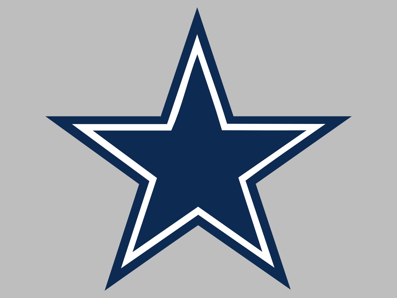
Dallas' problem wasn't the jersey it was the failure to make a complete break from moving the team from Minnesota and not ditching the entirety of the former name (North Stars). I dislike the sports franchise model but one of the more puzzling aspects has always been why some teams keep their old names when the follow through on their extortion racket and actually move. I mean the LA Lakers? It's like they intentionally decided to keep the name to give a big fuck-you to where they came from. No wonder MN ponyed up so much $ for a new football stadium, if they didn't I'm sure we would have seen the Las Vegas Viking before long.
posted by edgeways at 8:07 AM on April 3, 2014
I just have never understood the mighty ducks as a acceptable name/mascot but eh.
I barely follow hockey, but I watch a game now and again. I saw part of one in a pub one night, and as the game progressed there were those little updates on the bottom of the screen reading "Canadiens 5 Red Wings 3" or whatever. On this night there was an update showing by how much the Predators were tromping the Ducks and I thought, "Well, that is hardly a fair match."
posted by ricochet biscuit at 8:17 AM on April 3, 2014 [4 favorites]
While I don't care for the buffalo slug it's only real crime is it's blandness as a logo
Well, no, not really. My personal beef with the Buffaslug and the previous Buffalo head logo (aside from the ever-hideous Extreme Doritos aesthetic) is that the team is called the Buffalo Sabres, not the Buffalo Buffaloes; there really ought to be some sabres in there somewhere. The original and current rebus logo, while not perfect, at least makes sense.
posted by Sys Rq at 8:19 AM on April 3, 2014 [1 favorite]
That's a fair point that didn't cross my mind. The 2014 Sabers' jersey is much better than the slug version.. there are still haters though. Guess it doesn't matter what you print out someone will call it the worst thing ever
posted by edgeways at 8:22 AM on April 3, 2014
posted by edgeways at 8:22 AM on April 3, 2014
edgeways, every Dallas team incorporates the star in some way, I don't think it's a stretch for the NHL team to keep that at all, despite the move.
posted by Navelgazer at 8:24 AM on April 3, 2014
posted by Navelgazer at 8:24 AM on April 3, 2014
While I strongly agree with about half of his choices (dear lord those Coyotes jerseys), he dislikes such a wide array of designs that I couldn't possibly guess what kind of design he'd actually like.
posted by jason_steakums at 8:25 AM on April 3, 2014
posted by jason_steakums at 8:25 AM on April 3, 2014
I never got the hate for the Islander jersey. I get it does look a bit like the fishstick guy, but I still think it works okay.
posted by Chrysostom at 8:26 AM on April 3, 2014
posted by Chrysostom at 8:26 AM on April 3, 2014
FWIW the only Dallas team to have a star in it's logo prior to the North Star move was the Cowboys (which seems to makes as much sense as the Buffalo buffalo/sabers thing),
posted by edgeways at 8:34 AM on April 3, 2014
posted by edgeways at 8:34 AM on April 3, 2014
A good sports logo should be simple enough to allow a non-artistic twelve year old kid to draw reasonable facsimiles all over his school books and binders. Most of these fail that test.
posted by rocket88 at 8:59 AM on April 3, 2014 [7 favorites]
posted by rocket88 at 8:59 AM on April 3, 2014 [7 favorites]
OK, those Coyotes jerseys are pretty bad, but I love the logo. The new one is so generic.
posted by bongo_x at 9:08 AM on April 3, 2014
posted by bongo_x at 9:08 AM on April 3, 2014
Is this a safe place to express my extreme loathing of camouflage jerseys? 'Cuz I really really loath camouflage jerseys. Military appreciation night is fine and all, but do the players really need camouflage jerseys? It seems like some horrible leftover remnant of the faux patriotism fashion movement that swept the nation. I'd love to hear a decent argument for it.
Also I hope the Avs success this years leads to a sweater re-design. That shoulder piping. *shudder* It leads right through the C and looks awful.
posted by barchan at 9:17 AM on April 3, 2014
Also I hope the Avs success this years leads to a sweater re-design. That shoulder piping. *shudder* It leads right through the C and looks awful.
posted by barchan at 9:17 AM on April 3, 2014
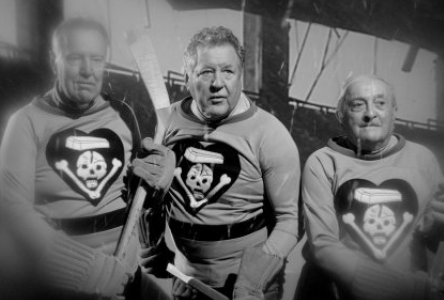
The best hockey uniforms belong to The Black Tuesdays from My Winnipeg.
posted by jason_steakums at 9:37 AM on April 3, 2014 [3 favorites]
posted by jason_steakums at 9:37 AM on April 3, 2014 [3 favorites]
The retro Canucks "C" logo looks like a rock with a sly smirk.
posted by TheSecretDecoderRing at 10:29 AM on April 3, 2014
posted by TheSecretDecoderRing at 10:29 AM on April 3, 2014
Proud owner of both Buffaslug and Fishsticks jerseys right here.
No one in Buffalo liked the slug, but it was a great improvement over the red and black goat head. I mean, at least the Sabres were wearing blue and gold again. The current sweaters are wonderful, though, except for the third jersey. I do love how the BUFFALO lettering on the front resembles alt text, though.
posted by troika at 10:33 AM on April 3, 2014
So this is what he's doing instead of reissuing that Targaryen jersey.
posted by ChurchHatesTucker at 10:44 AM on April 3, 2014
posted by ChurchHatesTucker at 10:44 AM on April 3, 2014
not the Buffalo Buffaloes
I don't mind the Buffalo being part of the logo because Buffalonians, generally speaking, LOVE BUFFALO SO HARD. Buffalo, the animal, is a city emblem. It's in the Buffalo Bills' logo as well. I like the way it ties the teams together, sort of like how Pittsburgh teams all use the same colors. Plus, we already have Buffalo Buffaloes, the minor league baseball Buffalo Bisons.
posted by troika at 10:45 AM on April 3, 2014 [1 favorite]
If the '96 Coyotes jersey is wrong, then I don't want to be right.
I kind of like the '96 one as well, since I can see the aesthetic they were going for. The subsequent jersey does look like it was designed by a colorblind person in a dimly lit room though.
posted by Panjandrum at 10:53 AM on April 3, 2014
I kind of like the '96 one as well, since I can see the aesthetic they were going for. The subsequent jersey does look like it was designed by a colorblind person in a dimly lit room though.
posted by Panjandrum at 10:53 AM on April 3, 2014
Huh. If he ever does a Lost in Space jersey, that Flying V is a good place to start.
posted by ChurchHatesTucker at 10:57 AM on April 3, 2014
posted by ChurchHatesTucker at 10:57 AM on April 3, 2014
I kind of like the '96 one as well, since I can see the aesthetic they were going for.
Pretty sure they were going for Navajo/Hopi, not Aztec/Maya. (You're off by a couple thousand miles.)
posted by Sys Rq at 11:31 AM on April 3, 2014
Pretty sure they were going for Navajo/Hopi, not Aztec/Maya. (You're off by a couple thousand miles.)
posted by Sys Rq at 11:31 AM on April 3, 2014
edgeways, the Dallas Stars make perfect sense, because Texas is the Lone Star State. Half the major sports teams in Texas incorporate the star: the Cowboys, the Rangers have the star badge logo, and the Dallas Stars.
posted by nushustu at 11:48 AM on April 3, 2014
posted by nushustu at 11:48 AM on April 3, 2014
The best jersey (and perhaps the best team logo ever) belongs to the Milwaukee Admirals.
I got one of these for Christmas last year, it delights me to no end.
posted by fifteen schnitzengruben is my limit at 7:40 PM on April 3, 2014
I got one of these for Christmas last year, it delights me to no end.
posted by fifteen schnitzengruben is my limit at 7:40 PM on April 3, 2014
« Older Keep your Cadburys, make mine Fabergé | Jeff Smith's newest comic, Tuki Saves the Humans... Newer »
This thread has been archived and is closed to new comments
posted by Jahaza at 7:12 AM on April 3, 2014