“It was like I was five and got lost at the swimming pool”
January 1, 2015 6:54 AM Subscribe
The European Parliament building regularly makes visitors and employees break down and cry. The disorienting effect probably wasn’t an accident. “Our buildings offer themselves to their inhabitants and to the city as ‘mysteries,’ or stories for which we provide ‘keys’ and signs so that they can be deciphered,” is how Architecture-Studio’s website describes its approach.
massively undemocratic and very, very German. hmm, reminds me of something!
posted by runincircles at 7:12 AM on January 1, 2015 [1 favorite]
posted by runincircles at 7:12 AM on January 1, 2015 [1 favorite]
When the much-vaunted Seattle Central Library opened in 2004, the architects left some unpleasant surprises for users. No signage. Librarians had to print restroom door signs, etc. Disabled user doors opened/closed the opposite of how service dogs are trained. The doors had to be re-engineered. The fiction shelves wander like cow trails, while the ceiling lights are set in straight lines. Accordingly, some fiction is well-lit, while other books are in shadows. Even so, Seattle's elite praised this building as "world-class." I use this nearby library, but I dislike it.
posted by Carol Anne at 7:19 AM on January 1, 2015 [25 favorites]
posted by Carol Anne at 7:19 AM on January 1, 2015 [25 favorites]
massively undemocratic and very, very German. hmm, reminds me of something!
In this case the architects are French and the bureaucrats are Belgians, so...
Anyway this would never happen in Canada. We're so cheap we would never be able to afford more than bare utilitarianism for a mere public space.
posted by Nevin at 7:30 AM on January 1, 2015 [14 favorites]
In this case the architects are French and the bureaucrats are Belgians, so...
Anyway this would never happen in Canada. We're so cheap we would never be able to afford more than bare utilitarianism for a mere public space.
posted by Nevin at 7:30 AM on January 1, 2015 [14 favorites]
I agree with this. The place is a nightmare to navigate, especially if you are not a part if the EU bubble. However, if you can make it to the cafeterias, the food is good and subsidized!
posted by JiffyQ at 7:37 AM on January 1, 2015 [1 favorite]
posted by JiffyQ at 7:37 AM on January 1, 2015 [1 favorite]
I spent a weekend with friends in Brussels, one English and one Belgian, and they lived in a building with an antique wrought iron lift with no door at all. It was explained to me that the EU had just announced regulations that would require them to retrofit a door and that according to my English friend, people in the building had taken to grumbling "Bloody Brussels" ( a common refrain amongst English Daily Mail readers) and shaking their heads.
Then we went drinking and I stayed mildly and deliciously drunk for about three days.
posted by srboisvert at 7:39 AM on January 1, 2015 [4 favorites]
Then we went drinking and I stayed mildly and deliciously drunk for about three days.
posted by srboisvert at 7:39 AM on January 1, 2015 [4 favorites]
This is why postmodern architecture must die. The pomo architects believe that the building is supposed to actively push back against the occupants, to exert its presence, and the presence of the architect. My art school recently constructed a bizarre showpiece by pomo architect Steven Holl. His signature is a convoluted, irregular staircase to the lobby. This one is constructed out of steel, hanging precariously from cables. As you walk down, you can hear your shoes clanging against the metal. Women with wooden shoes can bang so loudly, it can be heard in all corners of the building. And that was deliberate. There are other horrible features in the building, idiocies that scream at people, "I am an architect and I did this just to mess with you!" I attended the building's opening, in the grand lecture hall. As the entire crowd left, I noticed that the exit halls had non-parallel sides. The hall sometimes widened, sometimes narrowed, forcing the crowd of people to speed up and slow down, as they bunched up and got jammed in the narrow spots. Now this is going to happen about once every hour, after every class, every day of classes, every time a group of people exit the hall. People will be deliberately inconvenienced by the architect's stupid design. But that's still not the worst feature of the building. The main lobby is sunk 2 inches, all the surrounding rooms have a wide ledge that suddenly drops 2 inches. It is terribly hard to see the drop, coming from the outer rooms like the library. And before the building even opened, an elderly patron was touring the building, she did not see the 2 inch drop and tripped over it, breaking both her ankles. This building will injure and maim people as long as it is used.
posted by charlie don't surf at 7:46 AM on January 1, 2015 [121 favorites]
posted by charlie don't surf at 7:46 AM on January 1, 2015 [121 favorites]
It's rather like the Non-Euclidean Cyclopian monstrosities that littered the ruins of the Old Ones' Kadath. Tekeli-li, tekeli-li!
posted by Renoroc at 8:02 AM on January 1, 2015 [14 favorites]
posted by Renoroc at 8:02 AM on January 1, 2015 [14 favorites]
"Good morning, gentlemen. This is a twelwe-storey block combining classical neo-Georgian features with the efficiency of modern techniques. The tenants arrive in the entrance hall here, and are carried along the corridor on a conveyor belt in extreme comfort and past murals depicting Mediterranean scenes, towards the rotating knives. The last twenty feet of the corridor are heavily soundproofed. The blood pours down these chutes and the mangled flesh slurps into these..."
posted by valkane at 8:18 AM on January 1, 2015 [28 favorites]
posted by valkane at 8:18 AM on January 1, 2015 [28 favorites]
Let's hope there's never a fire or other emergency requiring rapid exit from the building.
posted by tommasz at 8:23 AM on January 1, 2015 [6 favorites]
posted by tommasz at 8:23 AM on January 1, 2015 [6 favorites]
Sounds like the kind of building the fictional Philip Lemarchand supposedly designed.
posted by unru at 8:38 AM on January 1, 2015 [3 favorites]
posted by unru at 8:38 AM on January 1, 2015 [3 favorites]
An easy and cost-effective way to improve the building's navigability and safety would be to install highly visible save points on every floor, preferably outside bosses' offices.
posted by Metroid Baby at 8:52 AM on January 1, 2015 [61 favorites]
posted by Metroid Baby at 8:52 AM on January 1, 2015 [61 favorites]
Good morning, gentlemen. This is a twelwe-storey block combining classical neo-Georgian features with the efficiency of modern techniques.
Providing the bureaucrats are of light build and relatively sedentary and, er, given a spot of good weather, I think we're on to a winner here.
posted by ricochet biscuit at 8:55 AM on January 1, 2015 [6 favorites]
Providing the bureaucrats are of light build and relatively sedentary and, er, given a spot of good weather, I think we're on to a winner here.
posted by ricochet biscuit at 8:55 AM on January 1, 2015 [6 favorites]
“Our buildings offer themselves to their inhabitants and to the city as ‘mysteries,’ or stories for which we provide ‘keys’ and signs so that they can be deciphered,” is how Architecture-Studio’s website describes its approach.
Man, I want to punch these people.
charlie don't surf, might you have a link to photos of the building you describe? Your description makes me want to see the awfulness for myself.
posted by longdaysjourney at 9:15 AM on January 1, 2015 [6 favorites]
Man, I want to punch these people.
charlie don't surf, might you have a link to photos of the building you describe? Your description makes me want to see the awfulness for myself.
posted by longdaysjourney at 9:15 AM on January 1, 2015 [6 favorites]
Let's hope there's never a fire or other emergency requiring rapid exit from the building.
This crossed my mind sitting in the circle at the Barbican theatre last week - two rows, the front row only accessible via doors at the side which are shut during the performance. The space between the seat and the barrier at the front so narrow that it's very difficult to get past anyone already sitting down (the seats don't flip up.) Beyond the barrier is a sheer drop to the stalls way below. Essentially:
(And there's another even more terrifying circle ten feet above the one I was sitting on.)
It was very clear that that part of the theatre at least had been designed without any consideration that actual human beings would need to get in and out. In some ways the whole arts complex is like that - at the very least it's all painted in shades of brown and orange that were fleetingly popular in the early 70s.
posted by Grangousier at 9:22 AM on January 1, 2015 [2 favorites]
This crossed my mind sitting in the circle at the Barbican theatre last week - two rows, the front row only accessible via doors at the side which are shut during the performance. The space between the seat and the barrier at the front so narrow that it's very difficult to get past anyone already sitting down (the seats don't flip up.) Beyond the barrier is a sheer drop to the stalls way below. Essentially:
- When you're in your seat, you're there to stay.
- If you're in any way acrophobic, reaching any seat at all is extremely unpleasant.
(And there's another even more terrifying circle ten feet above the one I was sitting on.)
It was very clear that that part of the theatre at least had been designed without any consideration that actual human beings would need to get in and out. In some ways the whole arts complex is like that - at the very least it's all painted in shades of brown and orange that were fleetingly popular in the early 70s.
posted by Grangousier at 9:22 AM on January 1, 2015 [2 favorites]
charlie don't surf, might you have a link to photos of the building you describe? Your description makes me want to see the awfulness for myself.
I'm guessing it's this one.
posted by LionIndex at 9:24 AM on January 1, 2015 [3 favorites]
I'm guessing it's this one.
posted by LionIndex at 9:24 AM on January 1, 2015 [3 favorites]
So is floor 5.5 the one that lets you get inside Angela Merkel's brain? No wonder people are crying...
posted by Chocolate Pickle at 9:32 AM on January 1, 2015 [12 favorites]
posted by Chocolate Pickle at 9:32 AM on January 1, 2015 [12 favorites]
That building (The Steven Holl one) made me nauseous just looking at the photos. Why does it look like even the outside walls are just slightly off kilter? Is it just me? Everything slopes wrong.
posted by instead of three wishes at 9:43 AM on January 1, 2015
posted by instead of three wishes at 9:43 AM on January 1, 2015
Man, I want to punch these people.
You know who they are? They're the architectural equivalent of those "Sometimes you have to sacrifice legibility for design" assholes from the bad neon-geometrical-shapes era of Wired.
posted by Mr. Bad Example at 9:46 AM on January 1, 2015 [3 favorites]
You know who they are? They're the architectural equivalent of those "Sometimes you have to sacrifice legibility for design" assholes from the bad neon-geometrical-shapes era of Wired.
posted by Mr. Bad Example at 9:46 AM on January 1, 2015 [3 favorites]
I have no clue as to the rationality of people who design some of our public spaces. The main library here in San Francisco is a good example. When it first opened back in the nineties there was no signage anywhere to tell you where particular Dewey Decimal numbers were located on the many floors of the building. Given that there is no natural flow of numbers with sections and subsections shuttled off to other floors this made it almost impossible to find anything. Seeing that this was a library where you had to locate books how could this design happen? The first fix was xeroxed sheets of paper taped to the walls next to elevators. I feel like there are ulterior motives for building designers. Most involve ego.
posted by njohnson23 at 9:46 AM on January 1, 2015 [2 favorites]
posted by njohnson23 at 9:46 AM on January 1, 2015 [2 favorites]
I think this may be the only part of that Holl building I like. Everything else about it is just awful.
The European Parliament building (the 'buildings' link in the post) honestly looks like something out of SimCity 4.
posted by feckless fecal fear mongering at 9:48 AM on January 1, 2015 [1 favorite]
The European Parliament building (the 'buildings' link in the post) honestly looks like something out of SimCity 4.
posted by feckless fecal fear mongering at 9:48 AM on January 1, 2015 [1 favorite]
Security through obscurity is bad security. Design through obscurity is even worse.
posted by oceanjesse at 9:56 AM on January 1, 2015 [2 favorites]
posted by oceanjesse at 9:56 AM on January 1, 2015 [2 favorites]
My university building was five interlinked quads, cut into the side of a hill. What was floor 3 on one side of the building might be floor 1 on the other side. Or not. The "rational" room numbering scheme they paid a bunch of external consultants for was a joy to behold.
posted by Leon at 9:58 AM on January 1, 2015
posted by Leon at 9:58 AM on January 1, 2015
Reminds me of the Social Sciences and Humanities Building at UC Davis, commonly known as The Death Star.
posted by apricot at 10:19 AM on January 1, 2015 [1 favorite]
posted by apricot at 10:19 AM on January 1, 2015 [1 favorite]
I still want to know what happened in the 70's, at Universities. Almost any college or university in the country is made up of a bunch of charming old brick or be-columned campus buildings, some newer, modern buildings whose design subtly references the look of the original campus, and one or two Brutalist concrete fortresses, used either as dorms or as the Ministry of Social Sciences. And that's the one from 1972.
posted by thelonius at 10:26 AM on January 1, 2015 [21 favorites]
posted by thelonius at 10:26 AM on January 1, 2015 [21 favorites]
Ha, I was going to say Dwinelle Hall too, migurski. Ah, the times I wandered its halls, lost and hissing "this numbering scheme makes no sense!" and "shit, did this entrance put me on floor A, B, C, or D???" I'd always arrive at GSIs' office hours late, to be greeted with a sympathetic "got lost, huh?" On the other hand, Dwinelle's torturous labyrinthine nature did mean that the cafe on the top floor was generally a not too crowded oasis, and it had my favorite campus bathroom that was always clean and never occupied.
posted by yasaman at 10:27 AM on January 1, 2015 [1 favorite]
posted by yasaman at 10:27 AM on January 1, 2015 [1 favorite]
apricot: "Reminds me of the Social Sciences and Humanities Building at UC Davis, commonly known as The Death Star."
From that link: "Doorways that you need to pass through will sometimes be locked, forcing you to find a new way. The doors that get locked rotate every so often, further confusing the situation. The idea was to force human interaction because it houses the social sciences."
WHAT THE HELL IS WRONG WITH YOU.
Ugh, it really bothers me when architects hate the people who use their buildings and their "design" is totally divorced from the needs of the people who have to occupy them. Even just McMansions, which are clearly optimzed for square footage and certain visual frontage; the layout of the rooms makes it clear the designers have NEVER LIVED IN A HUMAN HABITATION. "Great for families" = "children's rooms totally separated from master bedroom, across common area that will be a sea of Legos to traverse barefoot in the dark of night"
posted by Eyebrows McGee at 10:32 AM on January 1, 2015 [16 favorites]
commonly known as The Death Star.
Reading the fuller description in the link, sounds like a fun place if you like active games, larping, etc.
posted by ovvl at 10:37 AM on January 1, 2015 [1 favorite]
Reading the fuller description in the link, sounds like a fun place if you like active games, larping, etc.
posted by ovvl at 10:37 AM on January 1, 2015 [1 favorite]
Dr. Egon Spengler: The architect's name was Evo Shandor. I found it in Tobin's Spirit Guide. He was also a doctor, performed a lot of unnecessary surgery. And then in 1920, he started a secret society...
Dr. Peter Venkman: Let me guess: Gozer worshippers.
Dr. Egon Spengler: Right. After the First World War, Shandor decided that society was too sick to survive... And he wasn't alone, he had close to a thousand followers when he died. They conducted rituals up on the roof. Bizarre rituals, intended to bring about the *end of the world*, and now it looks like it might actually happen.
posted by PenDevil at 10:42 AM on January 1, 2015 [5 favorites]
Sounds a bit like Berkeley's Dwinelle Hall
Yes! I went to Berkeley a looong time ago and I still have occasional dreams about wandering through Dwinelle. In the best one, I discovered a cozy little cafe on the landing halfway up one of the staircases.
posted by moonmilk at 10:59 AM on January 1, 2015 [1 favorite]
Yes! I went to Berkeley a looong time ago and I still have occasional dreams about wandering through Dwinelle. In the best one, I discovered a cozy little cafe on the landing halfway up one of the staircases.
posted by moonmilk at 10:59 AM on January 1, 2015 [1 favorite]
I still want to know what happened in the 70's, at Universities.
We were trying to compete with the Soviets.
posted by vogon_poet at 11:09 AM on January 1, 2015 [3 favorites]
We were trying to compete with the Soviets.
posted by vogon_poet at 11:09 AM on January 1, 2015 [3 favorites]
Franz Kafka's "The Castle is often understood to be about alienation, bureaucracy, the seemingly endless frustrations of man's attempts to stand against the system, and the futile and hopeless pursuit of an unobtainable goal."
posted by stbalbach at 11:12 AM on January 1, 2015 [4 favorites]
posted by stbalbach at 11:12 AM on January 1, 2015 [4 favorites]
The title of this post gave me a startlingly clear memory of getting lost at the Brighton Beach Baths and being wholly unable to find my leathery-tanned blue-haired chainsmoking Midwood-accented grandma in a sea of identical canasta players.
posted by poffin boffin at 11:15 AM on January 1, 2015 [3 favorites]
posted by poffin boffin at 11:15 AM on January 1, 2015 [3 favorites]
The solution to the same problem in Romania's Palace of the Parliament (the second largest building in the world) was to hide coded maps in the carpet patterns, letting those in the know see where they are.
posted by DirtyOldTown at 11:17 AM on January 1, 2015 [12 favorites]
posted by DirtyOldTown at 11:17 AM on January 1, 2015 [12 favorites]
I still want to know what happened in the 70's, at Universities.
I went on 45 separate college tours with my three kids. (I love college tours, obviously.)
Almost every campus we visited had the original library, a charming classical building which is now the Alumni Center, and the "new" library, which is a 1970s dystopian concrete structure with low coffered ceilings, fluorescent lights, and Helvetica signage. It was comical how predictably this pattern played out.
Clearly there was a moment when having that kind of building was the mandatory way to signal the fact that your institution was confidently moving towards the new millennium. People find architects frustrating, but unless you're willing to be a flat-out historicist, you're doomed to keep making bets on the zeitgeist, and frequently losing.
posted by How the runs scored at 11:18 AM on January 1, 2015 [7 favorites]
In this case the architects are French and the bureaucrats are Belgians, so...
And the Germans are the ones most confused by it all, so... maybe an attempt to slow them down and send them back home in frustrated defeat just in case there's a next time?
posted by clawsoon at 11:27 AM on January 1, 2015 [2 favorites]
And the Germans are the ones most confused by it all, so... maybe an attempt to slow them down and send them back home in frustrated defeat just in case there's a next time?
posted by clawsoon at 11:27 AM on January 1, 2015 [2 favorites]
My current institution specializes in building modern monstrosities that are not only soul crushing to look at but have numbering systems that make no sense whatsoever. I once taught in a classroom that was not only basically unfindable without serious effort, but a) had a constant temperature of 25c b) was one possible entrance way not only to a study room but to a giant lecture hall and so was constantly filled with people 'just passing through' c) was shaped in such a bizarre way that although it only seated 20 people, not everyone could see the board and d) despite being built something like 5 years before did not have a working projector. I would like to see if the EU can compete with that room. (I checked and it was designed as a classroom, not as a corridor, despite my suspicions.)
posted by lesbiassparrow at 11:28 AM on January 1, 2015 [2 favorites]
posted by lesbiassparrow at 11:28 AM on January 1, 2015 [2 favorites]
Almost every campus we visited had the original library, a charming classical building which is now the Alumni Center, and the "new" library, which is a 1970s dystopian concrete structure with low coffered ceilings, fluorescent lights, and Helvetica signage. It was comical how predictably this pattern played out.
Interesting. That was also the time when the cult of the Selfish Human Individual was de rigeur among rising star academics in economics, sociology and evolutionary theory. I wonder if there's a connection. Did that strain of thought take over architecture around that time, too?
posted by clawsoon at 11:31 AM on January 1, 2015
I still want to know what happened in the 70's, at Universities.
Judging from the history of my own alma mater's concrete monstrosity, I think it's more about what happened in the 60's:
posted by DaDaDaDave at 11:31 AM on January 1, 2015 [5 favorites]
Judging from the history of my own alma mater's concrete monstrosity, I think it's more about what happened in the 60's:
The distinctive brutalist architecture, part of the architectural movement that flourished from the 1950s to 1970s, of Lovett has led many to compare it to a giant toaster. This is due to the concrete grating that surrounds the third, fourth, and fifth floors. This grating is part of the architects' intent to make Lovett riot–proof in reaction to the student riots of the late 1960s.A befuddling labyrinth is a lot harder to take over than a neoclassical palazzo.
posted by DaDaDaDave at 11:31 AM on January 1, 2015 [5 favorites]
You're all a bunch of haters, 70s college brutalism is great.
This stuff, on the other hand, seems like an attempt to build an unfriendly version of Hogwarts. I sort of admire the glorious impracticality of the designs, though. As art, it's delightful. As architecture, it's obnoxious.
Seattle Central Library does have the seemingly empty blood-red floor with no sharp angles, which is one of the best arguments in its favor I think.
posted by vibratory manner of working at 11:33 AM on January 1, 2015 [11 favorites]
It would be nice to see plan drawings, or at least interior shots, of this incredibly confusing parliament building. I'm skeptical that it could be that hard to navigate, considering it's basically a cylinder. Doing some googling I'm finding a lot of New World Order conspiracy-types (Glenn Beck among them) comparing the building to the Tower of Babel.
posted by adecusatis at 11:34 AM on January 1, 2015 [2 favorites]
posted by adecusatis at 11:34 AM on January 1, 2015 [2 favorites]
Reminds me of the Social Sciences and Humanities Building at UC Davis, commonly known as The Death Star.
The Death Star has an outdoor elevator that allows you to bring your mountain bike to the top and do some Danny Mcaskill shit all the way down though. Also epic water balloon wars. I doubt Brussles has that!
It's funny to hear that it was designed to create human contact because a week after it was built there were signs on all the office doors "if you're looking for history do x, sociology, y, psychology - z, please do not knock!!!!"
Davis does have a delightful library though, complete with massive window seats.
posted by fshgrl at 11:45 AM on January 1, 2015
Here's similar info about UMass' brutalism architecture. In this case, the buildings were meant to appeal to a wider range of students of all classes including those who weren't accustomed to the fancier trappings of the elite.
posted by bendy at 11:45 AM on January 1, 2015 [7 favorites]
posted by bendy at 11:45 AM on January 1, 2015 [7 favorites]
This grating is part of the architects' intent to make Lovett riot–proof in reaction to the student riots of the late 1960s.
I'd believe this story a lot more readily if I hadn't heard the same story about literally every other obligatory Brutalist box on every other college campus I've ever visited. It's one of the most popular campus legends there is.
posted by RogerB at 11:47 AM on January 1, 2015 [7 favorites]
I'd believe this story a lot more readily if I hadn't heard the same story about literally every other obligatory Brutalist box on every other college campus I've ever visited. It's one of the most popular campus legends there is.
posted by RogerB at 11:47 AM on January 1, 2015 [7 favorites]
The European Parliament building regularly makes visitors and employees break down and cry. The disorienting effect probably wasn’t an accident.
Well, it probably will allow the autarchs at least an extra five minutes to make it to the roof helipads when the peasants finally get around to storming the thing.
I still want to know what happened in the 70's, at Universities. Almost any college or university in the country is made up of a bunch of charming old brick or be-columned campus buildings, some newer, modern buildings whose design subtly references the look of the original campus, and one or two Brutalist concrete fortresses, used either as dorms or as the Ministry of Social Sciences. And that's the one from 1972.
The student unrest which began in the late '60s forced a siege mentality on almost every university administration in the country.
posted by jamjam at 11:47 AM on January 1, 2015 [1 favorite]
But it sounds like... if the peasants do finally storm the gates and wander the corridors with their pitchforks, the autarchs would have all day to make their escape.
posted by Auden at 11:55 AM on January 1, 2015 [1 favorite]
posted by Auden at 11:55 AM on January 1, 2015 [1 favorite]
It's one of the most popular campus legends there is.
Second only to another great architecture UL, the library that's sinking into the ground because the architect forgot to account for the weight of books.
posted by Etrigan at 11:57 AM on January 1, 2015 [2 favorites]
Second only to another great architecture UL, the library that's sinking into the ground because the architect forgot to account for the weight of books.
posted by Etrigan at 11:57 AM on January 1, 2015 [2 favorites]
I feel most hospitals are designed for the utter bewilderment of visitors. Zeus help you if you get up under the influence of narcotics and try to navigate.
posted by BlueHorse at 12:08 PM on January 1, 2015
posted by BlueHorse at 12:08 PM on January 1, 2015
"Doorways that you need to pass through will sometimes be locked, forcing you to find a new way. The doors that get locked rotate every so often, further confusing the situation. The idea was to force human interaction because it houses the social sciences."
They could have just installed a few butt funnels...
posted by Gymnopedist at 12:13 PM on January 1, 2015 [2 favorites]
They could have just installed a few butt funnels...
posted by Gymnopedist at 12:13 PM on January 1, 2015 [2 favorites]
I don't think I've ever before loved my workplace, which is a converted parking garage. Big open rooms for the cubicles separated by security doors, straight line hallways, etc.. There was no chance for an architect to make it non-functional.
posted by happyroach at 12:21 PM on January 1, 2015
posted by happyroach at 12:21 PM on January 1, 2015
I think this may be the only part of that Holl building I like. Everything else about it is just awful.
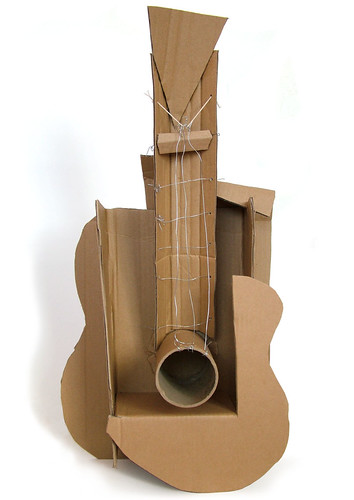
Yes, that is the building in question. No, that part of the building is one of the worst parts. It is a wing off the library, it is a narrow hall with glass walls on both sides and shiny off-white marble floors that reflect the sunlight. Holl obviously failed to do a solar survey of his design. That library wing is so bright, you almost need sunglasses just to read. On a sunny day, the temperatures rise rapidly until it becomes unbearable. The librarians complained that there was so much sunlight, it was fading the spines of the bound books on the shelves, so they moved books out of that area.
Now that part of the building serves no functional purpose. It is a glass wing that is suspended by a concrete pillar, it is supposed to be the neck of a guitar. The stupid building is modeled after a cubist guitar sculpture by Picasso. That means ART!!!11!!!11ll11!!
But the worst thing of all: they hired him again to build a new wing on the building. This was necessary because on the original building, Holl failed his primary design goal: build above the flood plain, to replace the building across the street which was destroyed in a flood. Result: the new building was heavily damaged in a flood, almost immediately after it was opened, and did not reopen for years. But hey, who cares about the students and faculty? It's still a grand monument to Steven Holl's ego, even when it's locked up and closed for repairs.
posted by charlie don't surf at 12:28 PM on January 1, 2015 [10 favorites]
I'd believe this story a lot more readily if I hadn't heard the same story about literally every other obligatory Brutalist box on every other college campus I've ever visited. It's one of the most popular campus legends there is.
Well, if those boxes were all constructed to discourage rioting, then you'd expect to hear the same story on every campus, wouldn't you? (Actually I'm sure you're right and this is yet another urban legend which I was credulous enough to swallow. Still,
posted by DaDaDaDave at 12:33 PM on January 1, 2015 [3 favorites]
Well, if those boxes were all constructed to discourage rioting, then you'd expect to hear the same story on every campus, wouldn't you? (Actually I'm sure you're right and this is yet another urban legend which I was credulous enough to swallow. Still,
[Wittgenstein] once greeted me with the question: "Why do people say that it was natural to think that the sun went round the earth rather than that the earth turned on its axis?" I replied: "I suppose, because it looked as if the sun went round the earth." "Well," he asked, "what would it have looked like if it had looked as if the earth turned on its axis?" [...] My reply was to hold out my hands with the palms upward, and raise them from my knees in a circular sweep, at the same time leaning backwards and assuming a dizzy expression. "Exactly!" he said.- Anscombe, An Introduction to Wittgenstein's Tractatus)
posted by DaDaDaDave at 12:33 PM on January 1, 2015 [3 favorites]
Oh, I just remembered - a friend's father was a lecturer at one of the English modernist Universities in the 1970s. Apparently, when they built the new library, they forgot to put in doors, so when dignitaries came to admire the award-winning building, they had to take them around with a stepladder so that one by one the V.I.P.s could clamber up it and peer in through the windows to admire it that way.
The award-winning primary school I attended from its opening in 1970 (the wonderfully named Queen's Dyke School - now, understandably, rebranded Queen Emma's) also won awards. The main hall had an angular, glazed roof, which did admit a lot of light, but made the room dangerously hot in summer.
posted by Grangousier at 12:37 PM on January 1, 2015
Apparently, when they built the new library, they forgot to put in doors, so when dignitaries came to admire the award-winning building, they had to take them around with a stepladder so that one by one the V.I.P.s could clamber up it and peer in through the windows to admire it that way.
This sounds incredibly UL-ish, because there are drawings of most buildings before they get built. So, no one from the university or whatever functions as the building department ever looked at the plans and noticed the lack of doors? They built the whole building and manged to put up the all the walls without anyone going "Hey..." It's as silly a concept as the rumor at my school that the chapel was meant to be built at Cornell but the architect switched the plans (it's the only gothic building on a classical campus), so of course nobody could look a the drawings and figure that out, and nobody realized the chapel was gothic until they finished it and stepped back a few feet.
posted by LionIndex at 12:59 PM on January 1, 2015 [5 favorites]
The University of Surrey, in Guildford, UK, occupies a campus that was substantially built in the late 1960s. The architects were very fond of linking buildings via walkways, which posed an interesting problem for floor numbering given that the campus is on the side of a hill: the ground floor of one building could link to a middle or upper floor of an adjacent one.
The obvious solution was to harmonise floor numbers so that all floors on the same level had the same number, but this risked further difficulties as the site spread down the hill: there might be negative floor numbers. The way around this: floor numbers were derived from their height in tens of feet above mean sea level. The library, as I recall, started at Floor 19 and went up to Floor 25.
Apparently this was eventually deemed Too Silly and there was a great renumbering about ten years ago, which must greatly reduce the opportunities for confusing new students.
posted by Major Clanger at 1:06 PM on January 1, 2015 [3 favorites]
This sounds incredibly UL-ish, because there are drawings of most buildings before they get built. So, no one from the university or whatever functions as the building department ever looked at the plans and noticed the lack of doors?
Easy. They went to that architecture school that gets disqualified from the list of top party architecture schools, because they are professionals and it's not fair to the amateurs to not exclude them.
posted by thelonius at 1:09 PM on January 1, 2015
Easy. They went to that architecture school that gets disqualified from the list of top party architecture schools, because they are professionals and it's not fair to the amateurs to not exclude them.
posted by thelonius at 1:09 PM on January 1, 2015
I have to admit, I am totally fascinated by buildings that are labyrinthine, nonsensical, confusing, capricious, or disorienting. But they sure shouldn't be built with public funds as a location for things that are actually important.
posted by threeants at 1:13 PM on January 1, 2015 [3 favorites]
posted by threeants at 1:13 PM on January 1, 2015 [3 favorites]
If you really want to know why so many colleges have a massive brutalist library, it's because most colleges were embarking on big expansion projects in the 60s and 70s to deal with the influx of baby boomer students, and brutalism was embarrassingly popular with the architecture world at the time.
posted by adecusatis at 1:20 PM on January 1, 2015 [2 favorites]
posted by adecusatis at 1:20 PM on January 1, 2015 [2 favorites]
From that link: "Doorways that you need to pass through will sometimes be locked, forcing you to find a new way. The doors that get locked rotate every so often, further confusing the situation. The idea was to force human interaction because it houses the social sciences."
Ok, this strikes me as kind of Urban Legend-y too. Based on everything I know about the world, I am skeptical of the idea that the facilities staff at a public university continues to dutifully execute a building's nonsensical, high-concept program element laid out by its architect 20 years ago.
posted by threeants at 1:29 PM on January 1, 2015 [6 favorites]
Man, I go to UCF which was founded in the late 60s, so you get a lot of buildings like e.g. the library and the administration building in a futuristic-at-the-time brutalistish (?) style. This sort of thing was compounded (in addition to the era) by the fact that the school was initially founded as Florida Technological University and intended to focus on engineering, physics, etc. to help feed Titusville, so I guess they wanted things to look futuristic. Another side effect of this is streets and programs named after stars and constellations, which results in an a-ha moment like 2 years into attending where you make the connection between the university's history and why everything is named like Apollo or Gemini or whatever.
posted by Gymnopedist at 1:30 PM on January 1, 2015
posted by Gymnopedist at 1:30 PM on January 1, 2015
Well, if those boxes were all constructed to discourage rioting, then you'd expect to hear the same story on every campus, wouldn't you?
Yeah, this is kind of the most interesting thing about the whole topic of these architectural folk-legends, original article about Brussels very much included (really it's a case of a new or new-ish legend being circulated). Even if they're false on the literal level they're usually not exactly lies. These stories circulate because they have a kernel of truth, it's just that it's a truth about people's felt relationship with buildings, or about the relationship of architecture to power, not (or at least not necessarily) a documentary truth about how a building actually got designed and built. Like, the WSJ has a set of political-ideological beliefs about Brussels as labyrinthine bureaucracy that's clearly visible in this story, and similarly student folklore has a set of beliefs about university administrators, and those are on some level pretty true beliefs, they just get translated into these stories about buildings in a perhaps non-literal way.
posted by RogerB at 1:37 PM on January 1, 2015 [8 favorites]
> The pomo architects
I really wondered for a moment what that anecdote would be about. Excellent keming.
posted by wachhundfisch at 1:39 PM on January 1, 2015 [11 favorites]
I really wondered for a moment what that anecdote would be about. Excellent keming.
posted by wachhundfisch at 1:39 PM on January 1, 2015 [11 favorites]
The solution to the same problem in Romania's Palace of the Parliament (the second largest building in the world) was to hide coded maps in the carpet patterns, letting those in the know see where they are.
Does anyone have a cite for this? I can't find any references to it through googling, which makes me think that this delightful idea is also, sadly, an urban legend.
posted by threeants at 1:39 PM on January 1, 2015 [1 favorite]
Does anyone have a cite for this? I can't find any references to it through googling, which makes me think that this delightful idea is also, sadly, an urban legend.
posted by threeants at 1:39 PM on January 1, 2015 [1 favorite]
The Lowry Centre in Manchester (Salford), UK was completed in 1999, and I went on a most interesting tour soon afterwards. It's built on a dock-side, so the architect (I was told) wanted to encourage or evoke exploration.
You can see what's coming. No signage. The Lowry is a theatre, so imagine turning up at 2.29pm with two screaming children for the afternoon matinee and needing to find the loo... Immediately rectified by the staff, and now permanent signage. Still sucks as a building though.
posted by alasdair at 1:40 PM on January 1, 2015
Brutalism is for the birds.
posted by feckless fecal fear mongering at 1:42 PM on January 1, 2015 [3 favorites]
posted by feckless fecal fear mongering at 1:42 PM on January 1, 2015 [3 favorites]
The solution to the same problem in Romania's Palace of the Parliament (the second largest building in the world) was to hide coded maps in the carpet patterns, letting those in the know see where they are.Does anyone have a cite for this? I can't find any references to it through googling, which makes me think that this delightful idea is also, sadly, an urban legend.
I couldn't find a link in English, though I didn't look very hard. I can have Comrade Doll look for a link in Romanian later, if you like. It's part of the tour, though, which I've taken. So I've seen said maps and been given a brief primer in how they work.
They're not map maps, by the way. They're more like glitches in the carpet pattern you can decode to understand your location.
posted by DirtyOldTown at 1:58 PM on January 1, 2015
Nah, it's cool, I believe you, just wanted to read more about it since it sounds fascinating!
posted by threeants at 2:01 PM on January 1, 2015
posted by threeants at 2:01 PM on January 1, 2015
The way they actually explain it on the tour is that Ceausescu had the carpet codes put in because he didn't want to get lost in his own ridiculously large building.
posted by DirtyOldTown at 2:10 PM on January 1, 2015
posted by DirtyOldTown at 2:10 PM on January 1, 2015
Apparently, when they built the new library, they forgot to put in doors, so when dignitaries came to admire the award-winning building, they had to take them around with a stepladder so that one by one the V.I.P.s could clamber up it and peer in through the windows to admire it that way.
So, if it had no doors, how did they even build the interior? Or are the floors littered with the skeletons of construction workers forever entombed since the last external wall section was added?
posted by dg at 2:18 PM on January 1, 2015 [11 favorites]
So, if it had no doors, how did they even build the interior? Or are the floors littered with the skeletons of construction workers forever entombed since the last external wall section was added?
posted by dg at 2:18 PM on January 1, 2015 [11 favorites]
Steven Holl is not pomo. Post Modernism in architecture usually means playing with elements from architectural history to try and make something that's meaningful to the present, but connected with the past. Think like pop-art from the 60s, that's more like what's going on with pomo in architecture.
To push the painting metaphor: Steven Holl's stuff is more about creating effects with layers, light and form, more like abstract expressionism.
posted by sevensixfive at 2:21 PM on January 1, 2015 [6 favorites]
To push the painting metaphor: Steven Holl's stuff is more about creating effects with layers, light and form, more like abstract expressionism.
posted by sevensixfive at 2:21 PM on January 1, 2015 [6 favorites]
Steven Holl's stuff is more about creating effects with layers, light and form, more like abstract expressionism.
That's nice, but what people really want is a functional building.
posted by Spatch at 2:25 PM on January 1, 2015 [12 favorites]
That's nice, but what people really want is a functional building.
posted by Spatch at 2:25 PM on January 1, 2015 [12 favorites]
Holl is definitely pomo, mostly about deconstructivism, which is a general subversion of practical elements in architecture, like his signature style of crooked staircases, deliberately non-ergonomic steps, misaligned walls, broken symmetry, and conspicuously non-functional elements, like the staircase that goes up half a flight and stops abruptly in a solid wall with no door.
That's nice, but what people really want is a functional building.
I'd just be happy if it they would make the building less hazardous to life and limb.
My town has some horrible architecture, which by architectural standards are quite prestigious. For example, this monstrosity of a parking ramp is by an architect that won the Pritzker Prize.
posted by charlie don't surf at 2:45 PM on January 1, 2015 [1 favorite]
“Sometimes you’re on the way to a meeting and you’re twice late and twice early,” Mr. Wieland says.
That's some Alice in Wonderland shit right there.
posted by redsparkler at 2:53 PM on January 1, 2015 [3 favorites]
That's some Alice in Wonderland shit right there.
posted by redsparkler at 2:53 PM on January 1, 2015 [3 favorites]
ffff, is that thing really supposed to look like a giant turkey?
posted by Johnny Wallflower at 3:43 PM on January 1, 2015 [2 favorites]
posted by Johnny Wallflower at 3:43 PM on January 1, 2015 [2 favorites]
charlie don't surf: I'd just be happy if it they would make the building less hazardous to life and limb.
Truth. I lost the sight in one of my eyes 5 years ago, leaving me with no depth perception, and non-ergonomic stairs are a special kind of hell. I'm talking about uneven distances, lack of handrails to grab in case I misjudge, lack of contrasting stripes that tell me where the edges are, inadequate lighting so I can't cheat by looking at shadows, and marbled surfaces that obscure which step is which so it all blends into one mass that I'm left inching over slowly, as a misstep could make me take a tumble. That completely unnecessary and unexpected 2-inch drop you described above would probably catch me many times, but at least I'm fortunate that I'm still young and relatively bouncy with quick reflexes. The elderly tourist, and my friend who has to navigate in a wheelchair, are SOL, though. Ugh.
I think everyone who designs buildings that people have to actually use should be forced to go around for a while partially blindfolded, fully blindfolded, in a wheelchair, and anything else I missed (though not all at once). Even asking my friends to close one eye for a minute, while we're hiking down some tricky terrain, helps them understand much better why I go so slowly.
posted by j.r at 4:33 PM on January 1, 2015 [13 favorites]
Robarts! Giant peacock, giant turkey, who knows. Either way, my office is in its belly, and I don't see the sun for four months a year.
posted by avocet at 4:37 PM on January 1, 2015
posted by avocet at 4:37 PM on January 1, 2015
The article about the European Parliament building reminds me of Robert Sheckley's description of the Octagon (an upgraded Pentagon building) in his novel The Journey of Joenes. The map of the building is meant to intentionally obfuscate where things are in order to protect its secrets. And the building itself is kept in a constant state of construction such that no one person knows where everything is. Joenes only finds his own office after days of searching, dozes off, then awakes in a totally different part of the building. Probably.
posted by jabah at 4:42 PM on January 1, 2015
posted by jabah at 4:42 PM on January 1, 2015
You're all a bunch of haters, 70s college brutalism is great.
Says no one who has ever worked in a 70s brutalist building. Mine is only slightly less horrible inside than outside; as a plus after they took out all the asbestos, the building now floods on a regular basis, so we have as well as the horror of our offices to enjoy.
posted by lesbiassparrow at 5:25 PM on January 1, 2015 [1 favorite]
People find architects frustrating, but unless you're willing to be a flat-out historicist, you're doomed to keep making bets on the zeitgeist, and frequently losing.
Would going back to Bauhaus and taking it from there count as “flat-out historicism”?
posted by acb at 5:44 PM on January 1, 2015 [1 favorite]
Would going back to Bauhaus and taking it from there count as “flat-out historicism”?
posted by acb at 5:44 PM on January 1, 2015 [1 favorite]
The thing is, I'm not opposed to whimsy or artistic statements or anything like that. I like buildings that have personality. But I'm fairly sure you can incorporate such things into a building without also creating despair, confusion, rage, or flat-out safety-hazards for everyone who has to use it. I'm sure that's a challenge, but that's the job of the architect.
posted by emjaybee at 6:10 PM on January 1, 2015 [5 favorites]
posted by emjaybee at 6:10 PM on January 1, 2015 [5 favorites]
If you really want to know why so many colleges have a massive brutalist library, it's because most colleges were embarking on big expansion projects in the 60s and 70s to deal with the influx of baby boomer students, and brutalism was embarrassingly popular with the architecture world at the time.
I think brutalism was also an easier sell than some other styles of architecture because it's comparatively cheap to build in and I'm guessing faster as well. At that point, all you have to do is convince institutional administrators that they're making an acceptable aesthetic choice, too.
posted by Copronymus at 7:01 PM on January 1, 2015 [1 favorite]
But I'm fairly sure you can incorporate such things into a building without also creating despair, confusion, rage, or flat-out safety-hazards for everyone who has to use it
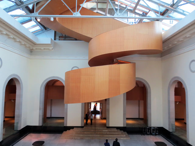
Oh hell ass yes. I was going to go into a whole rant about Gehry's fucking staircase in the fucking AGO that is fucking useless at the job of being a fucking staircase but it turned out all I needed was this sentence.
It looks really pretty from far away, but try walking up and down the thing--the weird curves make for some very steep and tight sections and argh. Plus, no matter how pretty it is, it just ruins that gorgeous, lofty space. I like most of what Gehry does, and I love most of the AGO transformation, but he should be put up against a wall and shot for that particular crime.
posted by feckless fecal fear mongering at 7:30 PM on January 1, 2015 [1 favorite]
The European Parliament building (the 'buildings' link in the post) honestly looks like something out of SimCity 4.
There are a number of new buildings in DC that eerily resemble CAD renderings (City Center DC being maybe the most cognitive dissonance-inducing). The gulf in appearance between digital design and physical execution is definitely narrowing.
posted by ryanshepard at 7:32 PM on January 1, 2015 [1 favorite]
I'm a fan of brutalist architecture. "Brick is stingy, Concrete is generous." But like anything in life, it has to be functional in order to work. If it's not functional, then yeah, starchitects and their dithering clients deserve our scorn.
posted by ovvl at 8:04 PM on January 1, 2015 [2 favorites]
posted by ovvl at 8:04 PM on January 1, 2015 [2 favorites]
Charlie, Deconstructivism, is post-pomo. It matters. Pomo is all signs, symbols and signifiers - whole things, re-arranged into different combinations. Decon is all fragments, no whole things at all, collisions and disjunctions of partial things. What Holl and others are doing is more abstract, back to form before it had meaning as a signifier, just phenomena and effect.
For some good clarification on the complicated (and often beautiful) mess that is architectural style and theory since the high period of Modernism, a good place to start is a book edited by Kate Nesbitt, called 'Theorizing a New Agenda for Architecture'. Wikipedia is really uneven when it comes this topic. Reader beware.
posted by sevensixfive at 8:04 PM on January 1, 2015 [5 favorites]
sevensixfive: “ What Holl and others are doing is more abstract, back to form before it had meaning as a signifier, just phenomena and effect.”
Man, I have to say, though – just googling around and reading a bit about Stephen Holl, it's hard not to dislike him:
All this – along with Gabriel Kahane's excellent recent album "The Ambassador Hotel," which is a whole record about the architecture of Los Angeles – makes me want to dig into architecture and read a bit about it. Thanks for the suggestions along that track.
posted by koeselitz at 9:54 PM on January 1, 2015 [2 favorites]
Man, I have to say, though – just googling around and reading a bit about Stephen Holl, it's hard not to dislike him:
Holl, who is based in New York, is an architect with an aura of seriousness. He gets up early every day to paint, usually in watercolour. He invokes philosophy and science and endows his projects with poetic names, such as Writing With Light House or The Tower of Silence. He ponders the qualities of daylight and of building materials, their roughness, smoothness, patination and porosity. He likes the word "haptic". He says things such as: "Building transcends physical requirements by fusing with a place, by gathering the meaning of a situation."That's from an article about the original announcement of his recent building at the Glasgow School of Art – across the street from the famed Charles Rennie Mackintosh building for the same school – which apparently drew a lot of ire. A review of the final building makes it sound like it's about as awful as the building charlie can't surf describes above.
All this – along with Gabriel Kahane's excellent recent album "The Ambassador Hotel," which is a whole record about the architecture of Los Angeles – makes me want to dig into architecture and read a bit about it. Thanks for the suggestions along that track.
posted by koeselitz at 9:54 PM on January 1, 2015 [2 favorites]
Liking or not liking aside, I'm just saying let's not miscategorize the work. History, styles, and periods matter. There are resources out there that offer opportunities to learn more about this stuff, whose names don't rhyme with "sticky media".
Alright, so far that's one architect that should be put up against a wall and shot, and another that deserves a punch in the face. What is it about this material that brings out the violence in this otherwise generous and carefully critical crowd?
Probably drifting off-topic here, if so, I apologize.
posted by sevensixfive at 10:00 PM on January 1, 2015 [3 favorites]
sevensixfive: “Alright, so far that's one architect that should be put up against a wall and shot, and another that deserves a punch in the face. What is it about this material that brings out the violence in this otherwise generous and carefully critical crowd? Probably drifting off-topic here, if so, I apologize.”
I think you're on-topic. But I feel like the thing about architecture is that it's one of relatively few arts that people – all people, not just appreciators of art or whatever – are required to live with intimately every single day. It's really the only art we live inside. So when architectural design goes wrong or creates spiritual discordance in architecture, we can't walk down the hall or go hide in our bedrooms or go out into the garage to be away from it. It's in all those places. And when we work every day in a space, that space's drawbacks and problems bear down on us constantly.
At least I get the feeling that's the source of the ire in charlie's comments here; and his comments have been the ones that inspired most of the annoyance in this thread, I think. Other people were mostly echoing his frustration with tedious or bad architecture.
In any case – maybe he's wrong about Stephen Holl – and I am going to keep that in mind; I haven't even been inside one of his buildings. The design principles listed by the people who designed the European Parliament sound distinctly like terrible principles if you want to build buildings that are functional. I feel like I need to educate myself a bit about all this.
posted by koeselitz at 10:33 PM on January 1, 2015 [2 favorites]
Alright, so far that's one architect that should be put up against a wall and shot, and another that deserves a punch in the face. What is it about this material that brings out the violence in this otherwise generous and carefully critical crowd?
Hyperbole for the sake of amusement. Obviously I don't think Gehry should be actually literally shot. I'd settle for him having to walk up and down those stairs ten times without incident.
And then shot.
posted by feckless fecal fear mongering at 10:45 PM on January 1, 2015 [6 favorites]
Hyperbole for the sake of amusement. Obviously I don't think Gehry should be actually literally shot. I'd settle for him having to walk up and down those stairs ten times without incident.
And then shot.
posted by feckless fecal fear mongering at 10:45 PM on January 1, 2015 [6 favorites]
(I do want to mention again, and recommend, Gabriel Kahane's marvelous album from a few months ago entitled The Ambassador Hotel. It's about the architecture of Los Angeles and how it affects daily life there; each song concerns a different building in LA, with an address attached. "Empire Liquor Mart (9127 S. Figueroa St.)," which details the shooting of a fifteen-year-old black girl named Latasha Harlins that sparked the LA Riots in 1992, is a masterpiece, I think, and easily one of the best songs of 2014. On other tracks Kahane discusses the architecture of Rudolph Schindler, Frank Lloyd Wright, and Richard Neutra. It's a fantastic record as a whole, really. Thoroughly engaging and interesting.)
posted by koeselitz at 10:46 PM on January 1, 2015 [3 favorites]
posted by koeselitz at 10:46 PM on January 1, 2015 [3 favorites]
. A review of the final building makes it sound like it's about as awful as the building charlie can't surf describes above.
All those weirdly off-kilter lines are making me vaguely seasick.
posted by feckless fecal fear mongering at 10:51 PM on January 1, 2015
All those weirdly off-kilter lines are making me vaguely seasick.
posted by feckless fecal fear mongering at 10:51 PM on January 1, 2015
Yeah, I certainly don't want to denigrate anyone's actual lived experience with a building (especially if it resulted in broken ankles: there's a 2-3" step just like that at a place I visit, right past a doorway, with dull concrete making depth perception more difficult, and the damn thing gets me every time; see also the parable of the broken step). But I'm also aware of the visceral reactions that older "classical/traditional" architecture can engender and I have to wonder how much this is influenced by style and changes in lifestyles and usage. There was, after all, a time when Gothic architecture was popular, and Second Empire, and Queen Anne, and yet all these are mixed up today with movie-juiced images of "haunted houses". (On an historic architecture board I frequent -- well, it is on Facebook -- you can almost do a one-two-three count on ceertain postings before someone chimes in "Looks like the Munsters house!" The opposite problem is found with almost any modern building, as someone will call that "Soviet", which is historically ludicrous, of course.)
I will also point out that the "starchitect" phenomenon of today is both overblown and not usual for the past. There's a particular set of circumstances -- competitive pressures as well as easy international communication -- that have (mostly since Gehry's Guggenheim in Bilbao) resulted in a high number of competitions for buildings, which has resulted in a kind of one-upmanship that has burnished the reputations of a few small one-percenters even as it's opened up (expensive if you lose) opportunities for small, younger shops to make names for themselves. I don't think this is what made universities choose Brutalism in the 1970s, though.
And about that. There are some comments in here -- not all -- that conflate a number of distinct styles. Brutalism, for example (read bendy's link), is a definite subset of Modernism, with tendencies toward Post-Modernism, but still not really the same thing. Post-Modernism comes in two flavors, Portland City Hall being one (a recasting of classical decoration, being a rebellion against the banality of pure International/Miesian boxes) and more daring forms today like Deconstructivism that completely eschew traditional forms, approaches, even the concept of straight lines. For a potted history of this sort of thing, you skeptics will probably like this essay, which I think is pretty good for the first 2/3 where it sorts out the motivations for the various changes in approach through the major 20th century -- then completely surrenders to subjectivism when -- conflating Modernism, Post-Modernism, and what it dubs "Avant-Gardism" (a title no one would choose for themselves, anymore, as it is only said with a sneer) -- it tries to argue which of two contemporary examples looks more like what a symphony hall should look like. tl;dr -- there isn't an answer, although I can rather easily guess what the donors for each particular orchestra prefer.
I also enjoyed two separate YouTube videos here and here which go a long way toward a defense of Post-Modernism. The first one actually gets into the academic philosophy (i.e. literary po-mo, Derrida et al.) in a way that makes the relationship accessible, whereas some other sources try to gloss over that lineage. If you're reading this and you're not entirely sure what is meant by the term or can't immediately discern examples, watch those.
But let's get back to the European Parliament in Strasbourg. I think it's interesting that RogerB, above, pointed out that criticism of the structure may be rooted in ideology. The thing is, I can also see how the lived experience of the building can be illuminating of some basic ideology underlying the project itself, which is to say, the European Project (a shorthand for transnational unity, meaning the various arms and expressions of the EU, the Eurozone, Schengen, etc.). The idea is that on the one hand, this is an unfinished project -- at the time, accession of Eastern European states was anticipated but not yet certain. As recently as the financial crisis, the basic underpinnings of the Eurozone have been called into question (willfully, no doubt, by the euroskeptics). But I think it's actually important to point out not just what the EU is striving to be, but what it is striving not to be, to wit, a hegemonic empire on the order of Welthauptstadt Germania^ and the Volkshalle^. I think the reflected experience of working in Strasbourg and Brussels might be that getting "lost" is a function of the attenuated structure of the EU -- daring to be transnational, but eschewing hegemony -- as much as the architecture, if you see my point. It's almost as if the design of the building deliberately reinforces the frustrations and obstacles that are welded directly into the structure of the EU itself.
So we come back to the question of what, say, a college library "should" look like. As before, I don't think there's a right answer, and I'm suspicious of reactionary architectural ideas and ideals that simply privilege certain romantic notions of university life. Keep in mind that the Harvard esthetic -- found to some extent throughout the Ivy League -- of Collegiate Gothic, and the New England liberal arts college eshetic of tidy mostly Greek Revival brick buildings is also artificial. It was adapted to certain notions of what were seen at the time as superlatively democratic, but we now understand to be highly elitist and privileged in execution, models of secondary education. Having reached its zenith toward the end of the 19th century (as with the current University of Chicago campus), it became a marker of outdated approaches by the middle of the 20th, and modernism and its descendants thence forward prevailed. But it's important to keep in mind that these were popular and celebrated forms at the time, not something forced on the people by egotistical academicians. Hard as it may be to fathom today, people actually liked even the Brutalist form when it was new, and it wasn't just universities -- churches, municipal buildings, and right down to small commercial developments all embraced it. The more standard Mid-Century Modern forms that Gymnopedist found in Titusville were not "futuristic"-- because it was the Space Age, yes so capitalized and unironically, and people really did think they were already in the future (and yet they chose forms that had still a slight relationship with Spanish Colonial architecture, interestingly enough).
But times have changed. I hear people wanting buildings to "just work" sort of the way they want their technology like their smart phones to "just work" (cue that Louis C.K. routine you've heard a hundred times). I think this is valid and certainly the occupants and users of buildings should have the opportunity to have input as stakeholders into any design process today. But I can't accept that any of these movements are essentially anti-humanist -- many of them in fact began with profoundly humanist or populist sentiment. Brutalist architecture in particular may have proven to be unmalleable for "buildings that learn". But I do think it's particularly interesting that especially Brutalism and Deconstructivism are spurring such visceral negative reactions today. In one sense, this is funny, because that individual relationship with a building is at the root of what Post-Modernism is all about (see the videos). On the other hand it isn't good that someone hates the building they live or work in. But on the gripping hand, architecture that pleases everyone will in the end please no one, and we've all been in bland, least-cost institutional places like that (my city seems determined to build only that way; fixed-income property taxpayers will yell loud and long over every penny over their personal perception of what a building ought to cost). So you're not going to see me on the picket line for duller, merely functional architecture.
So I'll leave you with this VICE clip I dug up about Vito Acconci, a onetime poet, musician, and filmmaker turned architect, who definitely represents the humanist end of whatever you want to call cutting-edge architecture these days. A lot of what he talks about isn't practical in the strictest sense, but it is definitely rooted in the human experience of architecture as a space, a place, and even an expression of culture or self.
posted by dhartung at 11:54 PM on January 1, 2015 [15 favorites]
He says things such as: "Building transcends physical requirements by fusing with a place, by gathering the meaning of a situation."
Later, he cuts a deal with his former classmate Howard Roark to do some simple designs which he takes credit for. Roark is annoyed with the final product, and blows it up with dynamite.
posted by valkane at 4:53 AM on January 2, 2015 [1 favorite]
Later, he cuts a deal with his former classmate Howard Roark to do some simple designs which he takes credit for. Roark is annoyed with the final product, and blows it up with dynamite.
posted by valkane at 4:53 AM on January 2, 2015 [1 favorite]
No discussion of brutal 60/70s university architecture can be complete without some mention of the University of East Anglia. No effort to try and give an olde worlde feel to any of this campus, just full on concrete and glass in its original form, now jazzed up with steel and even wood. The UEA architecture Flickr account. Want to live in a giant concrete ziggurat? Then UEA is the place for you.
posted by biffa at 5:43 AM on January 2, 2015
posted by biffa at 5:43 AM on January 2, 2015
This grating is part of the architects' intent to make Lovett riot–proof in reaction to the student riots of the late 1960s.
This is a myth. The grating around Lovett was built to contain all the suck. SID RICH RULES
posted by Metroid Baby at 6:12 AM on January 2, 2015 [1 favorite]
This is a myth. The grating around Lovett was built to contain all the suck. SID RICH RULES
posted by Metroid Baby at 6:12 AM on January 2, 2015 [1 favorite]
Our buildings offer themselves to their inhabitants and to the city as ‘mysteries,’ or stories for which we provide ‘keys’ and signs so that they can be deciphered
This is exactly the same kind of cockbrained head-up-its-own-arse wankery that enrages me so much about modern computer UI design.
You're not making a fucking abstract sculpture, you arseholes. People have to use this shit.
posted by flabdablet at 8:01 AM on January 2, 2015 [5 favorites]
This is exactly the same kind of cockbrained head-up-its-own-arse wankery that enrages me so much about modern computer UI design.
You're not making a fucking abstract sculpture, you arseholes. People have to use this shit.
posted by flabdablet at 8:01 AM on January 2, 2015 [5 favorites]
Want to live in a giant concrete ziggurat?
See also Habitat in Montreal.
You're not making a fucking abstract sculpture, you arseholes. People have to use this shit.
Yes! That's the thing. Some artistic media really can go way out and do completely wild things--music (well, depending), sculpture, painting. There is no function (other than the function of its existence) and so the form can be anything. For others, form has to follow function. That still leaves a lot of room for creating dialogues in spaces, for challenging notions of what a library is, whatever. At the end of the day architecture needs to be used first, then seen, then thought about. If usability is a problem, the other considerations simply don't matter.
posted by feckless fecal fear mongering at 8:22 AM on January 2, 2015 [2 favorites]
What is it about this material that brings out the violence in this otherwise generous and carefully critical crowd?
In my case, some of it is irritation that somebody actually got paid for making my working day more miserable than it needs to be; but most of it is fury at the gullibility of whichever dickheads chose this particular arsehole's slapped-together chunk of High Concept bullshit on the basis of some utterly transparent Emperor's New Clothes pomo promo.
I have no objection at all to architecture porn as long as it stays on the drawing board where it belongs instead of getting turned into buildings I have to suffer the fundamental deficiencies of every! single! day!
posted by flabdablet at 8:23 AM on January 2, 2015 [8 favorites]
Here's similar info about UMass' brutalism architecture. In this case, the buildings were meant to appeal to a wider range of students of all classes including those who weren't accustomed to the fancier trappings of the elite.
A bizarre notion, really. "We don't want to make poor students feel like the university isn't for them, so let's make sure that the universities they can go to look as little like a traditional university, and as much like a factory, as possible." It's assuming that poor people didn't go to university because they were culturally uncomfortable, rather than because they couldn't afford it.
Dhartung, that's a really great and informative comment, but I think it drifts into exactly what people hate about so much of this architecture. You keep thinking people are mad about "what a college library should look like," and sure, there's some of that. But most people here aren't talking about how their building looks, they're talking about how it works. A lot of deconstructivist architecture refuses to engage with that question, or treats it as something to wittily play with. But it's far more important than any of the academic thinking about signifiers and disconnected elements that occupy most deconstructivist architect's thinking.
Post-modern architecture, like a great deal of contemporary art, reflects the rise of university culture as the incubator and financier of the arts. When your training and your funding are coming from professional explainers, your work is going to privilege explanation, and be hostile to any art or aesthetics that shut out the explainer. Which is unnerving or enraging to those who would prefer to interact with their workplace more transparently. Again, I understand that a lot of deconstructivist architecture is ideologically opposed to that sort of transparency, but I'd suggest that is a problematic ideology itself.
posted by ThatFuzzyBastard at 8:23 AM on January 2, 2015 [5 favorites]
This is what you get when you start with How It Works. I want to work there.
posted by flabdablet at 8:25 AM on January 2, 2015
posted by flabdablet at 8:25 AM on January 2, 2015
as much like a factory, as possible
Yeah, so much like a factory you can hardly tell the difference.
posted by RogerB at 8:53 AM on January 2, 2015 [1 favorite]
Yeah, so much like a factory you can hardly tell the difference.
posted by RogerB at 8:53 AM on January 2, 2015 [1 favorite]
Yeah, on university campuses, even when people think some of the brutalist architecture is ugly, they tend to develop an affection for it over time if it functions. The buildings people HAAAAAAAAAAATE are the ones that don't work -- that are hard to understand and navigate, that hide their entrances, that are uncomfortable, that can't adapt to shifting uses, that get too hot, that don't interact with local weather, etc. People particularly resent it if the show-offy architectural bits cost a shitload to maintain or break frequently. ("Boy, great roof concept, too bad IT LEAKS CONSTANTLY SO I CAN NEVER USE MY CLASSROOM.")
It's not limited to modernist or brutalist or pomo or anything ... we had this faux-gothic building which was fine, it matched the rest of campus fine, it wasn't as good as the older buildings where the windows were actually deep and had good window seats to curl up in to study, but it was fine. The architect has a vision that the door would open outward into the wide, unimpeded hallway to show how the university was about taking knowledge out into the world. Two broken noses later and one absolutely catastrophic fire drill later, they rehung all the doors to open inward. Because when you open blind doors INTO a wide, unimpeded hallway of knowledge with no alcoves or anything for the doors, not even flooring that suggests where walking is and where the sides are, people anxiously sidle down the center of the hallway watching for doors, and eventually noses get broken. (The bathrooms were also a horrible, miniature afterthought. You could not pee there.)
There's no excuse for bad bathrooms in newly-build buildings. There was a new big lecture hall building on campus -- and, again, dull but fine, this one more modern-looking, different quad -- and they put in adequate bathrooms for the large lecture halls! Yay! It was a talking point in the fundraising! They did it! ... but the entrance/exit for the bathroom (maze-style, no door) was so narrow that people had to turn sideways and slide past each other, and someone with a mobility aid meant everyone else had to back out of the hallmaze and the bathroom never got fully used because the entry/exit was too congested and the line would end up outside the bathroom TO USE THE HALL while there were empty stalls and sinks all over the bathroom! It was like, "Have you never been to a movie theater?"
How do architects get to be architects knowing SO LITTLE about buildings? It's baffling.
posted by Eyebrows McGee at 8:56 AM on January 2, 2015 [8 favorites]
ThatFuzzyBastard: “Post-modern architecture, like a great deal of contemporary art, reflects the rise of university culture as the incubator and financier of the arts. When your training and your funding are coming from professional explainers, your work is going to privilege explanation, and be hostile to any art or aesthetics that shut out the explainer. Which is unnerving or enraging to those who would prefer to interact with their workplace more transparently. Again, I understand that a lot of deconstructivist architecture is ideologically opposed to that sort of transparency, but I'd suggest that is a problematic ideology itself.”
I'm not sure what you mean by "the rise of university culture as the incubator and financier of the arts." "University culture" has, by its very definition, always been the premier incubator and financier of the arts. This has been the case since the medieval period, when the university was first founded on the premise that it would be a place where liberal arts – which as defined then specifically included all the components of architectural design.
And I'm not sure how much mileage you're going to get out of a somewhat reductive definition of scholars at a university as "professional explainers." For instance: you say that the problem with "university" architecture is that it "privileges explanation" and thereby shortchanges people who just want to interact with the building directly and don't want an explanation. But this is clearly dependent on the assumption that the explanation is wrong – that it doesn't include all the things people use a building for, and that it isn't communicated directly by the design of the building itself. You are assuming, in short, that universities are inherently limited in perspective and scope. And that assumption seems dramatically unwarranted to me.
In any case – if you're looking for an architecture that wasn't informed by an education among "professional explainers" at a university, I have a feeling you will search in vain. Since the dawn of architecture, architects have always had their creative educations at universities or their analogues; even in ancient times architects studied mathematics and physics among the philosophers and teachers in order to give them insight into how to build buildings. The best architects are the ones who have gained through this experience at the university an appreciation for how mathematical and geometrical design can interact with life, and who take into account all the many ways people want to use their buildings and then design accordingly.
If you want non-university architecture, I suspect the best you'll do is probably something like the House on the Rock. But maybe there is a movement of "outsider architecture"? I guess there's also that castle in Colorado that some guy built. I don't imagine most of those buildings are very liveable, though.
posted by koeselitz at 10:09 AM on January 2, 2015
Wow... that Infinity Room is beautiful.
posted by feckless fecal fear mongering at 10:23 AM on January 2, 2015
posted by feckless fecal fear mongering at 10:23 AM on January 2, 2015
This grating is part of the architects' intent to make Lovett riot–proof in reaction to the student riots of the late 1960s.
Were Brutalist Buildings on College Campuses Really Designed to Thwart Student Riots? [Slate]:
Though the riot-prevention narrative is widely known, every architectural historian or critical source that I consulted viewed it as extremely dubious. For one thing, the claim is somewhat anachronistic. Many campus Brutalist projects were planned (if not totally completed) before the student movements of the late '60s and early '70s really took off, so crafty administrators would have to have been very prescient to foresee the countercultural-quashing usefulness of any particular style. Plus, as one practical-minded source put it, “not only was [Brutalism] in vogue, architecturally speaking, but building in concrete was way, way cheap. Hence its widespread use in institutional building” during the period.
posted by ryanshepard at 10:43 AM on January 2, 2015 [2 favorites]
In my case, some of it is irritation that somebody actually got paid for making my working day more miserable than it needs to be; but most of it is fury at the gullibility of whichever dickheads chose this particular arsehole's slapped-together chunk of High Concept bullshit on the basis of some utterly transparent Emperor's New Clothes pomo promo.
I have no objection at all to architecture porn as long as it stays on the drawing board where it belongs instead of getting turned into buildings I have to suffer the fundamental deficiencies of every! single! day!
So is there a type of architecture that "just works", and everybody should just design like that forever? This is a common feeling about architecture, that there is somehow this timeless essence to it, that we need to get back to. This is not the case, architecture is a human construct, it has to do with culture, which is always changing, and technology, which is always changing. Everything you see before you (and unless you're in Yosemite, you've probably got architecture in front of you right now) did not, at one point, exist. It was invented by a human being, who was trying something new.
We have to keep trying new things, and that's hard with building, because it has to exist at full scale, and sometimes people have to live for a while with the mistakes. There's very little bad faith or gullibility involved, no one's trying to get one over on you, or ruin your day, or out-intellectualize you, they're just trying new stuff, and sometimes that doesn't work. There's not a lot of other ways to do it, when you're designing buildings.
posted by sevensixfive at 12:05 PM on January 2, 2015 [4 favorites]
I'll just leave this here, too: Fuck Yeah Brutalism
posted by sevensixfive at 12:12 PM on January 2, 2015 [4 favorites]
posted by sevensixfive at 12:12 PM on January 2, 2015 [4 favorites]
This is not the case, architecture is a human construct, it has to do with culture, which is always changing, and technology, which is always changing.
This is exactly right. For instance, while Victorian row houses and brownstones are almost universally beloved today, 60 years ago they were almost universally seen as old-fashioned, fussy and generally unfit for contemporary life. Across the country, cities tore down fine office buildings and row houses, and the strange few who valued these buildings had to go picking in the rubble to save fragments.
It's not like the people of Fifties America were totally insane when it came to architecture. Like in every era, they were (generally) favoring architecture that spoke to their self-image.
posted by fitnr at 1:10 PM on January 2, 2015 [2 favorites]
dhartung: The more standard Mid-Century Modern forms that Gymnopedist found in Titusville were not "futuristic"-- because it was the Space Age, yes so capitalized and unironically, and people really did think they were already in the future (and yet they chose forms that had still a slight relationship with Spanish Colonial architecture, interestingly enough).
Hey, thanks for the insight. The buildings at UCF all actually work very well, practically speaking, and I've really developed a love for them over time because they're very different from what you see on older campuses. I lack the architectural knowledge to really put my finger on how they should be described and don't know much about the context within which they were designed, so I really appreciate this post.
posted by Gymnopedist at 4:56 PM on January 2, 2015
> "This is exactly the same kind of cockbrained head-up-its-own-arse wankery that enrages me so much about modern computer UI design."
Just as in architecture, the modern method indicates that the interface should hurt the user.
posted by kyrademon at 6:25 PM on January 2, 2015 [2 favorites]
Just as in architecture, the modern method indicates that the interface should hurt the user.
posted by kyrademon at 6:25 PM on January 2, 2015 [2 favorites]
Charlie, Deconstructivism, is post-pomo. It matters. Pomo is all signs, symbols and signifiers - whole things, re-arranged into different combinations. Decon is all fragments, no whole things at all, collisions and disjunctions of partial things. What Holl and others are doing is more abstract, back to form before it had meaning as a signifier, just phenomena and effect.
Well, you are quibbling about subgenres of post Modernism, deconstructionism is just the newest postmodernism IMHO. You can quibble about this endlessly. Where does one end and the other begin? I once attended a very interesting lecture by an eminent pomo theorist and historian. It was a classic "slide lecture," which is oh so familiar to anyone who ever took art history. The lecture started with two slides, paintings presented side by side, one by Jean Dubuffet and the other by Gerhard Richter. The two paintings looked almost identical, they were produced with nearly identical methods at nearly the same size, and within a year of each other. But one painting is obviously Modernism and the other is obviously Postmodernism. So, why is that? How can we tell the difference so easily, if we can't really articulate just what the difference is?
Anyway, I probably would not abhor these architectural designs if the implementation wasn't so obviously inimical to human activity. Your building must adequately provide basic safety and shelter, before you can move on to displays of your whimsical post architectural genius.
posted by charlie don't surf at 10:51 PM on January 2, 2015
I'm not quibbling. Art and architecture history is a thing, and it exists independently of anyone's individual opinion. Some people make professions out of teaching and studying this stuff.
posted by sevensixfive at 10:10 AM on January 3, 2015
posted by sevensixfive at 10:10 AM on January 3, 2015
So is there a type of architecture that "just works", and everybody should just design like that forever?
No. There is an attitude toward architecture that just works, and it involves making Bold Architectural Statements come way, way, way, WAY down the priority list from making sure that the building's users needs will be met.
posted by flabdablet at 11:07 AM on January 3, 2015 [6 favorites]
No. There is an attitude toward architecture that just works, and it involves making Bold Architectural Statements come way, way, way, WAY down the priority list from making sure that the building's users needs will be met.
posted by flabdablet at 11:07 AM on January 3, 2015 [6 favorites]
no one's trying to get one over on you, or ruin your day, or out-intellectualize you, they're just trying new stuff, and sometimes that doesn't work.
Like bullshit Fiddler On The Roof staircases going nowhere just for show? Fucksake.
posted by flabdablet at 11:08 AM on January 3, 2015
Like bullshit Fiddler On The Roof staircases going nowhere just for show? Fucksake.
posted by flabdablet at 11:08 AM on January 3, 2015
No. There is an attitude toward architecture that just works, and it involves making Bold Architectural Statements come way, way, way, WAY down the priority list from making sure that the building's users needs will be met.
When the revolution comes, I will make you Minister of Architecture.
posted by feckless fecal fear mongering at 11:56 AM on January 3, 2015 [1 favorite]
When the revolution comes, I will make you Minister of Architecture.
posted by feckless fecal fear mongering at 11:56 AM on January 3, 2015 [1 favorite]
I go to UCF which was founded in the late 60s, so you get a lot of buildings like e.g. the library and the administration building in a futuristic-at-the-time brutalistish (?) style.
fwiw, i liked simon fraser's architecture :P
also btw...
-George Packer on the Reichstag
posted by kliuless at 3:49 PM on January 3, 2015
fwiw, i liked simon fraser's architecture :P
also btw...
-George Packer on the Reichstag
...at midnight on October 3, 1990, President Richard von Weizsäcker stood outside the Reichstag and announced to a crowd of a million people the reunification of Germany, in freedom and peace. Berlin became its capital.-Memorials To Monstrosities
For the next decade, until the Bundestag began convening there officially, the Reichstag was reconstructed in an earnestly debated, self-consciously symbolic manner that said as much about reunified Germany as its ruin had said about the totalitarian years. The magnificent dome, designed by Norman Foster, suggested transparency and openness. The famous words on the colonnaded entrance, “DEM DEUTSCHEN VOLKE” (“To the German People”)—fabricated out of melted-down French cannons from the Napoleonic Wars and affixed during the First World War—were preserved out of a sense of fidelity to history. But, after parliamentary argument, a German-American artist was commissioned to create a courtyard garden in which the more modest phrase “DER BEVÖLKERUNG”—“To the Populace,” without the nationalistic tone of the older motto—was laid out in white letters amid unruly plantings. During the Reichstag’s reconstruction, workers uncovered graffiti, in Cyrillic script, scrawled by Red Army soldiers on second-floor walls. After another debate, some of these were kept on display as historical reminders: soldiers’ names, “Moscow to Berlin 9/5/45,” even “I fuck Hitler in the ass.”
No other country memorializes its conquerors on the walls of its most important official building. Germany’s crimes were unique, and so is its way of reckoning with the history contained in the Reichstag. By integrating the slogans of victorious Russian soldiers into its parliament building, Germany shows that it has learned essential lessons from its past (ones that the Russians themselves missed). By confronting the twentieth century head on, Germans embrace a narrative of liberating themselves from the worst of their history. In Berlin, reminders are all around you. Get on the U-Bahn at Stadtmitte, between the Memorial to the Murdered Jews of Europe and the Topography of Terror Gestapo museum, and glance up at the train’s video news ticker: “80 years ago today PEN Club-Berlin forced into exile.” Like a dedicated analysand, Germany has brought its past to the surface, endlessly discussed it, and accepted it, and this work of many years has freed the patient to lead a successful new life.
...the Reichstag building in Berlin, which sat burned out and unused from 1933 and pockmarked from bullets and artillery fire in 1945 during the battle for Berlin, has been, since reunificaiton, completely rehabbed and brought back to life. Its most arresting feature is the chamber for the Bundestag, the German parliament, which sits on the top floor of the building under a giant glass dome which contains a system for reflecting light down into the chamber.-What Architecture Is Doing to Your Brain: "Looking at buildings designed for contemplation—like museums, churches, and libraries—may have positive, measurable effects on your mental state."
There are three symbols at work. One, the rehabilitation of the building was conceived and designed by the great British architect Sir Norman Foster. Yes, the Germans selected an architect from the victors of WWII to build their “capitol” building. Second, the building was last used as the seat of German government in 1933, the last time Germany was a democracy, however flawed, before the dark ages of Nazism and the Cold War. So it is a bridge over those times. Lastly, but perhaps most importantly, the glass dome symbolizes Germany ruled in the light, hopefully never again in the darkness.
posted by kliuless at 3:49 PM on January 3, 2015
Perhaps the building is actually a Lament Configuration, kinda like the one in Hellraiser 3.
posted by homunculus at 5:33 PM on January 3, 2015
posted by homunculus at 5:33 PM on January 3, 2015
I actually really like the campus I work at these days. It's a primary school (roughly K-6 for US readers).
There are four "pods", each containing a high-roofed central atrium with plenty of natural light and four five-sided classrooms radiating from it. The classrooms are mirror pairs with one pair at 90° to the other.
The unusual room shape and layout causes a certain amount of initial disorientation but this is more than made up for by the comfortable proportions of all the resulting spaces. The whole place feels open, airy, light and welcoming. The only corridors are in the admin/library/chapel building, and they're short and not lined with lockers.
The campus is fairly new (2004), the school having moved to its present location from a much earlier collection of buildings close to the centre of town. Three original pods are arranged around a central play courtyard, part of which has swings and slides and climbing stuff under large shade sails. A fourth pod of similar design, opened in 2009, sits a little further from the other three.
The architect worked closely with school staff from very early in the design process, and listened, and it really shows. The resulting buildings are innovative without being flashy, have very few annoyances and in general just work tremendously well. I am quite convinced they make a major contribution to keeping the school's culture as healthy as it is.
posted by flabdablet at 6:05 AM on January 4, 2015 [1 favorite]
I think part of the problem is that making a usable building is actually really straightforward and well defined- and boring. You make a square or a rectangle ((or if you need a courtyard, an O, C or H shape), modify te design according to known light paths, set up interior spaces based on the area needs of the client, set up elevators, stairs and bathrooms based on easy access, make sure there's clear lines of evacuation and adequate data, plumbing and electrical access, and done. We know how to do it, we have centuries of experience in it.
But it's not the sort of thing that impresses people with how great an artist you are, so designers start going past "form over function" into the realm of form actively acting against function. It's what you get when designers are completely divorced from having to use their own output.
posted by happyroach at 7:23 PM on January 4, 2015 [1 favorite]
homunculus, we have been over this. Not everything is a Lament Configuration. "Don't eat the jelly donut, or the rest of them will form a Lament Configuration." Honestly...
posted by Etrigan at 7:54 PM on January 4, 2015
posted by Etrigan at 7:54 PM on January 4, 2015
making a usable building is actually really straightforward and well defined- and boring. ... But it's not the sort of thing that impresses people with how great an artist you are...
I don't see why it's so hard to start with the function and wrap it in a beautiful and artistic exterior (and interior). Sure, it's probably harder to get a building that truly expresses the architect's vision that way, but it would be a far more impressive and lasting monument to that vision if everyone doesn't loath it a few years later.
posted by dg at 10:38 PM on January 4, 2015
Citation needed for architectural designers who claim to be anti-functionalist (besides Peter Eisenman).
posted by sevensixfive at 9:12 AM on January 5, 2015 [1 favorite]
posted by sevensixfive at 9:12 AM on January 5, 2015 [1 favorite]
"Don't eat the jelly donut, or the rest of them will form a Lament Configuration."
Well, sometimes they do! Or they could. Same thing.
posted by homunculus at 3:08 PM on January 5, 2015
Well, sometimes they do! Or they could. Same thing.
posted by homunculus at 3:08 PM on January 5, 2015
...it's not the sort of thing that impresses people with how great an artist you are, so designers start going past "form over function" into the realm of form actively acting against function.
In order for an architect to impress me with the greatness of their artistry, they'd have a consistent track record of designing structures incorporating unprecedented levels of energy efficiency, where the most natural ways for users to interact with the buildings are also the ways that result in achieving that efficiency, and where the buildings are inviting and welcoming rather than repellent to their users. That's not easy and there's plenty of challenge in doing it.
posted by flabdablet at 3:10 PM on January 5, 2015 [2 favorites]
I think energy efficiency is so critical and obvious these days that any building not taking full advantage of nature to maintain its environment is a failure right from the start (so solar panels don't count if they are feeding huge air-conditioning units). That doesn't only apply to Big Important Buildings either - we could do so much better in building our homes, but we stick to the cookie-cutter model and consistently build houses that are totally at odds with their environment. This has become blindingly obvious to me after moving from a home that was purpose-designed for its location (by me), with lots of cross-flow, lots of insulation, spaces that flow into one another with no passages and a minimum of glass on the Eastern and Western sides. Contrast this with what I now live in (this is a southern hemisphere sub-tropical climate, so weather ranges from cool and slightly humid to very hot and very humid):
To be fair, the land is narrow and faces east/west, so there are challenges. It's also part of a cookie-cutter development built in the late '90s when people didn't (but should have) know better. I don't buy for a moment, though, that you can't design intelligent houses at the same cost as dumb ones, but we see the same style of house springing up everywhere even today. The local government has done quite a bit to get things to change, with strict mandated requirements for energy efficiency (eg not many houses are built today without eaves), but the main result has been more expensive houses because it costs money to bring a badly-designed house up to that standard. I still don't see much intelligence in housing design and none in street design - the majority of new suburban streets are still wholly or partly north-south in orientation, meaning house designers have a battle to take advantage of nature.
As in so many areas, we are our own worst enemy :-(
posted by dg at 5:11 PM on January 5, 2015 [1 favorite]
- No eaves
- Significant glass areas on east and west facades
- Almost no glass on north facade
- No flow-though of breeze, even on windy days
- No insulation to speak of
- A long, narrow passage down most of the house.
To be fair, the land is narrow and faces east/west, so there are challenges. It's also part of a cookie-cutter development built in the late '90s when people didn't (but should have) know better. I don't buy for a moment, though, that you can't design intelligent houses at the same cost as dumb ones, but we see the same style of house springing up everywhere even today. The local government has done quite a bit to get things to change, with strict mandated requirements for energy efficiency (eg not many houses are built today without eaves), but the main result has been more expensive houses because it costs money to bring a badly-designed house up to that standard. I still don't see much intelligence in housing design and none in street design - the majority of new suburban streets are still wholly or partly north-south in orientation, meaning house designers have a battle to take advantage of nature.
As in so many areas, we are our own worst enemy :-(
posted by dg at 5:11 PM on January 5, 2015 [1 favorite]
I think part of the problem is that making a usable building is actually really straightforward and well defined- and boring.
See, I disagree. The complexity involved in managing and tying all these aspects together is vastly underrated.
It's not a coincidence that most of the buildings talked about here are particularly complex: libraries, or school buildings, or political gathering spaces, where a space is pushed to the limit of how many kinds of spaces, how many kinds of functions, and how many different types of users will inhabit the space.
Can you imagine a more complex grouping than a building that has an auditorium, a conference spaces, tiny meeting rooms, quiet space for people to work in, group spaces where people can talk in, large open areas where people can eat, an entrance where people can gather and disperse -- not to mention numerous bathrooms, storage areas, areas for mechanical equipment, janitor closets, maintenance, structural columns, electrical and plumbing risers, parking, and finally, the structural components of the building itself (load bearing walls, shear walls, beams, columns, etc)? Not to mention the logistical juggle of material costs, labor costs, available finishes, etc. etc.
These kinds of buildings haven't been around for a long time. Notice that nobody's talking about office buildings/towers, or residential buildings. I'd argue that this complexity is very new, especially enabled by recent architectural technologies (CAD, BIM)- hardly more than a generation or two, and thus still very young.
Of course, we could question the decision to mash all of these programs together into a single building, but that's not the architect's fault; usually the school or institution has done its own space planning study to understand what it requires, undertaken by behemoth firms like AECOM.
On top of that, you have many different types of people who will use the space: those who will use it every day, those who will visit it once and never visit it again, those who love natural light, those whose eyes are sensitive to glare.
--
(To borrow a computer science metaphor - Architecture tries to solve a problem by creating three-dimensional spaces that need to change based on time, different uses, different type of people, and so has many dimensions. For simple functions of a building (say, a residential tower), this design process is NP-complete, because while the design process is really tricky (non-polynomial time), it's more easy to foresee when or when not a building is working. For more complex buildings (say, a large multipurpose parliament building), the design process is NP-hard - while the design process is still tricky, it's actually harder to foresee when a building is working or not working during the design process. It's only when the building is flooded with users that these issues become apparently clear.)
--
Add confirmation bias to this: architects more skillful at these issues are not actively noticed, since architecture is usually absorbed in a state of distraction, so if the building is gorgeous and works well it feels so effortless that most people don't notice it in the first place.
Add to this the fact that most of us use objects and commodities that are so mass-produced at incredible scales (millions, billions of production units), and so can have the complexities and kinks ironed out of them, through different versions and over time. In contrast buildings are built one at a time, never mass-produced (although pre-fab construction is trying to change that). As a result, most of us encounter objects and commodities that fail much less often. Even then, your iPhone, of which 500 million has been sold, might fail tomorrow.
Yes, the architect is to blame, sure, and there are certainly architects who certainly think less about their users than others. But designing spaces/functions/programs in a highly linear process (design -> construction) with highly entropy-sensitive processes (materials, construction, etc) is a highly complex process.
It's not so straightforward.
posted by suedehead at 11:32 PM on January 5, 2015 [1 favorite]
dg, have you got photos of your previous home that you are willing to share? It sounds lovely.
posted by feckless fecal fear mongering at 2:39 AM on January 6, 2015
posted by feckless fecal fear mongering at 2:39 AM on January 6, 2015
Sure. There's a whole range of photos there - the earlier ones that some have furniture are those that I took as we were moving in, the later ones with furniture when it was up for sale after my ex had moved out and taken most of the furniture. It's a tragedy to me that it never quite got finished (by me, anyway) and not only because it would easily have sold for $100k more than it did had it been finished. Having designed it myself and built the whole thing with my own hands, it was tough to let go of, but such is life. The design worked out pretty well and, overall, I was pretty happy with it. There were some rookie mistakes that a halfway competent architect probably wouldn't have made and that only became obvious to me when it was too late - some I could fix, but others had to be lived with. The stuff you can't see is the insulation, including 75mm thick extruded polystyrene cladding and insulation directly under the roof as well as directly over the ceilings - overall about double the minimum required.
But the main point is that it was wonderfully cool in summer, pretty warm in winter (I acknowledge that it worked better in the heat than in the cold, but that's only like 6 weeks or so here, so not so critical). It did this because the layout was thought through taking into account the environment, the specific location and the various aspects of weather that affect how comfortable a house is, particularly where the breezes came from and when. It probably helped that we lived on-site (in the shed) before the house was built, which is obviously impractical for every building, but isn't that what architects are supposed to learn? How to make a building that works?
posted by dg at 3:48 AM on January 6, 2015 [2 favorites]
"Don't eat the jelly donut, or the rest of them will form a Lament Configuration."
Well, sometimes they do! Or they could. Same thing.
I have eaten
the jelly donut
that was in
the donut box
and which
you were probably
saving
for breakfast
Forgive me
it was delicious
so oh shit
it's Pinhead
posted by Etrigan at 4:13 AM on January 6, 2015
Well, sometimes they do! Or they could. Same thing.
I have eaten
the jelly donut
that was in
the donut box
and which
you were probably
saving
for breakfast
Forgive me
it was delicious
so oh shit
it's Pinhead
posted by Etrigan at 4:13 AM on January 6, 2015
usually the school or institution has done its own space planning study to understand what it requires
...with varying degrees of competence
posted by flabdablet at 5:52 AM on January 6, 2015
...with varying degrees of competence
posted by flabdablet at 5:52 AM on January 6, 2015
« Older It looks a bit empty. Try to make everything... | I Think the Storm Ran Out of Rain, the Clouds Are... Newer »
This thread has been archived and is closed to new comments
Such a complex language to communicate a simple idea. You know, just the building itself.
posted by Foci for Analysis at 7:05 AM on January 1, 2015 [4 favorites]