What Women Want in Women Characters
March 29, 2015 12:26 PM Subscribe
Women Characters Redesigned by Women SFF Artists
By Lauren Panepinto. Via Muddy Colors.
As I said, I’m going to be discussing this at length in my next post. For now, I’m going to give you a flood of examples of women characters in fantasy art — many infamous for being depictions unwelcoming to women — that have been redesigned by the professional artists in the Women in Fantasy Illustration group. Each woman’s point of view is different, and the redesigns reveal what is most important to that woman, whether it’s realistic body armor, or it’s making sure the woman has a narrative and agency of her own. There is no one right way to depict a woman character, and it is not as simple as "cover her up more" because, as you'll see, some of these redesigns are sexier than the original. And I have found through my own work that you CAN absolutely have a single depiction of a character that is sexy and empowering to all genders. As I said, more on that next post.
By Lauren Panepinto. Via Muddy Colors.
I love almost all of these (Especially the new Samus and new Sonja), but the Princess Peach one the article led with just bothers me. Most of these seem to be finding an outfit that better suits the character's personality than the ridiculous sexed up design they were originally put in. Peaches's outfit (in particular the BFG) bothers me because it seems to require a complete rewrite of her personality to match the new outfit, instead of changing the outfit to better suit the personality.
tl;dr I'd much rather see Peach dressed as the powerful absolute monarch of an entire nation, Queen Victoria style, than as something gratuitously violent.
posted by yeolcoatl at 1:08 PM on March 29, 2015 [8 favorites]
tl;dr I'd much rather see Peach dressed as the powerful absolute monarch of an entire nation, Queen Victoria style, than as something gratuitously violent.
posted by yeolcoatl at 1:08 PM on March 29, 2015 [8 favorites]
I wasn't bothered by the Princess Peach redraw. They set out, explicitly, to represent a diverse set of views about what women want to see, and it seems reasonable that a woman could want to see a Princess Peach that's a fighter to contrast with her canonical damsel in distress role. It's not simply the outfits that women are cast in that can be problematic. There are different directions that one could go in to break out of that damsel in distress role, and "powerful absolute monarch" is one, but that isn't a completely neutral choice either.
posted by Kutsuwamushi at 1:15 PM on March 29, 2015 [1 favorite]
posted by Kutsuwamushi at 1:15 PM on March 29, 2015 [1 favorite]
It doesn't help that the Peach redesign gave her cleavage and hot pants out of nowhere.
posted by kafziel at 1:16 PM on March 29, 2015 [4 favorites]
posted by kafziel at 1:16 PM on March 29, 2015 [4 favorites]
It doesn't help that the Peach redesign gave her cleavage and hot pants out of nowhere.
Did you read the introduction?
posted by Kutsuwamushi at 1:17 PM on March 29, 2015 [1 favorite]
Did you read the introduction?
posted by Kutsuwamushi at 1:17 PM on March 29, 2015 [1 favorite]
Using the power-switch icon for Power Girl's symbol is genius.
posted by straight at 1:18 PM on March 29, 2015 [13 favorites]
posted by straight at 1:18 PM on March 29, 2015 [13 favorites]
I agree about the Princess Peach redesign: goes from stereotypical Disneyesque princess to equally stereotypical Strong Female Character.
The Seamus redesign is pants too.
posted by MartinWisse at 1:18 PM on March 29, 2015
The Seamus redesign is pants too.
posted by MartinWisse at 1:18 PM on March 29, 2015
Seriously, there is no winning here. Whenever we talk about sexualization of illustrated female characters and less revealing outfits are brought up, people object: "Prudery isn't the same as feminism! Women can be sexy and strong!"
Yeah, it is a pretty stereotypical character type: pretty girl in pink with BFG. I'm just disappointed in how knee-jerk negative responses to any such project are, even when they're framed in such thoughtful and explicitly individual terms as this one.
Cover them up, and you're shaming women's sexuality or "infantalizing" them; reveal skin and you're "giving them cleavage and hot pants out of nowhere." The introduction addresses both of these. You might not agree but it's uncharitable to respond as if you haven't even read what the editor had to say about it.
And I like the Seamus redesign a lot. It was one of my favorites.
I wish we could stop shitting on women for indulging in a fantasy about how they would like to see a character portrayed because that fantasy doesn't fit our ideas of how women should be portrayed.
If I was an artist this kind of response would make me nervous about participating at all.
posted by Kutsuwamushi at 1:27 PM on March 29, 2015 [22 favorites]
"Prudery isn't the same as feminism! Women can be sexy and strong!"
Which nobody here has been saying. If you redesign a character, you have to accept that some people won't like your redesign, regardless of your intentions and you can't always dismiss it with "but sexism".
The Peach redesign doesn't really work because it misreads the character and swaps one stereotype for another. Seamus doesn't need redesigning so much as she needs her original armour back and Emma Frost without fetish clothing isn't Emma Frost.
Now of course it's possible to criticise her entire character for being a sexist, obnoxious trope and you wouldn't be far wrong, but if you are just going for a costume redesign, you need either to stick somewhat to the character traits of the person you're revamping, or have a good reason to alter them.
Doesn't mean all these designs are bad: the Red Sonja one is great frex and not too far from some of her earlier appearances.
posted by MartinWisse at 1:47 PM on March 29, 2015 [2 favorites]
The best part about the Samus redesign is the inspiration from Moebius. Red Sonja is also what she should have been from the beginning.
OTOH, I'm not a fan of the Princess Peach redesign because at this time it's so cliché to do grimdark redesigns of cute characters.
posted by sukeban at 1:47 PM on March 29, 2015 [1 favorite]
OTOH, I'm not a fan of the Princess Peach redesign because at this time it's so cliché to do grimdark redesigns of cute characters.
posted by sukeban at 1:47 PM on March 29, 2015 [1 favorite]
I was never into comic books and not that into video games so I didn't recognize most of these characters but I loved the redesigns. I really liked how the artists seemed to be personally connected to the characters and redesigned them in ways that reflected the character traits that spoke to them.
posted by LizBoBiz at 1:49 PM on March 29, 2015
posted by LizBoBiz at 1:49 PM on March 29, 2015
And that's exactly what bothers me. Peach has a long history of being a damsel-in-distress, being forced to do things that she does not want to do by people with power over her. Everybody in both our universe and hers has some idea of what role Peach should play, and she has no say in that. But she does have a long history and a well developed character, so if we pay attention, we can figure out what she wants from her own history. Why can't we (all of us, male, female, Mario, or Bowser) just let Peach be who she wants to be instead of insisting that she be someone different to satisfy our own desires?
The Queen Victoria comment seems to have been taken the wrong way. I don't imagine Peach as becoming an absolute monarch, she already is an absolute monarch[1]. I don't imagine the new Peach looking very different from the old Peach. It's pretty clear she already dresses the way she wants to. I just imagine her being portrayed as getting the respect that she already deserves by (in-universe) right and by (hypothetical in-universe) law.
[1] She's just an absolute monarch with a terrible military, or possibly an absolute monarch with a semi-secret reptilian lover that her xenophobic/patriarchal subjects don't approve of. It's hard to be sure.
posted by yeolcoatl at 2:10 PM on March 29, 2015 [10 favorites]
Overall, I liked these, some better than others (although, as fffm pointed out, I am not the audience). My only real caveat was that a couple of the superhero-types are wearing skirts, and as Elizabeth Watasin pointed out in her Flying Girl comics, skirts and flying don't go together (well, you can wear bike shorts underneath in a pinch).
My general opinion of Lady Death is that it will take more than a costume redesign to fix that character.
posted by GenjiandProust at 2:12 PM on March 29, 2015 [3 favorites]
My general opinion of Lady Death is that it will take more than a costume redesign to fix that character.
posted by GenjiandProust at 2:12 PM on March 29, 2015 [3 favorites]
You might not agree but it's uncharitable to respond as if you haven't even read what the editor had to say about it.
I'm emphasizing the part of my comment that I thought was the most important, but that seems to be overlooked.
You're free not to like some of the redesigns; you can even not like them for reasons that have nothing to do with sexism, or that have to do with fighting sexism.
What is really disappointing is how the words of the women involved are ignored. I don't like all of the redesigns, but at least I gave these women the credit of reading what they had to say about them, and not throwing up criticisms that show I'm just judging by what I think these characters should look like. That's not the point of the project.
Like, there is a social context here that makes the response incredibly predictable and incredibly disappointing at the same time.
Maybe the first artist likes that trope. Maybe the artist who did the Samus redesign wanted to see Samus in a different style. Maybe the artist who did the Emma Frost design (which is still pretty damn sexy, by the way), had more in mind than simply covering her up.
We could have a productive discussion about these redesigns that included criticisms of them, but we would need to start by listening to women about what they are even trying to do in the first place.
Jesus.
posted by Kutsuwamushi at 2:12 PM on March 29, 2015 [14 favorites]
The problem with the Peach redesign is that it is Generic Action Girl and not about the character.
Fran's battle chocobo is pretty fantastic and I would play that game.
posted by betweenthebars at 2:12 PM on March 29, 2015
Fran's battle chocobo is pretty fantastic and I would play that game.
posted by betweenthebars at 2:12 PM on March 29, 2015
Kutsuwamushi
We could have a productive discussion about these redesigns that included criticisms of them, but we would need to start by listening to women about what they are even trying to do in the first place.
I think it's pretty uncharitable of you to assume that I didn't read or pay attention to what the designer said about her motivations for Peach. I did read them. I just happen to disagree, and I've explained why.
posted by yeolcoatl at 2:16 PM on March 29, 2015 [2 favorites]
just let Peach be who she wants to be
The thing is, though, that Peach isn't a real person and doesn't have desires. If we listen to Peach, we're actually listening to the people who created her. They were the ones who gave her the damsel-in-distress role in the first place.
I personally think that you can't "fix" Peach; there is no "right" way to change her character that can escape her extremely gendered origin. That is, there is no neutral, unproblematic choice. And I think that this is true of many redesigns.
Also, yeolcatl, I did not have you in mind when I wrote that. There are some criticisms on this thread that were addressed in the linked post, but yours wasn't one of them AFAIK.
You're allowed to have an opinion here, so long as it's the correct one.
What an incredibly uncharitable interpretation. Please reread the objection that I raised to the criticisms of the redesigns on the thread.
posted by Kutsuwamushi at 2:19 PM on March 29, 2015 [4 favorites]
That Storm redesign is badass. Never was my favorite X-man because she didn't have much personality; I would read the hell out of comics about the redesigned character.
posted by Existential Dread at 2:20 PM on March 29, 2015 [4 favorites]
posted by Existential Dread at 2:20 PM on March 29, 2015 [4 favorites]
I think it's fair for people to talk about what worked or didn't work for them, assuming they feel like backing their opinions up. I also think it's entirely reasonable for men to realize that, in a project by women for women, men's opinions don't carry as much weight.
On the other hand, arguing about "I'm not being allowed to comment" is a MetaTalk for of thing, and probably shouldn't be continued here.
I was also underwhelmed by Princess Peach, by the way, but I find the tiny crown strangely fascinating.
posted by GenjiandProust at 2:21 PM on March 29, 2015 [1 favorite]
I'm a woman and when I first got sent these I was lukewarm, if not outright unimpressed by some of them. No, I don't want my monarchs redesigned as fighters in hot pants because I have a lot of those around in video games already. Focusing on Peach as a monarch would have suited me much better. That's why I don't like it, not some BS about 'oh no flesh' - I don't like it because it's boring and stock standard and unimaginative and that's one of the wider problems I have with the representation of women in art and games and comics. It's all the same body type and figure and clothing just different colours.
Emma Frost looks more fetish gear clad in the rework than the original they've got her beside so? I like it, aesthetically and design-wise.
Red Sonja I don't like. No that's not how the original should look - the original was a suicidal idiot but she wore a chainmail bikini that was her thing. Not a 'chainmail bikini over leather'. Just the fucking bikini. But you can still make her badass even in that so while I like the picture as a badass woman warrior, as Red Sonja I'm like 'eh.
It was a weakness to go with Peach at the start - it just sets the whole thing up as yet another 'turn Disney Princesses into zombie pinup warriors!' list with no real depth when there is a lot of depth to the works, even the ones I don't like still have depth. But I'm gonna still criticise boring ass female character design that seems to think power is a big gun. I'm gonna criticise redesigns that have only the barest thread of relation to the original and still manage to make themselves into a boring trope.
As a bit of art, or a fun reworking, it's great. If it weren't presented as the lead bit of art to a 'yay women redesign characters to be better/more/useful/interesting' when it arguably does none of those things, I'm gonna critique it.
posted by geek anachronism at 2:26 PM on March 29, 2015 [7 favorites]
These are ok, but real women like Ronda Rousey are the real deal to me.
posted by effluvia at 2:45 PM on March 29, 2015
posted by effluvia at 2:45 PM on March 29, 2015
There's a lot of discussion of Samus' greater-than-zero Zero Suit in the comments there. I love the concept. Here's my take on it...
The Zero Suit was introduced in Metroid: Zero Mission. You finish what is essentially a rewrite of the original NES Metroid only to find yourself alone and imprisoned on an alien ship with all of your armor impounded. From a gameplay perspective, going from totally badass to completely vulnerable is a striking transition. From a narrative perspective, it's terrifying. Enemies that you were dispatching in large numbers just moments ago can now kill you in seconds.
Yet Samus is resourceful and strong. Escaping her cell, she has only stealth. Remaining hidden, she has the run of the ship. THIS Zero Suit is the result of Samus moving through shadows and ducts, looting anything that could be used to give her any kind of advantage and just strapping it onto herself.
posted by rlk at 3:28 PM on March 29, 2015 [4 favorites]
Betty Boop was all about the sex appeal. Good or bad, she was an idealized female figure to get men to watch these things. I'm sorry, but making Business Betty is sort of like making Bugs Bunny a serious hedgehog laden with gravitas. It's just not the thing.
posted by Samizdata at 3:36 PM on March 29, 2015
posted by Samizdata at 3:36 PM on March 29, 2015
Red Sonja I don't like. No that's not how the original should look - the original was a suicidal idiot but she wore a chainmail bikini that was her thing.
The novel character that was the original basis for Red Sonja wore practical armor. The comics character is the poster girl for everything that's wrong with portrayal of female protagonists in fantasy, and giving her a glowering expression won't help. It's like trying to make a character look cool while wearing diapers; the sheer stupiduty of the outfit renders any attempt to portray something else as futile.
Honestly, you're doing the equivalent of arguing "Hey, there's nothing wrong with my character being in blackface and strumming a banjo- that's just his thing. I can totally make him badass." Nope. Not going to happen.
posted by happyroach at 3:50 PM on March 29, 2015 [8 favorites]
Yeah, that Gail Simone is such an Uncle Tom.
posted by Lentrohamsanin at 3:59 PM on March 29, 2015
posted by Lentrohamsanin at 3:59 PM on March 29, 2015
I like some and don't like others. For instance, I didn't like the Red Sonja redesign, but I did like Nariko and Pirotess. I think the difference is that the Red Sonja redesign doesn't look mythic: apart from the bracers (vambraces?) she looks pretty much the way you would expect a fighting woman to appear. The murky colors don't help, but I'd like the design better if it reinforced the idea that she's a mystically powerful epic heroine.
Maybe it's partially the weapons; they look practical, but not impressive. Nariko's sword (which the artist was not responsible for) arguably goes too far in the opposite direction, but at least it looks cool. The redesigned Red Sonja would, IMO, be truer to its origin if her swords were less practical. The bracers-as-shown are neither original or practical; they could replaced by something flashier, perhaps some sort of showy buckler?
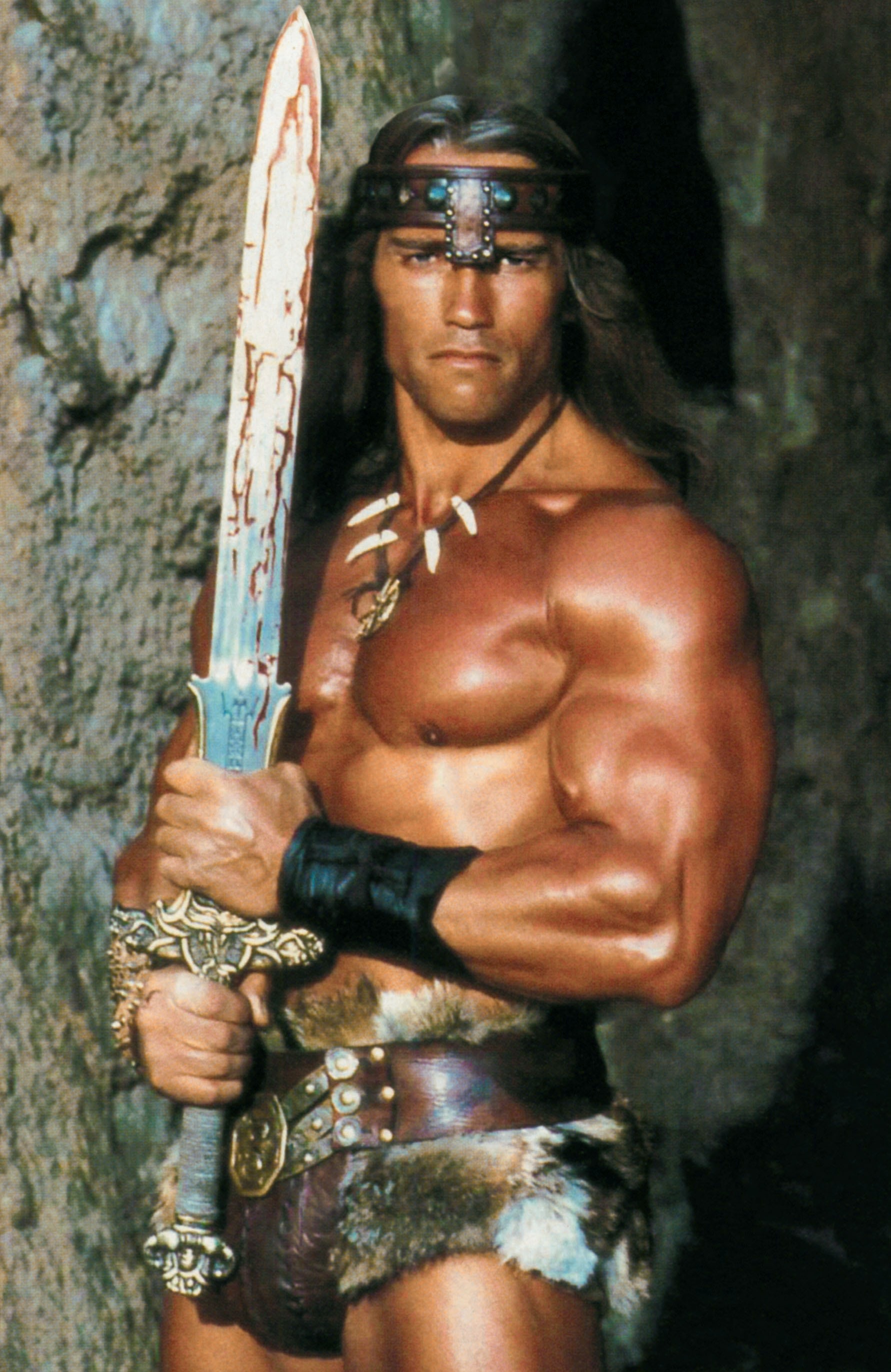
It's good to see her out of the silly chain-mail bikini, but the brown leather pants and boots are boring. Her costume doesn't need to be 100% utilitarian: Conan often doesn't wear pants at all! I know this design is trying to get away from fan-service, though, so perhaps some fancy greaves would brighten things up?
posted by Joe in Australia at 4:01 PM on March 29, 2015
Maybe it's partially the weapons; they look practical, but not impressive. Nariko's sword (which the artist was not responsible for) arguably goes too far in the opposite direction, but at least it looks cool. The redesigned Red Sonja would, IMO, be truer to its origin if her swords were less practical. The bracers-as-shown are neither original or practical; they could replaced by something flashier, perhaps some sort of showy buckler?
It's good to see her out of the silly chain-mail bikini, but the brown leather pants and boots are boring. Her costume doesn't need to be 100% utilitarian: Conan often doesn't wear pants at all! I know this design is trying to get away from fan-service, though, so perhaps some fancy greaves would brighten things up?
posted by Joe in Australia at 4:01 PM on March 29, 2015
Though the redesigns are great fun, the second page makes the author's point better: the big thing is not (just) covering up, it's agency. I like her point about Frazetta: completely naked figures can be either sexualized objects, or badass heroines, depending on pose and context.
As for the redesigns, the Storm, Nariko, and Red Sonja designs are the standouts, for me.
(The chainmail bikini is ludicrous. When even Dave Sim thinks it's a joke, there's no defense for it. What did the poor woman's breasts look like after a day spent in that outfit? With sword & sorcery, you could make the case that the costumes are based on very early civilizations like Egypt, where armor was apparently minimal. But I'm still not gonna accept that bikini.)
posted by zompist at 4:11 PM on March 29, 2015 [3 favorites]
I get and support the intent of these 100%, but the execution, for the most part, meh.
posted by signal at 4:17 PM on March 29, 2015
posted by signal at 4:17 PM on March 29, 2015
happyroach: It's like trying to make a character look cool while wearing diapers; the sheer stupidity of the outfit renders any attempt to portray something else as futile.
What, you mean like this?
posted by JDHarper at 4:19 PM on March 29, 2015 [2 favorites]
What, you mean like this?
posted by JDHarper at 4:19 PM on March 29, 2015 [2 favorites]
Am I recalling the novel wrong then? Where she talks about what she wears being distracting to the enemy and impractical but she's so good with the blade it doesn't matter?
Or am I mixing her up with Jirel of Joiry?
Seriously though, am I misremembering the novel? It got nicked so I can't check it.
(FTR don't fucking accuse me of supporting black face though.)
posted by geek anachronism at 4:25 PM on March 29, 2015
Or am I mixing her up with Jirel of Joiry?
Seriously though, am I misremembering the novel? It got nicked so I can't check it.
(FTR don't fucking accuse me of supporting black face though.)
posted by geek anachronism at 4:25 PM on March 29, 2015
There's a lot to love here, and a lot worth debating.
I agree with Samizdata that I don't think Betty Boop can be salvaged. A+ for effort, but this is a good example of when an artist should gently push back/"seek clarification" from the Art or Creative Director.
The Samus redesign looks like an overreaction - even by Call of Duty/Modern Warfare standards that's a LOT of tactical harness. You can't just calculate the degree of insult (huge in this case), and then flip that value over the X axis of "reasonable" - unless you specifically want an equally unreasonable outcome. The DOTA2 archer, on the other hand, is corrected with exacting precision - the new character is still feminine, even a bit sexy, but she's lost all of the impractical elements and nothing there is specifically *for men*. It's not - on technical merits as concept art - the best execution here, but a good chunk of that can be attributed to the blankness of the subject and it's my overwhelming favorite in terms of accomplishing the goal of the exercise.
The Nariko redesign was similarly balanced plus fantastic execution but that new shoulders practically cry out for some nice asymmetric shield-arm coverage, at minimum on the level of the vambraces in the Pirotess redesign. The bare leading arm is just completely at odds with the girdle and shin guards.
I get and support the intent of these 100%, but the execution, for the most part, meh
One thing I learned after a few years as an Art Producer was that there's room and need for all kinds of concept artists - you need artists who can make that one perfect art book cover painting, artists who can bang out 50 rough character variations in a day to let you hone in on an identity, and artists with a good sense of timing, weight, and cinematography to generate your storyboards. It's worth taking the time to assess technical merits after factoring in the usage case implied by the style.
posted by Ryvar at 4:30 PM on March 29, 2015 [6 favorites]
My favourite alternate Nintendo character look is Rosalina on her quad bike on the Mario Kart 8 title screen.
posted by dng at 4:51 PM on March 29, 2015
.png/revision/latest?cb=20140614165558)
posted by dng at 4:51 PM on March 29, 2015
> "Or am I mixing her up with Jirel of Joiry?"
Jirel of Joiry?! If I may quote:
"In her full armor she was impregnable to the men on foot, and the horse's armor protected him from their vengeful blades, so that alone, almost, she might have won the gateway. By sheer weight and impetuosity she carried the battle through the defenders under the arch. They gave way before the mighty war-horse and his screaming rider ... Jirel's eyes were yellow with bloodlust behind the helmet bars, and her voice echoed savagely from the steel cage that confined it. 'Giraud! Bring me Giraud! ...'"
"She waited impatiently in the courtyard, reining her excited charger in mincing circles over the flags, unable to dismount in her heavy armor and disdainful of possible arbalesters in the arrow slits ... A crossbow shaft was the only thing she had to fear in her impregnable mail ..."
"With difficulty they got her off the sidling horse. It took two men to handle her, and a third to steady the charger. All the while they struggled with straps and buckles she cursed them hollowly, emerging limb by limb from the casing of steel and swearing with a soldier's fluency as the armor came away."
Jirel of Joiry did NOT. WEAR. A BIKINI.
posted by kyrademon at 5:02 PM on March 29, 2015 [11 favorites]
Not even at the beach. Full armor all the way. Which, in retrospect, may have contributed to her drowning.
posted by Justinian at 5:12 PM on March 29, 2015 [1 favorite]
posted by Justinian at 5:12 PM on March 29, 2015 [1 favorite]
I didn't think she did but I read those stories at the same time as Red Sonja so I was wondering if my recollections were screwed up with that, or some other fantasy warrior woman in bad armour featured in my teen readings. Like I can vividly remember a tavern scene, red hair, talking about her impractical armour but how it lulled assholes into fantasy land while she cut them to pieces, alongside the good old 'beat me in battle and we can fuck' schtick.
I am genuinely confused as to if my recollection of the Red Sonja novel I read is actually even Red Sonja.
(my strongest memory of Jirel is that Giraud scene but I thought maybe there was another bikini scene I didn't recall)
posted by geek anachronism at 5:15 PM on March 29, 2015
I am genuinely confused as to if my recollection of the Red Sonja novel I read is actually even Red Sonja.
(my strongest memory of Jirel is that Giraud scene but I thought maybe there was another bikini scene I didn't recall)
posted by geek anachronism at 5:15 PM on March 29, 2015
Red Sonya is described in The Shadow of the Vulture. When she appeared in a comic book she switched settings and changed to Sonja. The bikini came after that.
posted by squinty at 5:18 PM on March 29, 2015 [1 favorite]
posted by squinty at 5:18 PM on March 29, 2015 [1 favorite]
While Reddit's upvote / downvote system has its flaws, it's proven very good at determining a few things, like "which types of cat pictures are the most adorable"
I wonder if some companies are hoarding such data internally, for example, say Blizzard / Valve / Riot, who have credit card details of their users (and can determine gender from it with some accuracy)... their internal team would put some chart on the wall showing, ok guys here are all the different character "looks" and designs cross referenced by popularity among male / female buyers. This would work in games where the cosmetics are divorced from gameplay.
1) what type of male characters females prefer
2) what type of female characters females prefer
3) what type of male characters males prefer
4) what type of female characters males prefer
posted by xdvesper at 5:52 PM on March 29, 2015 [1 favorite]
I'm down with most of these except Seven of Nine. The redesign pretty much ignores the Trek esthetic; AFAIK, no Starfleet uniform since the pre-Federation Starfleet had pockets, except for the Academy uniform for a short time, and those were kind of ugly. Of course, Seven isn't in Starfleet, so she can wear what she wants, but she also doesn't seem to care about clothes that much, so it would be more logical to have her in some variant of a Starfleet uniform that would be easy to replicate--either an all-black version (over the standard grey-mauve mock-turtleneck undershirt) or a top with black shoulders and a grey chest, with standard black trousers and boots, to both set her aside from the crew and be closer to standard Borg wear. (It would also have been funny/sad if at first she had stuck random bits of tech all over the uniform, with rationalizations for carrying each item, until Janeway realized that she was replacing her recently-moved implants and told her to knock it off.)
posted by Halloween Jack at 6:11 PM on March 29, 2015 [3 favorites]
posted by Halloween Jack at 6:11 PM on March 29, 2015 [3 favorites]
I am genuinely confused as to if my recollection of the Red Sonja novel I read is actually even Red Sonja.
Maybe? It looks like there was a series of Red Sonja books in the 80's (complete with chain-mail bikini covers), but, again, these were based on the comics, not written by Robert E. Howard or really derived from his Red Sonya character (who, as noted by squinty, made one appearance in Howard's work, unconnected with Conan.)
posted by soundguy99 at 6:57 PM on March 29, 2015
Some of these i love, like Pirotess and Power Girl. But a few of them, like Samus and Lady Death, are so purposefully drab and "tasteful" that they'd fail to catch the eye of a consumer in a crowded marketplace. The oversexualization of female characters is partly because men are horny jerks with poor taste, but also because striking, stylized forms are so much more noticeable. It takes a happy combination of concept and execution to create a stylized female superhero that is both striking and dignified.
Here are a few of my own attempts...
http://chronorin.deviantart.com/art/Tetra-Strike-Team-Discord-500226304
http://chronorin.deviantart.com/art/Zoel-Loftsara-goes-to-War-303898400
http://chronorin.deviantart.com/art/ATHENA-Lizzie-Matheson-413831209
posted by ELF Radio at 7:35 PM on March 29, 2015 [1 favorite]
The comments are so infuriating. Did none of the read TFA in which all of the things they're saying were pre-emptively addressed?
posted by The Underpants Monster at 7:57 PM on March 29, 2015 [1 favorite]
posted by The Underpants Monster at 7:57 PM on March 29, 2015 [1 favorite]
Two of my favorite character designers are Kazuma Kaneko and Shigenori Soejima from the Shin Megami Tensei games, for their ability to just effortlessly whip up great looking female characters in a number of styles that aren't embarrassing. Their work was actually what drew me to the games: that they weren't full of characters that make me cringe is kind of tragically remarkable. (That they've designed the best trans characters in videogames, regardless of how Persona 4's script fumbles that, is notable, too; that they keep doing it, raising the bar on representation essentially in isolation is pretty awesome.)
On the link: I'm not familiar with a lot of the characters, but I like the Samus redesign a lot. The Peach redesign isn't especially striking to me, but my take on it is that it's about emphasizing her agency--a quality she 100% lacks in almost every game.
posted by byanyothername at 8:05 PM on March 29, 2015 [3 favorites]
I'm not really the audience for this in that I haven't heard of a lot of these characters, but I really love the line by the person who did the DotA2 redesign:
Because there is no point in armour if it doesn't protect your vital organs.
I feel like that really gets at the heart of a lot of the issues with the portrayal of female characters in action/comics.
Overall, I thought most of these redesigns were really awesome. Emma Frost was the only one that stood out to me as seeming like not much of an improvement, because that whole lace-up boot, no pants outfit looks more fetishized and less practical than the original design.
(But again, I'm pretty uninformed about this whole world, so I'll defer to people with more knowledge than me about this.)
posted by litera scripta manet at 8:05 PM on March 29, 2015 [2 favorites]
Oh also, from the Fran redesign:
since getting a stubbed toe in battle is something easily avoidable!
Yes! Seeing both comic and live action heroes wearing high heels drives me crazy. In Person of Interest (live action TV show), the two main female characters are always wearing super high stilettos while shooting guns and punching people, and I just can't get over how ridiculous and unnecessary it is.
And looking over them again, I have to say, I especially like the Nariko and the Scarlet Witch redesigns. With the Scarlet Witch one, what I like most about it is that it takes her from this sort of generic looking oversexed comic character to someone who looks cool and interesting, and just that picture alone makes me want to go learn more about her character.
posted by litera scripta manet at 8:20 PM on March 29, 2015
All of this talk of armor and clothing has left me with an overwhelming desire to replay FF X-2. I never did get all of the dress spheres.
posted by betweenthebars at 9:01 PM on March 29, 2015 [1 favorite]
posted by betweenthebars at 9:01 PM on March 29, 2015 [1 favorite]
With the Scarlet Witch one, what I like most about it is that it takes her from this sort of generic looking oversexed comic character to someone who looks cool and interesting, and just that picture alone makes me want to go learn more about her character.
De gustibus non disputandum, but I particularly didn't like that one. She's supposed to be the daughter/step-daughter of Magneto, who - when he isn't wearing superhero jammies - is particularly elegant in dress. I wish the author had come up with some outfit that kept her outfit in the same aesthetic universe as the other X-Men characters instead of making her a slob with bad posture and weird hair.
Also, I'm not sure I like the artist's assertion that she "wanted [Scarlet Witch's] costume to reconnect with" ... "growing up in a Romani family". Any ethnic shout-out is potentially offensive, and I think that one is especially problematic. When you apply it to a person's dress sense, especially in the era of My Big Fat Gypsy Wedding, the ethnic reference starts looking pretty bad.
posted by Joe in Australia at 9:25 PM on March 29, 2015
I liked the Scarlet Witch one. All of the witches I've ever known were much more likely to wear flowing peasant skirts and comfortable shoes than swimsuits made of gaffer tape and high heeled go go boots.
posted by misfish at 10:18 PM on March 29, 2015 [3 favorites]
posted by misfish at 10:18 PM on March 29, 2015 [3 favorites]
I have to agree with Sukeban, the obvious Moebius influence in Samus makes that drawing by Anna Fehr a winner for me. I've always thought the mostly undressing of female characters in games and comics to be immature and embarrassing (not that I'm NOT often thought of as immature and embarrassing, mind you). We're speaking of characters that have control of their lives and would dress commensurate with their position and not as if they just got off shift at Hooters.
posted by evilDoug at 10:31 PM on March 29, 2015 [1 favorite]
posted by evilDoug at 10:31 PM on March 29, 2015 [1 favorite]
We're speaking of characters that have control of their lives and would dress commensurate with their position and not as if they just got off shift at Hooters.
But isn't that what Samus is doing in the Zero Suit? Prior to the Smash Bros. high heel thing which this is apparently referencing, it was just the outfit she wore under her armor, and it makes sense that way. It's not what she'd wear to the grocery store, it's part of her combat gear, which is why the redesign doesn't make much sense.
The description for that redesign was also unnecessarily defensive and insulting. While the update claims that they were reacting to the Smash Bros. design, the image they used in the picture clearly isn't.
posted by Sangermaine at 11:30 PM on March 29, 2015
litera script manet: I'm not really the audience for this in that I haven't heard of a lot of these characters, but I really love the line by the person who did the DotA2 redesign: Because there is no point in armour if it doesn't protect your vital organs.
Now, this might just be my hatred for DotA2 and all it stands for talking, but I didn't dig the rework of that ridiculous, generic, wink-wink-nudge-nudge Drow Ranger character at all. I'm not sure if the artist plays DotA2, I'd be a bit surprised since MOBAs are such a sausage party usually and it's the grognardiest of them all, but she clearly hasn't played the original DotA or WC3 and missed the original reference. Sylvanas is the goddamned Banshee Queen! She's a vengeance-obsessed, somewhat omnicidal, undead megalomaniac, she probably doesn't have any internal organs anymore and even if she did, you think some puny mortal weapon to the guts is going to slow her down? Pfft. Even the generic Dark Ranger units possess the living and can drain life from their enemies, so they're probably safe from your basic shanking. Plus, they're rangers: spies, assassins, sneaks. As dumb as revealing armor is, given the undead factor, it's still better than clunky, bulky armor. Unsurprisingly, since it's their character originally, I think Blizzard did a much better job. To be fair her normal and "you like elves so give us money" skins are more with the midriff bearing, but they do get the important part right which is SKULLS FOR THESKULL THRONE DARK LADY.
Overall, I thought most of these redesigns were really awesome. Emma Frost was the only one that stood out to me as seeming like not much of an improvement, because that whole lace-up boot, no pants outfit looks more fetishized and less practical than the original design.
But it's Emma Frost. I mean, a great deal of her character is that she's a mind-game-playing master manipulator who is hinted to be fairly kinky, was part of what's basically a fetish club for mutants, and also uses people's discomfort with her blatant sexuality to her advantage. The "dominatrix but in white" look is part of her character in a way that it's not for a lot of generic sexed up comics characters, it's not just a lazy default the way big boobs, a skinny waist, and spandex are for a lot of them. I liked the redesign better because it was more stylish, and restored that sense of regality and remoteness she had as the White Queen, instead of being just "generic comics chick in revealing outfit". Emma may dress like an albino dominatrix, but an albino dominatrix with style who is better than you and doesn't have time for your tedious PETA anti-fur crusade or squeamishness about blood diamonds.
geek anachronism: Red Sonja I don't like. No that's not how the original should look - the original was a suicidal idiot but she wore a chainmail bikini that was her thing. Not a 'chainmail bikini over leather'. Just the fucking bikini. But you can still make her badass even in that so while I like the picture as a badass woman warrior, as Red Sonja I'm like 'eh.
Once again, I think Blizzard has the superior take on Red Sonja. Part of that's just that her in-game dialogue is pure comedy gold, especially if you're a Diablo fan, but she has an amazing personality and actually looks like what you'd expect a female Conan to look like. I mean, he runs around in a loincloth and wrestling boots all the time and no one complains, but he's also built like Arnold. I like that yeah, Blizz Sonya is rocking the bikini/loincloth look, but she's also built like a brick shithouse, is easily a foot taller than all the other D3 heroes, and carries around two ginormous swords, which she uses to hack through the minions of hell like a chainsaw through chicken salad. In both games she absolutely plays like a crazed berseker; dishes out a ton of damage, is generally super squishy if she gets caught out but can also utterly wreck people, and is an absolute blast to play.
The only design that I really liked on it's own merits was the Storm design, which was absolutely fantastic and completely perfect. The Power Girl was a nice take very in keeping with the actual style of the character, but not something that really made me go "that looks awesome/amazing" in it's own. The Pirotess was quite good, too, although a little generic, since all these years later everyone and their mother has ripped off the Lodoss-style elf ears but also the Warhammer High Elf armor they used for the redesign. The Morrigan was just eye-rollingly ridiculous and terrible: okay, I agree with the rationale for keeping the cleavage, Morrigan gives absolutely no fucks about anyone else's opinion, but she lives in a swamp. All that drapey, concealing fabric and pretty colored silk is just going to get caught on brambles, dragged through mud, and either get ripped to shreds, slow her down, or give her location away to predators because it's bright fucking purple and gold. It's not actually more practical at all, it just "reads" that way because it's less revealing than her default costume. Her expression is also completely un-Morrigan-like. Pouty lips, bedroom eyes, and canted hips are somehow supposed to be less sexualized? Give me a break.
The rest mostly just seemed like "my discomfort with low waist-to-hip ratios, let me show you it". In the case of 7of9, the frumpification was kind of insulting, because she's not a comics or videogame character who is continually being illustrated by different artists and in different media, she was brought to life by a specific actress with a real life body that does not at all look like the illustration, and in a series were everyone went around wearing spandex jumpsuits. To me, that seems extremely uncool in a way that just reimagining purely imagined characters, or roles played by lots of different actresses, is not. Just "real women have curves~!!" nonsense in a slightly different form.
posted by The Master and Margarita Mix at 11:30 PM on March 29, 2015 [2 favorites]
Now, this might just be my hatred for DotA2 and all it stands for talking, but I didn't dig the rework of that ridiculous, generic, wink-wink-nudge-nudge Drow Ranger character at all. I'm not sure if the artist plays DotA2, I'd be a bit surprised since MOBAs are such a sausage party usually and it's the grognardiest of them all, but she clearly hasn't played the original DotA or WC3 and missed the original reference. Sylvanas is the goddamned Banshee Queen! She's a vengeance-obsessed, somewhat omnicidal, undead megalomaniac, she probably doesn't have any internal organs anymore and even if she did, you think some puny mortal weapon to the guts is going to slow her down? Pfft. Even the generic Dark Ranger units possess the living and can drain life from their enemies, so they're probably safe from your basic shanking. Plus, they're rangers: spies, assassins, sneaks. As dumb as revealing armor is, given the undead factor, it's still better than clunky, bulky armor. Unsurprisingly, since it's their character originally, I think Blizzard did a much better job. To be fair her normal and "you like elves so give us money" skins are more with the midriff bearing, but they do get the important part right which is SKULLS FOR THE
Overall, I thought most of these redesigns were really awesome. Emma Frost was the only one that stood out to me as seeming like not much of an improvement, because that whole lace-up boot, no pants outfit looks more fetishized and less practical than the original design.
But it's Emma Frost. I mean, a great deal of her character is that she's a mind-game-playing master manipulator who is hinted to be fairly kinky, was part of what's basically a fetish club for mutants, and also uses people's discomfort with her blatant sexuality to her advantage. The "dominatrix but in white" look is part of her character in a way that it's not for a lot of generic sexed up comics characters, it's not just a lazy default the way big boobs, a skinny waist, and spandex are for a lot of them. I liked the redesign better because it was more stylish, and restored that sense of regality and remoteness she had as the White Queen, instead of being just "generic comics chick in revealing outfit". Emma may dress like an albino dominatrix, but an albino dominatrix with style who is better than you and doesn't have time for your tedious PETA anti-fur crusade or squeamishness about blood diamonds.
geek anachronism: Red Sonja I don't like. No that's not how the original should look - the original was a suicidal idiot but she wore a chainmail bikini that was her thing. Not a 'chainmail bikini over leather'. Just the fucking bikini. But you can still make her badass even in that so while I like the picture as a badass woman warrior, as Red Sonja I'm like 'eh.
Once again, I think Blizzard has the superior take on Red Sonja. Part of that's just that her in-game dialogue is pure comedy gold, especially if you're a Diablo fan, but she has an amazing personality and actually looks like what you'd expect a female Conan to look like. I mean, he runs around in a loincloth and wrestling boots all the time and no one complains, but he's also built like Arnold. I like that yeah, Blizz Sonya is rocking the bikini/loincloth look, but she's also built like a brick shithouse, is easily a foot taller than all the other D3 heroes, and carries around two ginormous swords, which she uses to hack through the minions of hell like a chainsaw through chicken salad. In both games she absolutely plays like a crazed berseker; dishes out a ton of damage, is generally super squishy if she gets caught out but can also utterly wreck people, and is an absolute blast to play.
The only design that I really liked on it's own merits was the Storm design, which was absolutely fantastic and completely perfect. The Power Girl was a nice take very in keeping with the actual style of the character, but not something that really made me go "that looks awesome/amazing" in it's own. The Pirotess was quite good, too, although a little generic, since all these years later everyone and their mother has ripped off the Lodoss-style elf ears but also the Warhammer High Elf armor they used for the redesign. The Morrigan was just eye-rollingly ridiculous and terrible: okay, I agree with the rationale for keeping the cleavage, Morrigan gives absolutely no fucks about anyone else's opinion, but she lives in a swamp. All that drapey, concealing fabric and pretty colored silk is just going to get caught on brambles, dragged through mud, and either get ripped to shreds, slow her down, or give her location away to predators because it's bright fucking purple and gold. It's not actually more practical at all, it just "reads" that way because it's less revealing than her default costume. Her expression is also completely un-Morrigan-like. Pouty lips, bedroom eyes, and canted hips are somehow supposed to be less sexualized? Give me a break.
The rest mostly just seemed like "my discomfort with low waist-to-hip ratios, let me show you it". In the case of 7of9, the frumpification was kind of insulting, because she's not a comics or videogame character who is continually being illustrated by different artists and in different media, she was brought to life by a specific actress with a real life body that does not at all look like the illustration, and in a series were everyone went around wearing spandex jumpsuits. To me, that seems extremely uncool in a way that just reimagining purely imagined characters, or roles played by lots of different actresses, is not. Just "real women have curves~!!" nonsense in a slightly different form.
posted by The Master and Margarita Mix at 11:30 PM on March 29, 2015 [2 favorites]
If you want to see a good redesign for the Scarlet Witch, I would say X-Men: Evolution actually gave her a functional redesign, as a sort of 'Red Goth' look. It was ostentatious, but I'd say it fit the character (the somewhat unstable neglected daughter of a major terrorist/activist) much better than this redesign. The redesign here seems to be more for an earlier Wanda, at the very outset of her powers.
I love the Polaris redesign (the utility belt is perfect), the Red Sonja redesign, and the Betty Boop redesign.
At the same time, I don't like the Gamorra design, not because it's plain, but because a martial artist doesn't want baggy handholds. The Samus redesign is also aesthetically bad but it can be argued to be a better representative suit for someone inside a power armor- it's essentially a pilot suit.
posted by LeRoienJaune at 1:21 AM on March 30, 2015 [1 favorite]
but because a martial artist doesn't want baggy handholds
Let me think.
No, I don't think it's that.
posted by sukeban at 4:25 AM on March 30, 2015 [2 favorites]
Let me think.
No, I don't think it's that.
posted by sukeban at 4:25 AM on March 30, 2015 [2 favorites]
There's a lot of discussion of Samus' greater-than-zero Zero Suit in the comments there. I love the concept. Here's my take on it...
On top of your other points, after going through that gauntlet, she recovers her upgraded armor and becomes virtually invincible. Samus' canonical description is clad in her massive armor as befits someone in her line of work.
posted by ersatz at 5:32 AM on March 30, 2015
On top of your other points, after going through that gauntlet, she recovers her upgraded armor and becomes virtually invincible. Samus' canonical description is clad in her massive armor as befits someone in her line of work.
posted by ersatz at 5:32 AM on March 30, 2015
I saw GroundHog Day the other day, and I was blown away. Not only was it a great script with talented actors (rare enough nowadays) but the women were in the same age range as their partners and were dressed normal.- The way people would REALLY dress in that time and place rather than sexy.
I dunno. I think most women just want a portrayal that makes sense and has some more realism to it. Only in today's movies do women not age past the age of 30 while their partners continue to age. That's not an honest portrayal of real life at all.
posted by rancher at 6:03 AM on March 30, 2015 [3 favorites]
I don't have any idea who Samus is, but without any context I really liked the redesign. I think she looks super-cute, and I would watch a TV show about her whereas I would purposely avoid consuming any media about the character in the blue catsuit.
posted by Squeak Attack at 7:27 AM on March 30, 2015
posted by Squeak Attack at 7:27 AM on March 30, 2015
The fact that Samus is a subject of this amuses me because not having played Zero Suit and only seen the costume a little in Smash Bros., my main association with he character is still someone in armor bulky enough to make their gender indeterminate.
posted by Muttoneer at 8:39 AM on March 30, 2015
posted by Muttoneer at 8:39 AM on March 30, 2015
Sylvanas is the goddamned Banshee Queen!
She's another fucking bikini elf in ridiculous armor. Seriously, if she's all withered organs shank proof blahblahblah, why does she need armor in the first place? Belly exposing armor that the guy characters do not wear. And why not make her look like an actual corpse, rather than going for the "necrotits" look?
You know, I think what annoys me as much as anything else are the bizarrely convoluted justifications people come up with for the sexist outfits. If the people could just be honest and admit they liked looking at sexist outfits, and that the only reason involved was titillation, I could deal with that better. I can have more respect for someone who says "I designed the character like this so guys can play this game/read this comic with their dicks in hand" a lot more than someone coming up with some ridiculous line of BS justifying it.
Anyway:
Polaris: not sure about the half cape; it looks prone to flying up in her face in a fight. Made up for by taking a hint from Legend of Kirra and giving her weapons/shields/tools as part of her costume.
Samus: I agree there's a bit too much harness, but hey- pockets! A women was allowed pockets! The sorta-pulp era helmet is nice too.
Scarlett Witch: I think one thing I like is that this outfit looks like something eccentric a young heroine might kitbash together, as opposed to needing a tailor skilled in sewing spandex. And very practical shoes, though I'd go for running shoes- because I'd be runing.
Storm: I LOVE that design. That's all.
Chun Li: aside from the practical shorts, I like that the artist actually knows what fabric looks like over breasts. And there's no crotch shot involved. Though I'm sure somebody will will be adding shortly to explain, using martial arts references and physics, why it's absolutely necessary to have the camera focused on Chun Li's snatch.
Pirotessa: I like that she no longer needs sticky stuff on her breasts to keep from falling out- also that this is in many ways a mirror outfit to her rival Deedlit.
Emma Frost: NO CAPES! Seriously, I get that Frost is supposed to have the whole Dom sexiness thing going for her (and it works much better for her than Red Sonja. And in a place like the Hellfire Club that works. But this is a leader who also takes to the field, and it's worth noting that the outfit on the left is still more practical than the original. That said, even though I'm not a fan of the feathers, the only change I'd really make is make the boots white.
Also, I'm convinced that in actuality, Emma slopes around in grey sweatsuits, and uses her telepathy to make people THINK she's all made up and sexy.
Power Girl: I have a soft spot for jackets over athletic outfits...also now she has someplace to put her keys. And the visual pun is great too, and the sheer solitude that comes through.
posted by happyroach at 8:40 AM on March 30, 2015 [5 favorites]
In my opinion, the proper way to redesign Princess Peach would be to simply use Princess Bubblegum instead.
posted by Galaxor Nebulon at 11:01 AM on March 30, 2015 [1 favorite]
posted by Galaxor Nebulon at 11:01 AM on March 30, 2015 [1 favorite]
Princess Bubblegum is a pretty rad standard to design to. I like that more and moreas they develop her as an independent character that her selection of outfits expands- she's not locked into wearing the princess dress.
posted by happyroach at 12:52 PM on March 30, 2015 [1 favorite]
posted by happyroach at 12:52 PM on March 30, 2015 [1 favorite]
The second post has some interesting thoughts about how easy it is to kind of unthinkingly default to the sexualized/suggestive poses & clothing even when you're creating something where you know dam' well the majority of your audience is women (like a lot of Urban Fantasy novels), and the "rules" the author has set for herself in order to try to consciously steer away from the default.
posted by soundguy99 at 4:43 PM on March 30, 2015
posted by soundguy99 at 4:43 PM on March 30, 2015
Yes, the Emma Frost redesign also has her in tight clothes, and she's bare-legged. The big difference is in the functionality of the clothes. The new jacket is tight, but it's not in danger of falling off like the old top (which basically would have to be glued on at the nipples to not be completely dragged down around her ankles by the cape. Same deal with the new shorts. If you tried to actually wear the low-cut tights/boots combo from the old costume, you'd have to keep pulling it up every half second, and you wouldn't be able to take your shoes off without disrobing. The new costume is something you could actually walk around and do things in. It'a a HUGE difference if you put yourself in the point of view of the person wearing it. I'm no sexpot, but I'd be perfectly comfortable in the new design.
posted by The Underpants Monster at 7:50 PM on March 30, 2015 [1 favorite]
posted by The Underpants Monster at 7:50 PM on March 30, 2015 [1 favorite]
In the case of 7of9, the frumpification was kind of insulting, because she's not a comics or videogame character who is continually being illustrated by different artists and in different media, she was brought to life by a specific actress with a real life body...
A real-life body that was so tortured by the costume it was jammed into that they had to have nurses with oxygen tanks on set because the actress kept passing out from wearing it.
posted by The Underpants Monster at 7:57 PM on March 30, 2015 [8 favorites]
A real-life body that was so tortured by the costume it was jammed into that they had to have nurses with oxygen tanks on set because the actress kept passing out from wearing it.
posted by The Underpants Monster at 7:57 PM on March 30, 2015 [8 favorites]
It's a HUGE difference if you put yourself in the point of view of the person wearing it.
It's striking that even here the comments seem to focus more on, "Does it make me think of the character as a sex object?" than "Would you want to wear that?"
posted by straight at 8:29 PM on March 30, 2015
It's striking that even here the comments seem to focus more on, "Does it make me think of the character as a sex object?" than "Would you want to wear that?"
posted by straight at 8:29 PM on March 30, 2015
One simple thing artists could do to improve the costumes of stereotypical female fantasy/superhero characters, and endear themselves to female readers, can be summed up with the word "STRAPS."
You can show just as much in a leotard or bikini top with two straps as you can in a strapless one, but you cut your need for eyerolling levels of suspension of disbelief by at least half.
Any woman who's worn a strapless top can tell you that if you;re going to move around in it, it's got to have some means of keeping it up. Dance and athletic costumes that look strapless generally have some kind of hidden straps or illusion net that you can't see form the audience but could see if you were close-up in a comics panel. Strapless dresses usually have boning to hold them up. Tube tops or bandeaux are usually held up one of two ways: banded across the top and looser across the breasts, or tight enough to smoosh the breasts. If you see a garment not help up in one of those ways, it's often glued on. No strapless top I've ever worn or seen worn screams "carefree action" to me.
Seriously, just draw two small lines from the top of the costume over the shoulders. Everybody's happier.
posted by The Underpants Monster at 1:24 PM on March 31, 2015 [1 favorite]
Even the iconic Wonder Woman costume, which I *like*, looks more body-friendly with something to hold it up besides the Playboy-bunny-costume-style construction.
posted by The Underpants Monster at 1:45 PM on March 31, 2015
posted by The Underpants Monster at 1:45 PM on March 31, 2015
One simple thing artists could do to improve the costumes of stereotypical female fantasy/superhero characters, and endear themselves to female readers, can be summed up with the word "STRAPS."
Oh yeah. And practical shoes. That's one reason I like that scarlet Witch Picture.
Also, obligatory link.
posted by happyroach at 6:30 PM on March 31, 2015
Oh yeah. And practical shoes. That's one reason I like that scarlet Witch Picture.
Also, obligatory link.
posted by happyroach at 6:30 PM on March 31, 2015
« Older Everything you need to know about Quebec’s latest... | I was stumped. So of course, I asked Facebook. Newer »
This thread has been archived and is closed to new comments
posted by dejah420 at 12:52 PM on March 29, 2015 [4 favorites]