They’ve kept the professional white background
September 1, 2015 10:38 AM Subscribe
”Google’s new logo is its biggest update in 16 years“ (says Fast Company) “[I]t's now using a sans-serif typeface, making it look a lot more modern and playful. The colors are also softer than they used to be. The logo bears a bit more resemblance to the logo of Google's new parent company, Alphabet, as well.” (says Verge) The Google Blog has more. And, of course, there’s an introductory doodle.
GOOGLE HAS A NEW LOGO THAT DITCHES THE OLD SERIF LOOK, AND REACTS TO YOU IN ALL CONTEXTS.
I hope this looks OK, because my eyes rolled so hard they fell out and I can't see what I'm typing.
posted by dirigibleman at 10:40 AM on September 1, 2015 [44 favorites]
I hope this looks OK, because my eyes rolled so hard they fell out and I can't see what I'm typing.
posted by dirigibleman at 10:40 AM on September 1, 2015 [44 favorites]
I clicked "Skip This Ad" but to no avail.
posted by stupidsexyFlanders at 10:41 AM on September 1, 2015 [7 favorites]
posted by stupidsexyFlanders at 10:41 AM on September 1, 2015 [7 favorites]
My reaction is quite negative, but perhaps it will grow on me.
posted by humanfont at 10:41 AM on September 1, 2015 [3 favorites]
posted by humanfont at 10:41 AM on September 1, 2015 [3 favorites]
I'm not sure about the tilted “e”.
That's their Yahoo! quirk factor.
posted by filthy light thief at 10:41 AM on September 1, 2015 [3 favorites]
That's their Yahoo! quirk factor.
posted by filthy light thief at 10:41 AM on September 1, 2015 [3 favorites]
They will never succeed with that logo.
posted by mazola at 10:42 AM on September 1, 2015 [11 favorites]
posted by mazola at 10:42 AM on September 1, 2015 [11 favorites]
Really digging the animation and the mobile-first design philosophy. Curious to see how other Alphabet properties adapt to this.
Also, Roast Beef and Ray called this back in 2006.
posted by fifteen schnitzengruben is my limit at 10:43 AM on September 1, 2015 [33 favorites]
Also, Roast Beef and Ray called this back in 2006.
posted by fifteen schnitzengruben is my limit at 10:43 AM on September 1, 2015 [33 favorites]
The new google logo looks like it was designed by someone who's still learning the.... alphabet.
posted by BuddhaInABucket at 10:43 AM on September 1, 2015 [15 favorites]
posted by BuddhaInABucket at 10:43 AM on September 1, 2015 [15 favorites]
Google's new logo: disruptive, iterative, agile, and rasta-fied by, oh, about 10%. It's the original logo from hell.
posted by entropicamericana at 10:43 AM on September 1, 2015 [14 favorites]
posted by entropicamericana at 10:43 AM on September 1, 2015 [14 favorites]
GOOGLE TO SERIFS: DROP DEAD
posted by Strange Interlude at 10:44 AM on September 1, 2015 [9 favorites]
posted by Strange Interlude at 10:44 AM on September 1, 2015 [9 favorites]
Apparently Microsoft actually sued Google about the quad color similarities in the Windows and Android logos back in 2009. Looking at both logos now, all I see is branding people who must have played too much Uno! back in the day.
posted by Existential Dread at 10:45 AM on September 1, 2015 [28 favorites]
posted by Existential Dread at 10:45 AM on September 1, 2015 [28 favorites]
What the fuck is this? Graphic design has really died since Raymond Loewy et al.
posted by colie at 10:46 AM on September 1, 2015 [3 favorites]
posted by colie at 10:46 AM on September 1, 2015 [3 favorites]
It's okay.
posted by SansPoint at 10:46 AM on September 1, 2015 [3 favorites]
posted by SansPoint at 10:46 AM on September 1, 2015 [3 favorites]
At first I hated it. Then I liked it. Now I'm bored with it.
posted by mazola at 10:48 AM on September 1, 2015 [8 favorites]
posted by mazola at 10:48 AM on September 1, 2015 [8 favorites]
I like it.
posted by roomthreeseventeen at 10:48 AM on September 1, 2015
posted by roomthreeseventeen at 10:48 AM on September 1, 2015
Yeah, yeah. When do we get Reader back?
posted by traveler_ at 10:48 AM on September 1, 2015 [80 favorites]
posted by traveler_ at 10:48 AM on September 1, 2015 [80 favorites]
Looking at both logos now, all I see is branding people who must have played too much Uno! back in the day.
And probably listened to a bunch of Devo.
posted by Strange Interlude at 10:48 AM on September 1, 2015 [3 favorites]
And probably listened to a bunch of Devo.
posted by Strange Interlude at 10:48 AM on September 1, 2015 [3 favorites]
The crooked "e" is there to remind us that our dystopian computer overlords have maintained a sense of play about the whole thing.
posted by incomple at 10:48 AM on September 1, 2015 [51 favorites]
posted by incomple at 10:48 AM on September 1, 2015 [51 favorites]
How many smartphone apps running on 800x480 screens did Raymond Loewy design?
posted by GuyZero at 10:49 AM on September 1, 2015 [3 favorites]
posted by GuyZero at 10:49 AM on September 1, 2015 [3 favorites]
It all makes sense now.
Making the logo look good on small screens seems to have been a major consideration. The new, simpler lettering is supposed to scale better to smaller sizes, making the wordmark more distinct and easier to read. It's also supposed to be easier for Google to display on low-bandwidth connections: Google says that it's made a version of its logo that's "only 305 bytes, compared to our existing logo at ~14,000 bytes." Given that one of new Google CEO Sundar Pichai's big goals is to bring the internet — and Google, of course — to areas of the globe that don't already have it, that small difference is definitely going to be an important one.posted by aniola at 10:49 AM on September 1, 2015 [21 favorites]
Both logos are terrible, but banishing that beautiful lowercase serif g for one straight from a kindergarten chalkboard is especially heinous.
posted by oulipian at 10:49 AM on September 1, 2015 [24 favorites]
posted by oulipian at 10:49 AM on September 1, 2015 [24 favorites]
a bile or mucous green background would be better, yes
posted by thelonius at 10:50 AM on September 1, 2015 [1 favorite]
posted by thelonius at 10:50 AM on September 1, 2015 [1 favorite]
I think about this comment from louche mustachio every once in a while, and I thought about it here.
It's not horrible, but it is bland and pedestrian. Maybe we've reached the end of history, font-and-logo design wise?
posted by ryanshepard at 10:51 AM on September 1, 2015
It's not horrible, but it is bland and pedestrian. Maybe we've reached the end of history, font-and-logo design wise?
posted by ryanshepard at 10:51 AM on September 1, 2015
i assume the e is a werewolf howling at the moon
posted by robocop is bleeding at 10:53 AM on September 1, 2015 [6 favorites]
posted by robocop is bleeding at 10:53 AM on September 1, 2015 [6 favorites]
How many smartphone apps running on 800x480 screens did Raymond Loewy design?
I think the dude could have nailed as many as you like.
posted by colie at 10:53 AM on September 1, 2015 [1 favorite]
I think the dude could have nailed as many as you like.
posted by colie at 10:53 AM on September 1, 2015 [1 favorite]
Was there really that much of a problem with people going to Google on a small-screen device and then being all like oh god where am i i can't read the logo what is happening?
posted by Spathe Cadet at 10:54 AM on September 1, 2015 [14 favorites]
posted by Spathe Cadet at 10:54 AM on September 1, 2015 [14 favorites]
hey guys we removed our serifs and increased color saturation by 10% to convey our sleek modern corporate structure and to synergize our mindshare
the offset e is a photoshop mistake that will be corrected in our next brand rollout
posted by Existential Dread at 10:55 AM on September 1, 2015 [7 favorites]
the offset e is a photoshop mistake that will be corrected in our next brand rollout
posted by Existential Dread at 10:55 AM on September 1, 2015 [7 favorites]
I'm not sure about the tilted “e”.
It's not tilted, it's jaunty.
posted by rhizome at 10:55 AM on September 1, 2015 [27 favorites]
It's not tilted, it's jaunty.
posted by rhizome at 10:55 AM on September 1, 2015 [27 favorites]
And so Google has created a logo that can read as well on a 2.5-inch Android Wear watch face as it does your 50-inch TV playing Chromecast.
Google is buying me a TV?
posted by nickmark at 10:56 AM on September 1, 2015 [11 favorites]
Google is buying me a TV?
posted by nickmark at 10:56 AM on September 1, 2015 [11 favorites]
increased color saturation by 10%
To be gradually reduced so as to save on printing costs for collateral.
posted by rhizome at 10:57 AM on September 1, 2015 [1 favorite]
To be gradually reduced so as to save on printing costs for collateral.
posted by rhizome at 10:57 AM on September 1, 2015 [1 favorite]
Woah. It's all simple and childlike-ish and stuff.
posted by sneebler at 10:57 AM on September 1, 2015 [1 favorite]
posted by sneebler at 10:57 AM on September 1, 2015 [1 favorite]
oh cool I guess they could get it to look more like a logo for a competitor to Fischer-Price
posted by griphus at 10:57 AM on September 1, 2015 [17 favorites]
posted by griphus at 10:57 AM on September 1, 2015 [17 favorites]
How many smartphone apps running on 800x480 screens did Raymond Loewy design?
A Loewy-designed Google logo would look a little something like this.
posted by ryanshepard at 10:58 AM on September 1, 2015 [8 favorites]
A Loewy-designed Google logo would look a little something like this.
posted by ryanshepard at 10:58 AM on September 1, 2015 [8 favorites]
An interesting thing I should have highlighted in the FPP: the Fast Company post's slide show includes a photograph of designers considering a number of the alternative logos that Google considered. Some of them I like better than the current one. (Though really, I'm fine with it.)
posted by Going To Maine at 10:59 AM on September 1, 2015 [4 favorites]
posted by Going To Maine at 10:59 AM on September 1, 2015 [4 favorites]
I dunno. There's something really off-balance about it to me. Those three big, round voids right in the middle (oog) really do something negative to the feel and flow. At least with the old serif version, the lower case g had a smaller void, which was also raised above the centerline of the two o's, breaking-up any extended visual pattern.
The kerning before and after the L also seems a bit too tight, especially in comparison to the crazy spacious kerning around the double-o's. It's as if the front and back halves of the logo were done by different teams, and then joined at the end of the process.
Overall...Meh.
posted by Thorzdad at 10:59 AM on September 1, 2015 [9 favorites]
That "e" really seems like the kind of "e" I'd like to hang out and have a beer with. It should run for president.
posted by tittergrrl at 11:00 AM on September 1, 2015 [21 favorites]
posted by tittergrrl at 11:00 AM on September 1, 2015 [21 favorites]
This is a thing we are going to treat like a Big Thing then forget about forever, somewhere around 5-10 days from now.
posted by DirtyOldTown at 11:01 AM on September 1, 2015 [13 favorites]
posted by DirtyOldTown at 11:01 AM on September 1, 2015 [13 favorites]
Truly a day I will remember the rest of my life. My grandnieces and nephews will ask where I was when Google dropped the serifs. They only ask once because they can see what an emotional journey it has been for me.
posted by Elly Vortex at 11:02 AM on September 1, 2015 [13 favorites]
posted by Elly Vortex at 11:02 AM on September 1, 2015 [13 favorites]
I also feel they should have stuck with the two-story lower-case g. It would go a long way toward making the new logo look a lot less childish.
posted by Thorzdad at 11:04 AM on September 1, 2015
posted by Thorzdad at 11:04 AM on September 1, 2015
You won't believe the Easter eggs hidden inside the new Google logo.
posted by mazola at 11:05 AM on September 1, 2015 [5 favorites]
posted by mazola at 11:05 AM on September 1, 2015 [5 favorites]
Oh yeah? Know who else had a tilted E in their logo?
Seriously. The tilted E does not have good connotations.
posted by schmod at 11:05 AM on September 1, 2015 [9 favorites]
Seriously. The tilted E does not have good connotations.
posted by schmod at 11:05 AM on September 1, 2015 [9 favorites]
I dislike that the capital G is a perfect circle with an arc cut out of it. It makes the horizontal portion jut out too much. It looks like it has a huge underbite.
I assume they did this partly because they want to use the G turned 90 degrees counterclockwise as a power button symbol on Google products.
posted by painquale at 11:06 AM on September 1, 2015 [3 favorites]
I assume they did this partly because they want to use the G turned 90 degrees counterclockwise as a power button symbol on Google products.
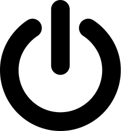
posted by painquale at 11:06 AM on September 1, 2015 [3 favorites]
You know you've got it pretty good if this is important to you.
posted by tommasz at 11:06 AM on September 1, 2015 [23 favorites]
posted by tommasz at 11:06 AM on September 1, 2015 [23 favorites]
Well, you've finally done it. You've made me look up what serifs are.
posted by selfnoise at 11:07 AM on September 1, 2015 [7 favorites]
posted by selfnoise at 11:07 AM on September 1, 2015 [7 favorites]
Between this and those Microsoft "LOG IN TO YOUR COMPUTER BY SMILING AT IT YOU BIG BABY" commercials I'm starting to feel like the new masters of the universe don't think very highly of our intellectual capacity.
posted by prize bull octorok at 11:11 AM on September 1, 2015 [10 favorites]
posted by prize bull octorok at 11:11 AM on September 1, 2015 [10 favorites]
I'm so tired of the internet
posted by goHermGO at 11:11 AM on September 1, 2015 [23 favorites]
posted by goHermGO at 11:11 AM on September 1, 2015 [23 favorites]
This is a thing we are going to treat like a Big Thing then forget about forever, somewhere around 5-10 days from now.
Welcome to the Internet!
posted by Going To Maine at 11:13 AM on September 1, 2015 [8 favorites]
Welcome to the Internet!
posted by Going To Maine at 11:13 AM on September 1, 2015 [8 favorites]
I miss serifs. I'm changing my MeFi fonts to all have serifs.
posted by mountmccabe at 11:14 AM on September 1, 2015 [5 favorites]
posted by mountmccabe at 11:14 AM on September 1, 2015 [5 favorites]
Between this and those Microsoft "LOG IN TO YOUR COMPUTER BY SMILING AT IT YOU BIG BABY" commercials I'm starting to feel like the new masters of the universe don't think very highly of our intellectual capacity.
wait wat
posted by Existential Dread at 11:15 AM on September 1, 2015
wait wat
posted by Existential Dread at 11:15 AM on September 1, 2015
You've heard the expression, "let's get busy?" Well, this is a logo that gets "biz-zay!" Consistently and thoroughly.
posted by infinitewindow at 11:16 AM on September 1, 2015 [15 favorites]
posted by infinitewindow at 11:16 AM on September 1, 2015 [15 favorites]
I'm so tired of the internet
Welcome to the Internet!
posted by sneebler at 11:18 AM on September 1, 2015 [8 favorites]
Welcome to the Internet!
posted by sneebler at 11:18 AM on September 1, 2015 [8 favorites]
In the next iteration, the e will be wearing a bowler hat tipped rakishly forward.
posted by dephlogisticated at 11:18 AM on September 1, 2015 [4 favorites]
posted by dephlogisticated at 11:18 AM on September 1, 2015 [4 favorites]
They will never succeed with that logo.
There are a lot of articles that refute this very argument, just Bing! it.
posted by Fizz at 11:20 AM on September 1, 2015 [2 favorites]
There are a lot of articles that refute this very argument, just Bing! it.
posted by Fizz at 11:20 AM on September 1, 2015 [2 favorites]
It's not horrible, but it is bland and pedestrian. Maybe we've reached the end of history, font-and-logo design wise?
Google doesn't own graphic design. They might own genetic data and kill-bots, but they don't have their claws into that creative endeavor, thankfully.
posted by a lungful of dragon at 11:24 AM on September 1, 2015 [1 favorite]
Google doesn't own graphic design. They might own genetic data and kill-bots, but they don't have their claws into that creative endeavor, thankfully.
posted by a lungful of dragon at 11:24 AM on September 1, 2015 [1 favorite]
I did use Google®-brand web search to look up everything in this thread that was a Poochie joke, though, so maybe the new logo is working!
posted by infinitewindow at 11:27 AM on September 1, 2015 [2 favorites]
posted by infinitewindow at 11:27 AM on September 1, 2015 [2 favorites]
As a person whose first name has been mangled consistently in at least four different ways (Llana, Illana, Lilana, Hana) due to sans serif fonts, it is my considered opinion that all sans-serif fonts can go to hell (or is that really a double L, who knows, if it's a sans-serif font!) Therefore, phooey.
(I also don't know when "modern" and "kindergarten" became synonymous. I suppose small children are the most modern people we have, technically.)
posted by ilana at 11:28 AM on September 1, 2015 [16 favorites]
(I also don't know when "modern" and "kindergarten" became synonymous. I suppose small children are the most modern people we have, technically.)
posted by ilana at 11:28 AM on September 1, 2015 [16 favorites]
GOOGLE PAUL RAND
posted by Homeboy Trouble at 11:31 AM on September 1, 2015 [15 favorites]
posted by Homeboy Trouble at 11:31 AM on September 1, 2015 [15 favorites]
As a person whose first name has been mangled consistently in at least four different ways (Llana, Illana, Lilana, Hana) due to sans serif fonts, it is my considered opinion that all sans-serif fonts can go to hell (or is that really a double L, who knows, if it's a sans-serif font!) Therefore, phooey.
Read in sans serif.
I didn't like the MeFi redesign and I don't like this, either. Now pardon me, I have a yard to go protect with a cane.
posted by Atreides at 11:34 AM on September 1, 2015 [7 favorites]
Read in sans serif.
I didn't like the MeFi redesign and I don't like this, either. Now pardon me, I have a yard to go protect with a cane.
posted by Atreides at 11:34 AM on September 1, 2015 [7 favorites]
Was there really that much of a problem with people going to Google on a small-screen device and then being all like oh god where am i i can't read the logo what is happening?
They did a study and when they asked people what search engine they were looking at people got it wrong like 30% of the time.
posted by GuyZero at 11:34 AM on September 1, 2015 [2 favorites]
They did a study and when they asked people what search engine they were looking at people got it wrong like 30% of the time.
posted by GuyZero at 11:34 AM on September 1, 2015 [2 favorites]
When a Google updates their goddamn logo, it's huge headline news. That is some serious brand power. I'm getting a chortle out of imagining other companies' adjustments to logo design/branding getting this kind of global news coverage.
Des Moines Register Drops "The" from Masthead, Times of India
Namaste Day Spa in Albuquerque Adopts Papyrus as New Logo Font, BBC World News
Scruffles, Beloved "Spokes-Dog" at Peoria Puppy Wash & Trim, Dies at Age 13, Xinhua News Agency
posted by duffell at 11:34 AM on September 1, 2015 [4 favorites]
”Google’s new logo is its biggest update in 16 years“ (says Fast Company)
In a related story, 16 years is how long it's been since I paid any atttention to Fast Company, whom I recall primarily as the the most wild-eyed and uncritical cheerleader of the first dotcom boom and of course the inspiration for Fucked Company, the official* real-time transcript of the ensuing bust.
*not official
posted by George_Spiggott at 11:34 AM on September 1, 2015 [8 favorites]
There are a lot of articles that refute this very argument, just Bing! it.
Google it with Bing
posted by rhizome at 11:37 AM on September 1, 2015 [1 favorite]
Google it with Bing
posted by rhizome at 11:37 AM on September 1, 2015 [1 favorite]
wait wat
That's a reference to this incessant Microsoft ad, which implies that the future will not have any room for you if you are not a well-off white baby. Which, given that facial recognition just magically happens to have trouble with certain complexions, may be literally true
posted by phooky at 11:37 AM on September 1, 2015 [5 favorites]
Looks good! Matches their Material Design aesthetic more.
posted by oceanjesse at 11:43 AM on September 1, 2015
posted by oceanjesse at 11:43 AM on September 1, 2015
It looks almost like comic sans.
Here, let me google that for you.
posted by duffell at 11:48 AM on September 1, 2015
Here, let me google that for you.
posted by duffell at 11:48 AM on September 1, 2015
i assume the e is a werewolf Google user howling at the moon cold uncaring Internet overlords.
FTFY.
posted by Greg_Ace at 11:50 AM on September 1, 2015 [1 favorite]
FTFY.
posted by Greg_Ace at 11:50 AM on September 1, 2015 [1 favorite]
Since my reaction to it is "I guess it looks fine. What did it used to look like?", it's probably a good thing that I'm not a designer.
posted by octothorpe at 11:51 AM on September 1, 2015 [7 favorites]
posted by octothorpe at 11:51 AM on September 1, 2015 [7 favorites]
So nobody else sees fridge magnets? 'Cus it looks like fridge magnets to me.
posted by Happy Dave at 11:56 AM on September 1, 2015 [15 favorites]
posted by Happy Dave at 11:56 AM on September 1, 2015 [15 favorites]
Maybe the problem is with me, but my reaction is, "Who cares?" Should I care? Is this supposed to make me more likely to use Google search or any Google/Alphabet product? Maybe it will subtley get me to switch back from Bing which I switched to several months ago because, well, just because I was going to stick it to Google and use Bing.
Yawn.
posted by AugustWest at 11:57 AM on September 1, 2015
Yawn.
posted by AugustWest at 11:57 AM on September 1, 2015
It's all about the keming!
posted by blue_beetle at 11:57 AM on September 1, 2015 [24 favorites]
posted by blue_beetle at 11:57 AM on September 1, 2015 [24 favorites]
oh cool I guess they could get it to look more like a logo for a competitor to Fischer-Price
That was my first reaction, and then I realized even small children playing with bright plastic letters on the fridge door can handle serifs.
posted by aught at 11:57 AM on September 1, 2015
That was my first reaction, and then I realized even small children playing with bright plastic letters on the fridge door can handle serifs.
posted by aught at 11:57 AM on September 1, 2015
I like the way the tilted 'e' mirrors the tilted tail of the 'g'. Do the two meet up if you draw a line? I... don't think they quite do. Now I'm not sure I like this. I can't stop staring. Who allowed this abomination.
posted by naju at 12:13 PM on September 1, 2015 [5 favorites]
posted by naju at 12:13 PM on September 1, 2015 [5 favorites]
So I notice the yellow o looks smaller than the red o (and the g)
How much larger should the yellow o be to look balanced?
And while the kerning is ok for 'Google', if you write "Google Illustrated" with that font and kerning, the Ill would look really ill.
posted by hexatron at 12:15 PM on September 1, 2015
How much larger should the yellow o be to look balanced?
And while the kerning is ok for 'Google', if you write "Google Illustrated" with that font and kerning, the Ill would look really ill.
posted by hexatron at 12:15 PM on September 1, 2015
kill-bots
The defense claimed that the bots only fired in self-defense, arguing that their clients were in fact attempting to turn around and leave the scene when the victims allegedly surrounded them and began harassing and physically assaulting them. Eyewitnesses to the incident recalled that victims referred to the bots with the slur "Idiot" up to eight times before they began fighting back.
posted by Freelance Demiurge at 12:16 PM on September 1, 2015 [2 favorites]
I think it's just Google trolling Apple.
posted by Devonian at 12:17 PM on September 1, 2015 [1 favorite]
posted by Devonian at 12:17 PM on September 1, 2015 [1 favorite]
Looks like the font in the old 1970s PBS Electric Company silhouette word-sound segments. So, not actually evolving at all.
posted by blucevalo at 12:19 PM on September 1, 2015 [1 favorite]
posted by blucevalo at 12:19 PM on September 1, 2015 [1 favorite]
Why is everyone talking about the tilted 'e'? The 'e' has always been tilted! Am I going crazy?
posted by theodolite at 12:20 PM on September 1, 2015 [13 favorites]
posted by theodolite at 12:20 PM on September 1, 2015 [13 favorites]
It's not as bad as when Yahoo redid their logo and bragged about the less than 2 days' work they put into it.
These companies are just the enemy of everything now.
posted by colie at 12:23 PM on September 1, 2015 [1 favorite]
These companies are just the enemy of everything now.
posted by colie at 12:23 PM on September 1, 2015 [1 favorite]
fuck this dumb goddamn earth and everything in it that made this quote-unquote notable
posted by boo_radley at 12:23 PM on September 1, 2015 [6 favorites]
posted by boo_radley at 12:23 PM on September 1, 2015 [6 favorites]
veni vidi odivi
posted by poffin boffin at 12:24 PM on September 1, 2015 [1 favorite]
posted by poffin boffin at 12:24 PM on September 1, 2015 [1 favorite]
They did a study and when they asked people what search engine they were looking at people got it wrong like 30% of the time.
notsureifserious.jpg
(Though even if this is true, I'm not sure why Google would care. The question is not whether internet users know where they are, it's whether they click the ads, right?)
posted by Spathe Cadet at 12:25 PM on September 1, 2015
notsureifserious.jpg
(Though even if this is true, I'm not sure why Google would care. The question is not whether internet users know where they are, it's whether they click the ads, right?)
posted by Spathe Cadet at 12:25 PM on September 1, 2015
It does have a certain je ne sais quoi to it.
More like je ne sais pourquoi.
posted by Celsius1414 at 12:27 PM on September 1, 2015 [8 favorites]
More like je ne sais pourquoi.
posted by Celsius1414 at 12:27 PM on September 1, 2015 [8 favorites]
So I'm having one of these moments, like you do in the 21st century:
Am I really reading about the font choices of a logo design of a company that exists to provide ads beside results that come from searching (the closest we've come) the archive of the sum total of human knowledge?
Yes. Yes, I am.
And so are lots of other people, apparently.
O Brave New World,
that has such people in't!
posted by nubs at 12:28 PM on September 1, 2015 [10 favorites]
Between this and those Microsoft "LOG IN TO YOUR COMPUTER BY SMILING AT IT YOU BIG BABY" commercials I'm starting to feel like the new masters of the universe don't think very highly of our intellectual capacity.
Well, they've seen our searches. and the emails we write. All of them. And they've made a data-driven conclusion about our capabilities.
posted by jjwiseman at 12:29 PM on September 1, 2015 [11 favorites]
Well, they've seen our searches. and the emails we write. All of them. And they've made a data-driven conclusion about our capabilities.
posted by jjwiseman at 12:29 PM on September 1, 2015 [11 favorites]
The 'e' is just being devilish.
Once the e rotates upside down in another couple of logo iterations, Googlǝ will at last be free of its "Don't be evil" mantra. It will be officially ǝvil.
posted by Celsius1414 at 12:30 PM on September 1, 2015 [2 favorites]
Once the e rotates upside down in another couple of logo iterations, Googlǝ will at last be free of its "Don't be evil" mantra. It will be officially ǝvil.
posted by Celsius1414 at 12:30 PM on September 1, 2015 [2 favorites]
Google says that it's made a version of its logo that's only 305 bytes
There is hardly anything in the world that some man cannot make a little worse and sell a little cheaper, and the people who consider price only are this man's lawful prey - John Ruskin
posted by Lanark at 12:32 PM on September 1, 2015 [8 favorites]
There is hardly anything in the world that some man cannot make a little worse and sell a little cheaper, and the people who consider price only are this man's lawful prey - John Ruskin
posted by Lanark at 12:32 PM on September 1, 2015 [8 favorites]
Almost 2 hours in and now I cannot imagine the logo any other way.
This is the Google I've been waiting for.
I am so passionate about the brand right now.
I feel so warm.
posted by mazola at 12:36 PM on September 1, 2015 [19 favorites]
This is the Google I've been waiting for.
I am so passionate about the brand right now.
I feel so warm.
posted by mazola at 12:36 PM on September 1, 2015 [19 favorites]
At this point I don't really notice logos anymore. They're just noise. The idea of stopping and admiring or mocking a logo seems to imply a sad capitulation to the corporate overlords. They want us to look. Like some hyperactive child, jumping up and down, "look at me! Look at me!"
posted by njohnson23 at 12:37 PM on September 1, 2015 [2 favorites]
posted by njohnson23 at 12:37 PM on September 1, 2015 [2 favorites]
The Eternal Screenshine of the Serifless Logo
posted by jamjam at 12:38 PM on September 1, 2015 [1 favorite]
posted by jamjam at 12:38 PM on September 1, 2015 [1 favorite]
There is hardly anything in the world that some man cannot make a little worse and sell a little cheaper
This describes the US economy since Reagan was elected.
Have we hit bottom yet?
posted by ThreeCatsBob at 12:39 PM on September 1, 2015 [1 favorite]
This describes the US economy since Reagan was elected.
Have we hit bottom yet?
posted by ThreeCatsBob at 12:39 PM on September 1, 2015 [1 favorite]
I have not read the whole thread yet, but I looked at the new logo, and man, that's ugly.
posted by SLC Mom at 12:43 PM on September 1, 2015 [1 favorite]
posted by SLC Mom at 12:43 PM on September 1, 2015 [1 favorite]
veni vidi odivi
I came, I saw, I divided by zer-OHHHHH SHIIIIIII
posted by Going To Maine at 12:43 PM on September 1, 2015 [4 favorites]
I came, I saw, I divided by zer-OHHHHH SHIIIIIII
posted by Going To Maine at 12:43 PM on September 1, 2015 [4 favorites]
The logo looks like something Playskool or Fischer-Price would use. Just like the default Windows XP look.
posted by ThreeCatsBob at 12:44 PM on September 1, 2015
posted by ThreeCatsBob at 12:44 PM on September 1, 2015
Also, surely the missing serifs are not entirely responsible for the saving or 14K bytes of data?
posted by SLC Mom at 12:44 PM on September 1, 2015
posted by SLC Mom at 12:44 PM on September 1, 2015
If you were interested in legibility and byte count (which -- don't lie -- couldn't be even a third order concern), just use A FONT and styles.
You're welcome.
posted by boo_radley at 12:47 PM on September 1, 2015 [2 favorites]
You're welcome.
posted by boo_radley at 12:47 PM on September 1, 2015 [2 favorites]
Also, surely the missing serifs are not entirely responsible for the saving or 14K bytes of data?
The subtle gradient was the major culprit.
posted by mazola at 12:48 PM on September 1, 2015
The subtle gradient was the major culprit.
posted by mazola at 12:48 PM on September 1, 2015
The crooked E has some negative history associated with it.
posted by Standeck at 12:55 PM on September 1, 2015
posted by Standeck at 12:55 PM on September 1, 2015
That's it, from now on I'm writing everything in Courier in protest.posted by Existential Dread at 12:55 PM on September 1, 2015 [3 favorites]
> The tilted E does not have good connotations.
Maybe Google were inspired by Heineken, who describe their tilted, lower case e as the 'smiling e'.
posted by ZipRibbons at 12:58 PM on September 1, 2015
Maybe Google were inspired by Heineken, who describe their tilted, lower case e as the 'smiling e'.
posted by ZipRibbons at 12:58 PM on September 1, 2015
I wish they'd have done something more akin to Klasky Csupo's logos.
posted by gucci mane at 1:07 PM on September 1, 2015 [1 favorite]
posted by gucci mane at 1:07 PM on September 1, 2015 [1 favorite]
The crossbar on the e has been tilted since 1999; tilting the entire letter in the new logo seems like a conscious nod to that.
posted by Itaxpica at 1:09 PM on September 1, 2015 [1 favorite]
posted by Itaxpica at 1:09 PM on September 1, 2015 [1 favorite]
Seems like a decent enough time to take a quick spin through the display fonts: imgur. I think there's some real potential they missed.
posted by klangklangston at 1:11 PM on September 1, 2015 [2 favorites]
posted by klangklangston at 1:11 PM on September 1, 2015 [2 favorites]
Fast Company is still around, huh? I used to work in a business library (late '90s-early 2000s), and of all the magazines we subscribed to it was by far the most enthusiastic cheerleader of all that dot-com bullshit that was about to go down the tubes.
posted by The Card Cheat at 1:14 PM on September 1, 2015
posted by The Card Cheat at 1:14 PM on September 1, 2015
Sorry, guys, but that old lower case g was ugly as hell.
posted by saul wright at 1:14 PM on September 1, 2015
posted by saul wright at 1:14 PM on September 1, 2015
Fro some reason the slanted e makes me want to pronounce it goo-glay.
posted by doctor_negative at 1:28 PM on September 1, 2015 [5 favorites]
posted by doctor_negative at 1:28 PM on September 1, 2015 [5 favorites]
"or is that really a double L, who knows, if it's a sans-serif font!"
You made me realize in this font, Source Sans Pro, the lowercase-l has a small hook at the bottom to distinguish it from uppercase-I. Which, hooray, because I also despise that ambiguity. Although since it doesn't appear in my name (well, IRL name) I mostly have occasion to despise it when it happens in a printed URL I have to try to read.
posted by traveler_ at 1:28 PM on September 1, 2015
This describes the US economy since Reagan was elected.
Have we hit bottom yet?
I dunno. Have you started paying your employer in order to work at your job? If not, then no.
posted by Thorzdad at 1:29 PM on September 1, 2015 [4 favorites]
Have we hit bottom yet?
I dunno. Have you started paying your employer in order to work at your job? If not, then no.
posted by Thorzdad at 1:29 PM on September 1, 2015 [4 favorites]
Google logo is fun to say.
That is all.
posted by srboisvert at 1:32 PM on September 1, 2015 [5 favorites]
That is all.
posted by srboisvert at 1:32 PM on September 1, 2015 [5 favorites]
I really don't care that much save it may help discuss branding with certain clients (though that could be quite dreadful as well) but I don't mind it. At least you're not instantly frustrated by it as you can be when you login to Google+ or Analytics or other such service and have to figure out the goddamned latest interface yet again.
I do thank them for being able to freely use more fonts on the web these days without hideous licensing though some clients do, at times, select the most awful fonts possible for their sites. The price of freedom I suppose, but a low price nonetheless.
Well, you've finally done it. You've made me look up what serifs are.
I would not be surprised if Serifs were members of the Serif Consortium in Dr. Who fan fiction (or the real show, which is also just Doctor Who fan fiction). They're a bunch of jackholes who have delusions of royalty and just have no idea what's really going on in the space time continuum.
posted by juiceCake at 1:34 PM on September 1, 2015
googl-schwa
I can dig it.
Googluh?
posted by wanderingmind at 1:41 PM on September 1, 2015 [1 favorite]
I can dig it.
Googluh?
posted by wanderingmind at 1:41 PM on September 1, 2015 [1 favorite]
Even more fun is to try to say it with one syllable: "Googl'" in which the e is silent and the l nearly so, almost like "Goog" but with a quasi-French half-imagined noise at the end.
posted by George_Spiggott at 1:49 PM on September 1, 2015 [2 favorites]
posted by George_Spiggott at 1:49 PM on September 1, 2015 [2 favorites]
Or you could go the other way, given that the angled line suggests an acute accent, and call it Googlé. I suspect if that trended it would probably really bug them. Use the Googlé, s'il vous plait.
(Or on didn't preview, what doctor_negative said above.)
posted by George_Spiggott at 1:57 PM on September 1, 2015
(Or on didn't preview, what doctor_negative said above.)
posted by George_Spiggott at 1:57 PM on September 1, 2015
Google pronounced (en francais)
In France, apparently, serifs are used by right wing publications while the left wing publishes sans-serif.
posted by phoque at 2:20 PM on September 1, 2015 [1 favorite]
In France, apparently, serifs are used by right wing publications while the left wing publishes sans-serif.
posted by phoque at 2:20 PM on September 1, 2015 [1 favorite]
Just got back from visiting America for the first time in a year and a half, and I was struck immediately by the fact that every single product name is now set in a rounded sans-serif, everywhere (with the exception of Applebee's, who decided to use a font that makes me want to Think Different).
Now I finally know the reason why: serifs waste bandwidth.
posted by DoctorFedora at 2:23 PM on September 1, 2015
Now I finally know the reason why: serifs waste bandwidth.
posted by DoctorFedora at 2:23 PM on September 1, 2015
I don't trust a word they say. I had surgery quite recently and yesterday's doodle explanation had an error so blatant that I spent the better part of an hour convincing myself I was right, only to realize that I couldn't actually be sure that the error existed in real reality or only in my brain. Enough! I cried and returned to my stash of painkillers and anti-anxiety meds.
For the curious, Google noted yesterday that Serena has a chance of being the first woman to win a grand slam since Poison was at the top of the charts. They meant Golden Slam. But that's an afternoon I'd like to have back.
posted by janey47 at 2:26 PM on September 1, 2015 [1 favorite]
For the curious, Google noted yesterday that Serena has a chance of being the first woman to win a grand slam since Poison was at the top of the charts. They meant Golden Slam. But that's an afternoon I'd like to have back.
posted by janey47 at 2:26 PM on September 1, 2015 [1 favorite]
All the comments about the slanted e confuse me. It was slanted in the original logo too, wasn't it? Or is that the joke?
posted by sotonohito at 2:27 PM on September 1, 2015 [1 favorite]
posted by sotonohito at 2:27 PM on September 1, 2015 [1 favorite]
Companies are beginning to reason thus: typography people are never happy, so why bother?
posted by thelonius at 2:27 PM on September 1, 2015 [9 favorites]
posted by thelonius at 2:27 PM on September 1, 2015 [9 favorites]
I've looked at the history of their logo too much and now "Google" doesn't look like a real word anymore.
posted by Foosnark at 2:27 PM on September 1, 2015 [3 favorites]
posted by Foosnark at 2:27 PM on September 1, 2015 [3 favorites]
serifs waste bandwidth.
And pixels.
posted by entropicamericana at 2:27 PM on September 1, 2015 [1 favorite]
And pixels.
posted by entropicamericana at 2:27 PM on September 1, 2015 [1 favorite]
phoque: "In France, apparently, serifs are used by right wing publications while the left wing publishes sans-serif.
"
In French, they are called "avec des affleurements" and "sans morceaux pointus". You're welcome.
posted by boo_radley at 2:46 PM on September 1, 2015 [3 favorites]
"
In French, they are called "avec des affleurements" and "sans morceaux pointus". You're welcome.
posted by boo_radley at 2:46 PM on September 1, 2015 [3 favorites]
How many of the books in your library are typeset in fonts without serifs?
Serif fonted types can be read faster and with more comprehension and if that folk-printer wisdom has not been verified with sound research I would be very surprised but I don't have time to google for it.
posted by bukvich at 2:51 PM on September 1, 2015
Serif fonted types can be read faster and with more comprehension and if that folk-printer wisdom has not been verified with sound research I would be very surprised but I don't have time to google for it.
posted by bukvich at 2:51 PM on September 1, 2015
Serif fonted types can be read faster and with more comprehension
This is definitely true of small and/or dense type, particularly in sentences and paragraphs where it's very important that letters not resemble each other any more than can be helped. Serif type, which also includes things like varying stroke width, gives letters extremely distinctive shapes which helps a lot at small scales and in high densities.
But road signs and sigils are different enough in context that it seems to work the other way -- letters work better if they are "unbusy", if the words are large, singular and have space around them. On a stop sign, serifs and a varied stroke width would be noise rather than signal.
I think a logo is more the latter than the former.
posted by George_Spiggott at 2:56 PM on September 1, 2015 [1 favorite]
It does have a certain je ne sais quoi to it.
Mais non.
posted by sneebler at 3:24 PM on September 1, 2015
Mais non.
posted by sneebler at 3:24 PM on September 1, 2015
I think this looks really fantastic. And no offence but you guys thought the old Mefi logo was great, so yeah.
In fact it kind of makes me sad, because Google's economic-technological-informational power is legitimately frightening, and this makes them seem fun and friendly and nice.
posted by dontjumplarry at 3:40 PM on September 1, 2015
In fact it kind of makes me sad, because Google's economic-technological-informational power is legitimately frightening, and this makes them seem fun and friendly and nice.
posted by dontjumplarry at 3:40 PM on September 1, 2015
I agree with Thorzdad - the "l" is just jammed in there. It would be a much better logo with some extra breathing room around it. Still not a stupendous logo, but... (That lower case g is just boring. And, it looks so heavy compared to the old logo.)
posted by Benny Andajetz at 3:46 PM on September 1, 2015 [1 favorite]
posted by Benny Andajetz at 3:46 PM on September 1, 2015 [1 favorite]
In fact it kind of makes me sad, because Google's economic-technological-informational power is legitimately frightening, and this makes them seem fun and friendly and nice.
Damn good point, really. When the uberpowerful break out the crayons and the kids-book stylings in their manner of communicating, it's really not a good sign. I believe it's called infantilization, and it is not a compliment.
posted by George_Spiggott at 3:47 PM on September 1, 2015 [7 favorites]
Damn good point, really. When the uberpowerful break out the crayons and the kids-book stylings in their manner of communicating, it's really not a good sign. I believe it's called infantilization, and it is not a compliment.
posted by George_Spiggott at 3:47 PM on September 1, 2015 [7 favorites]
It Stinks!
posted by Ray Walston, Luck Dragon at 4:07 PM on September 1, 2015 [2 favorites]
posted by Ray Walston, Luck Dragon at 4:07 PM on September 1, 2015 [2 favorites]
GOOGLE PAUL RAND
well, it does have a slight resemblance to his letter logo for America's ABC television network, designed in 1962 with minimal variation over the last 50 years (especially the tri-color letters proudly proclaiming their Broadcasting in Color.
But this design struck me immediately as ITC Avant Garde Gothic (DemiBold), complete with 'tilted e' alternative glyphs. The only thing that could've made it more obvious would've been if they overlapped the two 'o's.
posted by oneswellfoop at 4:55 PM on September 1, 2015
Damn. I was hoping for letters made of human skin.
posted by asfuller at 4:55 PM on September 1, 2015
posted by asfuller at 4:55 PM on September 1, 2015
Looks like it was barfed up by Sea Monkeys. Take a fresh look at it right now and you'll see that this is 100% correct.
posted by vverse23 at 4:57 PM on September 1, 2015
posted by vverse23 at 4:57 PM on September 1, 2015
Meanwhile Kris Straub nails it (as usual).
posted by oneswellfoop at 5:17 PM on September 1, 2015 [3 favorites]
posted by oneswellfoop at 5:17 PM on September 1, 2015 [3 favorites]
So it's proactive? Oh God yes. We're talking about a totally outrageous paradigm.
posted by RobotVoodooPower at 5:57 PM on September 1, 2015
posted by RobotVoodooPower at 5:57 PM on September 1, 2015
I thought dead serfs was more of a Gogol thing.
Oh, serifs.
posted by qxntpqbbbqxl at 6:14 PM on September 1, 2015 [3 favorites]
Oh, serifs.
posted by qxntpqbbbqxl at 6:14 PM on September 1, 2015 [3 favorites]
@mbutterick: "Four Horsemen of the Apocalypse: new branding"
posted by snuffleupagus at 6:32 PM on September 1, 2015 [1 favorite]
posted by snuffleupagus at 6:32 PM on September 1, 2015 [1 favorite]
In fact it kind of makes me sad, because Google's economic-technological-informational power is legitimately frightening, and this makes them seem fun and friendly and nice.
Except it doesn't. Though it quite obviously looks childlike, the logo just sits there like a lifeless lump. Or, maybe it's just that all personality has been committeed/a-b tested/bean plated/wrung out of it.
In any case, it really doesn't project anything like legitimate friendliness or fun. It feels much more like a Stepfordwifelogo. Kind of empty and cold and mechanical. But with great makeup.
posted by Thorzdad at 6:33 PM on September 1, 2015 [1 favorite]
Except it doesn't. Though it quite obviously looks childlike, the logo just sits there like a lifeless lump. Or, maybe it's just that all personality has been committeed/a-b tested/bean plated/wrung out of it.
In any case, it really doesn't project anything like legitimate friendliness or fun. It feels much more like a Stepford
posted by Thorzdad at 6:33 PM on September 1, 2015 [1 favorite]
Oh lord, the favicon is making my skin crawl. Is this a search engine or a production of Godspell ?
posted by snuffleupagus at 6:35 PM on September 1, 2015 [3 favorites]
posted by snuffleupagus at 6:35 PM on September 1, 2015 [3 favorites]
If you weren't keeping track: three direct Poochie refs in the thread, and one meta-reference to other Poochie refs.
Plus this one, of course.
posted by Chrysostom at 7:37 PM on September 1, 2015
Plus this one, of course.
posted by Chrysostom at 7:37 PM on September 1, 2015
"Serif fonted types can be read faster and with more comprehension and if that folk-printer wisdom has not been verified with sound research I would be very surprised but I don't have time to google for it."
Nope, unsupported by any research either way.
posted by klangklangston at 8:04 PM on September 1, 2015
Nope, unsupported by any research either way.
posted by klangklangston at 8:04 PM on September 1, 2015
I thought I couldn't care less about this but of course they changed the favicon and I am completely confused
I noticed the new favicon (is that a word anymore?), and thought I'd been hit by a drive-by download. Browser bar, lol.
posted by mrgrimm at 8:51 PM on September 1, 2015 [1 favorite]
I noticed the new favicon (is that a word anymore?), and thought I'd been hit by a drive-by download. Browser bar, lol.
posted by mrgrimm at 8:51 PM on September 1, 2015 [1 favorite]
Oh God when will http://lmgtfy.com/ be updated?
posted by alex_skazat at 9:37 PM on September 1, 2015 [1 favorite]
posted by alex_skazat at 9:37 PM on September 1, 2015 [1 favorite]
It reminds me of Sony. Their old logo wasn't classic, it was dated. So they designed a new Sony logo, and another new Sony logo.
These new logos will be around forever, they said, like New Coke. Fast forward 10 years and the new logos are horrifically dated to the 80s, and the old logo is now a classic.
So what is this new Google logo? Is it not horribly dated right out of the gate? Forever stuck in 2015...
posted by i_have_a_computer at 9:47 PM on September 1, 2015 [2 favorites]
/cdn0.vox-cdn.com/uploads/chorus_asset/file/2481890/Sony-Logos-1981.0.jpg)
These new logos will be around forever, they said, like New Coke. Fast forward 10 years and the new logos are horrifically dated to the 80s, and the old logo is now a classic.
So what is this new Google logo? Is it not horribly dated right out of the gate? Forever stuck in 2015...
posted by i_have_a_computer at 9:47 PM on September 1, 2015 [2 favorites]
I was just reminded how "things could be worse", as the B. Kliban feature on gocomics just showed "a decorative typeface" he created 30-some years ago: Barf Bold.
posted by oneswellfoop at 11:17 PM on September 1, 2015
posted by oneswellfoop at 11:17 PM on September 1, 2015
I've looked at the history of their logo too much and now "Google" doesn't look like a real word anymore.
Connection complete. Begin transfer.
posted by Trochanter at 6:21 AM on September 2, 2015 [1 favorite]
Connection complete. Begin transfer.
posted by Trochanter at 6:21 AM on September 2, 2015 [1 favorite]
From the Brand New rave review linked by octothorpe:
"In essence, yes, the new logo is boring but it’s not like the old logo was a party with cocaine falling from the sky and male and female strippers grinding on everyone’s groin while Jay Z performed a secret concert."
I have to figure out how to work that phrase into today's lecture to my design students.
posted by signal at 9:07 AM on September 2, 2015 [1 favorite]
I call it the Glogo, because that's the kind of guy I am.
posted by Chitownfats at 10:50 AM on September 2, 2015 [1 favorite]
posted by Chitownfats at 10:50 AM on September 2, 2015 [1 favorite]
I saw a FB post by some FB person praising the logo because it emphasized "systems" or some such rationalization for boringness. I think for me, I just don't really care for the simplification and the rejection of personality. I mean, sure, "boring" is a personality, but...
posted by rhizome at 11:35 AM on September 2, 2015
posted by rhizome at 11:35 AM on September 2, 2015
A pretty good designer once told me that for corporate logos, you want boring and familiar. His exact words, boring and familiar. I think maybe a lot of typography nerds want to prove how savvy they are and overlook that. It's an unhip sentiment, but he has a point. And he has corporate clients for a reason.
posted by naju at 11:56 AM on September 2, 2015 [1 favorite]
posted by naju at 11:56 AM on September 2, 2015 [1 favorite]
yeah but does it have to be jejune? this shit is mad jejune
posted by prize bull octorok at 12:02 PM on September 2, 2015 [4 favorites]
posted by prize bull octorok at 12:02 PM on September 2, 2015 [4 favorites]
Yeah, I don't doubt that attaching a recognizable corporate identity to the emptiest of signifiers is the apotheosis of design genius in a business context, but I don't have to like it.
posted by rhizome at 12:26 PM on September 2, 2015 [1 favorite]
posted by rhizome at 12:26 PM on September 2, 2015 [1 favorite]
You do have to like it. Never cross google.
posted by naju at 12:29 PM on September 2, 2015 [1 favorite]
posted by naju at 12:29 PM on September 2, 2015 [1 favorite]
Oh lord, the favicon is making my skin crawl. Is this a search engine or a production of Godspell ?
Man! I love the new favicon. ♬Search by Search…♬
posted by Going To Maine at 1:09 PM on September 2, 2015 [1 favorite]
Man! I love the new favicon. ♬Search by Search…♬
posted by Going To Maine at 1:09 PM on September 2, 2015 [1 favorite]
Vox: “Google logo history: the freak shows in the early years” (Primarily linked for the BackRub logo, which features Larry Page’s hand.)
posted by Going To Maine at 2:24 PM on September 2, 2015
/cdn0.vox-cdn.com/uploads/chorus_asset/file/4019768/backrub.0.jpg)
posted by Going To Maine at 2:24 PM on September 2, 2015
I love their work, Nice logo
posted by jessicakaur at 5:48 AM on September 3, 2015
posted by jessicakaur at 5:48 AM on September 3, 2015
Currently Google Scholar is still going with the old logo.
posted by Existential Dread at 10:44 AM on September 3, 2015 [1 favorite]
posted by Existential Dread at 10:44 AM on September 3, 2015 [1 favorite]
Sure, it's more historical.
posted by Chrysostom at 11:00 AM on September 3, 2015
posted by Chrysostom at 11:00 AM on September 3, 2015
Actually, that Google Scholar logo is several logos old - it’s still all 3D and bubbly.
posted by Going To Maine at 5:08 PM on September 3, 2015 [1 favorite]
posted by Going To Maine at 5:08 PM on September 3, 2015 [1 favorite]
I hadn't seen this posted - someone explored what 305 bytes (vs. the old logo's 14,000 bytes) really means... I have to say I'm quite impressed now.
posted by naju at 4:10 PM on September 5, 2015 [1 favorite]
posted by naju at 4:10 PM on September 5, 2015 [1 favorite]
Damn, I wish I'd thought of this sooner. On June 14, 2014 the Google Doodle used a font that I wanted to track down. I posted it on the Reddit IdentifyThisFont page but no luck. Maybe it's unique to Google and if that's the case, they shoulda went with it for their logo. If not, does anyone recognize it?
posted by TWinbrook8 at 7:09 PM on September 5, 2015
posted by TWinbrook8 at 7:09 PM on September 5, 2015
Well, thank God, http://lmgtfy.com/ has been updated!
posted by alex_skazat at 7:56 PM on September 28, 2015
posted by alex_skazat at 7:56 PM on September 28, 2015
Google Scholar is also updated!
posted by alex_skazat at 7:57 PM on September 28, 2015
posted by alex_skazat at 7:57 PM on September 28, 2015
« Older Hello, this is Lenny | It's a movement away from looking for one person... Newer »
This thread has been archived and is closed to new comments
posted by Going To Maine at 10:39 AM on September 1, 2015 [12 favorites]