It’s where you’ve been living this whole time.
September 8, 2015 1:21 PM Subscribe
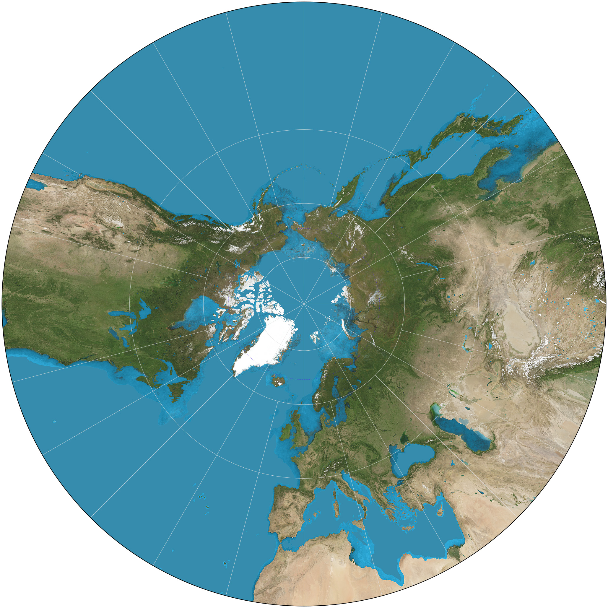
The True Size Of… is an interactive demonstration of the limitations of the Mercator projection.
Africa, USA, China & India
USA and Australia
Russia and Canada
Africa, USA, China & India
USA and Australia
Russia and Canada
Greenland is still pretty damn big too, if not quite as big as it looks on first glance at a Mercator map.
posted by T.D. Strange at 1:32 PM on September 8, 2015
posted by T.D. Strange at 1:32 PM on September 8, 2015
This is awesome. I'd love to see this done with other map projections. Also I'm reminded that Andrew Jackson, in the main foyer of his White House had a big block of cheese....but I digress.
posted by noneuclidean at 1:33 PM on September 8, 2015 [10 favorites]
posted by noneuclidean at 1:33 PM on September 8, 2015 [10 favorites]
Mercator really gets a bad rap these days. Yes, the size distortions become absurd as you move toward the poles; Greenland looks as big as Africa when it's actually about the size of Algeria. But no matter how you slice it, it's impossible to perfectly project the surface of a sphere onto a 2D surface. EVERY map projection is good for some applications and terrible for others; every map projection sacrifices accuracy in one way or another. Mercator is indispensable for maritime navigation because it is conformal (it preserves angles on a local scale) and because a straight line will cross all lines of longitude at the same angle. It's also great for calculating Great Circle distances between two points.
I mean, the Waterman Butterfly projection is gorgeous, but if I need to navigate from point A to point B I am pretty much screwed with that thing.
posted by Vic Morrow's Personal Vietnam at 1:36 PM on September 8, 2015 [20 favorites]
I mean, the Waterman Butterfly projection is gorgeous, but if I need to navigate from point A to point B I am pretty much screwed with that thing.
posted by Vic Morrow's Personal Vietnam at 1:36 PM on September 8, 2015 [20 favorites]
This is really great! I'm enjoying searching for countries that can be plonked down in the ocean to look like a nicely appropriate Atlantis.
posted by protorp at 1:39 PM on September 8, 2015 [1 favorite]
posted by protorp at 1:39 PM on September 8, 2015 [1 favorite]
Sorkin has his 1300 dues-paying members of the Cartographers for Social Equality pushing for the Peters Projection, though, which is insane.
posted by Navelgazer at 1:41 PM on September 8, 2015 [4 favorites]
posted by Navelgazer at 1:41 PM on September 8, 2015 [4 favorites]
(Previously)
What gets my goat is Google Maps and the like using Mercator. Just plunk it on a virtual sphere, dangit!
posted by Sys Rq at 1:43 PM on September 8, 2015 [6 favorites]
What gets my goat is Google Maps and the like using Mercator. Just plunk it on a virtual sphere, dangit!
posted by Sys Rq at 1:43 PM on September 8, 2015 [6 favorites]
This will only be surprising to someone who has never seen a globe.
posted by rocket88 at 1:45 PM on September 8, 2015 [4 favorites]
posted by rocket88 at 1:45 PM on September 8, 2015 [4 favorites]
> It's also great for calculating Great Circle distances between two points.
How is mercator good for this? Aren't great circles through points not on the same longitude curved and therefore difficult to measure?
posted by noneuclidean at 1:45 PM on September 8, 2015 [1 favorite]
How is mercator good for this? Aren't great circles through points not on the same longitude curved and therefore difficult to measure?
posted by noneuclidean at 1:45 PM on September 8, 2015 [1 favorite]
Africa's big.
posted by benito.strauss
It's always killed me that in an infographic that rails against "immappancy" they forget to include Alaska when overlaying the United States onto Africa, even though they include Alaska when calculating the US's total land area.
posted by The Notorious SRD at 2:06 PM on September 8, 2015 [4 favorites]
I mean, the Waterman Butterfly projection is gorgeous, but if I need to navigate from point A to point B I am pretty much screwed with that thing.
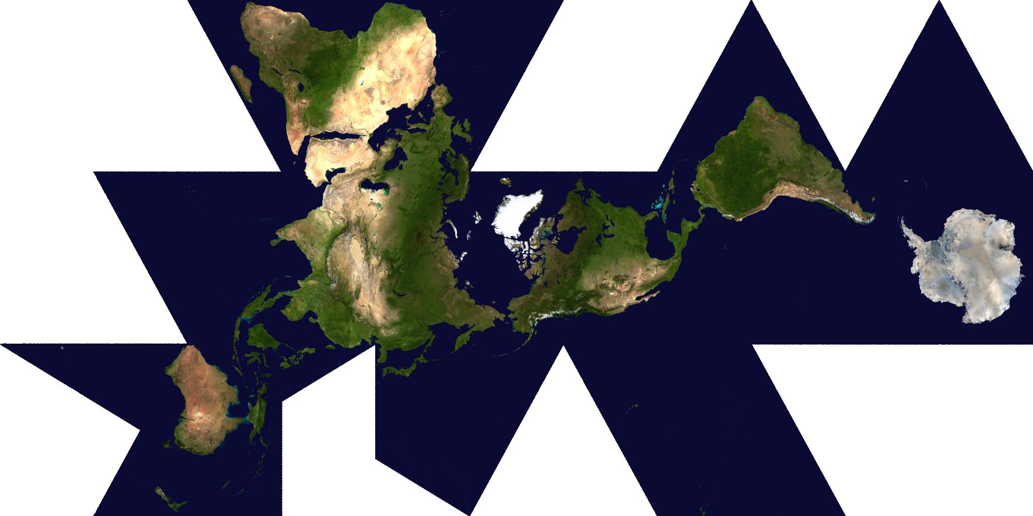
Same goes for Buckminster Fuller's Dymaxion Map (except for the gorgeous part).
posted by fairmettle at 2:13 PM on September 8, 2015 [2 favorites]
Same goes for Buckminster Fuller's Dymaxion Map (except for the gorgeous part).
posted by fairmettle at 2:13 PM on September 8, 2015 [2 favorites]
How is mercator good for this? Aren't great circles through points not on the same longitude curved and therefore difficult to measure? noneuclidean - eponysterical :)
it's true that a straight line on a Mercator map is not a great circle line. The good news is, you only need three pieces of info from your map: the latitudes of the two locations, and the difference between their longitudes. Then you can plug these into the Spherical Law of Cosines, and after some painless trigonometry you have your great circle distance.
Now, with that said, it's just as easy to find the latitudes and longitudes on most other cylindrical projections, especially on an equirectangular projection. The nice thing about Mercator and many other cylindrical maps is that it's very easy to measure the difference between longitudes, and all of your lines -- both latitude and longitude -- are straight and uninterrupted. When your lines are curved or squiggly, or when they vanish and pop up somewhere else, you're more likely to make an inaccurate measurement.
(Actually, you can directly measure great circle distance on a Gnomonic projection, but damn that is a freaky looking map.)
posted by Vic Morrow's Personal Vietnam at 2:15 PM on September 8, 2015 [6 favorites]
Sys Rq: like this? (Click on the "Earth" button in the bottom-left corner of the map to get the 3D globe.)
posted by frogmanjack at 2:23 PM on September 8, 2015 [1 favorite]
posted by frogmanjack at 2:23 PM on September 8, 2015 [1 favorite]
Ha, I came into this thread all guns a blazin to say......exactly what Vic Morrow's Personal Vietnam said, but probably in a less polite manner. Cartographer problems!
posted by everybody had matching towels at 2:26 PM on September 8, 2015 [1 favorite]
posted by everybody had matching towels at 2:26 PM on September 8, 2015 [1 favorite]
Mercator's best use is precision mapping, since the thing it distorts the least is shape of landforms, which is why it was so frequently used for maritime applications).
I spent a lot of time making maps with GIS software in college and professionally thereafter. Unless things have changed a great deal since I was doing it, Universal Transverse Mercator is often the preferred choice for scientific work in GIS since you're using projected cartesian coordinates (Easting and Northing in meters from an origin) and it splits the world into 60 different zones, so it's great for accurate mapping in a larger area. I used the state plane system at work, but that's largely because the U.S. still hates the metric system. Cartography buffs know that Mercator has its place.
Whole-world mapping is probably the worst way to employ the Mercator projection, unless you really wanted to see all the crinkles in Greenland's edges but also see Japan on the same map, and you happen to actually know how big the landforms really are. Which is why the Mercator projection should never, ever be used as a whole-world in classrooms where there are small children (or...at all? Who needs a Mercator projection of the whole world, anyway?). Stick to Robinson or something more appropriate. I suspect most Americans don't really have a good handle on the relative sizes of Greenland and South America for this reason.
posted by Strudel at 2:28 PM on September 8, 2015 [4 favorites]
You know what I want to start seeing on map projections? Show me the ground path for a dozen or so orbits of the ISS. Let me see how that looks on the projection you're pushing.
posted by Kid Charlemagne at 2:29 PM on September 8, 2015 [1 favorite]
posted by Kid Charlemagne at 2:29 PM on September 8, 2015 [1 favorite]
frogmanjack: Sys Rq: like this?
Yes, sort of! Except that only seems to work for satellite imagery.
posted by Sys Rq at 2:33 PM on September 8, 2015
Yes, sort of! Except that only seems to work for satellite imagery.
posted by Sys Rq at 2:33 PM on September 8, 2015
The reason the Mercator Projection became the default is has two properties that make it extremely useful for navigation. First, it's conformal -- if a point is stretched east-to-west, it's also stretched north-to-south. Thus, with suitable scale adjustment, accurate distances can be measured across the map, and on most scales of a mercator projection, you don't need to adjust your scale at all -- only on the global scale do you worry.
The second is that lines of constant bearing are straight on the map, so transferring them across the map is trivial. You print a compass rose somewhere on your map and you can then use parallel rulers to move that bearing across, and while navigating via rhumb line isn't as efficient as navigating a great circle course, sailing a great circle involves constantly changing a bearing, whereas sailing a rhumb line involves holding a course on your compass. On long voyages, you'd sail something close to a Great Circle by setting a daily course close to it, but it would be a series of rhumb lines, because you'd follow a compass course, and of course, there's far more to it than just the Great Circle -- weather, ocean currents, other traffic, and if you were wind powered, the wind gets far more of a vote on your course than the shortest distance between two ports does.
It is basically useless above 70° N or S, but in sailing, most of those latitudes is useless to the sailor -- North being in the Arctic icepack in the winter and south being in the Antarctic all the time, so that limitation really doesn't affect it. The exaggeration of Greenland is annoying, but we didn't sail around Greenland much at all. Aircraft, of course, can use these, but for long distance navigation, they often use charts that aren't to any fixed scale at all, just to a general diagram of nav points with indicated distances, with whatever compromises to scale needed to make the chart fit on the page. This is only for ILS charts, where visual navigation is not in play.
And, as Vic Morrow's Personal Vietnam says, all 2D projections of Earth will fail. The Earth is a 3D shape. The only accurate map that is conformal and accurately represents the shape, positions and distances of the landmasses of the Earth is a properly shaped globe.
So, as long as we have a need for shoving a projection of the Earth onto a page, we're going to have this problem. Either we deal with this distortion, and use Mercator, or we pick another distortion. The Dymaxion Map does a good job at keeping the shape and sizes of the landmasses of Earth correct, but in many cases, it makes a completely hash of the distances and positions between them. Australia and Antartica are actually quite close, not on opposite sides of the world, and while the Pacific Ocean is wide, it's not that wide.
posted by eriko at 2:33 PM on September 8, 2015 [4 favorites]
The good news is, you only need three pieces of info from your map: the latitudes of the two locations, and the difference between their longitudes. Then you can plug these into the Spherical Law of Cosines, and after some painless trigonometry you have your great circle distance.
I have to calculate great circle distance frequently for my job and end up using those same formulas, so yeah it's easy enough to create a function to calculate the distance, but I certainly wouldn't call the Mercator projection great for it. Heck, all you need are latitudes and longitudes for your points, and those aren't properties of any projection but of the Earth itself.
posted by noneuclidean at 2:46 PM on September 8, 2015 [1 favorite]
The Dymaxion was designed to do one job and carry one political message - we are all much more closely connected than our governance systems recognise - and does it brilliantly*. In many ways it's the perfect example of what a map projection actually is; Gauss showed us we had to break the surface of the sphere, but which cracks we choose to make, and how far we fall down them, is up to us.
*yes, Australia, sorry.
posted by cromagnon at 2:53 PM on September 8, 2015 [1 favorite]
*yes, Australia, sorry.
posted by cromagnon at 2:53 PM on September 8, 2015 [1 favorite]
What I gather from this is that it's incredibly dangerous to let any countries take control of the North Pole, because if they did, they might be able to travel further North, and reach INFINITY
posted by shenkerism at 3:54 PM on September 8, 2015 [1 favorite]
posted by shenkerism at 3:54 PM on September 8, 2015 [1 favorite]
It's interesting to call up Antarctica and move it around to see how it compares to the other continents. It's a little misleading, though- on maps we see this big ice continent, but it's actually a buried archipelago.
posted by BuddhaInABucket at 4:10 PM on September 8, 2015 [2 favorites]
posted by BuddhaInABucket at 4:10 PM on September 8, 2015 [2 favorites]
russia is still really freaking huge.
Try dragging it down to Africa.
posted by JackFlash at 4:12 PM on September 8, 2015 [3 favorites]
Try dragging it down to Africa.
posted by JackFlash at 4:12 PM on September 8, 2015 [3 favorites]
Brazil isn't puny either
Note: You can double-click to change the color of a country. Anyone know how to rotate one?
posted by mbrubeck at 4:20 PM on September 8, 2015 [1 favorite]
Note: You can double-click to change the color of a country. Anyone know how to rotate one?
posted by mbrubeck at 4:20 PM on September 8, 2015 [1 favorite]
> Note: You can double-click to change the color of a country. Anyone know how to rotate one?
Best I can tell is when you double click on the country it slightly reorients itself based on where it is on the map. For instance, call up the US, move it over Greenland, double click to change color, and then drag it back to where it should be. You'll notice it now rotated slightly. If you double click again, it will reorient to fit back to its normal position.
posted by noneuclidean at 4:47 PM on September 8, 2015
Indonesia is really long. No, even longer than that.
Democratic Republic of Congo versus all of central Europe, or most of the western U.S.
posted by mbrubeck at 5:10 PM on September 8, 2015 [2 favorites]
Democratic Republic of Congo versus all of central Europe, or most of the western U.S.
posted by mbrubeck at 5:10 PM on September 8, 2015 [2 favorites]
But no matter how you slice it, it's impossible to perfectly project the surface of a sphere onto a 2D surface. EVERY map projection is good for some applications and terrible for others; every map projection sacrifices accuracy in one way or another. Mercator is indispensable for maritime navigation
So because everything is as bad as everything else we should use the projection that is only useful for sailors...? I'm not sure if that is the best argument in favor of Mercator.
posted by Pyrogenesis at 5:44 PM on September 8, 2015 [2 favorites]
So because everything is as bad as everything else we should use the projection that is only useful for sailors...? I'm not sure if that is the best argument in favor of Mercator.
posted by Pyrogenesis at 5:44 PM on September 8, 2015 [2 favorites]
For every purpose there is a projection.
Platte carre has its use as being visually recognizable, but it's neither equal area nor shape preserving. And it distorts shape near the poles really badly (so much I can't even tell about the area).
I do think it's what's used in most in-flight entertainment systems-- including, much to my chagrin, the one for Air Greenland. I would have at least hoped they recentered the projection, because as it was, mostly it wasn't so useful for watching the (global) paths of our flights. Look, we're over a squashed continent!
posted by nat at 5:50 PM on September 8, 2015
Oh don't even get me started on Air Greenland's in-flight entertainment.
posted by Flashman at 8:22 PM on September 8, 2015 [2 favorites]
posted by Flashman at 8:22 PM on September 8, 2015 [2 favorites]
so how is it that mercator (argued here as valuable because global maritime navigation) a good choice for google etc? most of my friends hitting it up on their mobile aren't globally navigating a boat.
it's really not - except for the marketing aspect. like every web *standard*, it's useful to have a standard, but why always pick the shittiest one?
it really makes no sense in this web era to not use a robinson, or spherical, or something cool and useful until you get to a large scale, then switch to something locally conformal automatically. yes, i have coded this. yes it is trivial.
posted by j_curiouser at 9:27 PM on September 8, 2015 [1 favorite]
Some of the properties that make Mercator useful for navigation are also very valuable for a tiled, zoomable map interface like Google Maps. Because it's a conformal projection, shapes and angles are fairly well preserved at local scale. This means that, when you zoom in to look at a small area, shapes are not distorted, the cardinal directions are at right angles to each other, etc. Meanwhile, the disadvantages of Mercator only show up at the global scale when doing things like comparing Greenland to Africa, which is probably not a high-priority use case for Google Maps.
posted by mbrubeck at 10:22 PM on September 8, 2015 [2 favorites]
posted by mbrubeck at 10:22 PM on September 8, 2015 [2 favorites]
I think it would be neat to have a Google maps like site where you can arbitrarily relocate the equator, i.e. if you wanted the north pole to be where the equator normally is in the center of the map, so that sizes of equatorial countries are exaggerated and stretched and arctic countries are compressed. Bonus points if you can apply an arbitrary rotation and still have the text labels remain horizontal so that they can be read. In other words, I want to be able to choose an arbitrary origin and orientation for the projection. Does anything like this exist?
posted by Rhomboid at 1:15 AM on September 9, 2015 [3 favorites]
posted by Rhomboid at 1:15 AM on September 9, 2015 [3 favorites]
Rhomboid: The Da Vinci Worldmap Generator lets you play dynamically with arbitrary geographic centers, to see how it affects many different projections.
It doesn't let you overlay other layers, but you can download the results. That can be enough, though, like showing human migration from East Africa to South America as nearly a straight shot though.
posted by bendybendy at 4:21 AM on September 9, 2015 [1 favorite]
It doesn't let you overlay other layers, but you can download the results. That can be enough, though, like showing human migration from East Africa to South America as nearly a straight shot though.
posted by bendybendy at 4:21 AM on September 9, 2015 [1 favorite]
Puny United States! Feel the wrath of the great and fashionable Italy boot! Our power is unstoppable!
posted by Rhomboid at 5:05 AM on September 9, 2015 [1 favorite]
posted by Rhomboid at 5:05 AM on September 9, 2015 [1 favorite]
if you take mbrubeck's Indonesia link and move the country to the upper pole it looks like a pretty cool... monster thing. (If you then copy and paste the url, though, it gets reset somehow and doesn't look as cool anymore)
posted by numaner at 6:06 AM on September 9, 2015
posted by numaner at 6:06 AM on September 9, 2015
You got your Brazil in my Canada! You got your Canada in my Brazil!
(This is really cool)
posted by psoas at 8:56 AM on September 9, 2015 [1 favorite]
(This is really cool)
posted by psoas at 8:56 AM on September 9, 2015 [1 favorite]
Mandatory link to that adorable "Cartographers For Social Equality" scene from The West Wing.
posted by rufb at 10:39 AM on September 9, 2015
posted by rufb at 10:39 AM on September 9, 2015
« Older Is That Technology In Your Pocket? | Pay them their goddamn money. Newer »
This thread has been archived and is closed to new comments
Cool toy! Thanks!
posted by Thorzdad at 1:31 PM on September 8, 2015