Evolution of Horror Movie Poster Designs: 1922 – 2009
June 13, 2016 4:48 PM Subscribe
Frankly, I like the Nosferatu poster and I don't think I care what he has to say about the rest of it.
posted by doctor_negative at 5:31 PM on June 13, 2016 [3 favorites]
posted by doctor_negative at 5:31 PM on June 13, 2016 [3 favorites]
Seconding the like for the Nosferatu poster. It's beautiful and crepuscular, like a Nosferatu poster should be.
Also, the writing is very odd, and why there jump from 1939 to 1960?
Lovely to see all those posters in one place though.
posted by Phlegmco(tm) at 6:16 PM on June 13, 2016
Also, the writing is very odd, and why there jump from 1939 to 1960?
Lovely to see all those posters in one place though.
posted by Phlegmco(tm) at 6:16 PM on June 13, 2016
Nothing at all between 1939 and 1960? I'm not a big horror buff so I don't know what's missing, but that seemed like kind of a big gap...
posted by Sing Or Swim at 6:23 PM on June 13, 2016
posted by Sing Or Swim at 6:23 PM on June 13, 2016
Is dreadful a critique or the point of that Nosferatu poster?
At least some of the subtext of Dracula/Nosferatu has to do with "orientalism" and fear of Eastern Europe, so the folksy border fits. As for the rest, Shreck was beyond creepy looking for anything they'd seen on stage and cinema.
posted by CBrachyrhynchos at 6:24 PM on June 13, 2016
At least some of the subtext of Dracula/Nosferatu has to do with "orientalism" and fear of Eastern Europe, so the folksy border fits. As for the rest, Shreck was beyond creepy looking for anything they'd seen on stage and cinema.
posted by CBrachyrhynchos at 6:24 PM on June 13, 2016
As far as I can tell, the text accompanying each poster is the movie description copied verbatim from Amazon. No real commentary or insight here.
posted by Metroid Baby at 7:13 PM on June 13, 2016 [2 favorites]
posted by Metroid Baby at 7:13 PM on June 13, 2016 [2 favorites]
> And why has the original screen full of static on the Poltergeist poster been replaced with what appears to be an NHL game?
Because it's for the Canadian Filmmakers Festival?
I'm having trouble deciding whether or not I want that to truly be the answer.
posted by cardioid at 7:23 PM on June 13, 2016
Because it's for the Canadian Filmmakers Festival?
I'm having trouble deciding whether or not I want that to truly be the answer.
posted by cardioid at 7:23 PM on June 13, 2016
And why has the original screen full of static on the Poltergeist poster been replaced with what appears to be an NHL game?
I thought the exact same thing. A reverse image search led me to this 2013 precursor of this list that also uses the hockey version. Guess it was the thing that popped up online for poltergeist, even though it looks like it was indeed made as an ad for that festival.
posted by gemmy at 9:18 PM on June 13, 2016 [1 favorite]
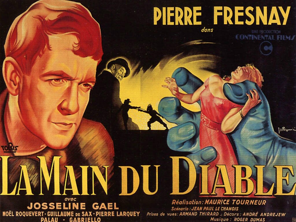
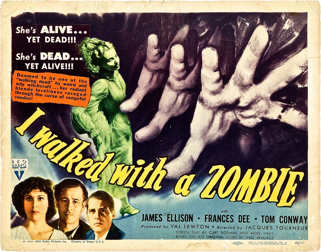
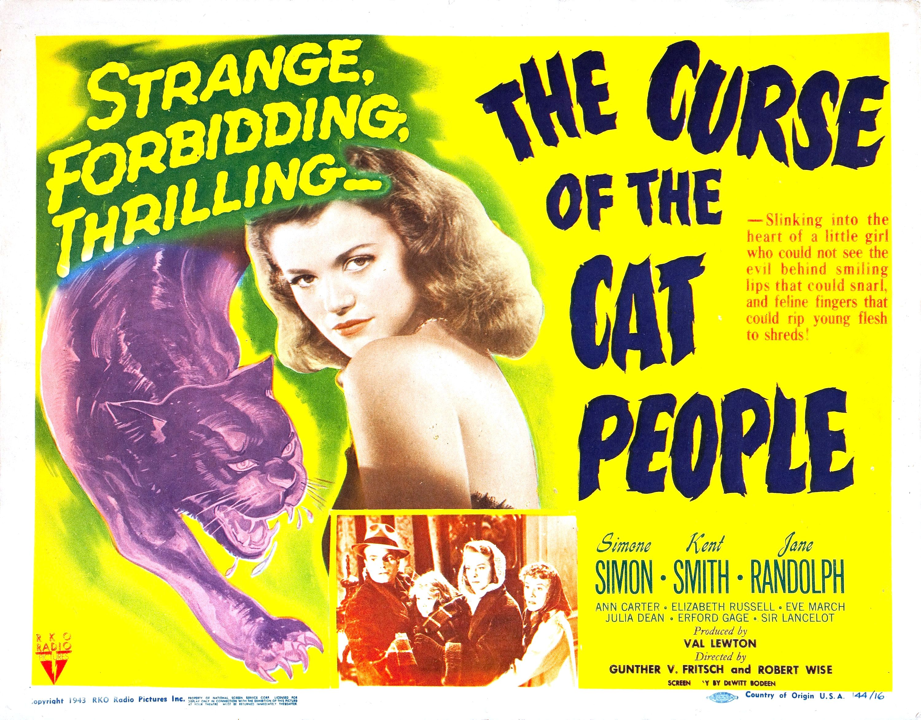
A list of horror movies from 1940 to 1959, including such classics as La main du diable, I Walked with a Zombie, The Curse of the Cat People, etc. The omission of these quite prolific two decades is indeed strange.
posted by sapagan at 12:14 AM on June 14, 2016
posted by sapagan at 12:14 AM on June 14, 2016
This isn't an article, it's a lazy, inept Google search by someone who needed words and pictures to put ads next to.
posted by Horace Rumpole at 4:15 AM on June 14, 2016 [2 favorites]
posted by Horace Rumpole at 4:15 AM on June 14, 2016 [2 favorites]
Lots of issues with this, aside from the fact that the text descriptions seem to be stolen from other sites.
1) That Frankenstein poster is from a later reissue, not the 1931 release as suggested.
2) That White Zombie "poster" is really the box art for a cheapie DVD. (Some actual period artwork from the film's release can be found at Vampire Over London: The Bela Lugosi Blog.)
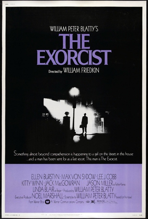
3) That The Exorcist image looks like box art to me. The actual one-sheet design is similar but made better use of black space.
4) Salem's Lot is box art and, anyway, it was a TV movie so doesn't really belong on this list.
5) As noted above, that's not the Poltergeist poster.
6) Not sure why that's a Spanish-language Hellraiser poster but whatever.
7) That's the DVD box cover for Arachnophobia. The original poster includes ... wait for it ... a spider in the design.
8) Not sure why that's a German-language Misery poster but whatever.
9) Seven is box art, not the movie poster.
10. That's the poster for The Ring Two, not The Ring.
11. That's Hostel box art, not a movie poster.
12. That poster is for 24 Weeks Later, not 24 Days Later.
I mean come on. It's too bad, because if this thing were the thing it purported to be, it would be a cool thing on the Internet.
posted by Mothlight at 6:59 AM on June 14, 2016 [1 favorite]
1) That Frankenstein poster is from a later reissue, not the 1931 release as suggested.
2) That White Zombie "poster" is really the box art for a cheapie DVD. (Some actual period artwork from the film's release can be found at Vampire Over London: The Bela Lugosi Blog.)
3) That The Exorcist image looks like box art to me. The actual one-sheet design is similar but made better use of black space.
4) Salem's Lot is box art and, anyway, it was a TV movie so doesn't really belong on this list.
5) As noted above, that's not the Poltergeist poster.
6) Not sure why that's a Spanish-language Hellraiser poster but whatever.
7) That's the DVD box cover for Arachnophobia. The original poster includes ... wait for it ... a spider in the design.
8) Not sure why that's a German-language Misery poster but whatever.
9) Seven is box art, not the movie poster.
10. That's the poster for The Ring Two, not The Ring.
11. That's Hostel box art, not a movie poster.
12. That poster is for 24 Weeks Later, not 24 Days Later.
I mean come on. It's too bad, because if this thing were the thing it purported to be, it would be a cool thing on the Internet.
posted by Mothlight at 6:59 AM on June 14, 2016 [1 favorite]
Interesting how the Carrie poster has a massive spoiler.
posted by Beholder at 7:11 AM on June 14, 2016
posted by Beholder at 7:11 AM on June 14, 2016
Wow, really wish I hadn't given the site the traffic. Spoiler: it's a bunch of movie posters chosen with no real directive in mind and plot explanations lifted from other sites. The text
"From the dreadful art work created for Nosferatu in 1922 till the present, horror movie posters has evolved with time, immensely."
should give you all the info you need: The poster for Nosferatu is not "dreadful = bad" but "dreadful = menacing", and is a very good example of 1920's poster art. The "evolved" is not only subjective and contentious (and stupid, IMO), but the poor sentence structure makes it look like it's put together by a machine.
The other page titles on the site all look like clickbait. Avoid this article and DON'T give these jerks the site hits!
posted by Zack_Replica at 1:02 PM on June 14, 2016
Why doesn't the article actually talk about the posters? Was this written by software?
posted by lumpenprole at 2:21 PM on June 14, 2016
posted by lumpenprole at 2:21 PM on June 14, 2016
« Older You know what grinds my gears? | Broomgate sweeps curling! Newer »
This thread has been archived and is closed to new comments
posted by ricochet biscuit at 5:03 PM on June 13, 2016