Because ≤ and ← are better than <= and <-
September 28, 2016 11:07 AM Subscribe
Some monospaced fonts with ligatures for common mathematical and programming symbols: Hasklig, Fira Code, Monoid (a small “why” from the creator), Iosevka, DejaVu Sans Code, and Fixedsys Excelsior. Take them (and a bunch of no-ligature monospaced fonts) for a spin at app.programmingfonts.org!
Very nice! Not all of them handle sequences that include others as subsequences, though. Take Ruby's spaceship operator
Every time I see -> instead of → in some otherwise nicely typeset slides I die a little.
I set up WinCompose so that pressing CapsLock - > enters a literal Unicode →. Which has the added benefit of making CapsLock useful.
posted by Rangi at 11:14 AM on September 28, 2016 [3 favorites]
<=>. With Fira Code and Fixedsys it appears correctly as ⟺, but with Hasklig it appears as <⇒. (Which is informative; the ligature algorithm I expected, reading character by character from the left, would have shown ⇐>.)Every time I see -> instead of → in some otherwise nicely typeset slides I die a little.
I set up WinCompose so that pressing CapsLock - > enters a literal Unicode →. Which has the added benefit of making CapsLock useful.
posted by Rangi at 11:14 AM on September 28, 2016 [3 favorites]
I've thought about these ligatured fonts but honestly I prefer having two characters for stuff like <=, because (humor me for a second) == != =.
posted by destructive cactus at 11:15 AM on September 28, 2016 [27 favorites]
posted by destructive cactus at 11:15 AM on September 28, 2016 [27 favorites]
I've thought about these ligatured fonts but honestly I prefer having two characters for stuff like <>
The workaround is generally that the ligature characters appear longer than their single version. In Fira Code, for instance, == is twice as long as =, so it’s hard to confuse the two. Similarly, === is represented by three vertical lines while still taking up as much horizontal space as three =s, end-to-end.
posted by Going To Maine at 11:18 AM on September 28, 2016 [1 favorite]
I'm all get-off-my-lawn about ligatures in fonts for programming. Characters on the screen should be exactly what I can type to reproduce them. However, for parts of the UI that aren't the text I'm editing, I'm totally cool with fancy characters such as those used in powerline or airline.
I'm weirdly proud of my custom hacked version of Letter Gothic (actually FF Letter Gothic) with dotted 0s and powerline symbols.
posted by zsazsa at 11:21 AM on September 28, 2016 [7 favorites]
I'm weirdly proud of my custom hacked version of Letter Gothic (actually FF Letter Gothic) with dotted 0s and powerline symbols.
posted by zsazsa at 11:21 AM on September 28, 2016 [7 favorites]
oh, this is pretty useful. My gut reaction was HELLO HOMOGLYPH TROLLING IN SOURCE CODE, but that's not it at all.
posted by boo_radley at 11:21 AM on September 28, 2016 [1 favorite]
posted by boo_radley at 11:21 AM on September 28, 2016 [1 favorite]
" ← better than <-"
That's not a thing, arrows point to the right. Non-programmer detected.
posted by w0mbat at 11:24 AM on September 28, 2016 [4 favorites]
That's not a thing, arrows point to the right. Non-programmer detected.
posted by w0mbat at 11:24 AM on September 28, 2016 [4 favorites]
Non-programmer detected.
Non-R-programmer detected.
posted by paper chromatographologist at 11:28 AM on September 28, 2016 [39 favorites]
Non-R-programmer detected.
posted by paper chromatographologist at 11:28 AM on September 28, 2016 [39 favorites]
Oh, wow, the instant the in-browser editor silently transmogrified my -> into a very pretty → I just had this kind of inchoate reptile brain revulsion reaction. I got a little angry.
I can absolutely see the need for pretty ligatures in presentation slides or papers or documentation or hell, even comments, but keep. your. damn. hands. off. my. code. What I type is what I type; don't make it cute. I'm way too anal retentive for that.
My visual cortex is already tuned to search through code looking for double character <= symbols while debugging. I can only imagine the Hate that would come from trying to find a rogue ≤ in place of a <.
Also Terminus 4 lyfe.
posted by quite unimportant at 11:29 AM on September 28, 2016 [11 favorites]
Non-programmer detected.
Non-R-programmer detected.
This is, of course, one of the many ways in which R is awful. But yes. My trap, it is sprung.
I can absolutely see the need for pretty ligatures in presentation slides or papers or documentation or hell, even comments, but keep. your. damn. hands. off. my. code. What I type is what I type; don't make it cute. I'm way too anal retentive for that
Just to be clear: the actual text is unchanged. If you switch fonts, the text will (visually) go right back to what it actually is. If you search the text, the original string will work just fine. This isn’t to argue against that gut reaction -since I had it for a bit as well- but just to remove ambiguity that is in the post itself.
posted by Going To Maine at 11:34 AM on September 28, 2016 [3 favorites]
I am oddly upset at /= instead of !=.
posted by maryr at 11:36 AM on September 28, 2016 [1 favorite]
posted by maryr at 11:36 AM on September 28, 2016 [1 favorite]
Just to be clear: the actual text is unchanged. If you switch fonts, the text will (visually) go right back to what it actually is. If you search the text, the original string will work just fine.
Oh my God that's so much worse.
posted by quite unimportant at 11:41 AM on September 28, 2016 [6 favorites]
Oh my God that's so much worse.
posted by quite unimportant at 11:41 AM on September 28, 2016 [6 favorites]
well, it isn't APL, so there's that ...
posted by k5.user at 11:44 AM on September 28, 2016 [2 favorites]
posted by k5.user at 11:44 AM on September 28, 2016 [2 favorites]
In Fira Code, for instance, == is twice as long as =, so it’s hard to confuse the two. Similarly, === is represented by three vertical lines while still taking up as much horizontal space as three =s, end-to-end.
Yeah, I noticed that when I tried it out, but that just leads me to more questions about the point of this, for programming at least.
posted by destructive cactus at 11:46 AM on September 28, 2016
Yeah, I noticed that when I tried it out, but that just leads me to more questions about the point of this, for programming at least.
posted by destructive cactus at 11:46 AM on September 28, 2016
That's not a thing, arrows point to the right. Non-programmer detected
Non-R-programmer detected.
Go uses the left arrow (for channels). I think Haskell has a left arrow.
posted by atoxyl at 11:55 AM on September 28, 2016
Non-R-programmer detected.
Go uses the left arrow (for channels). I think Haskell has a left arrow.
posted by atoxyl at 11:55 AM on September 28, 2016
So, I think I'm liking this, but am mildly frustrated at the fact that IntelliJ seems to butcher certain fonts... The heavier weights of Fira Code seem particularly awful for some reason.
posted by schmod at 11:57 AM on September 28, 2016
posted by schmod at 11:57 AM on September 28, 2016
APL of course has a left arrow but that's APL it has a lot of things not on a standard keyboard as well.
posted by atoxyl at 12:01 PM on September 28, 2016
posted by atoxyl at 12:01 PM on September 28, 2016
I'd like to file a show stopper:
a<-b becomes a←b
This ("a←b") is not the same as "(a) (less than) (negate b)"
posted by MikeKD at 12:04 PM on September 28, 2016 [15 favorites]
a<-b becomes a←b
This ("a←b") is not the same as "(a) (less than) (negate b)"
posted by MikeKD at 12:04 PM on September 28, 2016 [15 favorites]
Having recently been knighted a swift programmer, I am dismayed to make such frequent and pedestrian use of the -> operator. Also the damn === operator.
posted by jeffamaphone at 12:12 PM on September 28, 2016
posted by jeffamaphone at 12:12 PM on September 28, 2016
Ooooooooooooh pretty.
posted by Anticipation Of A New Lover's Arrival, The at 12:14 PM on September 28, 2016
posted by Anticipation Of A New Lover's Arrival, The at 12:14 PM on September 28, 2016
Really, really needs an interrobang ligature for comments.
// wtf ‽
posted by BungaDunga at 12:19 PM on September 28, 2016 [1 favorite]
// wtf ‽
posted by BungaDunga at 12:19 PM on September 28, 2016 [1 favorite]
Ligatures not supported in my company-provided-IDE, so sad face I guess? I lean slightly more towards the "I want to see all the characters when reading code" anyway, as pretty as it might look otherwise.
posted by howling fantods at 12:20 PM on September 28, 2016
posted by howling fantods at 12:20 PM on September 28, 2016
You millennial weirdoes with languages that have left pointing arrows can get off my lawn. Go take a selfie or something.
posted by w0mbat at 12:21 PM on September 28, 2016 [7 favorites]
posted by w0mbat at 12:21 PM on September 28, 2016 [7 favorites]
Just to be clear: the actual text is unchanged. If you switch fonts, the text will (visually) go right back to what it actually is. If you search the text, the original string will work just fine.
Oh my God that's so much worse.*
I like that as a gut reaction, but don’t actually understand it. How would you expect it to even begin to work otherwise? You’d need some kind of intermediate step before compiling and interpreting that would convert the (I guess… unicode?) symbol back into something that actually had meaning in the language itself. The ligature can only mask what’s there, not change it. If it changed it you’d run into all kinds of crazy problems. Like, my initial terrified reaction to the idea was that this was going to gung my code up to heck with crazy font garbage. The fact that it doesn’t do that makes me happy. Everything still works, just as it did before.
posted by Going To Maine at 12:21 PM on September 28, 2016 [2 favorites]
My favorite way to have pretty characters in code remains agda-mode.
posted by eruonna at 12:22 PM on September 28, 2016 [2 favorites]
posted by eruonna at 12:22 PM on September 28, 2016 [2 favorites]
What about the famous "goes to" operator?
while( x--> 0 ){ do stuff }
It's completely valid, and occasionally quite lovely. :)
posted by MengerSponge at 12:23 PM on September 28, 2016 [3 favorites]
while( x--> 0 ){ do stuff }
It's completely valid, and occasionally quite lovely. :)
posted by MengerSponge at 12:23 PM on September 28, 2016 [3 favorites]
You millennial weirdoes with languages that have left pointing arrows can get off my lawn. Go take a selfie or something.
APL did it first
posted by BungaDunga at 12:23 PM on September 28, 2016 [2 favorites]
APL did it first
posted by BungaDunga at 12:23 PM on September 28, 2016 [2 favorites]
The very idea of ligatures in a monospaced font makes me cringe.
posted by Foosnark at 12:24 PM on September 28, 2016 [2 favorites]
posted by Foosnark at 12:24 PM on September 28, 2016 [2 favorites]
You millennial weirdoes with languages that have left pointing arrows can get off my lawn. Go take a selfie or something.
R:
R:
First appeared 1993; 23 years agoS:
First appeared 1976; 40 years agoposted by Going To Maine at 12:25 PM on September 28, 2016 [5 favorites]
Now I think about it you could probably come up with a font for APL that you can type in ASCII but (ab)uses ligatures to display correctly.
posted by BungaDunga at 12:28 PM on September 28, 2016 [2 favorites]
posted by BungaDunga at 12:28 PM on September 28, 2016 [2 favorites]
Don't like it. If anything, we need fewer characters, not more.
Also, "for x rockets to zero with a smile and a wink"...
Also, "for x rockets to zero with a smile and a wink"...
   for (x = 11; 0 <=~~-- x ;)
       countdown(x);
   blastoff();
posted by smcameron at 12:32 PM on September 28, 2016 [2 favorites] Hey, the first programming language I ever learned had a ← operator.
posted by Ampersand692 at 12:32 PM on September 28, 2016 [1 favorite]
posted by Ampersand692 at 12:32 PM on September 28, 2016 [1 favorite]
Depending on the font, <= either looks like a ⇐ (Fixedsys Ligatures) or a ≤ (Fira Code). Awesome.
posted by BungaDunga at 12:35 PM on September 28, 2016 [4 favorites]
posted by BungaDunga at 12:35 PM on September 28, 2016 [4 favorites]
How would you expect it to even begin to work otherwise?
I guess my whole point is that I wouldn't. Expect it to work. Ever.
I don't know if it's because I spend way to much time in a terminal window or what, but telling me that what I'm seeing is not /really/ what's actually there but oh no wait what you typed is in there but you're just not seeing it the way you typed it but no problem because the compiler won't puke on it if we do it this way makes this a flavor of frippery I'm willing to man the barricades against. I'm writing to a file to feed to a piece of software that has zero room for bullshit. => is 3D 3E, ⇒ is 21D2. Showing me 21D2 while the file I'm working on is holding 3D 3E is completely bananas to me.
I will sit and tweak LaTeX until I get the exact symbol I want in the exact place in the equation I want. I am fully on board with keeping a symbolic language stringently defined and showing to the viewer exactly what is needed to convey the message. I'm not dismissing ligatures out of hand.
The misstep is taking that school of thought and applying it to source code, a tool, which due to the history of computing has its own approximation of that same symbolic language and a toolchain that lives and dies by that approximation. I''m using it to do something, within the ruleset defined in the language to be interpreted or compiled. Changing how that looks in the editor (another tool) I'm using to craft that source code just digs right under my skin in a way I'm apparently really bad at communicating to others.
posted by quite unimportant at 12:39 PM on September 28, 2016 [10 favorites]
Also, many variants of ml use <- for assignment to mutable values
posted by idiopath at 12:41 PM on September 28, 2016
posted by idiopath at 12:41 PM on September 28, 2016
First of all, I like this post very much. I'm having fun playing with the font tester, and I'm happy to see more nice monospaced fonts! So thank you for that.
I wonder what the intended purpose of including ligatures in fonts for developers is? I've seen them used to reasonably good effect in some REPLs (mostly to make the interactive experience more pleasant: used to highlight errors, separate lines, and things like that), so maybe they were never intended to be used for editing production code. They're definitely a hindrance to productivity in reading unfamiliar code, at least for me. I have to read code in multiple languages, some of which come with a lot of special operators that are the same ones that are used to compose ligatures. Things like two arrows followed by an equals sign. With ligature replacement, some of the code would probably be unreadable, since I wouldn't exactly trust the ligature parser to be aware of operator precedence in that specific language.
posted by rhythm and booze at 1:10 PM on September 28, 2016 [1 favorite]
Swift also seems to love overloading and new operators, so I'm sure people are using <- for... something... in it.
posted by OverlappingElvis at 1:12 PM on September 28, 2016
posted by OverlappingElvis at 1:12 PM on September 28, 2016
Coming back to report that ¯\_(ツ)_/¯ is a ligature in Monoid, so I guess I've found a use for them. If there is also a ligature for the look of disapproval ಠ_ಠ, well, all is forgiven..
Oh and <- is used in Scala for comprehensions.
posted by rhythm and booze at 1:19 PM on September 28, 2016 [1 favorite]
Oh and <- is used in Scala for comprehensions.
posted by rhythm and booze at 1:19 PM on September 28, 2016 [1 favorite]
I guess my whole point is that I wouldn't.
Don't use one of these fonts, then? Seems easy enough.
For my part, this would seem to make a lot of code more readable, without affecting writability at all. Depending on the language, there are a heck of a lot of dumb typos you can make with operators that will produce unexpected results without necessarily raising a compiler/interpreter error, and these fonts seem like a visually-pleasant way to catch some of those.
posted by tobascodagama at 1:22 PM on September 28, 2016
Depending on the font, <= either looks like a ⇐ (Fixedsys Ligatures) or a ≤ (Fira Code). Awesome.
So, between this and my example, can we coin a new disease: Arts & Humanities Disease. It's the tendency to introduce frippery that ends up causing serious problems when exchanging information. /me throws down glove
posted by MikeKD at 1:22 PM on September 28, 2016 [1 favorite]
So, between this and my example, can we coin a new disease: Arts & Humanities Disease. It's the tendency to introduce frippery that ends up causing serious problems when exchanging information. /me throws down glove
posted by MikeKD at 1:22 PM on September 28, 2016 [1 favorite]
The misstep is taking that school of thought and applying it to source code, a tool, which due to the history of computing has its own approximation of that same symbolic language and a toolchain that lives and dies by that approximation. I''m using it to do something, within the ruleset defined in the language to be interpreted or compiled. Changing how that looks in the editor (another tool) I'm using to craft that source code just digs right under my skin in a way I'm apparently really bad at communicating to others.
I mean I get where you're coming from but is it really a difference of kind from letting people choose their own syntax highlighting or tab width? (A counterpoint being haha who uses tabs). I think it has a slightly greater risk of confusing yourself than those examples, and since I'm not super impressed by the aesthetic advantage I'm unlikely to find it worthwhile - however I think the risk is pretty small for people who are making this choice on purpose.
posted by atoxyl at 1:25 PM on September 28, 2016 [1 favorite]
The misstep is taking that school of thought and applying it to source code, a tool, which due to the history of computing has its own approximation of that same symbolic language and a toolchain that lives and dies by that approximation. I’m using it to do something, within the ruleset defined in the language to be interpreted or compiled. Changing how that looks in the editor (another tool) I’m using to craft that source code just digs right under my skin in a way I’m apparently really bad at communicating to others.
I don’t think you’re being unclear, really. Like I said, my initial reaction to these was that they somehow felt wrong. But my use case and background isn’t yours. These ligatures are making my code more readable, not breaking it (as yet…) and since I’m not at the forefront of a production pipeline I’m not really concerned about something mission-critical breaking. To me, they’re a nice, somewhat unorthodox, perk.
posted by Going To Maine at 1:26 PM on September 28, 2016 [1 favorite]
used in Scala for comprehensions.
Elixir too - which I am embarrassed to forget (I was hung up on the widespread -> in matching expressions).
posted by atoxyl at 1:29 PM on September 28, 2016 [1 favorite]
Elixir too - which I am embarrassed to forget (I was hung up on the widespread -> in matching expressions).
posted by atoxyl at 1:29 PM on September 28, 2016 [1 favorite]
I mean, I don't see these being particularly useful for me as somebody who's mostly buried in Enterprise Javaland. (Abandon all hope, etc., etc.) But I definitely do see some advantages for someone working in a more academic or mathematical setting.
posted by tobascodagama at 1:30 PM on September 28, 2016
posted by tobascodagama at 1:30 PM on September 28, 2016
INTERCAL also uses <- for assignment.
posted by WCWedin at 1:40 PM on September 28, 2016 [3 favorites]
posted by WCWedin at 1:40 PM on September 28, 2016 [3 favorites]
I mean I get where you're coming from but is it really a difference of kind from letting people choose their own syntax highlighting or tab width?
Not really, but on the other hand even highly subjective aesthetic choices aren't beyond criticism. It's possible to maintain both that you're entirely within your rights to install power mode into your editor and at the same time believe that having the editor animate little explosions for every keypress is extremely silly and hurts usability.
Speaking of ligature weirdness: try typing "ft" into the comment box and then editing it. At least on Chrome/Win10, it turns into a ligature with really strange editing behavior (e.g., it won't display the cursor between the letters).
posted by Pyry at 2:15 PM on September 28, 2016
I don't find this makes code more readable, it makes code less so. I've been programming a long time so at this point by brain just kind of automatically interprets things like <= as ≤ without me having to consciously work at it. I understand that implementing this kind of transform as a ligature doesn't modify the plaintext, just the display, but then I still have to do the mental work to remember to re-map ≤ to <= when grepping through code.
It seems weird to me to add a display transform to source code in general; I think of source code as (raw) input, not output of a display process (though obviously it is always thus on a strictly technical I'm-looking-at-source-on-a-computer-screen way). Doing this kind of modification makes it more obvious/blatant that something is messing with the source, which somehow adds a mental hurdle to reading it. Do not want.
posted by axiom at 2:38 PM on September 28, 2016 [3 favorites]
Y'all aren't writing enough Perl 6 :)
posted by merlynkline at 3:11 PM on September 28, 2016 [2 favorites]
posted by merlynkline at 3:11 PM on September 28, 2016 [2 favorites]
Beautiful. "The beautiful monospace world of programming fonts" (And its follow-up "The new frontier of non-monospace fonts!") have been on my to make a post about list for a while, so well done on the construction.
* (Yes, I know, recoil in horror from the idea of non-monospace code fonts. There's been a lot of interesting research lately looking at using formatting as an additional level of syntax-highlighting and the like.)
Input is both an excellent font in its own right, as well as an exploration of what support for a proportional coding font might look/behave like.
posted by CrystalDave at 4:03 PM on September 28, 2016
I have strong opinions on this topic. *Very* strong opinions. I have had to work with a library (in JavaScript - of course), in which someone decided to be cute and use 'π' instead of 'PI' or 'pi'. They are a horrible person and should feel bad. I do not have a π key on my keyboard, nor do I have or want to put in place some sort of 'cute' 'hack' to quickly create that character. I have never wanted to find someone and yell at them so much.
Now - if you want to talk about properly typeset papers, they better use the 'proper' characters.
(I also have feelings about the 'shortcuts' allowed by the Scala language syntax, but no one should be subjected to that horror unless they are willing participants)
posted by combinatorial explosion at 4:21 PM on September 28, 2016 [3 favorites]
(FWIW, Monoid is a very attractive, readable font, and I think I'd use it even without ligatures. Which, at least in IntelliJ, can be turned off.)
posted by tobascodagama at 4:26 PM on September 28, 2016
posted by tobascodagama at 4:26 PM on September 28, 2016
someone decided to be cute and use 'π' instead of 'PI' or 'pi'
That looks more like capital-pi on my browser using Verdana, which is a totally different thing. But I know it's a lowercase character.
I think I'm going to become a reactionary and refuse to use lowercase letters.
posted by RobotVoodooPower at 4:28 PM on September 28, 2016
That looks more like capital-pi on my browser using Verdana, which is a totally different thing. But I know it's a lowercase character.
I think I'm going to become a reactionary and refuse to use lowercase letters.
posted by RobotVoodooPower at 4:28 PM on September 28, 2016
Ligatures for display seem like a weird idea to me. I mean, I much prefer
Yet another reason why I like Julia. The actual unicode character
posted by biogeo at 4:30 PM on September 28, 2016 [2 favorites]
≤ to <=, but if the language defines the operator as <=, then that's what I want to see in my text editor.Yet another reason why I like Julia. The actual unicode character
≤ is syntactically recognized as the less-than-or-equal operator, as is <=, and the REPL and other tools let you easily type it and other standard math symbols using LaTeX autocompletion, as \le. But this shortcut is replaced by the actual unicode symbol for the operator. Since the standard tools make it easy to type these non-ASCII characters, it's easy to work with either form.posted by biogeo at 4:30 PM on September 28, 2016 [2 favorites]
I love the live test site. I thought most coding fonts were pretty much the same, but there is a surprising range of styles for something that so limited in scope (monospace, clarity). And now you can have ligatures too.
I also thought I didn't have a very strong opinion on coding fonts, but my horror at some of those fonts makes me realise otherwise. Perhaps someone loves their Nova Mono and thinks my Source Code Pro is terrible. I assume at least one person on this planet must be content with a font that barely distinguishes between 0 and O.
posted by milkb0at at 4:48 PM on September 28, 2016 [1 favorite]
telling me that what I'm seeing is not /really/ what's actually there
So, you don't use syntax highlighting either, I guess?
posted by kenko at 5:02 PM on September 28, 2016 [2 favorites]
So, you don't use syntax highlighting either, I guess?
posted by kenko at 5:02 PM on September 28, 2016 [2 favorites]
I mean, I much prefer ≤ to <=, but if the language defines the operator as <=, then that's what I want to see in my text editor.
Yeah, if.
posted by kenko at 5:04 PM on September 28, 2016
Yeah, if.
posted by kenko at 5:04 PM on September 28, 2016
Bah. Fortran-77 does not need these: .GT. 4 lyfe.
The proportions on that Monoid font make me want to lie down. It's like someone took the worst cut of OCR-B and decided to stretch it a bit. Ack.
Also: Inconsolata. That will be all.
posted by scruss at 5:06 PM on September 28, 2016
The proportions on that Monoid font make me want to lie down. It's like someone took the worst cut of OCR-B and decided to stretch it a bit. Ack.
Also: Inconsolata. That will be all.
posted by scruss at 5:06 PM on September 28, 2016
I notice a distinct correlation between just how much benefit a programming language gets from ligatured fonts (Erlang, Haskell) and just how relegated that language is to a small niche.
That said, if Emacs can DTRT out of the box with it, I would totally use it on my Python code. Especially for code samples in documentation or presentation slides.
posted by ocschwar at 5:34 PM on September 28, 2016
That said, if Emacs can DTRT out of the box with it, I would totally use it on my Python code. Especially for code samples in documentation or presentation slides.
posted by ocschwar at 5:34 PM on September 28, 2016
This is the attempted revenge of ALGOL 60's "reference language" vs "publication language" vs "hardware representation," three different ways of writing the same thing, because hardware character sets were genuinely terrible at the time, and mathematicians thought FORTRAN was unreadable. But the publication languages have always been what's actually hard to read, from ALGOL 60 to LISP M-expressions to Knuth's "Literate Programming," because what's readable is whatever you're used to, and we've all been reading ASCII for decades now.
posted by enf at 5:43 PM on September 28, 2016 [3 favorites]
posted by enf at 5:43 PM on September 28, 2016 [3 favorites]
ocschwar: Have you tried prettify-symbols mode? Emacs can very much do the right thing with a bit of configuration.
See here. If you're interested, This is my config.
I figured that after 30 years of <= meaning ≤ I would have a real hard time with it, but I have gotten used to it extremely fast. Having "lambda" transform to λ actually makes a lot of lisp/scheme code more readable, not less. Emacs 25 does a pretty good job of keeping the transformations really transparent too.
The best thing about prettify-symbols is that you can choose which characters to transform on a per-mode(language) basis.
posted by jonnay at 6:20 PM on September 28, 2016 [2 favorites]
I notice a distinct correlation between just how much benefit a programming language gets from ligatured fonts (Erlang, Haskell)
I think what you are noticing is that Erlang and Haskell users are more apt to use the ligatures. I don't think Haskell benefits from it any more than Python does. Python has a lot of symbols too!
posted by kenko at 7:14 PM on September 28, 2016
I think what you are noticing is that Erlang and Haskell users are more apt to use the ligatures. I don't think Haskell benefits from it any more than Python does. Python has a lot of symbols too!
posted by kenko at 7:14 PM on September 28, 2016
keep. your. damn. hands. off. my. code. What I type is what I type; don't make it cute.
This.
There are so many things in IT that are horribly broken and in desperate need of fixing. Cosmetics in code editors are not one of those things.
I think the only cosmetic change in a code editor I could even vaguely see myself getting behind is Douglas Crockford's context colouring. Fortunately, it's available for my preferred editor.
Ligatures, along with thin sans fonts in flat sharp-edged rectangles and web forums consisting of 99.9% whitespace, can stay off my lawn.
posted by flabdablet at 10:19 PM on September 28, 2016 [3 favorites]
Great, thanks for this - it's been at least 2 months since I pissed away half a morning deciding on a coding font and editor theme.
posted by GallonOfAlan at 12:05 AM on September 29, 2016 [3 favorites]
posted by GallonOfAlan at 12:05 AM on September 29, 2016 [3 favorites]
There are so many things in IT that are horribly broken and in desperate need of fixing. Cosmetics in code editors are not one of those things.
The miracle of open source is that people who think they can solve a small thing in their spare time do it.
posted by Going To Maine at 12:42 AM on September 29, 2016 [2 favorites]
The miracle of open source is that people who think they can solve a small thing in their spare time do it.
posted by Going To Maine at 12:42 AM on September 29, 2016 [2 favorites]
Love this. Especially the use of calt instead of liga for the alternate versions so that editors understand that they are still multi-character symbols.
But sadly they don’t work well in emacs (even with the hacks) so :(
Will definitely be using Fira Code in slides / websites though.
posted by pharm at 3:56 AM on September 29, 2016
But sadly they don’t work well in emacs (even with the hacks) so :(
Will definitely be using Fira Code in slides / websites though.
posted by pharm at 3:56 AM on September 29, 2016
I would love a proportional programming font, CrystalDave. Why do we look at such ugly monospace fonts? It's not like we're punching cards any more. Any decent editor can display the indentation properly for you, and modern languages like Go leave the formatting entirely up to a program.
posted by Nelson at 9:50 AM on September 29, 2016 [2 favorites]
posted by Nelson at 9:50 AM on September 29, 2016 [2 favorites]
Show me an editor that will let me do things like line up = signs on successive lines without looking awful and I’m right there with you Nelson.
posted by pharm at 10:37 AM on September 29, 2016 [2 favorites]
posted by pharm at 10:37 AM on September 29, 2016 [2 favorites]
> There are so many things in IT that are horribly broken and in desperate need of fixing. Cosmetics in code editors are not one of those things.
>
> I think the only cosmetic change in a code editor I could even vaguely see myself getting behind is Douglas Crockford's context colouring.
I'd say one of the broken things is people talking about how people are childish for doing something subjective one way and mature for doing it another way.
posted by cardioid at 11:13 AM on September 29, 2016 [4 favorites]
Yes, Haskell has a left arrow in do-notation. Actually Haskell has many funky operators.
I'm dubious about using not ascii symbols but if people want to add them tot he keyboards that might get interesting.
posted by jeffburdges at 11:54 AM on September 29, 2016
I'm dubious about using not ascii symbols but if people want to add them tot he keyboards that might get interesting.
posted by jeffburdges at 11:54 AM on September 29, 2016
Funny. This weekend I was taking notes from a book with mucho math, and I gave up using TextEditot's insert special character equivalent and wrote everything in MathJax instead. I was marveling at how readable MathJax is. This just seems unnecessary.
posted by xtian at 5:20 PM on September 29, 2016
posted by xtian at 5:20 PM on September 29, 2016
Show me an editor that will let me do things like line up = signs on successive lines without looking awful and I’m right there with you Nelson.
Oh that's easy, you just write your source-code source-code in latex and then compile that to get your beautifully typeset source. It looks something like
\begin{tabular}
\typename{\namespace{std} string} \varname{name} & = & ``John Doe''; \\
\typename{int} \varname{age} & = & 12;
\end{tabular}
posted by Pyry at 5:22 PM on September 29, 2016 [3 favorites]
I'm dubious about using not ascii symbols but if people want to add them tot he keyboards that might get interesting.
You could dig up an old APL keyboard
posted by BungaDunga at 5:28 PM on September 29, 2016
You could dig up an old APL keyboard
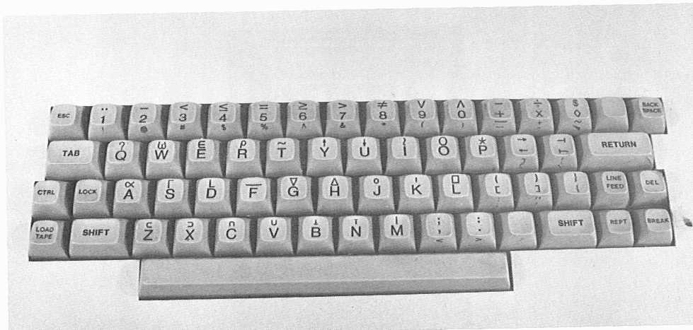
posted by BungaDunga at 5:28 PM on September 29, 2016
“Characters on the screen should be exactly what I can type to reproduce them”, said the programmer about a mapping of a sequence of bytes to a two-dimensional matrix of graphemes, punctuation, and invisible control characters.
posted by Coda at 10:45 PM on October 1, 2016 [5 favorites]
posted by Coda at 10:45 PM on October 1, 2016 [5 favorites]
« Older Useful Guide For Living A Self-Sustatining... | Don't look back—something might be rolling on you. Newer »
This thread has been archived and is closed to new comments
posted by dfan at 11:12 AM on September 28, 2016 [3 favorites]