Futile Fonts
October 16, 2016 1:54 PM Subscribe
Do you like fonts based on ultra-obscure 1980s LED displays, or based on ROM dumps from the Commodore 64's pen plotter? Of course you do! [via mefi projects]
I had a Commodore 1520 plotter which I hacked to work with a non-Commodore computer back in the day. This font gives me feels.
posted by Bringer Tom at 3:16 PM on October 16, 2016 [3 favorites]
posted by Bringer Tom at 3:16 PM on October 16, 2016 [3 favorites]
Oh man I could stare at that Hershey font forever. Maybe it's a side effect of being raised by professors, but old-fashioned math typesetting is just soothing as heck.
posted by nebulawindphone at 3:35 PM on October 16, 2016 [2 favorites]
posted by nebulawindphone at 3:35 PM on October 16, 2016 [2 favorites]
Last time I hardcoded a font somewhere it ended up being part of an international mystery.
posted by effbot at 4:16 PM on October 16, 2016 [2 favorites]
posted by effbot at 4:16 PM on October 16, 2016 [2 favorites]
I'm pretty sure I've seen a cleaners whose sign was in the Hershey Roman Complex font.
posted by RobotVoodooPower at 5:33 PM on October 16, 2016
posted by RobotVoodooPower at 5:33 PM on October 16, 2016
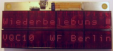
I love the litronix-inspired one. It brings back fond memories of many hours wasted with a Little Professor calculator (which used a more primitive display of a similar type). It's nice to see old vector fonts being revived. I have a ton of bitmap fonts from odd devices that I've dumped over the years, but they tend not to look too great when scaled up.
posted by phooky at 5:44 PM on October 16, 2016
posted by phooky at 5:44 PM on October 16, 2016
I still adore 16 segment LCD displays. My current car stereo still has one which is really cool.
posted by Talez at 5:52 PM on October 16, 2016 [1 favorite]
posted by Talez at 5:52 PM on October 16, 2016 [1 favorite]
There's a nice article here cataloguing and describing the fonts in most of the old 8-bit computers.
It also mentions that the screen font that became ubiquitous in arcade games during the golden age were all descended from Atari's Sprint 2, a racing game from 1976.
I was digging through schematics hoping to discover that the font was encoded in discrete diodes like earlier designs used but, alas, it looks like it was hand-encoded into a character generator ROM.
posted by JoeZydeco at 6:18 PM on October 16, 2016 [4 favorites]
Why, yes, I do like retro fonts and ROM dumps! I've coded up Hershey simplex for vector displays, another vector font based on the Asteroids game, the C64 (and its inverse), so many classic 5x7 fonts, and one derived from the MTA countdown clocks. Sometimes I run across things that aren't fonts, but fun bitmaps like the Muybridge animation or the Mac-SE development team.
posted by autopilot at 6:35 PM on October 16, 2016 [6 favorites]
posted by autopilot at 6:35 PM on October 16, 2016 [6 favorites]
This post inspired me to look up the display of an old calculator I remembered.
It turns out I was remembering the Ise Electronics Corporation’s “Itron” tubes.
They’re just lovely.
posted by Fongotskilernie at 7:12 PM on October 16, 2016 [3 favorites]
It turns out I was remembering the Ise Electronics Corporation’s “Itron” tubes.
They’re just lovely.
posted by Fongotskilernie at 7:12 PM on October 16, 2016 [3 favorites]
It also mentions that the screen font that became ubiquitous in arcade games during the golden age were all descended from Atari's Sprint 2, a racing game from 1976.
One of the amazing things is the tradeoff of ROM space vs processing power with the different colored text being different sprites. Those old machines wouldn't have the power or memory bandiwdth to loop through VRAM every frame updating a color value.
posted by Talez at 8:32 PM on October 16, 2016 [1 favorite]
→ What? No TIL311 font?
I think that's a 5×7, not the TIL311's dot matrix. I don't really do pixel fonts, because they're not the kind of retro I like (and lots of people have done really good ones already). Vector displays like the CRT on the Friden EC-132 Calculator are more my thing. If you ever get a chance to play with a Friden, they're amazing. They have wonderful keys that lock while the machine is calculating (which can be a few seconds) or if there's an overflow. Not bad for a machine whose memory is a twisted wire.
What grabbed me about the 1520's font was that Commodore managed to pack a usable (if, frankly, not very pretty) font in a few hundred bytes. The font is encoded as simple moveto/lineto instructions in an 8×8 matrix with one instruction per byte. Since it's driving a slow plotter, they didn't waste memory with a lookup table for character positions: instead, they seem to count character-end markers until they hit the right vectors to draw.
Just after I made these fonts, I discovered that FontForge has a way of converting simple character strokes into outline fonts. Previously, I'd mucked about with horrid stroke-to-path scripts in Inkscape. Who knows, this might actually allow me to get a usable OTF set of the Hershey fonts out there. Hershey's efforts alone deserve an FPP some day …
posted by scruss at 9:55 AM on October 17, 2016
That Hershey font gives me a very warm feeling of nostalgia for some reason.
posted by gucci mane at 1:16 PM on October 17, 2016 [1 favorite]
posted by gucci mane at 1:16 PM on October 17, 2016 [1 favorite]
As if I'm digging through my parents' old file cabinets, looking at old documents and Rolodexes, or thumbing through Dewey decimal cards at the library.
posted by gucci mane at 1:18 PM on October 17, 2016 [1 favorite]
posted by gucci mane at 1:18 PM on October 17, 2016 [1 favorite]
TIL311 5x7
But check out the descender on the g located on the top line, right side. The ubiquitous HD44780 LCD controller does this as well, and I hate it. Unfortunately, when you're displaying a 5x7 font with literally just 5x7 pixels in each char, you can't have proper descenders.
But lucky me, I've been playing around with an LCD display with slightly more flexibility. About a month ago, I wrote a character generator for this nifty LCD display. It's an 84x48 pixel graphics display pulled from an old Nokia candybar phone. Literally "pulled", as these are salvaged from e-waste. If you remember these phones from 15-20 years ago, the LCDs are actually really nice, with great contrast, albeit low res.
Getting back to the descenders, when you display a 5x7 font on a multi-line graphical LCD, you're actually drawing 6x8 cells because you need 1 pixel blank lines separating the characters vertically and horizontally. So I encoded my glyphs as 5x8 bitmaps, with the descenders in the bottom separator line. Here's a pic of the glyphs.
(Yes, that's a screenshot of the program I wrote just to edit this font, which is so much nicer than fiddling with pixels in photoshop. It's about 300 lines of OpenGL.)
posted by ryanrs at 4:13 AM on October 19, 2016 [1 favorite]
5510s are quite fun; I made a spectacularly futile clock with one. There's now a Raspberry Pi framebuffer driver for it, so you too can do terminal output in 84×48 pixels …
posted by scruss at 2:12 PM on October 20, 2016
posted by scruss at 2:12 PM on October 20, 2016
« Older there's freedom in covering your body with... | How do you motivate a human being to do things... Newer »
This thread has been archived and is closed to new comments
Debugging video and audio issues in iChat was always sort of annoying because you needed to run it on two acoustically isolated machines. Basically you needed to put the computers in separate rooms so the speakers from one wouldn't couple to microphone of the other. Because of this, I spent a lot of time walking between my office and our lab.
But for a lot of the codec debugging (more like optimization), I just needed a way to send a few numbers (SNR values and the like) across the connection to save me having to get up and walk to the next room. These debugging numbers were generated deep inside the video compression library, and there wasn't a great way to push them up to the iChat app proper, across the network, and to the other machine (mostly because my team didn't work on the app, just the underlying libs). I found the easiest and most reliable way to get the numbers out was to print them directly on the video frames.
So I wrote a small library called ImagePrintf that would take a pointer to a bitmap and a printf-style format string, and draw my debug text directly onto the video stream. But because the code was buried deep in the codec, we didn't want to drag in system font libraries and other dependencies, so we used a simple 6x13 font hardcoded directly in the source file. The best part of that 6x13 font, though, was that it was not stored as a binary blob. Instead, at the top of ImagePrintf.c, there was a huge array of string constants, with the font glyphs drawn in ascii art.
static const char* font_raw[] =
{
"    ##                                          ",
"      ##                ##                      ",
"                        ##                      ",
"                        ##                      ",
"              ######    ########      ######    ",
"                    ##  ##      ##  ##      ##  ",
"              ########  ##      ##  ##          ",
"            ##      ##  ##      ##  ##          ",
"            ##    ####  ##      ##  ##      ##  ",
"              ####  ##  ########      ######    ",
"                                                ",
"                                                ",
"                                                ",
The first time ImagePrintf was called, it parsed the ascii art and built its internal glyph bitmaps. So if you wanted to change a character or add new ones, you could just edit the ascii art in the source file. It was equal parts silly and clever, and also self-documenting. I hope some other Apple programmers have come across the code and laughed.posted by ryanrs at 2:49 PM on October 16, 2016 [40 favorites]