Flag it and Move On
November 30, 2017 5:35 AM Subscribe
Vexillology is the study of flags. There are five simple rules. There is also an incredibly entertaining TED Talk which highlights some egregious rule-breakers.
Fun with Flags!
posted by Melismata at 5:55 AM on November 30, 2017 [7 favorites]
posted by Melismata at 5:55 AM on November 30, 2017 [7 favorites]
I had the same experience of moving to Chicago and discovering their beautiful flag. I then moved to DC which has another beautiful flag which is also well loved. Two of my favorite flags.
posted by Bulgaroktonos at 5:56 AM on November 30, 2017 [1 favorite]
posted by Bulgaroktonos at 5:56 AM on November 30, 2017 [1 favorite]
The Hello Internet podcast is also unofficially about vexillology. (previously). They had a contest to design the podcast flag, as well as held a referendum out of fine winners. It's just a two-dudes-talking podcast though, any given episode could be about anything, but flags are covered a lot.
posted by jonnay at 5:56 AM on November 30, 2017 [3 favorites]
posted by jonnay at 5:56 AM on November 30, 2017 [3 favorites]
I've really enjoyed the 99 percent invisible podcast episodes about flags... one of those things 99pi is perfect for, some fascinating design detail about the world I never knew much about and really enjoyed submerging in.
Also, I suspect it was 99pi that introduced me to Provo, Utah's former city flag, which made me laugh and laugh. (They changed it, after the North American Vexillological Association ranked it the eighth worst city flag. It's no Pocatello, but still, hilarious.)
posted by theatro at 6:05 AM on November 30, 2017 [5 favorites]
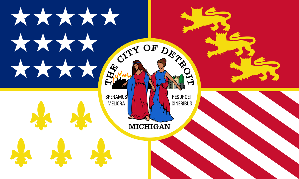
I'm trying to decide if the Michigan state flag violates 4 of the rules, or all 5.
posted by still_wears_a_hat at 6:07 AM on November 30, 2017 [2 favorites]
posted by still_wears_a_hat at 6:07 AM on November 30, 2017 [2 favorites]
I didn't realize until this post that I love flags. Good ones. Not ones like Maryland's state flag. Barf.
posted by yoga at 6:11 AM on November 30, 2017
posted by yoga at 6:11 AM on November 30, 2017
Kudos for post title as well. Thanks LiteraryHero.
posted by yoga at 6:12 AM on November 30, 2017 [1 favorite]
posted by yoga at 6:12 AM on November 30, 2017 [1 favorite]
Waves Saltire for St Andrew's Day
posted by fearfulsymmetry at 6:14 AM on November 30, 2017 [1 favorite]
posted by fearfulsymmetry at 6:14 AM on November 30, 2017 [1 favorite]
Whatever else you can say about Indiana (like, bitching about giving the nation both Dan Quayle and Mike Pence) I think we have a pretty damned handsome flag. The only change I'd make is possibly removing the name "Indiana" from it. But, that's pretty minor.
posted by Thorzdad at 6:18 AM on November 30, 2017
posted by Thorzdad at 6:18 AM on November 30, 2017
I always admired Madison, Wisconsin's city flag. Simple, classic, symbolically potent. I don't remember seeing it taken up much as a common design element in people's everyday lives the way Roman Mars talks about Chicago's flag, but still. Nice one.
posted by theatro at 6:20 AM on November 30, 2017 [4 favorites]
posted by theatro at 6:20 AM on November 30, 2017 [4 favorites]
While I get where they're coming from about no seals -- it's easy to do badly -- a flat-out ban is plain wrong. I will defend the old Portuguese flag, or the Vatican's to the death(*).
(*)Somebody else's death, I'm not crazy.
posted by Quindar Beep at 6:22 AM on November 30, 2017 [1 favorite]
.svg)
(*)Somebody else's death, I'm not crazy.
posted by Quindar Beep at 6:22 AM on November 30, 2017 [1 favorite]
I can't watch the TED Talk here at work, but it did get to the Liberian county flags, I hope? They're breath-taking in their awfulness.
posted by Quindar Beep at 6:25 AM on November 30, 2017 [8 favorites]
posted by Quindar Beep at 6:25 AM on November 30, 2017 [8 favorites]
yoga, Maryland is cited in the pdf as the exception that breaks the rules.
posted by yhbc at 6:26 AM on November 30, 2017 [2 favorites]
posted by yhbc at 6:26 AM on November 30, 2017 [2 favorites]
Came for Liberian county flags, am not disappoint.
posted by chavenet at 6:28 AM on November 30, 2017
posted by chavenet at 6:28 AM on November 30, 2017
Compared to the other flags identified as "good flags," the US flag is not particularly simple, and I would challenge almost any adult to draw it correctly from memory. I think there might be some natural patriotic bias to its inclusion.
posted by muddgirl at 6:30 AM on November 30, 2017 [4 favorites]
posted by muddgirl at 6:30 AM on November 30, 2017 [4 favorites]
the US flag is not particularly simple
I am the furthest thing from a patriot, but the general principal of stripes with a blue and white box of stars is pretty simple. Granted it fails the distance test, but I am pretty sure that 7 year old kids can scribble a fair approximation of it.
(At the same time, if you asked which color stripe came first or how many stars per row I would have no idea, so I don't think you are exactly wrong)
posted by Literaryhero at 6:38 AM on November 30, 2017
Living in Orlando, we recently changed city flags from the old flag to the new flag. And despite what everyone thinks, it was never this one. The city held a contest last year using the five rules, and submissions had to be on an index card. If you couldn't get you meaning across on an index card, it was too busy.
But despite this, they are all better than the hot mess that is the city flag of Tampa.
posted by Badgermann at 6:42 AM on November 30, 2017 [2 favorites]
But despite this, they are all better than the hot mess that is the city flag of Tampa.
posted by Badgermann at 6:42 AM on November 30, 2017 [2 favorites]
the city flag of Tampa
It's appropriate if one assumes that Tampa is famous for Christmas-themed stealth bombers.
posted by paper chromatographologist at 6:45 AM on November 30, 2017 [6 favorites]
It's appropriate if one assumes that Tampa is famous for Christmas-themed stealth bombers.
posted by paper chromatographologist at 6:45 AM on November 30, 2017 [6 favorites]
99pi flag secret - their 404 page has a 404 flag
posted by Uncle Glendinning at 6:54 AM on November 30, 2017 [7 favorites]
posted by Uncle Glendinning at 6:54 AM on November 30, 2017 [7 favorites]
I keep thinking of Roman Mars as being somehow Metafilter-adjacent since his interests and Mefi's line up so well. But unlike some podcasting luminaries he doesn't seem to have an account here. Which is OK, he's a busy guy and I'm happy if he keeps doing the things he's doing without even more distraction than what he already has to deal with.
posted by ardgedee at 6:59 AM on November 30, 2017
posted by ardgedee at 6:59 AM on November 30, 2017
Hadn't seen that Tampa flag before! You know, what more flags really need is the word "ORGANIZED" written on them.
posted by theatro at 7:15 AM on November 30, 2017 [1 favorite]
posted by theatro at 7:15 AM on November 30, 2017 [1 favorite]
Shout out for Ohio's flag burgee - the only non-rectangular one in the Union.
Also, hilariously mistaken by right-wing nuts in 2008 as the "Obama flag."
posted by zakur at 7:17 AM on November 30, 2017 [3 favorites]
Also, hilariously mistaken by right-wing nuts in 2008 as the "Obama flag."
posted by zakur at 7:17 AM on November 30, 2017 [3 favorites]
but I am pretty sure that 7 year old kids can scribble a fair approximation of it.
If a "fair approximation" is good enough for rule 1 then nearly every flag passes, except maybe for Maryland. I could draw a "fair approximation" of the California flag from memory.
posted by muddgirl at 7:30 AM on November 30, 2017
If a "fair approximation" is good enough for rule 1 then nearly every flag passes, except maybe for Maryland. I could draw a "fair approximation" of the California flag from memory.
posted by muddgirl at 7:30 AM on November 30, 2017
Links in the original site to the 14 page booklet seem to broken -- they take me to a slide carosel instead. Anyone have the proper link?
posted by gregglind at 7:34 AM on November 30, 2017
posted by gregglind at 7:34 AM on November 30, 2017
I wonder if the whole "Good Flag, Bad Flag" thing was inspired by the fact that they are from Oregon, whose flag doesn't even follow the basic rule of "keep both sides the same." I notice that the pamphlet on flag design includes on out of date Georgia flag. The current one is slightly better, but has the added "feature" of paying homage to the Confederacy. Perhaps that should be a corollary to the "use meaningful symbolism rule": don't honor racist traitors on your flag.
posted by TedW at 7:37 AM on November 30, 2017
posted by TedW at 7:37 AM on November 30, 2017
Here is the PDF of the booklet; it is linked at the bottom of the slideshow page.
posted by TedW at 7:39 AM on November 30, 2017 [1 favorite]
posted by TedW at 7:39 AM on November 30, 2017 [1 favorite]
Great timing! My city, Burlington, just adopted a new flag this past week. I'm still getting used to it, but it is at least a better design than the old flag (same link, above). I'm tickled that again it was students who came through with the selected design.
posted by meinvt at 7:39 AM on November 30, 2017 [3 favorites]
posted by meinvt at 7:39 AM on November 30, 2017 [3 favorites]
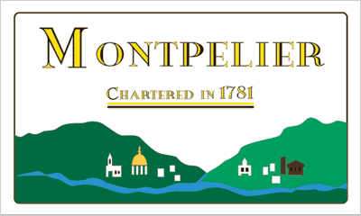
Even bigger contrast is the new Montpelier flag as compared to the old. I lived there under that old flag (to be honest, never saw it until after I'd moved away). But, boy is that a mess!
posted by meinvt at 7:43 AM on November 30, 2017 [5 favorites]
posted by meinvt at 7:43 AM on November 30, 2017 [5 favorites]
I will defend the old Portuguese flag
The one without the armillary sphere? It's such an iconic thing in Portuguese symbolism, I love having it there.
posted by Bulgaroktonos at 8:23 AM on November 30, 2017
The one without the armillary sphere? It's such an iconic thing in Portuguese symbolism, I love having it there.
posted by Bulgaroktonos at 8:23 AM on November 30, 2017
Incheon
Ottawa
A brief google search doesn't reveal the adoption date of the current Incheon flag (Ottawa adopted theirs in 2000), but someone is clearly ripping someone else off.
posted by cardboard at 8:26 AM on November 30, 2017
Ottawa
A brief google search doesn't reveal the adoption date of the current Incheon flag (Ottawa adopted theirs in 2000), but someone is clearly ripping someone else off.
posted by cardboard at 8:26 AM on November 30, 2017
God help me, I love Detroit's rule-breaker of a flag, especially the lady getting the other lady to not walk into the burning city, like 'no girl, this way.' Subtracting the words and increasing the size of the middle visual narrative would still be an improvement, though.
posted by palindromic at 8:27 AM on November 30, 2017 [6 favorites]
posted by palindromic at 8:27 AM on November 30, 2017 [6 favorites]
I know Chicago has a worthy good flag reputation, but I do love nearby St. Louis which has a flag that is both appealing and unique (and kind of fun to draw with the wavy lines...)
posted by rfbjames at 8:38 AM on November 30, 2017
posted by rfbjames at 8:38 AM on November 30, 2017
First saw this somewhere on Metafilter, but it's worth repeating: This Russian city has my favorite flag of all time. Some backstory here.
posted by martin q blank at 8:46 AM on November 30, 2017 [6 favorites]
posted by martin q blank at 8:46 AM on November 30, 2017 [6 favorites]
The flag of my hometown, Alexandria, VA breaks most of those rules, being just the city seal on a white field, but I'm still fond of it, perhaps because the city seal is pretty simple to begin with. They could probably drop the text entirely for some improvement, but I still like its "seal on a sheet" design.
posted by biogeo at 8:48 AM on November 30, 2017 [1 favorite]
posted by biogeo at 8:48 AM on November 30, 2017 [1 favorite]
(At the same time, if you asked which color stripe came first or how many stars per row I would have no idea, so I don't think you are exactly wrong)
OK, not horribly relevant, but I do have things I remember here that help me work it out in my head.
13 stripes--right, 13 colonies, that part's easy. But odd number means same on top and bottom; white on top and bottom wouldn't look as good against a light background, they make the exact edge harder to distinguish, so: start with red.
For stars, alternating rows have numbers differing by one so each interior star is "between" the stars on the other row up, so a little bit of number fiddling gets you to five rows of six with 4 rows of 5 between them. This is admittedly a lot more trouble than I'd want to go to if looking it up was easy.
posted by Four Ds at 8:48 AM on November 30, 2017 [4 favorites]
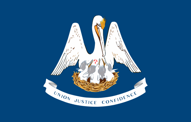
Speaking as a Louisiana resident I'm not super into the design of the state flag though I like the weirdo sentiment of a pelican tearing her own breast to feed her young.
The flag for New Orleans, however, is surprising restrained and traditional considering it's only 100 years old. We unveiled it at our bicentennial in 1918. I'm grateful I haven't heard any noise about updating it next year.
posted by komara at 8:54 AM on November 30, 2017
The flag for New Orleans, however, is surprising restrained and traditional considering it's only 100 years old. We unveiled it at our bicentennial in 1918. I'm grateful I haven't heard any noise about updating it next year.
posted by komara at 8:54 AM on November 30, 2017
So, green "+" on blue background, then?
posted by leotrotsky at 9:13 AM on November 30, 2017 [4 favorites]
posted by leotrotsky at 9:13 AM on November 30, 2017 [4 favorites]
Perhaps that should be a corollary to the "use meaningful symbolism rule": don't honor racist traitors on your flag.
Yeah, they need to expand that question a bit - it's not just meaningful symbolism, it is also "what is the meaning of the symbols? What message do you intend it to convey? Could it convey meaning you do not intend?"
posted by nubs at 9:16 AM on November 30, 2017 [1 favorite]
Yeah, they need to expand that question a bit - it's not just meaningful symbolism, it is also "what is the meaning of the symbols? What message do you intend it to convey? Could it convey meaning you do not intend?"
posted by nubs at 9:16 AM on November 30, 2017 [1 favorite]
The flag for New Orleans, however, is surprising restrained and traditional considering it's only 100 years old.
Surprisingly royalist.
posted by leotrotsky at 9:16 AM on November 30, 2017 [1 favorite]
Surprisingly royalist.
posted by leotrotsky at 9:16 AM on November 30, 2017 [1 favorite]
Wait. Provo's city flag was designed in MS Word '95? Because that is some WordArt level shit right there.
posted by hanov3r at 9:28 AM on November 30, 2017 [1 favorite]
posted by hanov3r at 9:28 AM on November 30, 2017 [1 favorite]
I'm trying to decide if the Michigan state flag violates 4 of the rules, or all 5.
Ugh, every time I need circumspice I'm out and I have to order it from Penzey's.
posted by uncleozzy at 9:41 AM on November 30, 2017 [1 favorite]
Ugh, every time I need circumspice I'm out and I have to order it from Penzey's.
posted by uncleozzy at 9:41 AM on November 30, 2017 [1 favorite]
For stars, alternating rows have numbers differing by one so each interior star is "between" the stars on the other row up, so a little bit of number fiddling gets you to five rows of six with 4 rows of 5 between them. This is admittedly a lot more trouble than I'd want to go to if looking it up was easy.
...and then Puerto Rico becomes a state, and the whole field gets thrown off. Maybe we'll have to go back to concentric circles.
I'm proposing a rule 6: Flag symbolism doesn't demand that we update the flag on a regular basis.
posted by muddgirl at 10:13 AM on November 30, 2017 [1 favorite]
...and then Puerto Rico becomes a state, and the whole field gets thrown off. Maybe we'll have to go back to concentric circles.
I'm proposing a rule 6: Flag symbolism doesn't demand that we update the flag on a regular basis.
posted by muddgirl at 10:13 AM on November 30, 2017 [1 favorite]
A 51-star flag could be barely noticeably different from the current flag.
posted by biogeo at 10:23 AM on November 30, 2017 [2 favorites]
posted by biogeo at 10:23 AM on November 30, 2017 [2 favorites]
I suppose if you need reasons to move to Switzerland, the flag is a big plus.
posted by Quindar Beep at 10:54 AM on November 30, 2017 [8 favorites]
posted by Quindar Beep at 10:54 AM on November 30, 2017 [8 favorites]
One of my favorites, simple and, ahem, elegant: Flag of Yaroslavl Oblast
I also really like the flag of South Vietnam, although it probably won't ever fly in any official capacity.
posted by Omon Ra at 10:56 AM on November 30, 2017 [1 favorite]
I also really like the flag of South Vietnam, although it probably won't ever fly in any official capacity.
posted by Omon Ra at 10:56 AM on November 30, 2017 [1 favorite]
...and then Puerto Rico becomes a state, and the whole field gets thrown off. Maybe we'll have to go back to concentric circles.
I'm proposing a rule 6: Flag symbolism doesn't demand that we update the flag on a regular basis.
Considering how badly Puerto Rico has been treated by the United States over the years, when they do become a state they should get a star. Dropping the tradition just as they joined would be terrible optics at best and incredibly racist at worst.
posted by zarq at 11:03 AM on November 30, 2017 [7 favorites]
That wasn't what I intended to suggest at all, and I apologize for giving that impression. The flag rules are rules for *good* flag design, not for flag design period. My original argument was that the US flag is not a *good* flag design for various reasons including my made-up rule 6, but that doesn't mean I think it should be changed!
posted by muddgirl at 11:29 AM on November 30, 2017 [1 favorite]
posted by muddgirl at 11:29 AM on November 30, 2017 [1 favorite]
This is all I really want out of the U.S. flag.
posted by Halloween Jack at 11:31 AM on November 30, 2017
posted by Halloween Jack at 11:31 AM on November 30, 2017
I think the no lettering rule is silly. Sure, for countries it probably makes sense -- most people will be able to recognize their country's flag. For cities, though, it's frankly useful to know which city it is.
posted by tavella at 11:45 AM on November 30, 2017
posted by tavella at 11:45 AM on November 30, 2017
MetaFilter- It's no Pocatello
51 stars- When I was living in DC, I remember someone on the radio saying that admitting DC as a state would be a bad idea because how would you put 51 stars on a flag?
Besides how ludicrous an objection that is, I was wondering what percentage of the US population knows how the 50 stars are currently arranged without looking at a flag or looking it up.
Things were simpler during WWII.
posted by MtDewd at 11:45 AM on November 30, 2017
That wasn't what I intended to suggest at all, and I apologize for giving that impression.
Yes, sorry. I didn't mean to call you out for anything. Was just thinking of the negative ramifications.
posted by zarq at 11:57 AM on November 30, 2017
Yes, sorry. I didn't mean to call you out for anything. Was just thinking of the negative ramifications.
posted by zarq at 11:57 AM on November 30, 2017
Texas has (IMO) one of the best flags of any US state, which is why it pains me that the flags of Texas cities are so consistently bad.
New Mexico deserves special mention for going from one of the worst flags to one of the best.
posted by adamrice at 12:46 PM on November 30, 2017 [5 favorites]
New Mexico deserves special mention for going from one of the worst flags to one of the best.
posted by adamrice at 12:46 PM on November 30, 2017 [5 favorites]
What a fascinating subject. Holy cow, that last flag with both a copyright and trademark symbol on it really emphasizes that when it comes to a city's flag design, actual design is not the highest priority.
I'm not a huge fan of the design of my hometown's flag, but it's definitely Santa Cruz, and I think it only really breaks the color rule.
posted by subocoyne at 1:01 PM on November 30, 2017
I'm not a huge fan of the design of my hometown's flag, but it's definitely Santa Cruz, and I think it only really breaks the color rule.
posted by subocoyne at 1:01 PM on November 30, 2017
That was far more interesting (and entertaining) than I'd expected; thank you! I've long been fond of Toronto's flag; now I know why.
posted by dendritejungle at 1:46 PM on November 30, 2017
posted by dendritejungle at 1:46 PM on November 30, 2017
The best flags: Greenland and North Korea.
posted by the duck by the oboe at 2:25 PM on November 30, 2017
posted by the duck by the oboe at 2:25 PM on November 30, 2017
adamrice: New Mexico deserves special mention for going from one of the worst flags to one of the best.
One of the best? Good sir, New Mexico has the best-designed flag of any U.S. state, territory or Canadian province, according to a 2001 survey by the North American Vexillological Association (PDF) -- runners-up were 2. Texas, 3. Quebec, 4. Maryland, and 5. Alaska.
But yes, that historical, unofficial flag is indeed tragic. It's clip art before clip art! And we had the gall to claim the title of "The Sunshine State" then! But TIL Florida has officially claimed the nickname, while South Dakota claims it as an unofficial state name. You know, because 200+ days of sun is totally sufficient, compared to 246 days, on average, in Tampa. (To which I say: oh yeah, how about an average of 280 sunny days in Albuquerque!?)
theatro: I always admired Madison, Wisconsin's city flag. Simple, classic, symbolically potent.
If you want to know more about the contentious history of New Mexico's use of the Zia sun symbol on its flag, which has lead to the symbol being on so many things in New Mexico, the New York Times has a good article from 2000, when Zia Pueblo was starting its efforts to get some payment for the use of a stolen symbol, including this snapshot of history:
the duck by the oboe: The best flags: Greenland
Best flag name: Greenland (Erfalasorput ("our flag"), and Aappalaartoq ("the red"))
posted by filthy light thief at 2:59 PM on November 30, 2017 [3 favorites]
One of the best? Good sir, New Mexico has the best-designed flag of any U.S. state, territory or Canadian province, according to a 2001 survey by the North American Vexillological Association (PDF) -- runners-up were 2. Texas, 3. Quebec, 4. Maryland, and 5. Alaska.
But yes, that historical, unofficial flag is indeed tragic. It's clip art before clip art! And we had the gall to claim the title of "The Sunshine State" then! But TIL Florida has officially claimed the nickname, while South Dakota claims it as an unofficial state name. You know, because 200+ days of sun is totally sufficient, compared to 246 days, on average, in Tampa. (To which I say: oh yeah, how about an average of 280 sunny days in Albuquerque!?)
theatro: I always admired Madison, Wisconsin's city flag. Simple, classic, symbolically potent.
The flag of Madison, Wisconsin, consists of a light blue background bisected from lower left to upper right by a white band. This design symbolizes Lake Mendota and Lake Monona and the isthmus between them. In the center of the flag is a black cross, which symbolizes the four lakes (Mendota, Monona, Wingra, and Waubesa), as well as the cross shape of the Wisconsin State Capitol. Overlaid on the cross is a Native American sun symbol, called the Zia, which similar to the sun symbols on the state flag of New Mexico and the municipal flags of Wichita, Kansas and Albuquerque, New Mexico.WTF, Madison and Wichita? Zia wants their sun symbol back from Madison. And Wichita city proud person, how can you brag about your flag but not once mention the Zia symbol? That symbol got woven into USS Wichita's crest, and this article recognizes the symbol as the Zia sun symbol. At least the controversy over Madison's flag prompted plans to redesign it, as of June 26, 2017.
If you want to know more about the contentious history of New Mexico's use of the Zia sun symbol on its flag, which has lead to the symbol being on so many things in New Mexico, the New York Times has a good article from 2000, when Zia Pueblo was starting its efforts to get some payment for the use of a stolen symbol, including this snapshot of history:
In 1925, the Daughters of the American Revolution held a contest for a design for the flag. The winner, a Santa Fe physician named Dr. Harry Mera, suggested the sun symbol he had seen on a Zia ceremonial pot in the Museum of Fine Arts in Santa Fe, and the Legislature approved it.And for even more history of the symbol and the Pueblo's legal battles, here's a 29 page student paper (PDF) from 2012 by Stephanie B . Turner for Yale Law School. It's unclear if Zia has ever been financially compensated for the use of their sun symbol, but it sounds like more recent uses of the symbol have been developed in support of the Pueblo.
That pot, Mr. Pino said, had been stolen: only ceremonial pottery was allowed to bear the Zia, and no ceremonial pottery was ever to leave the pueblo. And only the pueblo's elders can give permission for use of the symbol.
Why did the tribe not object in 1925? ''They were not even citizens,'' Ms. Price said. ''They had no power and no money.''
the duck by the oboe: The best flags: Greenland
Best flag name: Greenland (Erfalasorput ("our flag"), and Aappalaartoq ("the red"))
posted by filthy light thief at 2:59 PM on November 30, 2017 [3 favorites]
The US flag is pretty busy to be a good flag, but the thing about it is that the symbolism is clear and powerful and meaningful to citizens, so 50-and-counting stars for the states and 13 stripes for the colonies works, even though it's a lot visually.
posted by Eyebrows McGee at 6:23 PM on November 30, 2017
posted by Eyebrows McGee at 6:23 PM on November 30, 2017
I'm personally fond of my current hometown's flag, which is unusual for being a vertical rectangle, although apparently the city's official flag supplier only produces it in a conventional horizontal 5x3 dimension.
It's a good flag design, too. The stated color symbolism is a little overwrought, but I like the punning iconography of the seven stars for the constellation Taurus, since Durham's nickname is The Bull City.
posted by ardgedee at 3:31 AM on December 1, 2017 [1 favorite]
It's a good flag design, too. The stated color symbolism is a little overwrought, but I like the punning iconography of the seven stars for the constellation Taurus, since Durham's nickname is The Bull City.
posted by ardgedee at 3:31 AM on December 1, 2017 [1 favorite]
And holy cats, the flag narrowly avoided being officially redesigned with a white "DURHAM" smushed all over it. That would have been very bad.
posted by ardgedee at 3:34 AM on December 1, 2017
posted by ardgedee at 3:34 AM on December 1, 2017
Madison's new flag should totally have a milkshake duck on it.
posted by theatro at 6:13 AM on December 1, 2017
posted by theatro at 6:13 AM on December 1, 2017
I thought of this metric for "simple design" while watching olympic qualifying bobsled last night - how does the flag look when shrunk down for a sports chyron?
posted by muddgirl at 6:55 AM on December 1, 2017
posted by muddgirl at 6:55 AM on December 1, 2017
The Ted talk is pretty good.
I'd like to add a couple of design comments.
How does the flag look when limp on the pole outdoors in still air, not flying out in the breeze? Similarly how does it look furled around the indoor flag stand -- usually a 3'x5' flag on a 6-8 foot pole? You want it to still be somewhat distinctive even if the design elements are not all readable. State flags with complex emblems on blue b/g fare quite poorly at this test.
It's a positive feature that the design guidelines of NAVA align well with manufacturing considerations. This also goes for architectural banners and meeting/booth backdrops.
I worked for years at a flag manufacturer, among other duties taking orders for and pricing custom flags, and used pricing to reinforce good design. Schools, clubs, organizations, corporations, and the like would come in with their design ideas, sketches, logos, and graphics and we would try to steer them to simple, meaningful, bold designs -- not always successfully. Reviewing the options, with prices for sewing, screen-printing, and applique work, tended to simplify the designs dramatically, even where the artistic/aesthetic considerations hadn't carried the day.
If you want a lot of your flags to be made, sold, and used, cost is important.
posted by lathrop at 12:51 PM on December 2, 2017 [2 favorites]
Yeah, I know that's an issue with the Virginia state flag, which has something like 15 distinct colors.
posted by Chrysostom at 11:12 PM on December 6, 2017
posted by Chrysostom at 11:12 PM on December 6, 2017
I'm up for replacing the Maryland state flag with just the Baltimore Arms. Brings it down from 4 colors to 2, reduces clutter and business, and is free of crypto-Conferderate symbolism.
posted by jackbishop at 2:12 PM on December 25, 2017
posted by jackbishop at 2:12 PM on December 25, 2017
« Older breaking rules, not ice | Respectfully yours, Rosa L. Parks Newer »
This thread has been archived and is closed to new comments
Incheon (where I am raising my kids)
posted by Literaryhero at 5:42 AM on November 30, 2017 [2 favorites]