True North Indexed.
February 28, 2018 1:51 PM Subscribe
As the child of a Canadian packrat research librarian, I recognise a lot of those publications.
posted by Multicellular Exothermic at 2:38 PM on February 28, 2018 [2 favorites]
posted by Multicellular Exothermic at 2:38 PM on February 28, 2018 [2 favorites]
I was expecting a lot more Optima. I’m only seeing it on Expo 67 stuff, but it was all over the place, I swear!
Weird that the 1974 logo for Conrad Grebel College — a Mennonite school — is, like, pretty dang faux-Hebrewy. The designer gives a typically bullshitty explanation for it inside the calendar on which it appears, and it doesn’t mention that aspect at all. (The letters are supposed to resemble flames, apparently.) It’s a neat logo, but, like... Wrong beardos, dude.
posted by Sys Rq at 2:46 PM on February 28, 2018 [1 favorite]
Did someone go wandering through a used bookstore in Toronto? I see a lot of my childhood here.
My boring, boring childhood.
posted by Mogur at 2:49 PM on February 28, 2018 [4 favorites]
My boring, boring childhood.
posted by Mogur at 2:49 PM on February 28, 2018 [4 favorites]
The story of the logo for Expo ‘67 is quite the read.
posted by Thorzdad at 3:03 PM on February 28, 2018
posted by Thorzdad at 3:03 PM on February 28, 2018
I think Canada really hit it's stride with Medical and Social Aspects of Venereal Disease.
posted by Kabanos at 3:09 PM on February 28, 2018 [3 favorites]
posted by Kabanos at 3:09 PM on February 28, 2018 [3 favorites]
My boring, boring childhood.
I fail to see what is so “boring” about A Study of Management Systems for Department of Regional Economic Expansion.
posted by Sys Rq at 3:19 PM on February 28, 2018 [1 favorite]
I fail to see what is so “boring” about A Study of Management Systems for Department of Regional Economic Expansion.
posted by Sys Rq at 3:19 PM on February 28, 2018 [1 favorite]
Awesome, thanks so much.
I love this era of Canadian design. I'm instantly transported to being a kid in my open-concept Toronto classroom, watching trippy TVOntario programs and the '76 Montreal Olympics.
My junior-high geography teacher liked to tell us (every year) how the guy who created the CN logo came up with it while playing with a paperclip.
posted by chococat at 3:52 PM on February 28, 2018 [4 favorites]
This is highly fantastic.
posted by mandolin conspiracy at 4:29 PM on February 28, 2018
posted by mandolin conspiracy at 4:29 PM on February 28, 2018
I think Canada really hit it's stride with Medical and Social Aspects of Venereal Disease.
Damn that'd make a great album cover.
Also, I can't seem to find an entry for the classic pre-2000 Royal Bank logo. I've always thought that was another good one, heraldic but modern.
posted by mhum at 5:14 PM on February 28, 2018
Damn that'd make a great album cover.
Also, I can't seem to find an entry for the classic pre-2000 Royal Bank logo. I've always thought that was another good one, heraldic but modern.
posted by mhum at 5:14 PM on February 28, 2018
*thinks to self* I wonder if they'll have the CBC logo?
Heh.
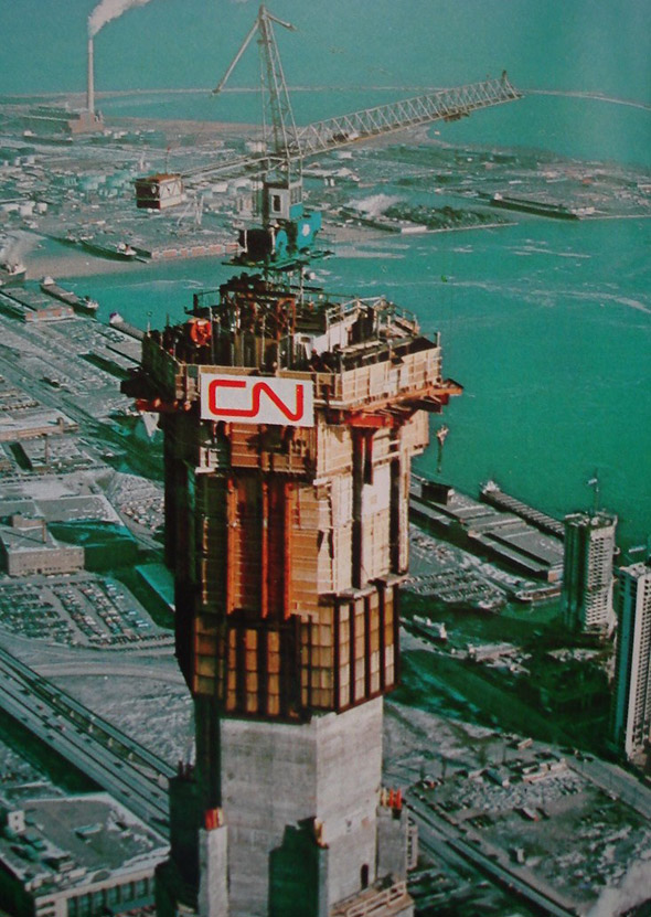
The other day I happened across this photo of the CN Tower under construction and I wondered in passing how old the logo was.
Some 68 years after the CN logo was designed it's amazing that it's still around.
posted by mandolin conspiracy at 5:14 PM on February 28, 2018
Heh.
The other day I happened across this photo of the CN Tower under construction and I wondered in passing how old the logo was.
Some 68 years after the CN logo was designed it's amazing that it's still around.
posted by mandolin conspiracy at 5:14 PM on February 28, 2018
My boring childhood too. Along with our collective future, frozen sometime in the mid-70s. And why not destroy our past?
posted by morspin at 5:18 PM on February 28, 2018
posted by morspin at 5:18 PM on February 28, 2018
I love those funky 60's/70's Modernism design styles!
But this ethos also reminds me a bit of Telidon graphics..
posted by ovvl at 8:14 PM on February 28, 2018
But this ethos also reminds me a bit of Telidon graphics..
posted by ovvl at 8:14 PM on February 28, 2018
Weird that the 1974 logo for Conrad Grebel College
Conrad Grebel Mennos are a weird bunch (took one class there... Church history but without all that Papist stuff!) But yeah they are definitely going for a Hebrew thing. I sort of see them as the Flames of Pentacost? Or flames from Advent candles?
Not graphic design but this site has a few more classics of Canadian design.
posted by Ashwagandha at 10:45 PM on February 28, 2018 [1 favorite]
OH COME ON.
Sex Counselling in Family Practice
Rolf Harder
mhum: Also, I can't seem to find an entry for the classic pre-2000 Royal Bank logo. I've always thought that was another good one, heraldic but modern.
This one contains an example (in the corner) because they were a sponsor: A Conspectus of Canada
posted by mandolin conspiracy at 11:37 PM on February 28, 2018
*thinks to self* I wonder if they'll have the CBC logo?
My wife and I are Canadian expats and like most Canadians we don't have a lot of Canadian Flag stuff but she does have a CBC gem logo tshirt that is regular rotation. It's kind of a secret Canadian expat handshake like Mountain Equipment Coop gear.
posted by srboisvert at 5:54 AM on March 1, 2018 [1 favorite]
I guess I'm old but damn, would I rather have a boring old thumbnail gallery of these
posted by thelonius at 6:30 AM on March 1, 2018 [2 favorites]
posted by thelonius at 6:30 AM on March 1, 2018 [2 favorites]
*thinks to self* I wonder if they'll have the CBC logo?
The primary version of the logo was red at the centre moving outwards through dark and light orange to yellow, set against a rich blue background. There were 3 master versions created, each with a greater degree of space running between the elements for the benefit of improved reproduction and appropriateness of scale (version 2 is shown above in this post). The official name for this symbol is ‘the gem’.
AKA "The Exploding Grapefruit"
posted by Multicellular Exothermic at 2:59 PM on March 2, 2018
« Older Reducing plastic waste, one aisle at a time | The Wild Parrots of San Diego Newer »
This thread has been archived and is closed to new comments
*scrolls down to first image* oh, of course
posted by mhum at 2:23 PM on February 28, 2018 [3 favorites]