Blue! Collar! Logos!
March 5, 2019 7:00 PM Subscribe
uh, what is a “blue collar logo”? Couldn’t dig anything up on my own.
posted by knownassociate at 7:21 PM on March 5, 2019 [6 favorites]
posted by knownassociate at 7:21 PM on March 5, 2019 [6 favorites]
Dunno if it counts as blue collar (trucks? I guess?), but I've always really enjoyed Saia's logo.
posted by salt grass at 7:24 PM on March 5, 2019 [1 favorite]
posted by salt grass at 7:24 PM on March 5, 2019 [1 favorite]
It didn't have the Chicago/Consolidated Pneumatic logo, so it can gtfo
posted by scruss at 7:25 PM on March 5, 2019 [3 favorites]
posted by scruss at 7:25 PM on March 5, 2019 [3 favorites]
Oh hey, the Drippy P! I used to work for that division of PPG. They're a weird and very hidebound company.
posted by octothorpe at 7:36 PM on March 5, 2019 [3 favorites]
posted by octothorpe at 7:36 PM on March 5, 2019 [3 favorites]
“Blue-collar logos” are mostly just logos for companies that make stuff that shows up in blue-collar work. They have a sort of sensibility to them that kind of reveals itself as you look at the different examples.
posted by DoctorFedora at 8:11 PM on March 5, 2019 [5 favorites]
posted by DoctorFedora at 8:11 PM on March 5, 2019 [5 favorites]
Holy shit I thought that this was a joke Twitter name on Megan Amram’s account and was like “wow what happened here”
posted by Automocar at 8:19 PM on March 5, 2019 [2 favorites]
posted by Automocar at 8:19 PM on March 5, 2019 [2 favorites]
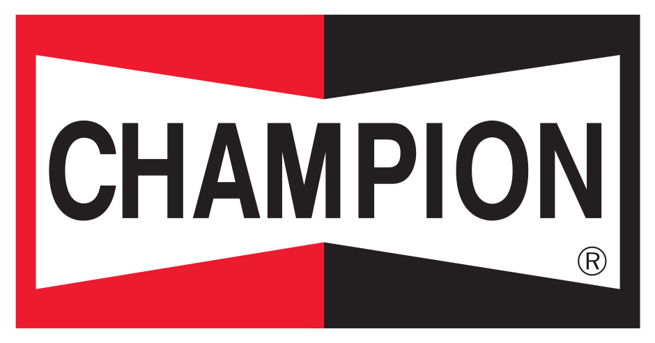
For a brief time, I became fascinated by quasi-old-timey automotive parts logos which I guess could fit under the theme of "blue-collar logos". Here are few of my favorite, coincidentally (or maybe not?) all in a red/white/black color scheme:
Hurst Shifters
Champion Spark Plugs
Edelbrock Manifolds
Snap-on Tools (vintage version)
posted by mhum at 8:20 PM on March 5, 2019 [3 favorites]
Hurst Shifters
Champion Spark Plugs
Edelbrock Manifolds
Snap-on Tools (vintage version)
posted by mhum at 8:20 PM on March 5, 2019 [3 favorites]
One I work with a lot and love the sort of homey inconsistent letter arcs and stuff is Weltron. Alternate version.
posted by glonous keming at 8:37 PM on March 5, 2019
posted by glonous keming at 8:37 PM on March 5, 2019
Logos like this are often for products that are the default purchase in their fields. It's a way of fairly aggressively saying "We're the best, no bull", and I suspect that that artlessness can be very expensive to achieve.
posted by thatwhichfalls at 9:07 PM on March 5, 2019 [10 favorites]
posted by thatwhichfalls at 9:07 PM on March 5, 2019 [10 favorites]
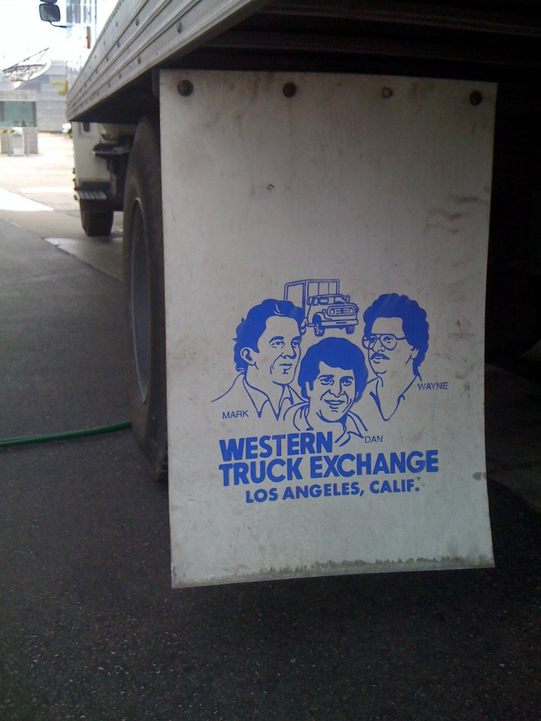
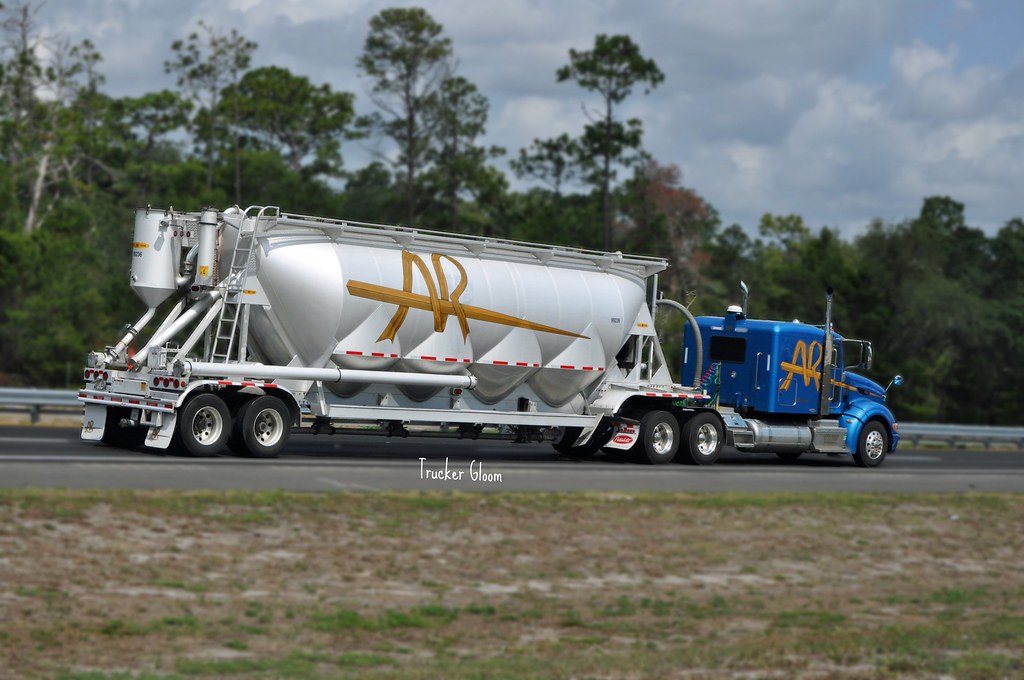
Two of my favorites from the trucking industry:
Western Truck Exchange
A&R Logistics
posted by q*ben at 9:17 PM on March 5, 2019 [2 favorites]
Western Truck Exchange
A&R Logistics
posted by q*ben at 9:17 PM on March 5, 2019 [2 favorites]
thatwhichfalls- yes! I’ve done design work for a few companies that fall in this category. People want to believe in some kind of essentialist “simple wisdom” is guiding these designs but in reality these companies make things for a living and thus have fully developed opinions about design. Many of the logos were internally developed by their technical staff.
Exhibit A: this is Hilti’s new office design
posted by q*ben at 9:26 PM on March 5, 2019 [8 favorites]
Exhibit A: this is Hilti’s new office design
posted by q*ben at 9:26 PM on March 5, 2019 [8 favorites]
I was expecting to see the MAC Tools logo that adorned my uncle's truck.
posted by The Underpants Monster at 9:31 PM on March 5, 2019
posted by The Underpants Monster at 9:31 PM on March 5, 2019
I live a blue collar life and so I didn't see anything remarkable about any of these logos. Perhaps if there had been some kind of actual discussion about logo types and how blue collar logos were different from white collar logos and what the significance of that was...
As it was, it was all just company logos. Advertisements. Logos. Ads. Companies. Exist. There they are, as a thing. A logo.
They're everywhere. That giant M. That big red chile. That smile on that box. That little Ad Council badge in the corner of a PSA. There's a lot going on. What makes these supposed "blue collar" logos stand out as being a part of a genre? On a day that doesn't have a Doodle going on, I look at the Google homepage and... what? That's not industrial, blue collar? It's a name typed out in different colors.
This feels oddly classist but lacks the rant or rave that would give it the proper context for exactly why these logos are included and others aren't. No pizza chain delivery car toppers in photos? Isn't delivery work considered blue collar?
Grrr, grumble grumble. Interesting set of images, but I don't understand their curation on any level.
posted by hippybear at 9:43 PM on March 5, 2019 [19 favorites]
Oh the early eighties were a golden era in graphic design, logos, advertisements... I am not saying this sarcastically or ironically.
I. Love. This. Shit.
posted by not_on_display at 11:14 PM on March 5, 2019 [2 favorites]
I. Love. This. Shit.
posted by not_on_display at 11:14 PM on March 5, 2019 [2 favorites]
These blue-collar logos are so fetch!
posted by the list of suspects is just you at 12:31 AM on March 6, 2019 [1 favorite]
posted by the list of suspects is just you at 12:31 AM on March 6, 2019 [1 favorite]
This one is indeed great.
I've always appreciated the trucking company logos on the sides of 18-wheelers. Many of them look like they were created on a drafting table, by someone more familiar with technical drawing than with graphic design – and, of course, many of them probably were.
I live a blue collar life and so I didn't see anything remarkable about any of these logos. Perhaps if there had been some kind of actual discussion about logo types and how blue collar logos were different from white collar logos and what the significance of that was...
I definitely feel a common vibe from these. Now, whether that's due to purely stylistic commonalities, or simply because I know that all of these logos signify blue-collar things, I'm not sure. But, to name a few stylistic things that jump out at me: lots of block lettering and rectilinear letterforms. Color schemes consisting mostly of primary and secondary colors. A certain datedness, for lack of a better term – which is probably better described as a lack of concern for keeping up with the latest design trends. A sort of rough-and-ready disregard for fussy designery things such as kerning or overall visual balance.
posted by escape from the potato planet at 4:37 AM on March 6, 2019 [2 favorites]
Color schemes consisting mostly of primary and secondary colors.
A lot of this stuff is industrial, or faux industrial, equipment. It's intended (or gives the image of intending) to get dirty.
The style gets used a lot parasitically by products that have no right to claim the aura of unpretentious value and efficiency it tries to claim.
posted by thatwhichfalls at 5:16 AM on March 6, 2019 [2 favorites]
The black-n-red Champion bowtie mentioned above is the platonic ideal of a logo. I once sported it on a t-shirt even though I was driving a diesel at the time.
posted by whuppy at 5:40 AM on March 6, 2019 [1 favorite]
posted by whuppy at 5:40 AM on March 6, 2019 [1 favorite]
I swear I thought that title said, “Blue Collar Legos”
posted by grimjeer at 6:16 AM on March 6, 2019 [4 favorites]
posted by grimjeer at 6:16 AM on March 6, 2019 [4 favorites]
My nominations for:
Best Blue Collar Logo
Worst Blue Collar Logo
Platonic ideal of a blue collar logo
posted by Chrischris at 6:26 AM on March 6, 2019
Best Blue Collar Logo
Worst Blue Collar Logo
Platonic ideal of a blue collar logo
posted by Chrischris at 6:26 AM on March 6, 2019
hippybear: "Grrr, grumble grumble. Interesting set of images, but I don't understand their curation on any level."
I agree there's an elitist, slumming-it, art-school edginess to the whole thing.
I understand 'blue collar logos' as logos applied to non-elite or aspirational products and services, that aren't trying to look exclusive or expensive, and don't use common signifiers of aesthetic sophistication or follow upmarket trends.
posted by signal at 6:28 AM on March 6, 2019 [1 favorite]
So what do you suppose is the difference between a "artless market leader" logo like DeWalt or Bosch versus a "artless market leader" logo like Google, or Walmart?
I, like others in this thread, am skeptical that "blue collar" is a meaningful descriptor for a category of logo. What is an example of an emphatically non-blue collar logo? Apple? Coca-Cola? Sony?
posted by Mr.Encyclopedia at 6:42 AM on March 6, 2019 [4 favorites]
I, like others in this thread, am skeptical that "blue collar" is a meaningful descriptor for a category of logo. What is an example of an emphatically non-blue collar logo? Apple? Coca-Cola? Sony?
posted by Mr.Encyclopedia at 6:42 AM on March 6, 2019 [4 favorites]
I live a blue collar life and so I didn't see anything remarkable about any of these logos. Perhaps if there had been some kind of actual discussion about logo types and how blue collar logos were different from white collar logos and what the significance of that was...
I suspect that Mrgan's twitter feed is more filled with designers and logo people than it is with blue-collar workers. As a non-designer but a person who sometimes thinks about these things, I notice a lot of what I think of as slab forms: letters that could be poured in concrete or cut out of plate steel, sort of thing. Or else forms that are intended to evoke a built object (such as the NEMF logo which is instantly recognizeable even though I have no idea what NEMF is or does).
There is a particular kind of playfulness with letters and shapes that accompanies these sorts of logos, although I do not know that "playfulness" is necessarily a consciously intended part of the brand or the design brief. They often give me the idea that they were originally made on a shop floor by the owner or a foreman out of whatever material the company sells or works with. The Pittsburgh Paints logo, for instance, or (not included here) the Westing House Electric logo, which evokes an electrical schematic, a crown, and the original Westinghouse "W".
I also see a lot of these logos as having both an implied and actual kind of hardiness or durability. These are logos meant to remain recognizable even if most of the logo is missing due to wear or damage. While that is true of even logos that have delicate features, I sort of take these logos to be making explicit claims to that effect, suggesting a warranty of sorts. The more delicate lines of the early Apple logotype, in Garamond, do not make such a claim even though they are just as recognizable.
posted by gauche at 6:49 AM on March 6, 2019 [9 favorites]
NEMF is New England Motor Freight from when I worked in a warehouse.
posted by AugustWest at 7:07 AM on March 6, 2019 [3 favorites]
posted by AugustWest at 7:07 AM on March 6, 2019 [3 favorites]
“Blue collar logos” doesn’t make sense to me even on the grammatical level, but it’s early.
Dude thinks he’s special cause he noticed good design in non prestige brands? How tiresome. Get lost dude.
posted by Sterros at 7:15 AM on March 6, 2019 [1 favorite]
Dude thinks he’s special cause he noticed good design in non prestige brands? How tiresome. Get lost dude.
posted by Sterros at 7:15 AM on March 6, 2019 [1 favorite]
These are logos meant to remain recognizable even if most of the logo is missing due to wear or damage.
I mean, is that really a design criteria here? Does Caterpillar really care about brand awareness on a 20 year old beat-to-shit bulldozer?
posted by JoeZydeco at 7:18 AM on March 6, 2019
I mean, is that really a design criteria here? Does Caterpillar really care about brand awareness on a 20 year old beat-to-shit bulldozer?
posted by JoeZydeco at 7:18 AM on March 6, 2019
I’ve personally always enjoyed variations of the Miller Paint logo. Saw a few guys wearing them on paint-splotched white tees while painting a house in the neighborhood.
posted by gucci mane at 7:27 AM on March 6, 2019
posted by gucci mane at 7:27 AM on March 6, 2019
I've never understood what 'blue collar' and 'white collar' meant, and this post motivated me to finally look it up. Apparently its something from the 20th century when people actually had jobs, and they were generally men, and they generally had clothes with collars on.
posted by memebake at 7:34 AM on March 6, 2019 [1 favorite]
posted by memebake at 7:34 AM on March 6, 2019 [1 favorite]
Building off of gauche's comment, conversations about design tend to have a narrow range of subjects: computers, phones, clothing (at least that worn by young people in big cities), etc. Moreover, design conversations themselves tend to be coded as an effete, white-collar pursuit. But as the thread shows, design considerations are a big deal to everyone, including in professions where you might not think they would be. Put another way, logos for Caterpillar or Bud Light are performing (in the sense of gender performance) just as much as, say, the Apple logo is, even if we don't typically think of them doing that.
As for favorite logos, I'm a fan of the Dickies logo (the horseshoe!), and also Wolverine.
posted by Cash4Lead at 7:34 AM on March 6, 2019 [3 favorites]
As for favorite logos, I'm a fan of the Dickies logo (the horseshoe!), and also Wolverine.
posted by Cash4Lead at 7:34 AM on March 6, 2019 [3 favorites]
Does Caterpillar really care about brand awareness on a 20 year old beat-to-shit bulldozer?
I would argue that yeah they do. Heavy equipment manufacturers go out of their way to create a culture around their machines.
posted by Dr. Twist at 7:34 AM on March 6, 2019 [4 favorites]
I would argue that yeah they do. Heavy equipment manufacturers go out of their way to create a culture around their machines.
posted by Dr. Twist at 7:34 AM on March 6, 2019 [4 favorites]
Does Caterpillar really care about brand awareness on a 20 year old beat-to-shit bulldozer?
My father was a residential contractor before he was a farmer, and I grew up playing on and around job sites. I'd say that durability and reliability is a real consideration for people who work with these sorts of tools.
Computers and consumer electronics are one particular kind of good: many goods do not share their characteristics. For instance, many hand tools (such as hammers, chisels, &c.) have been stable in more-or-less their current form for generations. If your mental model for a good comes from computing, then an old hammer may be inferior, in your eyes, to a new one. But if your mental model comes from other goods, then an old hammer might be a hammer that been field-tested and is reliable.
If I were Caterpillar, I might be very interested in making sure that a 20-year-old bulldozer that is still a valuable piece of equipment that can be identified with my brand.
posted by gauche at 7:46 AM on March 6, 2019 [6 favorites]
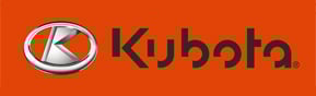
Tractors are also color coded to keep that brand recognition. Ford is blue, Deer is Green, Kubota is orange, etc. Tools are like that too: Black&Decker, Makita, Porter-Cable, etc all have distinctive color schemes that are easily identifiable even after years of use.
posted by octothorpe at 7:49 AM on March 6, 2019 [5 favorites]
posted by octothorpe at 7:49 AM on March 6, 2019 [5 favorites]
Put another way, logos for Caterpillar or Bud Light are performing (in the sense of gender performance) just as much as, say, the Apple logo is, even if we don't typically think of them doing that.
Or as RuPaul puts it, "We're all born naked; the rest is drag."
posted by gauche at 7:49 AM on March 6, 2019 [5 favorites]
Or as RuPaul puts it, "We're all born naked; the rest is drag."
posted by gauche at 7:49 AM on March 6, 2019 [5 favorites]
Thanks for the post, DoctorFedora! Seems like a weird place to discuss the concept of "blue collar" or to tell Neven Mrgan to get lost, but welcome to MetaFilter, I guess.
posted by Rock Steady at 7:52 AM on March 6, 2019 [2 favorites]
posted by Rock Steady at 7:52 AM on March 6, 2019 [2 favorites]
Back when I worked for Pittsburgh Paints, as I mentioned above, I owned the database of pigment formulas for painting corporate retail locations and we did a lot of work for tractor and heavy equipment companies. It was very important for them to match the showroom and sign colors exactly to the equipment colors.
posted by octothorpe at 7:53 AM on March 6, 2019 [2 favorites]
posted by octothorpe at 7:53 AM on March 6, 2019 [2 favorites]
My dad's a welder who spent a lot of time away from home building those giant oil tanks you see dotting the landscape in numerous shitty places you drive past. Usually he'd return with trucker caps featuring the logo of his employer or an affiliated company. I remember mortified teen me thinking "I will NEVER wear this hat" when he brought this one home.
posted by Alvy Ampersand at 7:55 AM on March 6, 2019 [2 favorites]
posted by Alvy Ampersand at 7:55 AM on March 6, 2019 [2 favorites]
Tractors are also color coded to keep that brand recognition. Ford is blue, Deer is Green, Kubota is orange, etc. Tools are like that too: Black&Decker, Makita, Porter-Cable, etc all have distinctive color schemes that are easily identifiable even after years of use.
I guess that is what I was getting at. THAT kind of design and style is what carries with customers over the simplicity and/or color separation schemes of their logos. We're arguing about how fancy the hood ornament should be. Yes, I'm old enough to remember hood ornaments and that's probably worth a FPP on its own.
posted by JoeZydeco at 8:14 AM on March 6, 2019
What is an example of an emphatically non-blue collar logo? Apple? Coca-Cola? Sony?
Chanel, Hermes, Louis Vuitton. Steinway & Sons, if you want one that's not a fashion brand.
Edit for 'hood ornaments': the Spirit of Ecstacy.
posted by box at 8:19 AM on March 6, 2019
Chanel, Hermes, Louis Vuitton. Steinway & Sons, if you want one that's not a fashion brand.
Edit for 'hood ornaments': the Spirit of Ecstacy.
posted by box at 8:19 AM on March 6, 2019
In Seattle we have a local lumber supply called Dunn Lumber. I’ve seen people who’ve had the little guy tattooed on their body.
The American Piledriving Equipment (A.P.E.) is so choice I actually tracked down an employee who hooked me up with a hoodie.
posted by Slarty Bartfast at 8:24 AM on March 6, 2019 [4 favorites]
The American Piledriving Equipment (A.P.E.) is so choice I actually tracked down an employee who hooked me up with a hoodie.
posted by Slarty Bartfast at 8:24 AM on March 6, 2019 [4 favorites]
It was very important for them to match the showroom and sign colors exactly to the equipment colors.
Exactly. Even if the original color was literally just whatever Old Man Caterpillar had on hand when he first drew the logo or whatever, the choice to stick with a color and to match it elsewhere is a deliberate design choice.
Basically, it's that monologue from The Devil Wears Prada, except in a sector which is not necessarily noted for its branding and design.
posted by gauche at 8:24 AM on March 6, 2019 [3 favorites]
I think the intention of the Twitter poster is not only to highlight logos for companies or products thought of as "blue collar" but rather to identify a particular style of logo design. I'm not a designer myself so I don't have the proper vocabulary, but those logos seem to share in common a few threads, the main one of which is a strong simplicity.
This style of design is indeed often associated with "blue collar" companies, but it can be adopted by anyone seeking a bold logo. The reason I say this is because one person posted the logo of a bank, which the Twitter OP said indeed was representative of the style he had in mind.
posted by Conrad Cornelius o'Donald o'Dell at 8:42 AM on March 6, 2019 [1 favorite]
I think a common element in these logos is that generally, if they were physical artifacts jumbled in a big pile and someone said "go fetch me the Westinghouse logo" you'd stand a good chance of bringing back the right one. "Go fetch me the Slack logo" is going to be happenstance.
I'm a designer and the older I get, the more valuable that attribute is. The kind of clever which gets you a mention in a design periodical is not necessarily something which means anything in the real world.
posted by maxwelton at 9:30 AM on March 6, 2019 [9 favorites]
I'm a designer and the older I get, the more valuable that attribute is. The kind of clever which gets you a mention in a design periodical is not necessarily something which means anything in the real world.
posted by maxwelton at 9:30 AM on March 6, 2019 [9 favorites]
I wonder: are there branding agencies that specialize in this market? I feel like I recognize these logos as members of a distinct category precisely because they aren't focus-grouped and brand-managed within an inch of their lives - but maybe I'm wrong, and that apparent unpretentiousness is actually very calculated.
posted by escape from the potato planet at 9:55 AM on March 6, 2019
posted by escape from the potato planet at 9:55 AM on March 6, 2019
> Dude thinks he’s special cause he noticed good design in non prestige brands? How tiresome. Get lost dude.
Neven is a wonderful, humble, and incredibly talented guy whose only agenda here AFAIK was to highlight some logo work that delighted him and fell outside what usually gets passed around in design circles on twitter, which is 25-page PDFs about iOS apps that changed the color of their icon. The grar in this thread is befuddling to me
posted by churl at 11:05 AM on March 6, 2019 [17 favorites]
Heavy equipment manufacturers go out of their way to create a culture around their machines.
This is very true - just look how John Deere markets next time you're at a fall fair or in a hardware store in a rural area. John Deere have a wide range of merchandise that covers just about ever demographic from baby to adult.
posted by Ashwagandha at 11:39 AM on March 6, 2019
This is very true - just look how John Deere markets next time you're at a fall fair or in a hardware store in a rural area. John Deere have a wide range of merchandise that covers just about ever demographic from baby to adult.
posted by Ashwagandha at 11:39 AM on March 6, 2019
Does Caterpillar really care about brand awareness on a 20 year old beat-to-shit bulldozer?
Thirding gauche and octothorpe, it's not unusual for a farm to have all their retired tractors lined up outdoors -- on a ridge, or at the turnoff from the public road. At which point brand durability is really visible in several senses.
posted by clew at 12:12 PM on March 6, 2019 [2 favorites]
Thirding gauche and octothorpe, it's not unusual for a farm to have all their retired tractors lined up outdoors -- on a ridge, or at the turnoff from the public road. At which point brand durability is really visible in several senses.
posted by clew at 12:12 PM on March 6, 2019 [2 favorites]
I'm not a designer, but it seems pretty plain to me that this guy is identifying a design philosophy that is beautiful in it's aestheticization of disregard for "design philosophy". It's supposed to communicate utilitarianism, durability, quality, and a certain sneering at ideas like "marketing" or "kerning". It's supposed to look like it was designed by the bootstrapping founder of the company on a drafting table in his garage and never changed because it works fine and people recognize it. (Satirized in Parks and Rec by Ron Swanson's Very Good Construction Company)
The consumer this design is targeting would, for instance, sneer at the kind of soft hipster who cares about what his clothes communicate to others, because they are just supposed to be durable and cover their bodies, right? (This is my dad) But of course, they wouldn't leave the house in a silk shirt or a sport coat or a dress for any amount of money, because they DO care what is communicated by their consumer choices--they want it communicate the fantasy that they don't care.
A lot of grar in this thread is totally understandable in this context, especially that coming from people self-identifying as working class*. Acknowledging it AS design, AS formulated to appeal to us and our particular class-bounded, gender-inflected preferences and values directly clashes with the core message of the design, and with the core values (however self-deceptive or paradoxical) the design appeals to.
*Which, sigh, I must affirm I am too in order to speak on this subject: I dropped out of high school to work in a factory, I am the target audience
posted by Krawczak at 2:34 PM on March 6, 2019 [3 favorites]
The grar in this thread is befuddling to me
I'm guessing it's the "blue collar" framing which feels a bit off somehow? It's unclear exactly what the descriptor is exactly referring to. On the one hand, you might think it's logos related to companies involved in blue-collar professions like construction -- and the majority of the cases he presents fall into this category. But then, he chooses Bud Light as an example. And also a Puerto Rican bank for some reason? So, it feels like there's some kind of class marker implications there (despite the fact that Bud Light is literally the #1 beer in the US).
Meanwhile, here are some more logos I think are neat (and which might qualify as "blue collar" whatever that means), this time from container shipping companies:
Maersk
MSC
Hanjin (RIP)
Matson (the "t" is an anchor!)
Mitsui OSK (bonus: alligator version)
Safmarine (an interesting outlier in using script rather than block letters)
Ocean Network Express (a relatively recent merger of a bunch of shipping companies, they went way out of the prevailing norms with their hot pink brand color)
posted by mhum at 2:39 PM on March 6, 2019 [2 favorites]
I'm guessing it's the "blue collar" framing which feels a bit off somehow? It's unclear exactly what the descriptor is exactly referring to. On the one hand, you might think it's logos related to companies involved in blue-collar professions like construction -- and the majority of the cases he presents fall into this category. But then, he chooses Bud Light as an example. And also a Puerto Rican bank for some reason? So, it feels like there's some kind of class marker implications there (despite the fact that Bud Light is literally the #1 beer in the US).
Meanwhile, here are some more logos I think are neat (and which might qualify as "blue collar" whatever that means), this time from container shipping companies:
Maersk
MSC
Hanjin (RIP)
Matson (the "t" is an anchor!)
Mitsui OSK (bonus: alligator version)
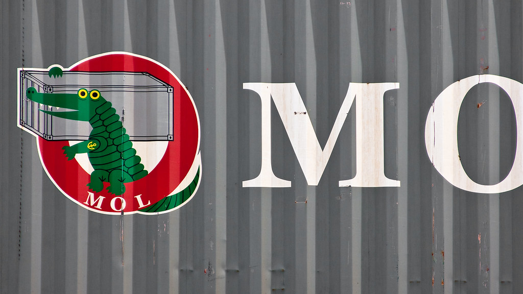
Safmarine (an interesting outlier in using script rather than block letters)
Ocean Network Express (a relatively recent merger of a bunch of shipping companies, they went way out of the prevailing norms with their hot pink brand color)
posted by mhum at 2:39 PM on March 6, 2019 [2 favorites]
I've been thinking about this a bit and I think that what makes these logos "blue collar" is that they are designed, above all else, to degrade gracefully.
The Cat logo would easily be legible even 80% corroded, to someone familiar with it - that shade of yellow, that sharp delineation of black and white.
Industrial kit is expensive and must last a long time. A beaten up piece of equipment, that is still being used, with visible patches of bright yellow speaks volumes to other people in that industry.
posted by thatwhichfalls at 2:40 PM on March 6, 2019 [2 favorites]
Octothorp mentioned Kubota which reminded me of my dad's joy over a Kubota t-shirt that said "sit on a big orange." I went looking for said shirt but was unsuccessful. I did find this shirt which is fun in its own way but does not use their regular logo
posted by vespabelle at 3:56 PM on March 6, 2019
posted by vespabelle at 3:56 PM on March 6, 2019
but maybe I'm wrong, and that apparent unpretentiousness is actually very calculated.
I think it’s a bit more orthogonal than that. In my opinion these companies have less conventionally pretty logos because they are confident in their understanding of brand and design through lived experience of creating a company that makes things. Call it the Dan Harmon POV.
posted by q*ben at 9:07 PM on March 6, 2019 [1 favorite]
Meanwhile, here are some more logos I think are neat (and which might qualify as "blue collar" whatever that means), this time from container shipping companies:
I would say that some of the logos you linked to fit in with the aesthetic in question. I'm curious if others agree with me.
Spoilers in link
posted by Rock Steady at 7:24 AM on March 7, 2019
I would say that some of the logos you linked to fit in with the aesthetic in question. I'm curious if others agree with me.
Spoilers in link
posted by Rock Steady at 7:24 AM on March 7, 2019
It might also be worth noting that Hilti hasn't always had its logo in its current form. At least in the 1950s, it was a much plainer, less distinctive look as seen in these pics. I wasn't able to track down exactly when they adopted their current logo, though.
posted by mhum at 2:35 PM on March 7, 2019 [1 favorite]
posted by mhum at 2:35 PM on March 7, 2019 [1 favorite]
« Older There is no documentation of a transient anus in... | Like hostile tribes doomed over centuries to share... Newer »
This thread has been archived and is closed to new comments
posted by mwhybark at 7:03 PM on March 5, 2019 [15 favorites]