"New alphabet dropped!"
April 18, 2021 1:36 PM Subscribe
One person reminisced about, as a child, writing capital letter Es with several redundant horizontal lines so that it looked like a ladder. Other Tumblr users yes-anded with sentiments like "All capital letters should have a leveled-up form" and "Please add your own unsettling godtier capitals!" as well as calligraphy and a font (.otf) file for an "Anxiety" font.
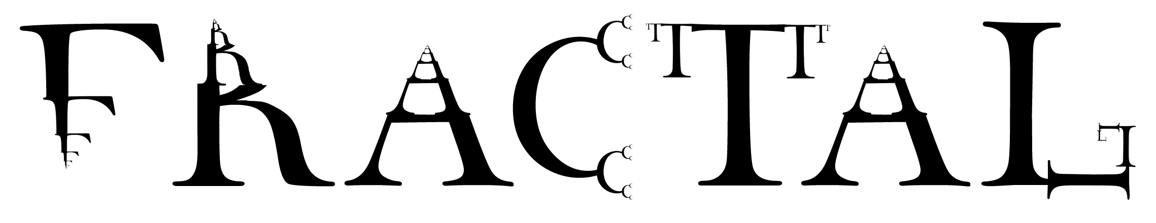
I love this. Personally I think the A should get extra points, rather than extra horizontal lines, because I feel it is the triangle shape that really "makes" the A. So a godtier A would have more of them.
^
A
posted by stillnocturnal at 1:49 PM on April 18, 2021 [3 favorites]
^
A
posted by stillnocturnal at 1:49 PM on April 18, 2021 [3 favorites]
Tom7 recently released a video on using machine learning to generate uppestcase and lowestcase letters (a case of glyphs for the whole alphabet that are 'above' uppercase and 'below' lowercase) which feels very relevant here.
posted by Dysk at 1:53 PM on April 18, 2021 [25 favorites]
posted by Dysk at 1:53 PM on April 18, 2021 [25 favorites]
id call them ladder E’s and adults fucking hated them
this is how children realize they're on to something good!
posted by chavenet at 1:59 PM on April 18, 2021 [19 favorites]
this is how children realize they're on to something good!
posted by chavenet at 1:59 PM on April 18, 2021 [19 favorites]
I had a second- or third- grade teacher who wrote up an envelope address with several mistakes in it, and asked the class to identify the errors.
One kid raised their hand, and noted that the initial number of the street address (which began with her handwritten, curly '2') wasn't capitalized.
Pause, then generalized laughter.
The thing is, that kid was *totally* right. Curly 2s are lowercase 2s.
posted by pykrete jungle at 2:05 PM on April 18, 2021 [8 favorites]
Also, any university that has a W next to a U should use the term "triple-U." G-Triple-U. Triple-U-S-T-L.
posted by pykrete jungle at 2:11 PM on April 18, 2021 [12 favorites]
posted by pykrete jungle at 2:11 PM on April 18, 2021 [12 favorites]
Calling the World Wide Web prefix "sextupleU" never took off, though.
posted by clew at 2:26 PM on April 18, 2021 [11 favorites]
posted by clew at 2:26 PM on April 18, 2021 [11 favorites]
My son decided that lowercase 'e' has a little curlicue at the end and always writes it that way. I don't know where he got it but I love it.
posted by potrzebie at 2:56 PM on April 18, 2021 [4 favorites]
posted by potrzebie at 2:56 PM on April 18, 2021 [4 favorites]
When this came up on my tumblr dash, all I could think of were the pictures I drew as a kid of mouths with three or four rows of teeth.
posted by The Underpants Monster at 3:12 PM on April 18, 2021 [4 favorites]
posted by The Underpants Monster at 3:12 PM on April 18, 2021 [4 favorites]
Dysk: Tom7 recently released a video on using machine learning
MeFi post from a couple of weeks ago
posted by dhruva at 3:37 PM on April 18, 2021 [3 favorites]
MeFi post from a couple of weeks ago
posted by dhruva at 3:37 PM on April 18, 2021 [3 favorites]
stillnocturnal: Personally I think the A should get extra points, rather than extra horizontal lines, because I feel it is the triangle shape that really "makes" the A. So a godtier A would have more of them.
I love this! It made me think of the video for White Stripes "Seven Nation Army" (permanent expanding triangles), which I think should be the godtier font song.
While Anxiety is a great name, I also wish that the font was called Godtier.
posted by clinthowarth at 4:13 PM on April 18, 2021 [3 favorites]
I love this! As a kid, I used to date all my homework as days since January 1st. So today would be January 107th, 2021. I don't know why my teachers never liked it, still makes sense to me!
posted by lock robster at 4:19 PM on April 18, 2021 [11 favorites]
posted by lock robster at 4:19 PM on April 18, 2021 [11 favorites]
glorious
posted by lapolla at 5:00 PM on April 18, 2021 [1 favorite]
posted by lapolla at 5:00 PM on April 18, 2021 [1 favorite]
I used to date all my homework as days since January 1st. So today would be January 107th, 2021. I don't know why my teachers never liked it
If you'd just written them like 2021-107 instead they'd have had no reasonable grounds to object.
posted by flabdablet at 5:51 PM on April 18, 2021 [4 favorites]
If you'd just written them like 2021-107 instead they'd have had no reasonable grounds to object.
posted by flabdablet at 5:51 PM on April 18, 2021 [4 favorites]
This, and the comments, made me laugh out loud. Thank you.
posted by limeonaire at 8:36 PM on April 18, 2021
posted by limeonaire at 8:36 PM on April 18, 2021
Metafilter: No reasonable grounds to object
I have a kid who did the ladder Es when learning to write. I think I'll have to show this to him.
posted by medusa at 8:58 PM on April 18, 2021 [1 favorite]
I have a kid who did the ladder Es when learning to write. I think I'll have to show this to him.
posted by medusa at 8:58 PM on April 18, 2021 [1 favorite]
dhruva: MeFi post from a couple of weeks ago
Ooh, thanks, hadn't seen that!
posted by Dysk at 1:53 AM on April 19, 2021
Ooh, thanks, hadn't seen that!
posted by Dysk at 1:53 AM on April 19, 2021
This is all a lot of fun, folks, but I hope you remember that in the end ladder E will get you nowhere.
posted by a car full of lions at 2:32 AM on April 19, 2021 [8 favorites]
posted by a car full of lions at 2:32 AM on April 19, 2021 [8 favorites]
I learned to write the pound sign (£) with two horizontal bars (it's been officially written with one since 1975), so this concept gets the thumbs-up from me.
posted by pipeski at 2:58 AM on April 19, 2021 [2 favorites]
posted by pipeski at 2:58 AM on April 19, 2021 [2 favorites]
Levelled up alphabet is lacking only a suitable use case rhyme:
A is for Ant, the crawls on the ceiling,
[Levelled up A] to for Angry, Aardvark, appealing
B is for butter, we spread on our bread
[Levelled up B] is for bitter bees banging in beds...
posted by rongorongo at 3:21 AM on April 19, 2021 [4 favorites]
A is for Ant, the crawls on the ceiling,
[Levelled up A] to for Angry, Aardvark, appealing
B is for butter, we spread on our bread
[Levelled up B] is for bitter bees banging in beds...
posted by rongorongo at 3:21 AM on April 19, 2021 [4 favorites]
Petition to replace spiral O with ꙮ
posted by ckape at 6:24 AM on April 19, 2021 [4 favorites]
posted by ckape at 6:24 AM on April 19, 2021 [4 favorites]
Personally I think the A should get extra points, rather than extra horizontal lines
Agree! Or maybe both? Same with the V and K, which should have a series of nested angles in their crooks.
Also, any university that has a W next to a U should use the term "triple-U."
Thinking about it, U Dub has actually been U Trip this whole time.
posted by evidenceofabsence at 8:00 AM on April 19, 2021
Calling the World Wide Web prefix "sextupleU" never took off, though.
Back in the olden days of the web when I worked for the nascent web development team in a Large Corporation, we were tasked with running training sessions for our sales team on subjects like "what is the Web?" and "What is a URL?" and "what does 'aitch tee tee pee colon backslash backslash' mean?". (For some reason it was always pronounced "backslash" even though it was a forward slash. These were dark times.)
One of the presenters, having tired of saying "double you double you double you" every time he spelled out one of these mysterious new "URL" things for the salespeople, started abbreviating it by saying "dubdubdub". Which was fine until one of us noticed the salespeople were dutifully writing down down "dub dub dub dot [companyname] dot com".
Which is to say I wish we'd thought of sextupleyou at the time! such a missed opportunity
posted by ook at 8:00 AM on April 19, 2021 [2 favorites]
I'm not sure if "sextuple you" sounds more like an insult or a proposition.
posted by evidenceofabsence at 8:02 AM on April 19, 2021 [6 favorites]
posted by evidenceofabsence at 8:02 AM on April 19, 2021 [6 favorites]
Love everything about this, especially the calligraphed versions. I’d be utterly unsurprised to see any of those on a fancy fitted baseball hat from Ebbets Field Flannels with accompanying alt-universe baseball history: The Earlyville Ladder Batters and the Springfield Ssssssnakes played in the short-lived Godtier League from 1961 to 196333 [where the 3 keeps branching and sending forth new 3-shaped curlicues]. Would buy the hell out of such a hat.
posted by miles per flower at 8:38 AM on April 19, 2021 [3 favorites]
posted by miles per flower at 8:38 AM on April 19, 2021 [3 favorites]
My son decided that lowercase 'e' has a little curlicue at the end and always writes it that way. I don't know where he got it but I love it.
Who doesn't love a pretext for drawing Porky Pig's butt as often as the most common in letter in the alphabet?
posted by straight at 9:50 AM on April 19, 2021
Who doesn't love a pretext for drawing Porky Pig's butt as often as the most common in letter in the alphabet?
posted by straight at 9:50 AM on April 19, 2021
Personally I think the A should get extra points, rather than extra horizontal lines
Agree! Or maybe both? Same with the V and K, which should have a series of nested angles in their crooks.
I was thinking the top "triangle" of the A should fractal out like a Kepler snowflake for as long as one feels like drawing it. And the V lines would just keen nesting in.
I made some concept sketches. The A needs another round of triangles and I'm not 100% sold on the K but I think I got Anxious V pretty well.
posted by Karmakaze at 12:08 PM on April 19, 2021 [2 favorites]
That A looks like it's wearing a Viking hat Karmakaze so obviously it's perfect.
posted by stillnocturnal at 12:41 PM on April 19, 2021
posted by stillnocturnal at 12:41 PM on April 19, 2021
« Older The High Cost of Clearing Tent Cities | Toward arcology: making ourselves scarce Newer »
This thread has been archived and is closed to new comments
posted by MonkeyToes at 1:48 PM on April 18, 2021