"Yes, I’m getting bored of ranking these."
August 21, 2021 2:05 PM Subscribe
A deep academic discussion of all 56 flags for the United States.
Wait. Wut?
Fine. Fight it out.
(Defector link. Free-ish. See below the fold.)
This is a Discourse blog via Defector.
For those not in the know, Defector is essentially the entire Deadspin team before things went south. Just a couple of things that have already been on the blue.
I e-mailed Defector to see if I could pay a gift article similar to NYT and WaPo and here was their response:
The site is actually on a metered soft paywall - people can read a couple articles every month with no strings attached, and then if they give us their email address they can read another couple articles before the paywall fully locks them out.
Seems like a nice balance between us arguing over nothing while also reading what we are arguing about and also still paying the content writers, but not locking anyone out of the conversation without context.
P.S. Read everything Drew Magary writes.
TIL Oregon’s flag is two-sided, and the back side is a beaver. That kicks flag ass!
I totally agree with the top two, though I would flip the order.
posted by Thorzdad at 2:30 PM on August 21, 2021 [4 favorites]
I totally agree with the top two, though I would flip the order.
posted by Thorzdad at 2:30 PM on August 21, 2021 [4 favorites]
Rhode Island deserves better than 42, you animal!
posted by GenjiandProust at 2:31 PM on August 21, 2021 [8 favorites]
posted by GenjiandProust at 2:31 PM on August 21, 2021 [8 favorites]
It's a travesty that Maryland's chaotic energy didn't place higher. And if I'd had a little bit of disposable income in my late twenties, I'd probably sport a tattoo with the old version of the Rhode Island flag, and though the current one is a slight downgrade, I still harbor a soft spot for the old anchor and stars.
posted by Kattullus at 2:32 PM on August 21, 2021 [19 favorites]
.svg)
posted by Kattullus at 2:32 PM on August 21, 2021 [19 favorites]
There should be a disqualifier pile for Confederate-inspired flags. Especially the worst state, whose name shall not be mentioned.
posted by They sucked his brains out! at 2:34 PM on August 21, 2021 [5 favorites]
posted by They sucked his brains out! at 2:34 PM on August 21, 2021 [5 favorites]
Let’s be clear about this. Ranking flags by zone:
4. Shame basement: do you have confederate symbols? Think about what you’ve done.
3. Design hell: do you have the state seal or other fiddly images? This is supposed to be seen at a distance! E for effort!
2. Not 4 or 3, but has the state’s name written in it? Are you that desperate?
1. Flags worthy of consideration.
I also kind of hate Alaska’s flag. People can see those constellations from their states, you know. How about a picture of a Mineral Extraction Company flunky handing a briefcase full of cash to the Governor? Truth in advertising.
posted by GenjiandProust at 2:43 PM on August 21, 2021 [25 favorites]
OK couple things. The Tennessee flag is actually great. I had no idea.
Arkansas flag just makes me think they assumed Arkansasians (arkansish, Arkansas wtf ever the demonym for then is) couldn't spell the state name.
Oregon does have a beaver on the back which is great but I swear that's nearly comic sans font so nope nopey nope.
And the winner for the most wrong in this article best flag there is.... Ohio. Because you tell me about your colors and who doesn't have blue or whatever omg. Us Ohioans where like "pish who's got time for rectangles"
Or maybe we were like "ya know what's square? Rectangles"
Or something else anyway. Yay beautiful Ohio!!!!
posted by chasles at 2:48 PM on August 21, 2021 [4 favorites]
I love Maryland's
posted by PinkMoose at 2:49 PM on August 21, 2021 [18 favorites]
posted by PinkMoose at 2:49 PM on August 21, 2021 [18 favorites]
Does anyone else see Bigfoot in the middle of the Michigan flag?
posted by hwyengr at 2:59 PM on August 21, 2021 [4 favorites]
posted by hwyengr at 2:59 PM on August 21, 2021 [4 favorites]
Maryland's flag is a celebration of the Confederacy, so it is -- empirically -- trash. If they stripped it to that godawful yellow-and-black, it would still be ugly, but it would at least rise up a tier in the rankings.
posted by miguelcervantes at 3:05 PM on August 21, 2021 [2 favorites]
posted by miguelcervantes at 3:05 PM on August 21, 2021 [2 favorites]
Wait, how is Maryland’s a celebration of the Confederacy? It’s based on the coat of arms of a 16th C British noble…
posted by GenjiandProust at 3:10 PM on August 21, 2021 [9 favorites]
posted by GenjiandProust at 3:10 PM on August 21, 2021 [9 favorites]
The first thing that came up when I googled "Maryland flag" was that it's the "17th-century heraldic banner of arms of Cecil, 2nd Baron Baltimore." The second thing was this weird image, which I think should be the uniform for an army of android super-villain minions.
posted by Harvey Kilobit at 3:25 PM on August 21, 2021 [4 favorites]
posted by Harvey Kilobit at 3:25 PM on August 21, 2021 [4 favorites]
Wild how highly Guam rates in this after being given a hard F by worldflagsgraded.com for “writing, graven images, and too-busy”.
posted by migurski at 3:27 PM on August 21, 2021 [5 favorites]
posted by migurski at 3:27 PM on August 21, 2021 [5 favorites]
It's this part that celebrates the Confederacy.
posted by 922257033c4a0f3cecdbd819a46d626999d1af4a at 3:31 PM on August 21, 2021 [3 favorites]
posted by 922257033c4a0f3cecdbd819a46d626999d1af4a at 3:31 PM on August 21, 2021 [3 favorites]
The reason why Maryland has two distinct panels is that the red/white component was overtly pro-secession. Combining that with the yellow/black was their way of saying "Hey, the war's over -- let's all be friends!"
posted by miguelcervantes at 3:34 PM on August 21, 2021 [9 favorites]
posted by miguelcervantes at 3:34 PM on August 21, 2021 [9 favorites]
But everyone agrees that New Mexico's flag is excellent, right?
posted by that girl at 3:34 PM on August 21, 2021 [40 favorites]
posted by that girl at 3:34 PM on August 21, 2021 [40 favorites]
So many of these just scream "CLIP ART!!!".
What animals/humans don't look like they were drawn back in the olde days? Yikes.
New Mexico just wins. I've been to both states. I did't see the big dipper/ursa motif repeated when I was in Alaska.
Drive across New Mexico, and you will see the sun everywhere. You may drive through the Zia Pueblo area, and as TFA mentions, it is their symbol. New Mexico just said, "Yep, that's a badass logo, we're going all in on that".
posted by Windopaene at 3:39 PM on August 21, 2021 [6 favorites]
It's this part that celebrates the Confederacy.
I honestly don’t understand. That is part of the heraldry of a 16th C nobleman. That’s maybe bad, but I don’t get the Confederate connection.
posted by GenjiandProust at 3:41 PM on August 21, 2021
I honestly don’t understand. That is part of the heraldry of a 16th C nobleman. That’s maybe bad, but I don’t get the Confederate connection.
posted by GenjiandProust at 3:41 PM on August 21, 2021
I'm comforted by the lidless eye gazing at me from Ohio's flag. No, not comforted, what's the word? Oh yes, "horrified".
posted by Joe in Australia at 3:44 PM on August 21, 2021 [4 favorites]
posted by Joe in Australia at 3:44 PM on August 21, 2021 [4 favorites]
The red and white cross bottony counterchanged had gained popularity during the American Civil War. Maryland had remained loyal to the U.S. despite a large proportion of the citizenry's support for the Confederacy, especially in the central city of Baltimore, the counties of the southern part of the state, and the Eastern Shore of the Chesapeake Bay. Those Marylanders who supported the Confederacy, many of whom fought in the Army of Northern Virginia of Robert E. Lee, adopted the Crossland banner (seen as "secession colors") and often used a metal bottony cross pinned to their gray uniforms or caps (kepis).[3][2] The black and gold bend dexter counterchanged of the Barons Baltimore was used in the flags and devices and pinned on the uniforms of Union Army regiments in the Army of the Potomac.[4] After the war, Marylanders who had fought on either side of the conflict returned to their state in need of reconciliation -- Wikipedia
posted by 922257033c4a0f3cecdbd819a46d626999d1af4a at 3:44 PM on August 21, 2021 [6 favorites]
posted by 922257033c4a0f3cecdbd819a46d626999d1af4a at 3:44 PM on August 21, 2021 [6 favorites]
- Too many of the state seal on blue, phoning it in types. (Wyoming gets a pass, because of the bison and the colored border.) One of the things a flag should be is immediately identifiable.
You know when Arizona or Ohio shows up, in the same way you know Japan or the UK is here. None of this "Is that Colombia or Venezuela? Ecuador? Okay. Ah, here comes the Netherlands. No wait, Russia? What do you mean that's Luxembourg?"
- fight over Maryland all you want, but the saltires on Florida and Alabama's flags aren't Confederate, they're Empire of Spain.
- similarly, Iowa'state flag looks like a Tricolor, because it used to be the northern part of French Louisiana, of Louisiana Purchase fame.
- Indiana, although lovely and embroiderable onto blue velvet, has always reminded me of the logo for a textbook publisher or online university.
- speaking of logo design, whoever got the contract for the mountain southwest - Colorado, Arizona, New Mexico - really understood the assignment.
- I think people who have never quilted or sewn by hand fail to appreciate the chaos energy of the Tennessee flag. Like a three-body problem, here's no actual way to align those stars 'properly'. A flag design that will somehow always look slightly homemade, even if produced on a computer automated stitching machine, has always seemed appropriate for the Volunteer State.
- that moment you realize, with his one white star on blue, with red stripes, Steve Rogers is actually Captain Puerto Rico.
posted by bartleby at 3:57 PM on August 21, 2021 [22 favorites]
I like pelicans, too, but that's not a real pelican. That's a Christian allegory.
posted by acrasis at 3:59 PM on August 21, 2021 [3 favorites]
posted by acrasis at 3:59 PM on August 21, 2021 [3 favorites]
Yeah, Louisiana is known for its allegories. The bayous are full of 'em.
posted by Joe in Australia at 4:04 PM on August 21, 2021 [60 favorites]
posted by Joe in Australia at 4:04 PM on August 21, 2021 [60 favorites]
I need a mnenomic or something, because I always get the flags for D.C. and Chiao mixed up.
posted by bartleby at 4:05 PM on August 21, 2021
posted by bartleby at 4:05 PM on August 21, 2021
Being from Chicago, I always assume we’re going to place high on these lists due to our top-shelf city flag — forgetting that it’s the just-okay state flag that they’re talking about.
It’s wild how well Mississippi did with their redesign.
posted by chimpsonfilm at 4:09 PM on August 21, 2021 [12 favorites]
It’s wild how well Mississippi did with their redesign.
posted by chimpsonfilm at 4:09 PM on August 21, 2021 [12 favorites]
I quite like Iowa’s flag. Although designed in 1917, it has that late 19th c steel engraving gravitas and the French tri-color classes it up. Not enthusiastic about the font choice however.
posted by TWinbrook8 at 4:13 PM on August 21, 2021 [2 favorites]
posted by TWinbrook8 at 4:13 PM on August 21, 2021 [2 favorites]
Mississippi’s new flag is one of the best on there.
It’s wild how well Mississippi did with their redesign.
I agree. I was born in Georgia and for 40+ years have been arguing that there are so many symbols that better represent the US South than the fzcking Confederate battle flag, and arguing that chief among them is the magnolia blossom.
The magnolia belongs to one of the most ancient types of tree, which symbolizes permanence and heritage. Its blossoms are gorgeous. It’s a ubiquitous symbol across the Deep South representing Southern climate, flora, culture and hospitality. I mean, it’s like, this symbol has been sitting right there waiting to be used.
In my fantasy, when I finally get my Archon powers, one of my first symbolic things I plan to do will be to change the enormous, Confederate bas-relief on Stone Mountain into a giant magnolia blossom. (If that ever happens, you’ll know I’ve just reached apotheosis.)
Anyway, I was disappointed when Georgia decided to retain their staid 18th Century clipart seal in their flag redesign, but I’m glad at least Mississippi didn’t miss the opportunity to embrace the magnolia.
posted by darkstar at 4:15 PM on August 21, 2021 [11 favorites]
Y'all, no, the Maryland flag is hideous. I will allow other flags to be listed as worse for ideological reasons, but there are none uglier flags. When I moved to MD, the weirdest things were (1) can't buy wine or beer at the grocery store and (2) the collective delusion that this hideous heraldry should be on all the things.
And yeah, like the state song we're finally ditching, the flag is pro-Confederacy. Maryland is the most Confederate state that never quite left the Union.
posted by the primroses were over at 4:19 PM on August 21, 2021 [4 favorites]
And yeah, like the state song we're finally ditching, the flag is pro-Confederacy. Maryland is the most Confederate state that never quite left the Union.
posted by the primroses were over at 4:19 PM on August 21, 2021 [4 favorites]
My issue with the Mississippi flag is the magnolia as drawn. There was a simpler, straight on variation.
posted by TWinbrook8 at 4:20 PM on August 21, 2021 [10 favorites]
.jpg)
posted by TWinbrook8 at 4:20 PM on August 21, 2021 [10 favorites]
Jeez, those seals... hire a professional artist next time, people!
posted by Saxon Kane at 4:20 PM on August 21, 2021
posted by Saxon Kane at 4:20 PM on August 21, 2021
Also, re: the Maryland flag - it's flown upside down like 40% of the time. Would definitely put "upside down MD flag" as an easy square on any Baltimore scavenger hunt. Doesn't look any better that way.
posted by the primroses were over at 4:24 PM on August 21, 2021 [4 favorites]
posted by the primroses were over at 4:24 PM on August 21, 2021 [4 favorites]
Ahem. Alaska’s flag is the best flag in Known Space. It was designed by a 13 year old boy named Benny Benson, an Alaska Native orphan who won a state wide contest. It is simple and iconic. It is everywhere. We love it so much our state song is The Alaska Flag Song (which is problematic as it ignores Native history, I fully acknowledge ). In terms of graphic design, however, my flag can beat up your flag’s dad.
posted by kerf at 4:25 PM on August 21, 2021 [8 favorites]
posted by kerf at 4:25 PM on August 21, 2021 [8 favorites]
Several of the Confederate-adjacent flags are based on the Stars and Bars.
Texas should just go ahead and switch to a Cowboys flag.
posted by kirkaracha at 4:54 PM on August 21, 2021 [1 favorite]
Texas should just go ahead and switch to a Cowboys flag.
posted by kirkaracha at 4:54 PM on August 21, 2021 [1 favorite]
Mississippi turned down some other promising ideas for flags, which included Elvis, Kermit, beer, and mosquitos (not all in the same flag, unfortunately) All the solicited designs were posted online, I don't know if Wayback Machine archived them unfortunately.
posted by RobotVoodooPower at 4:58 PM on August 21, 2021 [1 favorite]
posted by RobotVoodooPower at 4:58 PM on August 21, 2021 [1 favorite]
Also, re: the Maryland flag - it's flown upside down like 40% of the time. Would definitely put "upside down MD flag" as an easy square on any Baltimore scavenger hunt. Doesn't look any better that way.
Some people fly the Maryland flag upside-down on purpose, because they're white supremacists and prefer to put the Crossland arms in the upper left. But most of the time it's just a mistake, I think. I hope.
posted by Faint of Butt at 5:04 PM on August 21, 2021 [4 favorites]
Some people fly the Maryland flag upside-down on purpose, because they're white supremacists and prefer to put the Crossland arms in the upper left. But most of the time it's just a mistake, I think. I hope.
posted by Faint of Butt at 5:04 PM on August 21, 2021 [4 favorites]
The history of the Crossland arms portion of the Maryland flag is unfortunate, to say the least, as unburdened with that it's pretty-much unquestionably the best flag and I don't think anyone would really try to argue otherwise.
But in the world where we do argue about such things, the other real contenders are obviously:
New Mexico
Arizona
Colorado
Texas
Ohio
Indiana
Alaska
California
Mississippi
South Carolina
Oregon
Tennessee's flag looks great in a vacuum but since's it's basically just chopping-and-screwing the Stars and Bars to the point of plausible deniability, it gets DQed here.
posted by Navelgazer at 5:27 PM on August 21, 2021 [3 favorites]
kirkaracha: “Several of the Confederate-adjacent flags are based on the Stars and Bars.”Yes. Georgia's current flag is literally the national flag of the Confederacy with the state seal slapped on it. Sure, the old one had the battle flag on it, but what we've got now isn't actually better.
I'm a little mad Mississippi didn't pick my choice for their new flag, but the one they did pick isn't bad.
posted by ob1quixote at 5:37 PM on August 21, 2021 [2 favorites]
Mississippi's best candidate was the Gondor flag.
posted by GCU Sweet and Full of Grace at 6:09 PM on August 21, 2021 [1 favorite]
posted by GCU Sweet and Full of Grace at 6:09 PM on August 21, 2021 [1 favorite]
Agreed the NM flag absolutely slaps.
My own state of WA has a terrible flag. It's just awful. Remove the seal from it and it improves to perhaps second place, as just a field of green. Or put a cedar twig on it in white if you have to. Or, with permission, have an artist from one of the Salish Sea nations craft a symbol in their distinctive style (which, to be clear varied from nation to nation, but you know what I'm saying).
I just looked, and the proposed flag for "Cascadia" seems as bad as any on this list.
posted by maxwelton at 6:10 PM on August 21, 2021 [2 favorites]
Love or hate the Doug Fir flag, but everyone knows the true regional flag for 'Cascadia' should rotate between the city flags of Portland, Seattle, and Vancouver; based on whoever wins that year's Cascadia Cup soccer rivalry. You lose, you gotta look at the other guy's flag for a year.
posted by bartleby at 6:35 PM on August 21, 2021 [6 favorites]
posted by bartleby at 6:35 PM on August 21, 2021 [6 favorites]
people can read a couple articles every month with no strings attached
Lies.
Maryland's flag is easily best of the states' vexillology-wise, but the Confederate association of the cross botonny is undeniable (it is rather the point of it, whatever the intentions.)
So, just drop it. We no longer need to reconcile with any Confederates, so just use the Black & Gold. Indeed, the City of Baltimore acts like that's already the case with their city-seal-slapped-on city flag.
posted by ChurchHatesTucker at 7:02 PM on August 21, 2021 [4 favorites]
A compromise: y'know that Maryland-flag-on-a-crab-silhouette souvenir magnet stuck to every fridge in the state, and anyone who's visited the state?
Replace the cross botonny with a crab botonny in the same colors. Who's gonna notice?
Either that, or MD goes to war with itself over the flag, allowing a newly militarized Delaware to blitzkrieg south and size the Eastern Shore, planting the new flag of the DelMarVa Empire.
posted by bartleby at 7:19 PM on August 21, 2021 [5 favorites]
My own state of WA has a terrible flag.
I used to think so too, but looking at all of these others, I'd put it in the middle of the pack. At least it's got some interesting color. The dumbest thing about the WA flag is that this state never had anything to do with George Washington. Now I've been compelled to look it up...
answers.com: The Monticello Convention of 1852 chose that name.
They wanted to have at least one state named after a president. George Washington had been dead for over 50 years before the state was named.
Oddly, the first choice of names was "Columbia", but it was felt that it would be confused with the "District of Columbia", so it was named Washington instead, in 1852. It did not become an official state until 1889.
Well, at least we avoided that confusion between the state and the capital...
(upon further reading, it seems the Monticello Convention wanted it to be Columbia, and politicians overrode that to honor George Washington)
posted by qxntpqbbbqxl at 7:44 PM on August 21, 2021 [5 favorites]
my favourite is new mexico, followed by the back of the oregon one. sad but not suprised to hear about maryland.
posted by PinkMoose at 7:49 PM on August 21, 2021 [5 favorites]
posted by PinkMoose at 7:49 PM on August 21, 2021 [5 favorites]
Lifelong Iowan but didn’t know that about its colors! I like it.
The font fascinates but I’m not sold.
posted by Caxton1476 at 7:53 PM on August 21, 2021 [1 favorite]
The font fascinates but I’m not sold.
posted by Caxton1476 at 7:53 PM on August 21, 2021 [1 favorite]
Arkansas flag just makes me think they assumed Arkansasians (arkansish, Arkansas wtf ever the demonym for then is) couldn't spell the state name.
The denonym is Ar-KAN-san.
posted by zardoz at 8:02 PM on August 21, 2021 [2 favorites]
The denonym is Ar-KAN-san.
posted by zardoz at 8:02 PM on August 21, 2021 [2 favorites]
Came for the ranking of the SW states - was not disappointed.
posted by dbmcd at 8:08 PM on August 21, 2021 [1 favorite]
posted by dbmcd at 8:08 PM on August 21, 2021 [1 favorite]
> Texas should just go ahead and switch to a Cowboys flag.
Fuck no. I have to live here.
posted by JustSayNoDawg at 8:22 PM on August 21, 2021 [4 favorites]
Fuck no. I have to live here.
posted by JustSayNoDawg at 8:22 PM on August 21, 2021 [4 favorites]
Bummer about the CA flag association, I thought it was baller. The bear is awesome and it's great color scheme.
posted by Carillon at 8:42 PM on August 21, 2021 [3 favorites]
posted by Carillon at 8:42 PM on August 21, 2021 [3 favorites]
They're all good flags, Brent.
posted by soakimbo at 9:50 PM on August 21, 2021 [2 favorites]
posted by soakimbo at 9:50 PM on August 21, 2021 [2 favorites]
Got through to the site.
Generally, the point of flags is they should be recognizable at a distance and (to a necessarily lesser degree) when the wind isn't blowing. If you've ever been somewhere that displayed multiple state flags, you should instinctively get it. Maryland and Arizona are recognizable a mile away on a calm day. Nebraska and New Hampshire are harder to distinguish.
posted by ChurchHatesTucker at 10:11 PM on August 21, 2021 [3 favorites]
NM ftw.
posted by zenzenobia at 10:16 PM on August 21, 2021 [1 favorite]
posted by zenzenobia at 10:16 PM on August 21, 2021 [1 favorite]
We no longer need to reconcile with any Confederates, so just use the Black & Gold.
The thing that part suggests to me is the flag of Bavaria, a place which has its own racist heritage.
posted by Rash at 10:20 PM on August 21, 2021
The thing that part suggests to me is the flag of Bavaria, a place which has its own racist heritage.
posted by Rash at 10:20 PM on August 21, 2021
The thing that part suggests to me is the flag of Bavaria
Only vaguely similar (different colors and no counterchanged stripe). More importantly, the Black & Gold was used by Maryland's Union troops (which probably prompted their Confederate counterparts to adopt the alternate symbol.)
posted by ChurchHatesTucker at 11:04 PM on August 21, 2021 [2 favorites]
9. Michigan
"This is nepotism."
I believe this was the shortest statement in the flag article, likely the Sasquatch with a long rifle in the center was over looked.
"Si Quæris Peninsulam Amœnam Circumspice,"
but according to "The North American Vexillological Association (NAVA), in its 2001 survey of U.S. state, U.S. territorial, and Canadian provincial flags rated the current Michigan flag 59th out of 72 flags evaluated."
TUEBOR!
posted by clavdivs at 11:31 PM on August 21, 2021
better version of the Wisconsin state flag courtesy Charlie Berens
posted by taquito sunrise at 12:15 AM on August 22, 2021
posted by taquito sunrise at 12:15 AM on August 22, 2021
Hot take: Arizona in the top spot.
At a glance I love New Mexico, but the topic of reappropriation needs to be confronted. The Zia emblem is beautiful, deep... but in rightfully calling out Massachusetts' flag for explicit themes of colonization, New Mexico needs to be called out for similar implicit themes.
Arizona is a synthesis: navy blue and a star for the old school, the bold red/gold Western sunset for the new school.
I'm similarly warm to Colorado: give them #2, even though their "C" logo feels like an (effective!!) marketing ploy.
posted by Theophrastus Johnson at 1:43 AM on August 22, 2021 [4 favorites]
I'm surprised they gave a pass to so many flags with seals, words, and inscrutable illustrations. Those things seem wholly inappropriate for a flag. Colours, bars, simple symbols. Anyone should be able to recognize it and draw it. There should never, ever, be any words, and the name of the place itself is about as anti-flag as a flag can get. It's admitting the flag design is too weak to stand on it's own, and leans on the alphabet to communicate the state only to some literate people.
I think there's a reason so many of these flags are basically unknown except to those who grew up there and it's 100% these awful seals and text dumps.
posted by GoblinHoney at 2:31 AM on August 22, 2021 [16 favorites]
I think there's a reason so many of these flags are basically unknown except to those who grew up there and it's 100% these awful seals and text dumps.
posted by GoblinHoney at 2:31 AM on August 22, 2021 [16 favorites]
Wild how highly Guam rates in this after being given a hard F by worldflagsgraded.com for “writing, graven images, and too-busy”.
Really glad you linked to the correct flag evaluation website. I was looking through the list and my horror grew as flags with fiddly images, fonts, and seals were getting good marks.
posted by Meatbomb at 2:32 AM on August 22, 2021 [6 favorites]
Really glad you linked to the correct flag evaluation website. I was looking through the list and my horror grew as flags with fiddly images, fonts, and seals were getting good marks.
posted by Meatbomb at 2:32 AM on August 22, 2021 [6 favorites]
I think that overall Mississippi’s flag is not that great, for the reasons Meatbomb lists above, but they do get extra credit for not simply replacing one Confederate flag with another. Meanwhile the leaders of the slavers rebellion apparently messed up this part”… if you have any interest in the practice of bureaucratic iconography, I kind of recommend it! The official government descriptions of flags? Unbelievable in their specificity.” Their official description is broad enough that even flags flown by different state agencies don’t match. And of course, the attempt to fix it only generated controversy.
posted by TedW at 4:19 AM on August 22, 2021 [1 favorite]
posted by TedW at 4:19 AM on August 22, 2021 [1 favorite]
Aside from being partial, as a Michigander, the state motto is pretty much: “Nice peninsula? You’re soaking in it!”
posted by Ghidorah at 4:30 AM on August 22, 2021 [4 favorites]
posted by Ghidorah at 4:30 AM on August 22, 2021 [4 favorites]
I was curious about the process behind the re-design of the new Massachusetts flag.
According to the official announcement, its elements need to reflect "the commitments of the commonwealth to peace, justice, liberty and equality and to spreading the opportunities and advantages of education."
Hmm, that's a lot of stuff to try to represent simply and from a distance, but hey, I'm an educator, so I can get behind the concept at least.
But then there's this: the state "gave the 19-member commission until Oct. 1, 2021 to submit recommendations for a new or revised seal and motto."
19 frickin people? Literally the definition of "design by committee", that never ends up well.
posted by jeremias at 4:36 AM on August 22, 2021
4. Shame basement: do you have confederate symbols? Think about what you’ve done.
...
I also kind of hate Alaska’s flag. People can see those constellations from their states, you know. How about a picture of a Mineral Extraction Company flunky handing a briefcase full of cash to the Governor? Truth in advertising.
Lmao, choose a lane. Alaska's flag was designed by a 13 year old native kid and I'll defend the shit out of it till I die
posted by weewooweewoo at 5:07 AM on August 22, 2021 [5 favorites]
I just wanna note that the pelican on the Louisiana flag is piercing her breasts to feed her babies on her blood. Which is a Christian allegory but also: how fucking metal is that? Also of course major points for being a former Confederate state without a single nod to that on their flag.
posted by egypturnash at 6:36 AM on August 22, 2021 [5 favorites]
posted by egypturnash at 6:36 AM on August 22, 2021 [5 favorites]
As someone who lives in Massachusetts, I am glad to know I'm not the only one to think it is awful. We're the worst!! Glad they are redesigning it. I hope the new one is just a beaver, like the back of the Oregon flag. Or a giant lobster.
posted by pangolin party at 6:42 AM on August 22, 2021 [2 favorites]
posted by pangolin party at 6:42 AM on August 22, 2021 [2 favorites]
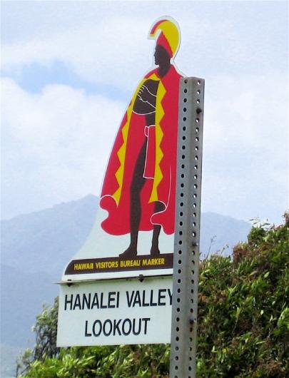
As an alternative to the colonial Hawaiian flag, the historical marker you see everywhere when touring the islands could be the basis for a new design. Although I guess that would make it harder to prevent sale of distasteful replica merch.
Alaska's flag was designed by a 13 year old native kid
This is cool!
posted by snuffleupagus at 6:47 AM on August 22, 2021 [1 favorite]
Alaska's flag was designed by a 13 year old native kid
This is cool!
posted by snuffleupagus at 6:47 AM on August 22, 2021 [1 favorite]
The argument that the California flag is problematic is absurd. If racist people liking something for non-racist reasons makes something problematic then literally every good is problematic.
posted by vorpal bunny at 7:02 AM on August 22, 2021 [4 favorites]
posted by vorpal bunny at 7:02 AM on August 22, 2021 [4 favorites]
Aren't most of the state flags from the states that were part of the Union during the Civil War supposed to be the battle standards for the states' regiments? If so, the whole "can be distinguished from a distance/easily drawable by schoolchildren" thing isn't that important.
posted by Halloween Jack at 7:06 AM on August 22, 2021
posted by Halloween Jack at 7:06 AM on August 22, 2021
If racist people liking something for non-racist reasons
No, it's non-racists liking something originally popularized by racists in ignorance of its origin.
It's a shame as I do really like the design. And all the visual puns based on it.
posted by snuffleupagus at 7:13 AM on August 22, 2021
No, it's non-racists liking something originally popularized by racists in ignorance of its origin.
It's a shame as I do really like the design. And all the visual puns based on it.
posted by snuffleupagus at 7:13 AM on August 22, 2021
41, Washington DC, is a faithful "keeping it simple" reproduction of the Washington family coat of arms. My childhood village church has the same on the tomb of Penelope, daughter of Colonel Henry Washington (civil war Royalist - awkward), from, uh, 1697 I think (different angle). We used to have a mini 4th of July celebration thing based around that tomb. There is/was apparently an earlier example of the stars and stripes in the Manor House, but that's a private residence.
More information on the family tree, though note the errata - they really need to produce an updated and fully correct version for selling to the stream of American history and flag enthusiasts who still visit.
posted by Wordshore at 7:19 AM on August 22, 2021 [2 favorites]
More information on the family tree, though note the errata - they really need to produce an updated and fully correct version for selling to the stream of American history and flag enthusiasts who still visit.
posted by Wordshore at 7:19 AM on August 22, 2021 [2 favorites]
Aside from being partial, as a Michigander, the state motto is pretty much: “Nice peninsula? You’re soaking in it!”
For the young, the non-Americans, and the otherwise puzzled, this is why that’s funny
As to the motto,
Si Quaeris Peninsulam Amoenam, Circumspice,
If you seek a pleasant peninsula, look about you
Britishers will see as a cheap rip off of Sir Christopher Wren’s epitaph (si monumentum requiris circumspice, "if you need a monument, look around", found in St. Paul's in London.
The Massachusetts state motto. Ense petit placidam sub libertate quietem, “roughly”, “freely”, translated. "By the sword we seek peace, but peace only under liberty."
Yes, well. Not quite Romanes eunt domus, but enough off for any Latin teacher to pull out the red pencil. More literally, it reads “by the sword [Massachusetts] seeks gentle peace under liberty”.
The phase itself was penned by Algernon Sydney, English politician, liberty and free speech lover, and one of the men who condemned Charles I to death in 1649 and was himself executed for treason in 1683. So when the Massachusetts rebels in 1775 were rattling swords against King George of England (not, NB, King Philip of the Wampanoag) the choice of Sydney’s words on the state seal were deliberately provocative. One suspects the words were slightly undercut by the absurdity of using this bow-legged fellow as spokesman (so to speak).
There had been an Algonquin on the 1629 seal, saying “Come and Help Us”, about which no comment. The post war redesign appears to be a mismatch at best of fiery motto (too good to lose) and - well, gentlemen, what should we use? Anyone? Mr. Bowleg lacked dignity, and though he could have been cleaned up, the part instead went to the Algonquin again, which shows inclusivity as understood at the time, that is, before times changed.
Interesting read on MA state seals over time
posted by BWA at 7:26 AM on August 22, 2021 [7 favorites]
No, it's non-racists liking something originally popularized by racists in ignorance of its origin.
If someone can explain how the flag is racist, I’d be happy to stand corrected. However, the only thing the article indicates is that the flag was supported by people who - for unrelated reasons - were also racists. The “Bear Flaggers” also probably enjoyed puppies and warm summer days. I don’t think we need to avoid those things now because those people were also racists.
posted by vorpal bunny at 7:50 AM on August 22, 2021 [2 favorites]
It says its adoption was driven by the Bear Flaggers. Thus, "Bear Flaggers?"
If someone can explain how the flag is racist
This is a close cousin of "heritage not hate." Confederates liked puppies too. Or we could go the Godwin route.
What do you think flags and heraldry are about?
posted by snuffleupagus at 8:19 AM on August 22, 2021
If someone can explain how the flag is racist
This is a close cousin of "heritage not hate." Confederates liked puppies too. Or we could go the Godwin route.
What do you think flags and heraldry are about?
posted by snuffleupagus at 8:19 AM on August 22, 2021
Good points, but the Gadsden Flag's still dead to me forever.
posted by box at 8:21 AM on August 22, 2021 [2 favorites]
posted by box at 8:21 AM on August 22, 2021 [2 favorites]
Arkansas flag just makes me think they assumed Arkansasians (arkansish, Arkansas wtf ever the demonym for then is) couldn't spell the state name.
The denonym is Ar-KAN-san.
ARK-an-san. When it comes to the state the stress is always on the first syllable and the K is in the first syllable. The Ar-KAN-san pronunciation is for someone from Arkansas City, Kansas. I’ve also heard Arkansawyers commonly used.
posted by jmauro at 8:27 AM on August 22, 2021 [2 favorites]
This is a close cousin of "heritage not hate." Confederates liked puppies too. Or we could go the Godwin route.
What do you think flags and heraldry are about?
If the California flag was adopted for racist reasons - like the bear representing white power - it would be bad. But if racists and non-racists like it for non-racist reasons, the flag is fine. The Confederate flag is bad because it is loved by racists for racist reasons.
posted by vorpal bunny at 8:44 AM on August 22, 2021
ChurchHatesTucker: More importantly, the Black & Gold was used by Maryland's Union troops (which probably prompted their Confederate counterparts to adopt the alternate symbol.)
Racism is like goddamn mold, ruins fucking everything.
posted by Kattullus at 8:51 AM on August 22, 2021 [6 favorites]
Racism is like goddamn mold, ruins fucking everything.
posted by Kattullus at 8:51 AM on August 22, 2021 [6 favorites]
South Carolina doesn't have an official standard for their flag, so they're working on it. Their first redesign proposal was rejected because they hit the palmetto tree with the ugly stick.
posted by peeedro at 9:07 AM on August 22, 2021 [2 favorites]
posted by peeedro at 9:07 AM on August 22, 2021 [2 favorites]
I've been seeing the new Mississippi flag flying more often in front of homes. I always assume it's a minor act of anti-racism signaling, and a reaction to the much larger set of pro-fascist flags you see around here on lawns, commercial properties, boats, trucks, and golf carts.
posted by RobotVoodooPower at 9:12 AM on August 22, 2021 [3 favorites]
posted by RobotVoodooPower at 9:12 AM on August 22, 2021 [3 favorites]
flags with fiddly images, fonts, and seals were getting good marks
I basically agree with that sentiment ... however ...
I found outside NYC City hall a big box containing all state flags, 2' x 3'.
I took them to a beach-side patio in Far Rockaway, and hung them all up. Immediate blowback from neighbors to take down anything with confederate imagery, so I did. I hadn't been critically evaluating them, just hung them all up, and in the shore winds the entire ensemble made a fantastic noise. But as to fussy and fiddly, Kansa kind of grew on me, "Per aspera ad astra!"
posted by StickyCarpet at 9:21 AM on August 22, 2021 [1 favorite]
The denonym is Ar-KAN-san.
ARK-an-san. When it comes to the state the stress is always on the first syllable and the K is in the first syllable. The Ar-KAN-san pronunciation is for someone from Arkansas City, Kansas. I’ve also heard Arkansawyers commonly used.
Here in Little Rock, our local tv anchors stress the ARK when they're naming the state, and the KAN (just one link, because I grew bored of watching local news clips on YouTube waiting for someone to say 'Arkansan') when they're naming the citizens.
posted by box at 9:44 AM on August 22, 2021 [3 favorites]
For the young, the non-Americans, and the otherwise puzzled, this is why that’s funny
One of the commercials so successfully mocked in a Suburban Torture by Julie Larson:
"Madge, do I smell urine?"
"You're soaking in it!"
posted by Rash at 9:50 AM on August 22, 2021 [1 favorite]
One of the commercials so successfully mocked in a Suburban Torture by Julie Larson:
"Madge, do I smell urine?"
"You're soaking in it!"
posted by Rash at 9:50 AM on August 22, 2021 [1 favorite]
If Ohio must do an unconventional shape, shouldn't it be high in the middle and round on both ends?
posted by Spathe Cadet at 12:10 PM on August 22, 2021 [11 favorites]
posted by Spathe Cadet at 12:10 PM on August 22, 2021 [11 favorites]
"I just wanna note that the pelican on the Louisiana flag is piercing her breasts to feed her babies on her blood. Which is a Christian allegory but also: how fucking metal is that?"
I thiiiiiiink the pelican ("in her piety") on the Louisiana flag comes from the coat of arms of the Archdiocese of New Orleans (it could be vice-versa, but I think that's an older coat of arms), which, yeah, is Christian allegory-y, buuuuut also makes the flag a nice callback to the history of Louisiana.
(If you didn't know, all dioceses get a coat of arms, so a city near you probably has one, which often feature callbacks to local history. Chicago's, for example, is a badass reference to the city after the Chicago fire -- a phoenix rising from the flames. But my favorite is Albany's, look at this beaver who thinks he's a bishop!)
posted by Eyebrows McGee at 12:11 PM on August 22, 2021 [8 favorites]
This disappointingly unserious go at ranking state flags has not had the desired effect of making me interested in the Discourse Blog.
Seriously, how do you rank so many phoned in "State Seal on a Blue field" flags above some objectively great flags?
posted by 3j0hn at 12:47 PM on August 22, 2021 [6 favorites]
Seriously, how do you rank so many phoned in "State Seal on a Blue field" flags above some objectively great flags?
posted by 3j0hn at 12:47 PM on August 22, 2021 [6 favorites]
look at this beaver
Aw, he thinks he's papal!
posted by bartleby at 1:04 PM on August 22, 2021 [11 favorites]
Aw, he thinks he's papal!
posted by bartleby at 1:04 PM on August 22, 2021 [11 favorites]
On the Oregon flag, the beaver is on the reverse of the flag, not the back. The front is called the obverse.
posted by Dr. Twist at 3:55 PM on August 22, 2021 [4 favorites]
posted by Dr. Twist at 3:55 PM on August 22, 2021 [4 favorites]
look at this beaver who thinks he's a bishop
Appropriate. Beavers are fish, so may be consumed during Lent, and the Greek word for fish was a coded Christian sign. The Greek word for a beaver, specifically, is κάστορας, which the Latins rendered as castor, the origin of the name castoreum by which we refer to the beaver's precious musk. Beavers therefore share a name with Castor, the wholly human brother of Pollux, son of Zeus, born through supernaturally heteropaternative superfecundation. Zeus appeared in the form of a swan; the jolly monks of Abbotsbury reportedly considered swans (although not barnacle geese) to be fish as well — but we are going astray. The castor oil plant, named after castoreum, (are you still with me?) is also known as palma christi, for its large, lobed leaves, and the reputed healing power of the oil, which means to be treated in this manner is symbolically both an anointment and a laying on of hands, the authority for which is received and transmitted by ordination, which means that beavers are a perfectly cromulent symbol of bishoprical authority.
posted by Joe in Australia at 5:59 PM on August 22, 2021 [31 favorites]
"which means that beavers are a perfectly cromulent symbol of bishoprical authority."
Yeah but it's actually a heraldic pun on the fact that Albany was originally named Beverwijck.
posted by Eyebrows McGee at 6:58 AM on August 23, 2021 [4 favorites]
Yeah but it's actually a heraldic pun on the fact that Albany was originally named Beverwijck.
posted by Eyebrows McGee at 6:58 AM on August 23, 2021 [4 favorites]
DC was robbed. 41?!?
posted by mosst at 7:20 AM on August 23, 2021 [5 favorites]
posted by mosst at 7:20 AM on August 23, 2021 [5 favorites]
Yeah but it's actually a heraldic pun on the fact that Albany was originally named Beverwijck.
Don’t ruin a perfectly good yarn with some truth!
I realize this is a dangerous position in 2021….
posted by GenjiandProust at 7:24 AM on August 23, 2021 [2 favorites]
Don’t ruin a perfectly good yarn with some truth!
I realize this is a dangerous position in 2021….
posted by GenjiandProust at 7:24 AM on August 23, 2021 [2 favorites]
I've been having some problems with the idea of pelicans having boobs, though of course they have a breast, just not breast-as-boobs. Though I suppose that's the least of this thread's issues.
posted by maxwelton at 11:11 AM on August 23, 2021 [1 favorite]
posted by maxwelton at 11:11 AM on August 23, 2021 [1 favorite]
Not the worst flag-ranking effort I've seen, but it makes the same mistake that most lists of them do, which is evaluating the flags spread out on a flat surface. How often do you ever get to see them like that?
No, a good flag should also be distinctive when hanging on a flagpole with no wind, or just a light breeze. I mean, they're flags. That's kind of their job. They go on flagpoles. And many of the US State flags really fail at that. All of the "state seal on blue background" flags—I'm looking at you guys in particular.
Successful flags by this metric would probably include Maryland (unmistakable pattern), Ohio (swallowtail shape—how do you fold that thing I wonder?), DC (strong, unique stripe pattern), American Samoa (another unique shape, strong distinct pattern on the "pole" side), Washington (unique color), New Jersey (unique color, but uglier), Texas (probably was a functional battle flag at some point), Arizona (distinctive color and shapes on the left edge), and New Mexico (mostly color, would probably be more distinctive if the Zia sun were larger).
Anyway, I am partial to this ranked list of US state flags, which uses the North American Vexillological Association's "principles of good flag design" as its guidelines for objectively ranking good and bad flags. The "Good Flag / Bad Flag" booklet (PDF) also contains some great examples of good and bad design via some obscure (and some not-so-obscure) flags. The Iroquois Confederacy one is particularly cool, while the Organization of American States? Woof.
posted by Kadin2048 at 12:40 PM on August 23, 2021 [9 favorites]
Is anyone else happy to see a long long list on only one damn page?
posted by achrise at 4:18 PM on August 23, 2021 [12 favorites]
posted by achrise at 4:18 PM on August 23, 2021 [12 favorites]
This disappointingly unserious go at ranking state flags has not had the desired effect of making me interested in the Discourse Blog.
The "desired effect" if there was any, was to add a little whimsy to someone's day and maybe even argue about something that really has no stakes because that also often adds giggles. Indeed, the title of the post is a direct quote from the article which, ya know, is at least honest. Still, I figured it would give some people a grin, at the very least.
FWIW, I've not read any of the Discourse Blog.
posted by a non mouse, a cow herd at 5:19 PM on August 23, 2021 [2 favorites]
This used to be the reverse of the Massachusetts state flag, and I'd love to see something similar for the redesign. Maybe a blue field with the tree inside a white shield?
posted by Rock Steady at 11:28 AM on August 24, 2021
.svg)
posted by Rock Steady at 11:28 AM on August 24, 2021
ALASKA!
We are very proud of our state flag; in fact, the state song is not about the state, but about how the flag represents the state. The symphony in Anchorage starts its season every year with the song and everyone in the audience stands and sings and knows the words. I teach my orchestra students the flag song every year (and usually skip the Star-Spangled Banner).
I am proud of very little else about Alaska that's not its natural beauty, abundance of outdoor activities , and ludicrously relaxed dress code, but the song is (relatively speaking), a jam, and I'll defend the flag to my grave.
posted by charmedimsure at 1:36 PM on August 24, 2021 [5 favorites]
Maryland's flag is ugly but I can totally believe that it used to be the standard of some 17th century nobleman.
Not feeling any of the various 'blue background with a complicated thing in the middle' ones.
Why does Hawaii have a union jack? I don't think it's ever been under British rule?
Alabama gets a little side-eye but it passes the 'looks like a proper flag' test.
I respect Ohio's willingness to experiment with the form.
If you are going to do a seal, I think Missouri does it well.
Actively good flags not mentioned: Tennessee, DC, Indiana, California, Texas, Colorado, Arizona, Puerto Rico, New Mexico, Alaska.
posted by Urtylug at 5:01 PM on August 24, 2021 [2 favorites]
I am not sure why RI’s flag gets such little respect. It aces those 5 flag rules, except for lettering, which it keeps to 4 letters. People seem to like Indiana’s, which looks like they were going for the same general idea, dropped the torch and stars in the process, and said “eh, good enough.” It’s miles ahead of the Blue-Backgound-and-Seal gang. Also, Colorado’s looks like the logo of an 80s computer company, and Washington’s looks like the sign off at the end of a cartoon.
posted by GenjiandProust at 3:15 AM on August 25, 2021 [1 favorite]
posted by GenjiandProust at 3:15 AM on August 25, 2021 [1 favorite]
Why does Hawaii have a union jack? I don't think it's ever been under British rule?
As Hawaii Magazine has it, Kamehameha flew a union jack given to him by King George as a sign of their friendship. When flags became a source of contention between his English and American courtiers during the war of 1812 he adopted a flag combining elements of the British and American flags that was reportedly designed by a Royal Navy man.
The article goes on to discuss a proposal for a native flag based on one destroyed by the British during the Paulet affair.
posted by snuffleupagus at 4:02 AM on August 25, 2021 [1 favorite]
supernaturally heteropaternative superfecundation
Even though the sound of it
Fills some with indignation
posted by rory at 5:23 AM on August 25, 2021 [8 favorites]
Even though the sound of it
Fills some with indignation
posted by rory at 5:23 AM on August 25, 2021 [8 favorites]
« Older Flowers for teenage panic attacks | Merrily We Roll Along Newer »
This thread has been archived and is closed to new comments
posted by qxntpqbbbqxl at 2:19 PM on August 21, 2021 [7 favorites]