The Clinch Still Looms Large in the Public Imagination
February 10, 2023 2:45 PM Subscribe
The seventies ushered in the era of the clinch—arguably the most iconic and easily recognizable genre cover in publishing—and it reached its peak in the eighties. A clinch cover features a couple embracing or close to embracing. One or both partners typically have exposed skin and long, flowing locks. This cover type exemplifies the sweeping emotions between the pair around whom the central narrative is based. Other clinch cover characteristics include cursive or stylized fonts for the title and author name and a background or object meant to be representative of the story. The clinch cover embraced design excess and its roots in pulp illustration. These designs play into the public’s idea of the books selling sexuality as uncontrollable desire, says Dr. Kamble, eliciting an almost puritanical societal response. from A Brief History of the Clinch
Love Letter to Clinch Covers by Amalie Howard
The Origin of the Romance Novel Clinch Covers
The Clinch
Books With Clinch Covers
Love Letter to Clinch Covers by Amalie Howard
The Origin of the Romance Novel Clinch Covers
The Clinch
Books With Clinch Covers
That second one is a bit...unusual for the genre, I think. They look like they are essentially mid-[redacted] already, whereas I think of the clinch as the "they are just about to...!!!"
posted by praemunire at 3:14 PM on February 10, 2023 [1 favorite]
posted by praemunire at 3:14 PM on February 10, 2023 [1 favorite]
Thanks for the post! Another great site to check out for clinch covers and artist information is Sweet Savage Flame, run by author Jacqueline Diaz.
I've been fascinated by clinch romance covers since I was little, since I saw the illustrated stories in my mother's Good Housekeepings (they used to have romance inserts illustrated by Robert Sabin, among others). Around 1987 or so, I was taken to a used bookstore, run by an eccentric old man in downtown Renton, WA, which had an entire room where a sign reading "bodice rippers" was posted. My parents thought it was hilarious, but I thought it was a wonderland of fun, amazing artwork. Balls! Lavish gowns! Sexy ballerinas! Georgian rakes! I loved all of it.
So I became determined to become a traditional romance illustrator, even though they were only hiring digital artists by the time I got into college, and by the time I was working in the field they weren't even hiring those any more. But I persisted. I haven't done many covers, mostly frontispieces for authors Jackie Barbosa and Lauren Smith (and the few covers I did were more genteel Regency-set works), but I finally have a new actual romance cover out. And there's more to come too! Actual old school clinch stuff this time too!! I can't wait.
posted by suburbanbeatnik at 3:28 PM on February 10, 2023 [45 favorites]
suburbanbeatnik: how wonderful! Thank you for your service!
It's a shame that this is one more place where work by a skilled professional has been replaced by thrown-together clip art, largely from Canva.
Still, I couldn't love the covers when they were around. For one thing, they were, and are, radiantly embarrassing, at least if you are young and have layers of shame around reading that sort of thing (either for feminist reasons or patriarchal reasons, or a confused mix of both). In fact, it took the invention of the Kindle app for me to actually read romance novels at all. And for another thing, they seemed thoroughly hollow and false in a way that the cover paintings of lurid fantasy novels were not. Of course, I knew that Drizzt Do'Urden and so forth weren't real, but they weren't outright lies about life.
posted by Countess Elena at 3:30 PM on February 10, 2023 [2 favorites]
"Bring back the oil paintings that fuck," I have to agree. Though the historical accuracy of the costumes portrayed was always iffy, but who cares, hot naked people embracing is a good thing.
But I get that the cartoony covers are less embarrassing, a form of plain brown wrapper.
Honestly I buy fluffy stuff like romance as ebooks, so it's moot. I'd still be delighted to see a clinch in them though.
posted by emjaybee at 3:35 PM on February 10, 2023 [1 favorite]
But I get that the cartoony covers are less embarrassing, a form of plain brown wrapper.
Honestly I buy fluffy stuff like romance as ebooks, so it's moot. I'd still be delighted to see a clinch in them though.
posted by emjaybee at 3:35 PM on February 10, 2023 [1 favorite]
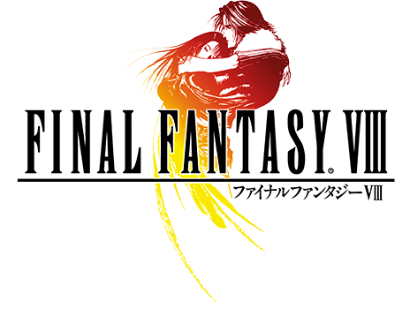
See also album covers.
And video game logos.
posted by NoxAeternum at 4:10 PM on February 10, 2023 [2 favorites]
And video game logos.
posted by NoxAeternum at 4:10 PM on February 10, 2023 [2 favorites]
The apogee is the mutual swooning embrace of a man, a woman, and a horse, all with flowing hair.
posted by clew at 4:25 PM on February 10, 2023 [5 favorites]
posted by clew at 4:25 PM on February 10, 2023 [5 favorites]
> "The apogee is the mutual swooning embrace of a man, a woman, and a horse"
Done and done.
posted by kyrademon at 4:58 PM on February 10, 2023 [4 favorites]
Done and done.
posted by kyrademon at 4:58 PM on February 10, 2023 [4 favorites]
These are fascinating links. The second-to-last one ("The Clinch") ended with a really interesting discussion of some of the newest covers which are allowing crossover into the general fiction section, and the pluses and minuses that come with that.
posted by Dip Flash at 5:18 PM on February 10, 2023 [1 favorite]
posted by Dip Flash at 5:18 PM on February 10, 2023 [1 favorite]
I was intrigued to find out that unlike other genres, romance covers have semi-codified signifiers that spell out what you can expect from the book, content wise.
The Clinchlink gets into some of the mechanics:
“When I see a bare-chested man like maybe his face isn’t even in the shot, it’s just torso. I know that it’s going to be a fairly steamy romance,” says Nichole Perkins, “and if it’s like a blue background, the hero is some kind of law enforcement or military person. And then green background or a yellow background then I know there is probably going to be some sort of paranormal element to it. Like maybe he’s some kind of werewolf or weretiger.”posted by zamboni at 5:42 PM on February 10, 2023 [5 favorites]
And, as for signifiers, if you see an exposed tattoo, nightbird, bat or cat, it's gonna be EDGY.
posted by abraxasaxarba at 6:21 PM on February 10, 2023 [3 favorites]
posted by abraxasaxarba at 6:21 PM on February 10, 2023 [3 favorites]
Robert McGinnis also painted many of the iconic posters for theJames Bond movies. A lot of his work can be seen on the pulpcovers.com blog.
A high school friend of mine made a decent living for a while painting romance novel covers. Not sure if she’s still in the business.
posted by The Underpants Monster at 6:41 PM on February 10, 2023 [1 favorite]
A high school friend of mine made a decent living for a while painting romance novel covers. Not sure if she’s still in the business.
posted by The Underpants Monster at 6:41 PM on February 10, 2023 [1 favorite]
I always loved this one (bottom cover).
posted by joannemerriam at 7:04 PM on February 10, 2023 [2 favorites]
posted by joannemerriam at 7:04 PM on February 10, 2023 [2 favorites]
But I get that the cartoony covers are less embarrassing, a form of plain brown wrapper.
One might think that walking around with Reylo fanart would be slightly more embarrassing.
My theory is that the cartoon covers are popular because they look better on a kindle lockscreen than sexy oil paintings.
posted by betweenthebars at 7:12 PM on February 10, 2023 [2 favorites]
One might think that walking around with Reylo fanart would be slightly more embarrassing.
My theory is that the cartoon covers are popular because they look better on a kindle lockscreen than sexy oil paintings.
posted by betweenthebars at 7:12 PM on February 10, 2023 [2 favorites]
This week I made a cover for a paranormal romance writer client that features a winged wolf shooting lightning out of its eyes. It’s time like this, and also times when I’m paging through thousands of stock photos of shirtless men, that I occasionally have to stop, look off into the distance for a while, and say to myself “It’s a tough job, but someone’s got to do it.”
posted by telophase at 8:24 PM on February 10, 2023 [10 favorites]
posted by telophase at 8:24 PM on February 10, 2023 [10 favorites]
"I thought it was a wonderland of fun, amazing artwork. Balls! Lavish gowns! Sexy ballerinas!"
More bulges than actual balls, surely?
posted by Paul Slade at 11:10 PM on February 10, 2023 [2 favorites]
More bulges than actual balls, surely?
posted by Paul Slade at 11:10 PM on February 10, 2023 [2 favorites]
If your tastes run towards the gothic, you may also enjoy these DC horror comics covers from the 1970s. Neal Adams and Nick Cardy both turned out dozens of these.
posted by Paul Slade at 11:23 PM on February 10, 2023 [2 favorites]
posted by Paul Slade at 11:23 PM on February 10, 2023 [2 favorites]
No I mean actual balls, as illustrated for the cover of Silks and Sabers by the wonderful Elaine Gignilliat. (There's more information about her at the Sweet Savage Flame page.)
posted by suburbanbeatnik at 12:55 AM on February 11, 2023 [1 favorite]
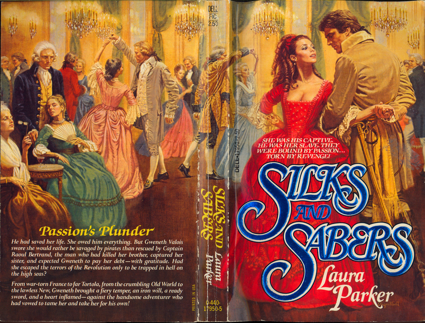
posted by suburbanbeatnik at 12:55 AM on February 11, 2023 [1 favorite]
Joannemerriam, the original artist for Lady Vixen is none other than the legendary H. Tom Hall. He was incredibly prolific and versatile, hopping from genre from genre. Besides his work for early romance authors, he did covers for tons of books, from gothic horror to historical fiction. One example is Marilyn Harris's Bledding Sorrow; another is Colleen McCullough's First Man in Rome.
posted by suburbanbeatnik at 1:12 AM on February 11, 2023 [2 favorites]
posted by suburbanbeatnik at 1:12 AM on February 11, 2023 [2 favorites]
No I mean actual balls,
It was once said of a (probably apocryphal) British aristocrat that she'd held some of the biggest balls in Europe.
I will now stop lowering the tone.
posted by Paul Slade at 1:37 AM on February 11, 2023 [5 favorites]
It was once said of a (probably apocryphal) British aristocrat that she'd held some of the biggest balls in Europe.
I will now stop lowering the tone.
posted by Paul Slade at 1:37 AM on February 11, 2023 [5 favorites]
suburbanbeatnik, that's really cool. Thanks! Interesting that he also did the cover for Interview with a Vampire which is basically a clinch cover.
posted by joannemerriam at 12:53 PM on February 11, 2023 [2 favorites]
posted by joannemerriam at 12:53 PM on February 11, 2023 [2 favorites]
But strictly a Gothic, viz. a man, a woman, and his house.
posted by clew at 6:26 PM on February 11, 2023 [1 favorite]
posted by clew at 6:26 PM on February 11, 2023 [1 favorite]
« Older Coregraterold Authathlike Licile Spokshariation... | When Did Hospitality Get So Hostile? Newer »
This thread has been archived and is closed to new comments
posted by Paul Slade at 3:00 PM on February 10, 2023 [6 favorites]