Best and worst U.S. city flags
October 8, 2004 5:06 PM Subscribe
My favorites were the ultra-cool seventies designs from Texas: Arlington and Plano.
posted by mr_roboto at 5:51 PM on October 8, 2004
posted by mr_roboto at 5:51 PM on October 8, 2004
That Provo one is great-- looks like a Vitamin or Cereal label.
posted by cell divide at 5:57 PM on October 8, 2004
posted by cell divide at 5:57 PM on October 8, 2004
I lived in Tampa for 3 and a half years and never realized its flag was so asstastic.
posted by contessa at 5:58 PM on October 8, 2004
posted by contessa at 5:58 PM on October 8, 2004
I'm kind of frightened of Wichita's flag. Sure, it's cool and all, but doesn't it remind anyone else of the scary flags of Evil Invading Aliens from 1950s science-fiction movies?
And is anyone else disturbed that the Seattle flag bears an astonishingly close resemblance to the Starbucks logo? Coincidence? I think not.
That Pocatello flag was clearly designed by a committee.
"Well, we need the mountains, yep. And that "Proud to be Pocatello" slogan--that's a must. And don't forget the trademark symbol. And the copyright information. And those little red horizontal lines that Bill's so crazy about..."
posted by Sidhedevil at 6:07 PM on October 8, 2004
Also, the respondents seem to me to be way too biased against the tried-and-true "superimpose the 19th-century city seal on a white or blue background" solution. No way that Boston's perfectly reasonable, if a little staid and boring, flag should be #133 while that Tampa abomination is #75.
It's an outrage, I tells ya! An outrage!
posted by Sidhedevil at 6:10 PM on October 8, 2004
It's an outrage, I tells ya! An outrage!
posted by Sidhedevil at 6:10 PM on October 8, 2004
A general rule seems to be "if it belongs on a NASCAR vehicle, it's not a proper flag".
posted by clevershark at 8:09 PM on October 8, 2004
posted by clevershark at 8:09 PM on October 8, 2004
> Simple Check
> Meaningful Symbolism Check
> Use 2–3 Basic Colors Check
> No Lettering or Seals Check
> Be Distinctive or Be Related Check
I nominate Tuktoyaktuk, North West Territories.
(Slight off topic. I like how the old Colorado Rockies jersey was essentially the state flag.)
posted by philfromhavelock at 8:37 PM on October 8, 2004
The seal idea is bad -- not necessarily aesthetically, but medium-wise -- because it's not readable from a distance or from both sides, wears out easily, is expensive, etc.
posted by Tlogmer at 8:57 PM on October 8, 2004
posted by Tlogmer at 8:57 PM on October 8, 2004
Even though it's ranked low, I like the flag for Provo -- it looks like it should be on an antacid bottle.
posted by Robot Johnny at 9:54 PM on October 8, 2004
posted by Robot Johnny at 9:54 PM on October 8, 2004
The Second City . . . AGAIN!! We're so much more attractive than those vexillologists think we are. Damn you DC!! Your flag is but a malformed clone of ours!
posted by aladfar at 10:37 PM on October 8, 2004
posted by aladfar at 10:37 PM on October 8, 2004
Is that guy in Tuktovaktuk playing tennis in the snow? Or is he trying to conduct a non-existant orchestra? I knew we had tar sands, but, uhhh, I don't think they look great on a flag. At least the tennis conductor is wearing an appropriate jacket, but, uhhh, those pants don't look right. That and him stepping into tar sands. Yuck.
Man, we let these new territories make their own flags and they come up with that. Yikes.
BTW: Does anyone else think that Toronto's flag is depicting someone wearing a blue outfit, with an open fly, using a maple leaf to cover up the family jewels?
posted by shepd at 12:49 AM on October 9, 2004
Man, we let these new territories make their own flags and they come up with that. Yikes.
BTW: Does anyone else think that Toronto's flag is depicting someone wearing a blue outfit, with an open fly, using a maple leaf to cover up the family jewels?
posted by shepd at 12:49 AM on October 9, 2004
Arlington's flag looks like a beer label. I lived in Colorado Springs for 25 years and never knew there was a city flag. In Denver, however, you can't miss the flag, as there is a little bitty flag emblazoned on every street sign in Denver proper. A lot of the Denver metro area cities have logos of the city on the street signs. Most of them are some sort of stylized version of the first letter in the city's name-- the rest are mystifying and random.
posted by Shoeburyness at 3:13 AM on October 9, 2004
posted by Shoeburyness at 3:13 AM on October 9, 2004
Oops, I meant Lubbock's flag looks like a beer label. Arlington's looks like a corporate logo from the '70s.
posted by Shoeburyness at 3:17 AM on October 9, 2004
posted by Shoeburyness at 3:17 AM on October 9, 2004
It was nice to see the Austin coat of arms again.
The Milwaukee flag is a little busy for a flag -- it might make a nice collage, but a flag's imagery ought to be simpler, more direct and powerful, I think.
posted by alumshubby at 5:57 AM on October 9, 2004
The Milwaukee flag is a little busy for a flag -- it might make a nice collage, but a flag's imagery ought to be simpler, more direct and powerful, I think.
posted by alumshubby at 5:57 AM on October 9, 2004
aladfar: I think the Chicago flag's design is better than DC's; and in any case the rankings aren't really statistically stable or methodologically precise.
On the whole, though, it's very on the mark. The city seal on a blue b/g is almost always a bad idea -- you can't "read" them in use or from a distance.
P.S. Disclosure: I was formerly in the flag business.
posted by lathrop at 8:02 AM on October 9, 2004
On the whole, though, it's very on the mark. The city seal on a blue b/g is almost always a bad idea -- you can't "read" them in use or from a distance.
P.S. Disclosure: I was formerly in the flag business.
posted by lathrop at 8:02 AM on October 9, 2004
That St. Louis flag is kind of cool. I guess I never noticed it before but I guess those ribbons are meant to symbolize the confluence of the Missouri and the Mississippi rivers.

posted by psmealey at 8:40 AM on October 9, 2004
posted by psmealey at 8:40 AM on October 9, 2004
I've always been disappointed in Minneapolis:

1950's seventh-grade textbook, or Devo album cover logo? You decide.
posted by gimonca at 2:40 PM on October 9, 2004
1950's seventh-grade textbook, or Devo album cover logo? You decide.
posted by gimonca at 2:40 PM on October 9, 2004
What the hell? Since when does Seattle have a flag? I've never seen that design anywhere before. Where do they get these things from? And why does a city need a flag in the first place?
posted by Mars Saxman at 3:19 PM on October 9, 2004
posted by Mars Saxman at 3:19 PM on October 9, 2004
Mars, that's what I said. I'd never seen it before either, and I lived and walked by the Municipal Building every day for 2.5 years.
It definitely looks like they redesigned it about the same time they redid the Seahawks' uniforms. Maybe the designer threw the flag in as a part of the deal.
posted by psmealey at 3:58 PM on October 9, 2004
It definitely looks like they redesigned it about the same time they redid the Seahawks' uniforms. Maybe the designer threw the flag in as a part of the deal.
posted by psmealey at 3:58 PM on October 9, 2004
Some of these (Glendale AZ, Pocatello) don't look like flags at all -- they're just logos that somebody printed on fabric and ran up a pole.
Anyway, there aren't many cities that actively use their flags. Chicago and DC are the only ones here I can remember ever seeing -- if New York used theirs, you *know* it would have come up in the whole anti-French movement. Instead, you'd be forgiven if you thought the NYC flag was the NYPD & FDNY emblems on a navy blue background.
posted by me3dia at 5:19 PM on October 9, 2004
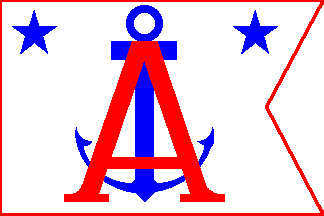
I rather like the straightforward design of the Alameda flag, except for the weird blue-white inversion thing, although it's more common to see the yacht club's version than the official city flag.
The San Francisco flag looks perfectly lovely when flown adjascent to California's bear and star, which is one of my favorite flags.
posted by majick at 7:45 PM on October 9, 2004
The San Francisco flag looks perfectly lovely when flown adjascent to California's bear and star, which is one of my favorite flags.
posted by majick at 7:45 PM on October 9, 2004
Problem with the NYC flag shown here is that it's depicted with non web safe colors. It's not the blue, le blanc, le rouge as others have cited... it's blue, white and orange... you know, Knicks and Mets colors.
posted by psmealey at 8:08 PM on October 9, 2004
posted by psmealey at 8:08 PM on October 9, 2004
In your face Rapids City!
When I clicked the link, I knew Milwaukee would be near the bottom. The funny thing is, the city had a contest to redesign the flag a little while ago. One of the winning entries was the basic idea I had, but I think the city decided to stick with what it's got.
posted by drezdn at 5:01 PM on October 10, 2004
« Older SciSiteFilter | Wangari Maathai Newer »
This thread has been archived and is closed to new comments
Denver
And from the bottom:
Provo
posted by Tlogmer at 5:10 PM on October 8, 2004