A Really Big Show
June 5, 2007 1:55 PM Subscribe
A warning about the automatic audio would be nice k thx.
posted by TheNewWazoo at 2:03 PM on June 5, 2007
posted by TheNewWazoo at 2:03 PM on June 5, 2007
Absolutely fascinating.
posted by Pope Guilty at 2:27 PM on June 5, 2007
posted by Pope Guilty at 2:27 PM on June 5, 2007
I both really like and really dislike this style at the same time.
posted by 517 at 2:28 PM on June 5, 2007
posted by 517 at 2:28 PM on June 5, 2007
The first tilt-shift shot had me thinking he was going to start talking about miniatures for some reason. It really is a striking technique, and pretty appallingly simple.
posted by cortex at 2:32 PM on June 5, 2007
posted by cortex at 2:32 PM on June 5, 2007
Cool stuff, thanks CE!
posted by doctor_negative at 2:32 PM on June 5, 2007
posted by doctor_negative at 2:32 PM on June 5, 2007
The most recent, IIRC, issue of Make Magazine tells how to make a tilt-shift lens.
posted by drezdn at 2:38 PM on June 5, 2007
posted by drezdn at 2:38 PM on June 5, 2007
This thread is useless without pictures of pole vaulting.
posted by UbuRoivas at 2:41 PM on June 5, 2007
posted by UbuRoivas at 2:41 PM on June 5, 2007
I felt the same way cortex: these look like photos of tiny toys. It's not just how the focus is broader, but something about the quality of the lighting - as if there was a giant lamp over the whole thing.
I can't say that I like the photos. They're so detached. But very interesting.
posted by serazin at 2:43 PM on June 5, 2007
I can't say that I like the photos. They're so detached. But very interesting.
posted by serazin at 2:43 PM on June 5, 2007
Flipping through the magazine on Sunday, I never even thought about how it was done. I just thought the photos were beautiful.
Thanks for the links!
posted by gummi at 2:45 PM on June 5, 2007
Thanks for the links!
posted by gummi at 2:45 PM on June 5, 2007
I wonder why he never contacted Goodyear or any of the other organizations who fly blimps over sporting events. (They still do that, don't they?)
posted by Dave Faris at 2:49 PM on June 5, 2007
posted by Dave Faris at 2:49 PM on June 5, 2007
Seconding the need for a warning about the audio. I opened a new tab in the background, and the unexpected audio scared the crap out of me.
posted by desjardins at 2:52 PM on June 5, 2007
posted by desjardins at 2:52 PM on June 5, 2007
I personally like the tilt-shift aerial photos of cities and landmarks better -- the effect is more striking; more toy-like. That said, the shot of Sharapova winning the the U.S. Open is awesome.
Oh, and he did not take the World Series pictures at Tiger Stadium. He took them at Comerica Park. Tiger Stadium slowly disintigrates two miles away at the corner of Michigan and Trumbull. It hasn't seen a baseball game since 1999.
posted by pardonyou? at 2:54 PM on June 5, 2007
Oh, and he did not take the World Series pictures at Tiger Stadium. He took them at Comerica Park. Tiger Stadium slowly disintigrates two miles away at the corner of Michigan and Trumbull. It hasn't seen a baseball game since 1999.
posted by pardonyou? at 2:54 PM on June 5, 2007
I really wanted to watch this, but I couldn't turn his voice off, and then when I went to hit mute, several things in my system tray had been shut down. I hate irritating crap like that. Why do people do shit like that?
posted by Eekacat at 2:57 PM on June 5, 2007
posted by Eekacat at 2:57 PM on June 5, 2007
Jesus, embedded audio with no volume controls save those on your actual machine has to be the most annoying thing on the face of the planet.
nthing the WARNING PLS K THX on that score.
posted by scrump at 3:07 PM on June 5, 2007
nthing the WARNING PLS K THX on that score.
posted by scrump at 3:07 PM on June 5, 2007
I wish I'd read the comments (as I usually do) before opening this. I too am nthing the request for warning about the audio. Anyway, great photos, really quite surreal like he had an intricate arrangement of tiny figurines and stadiums (the surfing ones do look so strange but then there's no stadium + 1000's of people to compare the figure to).
posted by ob at 3:19 PM on June 5, 2007
posted by ob at 3:19 PM on June 5, 2007
I never got to the audio. I gave up when the site resized my browser window, and it looked like it was all in a flash interface.
Useless arrogant fucking photographers. Links to JPGs, please.
posted by Jimbob at 3:50 PM on June 5, 2007
Useless arrogant fucking photographers. Links to JPGs, please.
posted by Jimbob at 3:50 PM on June 5, 2007
Absolutely fascinating. Amazing that it hasn't been done to death.
My first reaction was that they look like models and it's primarily the shallow depth of field that creates this optical illusion; macro photography has such a small range that is in focus that the same effect causes the eye to be fooled slightly. Quite a strange, almost uncanny effect.
posted by Kiell at 3:57 PM on June 5, 2007
Regarding the Wikipedia entry: when I read things like Miniature faking... can be done using the technique. This was popular in the early years of the twenty-first century it reminds me why it's sometimes hard to take Wikipedia seriously.
posted by QuietDesperation at 4:15 PM on June 5, 2007
posted by QuietDesperation at 4:15 PM on June 5, 2007
I'm surprised the photographer hadn't seen others doing tilt-shift recently. It's been all over the internet:
Top Left Pixel did architectural
photos in 2006. Boing Boing has shown them, too.
And Flicker is loaded with them.
posted by jjj606 at 4:17 PM on June 5, 2007
Top Left Pixel did architectural
photos in 2006. Boing Boing has shown them, too.
And Flicker is loaded with them.
posted by jjj606 at 4:17 PM on June 5, 2007
So, what happens when you shoot a tiny model using this same lens?
posted by notmydesk at 4:18 PM on June 5, 2007
posted by notmydesk at 4:18 PM on June 5, 2007
If you grab the slider on the bottom you can more quickly jump to a different picture Jimbob.
There was a post a while back here on MeFi where someone explained a simple way of doing this trick in Photoshop. Essentially it involved applying a blur to the bottom of the image and another one to the top.
It was a maddeningly clever idea. Can't find the link though. (And of course, I know it's much more impressive to do it all in camera.)
posted by quin at 4:22 PM on June 5, 2007
@quin: Creating Fake Miniature Environments
posted by desjardins at 4:51 PM on June 5, 2007 [1 favorite]
posted by desjardins at 4:51 PM on June 5, 2007 [1 favorite]
PLEASE WARN WHEN SOUND COMING
posted by humannaire at 4:59 PM on June 5, 2007
posted by humannaire at 4:59 PM on June 5, 2007
Well, here's how to do it in The Gimp, quin. And it can work well, but I have to admit (after biting the bullet and looking through this photograher's photos) that the real thing does look better, because the out-of-focus parts have that real bokeh len-out-of-focus look, rather than just a simple blur. The Superbowl photo, in particular, look excellent.
posted by Jimbob at 5:07 PM on June 5, 2007
posted by Jimbob at 5:07 PM on June 5, 2007
And Flicker is loaded with them
Guilty as charged.
There's no beating the real deal, though. Thanks for showing this, chunking express.
posted by CitrusFreak12 at 5:18 PM on June 5, 2007
Guilty as charged.
There's no beating the real deal, though. Thanks for showing this, chunking express.
posted by CitrusFreak12 at 5:18 PM on June 5, 2007
bah - get out there on that helicopter with your 5x4 like a real man !
posted by sgt.serenity at 6:23 PM on June 5, 2007 [1 favorite]
posted by sgt.serenity at 6:23 PM on June 5, 2007 [1 favorite]
The tilt shift affect appears to be a byproduct of our learned familiarity with the narrow focal range of macro photography. We are used to pictures like that, but only of small things. Tilt shift photography reminds me of model railroads. I like it.
posted by Area Control at 6:49 PM on June 5, 2007
posted by Area Control at 6:49 PM on June 5, 2007
God, the fake tilt-shift effect is almost as bad as the tacky over-emphasized bracketed-exposure faux-HDR effect that plagues flickr.
posted by blasdelf at 6:51 PM on June 5, 2007
posted by blasdelf at 6:51 PM on June 5, 2007
Sorry about the lack of audio warning: I don't have any sound at work, which is where I saw this first; I didn't realize there was sound of the page.
posted by chunking express at 8:04 PM on June 5, 2007
posted by chunking express at 8:04 PM on June 5, 2007
blasdelf, this is done with real tilt-shift lenses, so I'm not sure what makes it 'fake'.
posted by chunking express at 8:05 PM on June 5, 2007
posted by chunking express at 8:05 PM on June 5, 2007
Chunking: I assume he is referring to the links posted in the comments about how to emulate it, as well as my own attempts at achieving the look that I linked to in my comment.
Blasdelf: I hear you on the over emphasized HDR thing but... faux-HDR? Wazzat?
posted by CitrusFreak12 at 8:08 PM on June 5, 2007
Blasdelf: I hear you on the over emphasized HDR thing but... faux-HDR? Wazzat?
posted by CitrusFreak12 at 8:08 PM on June 5, 2007
picnik.com (an online photo editor) has faus-HDR as an effect option Citrus...
posted by acro at 8:26 PM on June 5, 2007
posted by acro at 8:26 PM on June 5, 2007
Oh GOD, acro. Thank you for showing me that. That is hideously inaccurate. HDR photos should look like normal photos, but only slightly different, if you know how to do it properly.
People whose HDR photos look like that is like somone doing needlepoint with a railroad spike.
I can't believe anyone would want to emulate that.
posted by CitrusFreak12 at 8:52 PM on June 5, 2007
People whose HDR photos look like that is like somone doing needlepoint with a railroad spike.
I can't believe anyone would want to emulate that.
posted by CitrusFreak12 at 8:52 PM on June 5, 2007
Well as people above have pointed out, I can't understand 99% of the uses of HDR.
I do understand what it might be good for. The big example is taking a picture inside a house, with a brightly-lit window in the room. With a normal photograph, you could either take a short exposure, where you'll be able to see the garden outside the window but the room will be underexposed, or you can take a long exposure so you can see the detail in the dim room, but the garden through the window will be overexposed. HDR lets you make both the garden through the window and the inside of the room visible in your photograph.
Unfortunately, now that there's some simple software out there to combine photos with multiple exposures, people are using it for everything. Photo of a car's dashboard? HDR! Photo of a tram on a street? HDR! Photo of a house in a forest? HDR! Photo of a cat? HDR! Photo of clouds and a sunset? HDR!
Ironically, HDR suggest to me "increased contrast"... infact, all the photos just come out lacking in contrast, being a uniform mid-tone with unrealistic saturation. I don't see what's so fantastic about it.
posted by Jimbob at 9:07 PM on June 5, 2007 [1 favorite]
Ironically, HDR suggest to me "increased contrast"... infact, all the photos just come out lacking in contrast, being a uniform mid-tone with unrealistic saturation. I don't see what's so fantastic about it.
It's all in the tonemapping.
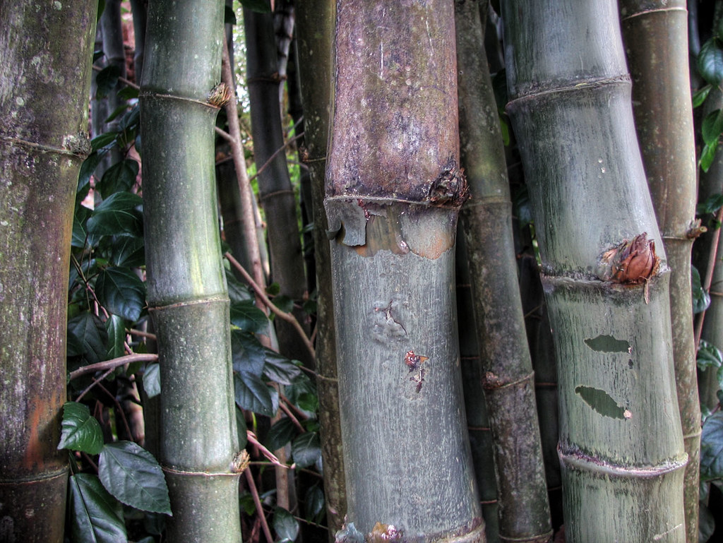
It can be useful in night photography*, I've noticed. Pretty much any situation where you have a lot of low light but still want to capture a lot of detail. Your eye can do it, but your camera, not so much. Another good example I think is this bamboo photo. That's how it looked when I saw it, so I tried to recreate the same look with my camera.
The problem is when people like those you linked to think the selling point of a photo is the fact that it is HDR. I could take an HDR photo of my foot right now, and it wouldn't be good, but I certainly wouldn't try and make it good by slapping HDR in the title. At the very most, I put an HDR tag solely to make searching for them in situations like this easier.
*I feel like I've been flickr whoring all day, so I've just going to link to the jpgs instead of the photo page :P.
posted by CitrusFreak12 at 9:22 PM on June 5, 2007 [1 favorite]
It's all in the tonemapping.
It can be useful in night photography*, I've noticed. Pretty much any situation where you have a lot of low light but still want to capture a lot of detail. Your eye can do it, but your camera, not so much. Another good example I think is this bamboo photo. That's how it looked when I saw it, so I tried to recreate the same look with my camera.
The problem is when people like those you linked to think the selling point of a photo is the fact that it is HDR. I could take an HDR photo of my foot right now, and it wouldn't be good, but I certainly wouldn't try and make it good by slapping HDR in the title. At the very most, I put an HDR tag solely to make searching for them in situations like this easier.
*I feel like I've been flickr whoring all day, so I've just going to link to the jpgs instead of the photo page :P.
posted by CitrusFreak12 at 9:22 PM on June 5, 2007 [1 favorite]
The fake tilt-shift effect I'm hating on is the one done by blurring photos taken with a normal lens. To me it doesn't look particularly macro-lensed when you do that. It looks like you crapped on it in photoshop, or at best in the enlarger.
Ironically, HDR suggest to me "increased contrast"... infact, all the photos just come out lacking in contrast, being a uniform mid-tone with unrealistic saturation. I don't see what's so fantastic about it.
Exactly -- the photos the flickrtards fawn over have little or no dynamic range -- they're fucking grey fog + bloom.
posted by blasdelf at 10:14 PM on June 5, 2007
Yeah those two examples you link to are fairly decent uses of HDR, CitrusFreak12.
posted by Jimbob at 10:21 PM on June 5, 2007
posted by Jimbob at 10:21 PM on June 5, 2007
I think an unappreciated use for HDR is when you are trying to make a photo look like an illustration, or producing a faux-painting. Many painters see a green hill, so paint a green hill, see a blue sky, so paint a blue sky, whereas a camera (or a different painter) produces a silhouette and sky.
I find it striking how many examples of bad HDR could, with a different emphasis and some processing, gain respect as not-so-bad illustrations. :)
posted by -harlequin- at 12:02 AM on June 6, 2007
I find it striking how many examples of bad HDR could, with a different emphasis and some processing, gain respect as not-so-bad illustrations. :)
posted by -harlequin- at 12:02 AM on June 6, 2007
Ironically, HDR suggest to me "increased contrast"... infact, all the photos just come out lacking in contrast, being a uniform mid-tone with unrealistic saturation. I don't see what's so fantastic about it.
No, that's not how HDR works, at least not really. Film (and digital) has a very narrow range of exposure. The human eye has a much, much greater range. So a "normal" sunny day to a human is either over-exposed-sky or under-exposed-foreground to film. Then there's the fact that the human eye can change its aperture on-the-fly, constantly adjusting for darker or brighter environments. A still picture doesn't have that luxury.
So your choices are either to photograph extremely narrow contrast ranges (can you say "sunrise and sunset"?) or fake it. There are about a million ways to fake it, but the principle is the same: compress the exposure range. Multiple exposures can be combined digitally, or you can try using a graduated neutral-density filter if you want to Keep It Real. Either way you're altering the image.
Also, tilt-shifts are the bees-knees. Sadly, Nikon only offers one (real) T/S lens. Of course, very-large-format cameras (view cameras, etc.) have had to deal with the whole "getting your perpendicular" problem a hundred years ago. That surf shot probably would have been a lot more difficult, though.
posted by Civil_Disobedient at 5:23 AM on June 6, 2007
Also, most of my (IMHO, valid) criticism of HDR stems from one of two problems:
- The idiot set his black-point way too high (for example)
- The idiot tried to blend objects in front of the sun and the blends look like shit (for example... I mean just look at those fucking ugly leaves on the tree. Christ.)
Nice foreground:: sky too dark e.g.
The weird skies in these 'fake hdr' shots is a result of skipping the use of a mirrored sphere or 'light probe'
posted by acro at 6:10 AM on June 6, 2007
The weird skies in these 'fake hdr' shots is a result of skipping the use of a mirrored sphere or 'light probe'
posted by acro at 6:10 AM on June 6, 2007
DIY with a lensbaby. A bellows based tilt /shift lens for your SLR.
posted by Gungho at 6:59 AM on June 6, 2007
posted by Gungho at 6:59 AM on June 6, 2007
I'm glad to know i'm not the only person who hates the over use of HDR. I'm sure it is a phase that will pass.
posted by chunking express at 6:59 AM on June 6, 2007
posted by chunking express at 6:59 AM on June 6, 2007
MAKE magazine had an article in their FRINGE issue on making your own tilt-shift lens with little bellows for your slr/dslr camera, for less than $100 I'm guessing ... depending on the cost of the lens you adapt.
posted by Dave Faris at 7:12 AM on June 6, 2007
posted by Dave Faris at 7:12 AM on June 6, 2007
There are about a million ways to fake it, but the principle is the same: compress the exposure range.
Yes; but so many of the HDR photos I see tend to compress it beyond what they should, leaving the darkest object in the images far brighter than black, and the lightest object in the image far dimmer than white. I imagine this is a problem with the software, or how people configure the software - it just surprises me that people look at the final result and consider it to be a good looking photo.
posted by Jimbob at 10:11 AM on June 6, 2007
It's a problem with people not knowing how to properly use the program or properly adjust the settings to get a realistic semi realistic look.
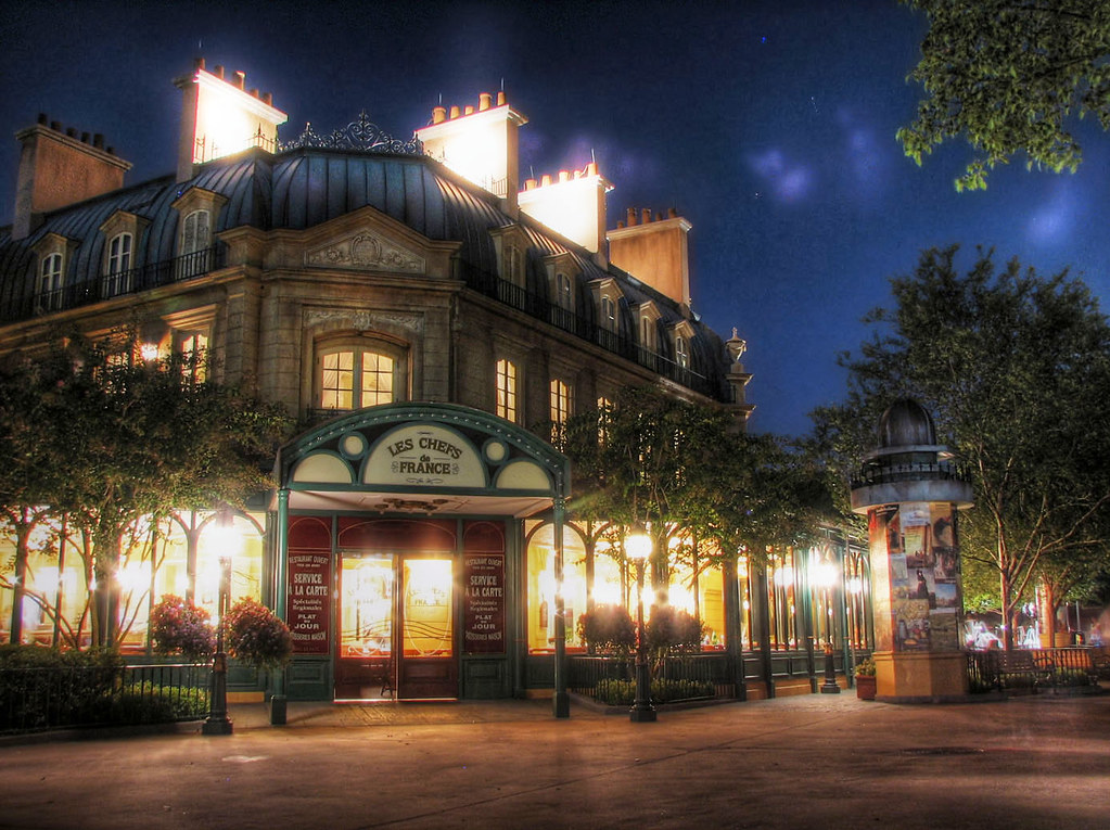
This photo is, for all intents and purposes, an HDR image. Why? Because (I'm pretty sure I) bracketed the shot and combined the one with the normal looking sky and the one with the normal looking foreground into one image. However I only replaced the sky, rather than running the images through a program to give me a completely HDR'd image. That is to say, from the trees up is one image, from the trees down is a second image, and the buck stops there.
That is what HDR should look like. In most cases, you shouldn't really be able to tell it's HDR unless you're really looking for it. You shouldn't really look at a photo and think "That looks wholly unatural..." Just because you can do it doesn't mean you should.
it just surprises me that people look at the final result and consider it to be a good looking photo.
It's because they don't know jack about photography or what makes a good photo. It's like anyone who has an unrefined taste in anything. It amazes me that a few of my friends think those $2 cigars they sell at gas stations are good, or that "discount vodka" is just as good as Grey Goose. They don't know any better. That's all well and good, but it'd be a helluva lot easier on me if I didn't have to smell their shitty cigars, deal with them when they're throwing up their shitty liquor, or look at their shitty photos.
posted by CitrusFreak12 at 1:40 PM on June 6, 2007
M AKE magazine had an article in their FRINGE issue on making your owntilt-shift lens with little bellows for your slr/dslr camera
I found the article in question with a little googling. Thanks for the tip, Dave!
posted by CitrusFreak12 at 1:43 PM on June 6, 2007
I found the article in question with a little googling. Thanks for the tip, Dave!
posted by CitrusFreak12 at 1:43 PM on June 6, 2007
« Older It's not about censorship, moron. | What's this for, love? Newer »
This thread has been archived and is closed to new comments
posted by chunking express at 1:57 PM on June 5, 2007